We need to talk about Baylor's new uniforms
Why "unoriginal" is worse than "ugly"
Today's post is free for everyone to read! Click here to subscribe and unlock all of the content on 2StripesCPD!
I can put up with stupid uniforms.
I can put up with comically ugly uniforms.
What I can't put up with are unoriginal uniforms.
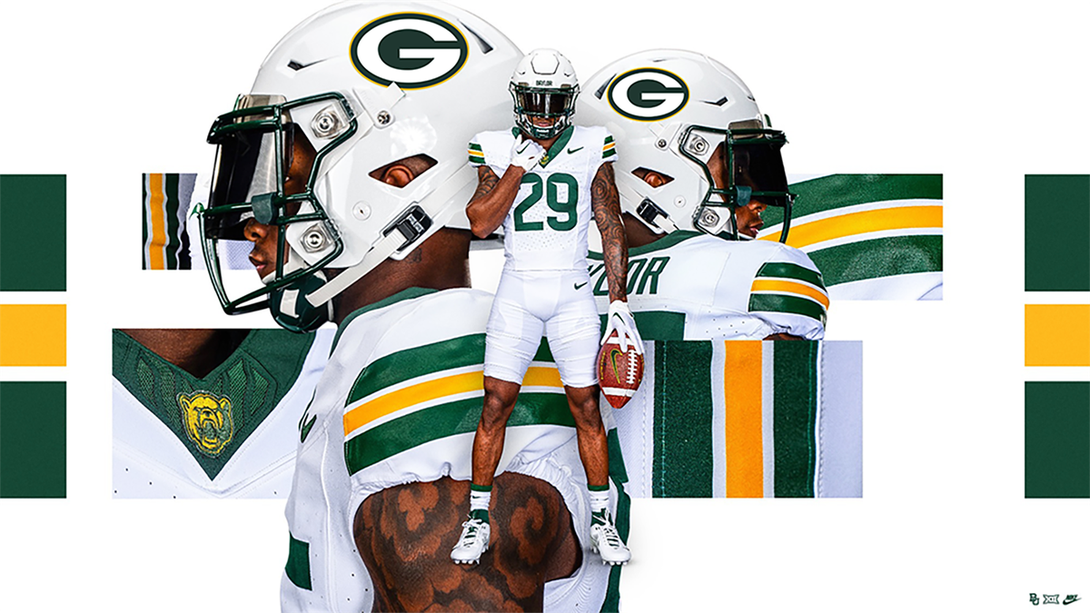
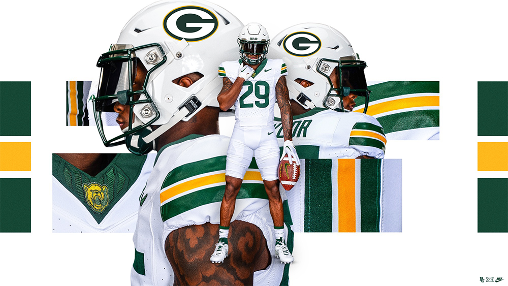
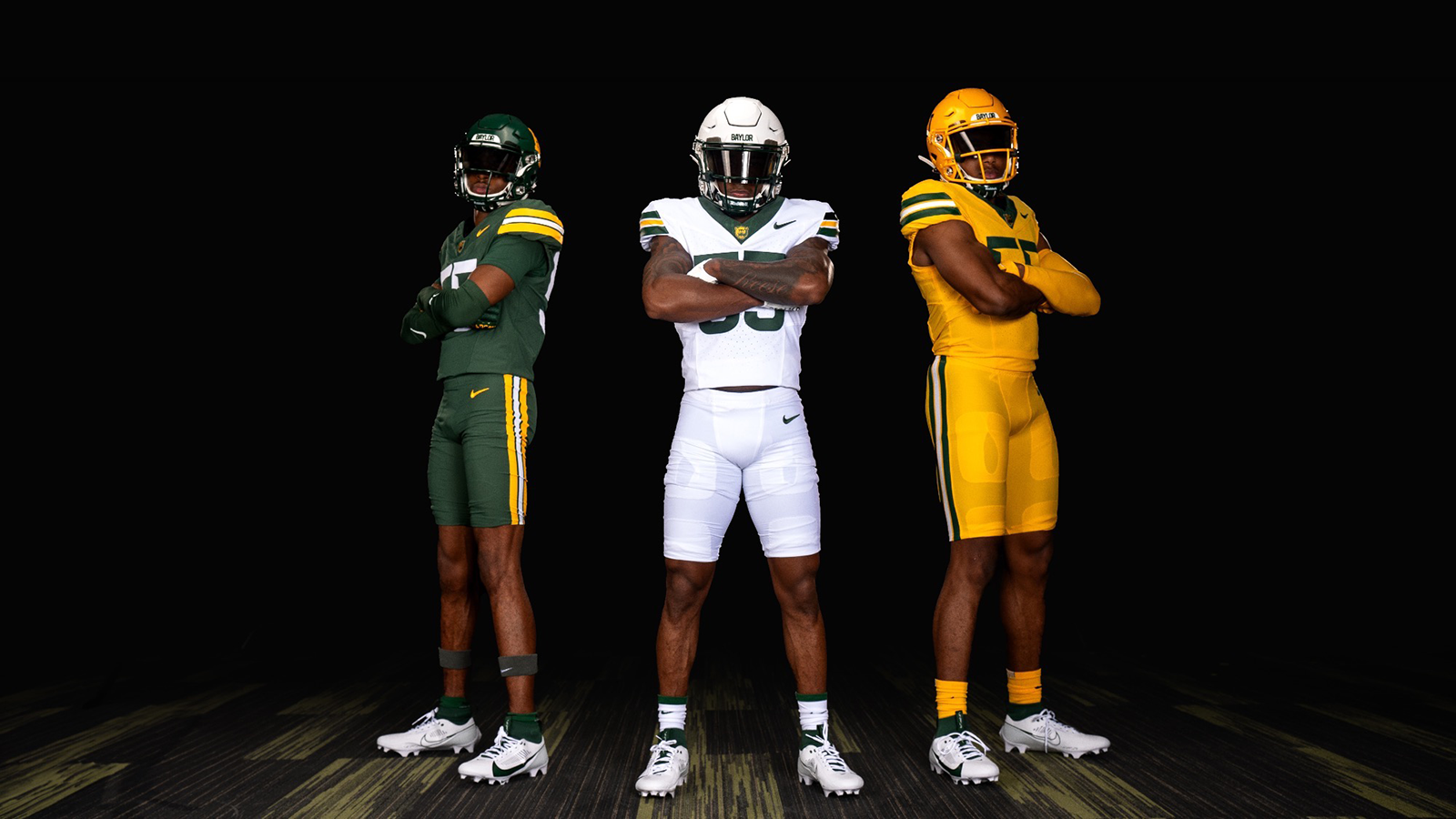
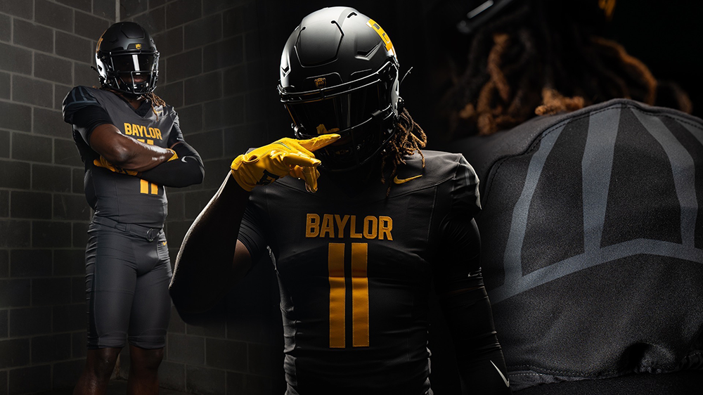
That's the best word to describe what Baylor just unveiled for the 2024 season:
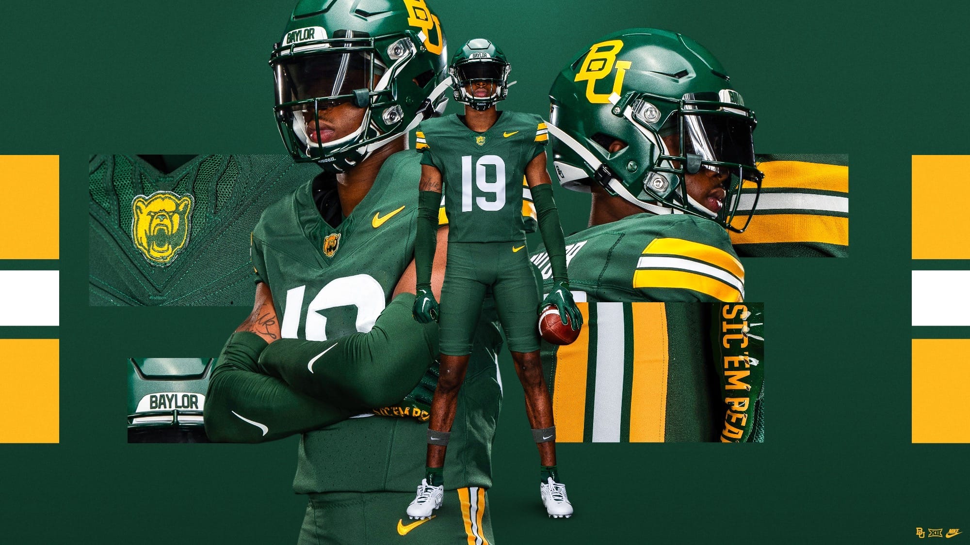
Via Baylor Athletics
In a vacuum, they aren't stupid, and they're certainly not ugly. It's almost impossible to mess up a green and "gold" colorway, and I'm not saying that's what happened here. But there's just something about these I can't quite put my finger on. Can you help me out?
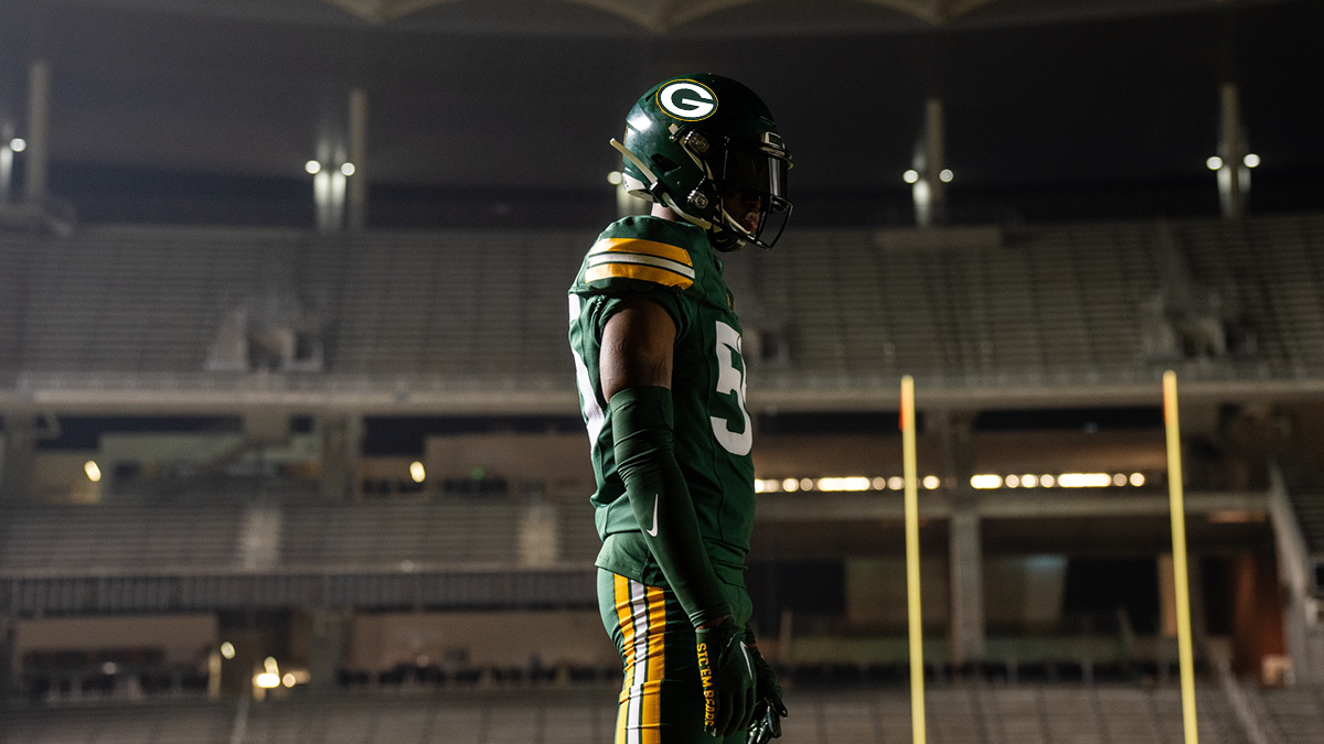
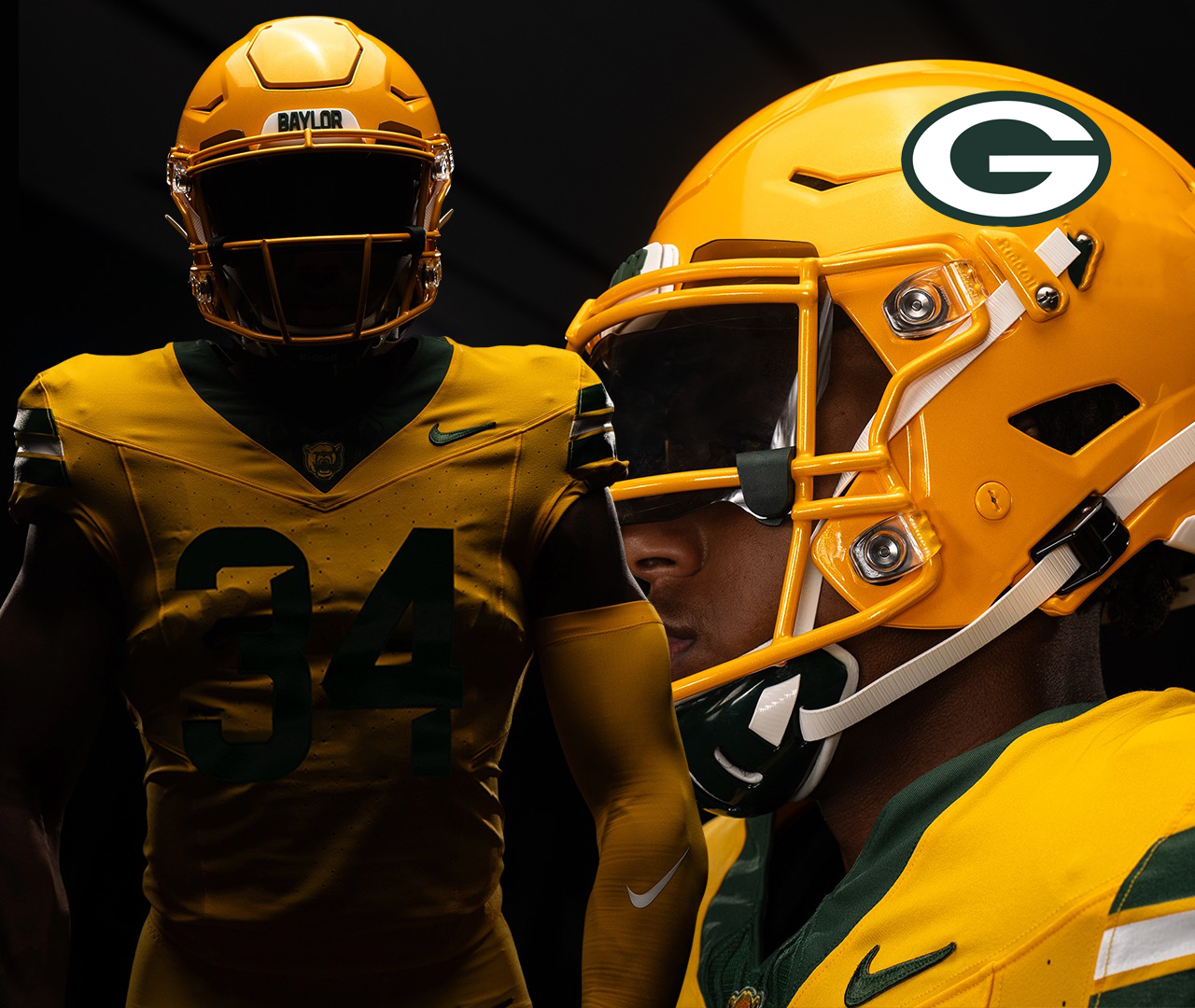
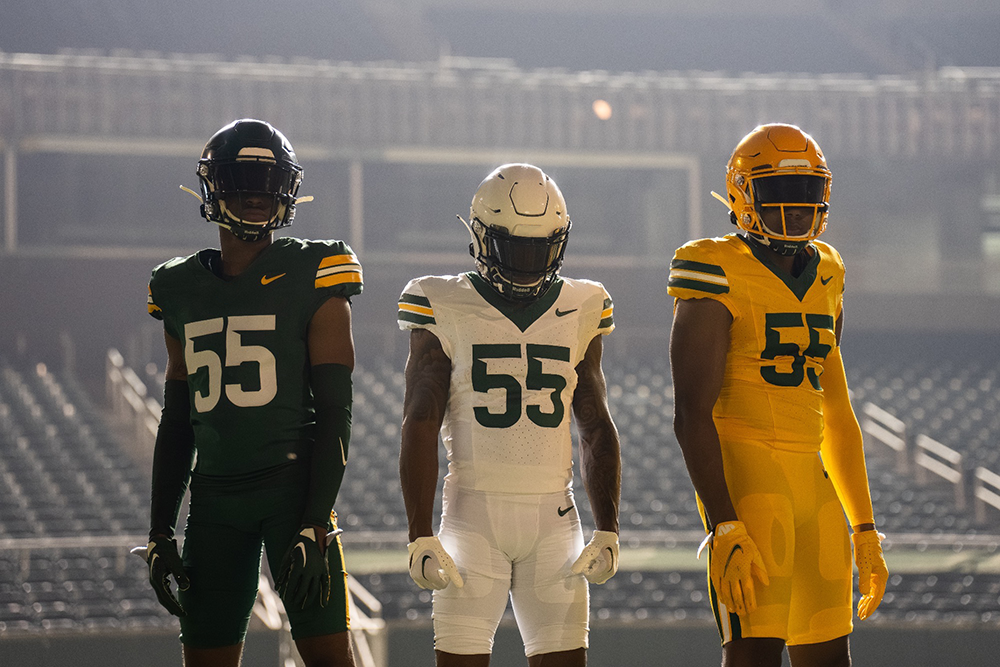
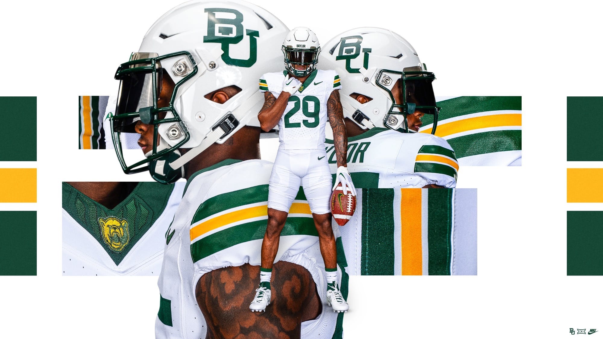
Via Baylor Athletics
If Baylor's ultimate goal here was to look like the Packers, than these are a 10/10 mammoth home run. In fact, I'm talking myself into the idea that the main reason they're wearing these is because Nike's trying to sell Green Bay on rocking modern alternates. They've worn a couple of different throwback alternates lately –plus a white jersey/pants color rush– but nothing that looks like what they're currently wearing. The Packers telling Nike to make Baylor their guinea pig so they don't have to deal with the blowback from their boomer fans seeing a gold uniform, or the money it would cost to produce them is an ultimate galaxy-brain move.
Like anything else in life, context is important. In an alternate universe where the Green Bay Packers don't exist, these are perfectly fine uniforms. I'd say they're great, even! In our universe, though? They're unoriginal, uninspired, and disappointing, especially when you remember the clean set and real gold Baylor used to wear.
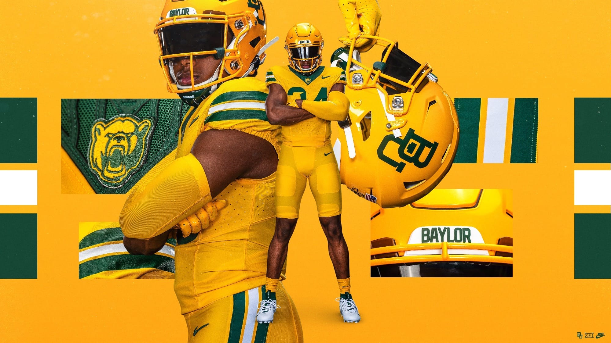
If that weren't enough, they also released an "anthracite" alternate that:
1) Doesn't match their color scheme.
2) Is nowhere near as sick as the "coal" alternate West Virginia dropped a few weeks ago.
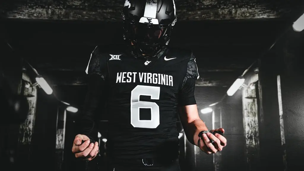
Via Baylor and West Virginia Athletics
Dave Aranda's already on the hot seat as is, and I'm ready to move him up to the top spot after this case of uniform identity fraud.