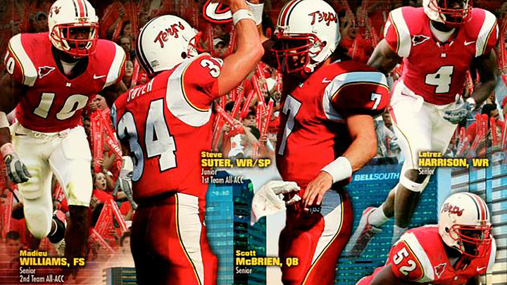
Uniform of the Day: Colorado descends into darkness

A truly awful uniform set.

Uniform of the Day: Colorado descends into darkness

Welcome to 'Uniform of the Day,' where I post about a random uniform in college football history (and other sports, too!)


My parents had Colorado season tickets from 1988-2005, so I grew up going to a lot of Buffs games in the golden era of the program. The teams were good, and the uniforms mostly kicked ass. Then, Dan Hawkins happened.

The program was already starting to crumble by the time Gary Barnett was fired at the end of 2005, but we could at least hang onto the fact that the uniforms still looked good. After Hawkins' first season ended with the program's worst record record in two decades (2-10), CU decided it was time for a refresh:

Via Wikipedia

The jerseys featured gold piping on the chest and around the back, reflective silver numbers on the black home jersey, and 'CU' logo panels on the side of the pants with additional piping. If that wasn't bad enough, Nike also added these weird ass dots to the shoulders and pants:

Everything about these uniforms was terrible. To make things even worse, they also changed the shade of gold on the helmets, which gave them a weird green-gold hue in certain lighting. It all made for a brutal on-field look:

I still hate these as much as the day they debuted, and I needed a post to vent about them. It's understandable that CU wanted a reset as they transitioned into a new era, but they decided to lean in way too hard into Nike's mid-2000s bullshit. They weren't the only ones who fell victim, but they might've gotten it worse than anyone else. These lasted from 2007-2010, and you can't convince me that they didn't somehow contribute to the fall of a program still trying to find solid footing over a decade later.