
The Top-25 New CFB Uniform poll
THIS IS THE ONLY TOP-25 THAT MATTERS
The big bad uniform takes man is back. Last time it was ranking NHL Reverse Retro jerseys, and now it's the new looks around college football (that I've seen so far) for the 2021 season. Since the AP/Coaches polls are useless, this is now officially the only top-25 that matters. Let's get to it.
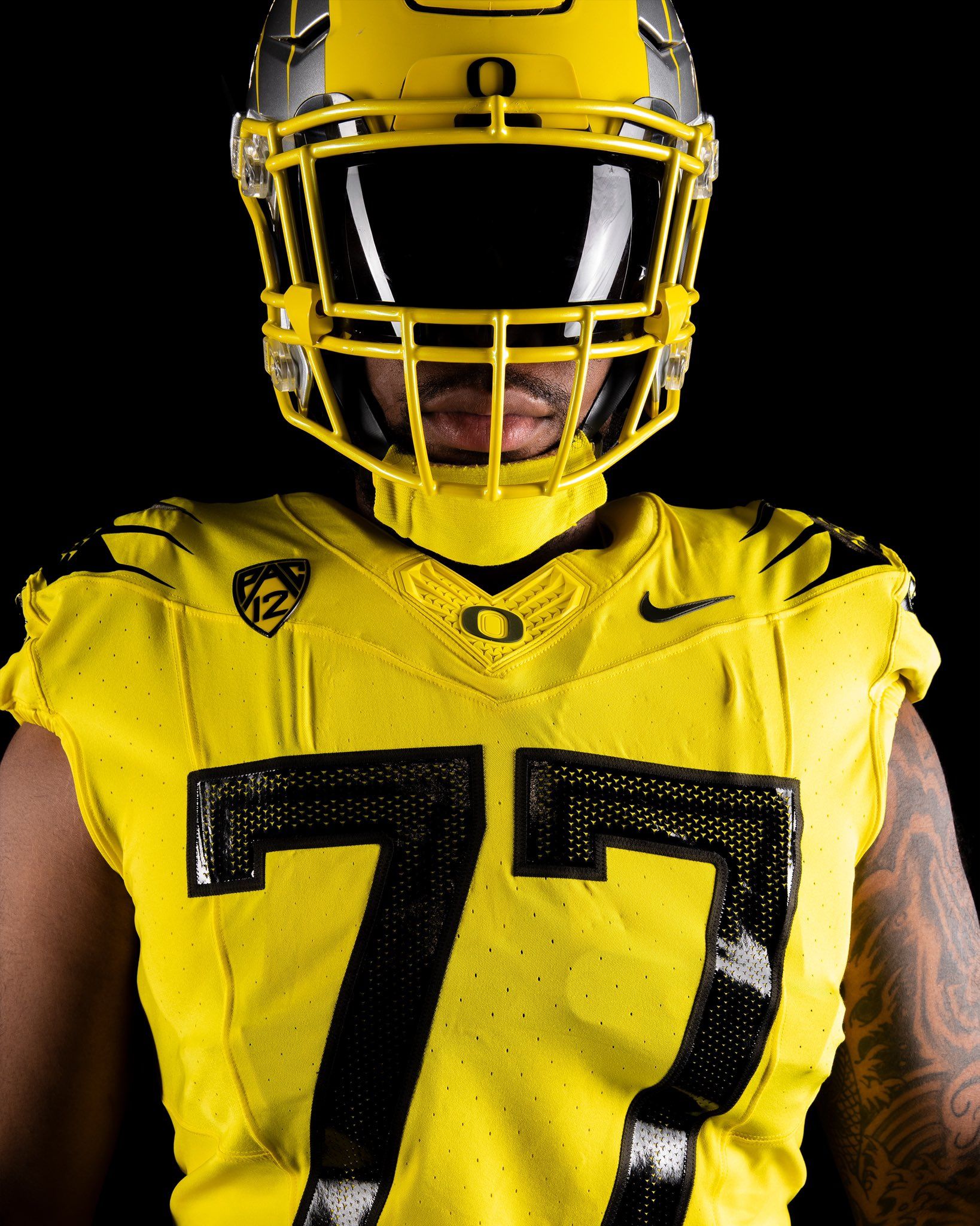
25. Oregon
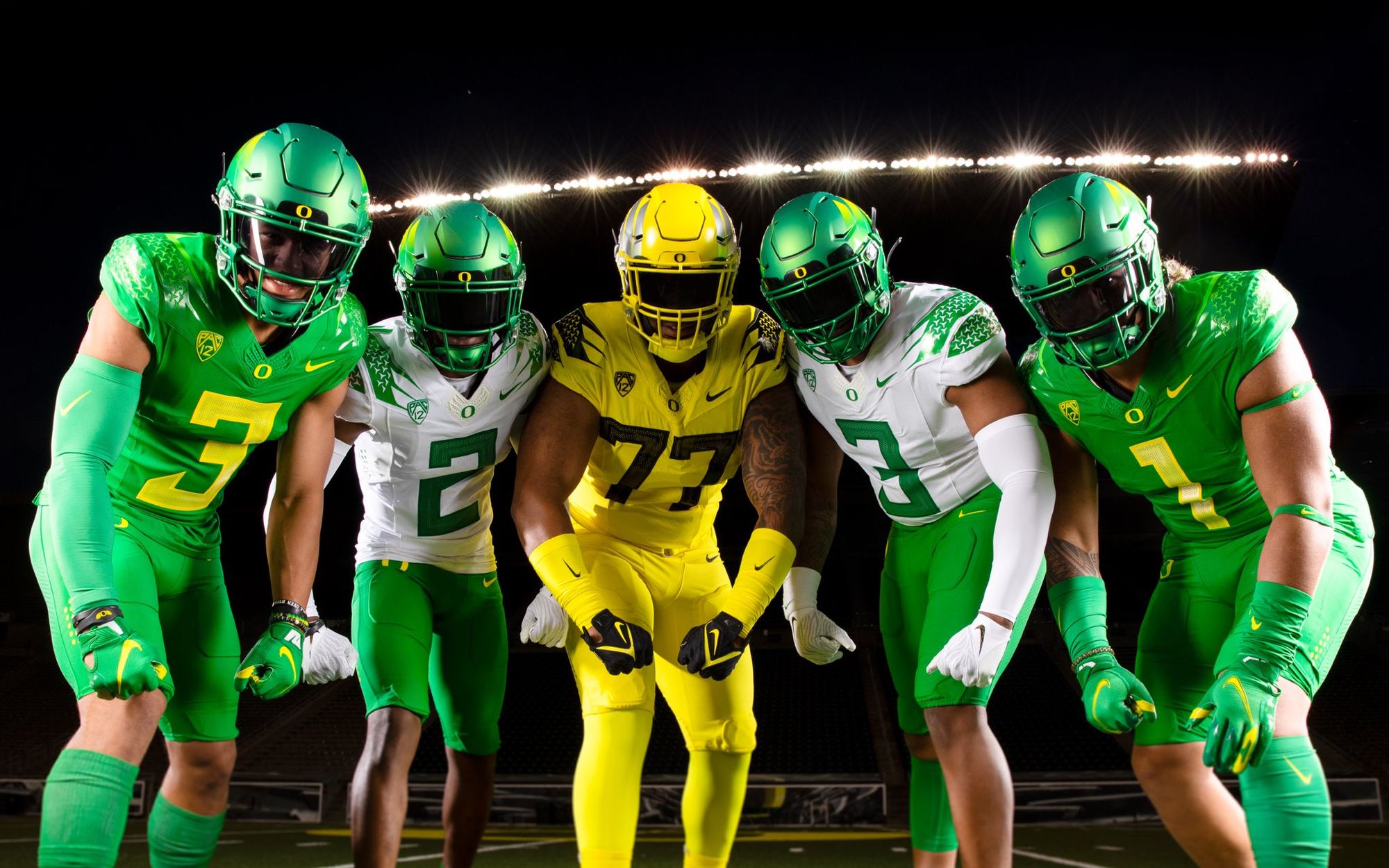
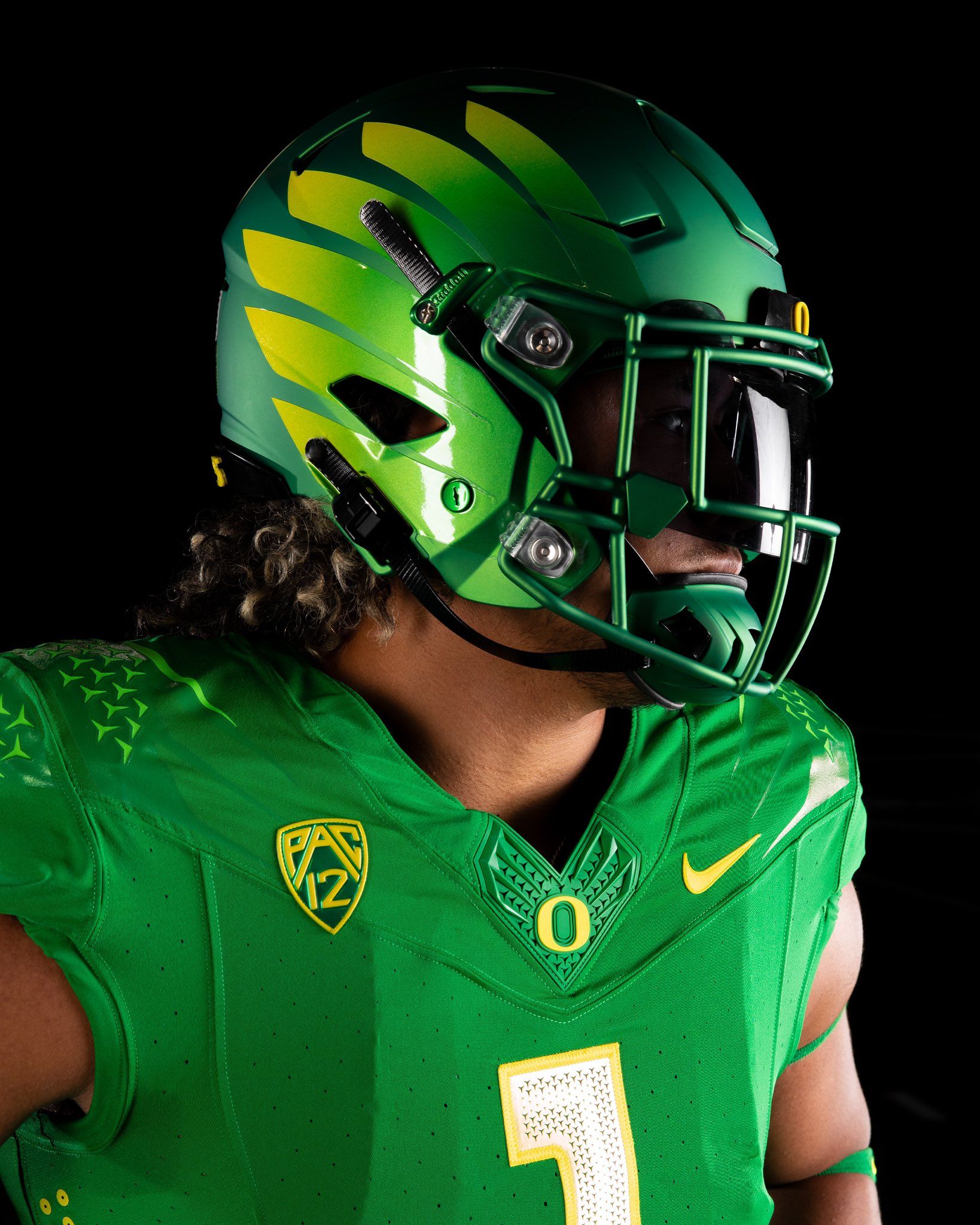
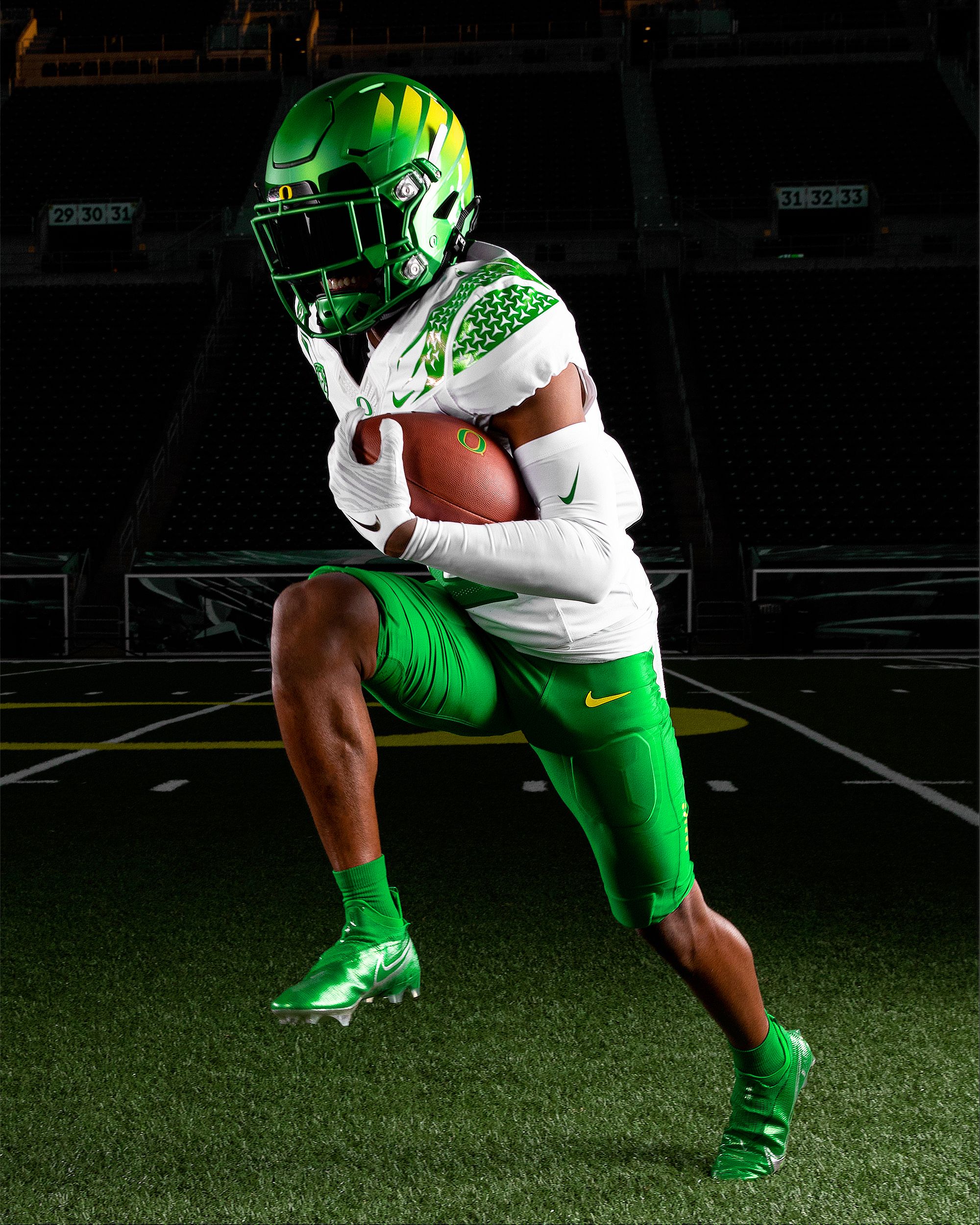
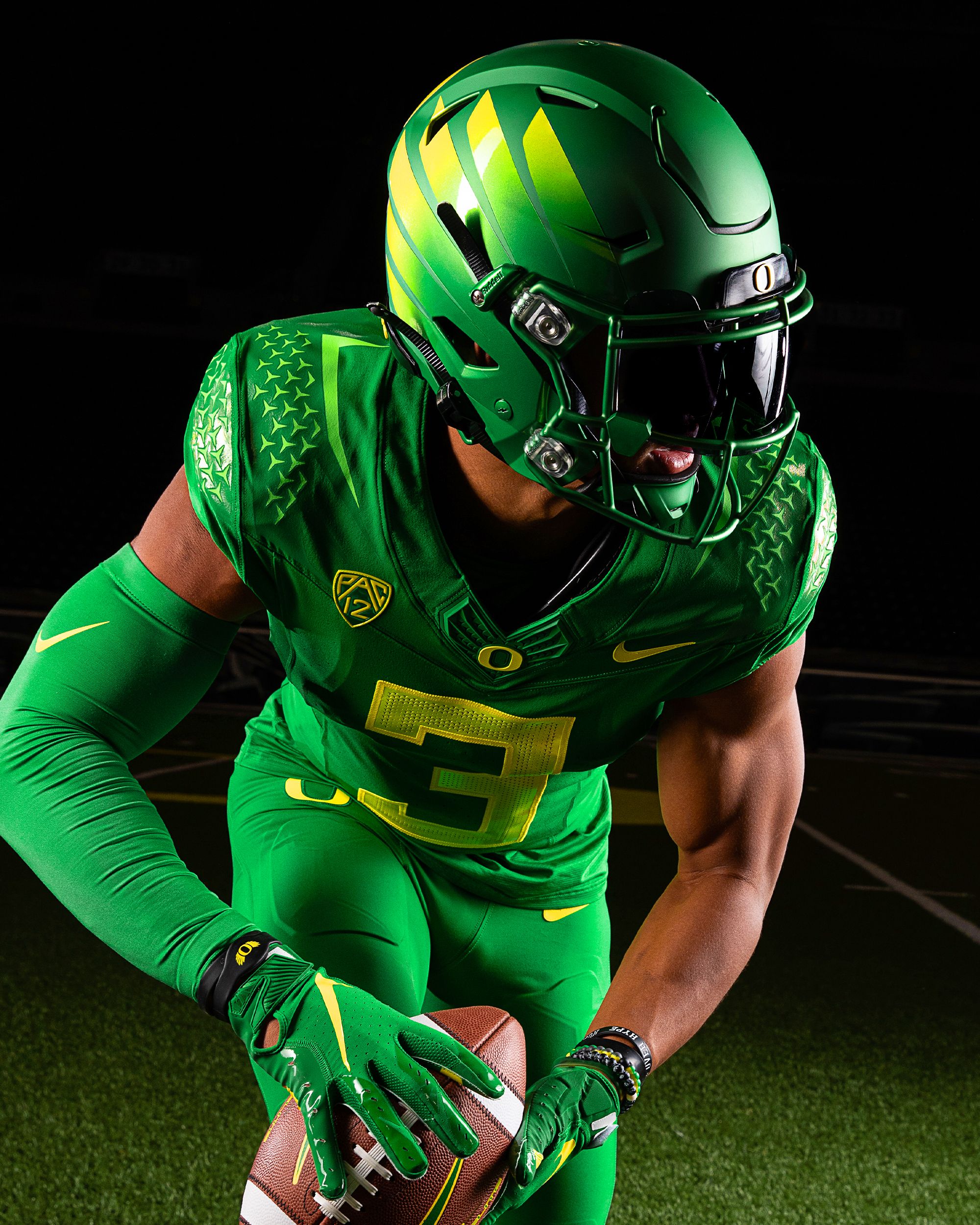
Good: The shade of green. The textured numbers. My favorite is the white top with the green pants.
Bad: The highlighter-yellow sucked when it debuted in 2013, and it's even worse now. The winged-helmets still look like a flying goomba. Did Toto Wolff green-light the textured shoulders?
Begrudgingly giving Oregon props for staying (mostly) true to their school colors. They strayed too far from 2010-2015, so I like that they're keeping things simple. But is it too simple? Outside for the sick Ohana set last year, Oregon's recent jerseys lack creativity, unless you think 300 size font numbers are groundbreaking. I expect more from Oregon, and that's my beef here. I'm sure they'll break out an alternate this season, but I miss the days of Nike pushing the envelope with creative design risks for the school who's led the charge in uniform culture over the last two decades.
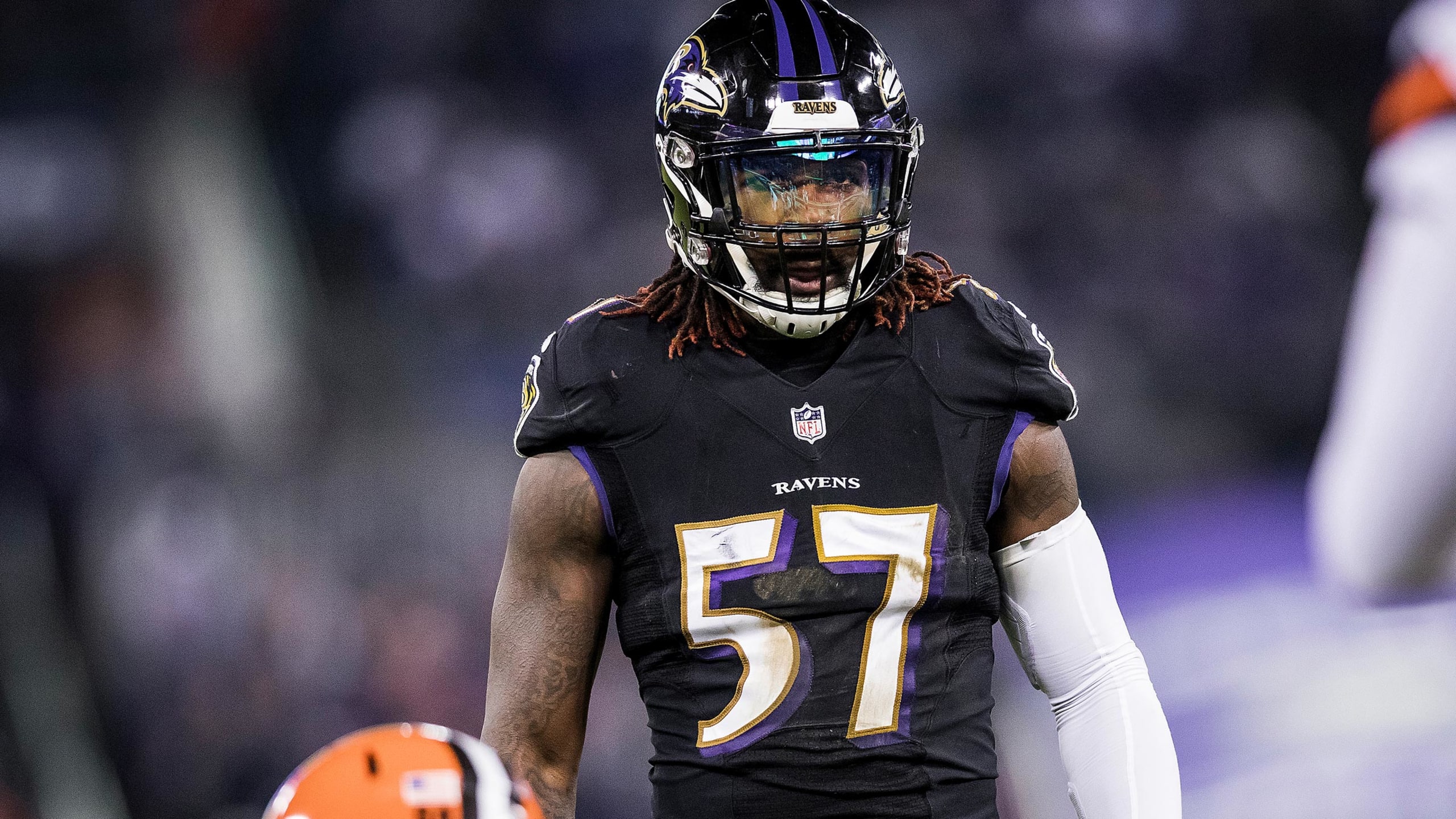
24. East Carolina
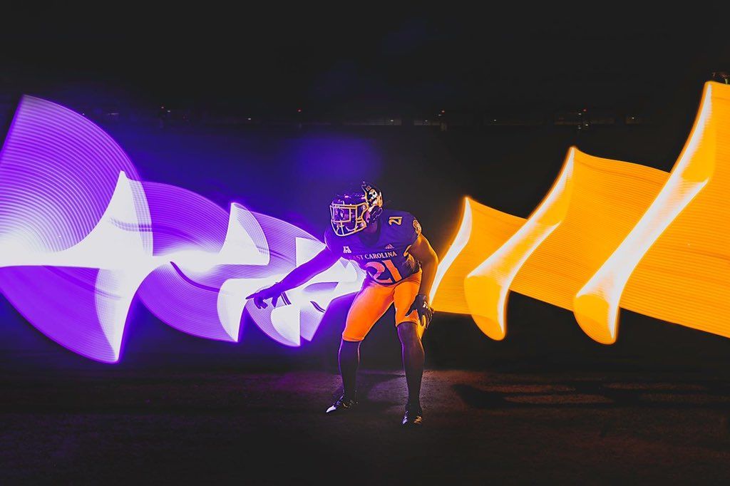
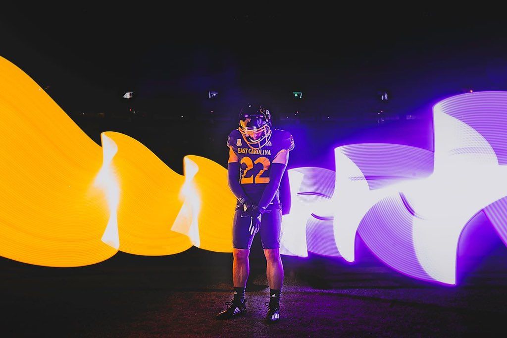
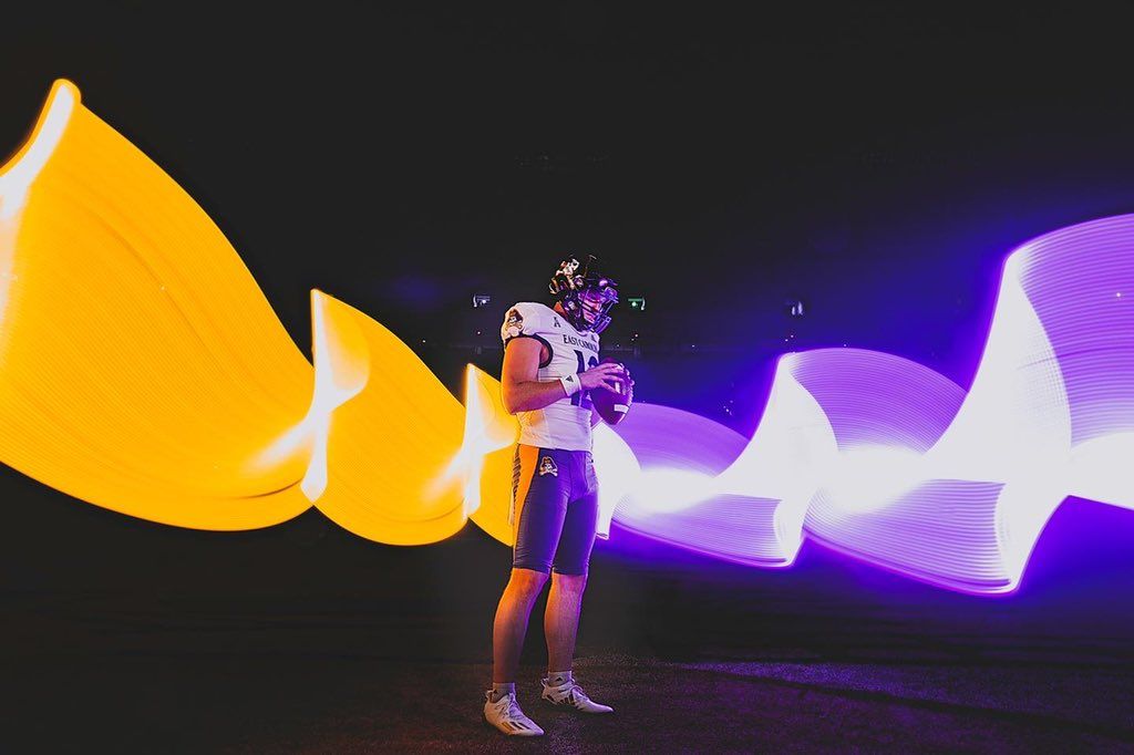
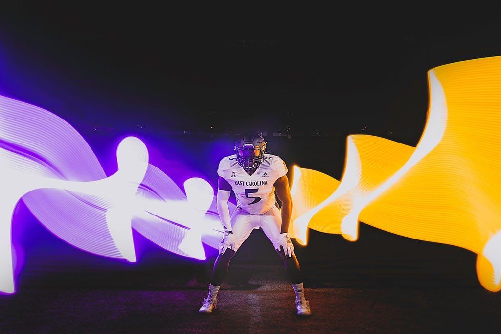
I have an irrational attachment to ECU because I've won multiple national titles with them on NCAA 07, so I'm always down with the purple and gold. They use the same badass number font as the Ravens, and it's my favorite in all of football.
23. Minnesota - Blackout
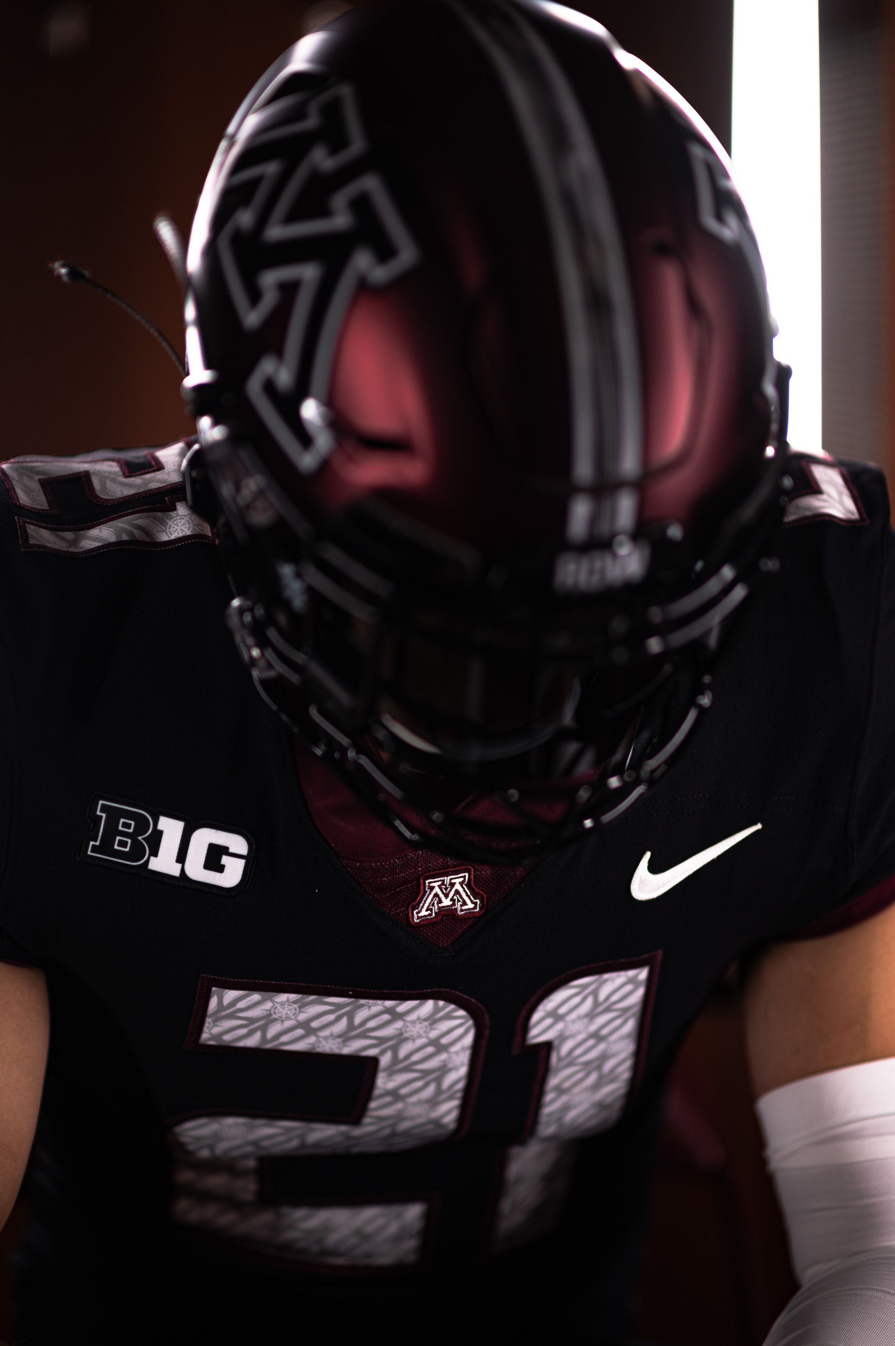
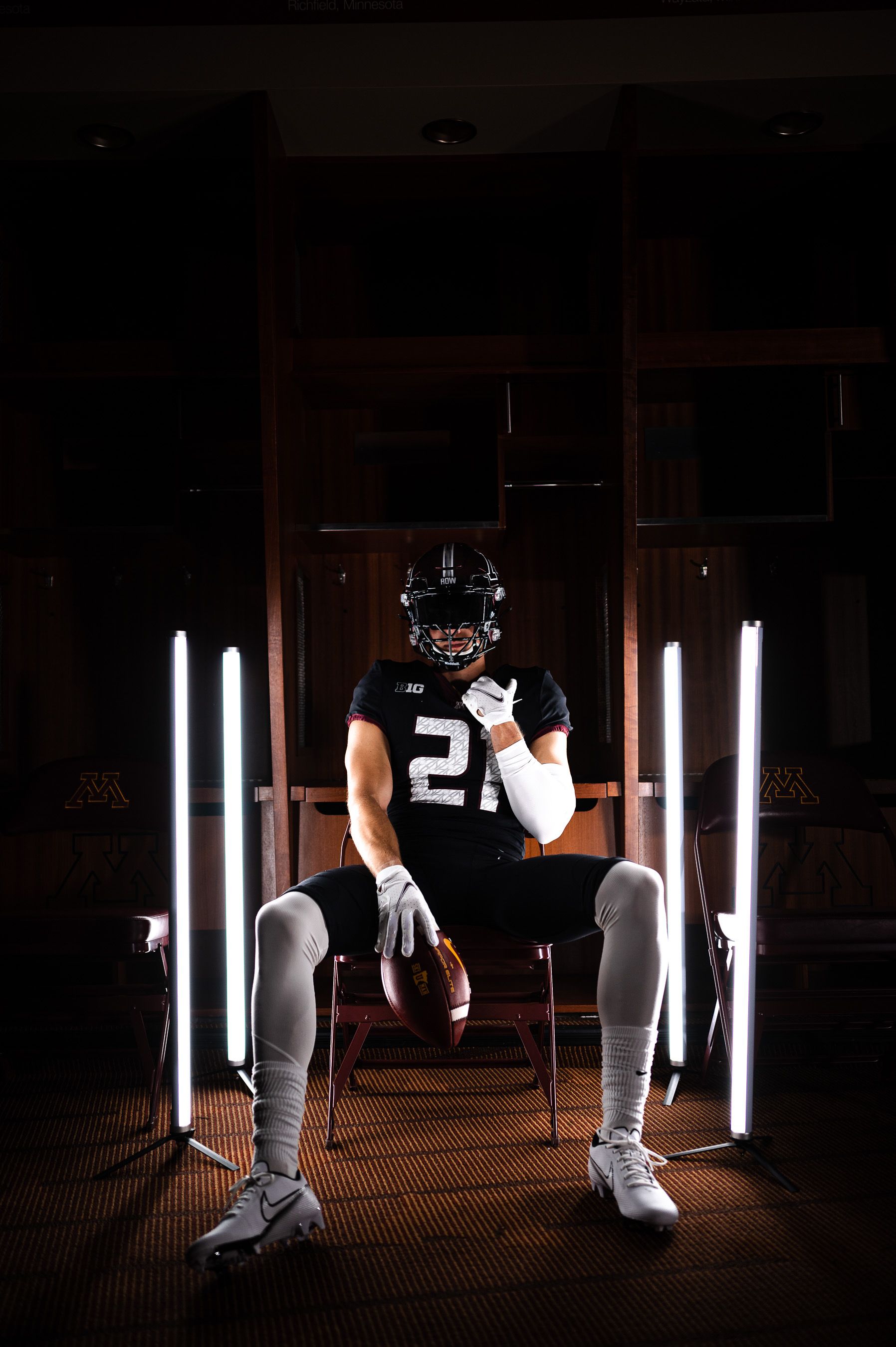
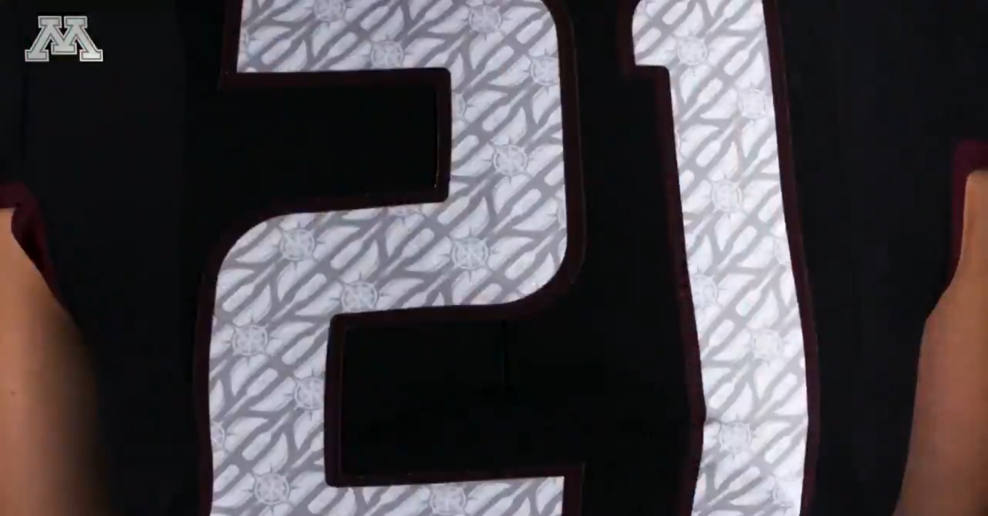
Most people hate these –I don't blame them– but I don't mind them for what they are: A one-off that Minnesota's wearing because they're opening the season at home, in prime-time against Ohio State. Of all people, PJ Fleck isn't keeping shit status quo for that. If they beat the Buckeyes: These go down as legendary jerseys you break out for big games. If they lose When they get blown out: You give away the jerseys to local kids, charity auction the helmets, and never speak about them again. I like the ship wheels inside the numbers ¯\_(ツ)_/¯
22. Arizona State - Reverse Retro
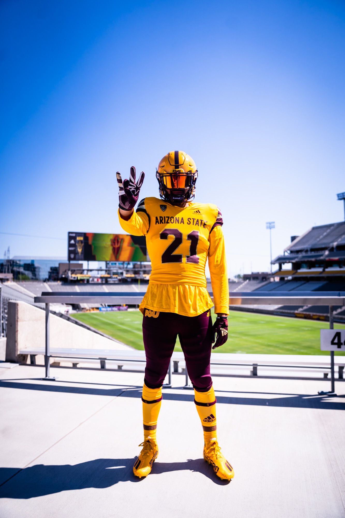
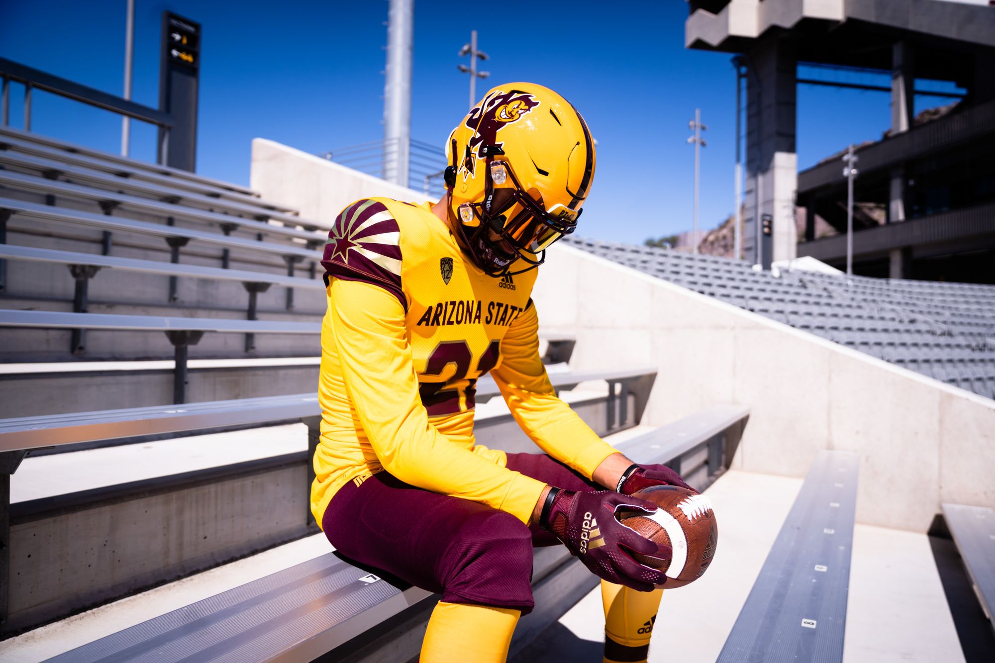
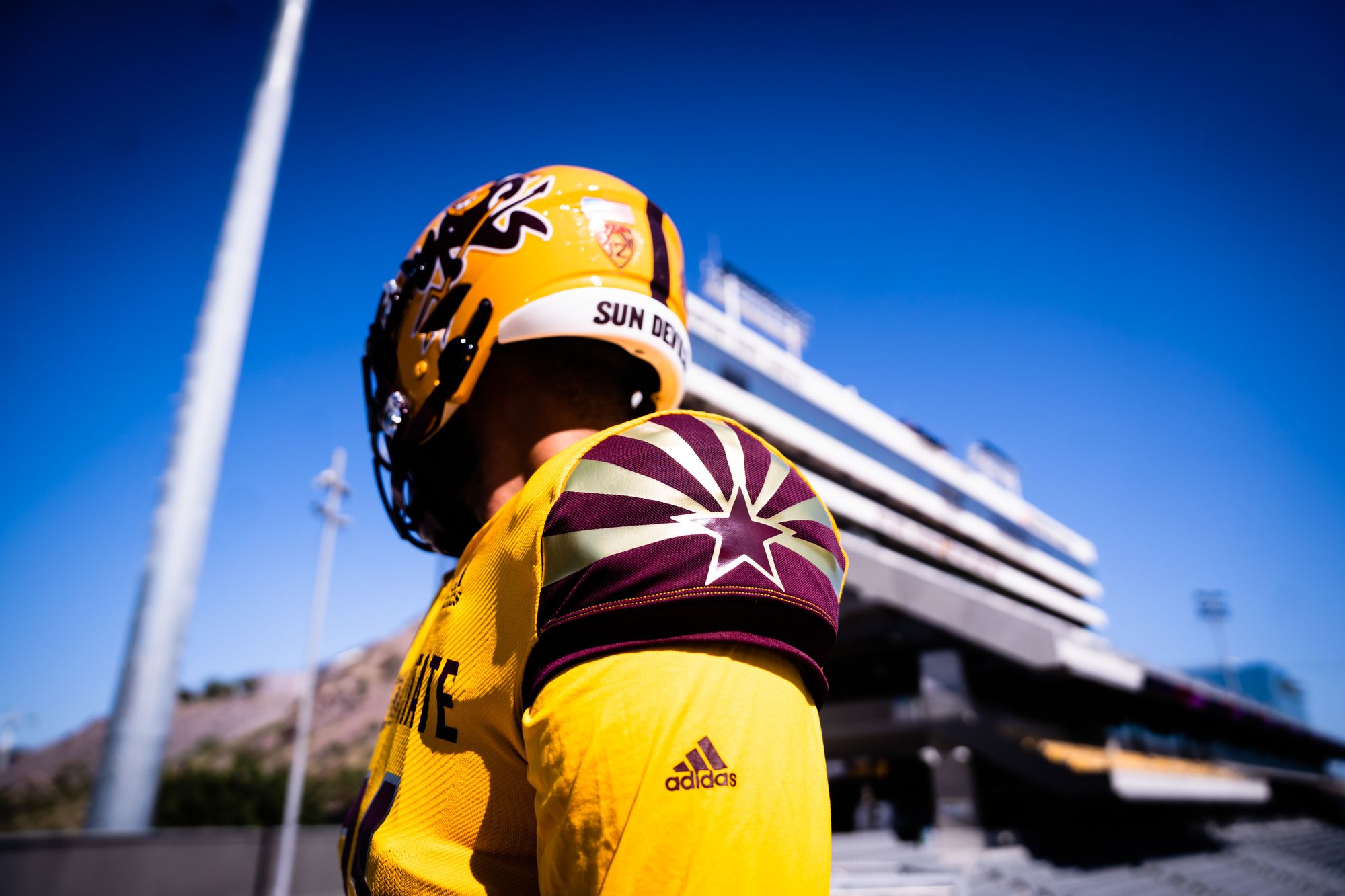
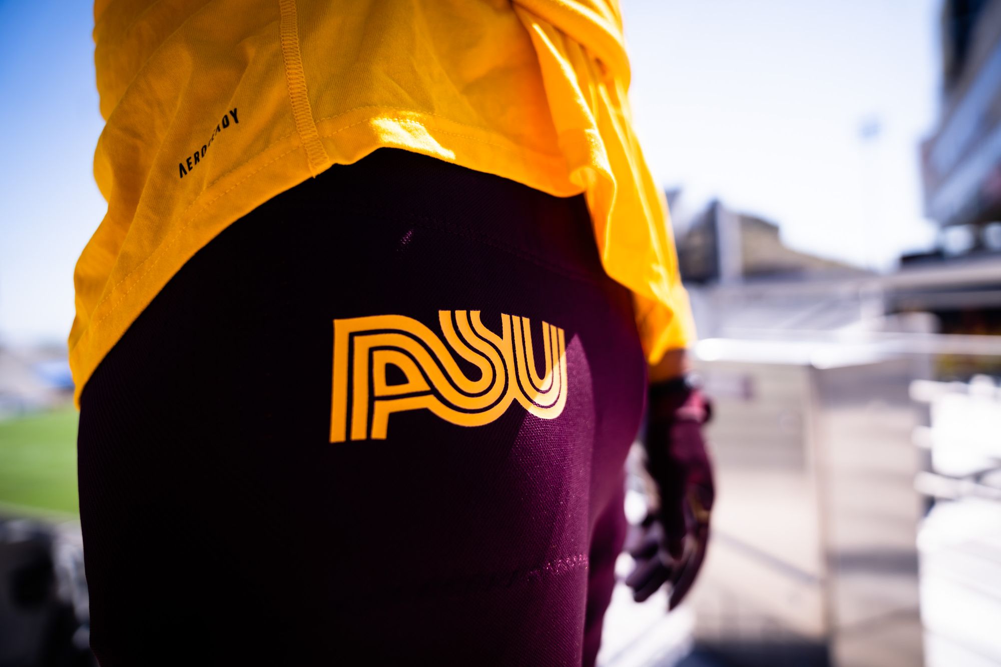
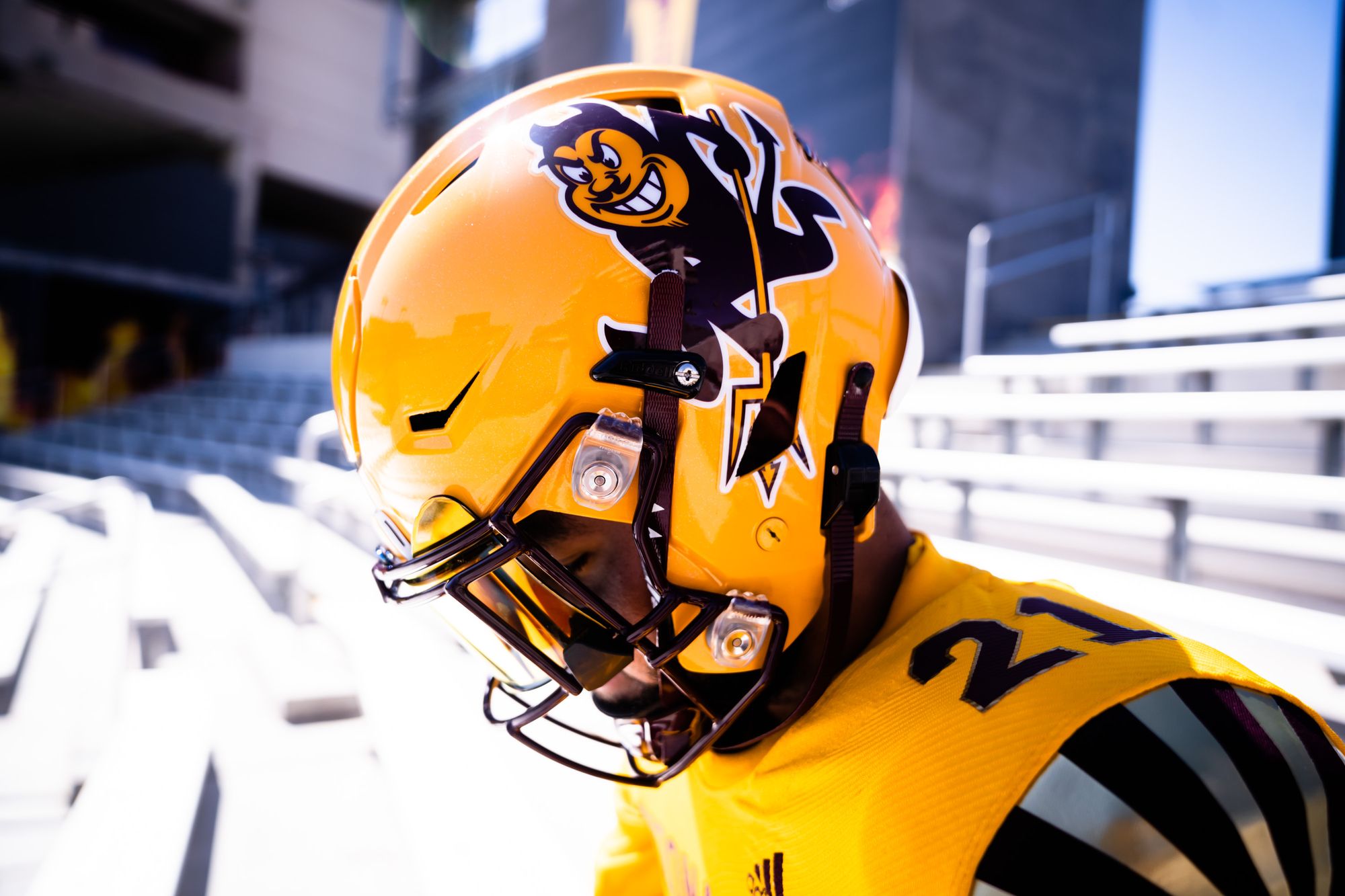
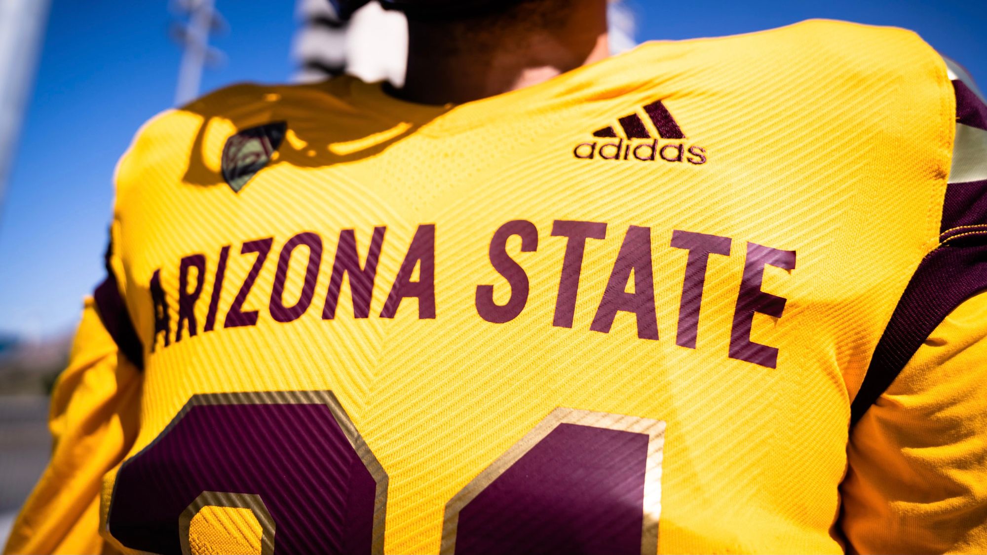
Adidas is giving some of their schools the 'reverse retro' treatment that NHL teams got this past season, and Arizona State's pass the test. It's aggressive, but isn't that just ASU in general? Anything with Sparky is good in my book. I like the gold accents, and the throwback ASU script on the pants works. They're rocking these on September 25 against Colorado, but it'll probably be on Pac-12 Network; so good luck actually seeing the jerseys in action.
21. Notre Dame - Shamrock Series
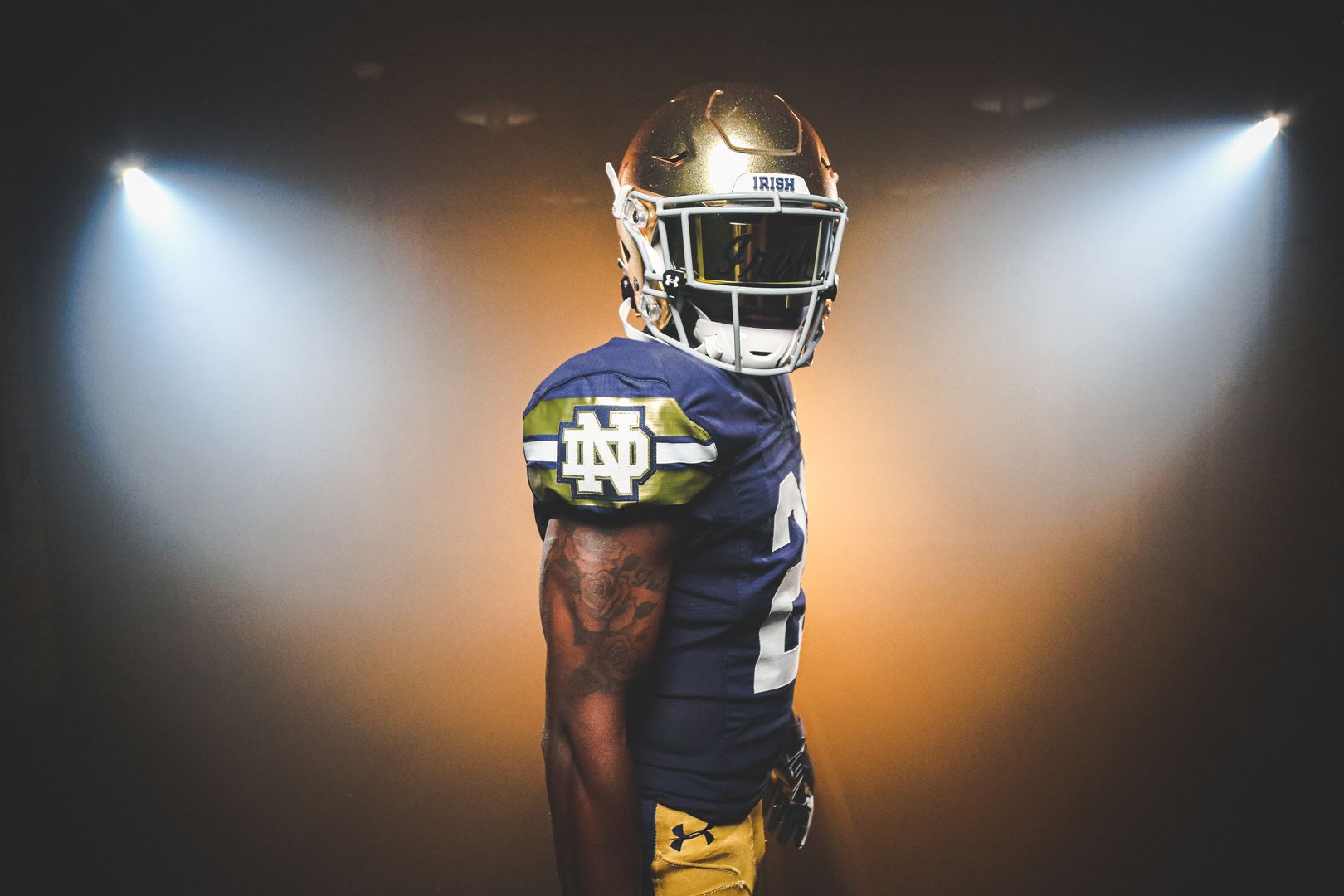
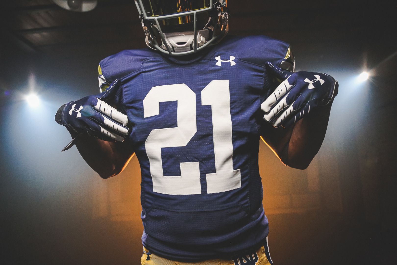
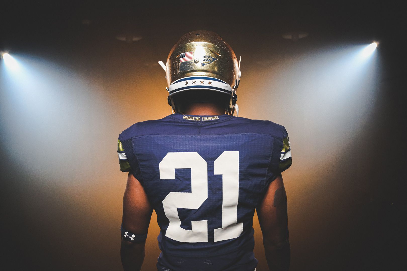
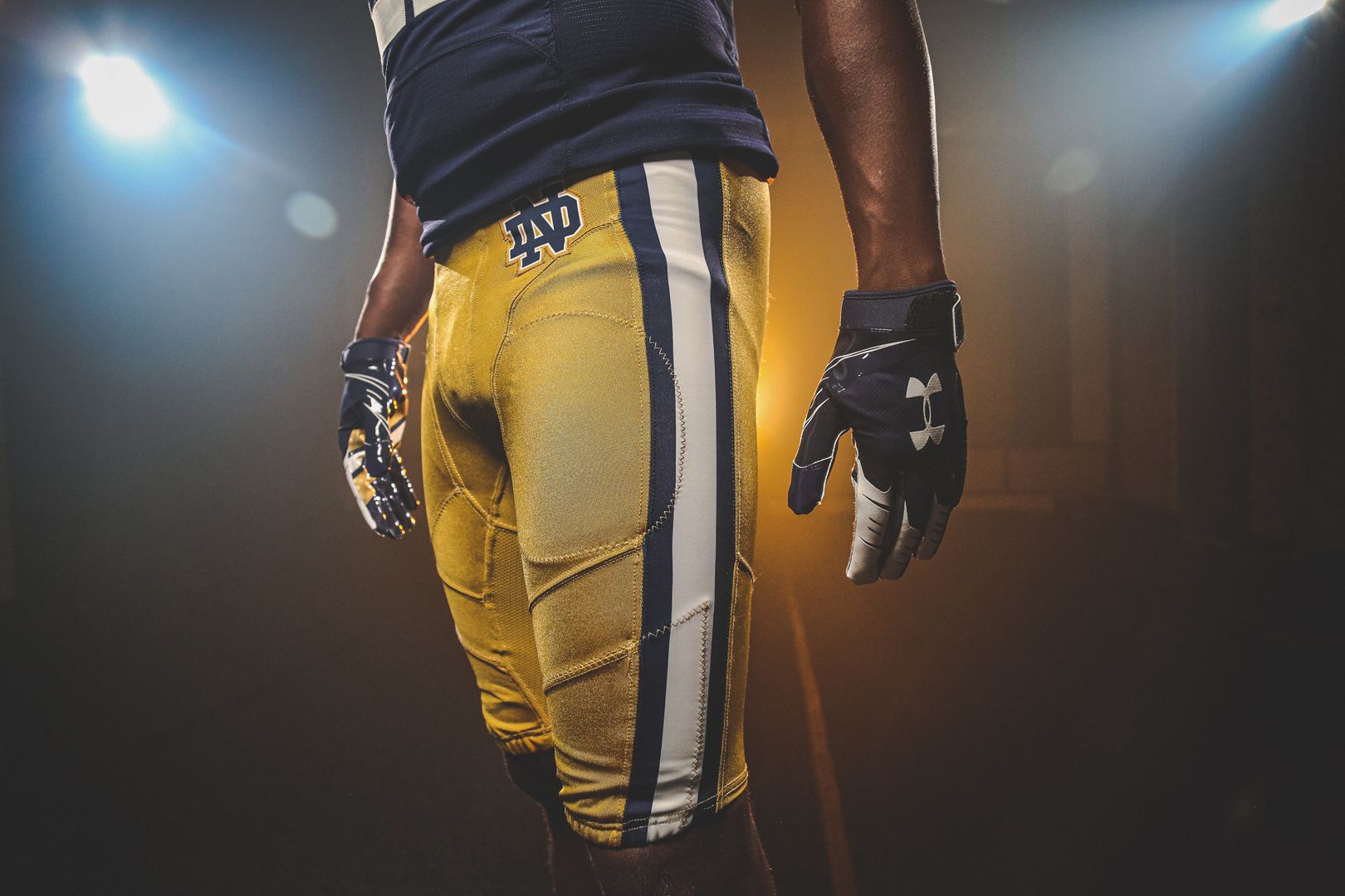
Are you sensing a theme here? Another one-off jersey designed for a specific purpose. These are for ND's Shamrock Series game at Soldier Field against Wisconsin, and nothing here bothers me. The Chicago flag on the back of the helmet is a cool touch, and the pants look like they have a metallic sheen. I can't think of another team who's tried that yet, and I'm excited to see how it looks on TV. Congratulations on reading the first lukewarm Notre Dame take in internet history.
20. Utah - USS Salt Lake City
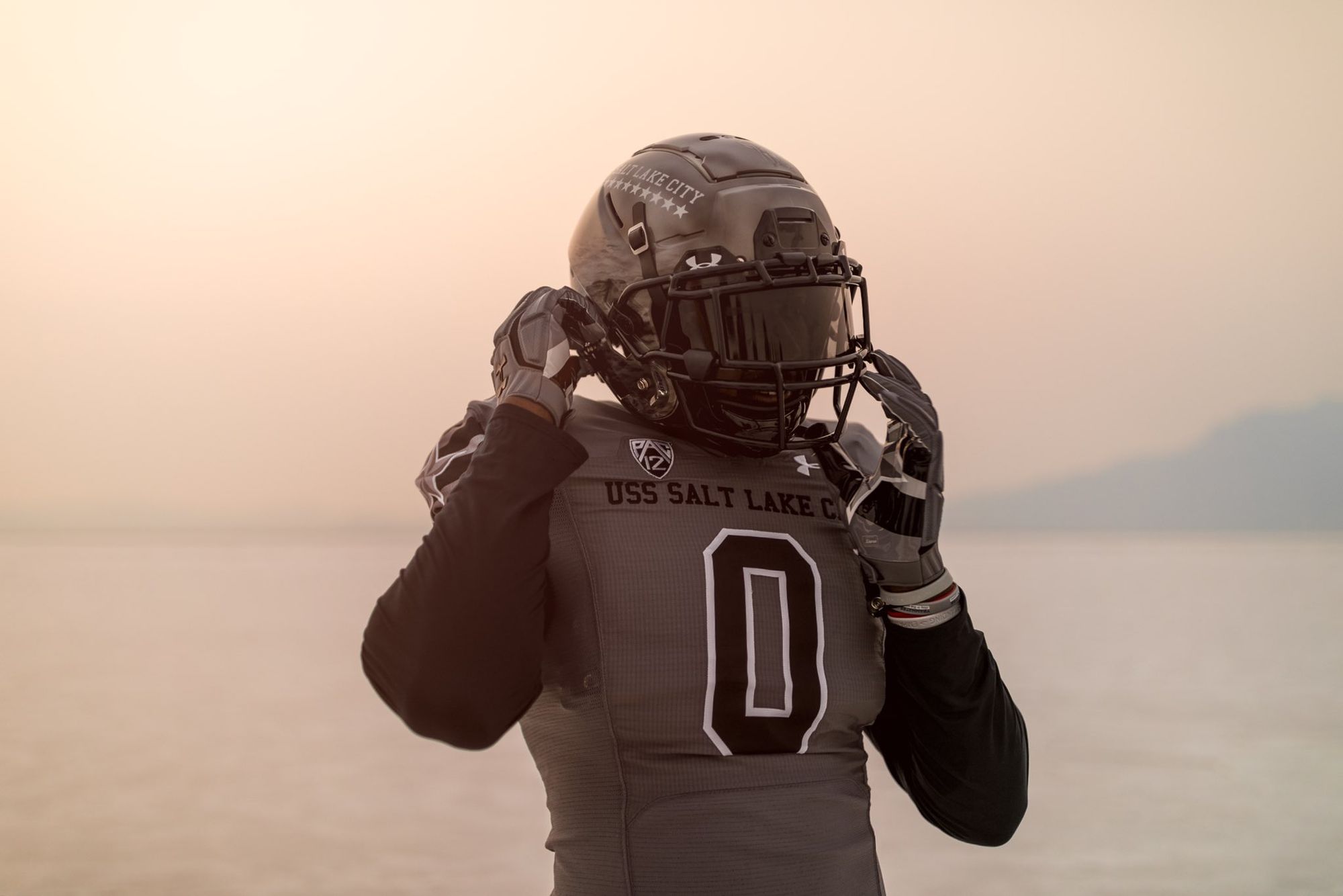
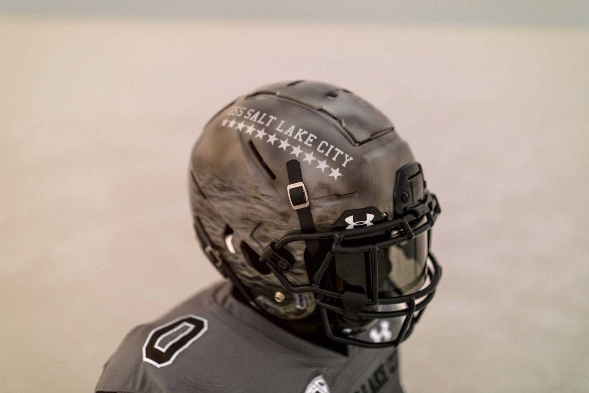
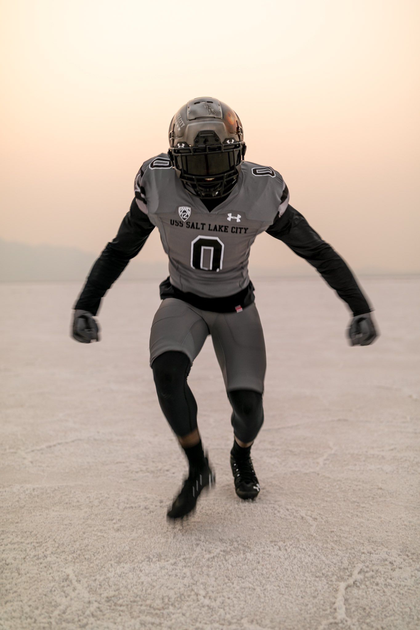
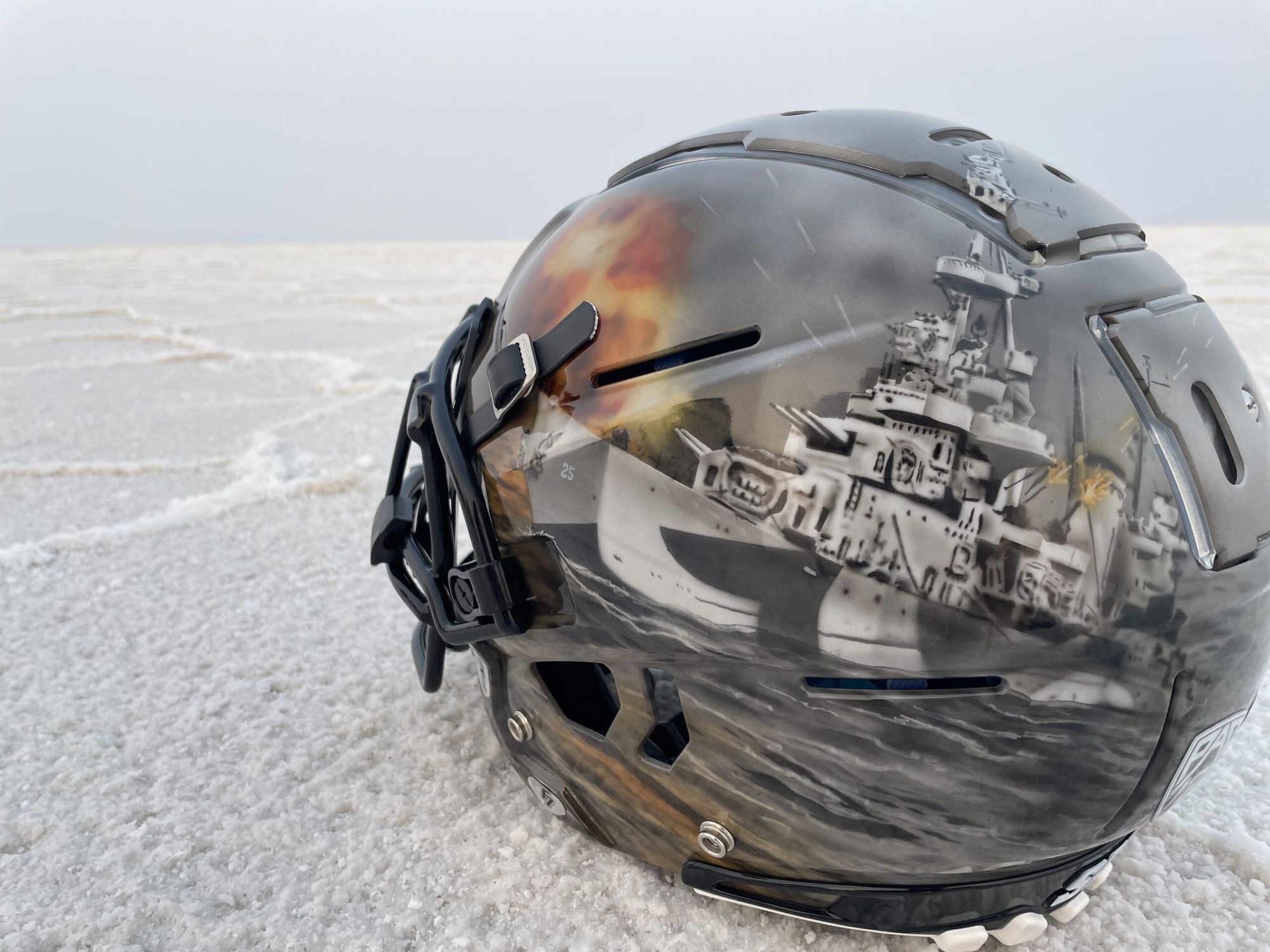
Military/war-related uniforms aren't my thing, but Under Armour went above and beyond for Utah on these. Almost every part of the jersey pays homage to the The USS Salt Lake City, which was a World War II-era heavy cruiser, and every single helmet design is hand-painted. They're wearing them for their November 20 game against Oregon, and you can learn more about the full jersey here.
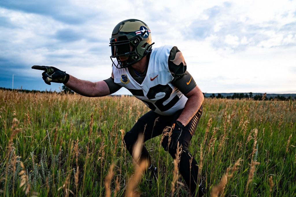
19. Navy
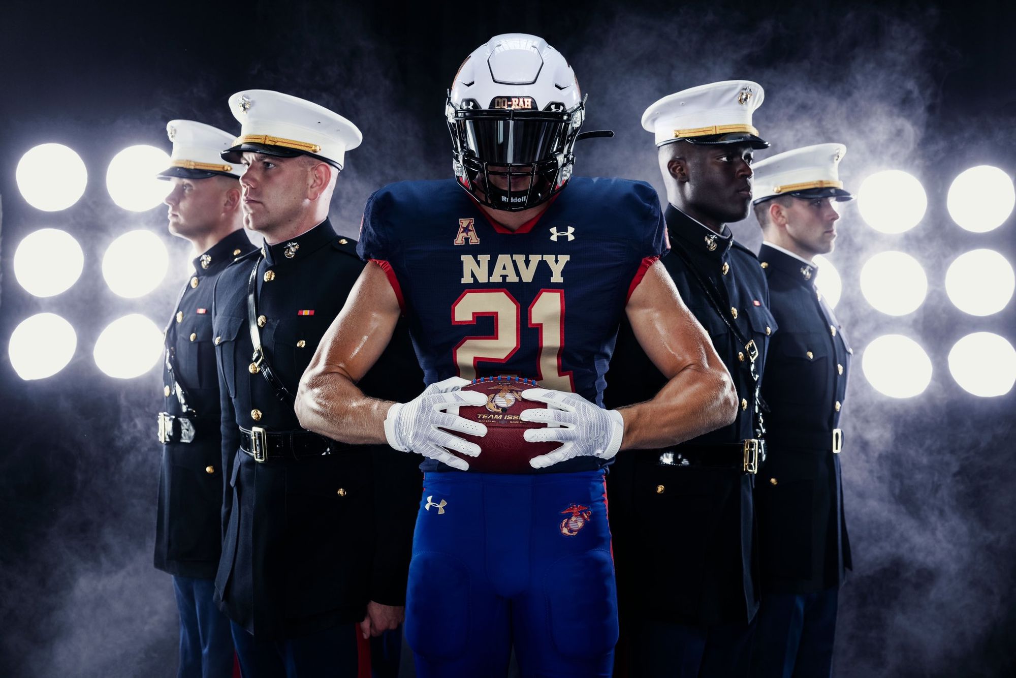
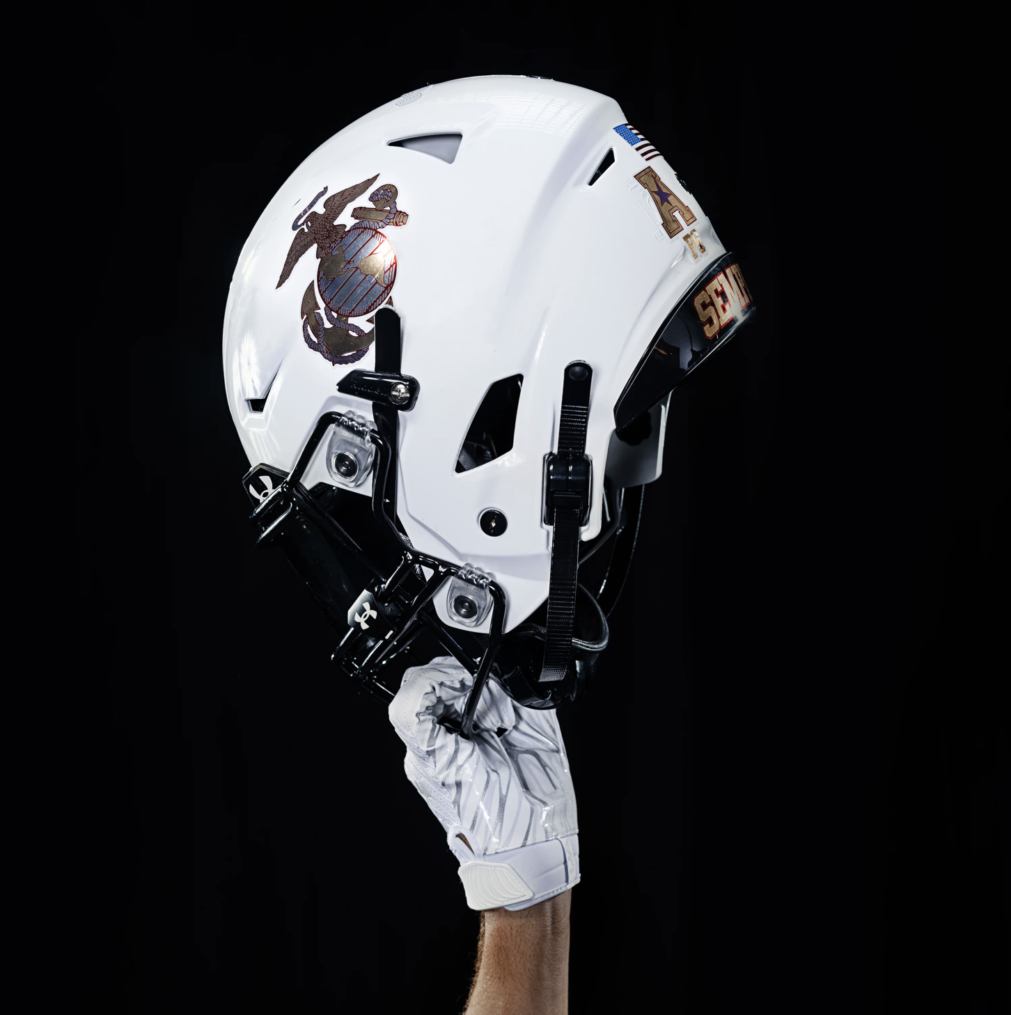
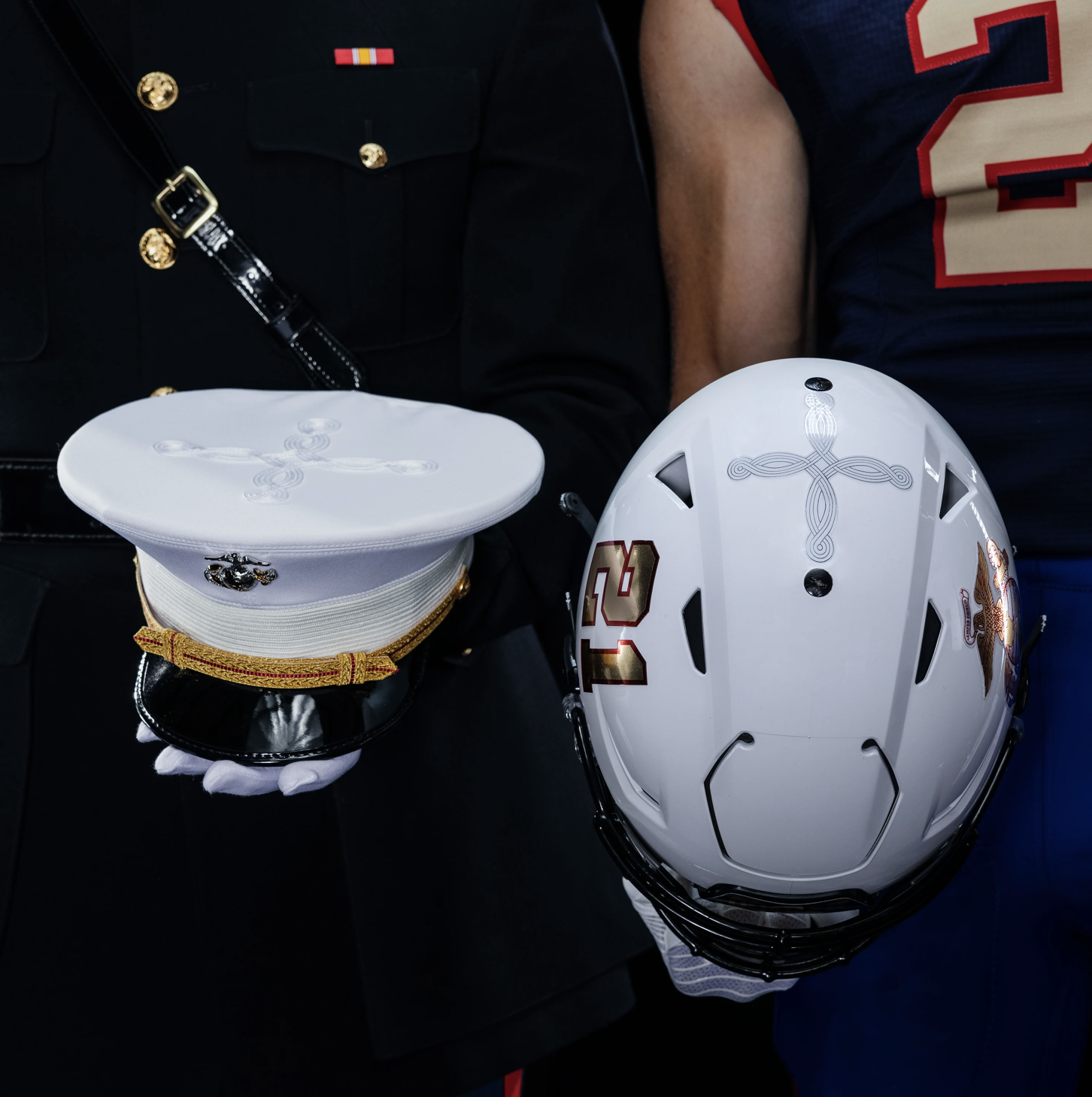
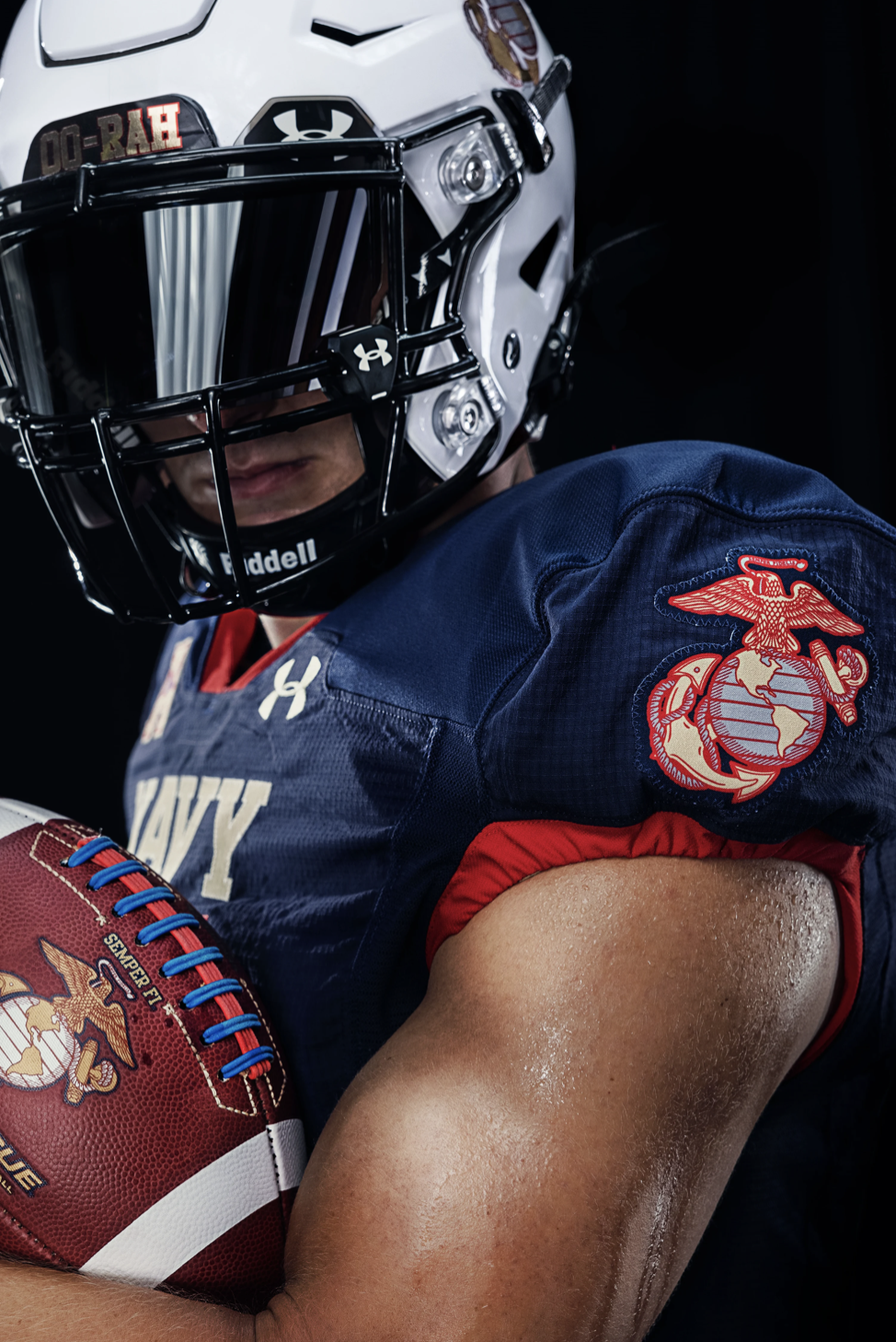
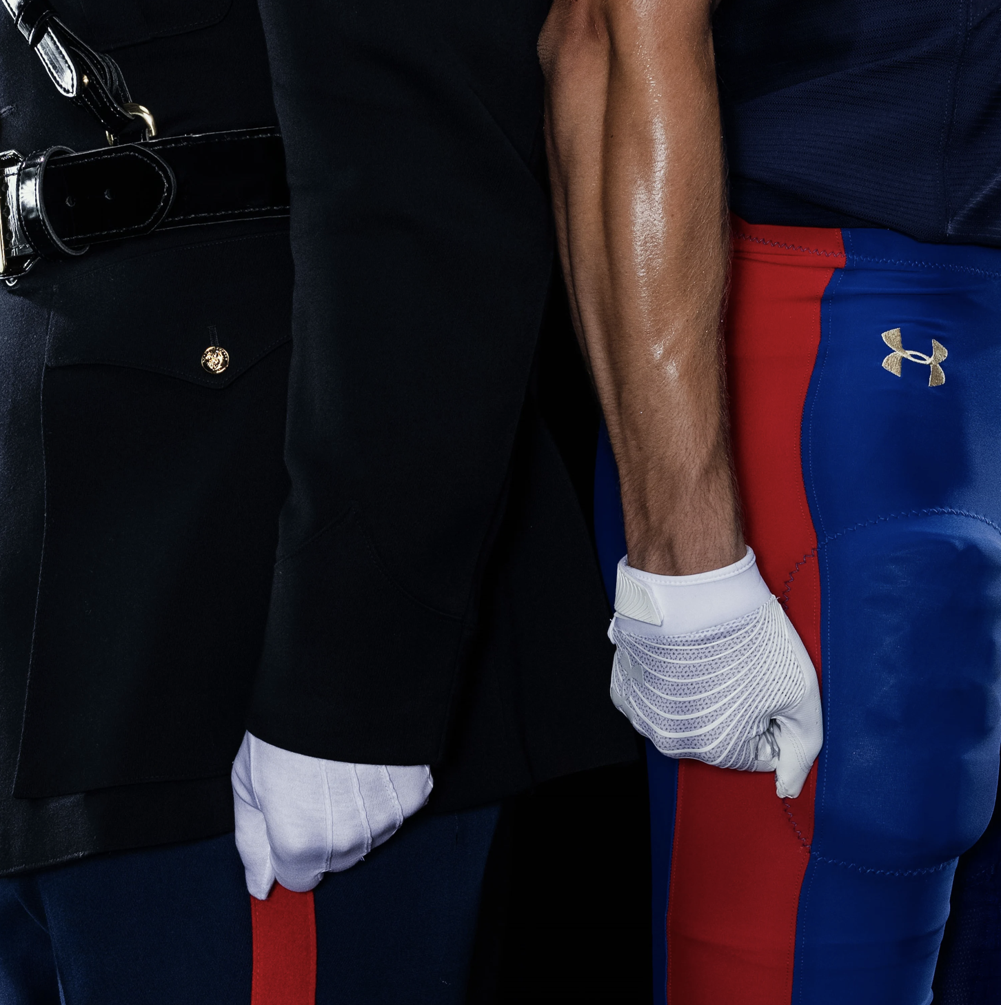
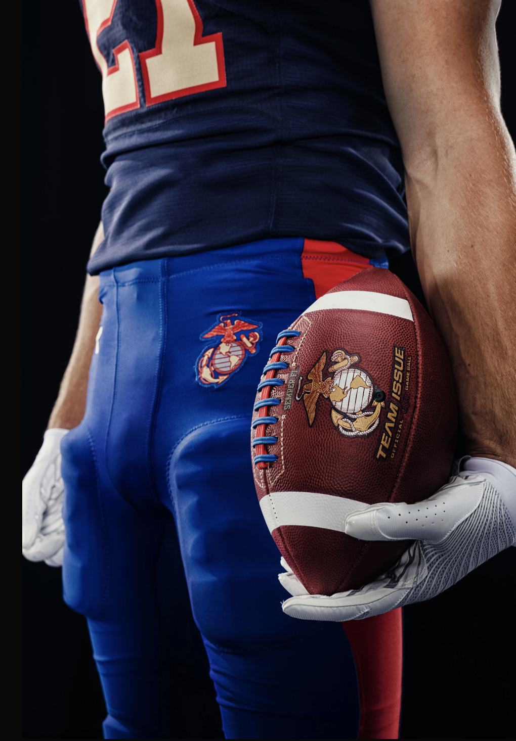
Speaking of military-inspired uniforms that Under Armour went crazy on; here's Navy's homage to the Marine Corps. The attention to detail on these is intense, even by modern uniform standards. The helmets, accent colors, white gloves, and pant stripes are about as close as you're going to get to just wearing an actual Marine Corps uniform. Even the official game ball is customized. Navy's breaking these out on 9/11 when they play Air Force.
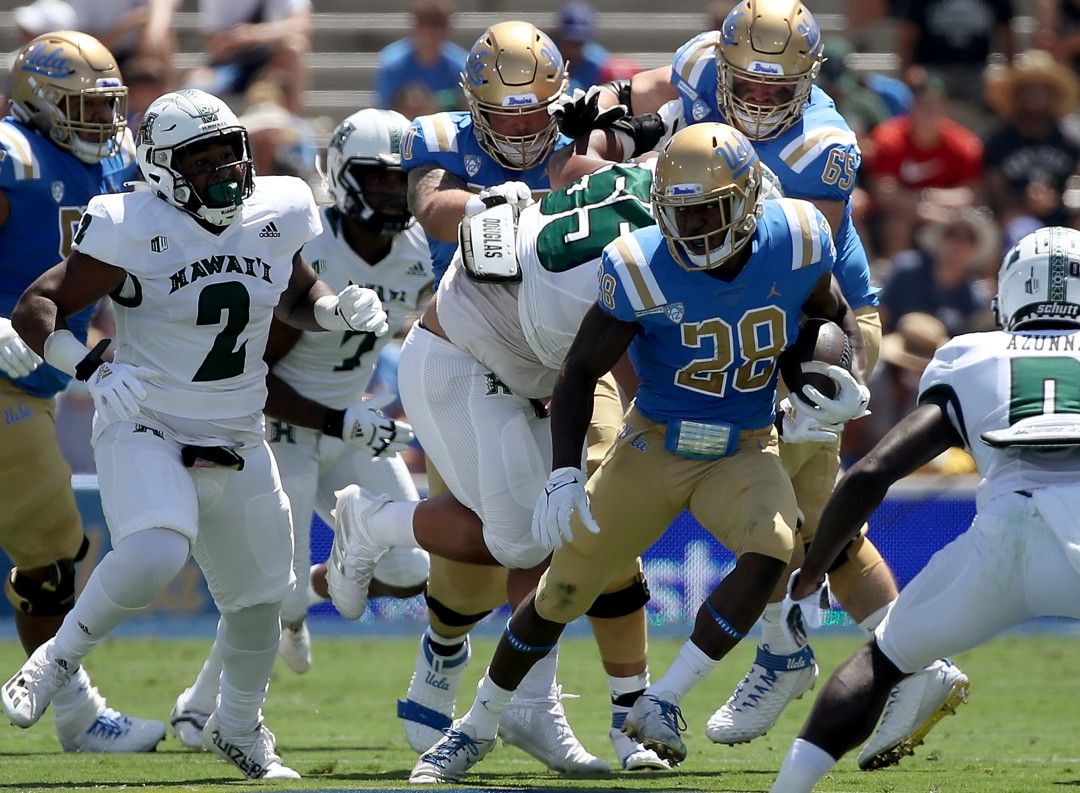
18. Hawai'i
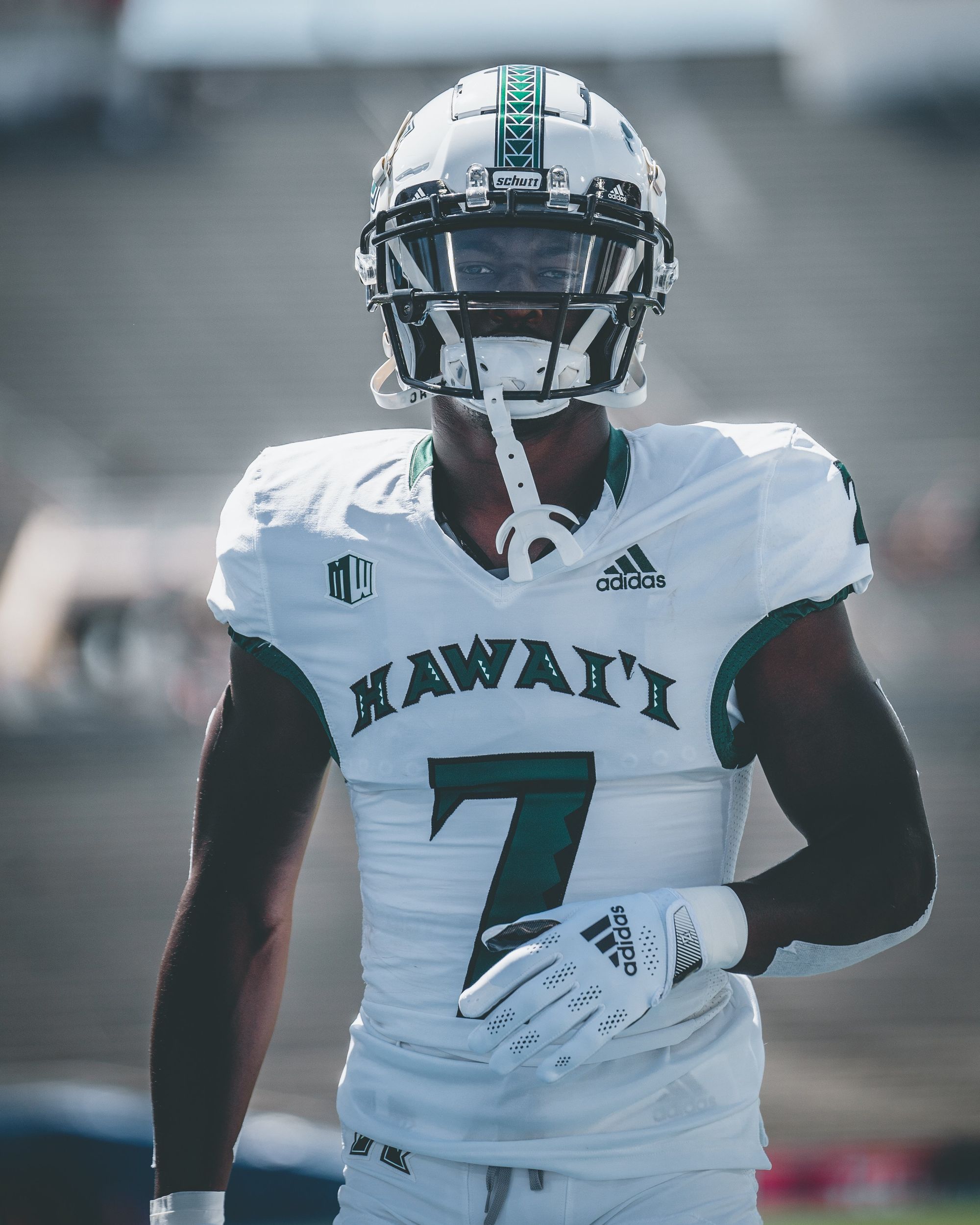
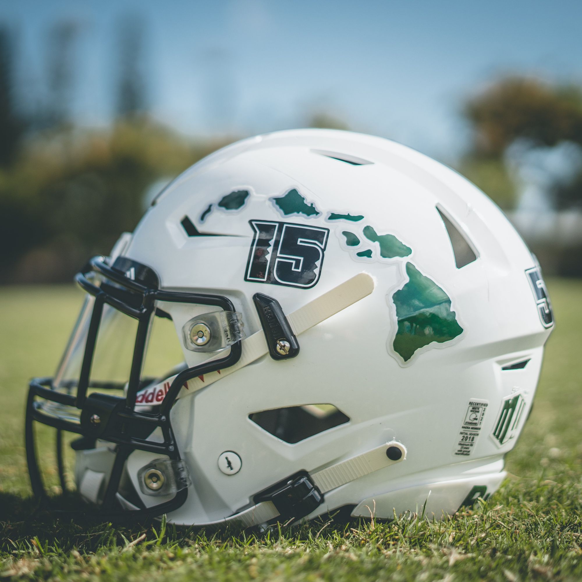
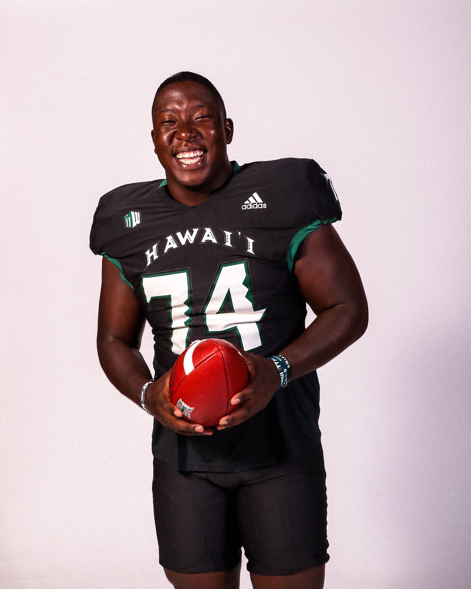
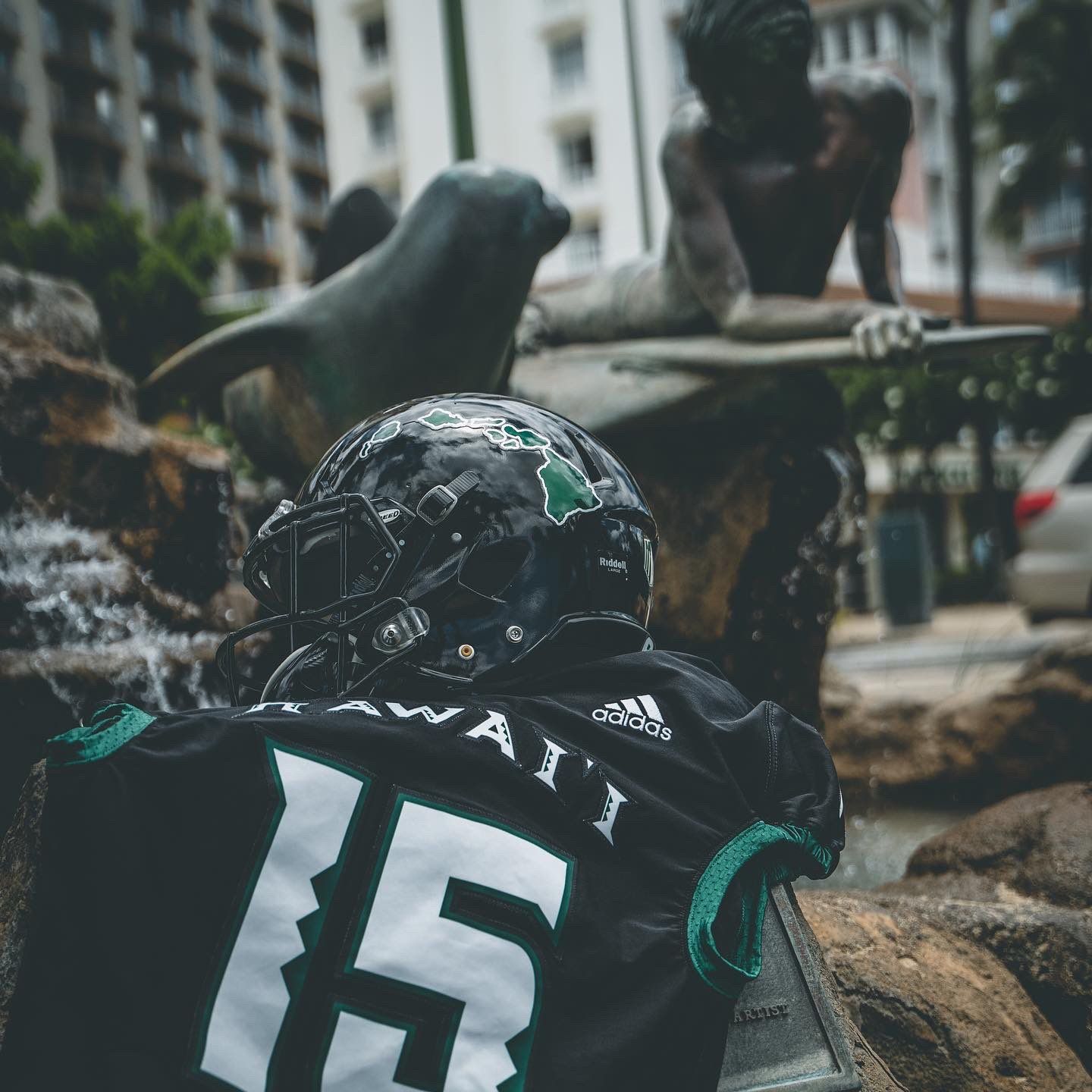
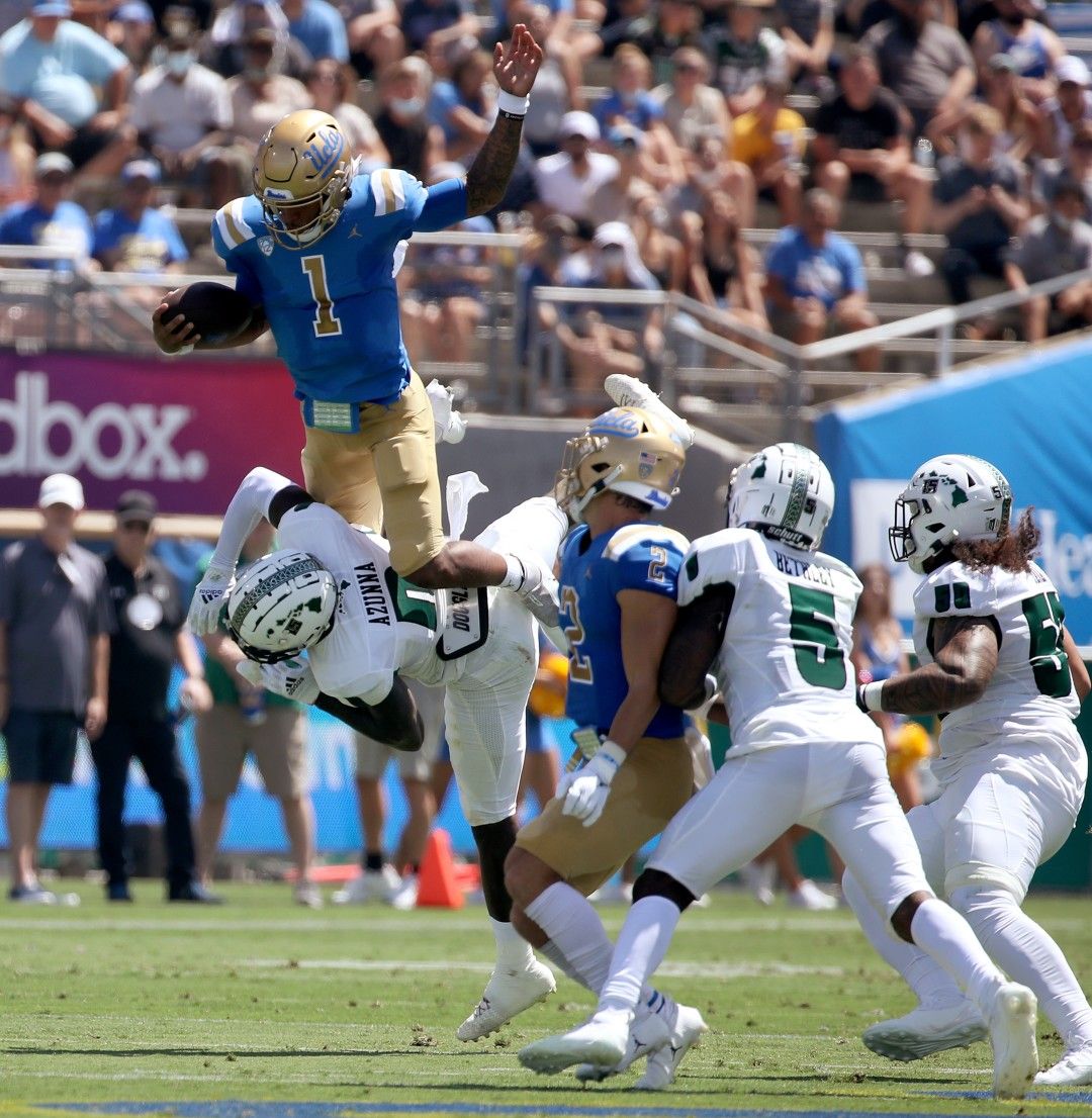
Hawai'i debuted their new Adidas set (they were formerly Under Armour) this past weekend against UCLA, and I'm a fan. The arched Hawai'i script on the chest is unique, and they added tribute decals on the helmets for former QB Colt Brennan for the 2021 season.
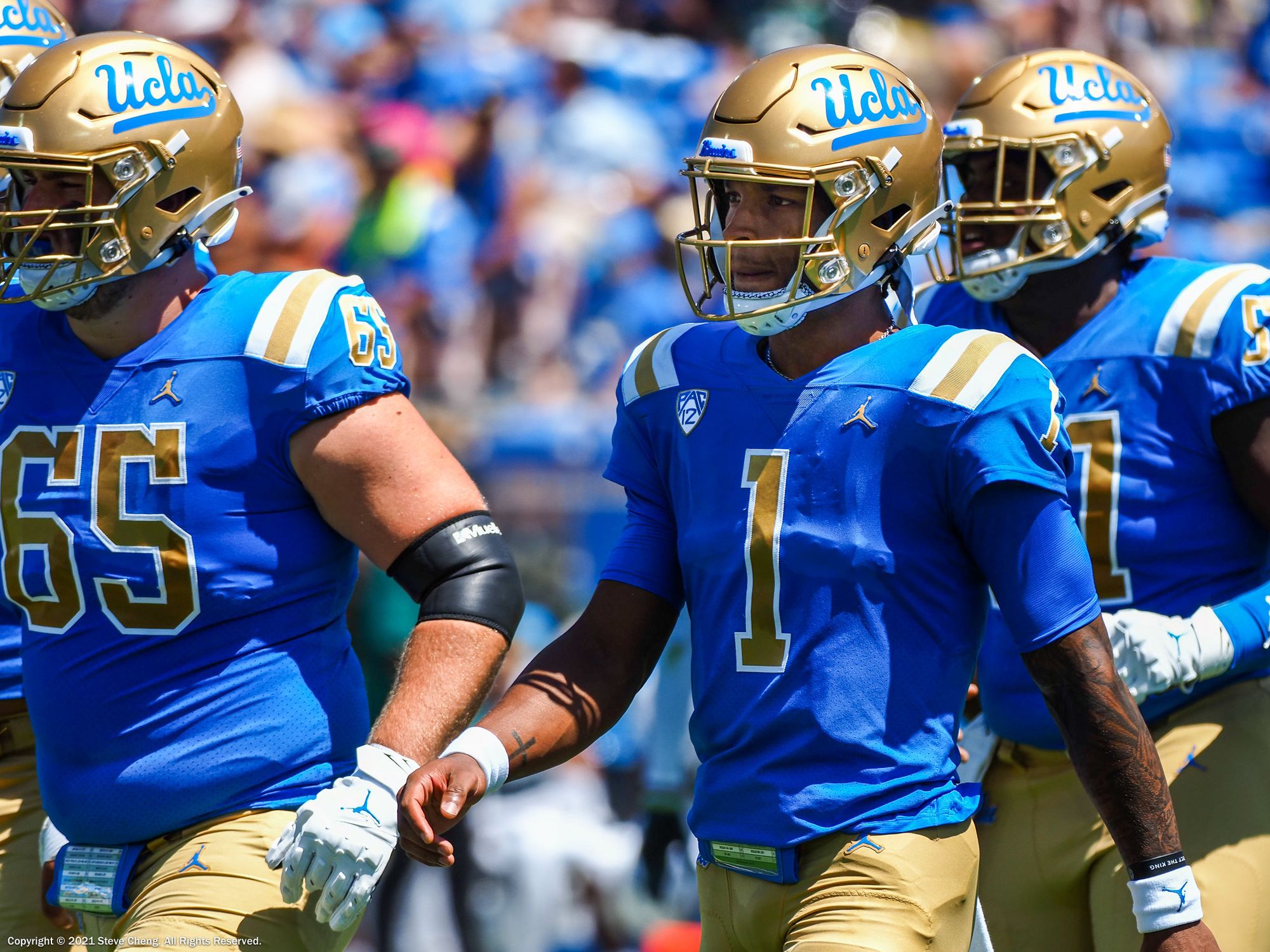
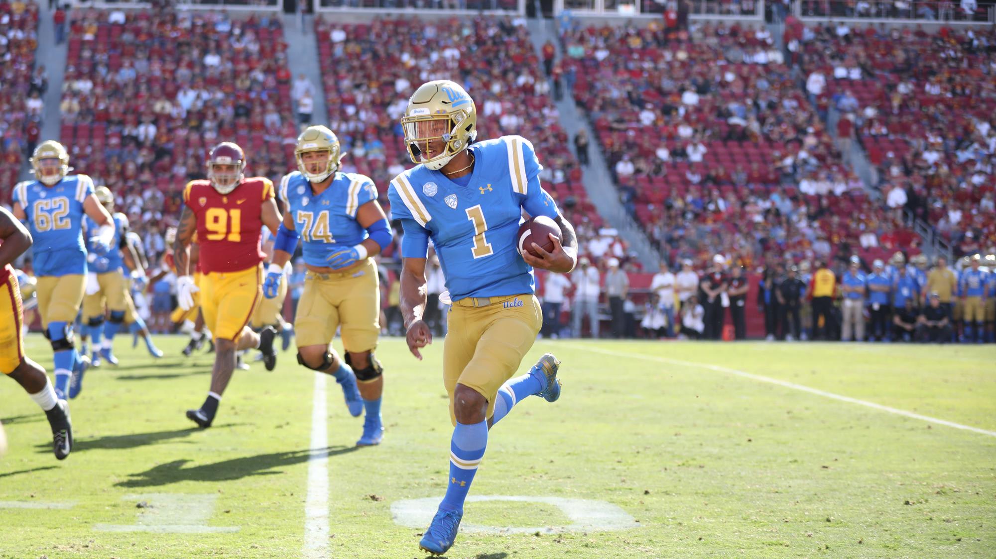
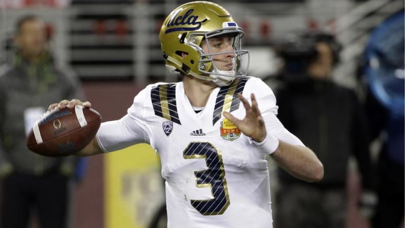
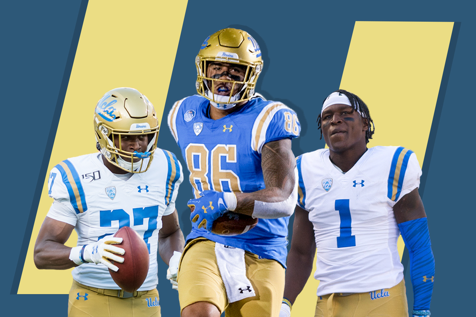
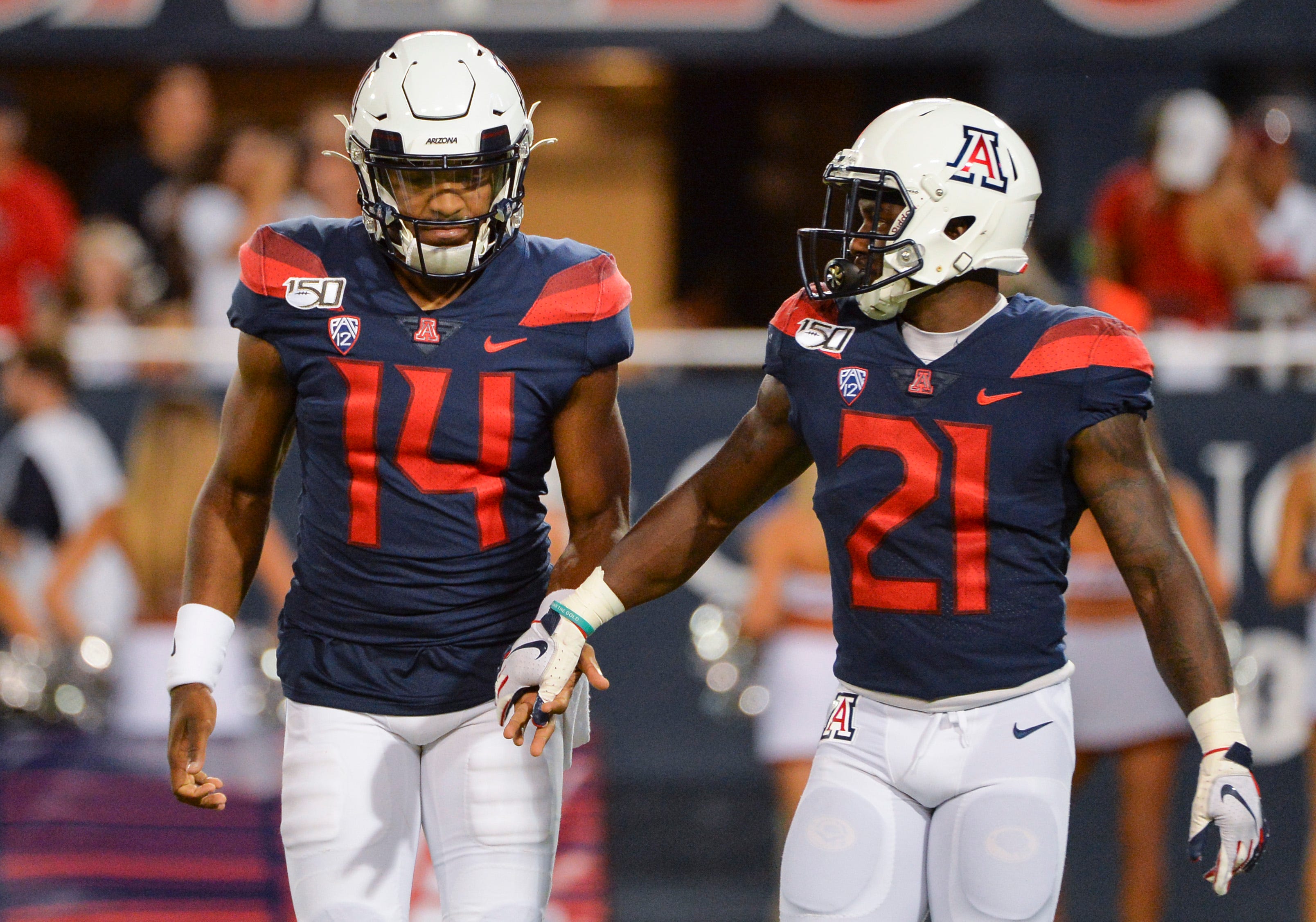
17. UCLA
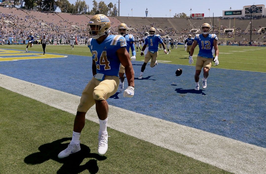
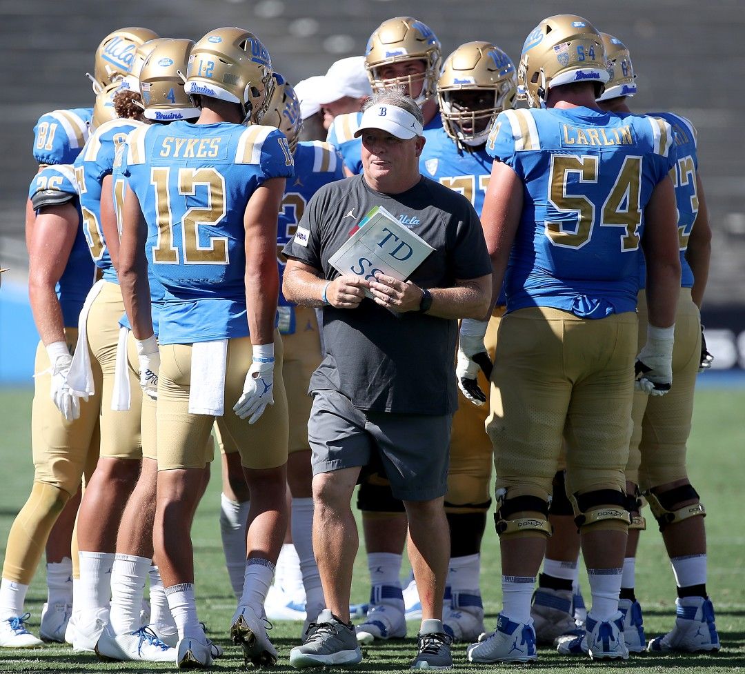
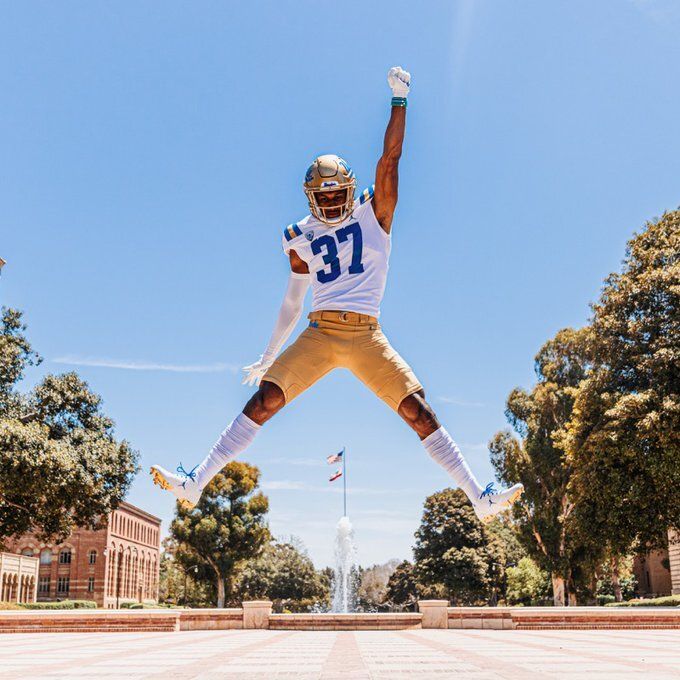
Speaking of UCLA: They also debuted new uniforms in that game, and I have some grievances.
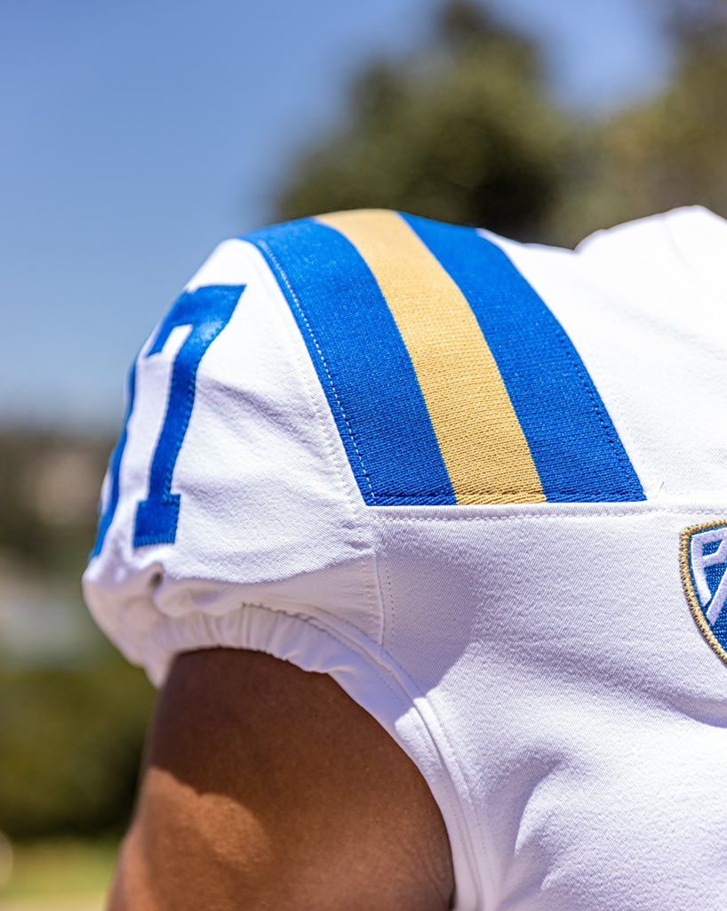
After UCLA's relationship with Under Armour went south, they rebounded by picking up a Jordan Brand sponsorship. In theory: Sweet! In reality: I am mad online. UA was great at UCLA because they brought justice to the crimes of the Adidas era by reintroducing the iconic full wrap-around shoulder stripes. Unfortunately, Nike/Jordan can't –or won't– do the the same with their current uniform templates, as LSU and Ole Miss can attest. You can't tell me the new shoulder stripes (left) look better than the Under Armour set (right):
Other things on my shit list:
- Not bringing back the Clarendon font.
- Powder blue ain't powder blue enough.
So we're clear: These uniforms are still one of the best in the sport, but they should be the best. On a positive note: No more mustard gold helmets:
Out with the old 🥱 In with the new 🤩@UCLAFootball #ELITE | #GoBruins pic.twitter.com/37ZnCnCBvP
— UCLA Football Equipment (@UCLA_EQ) July 25, 2021
16. Boston College
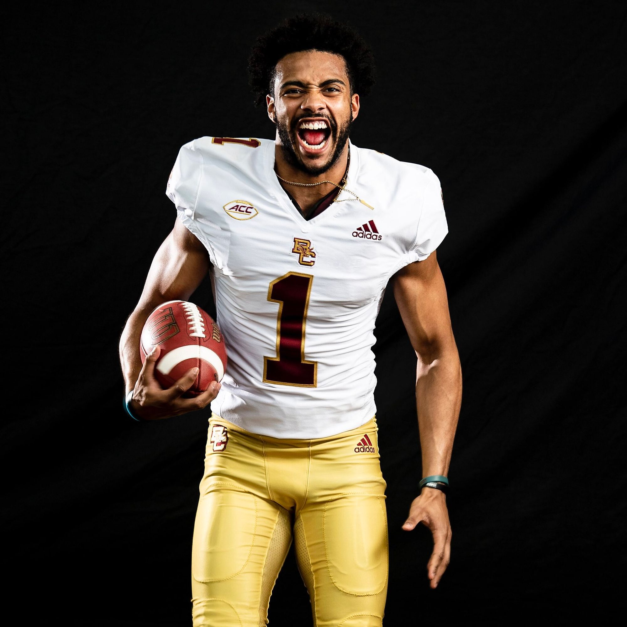
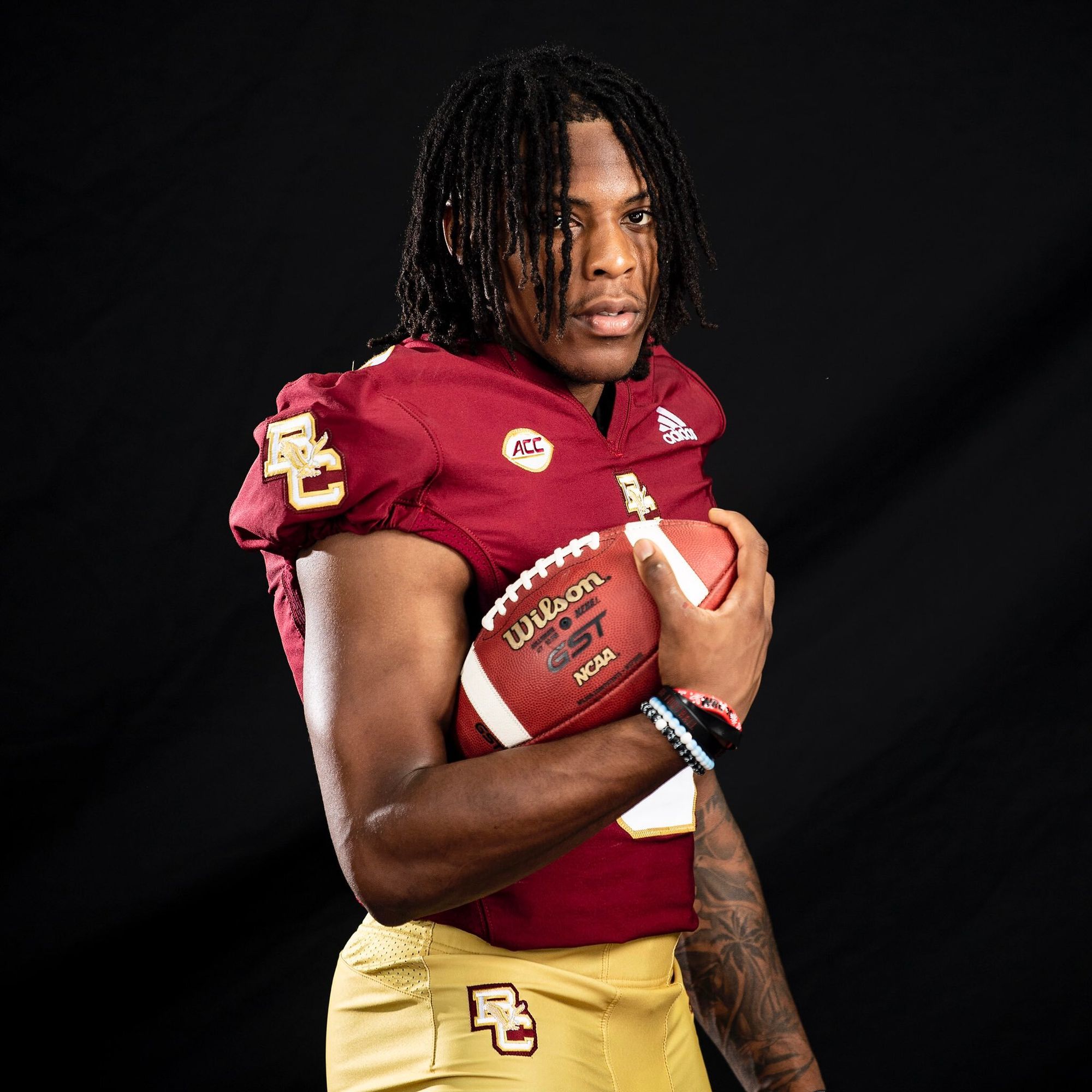
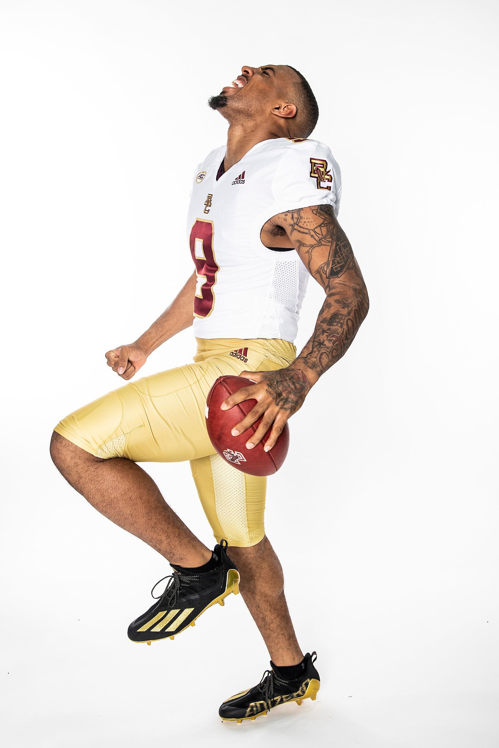
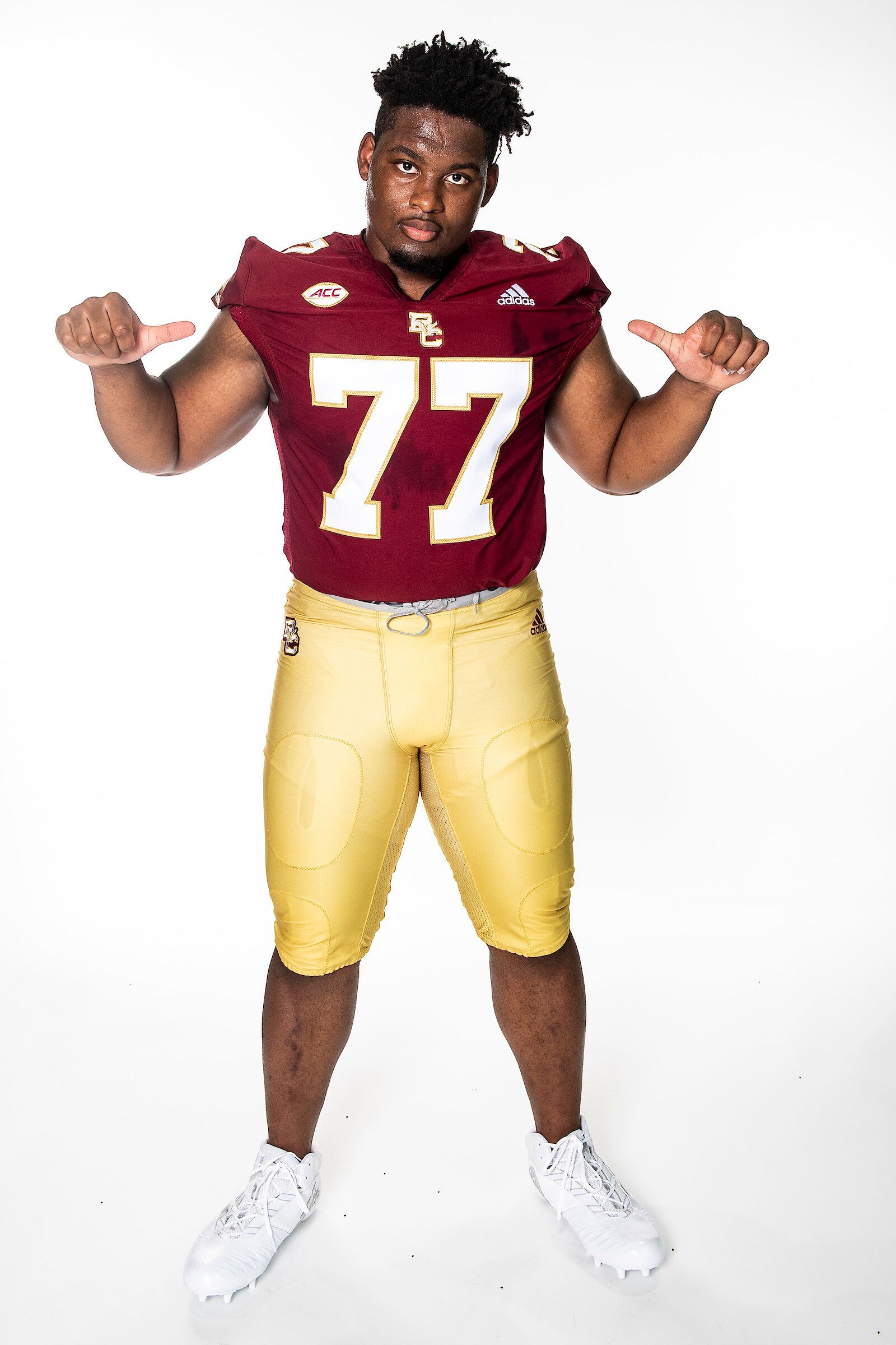
Yet another former Under Armour team. Boston College is with Adidas now, and they're keeping it old school. Nothing flashy, but the 'BC' with the Eagle in the middle is classic, and the new helmets fall in line with the throwback vibe:
New year new helmet gold 👀 pic.twitter.com/koGcvNZCTH
— BC Football (@BCFootball) August 2, 2021
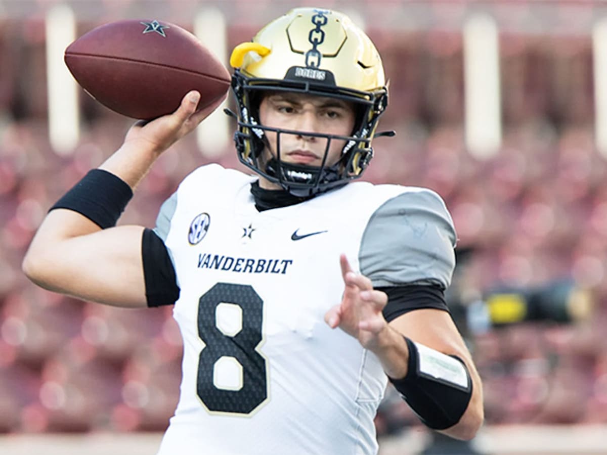
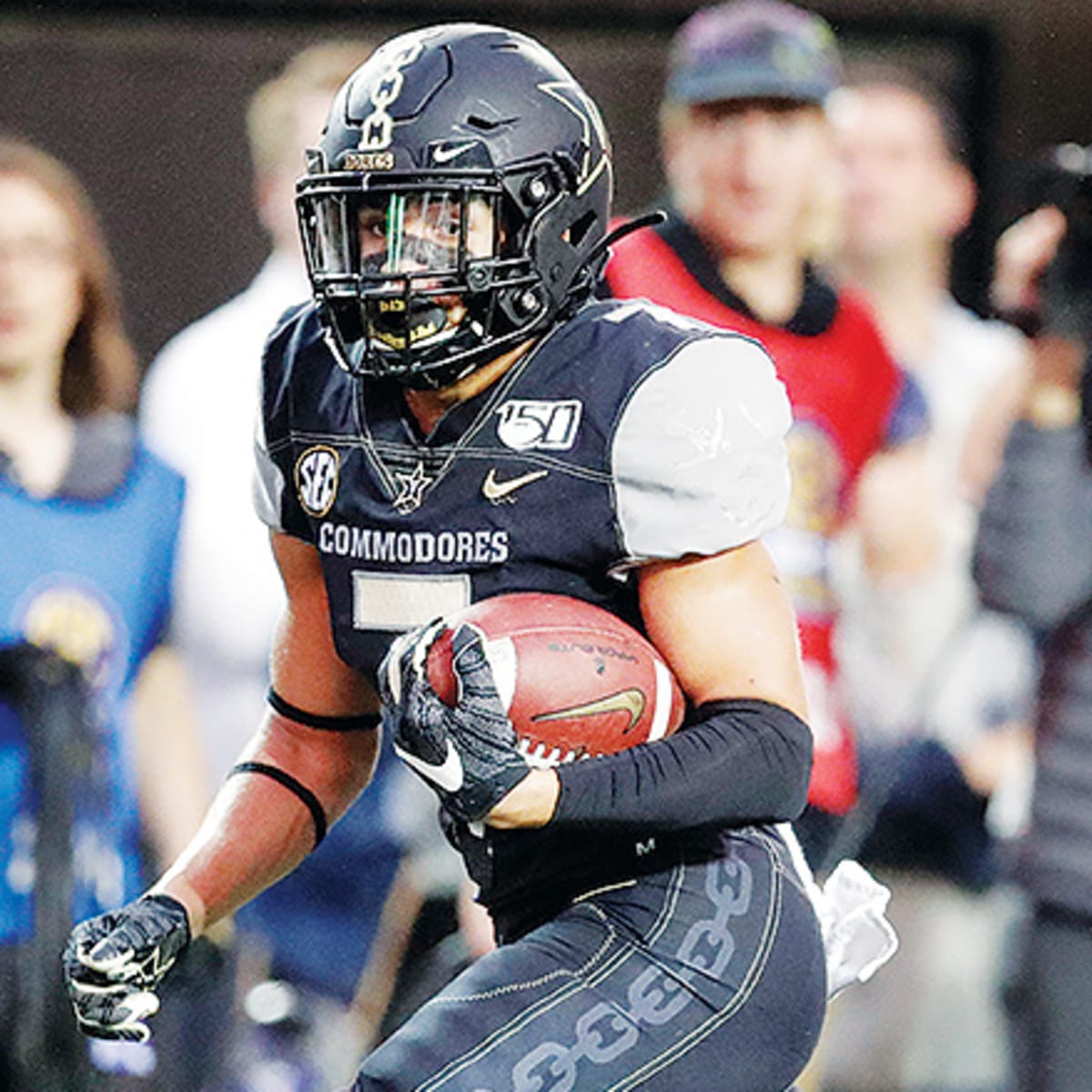
15. Vanderbilt
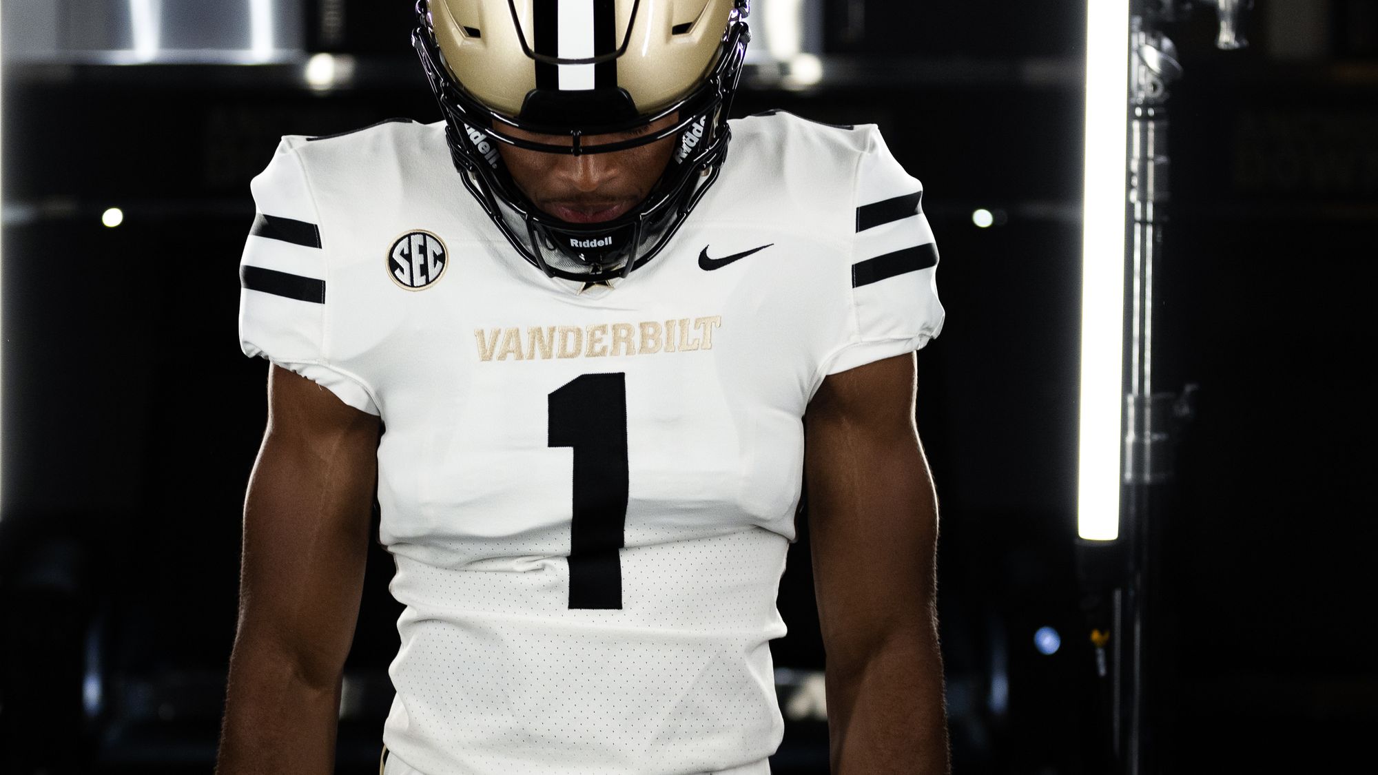
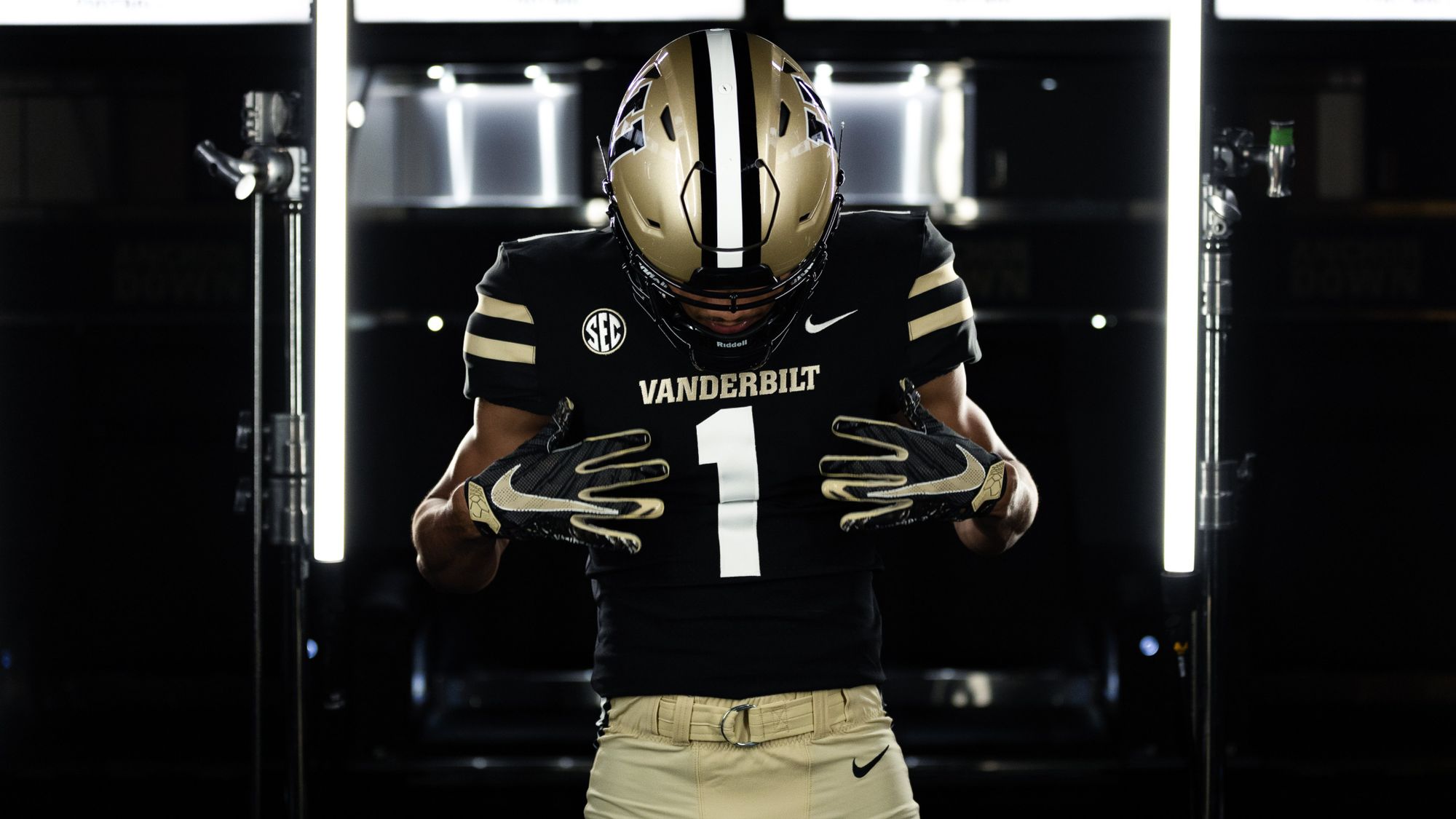
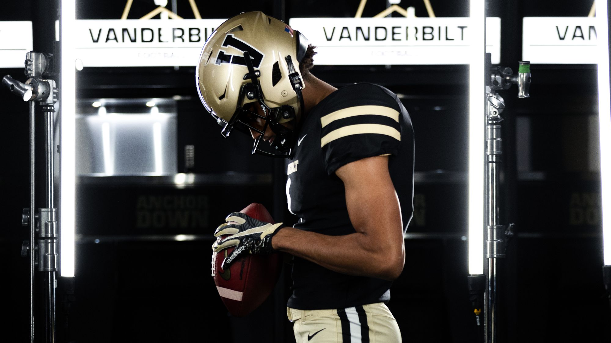
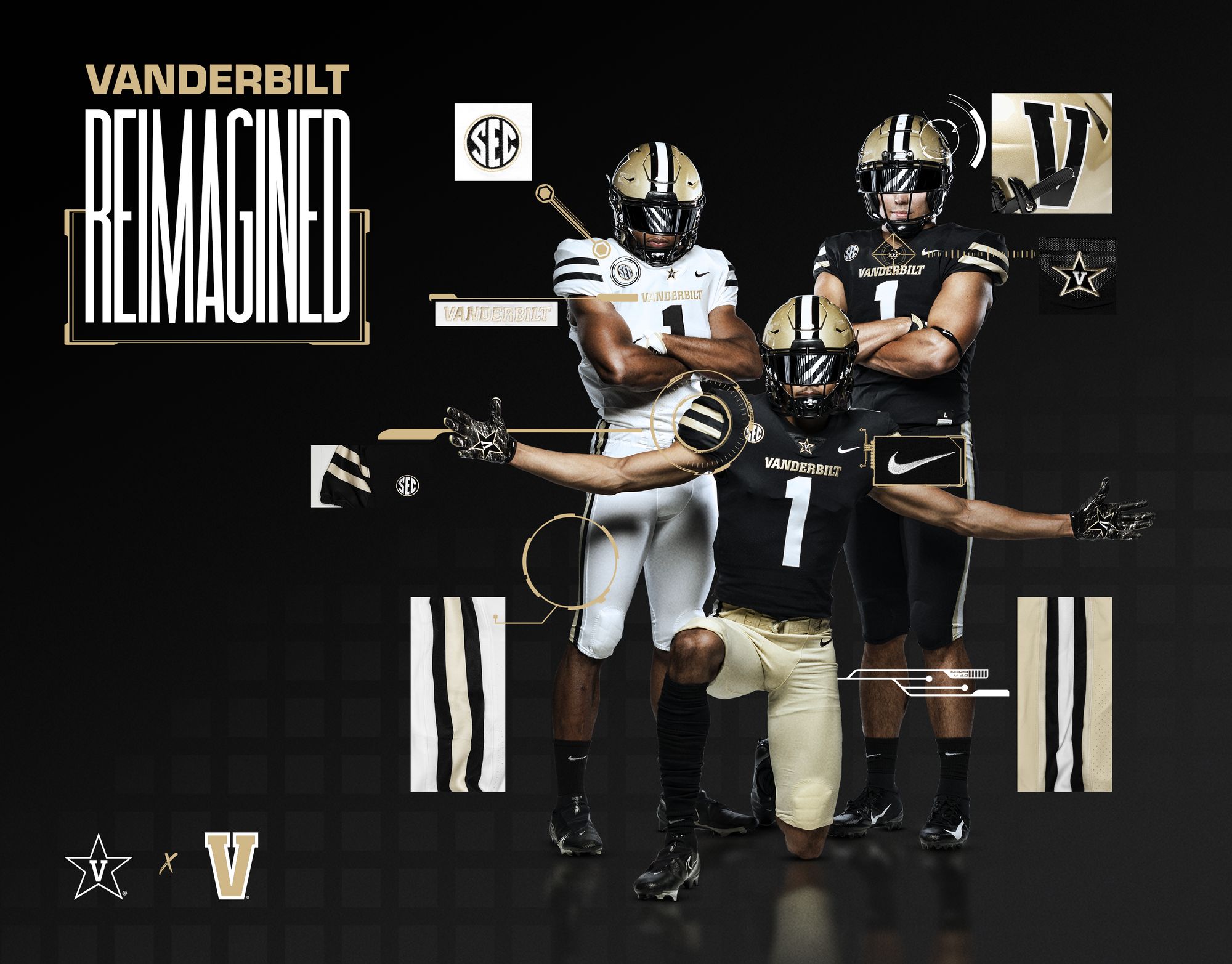
You have to try extra hard to fuck up black and gold, but Nike did exactly that with Vanderbilt's previous uniforms. These are a complete reset. The stripes are clean, and the design is basic enough that when Vandy wants to introduce a crazy alternate, it'll actually mean something instead of being a mashup of terrible ideas built on an already ugly format.
14. Florida
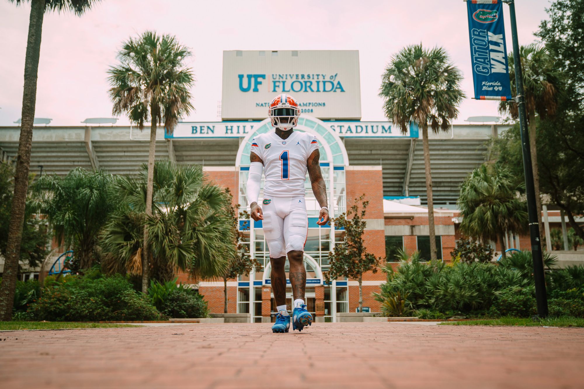
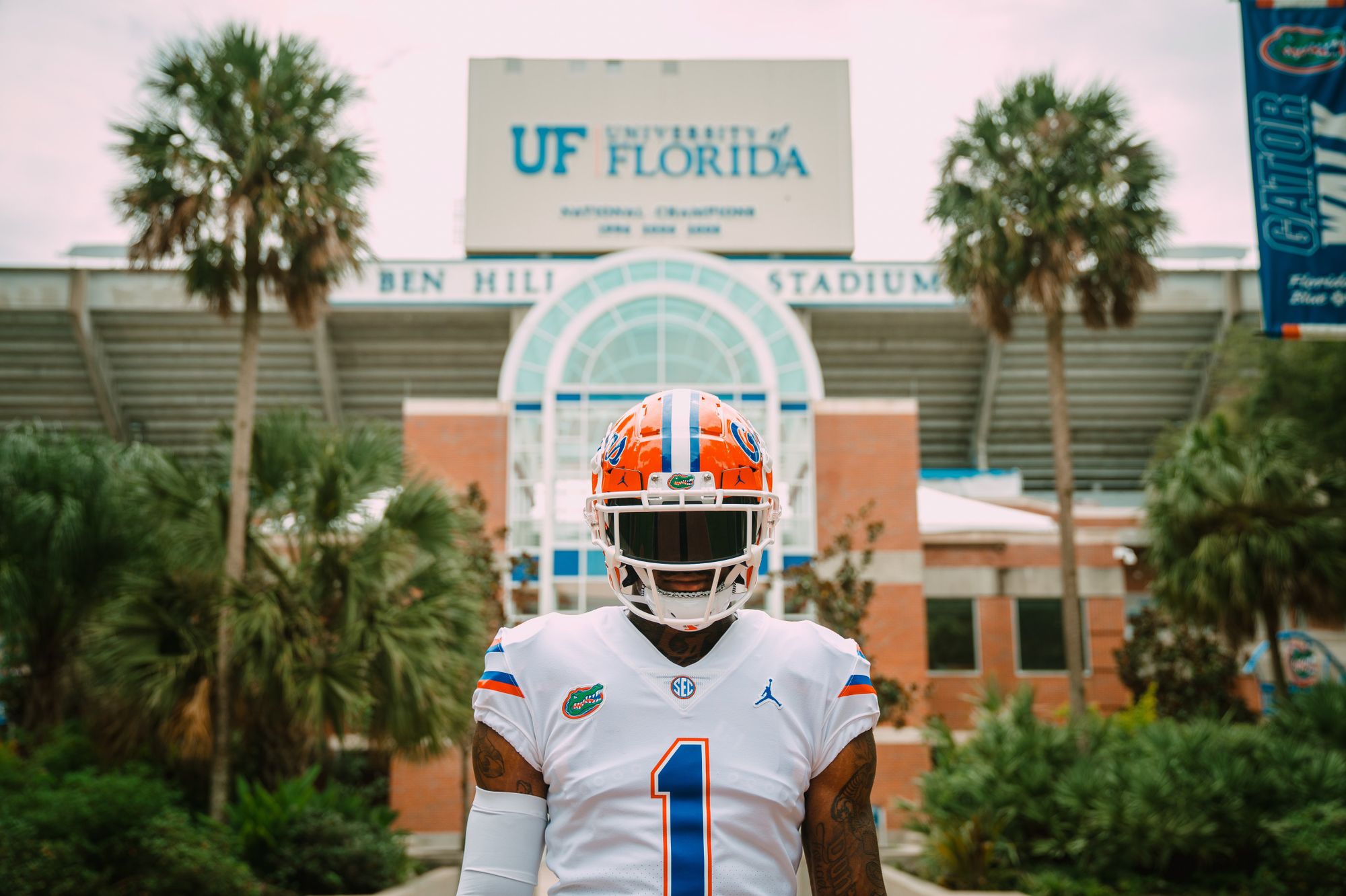
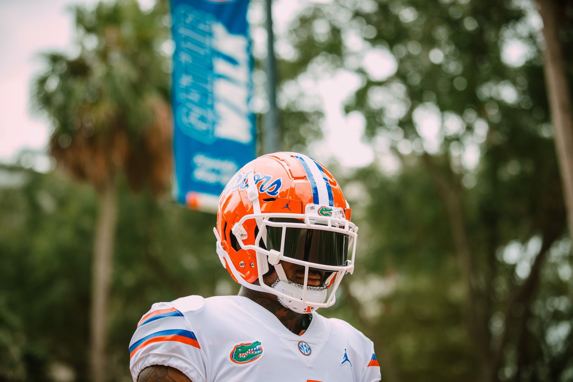
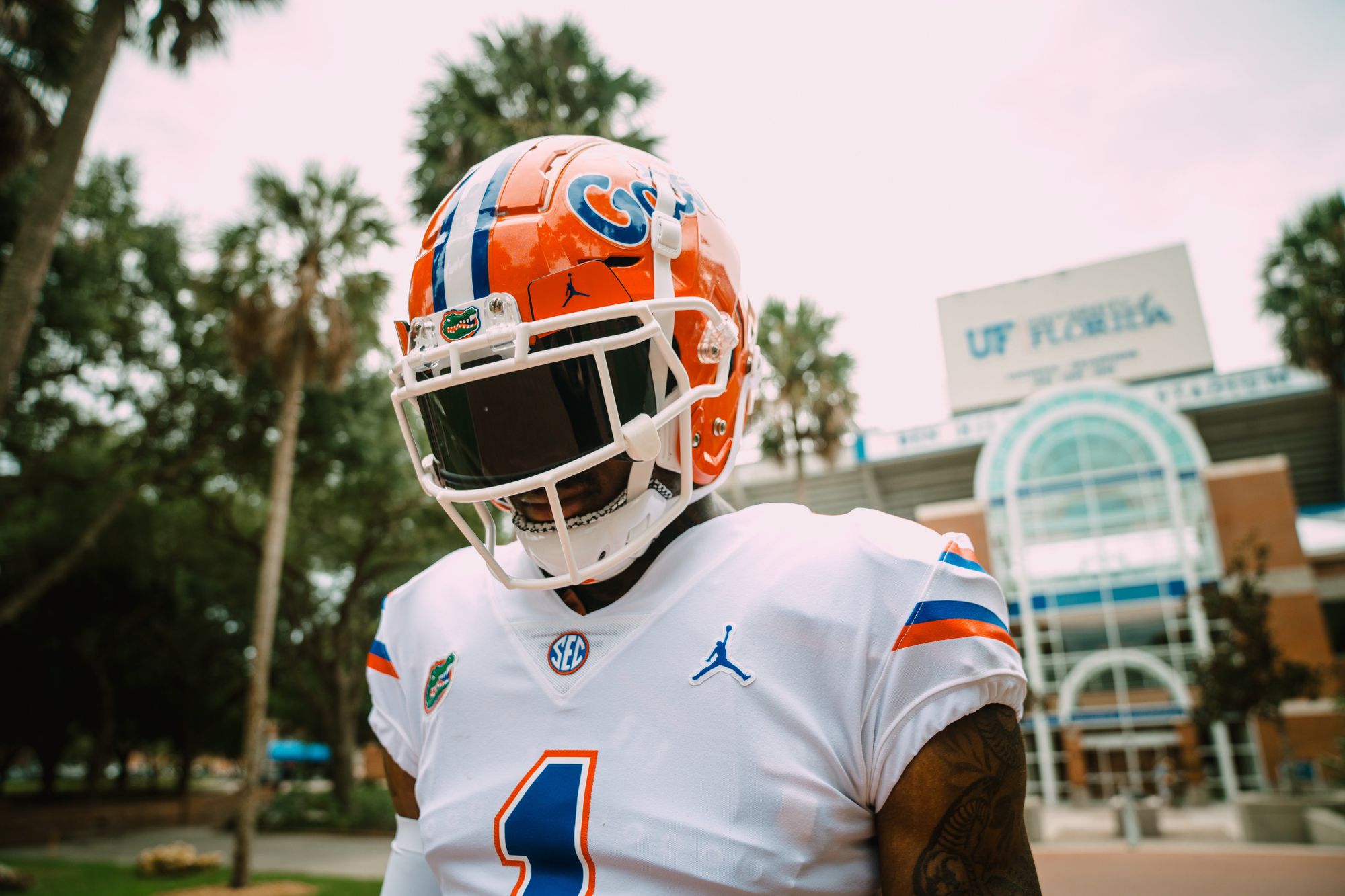
I'm cheating a bit here. Nothing new for Florida (yet), but it's the first time since 2001 that they're wearing white on white at home, and that's good enough for me. They're doing this for Saturday's opener against Florida Atlantic, and I wish more big schools would give it a shot. Also, is it a galaxy brain to say that it's projected to be 90 degrees in Gainesville this weekend, so it might actually be an advantage wearing white?
13. BYU - Two new helmets
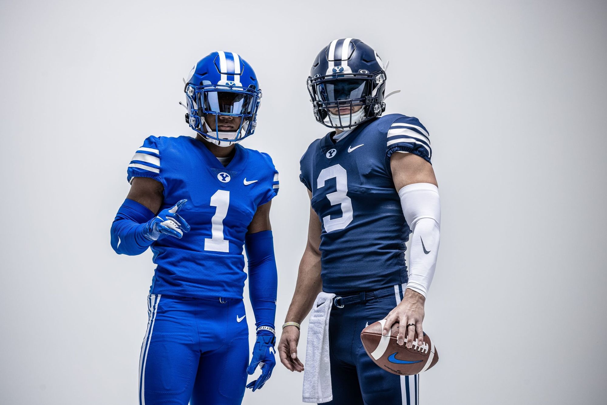
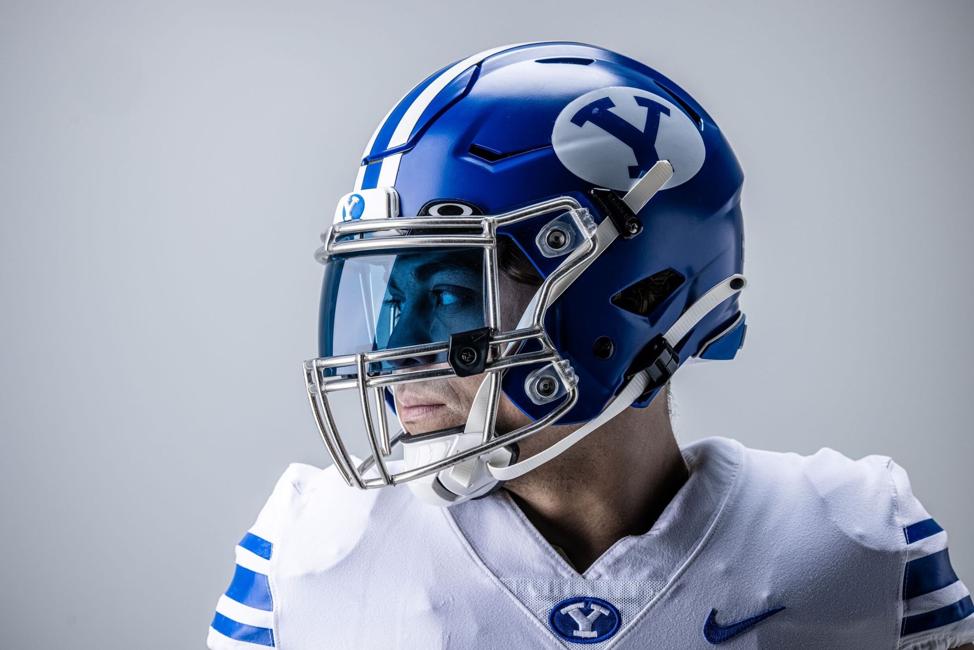
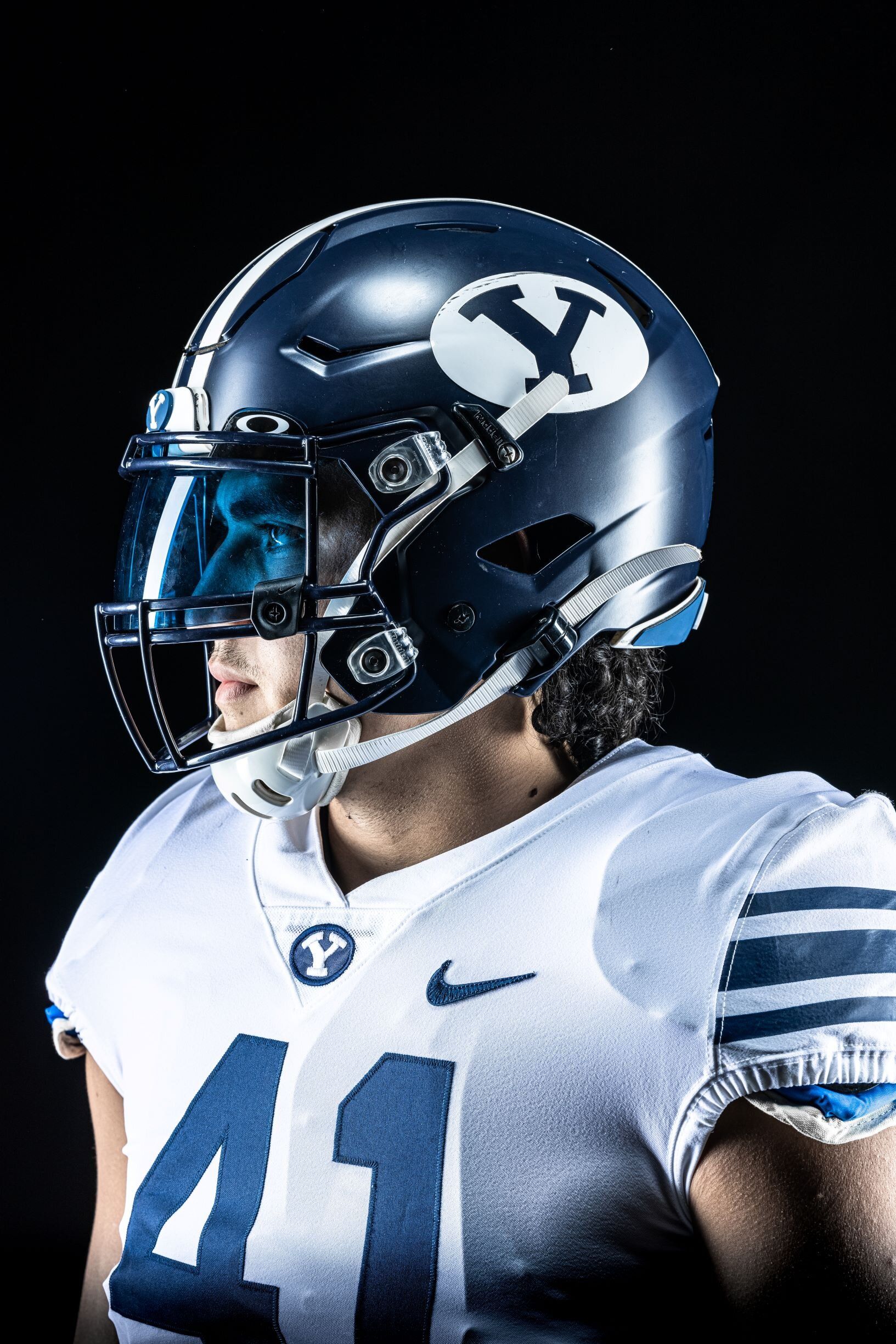
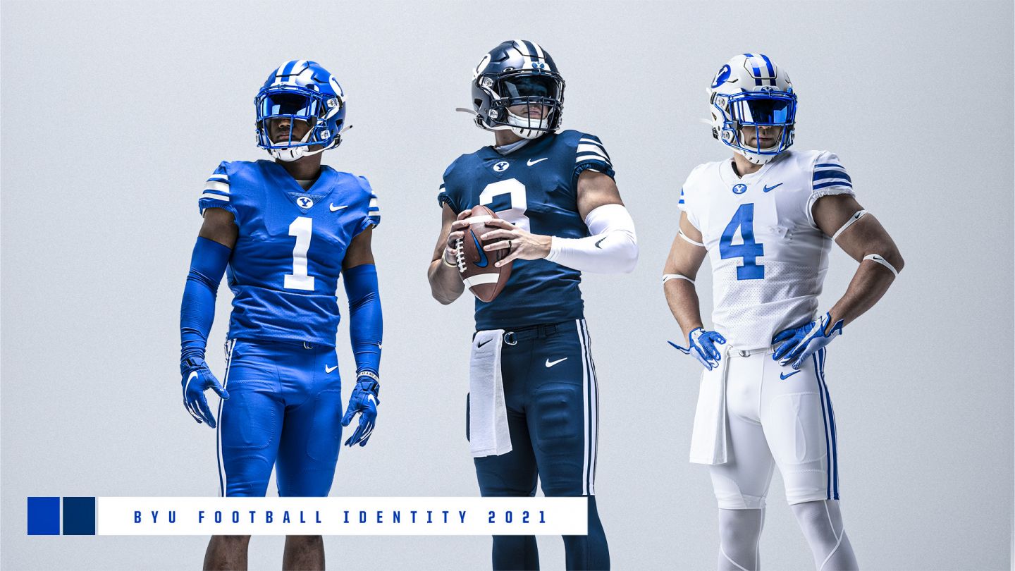
BYU adds royal blue and navy helmets to the mix this year, creating some pretty cool mashups they can run with as the season goes on. These are all good looks, but I still want the bib uniforms back:
12. Air Force - Linebacker II
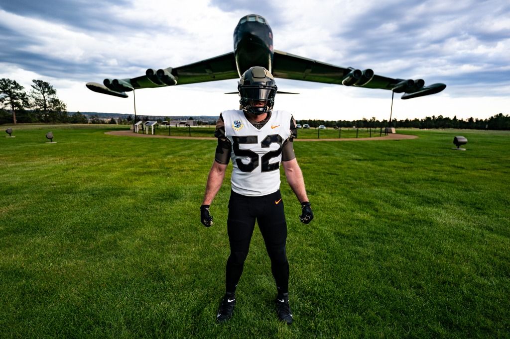
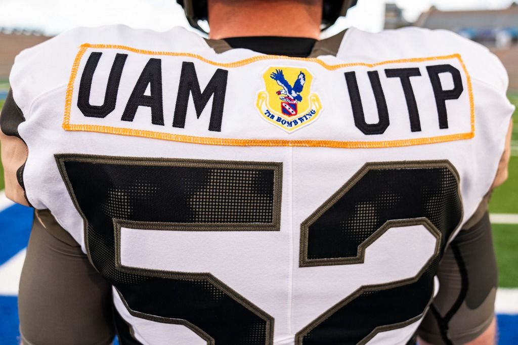
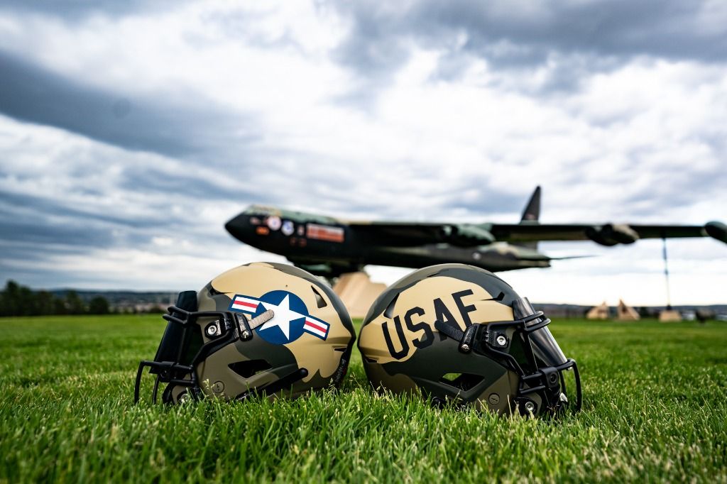
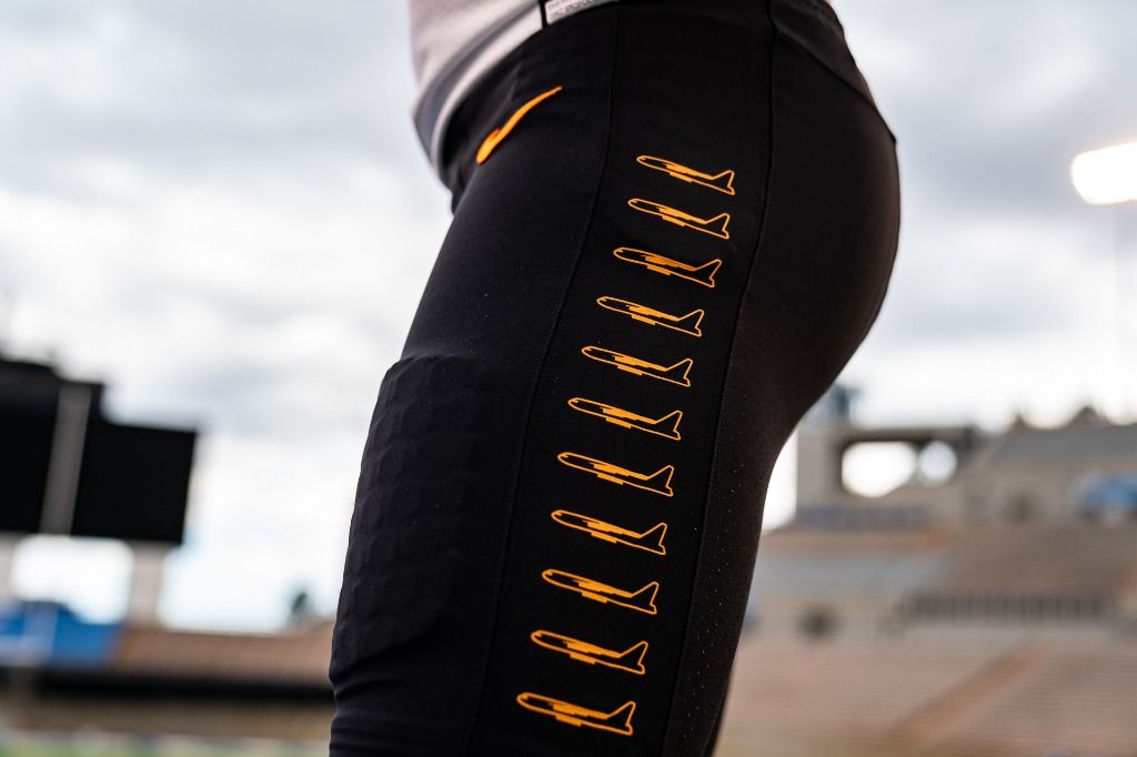
I said military uniforms aren't my thing, but these are too absurd to not mention. Air Force is wearing this B-52 tribute set opposite of Navy going full Marine Corps, which may end up being wildest uniform matchup ever. Why the B-52? I'll let the Air Force website explain:
I'm still having a hard time finding a job right now, so we're moving on to the next uniform before I make it any tougher on myself.
11. Miami
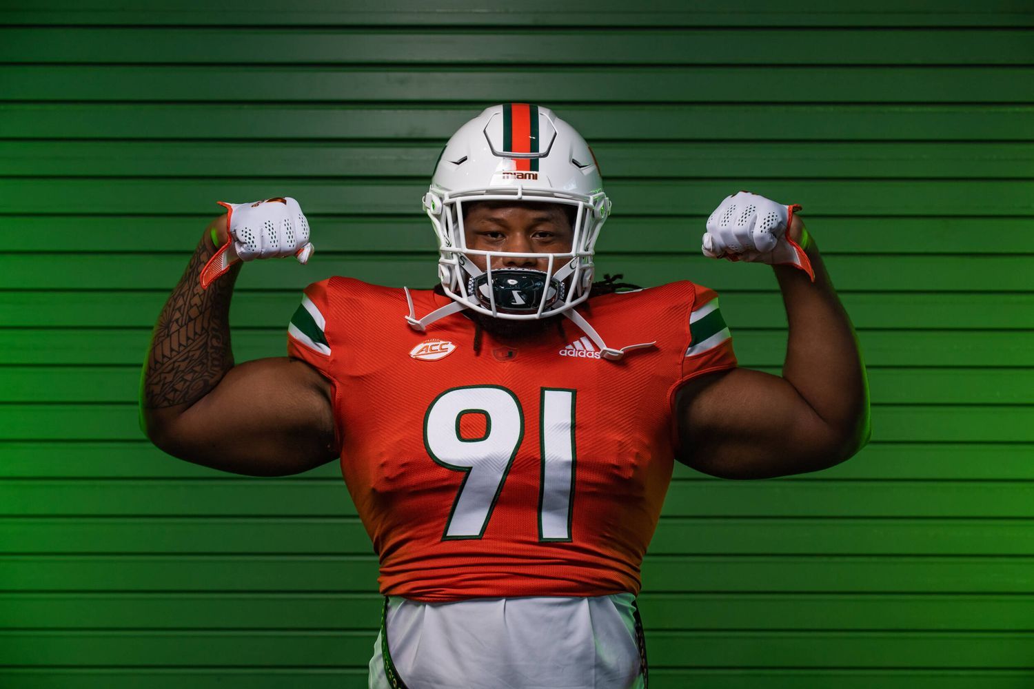
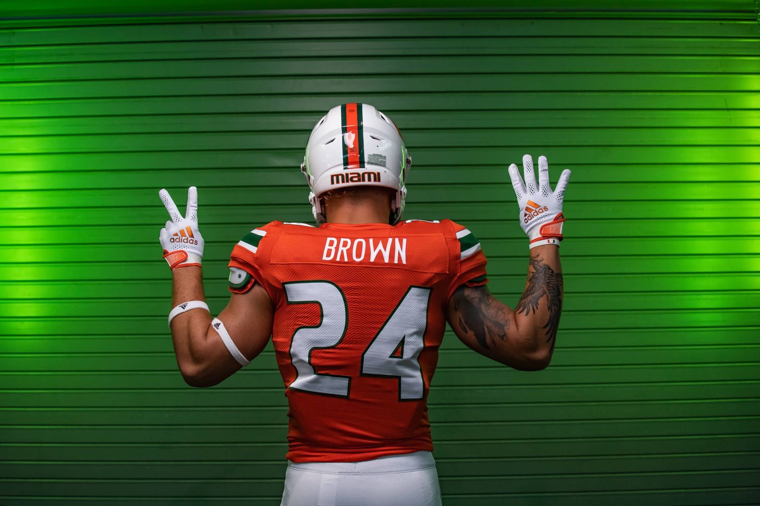
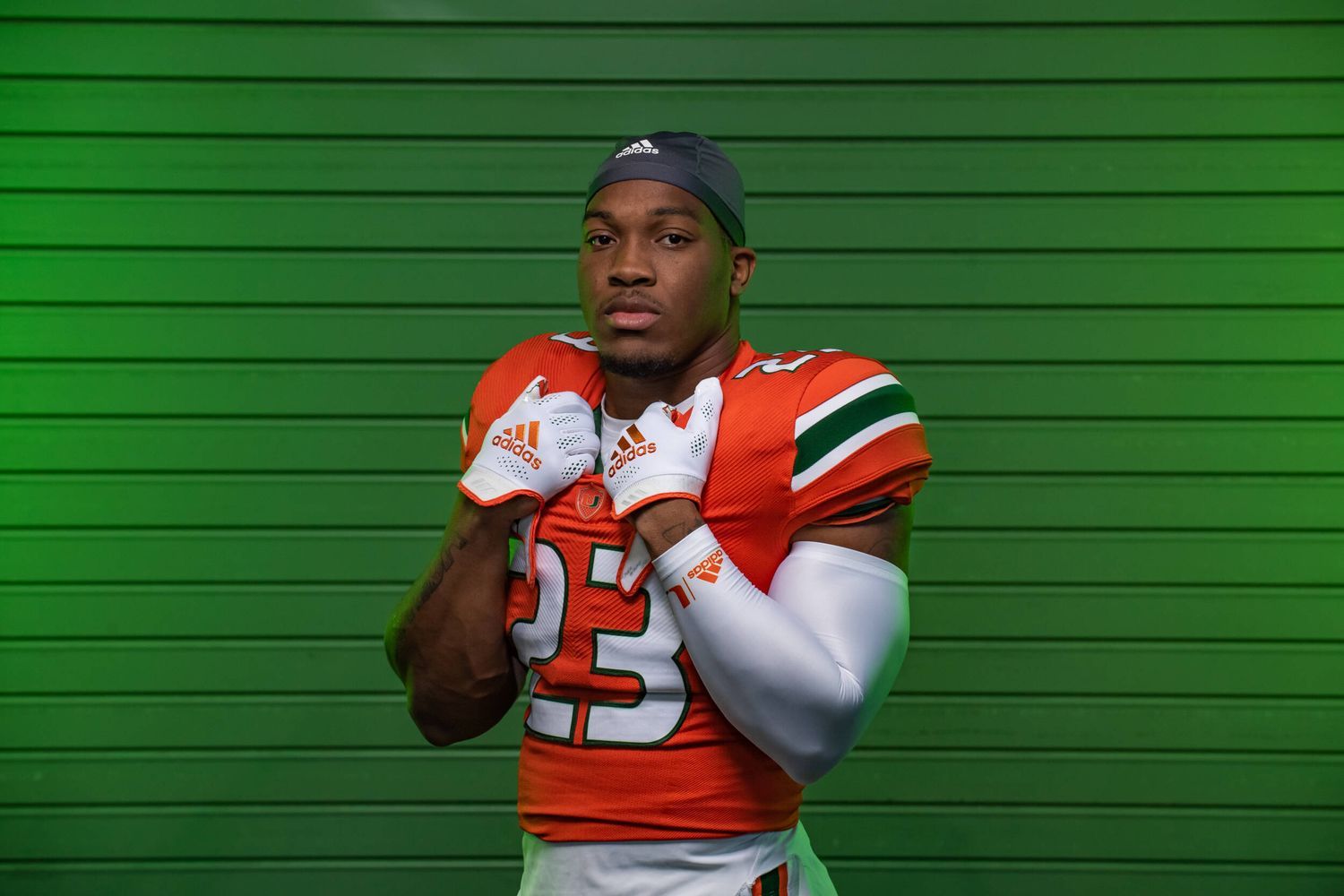
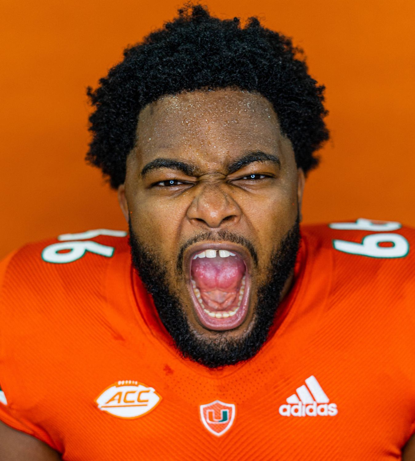
Miami's switching from a lame number font back to their classic late 90's/early 2000's font. They also ditched the 'U' symbol on the neck –which always looked warped because Adidas' uniform fabric is an affront to god– and now it sits nicely the middle of a shield. Small changes make a big difference!
10. Wisconsin - Shamrock Series
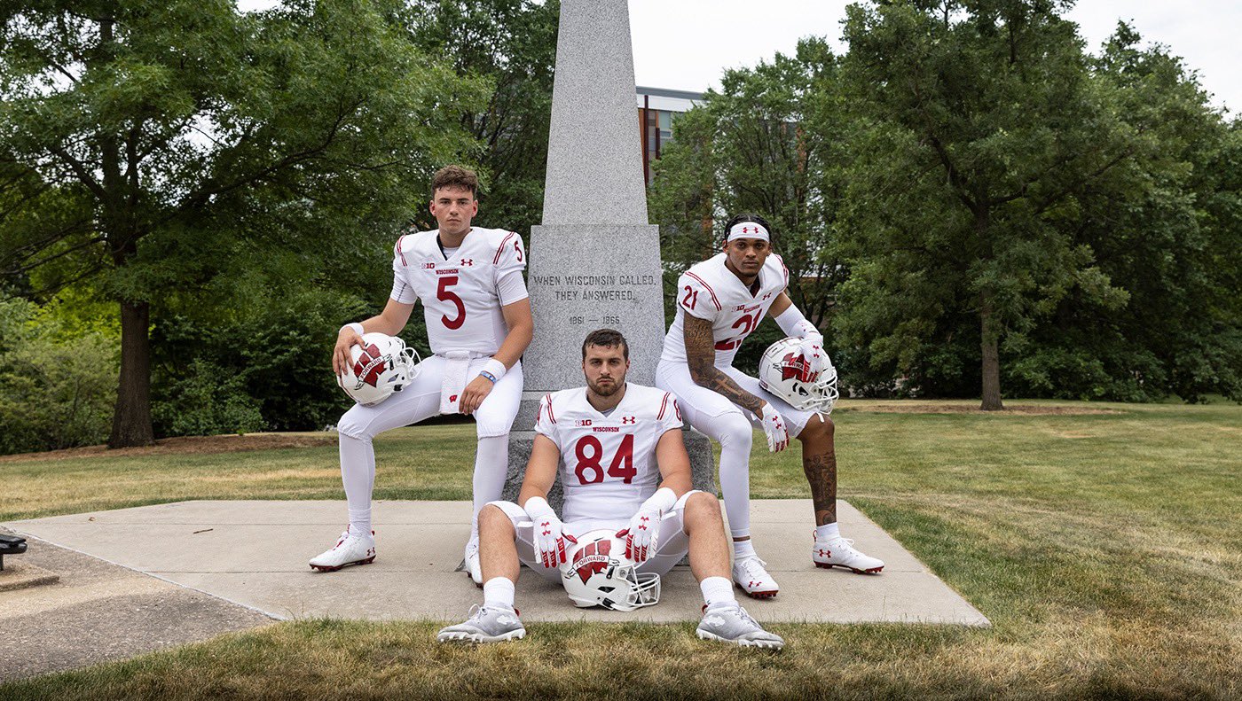
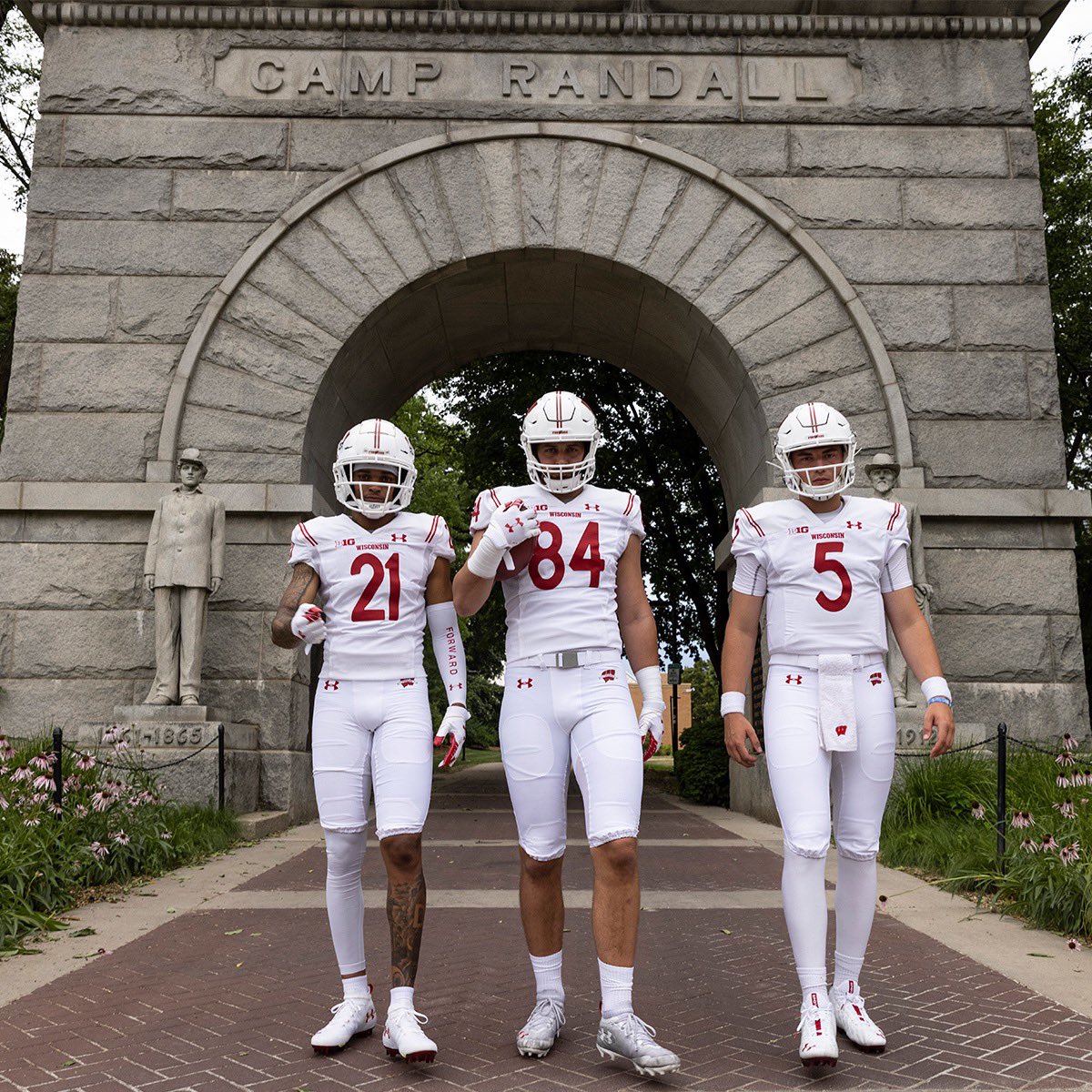
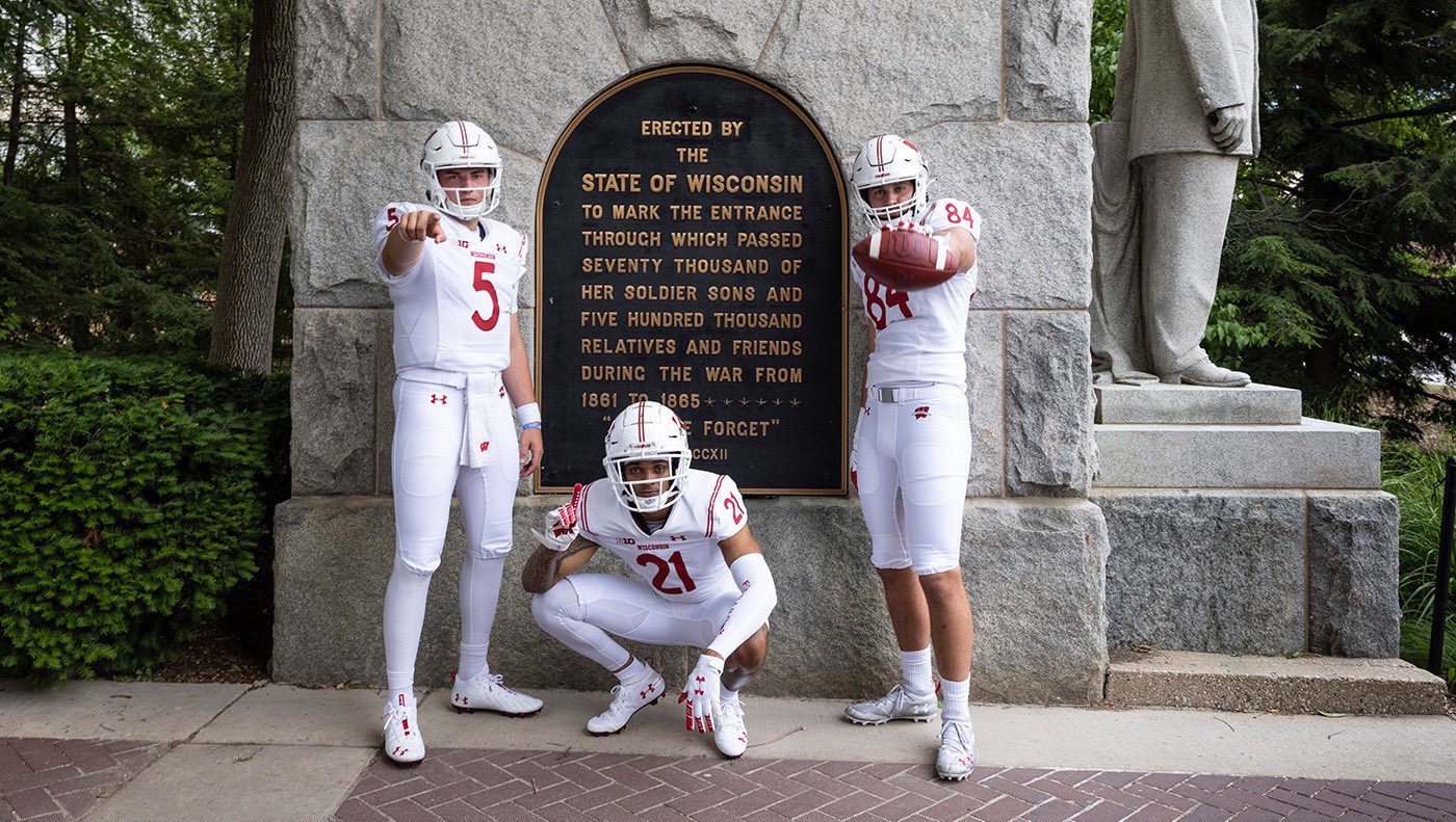
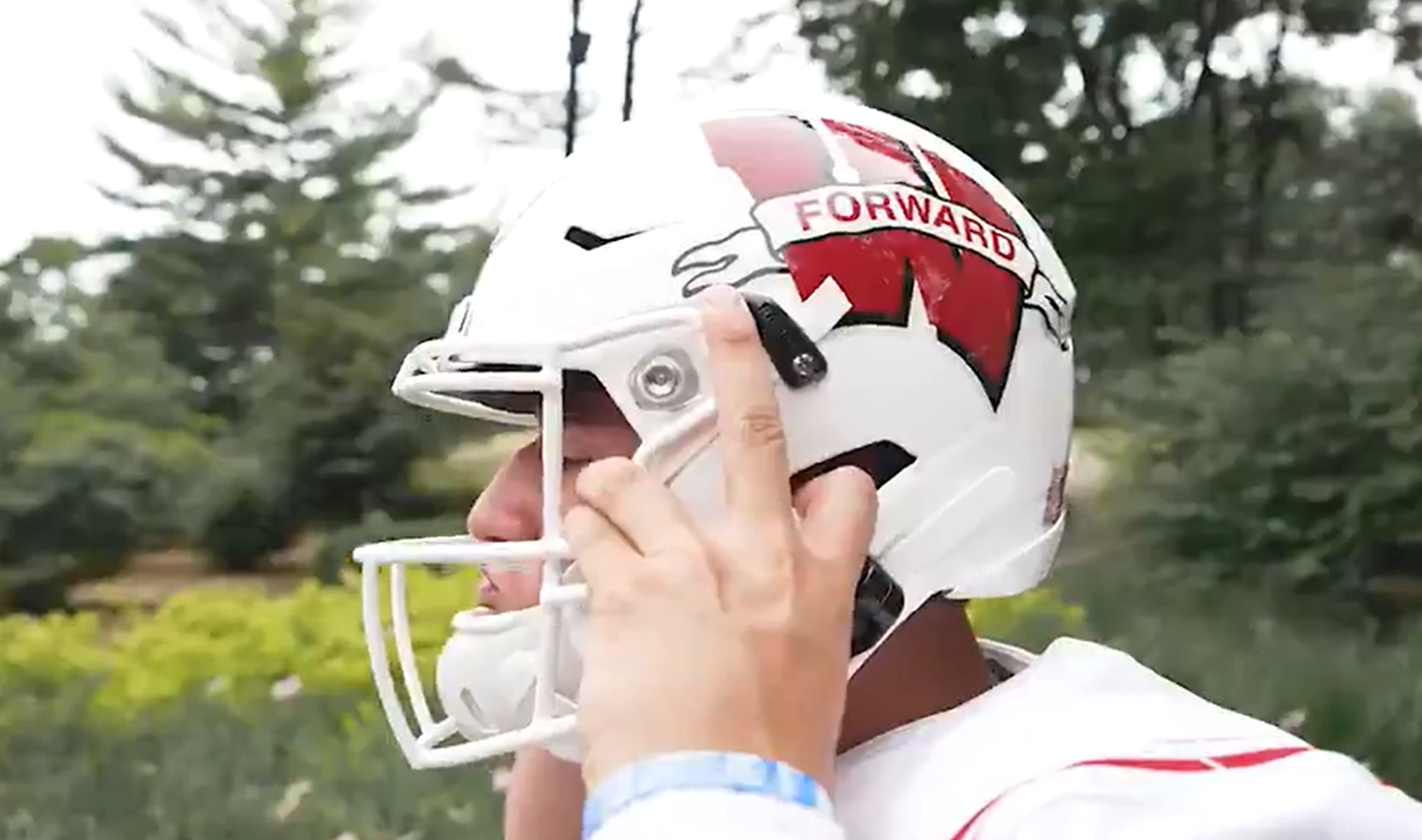
Only Wisconsin could make something so plain look so different from what they usually wear. These are their Shamrock Series fits against Notre Dame, and I approve. Bonus points for the two stripes on the jersey and the helmet.
9. Washington - 1991 Reverse Retro
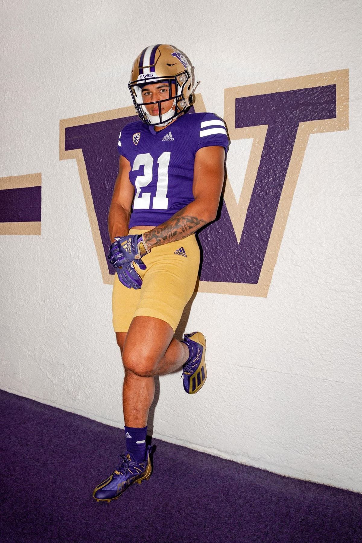
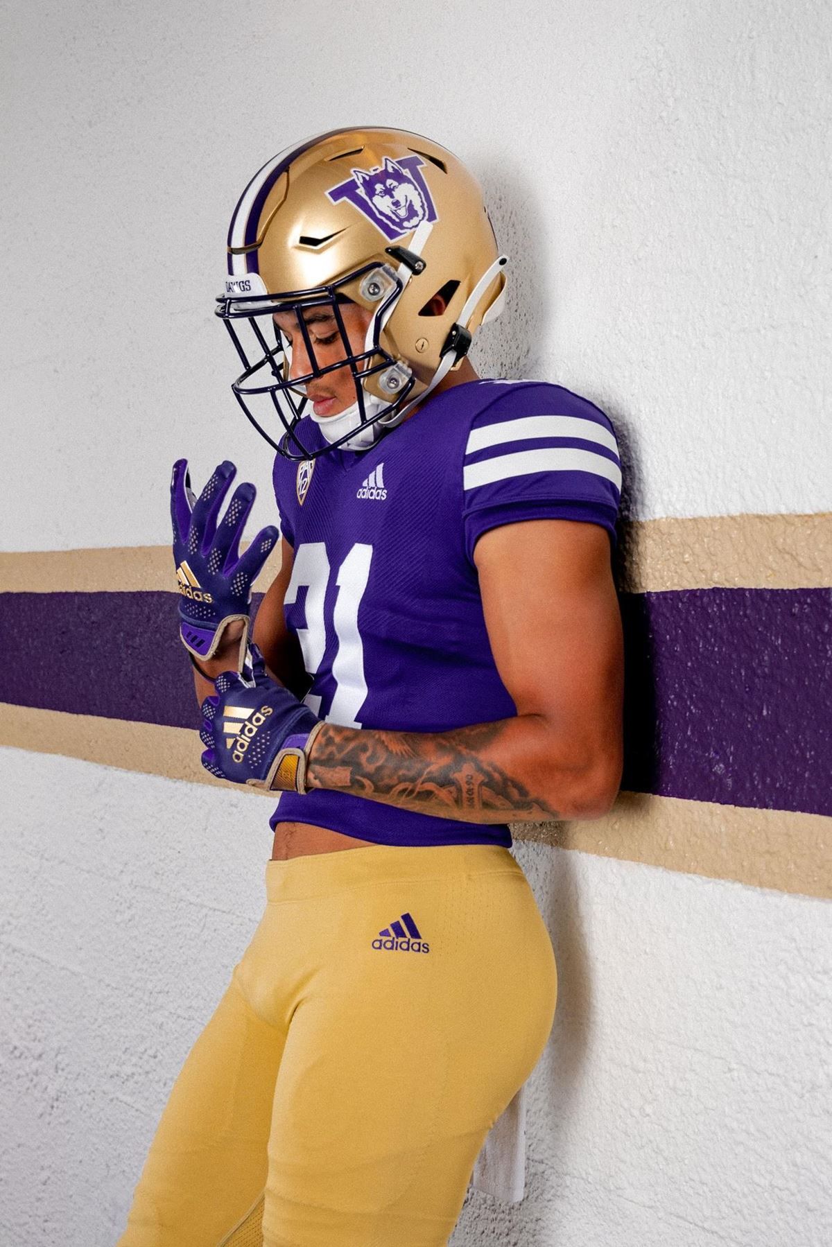
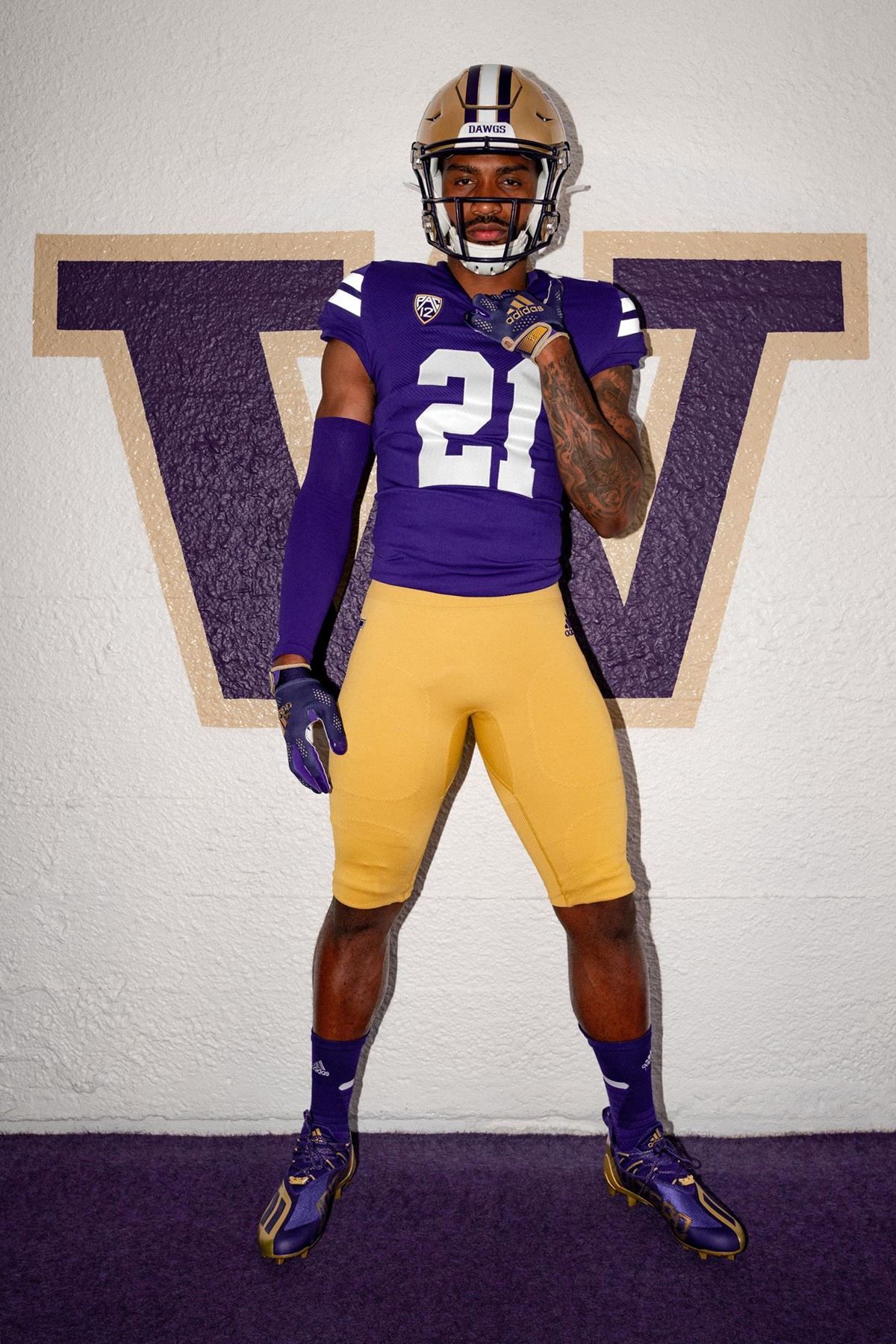
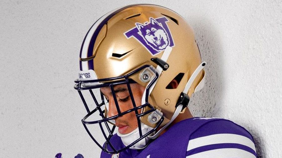
Reverse retros for Washington celebrating their 1991 National Championship. (Imagine processing that sentence if you're 20 years old.) I'm a noted Adidas hater, but I like them keeping it lowkey for most their 2021 designs. It worked at Boston College and Hawai'i, and it works here. The panting Husky on the helmet vaults them into the top-10.
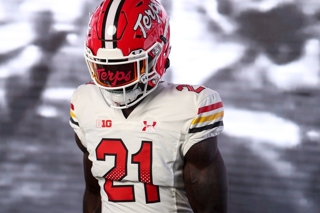
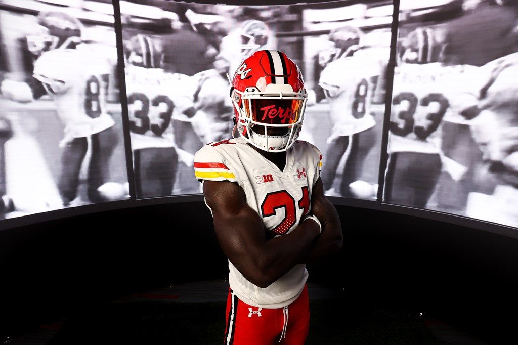
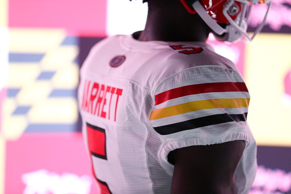
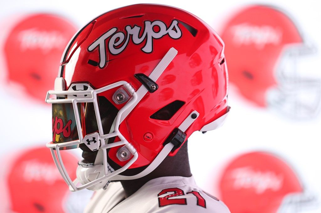
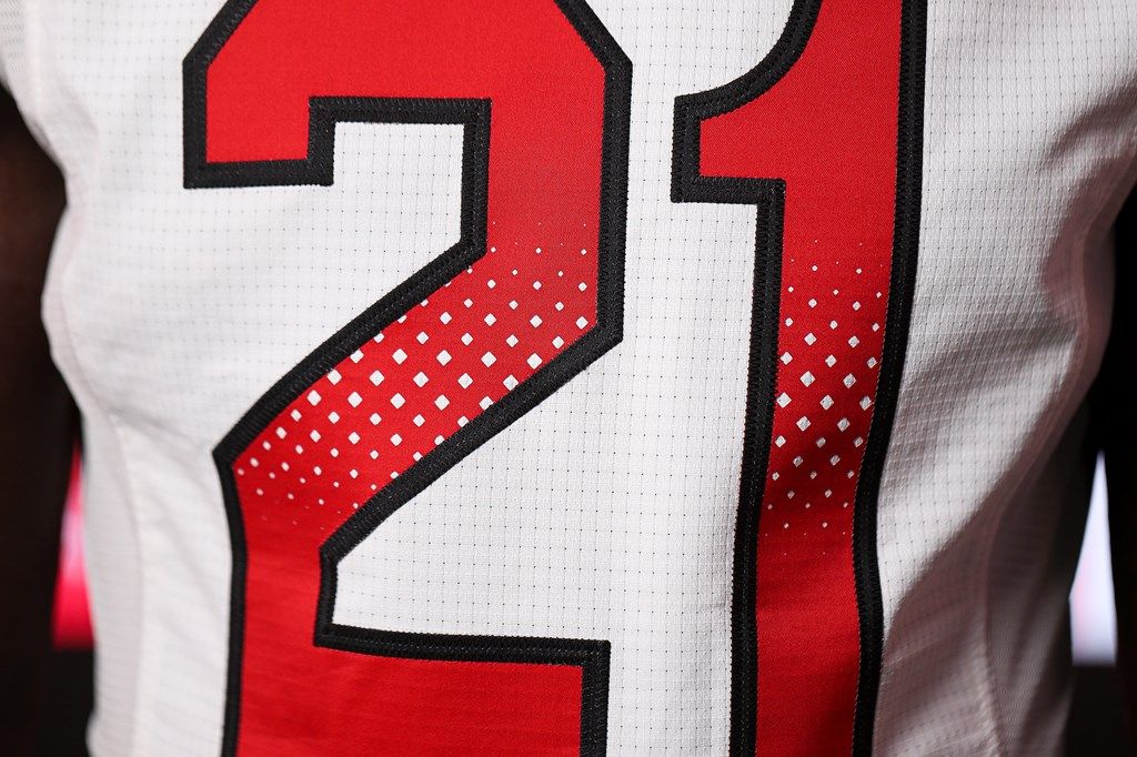
8. Maryland - Script 1980s throwback
"Paying homage to our past while also embracing the future"
If you've ever followed a new uniform release, you've definitely read/heard these words in some form. Like the Rams:
Honoring the past. Embracing the future. pic.twitter.com/7kX98dCxVb
— Los Angeles Rams (@RamsNFL) July 13, 2021
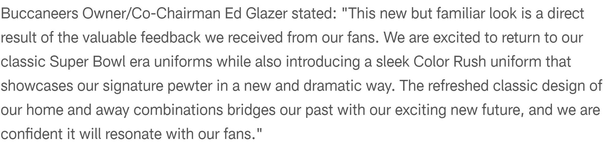
Or the Buccaneers:
Enter Maryland:
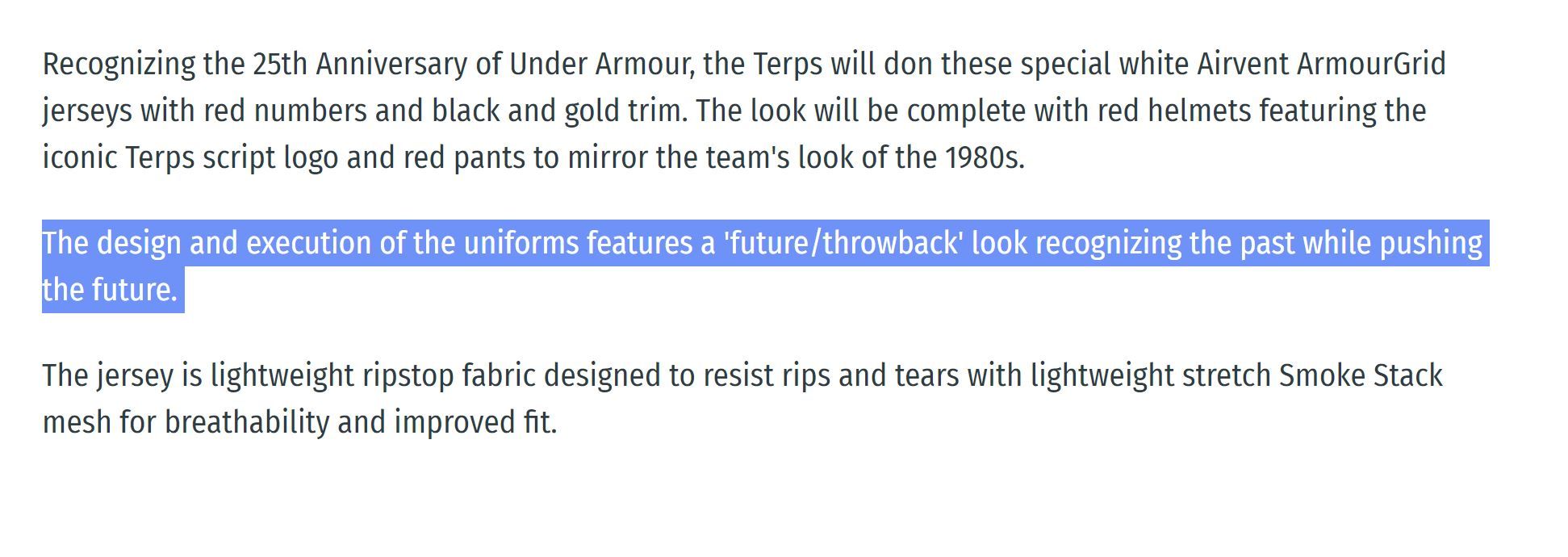
I'm only putting this in here for one reason: schools/pro teams releasing new jerseys when their fans are screaming for throwbacks always say shit like this, and 80% of the time the jerseys suck. That's obviously not the case with Maryland. These are almost perfect. The 'Terps' script on the helmet rules, and the triple stripe shoulder design looks awesome on that updated material. The only thing holding these back from top-3 contention is the weird 80s mesh number tribute. I appreciate the thought, but let's honor the past by leaving the bad shit back there.
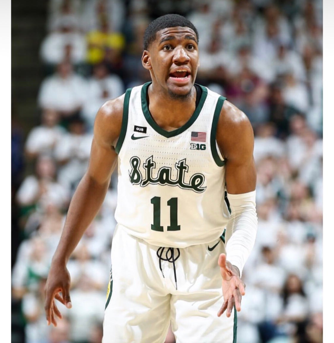
7. Michigan State - State helmets
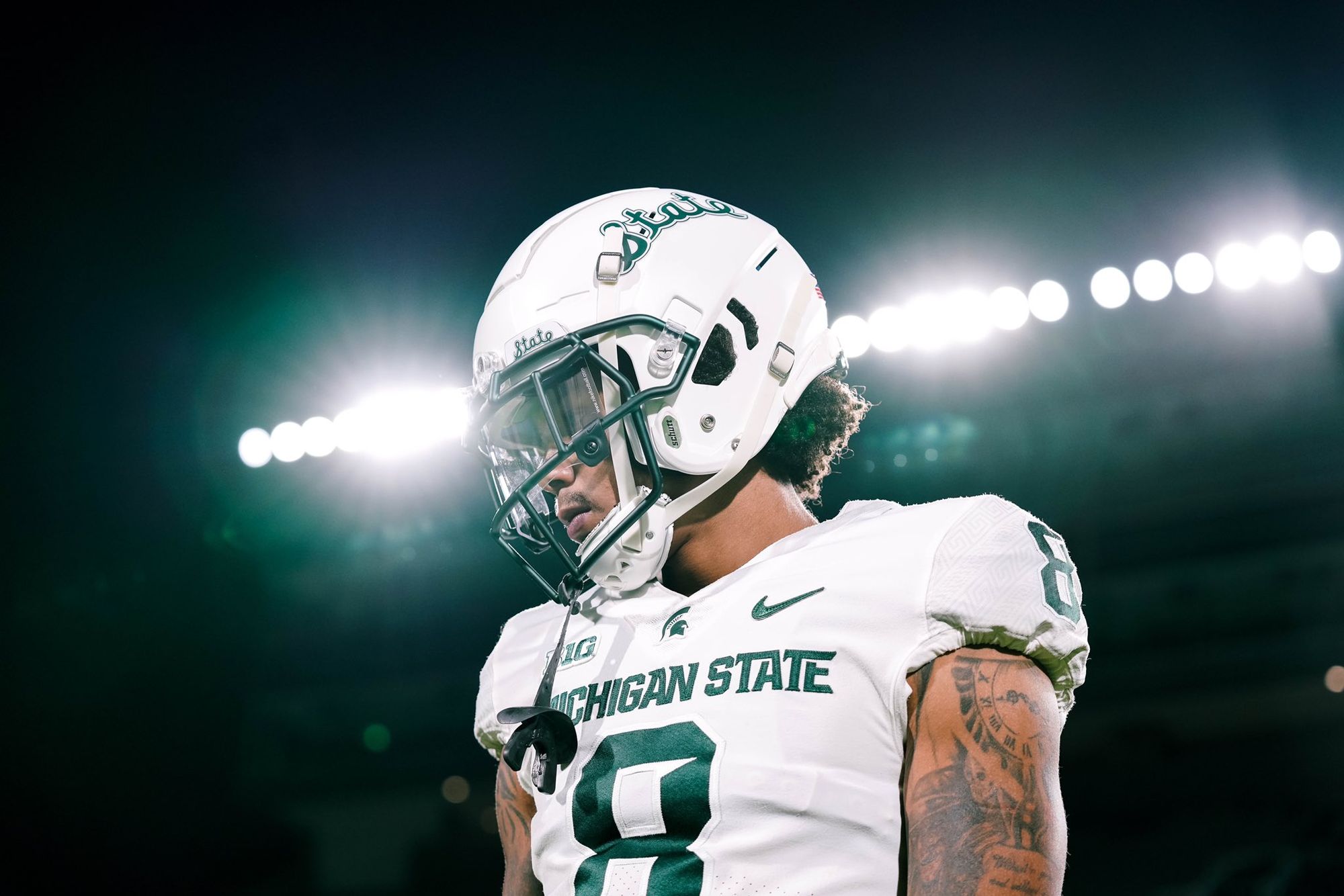
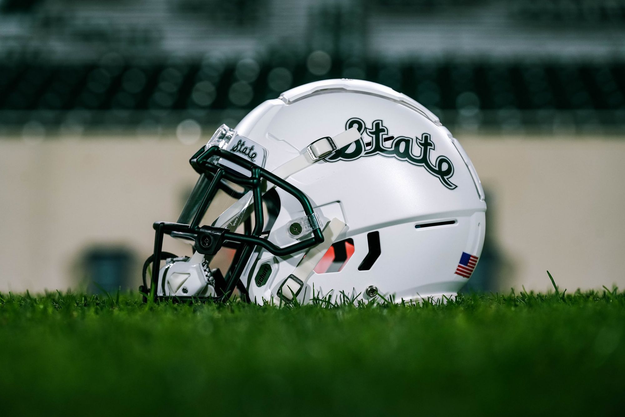
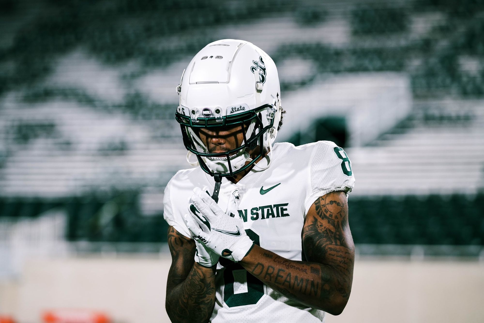
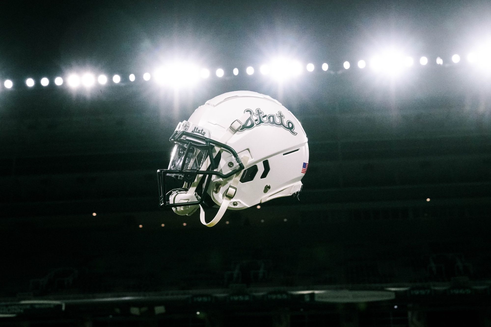
Speaking of script helmets that kick ass: Michigan State has entered the chat. Like BYU and Florida, this isn't technically a new uniform, but it's fire enough to make the list. MSU's basketball has been using the 'State' script for years, so it's about time the football team followed suit. The next step is a proper throwback jersey to match it.
6. NC State - "Light it Red"
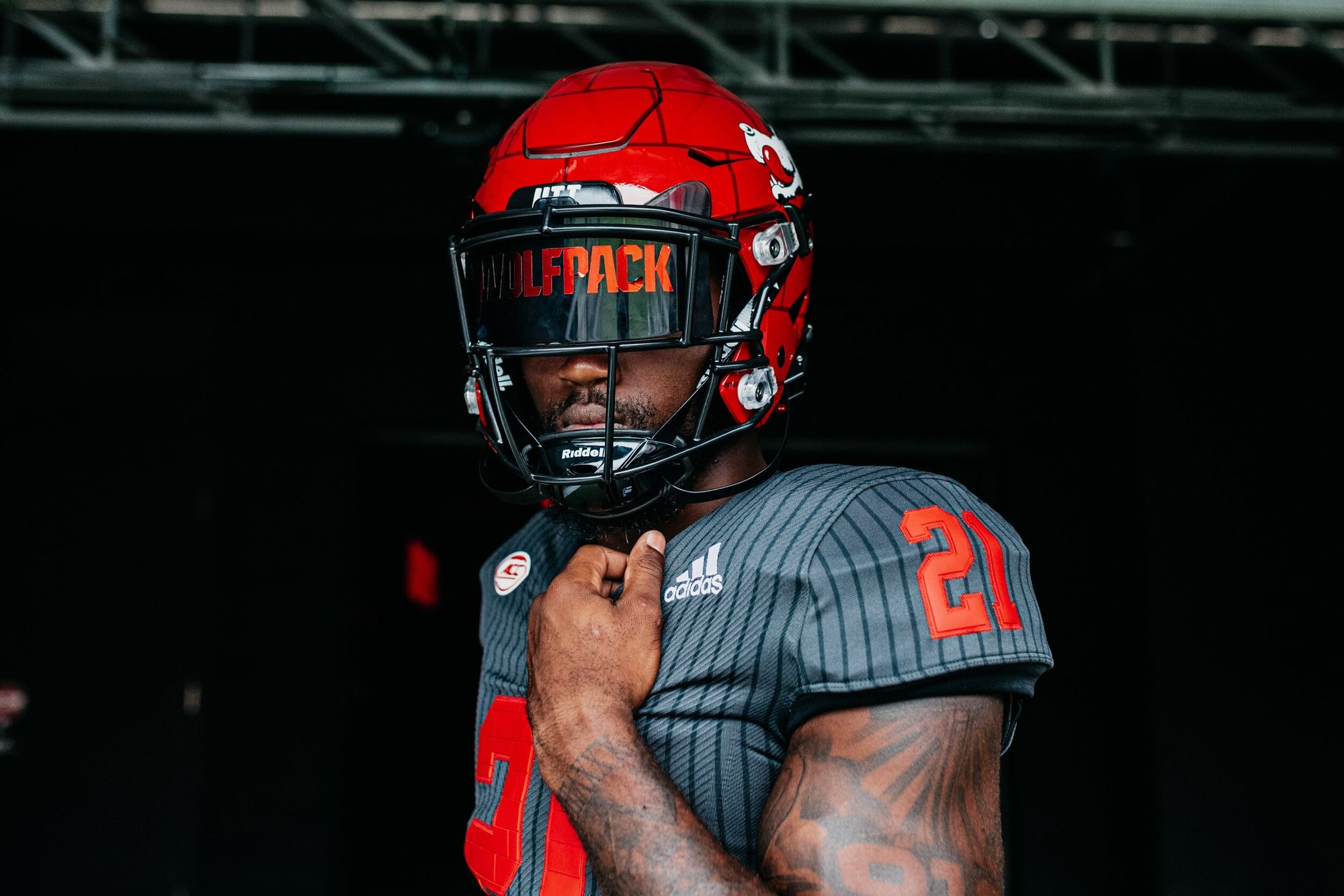
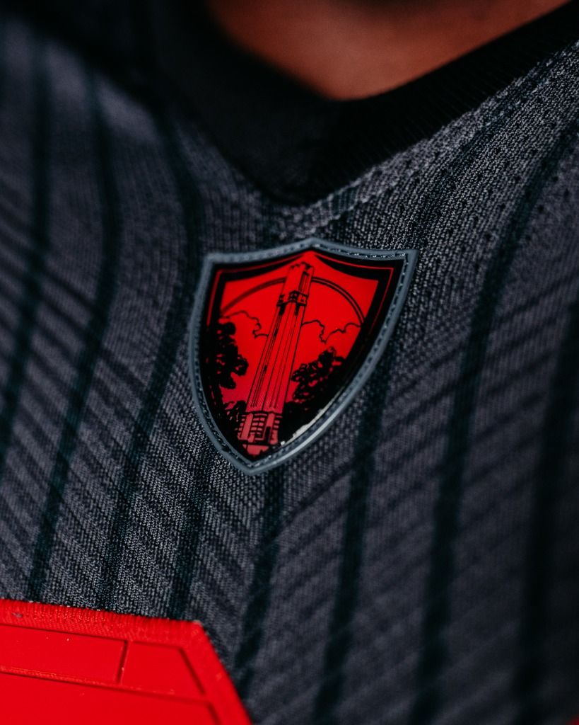
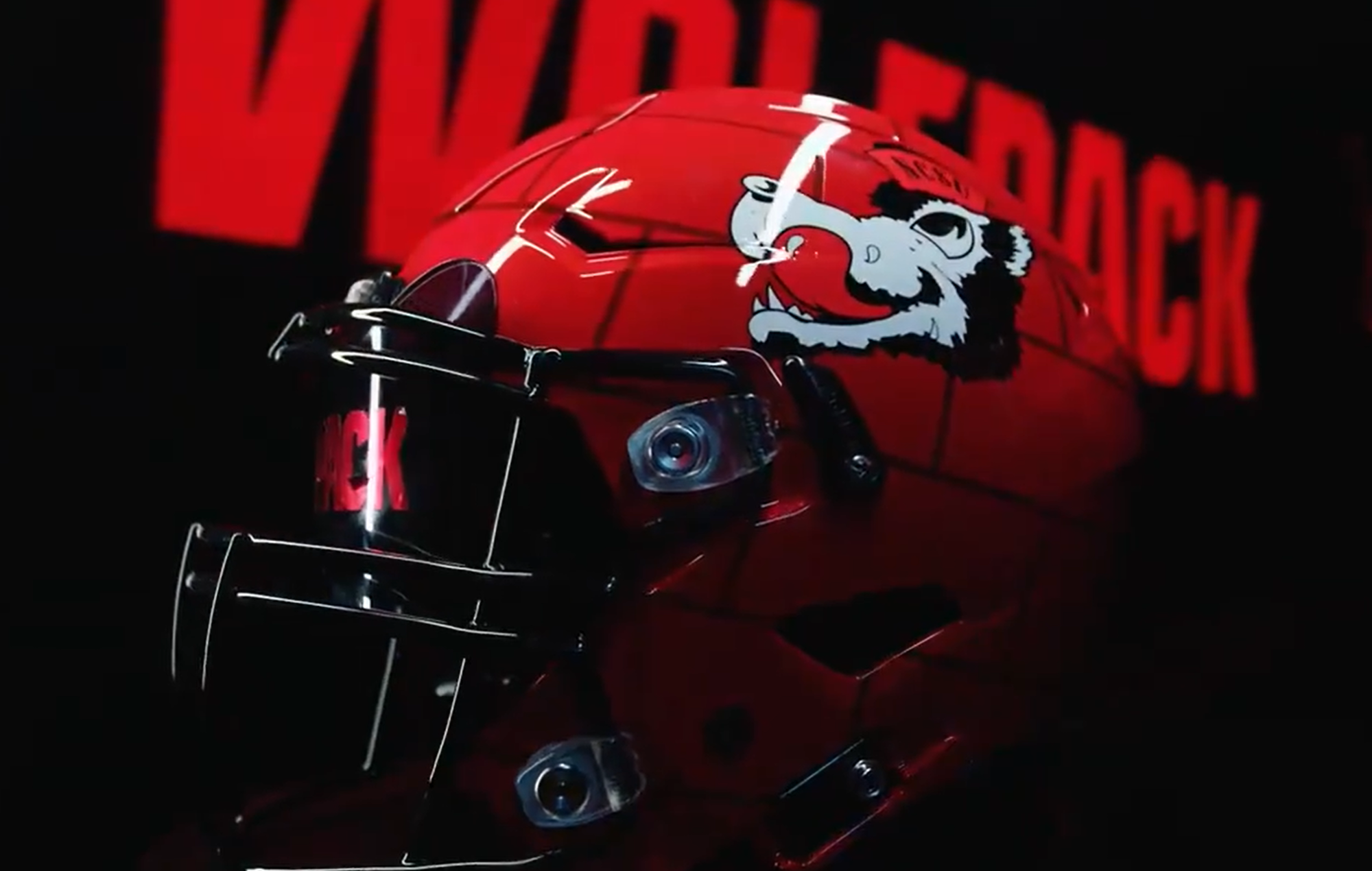
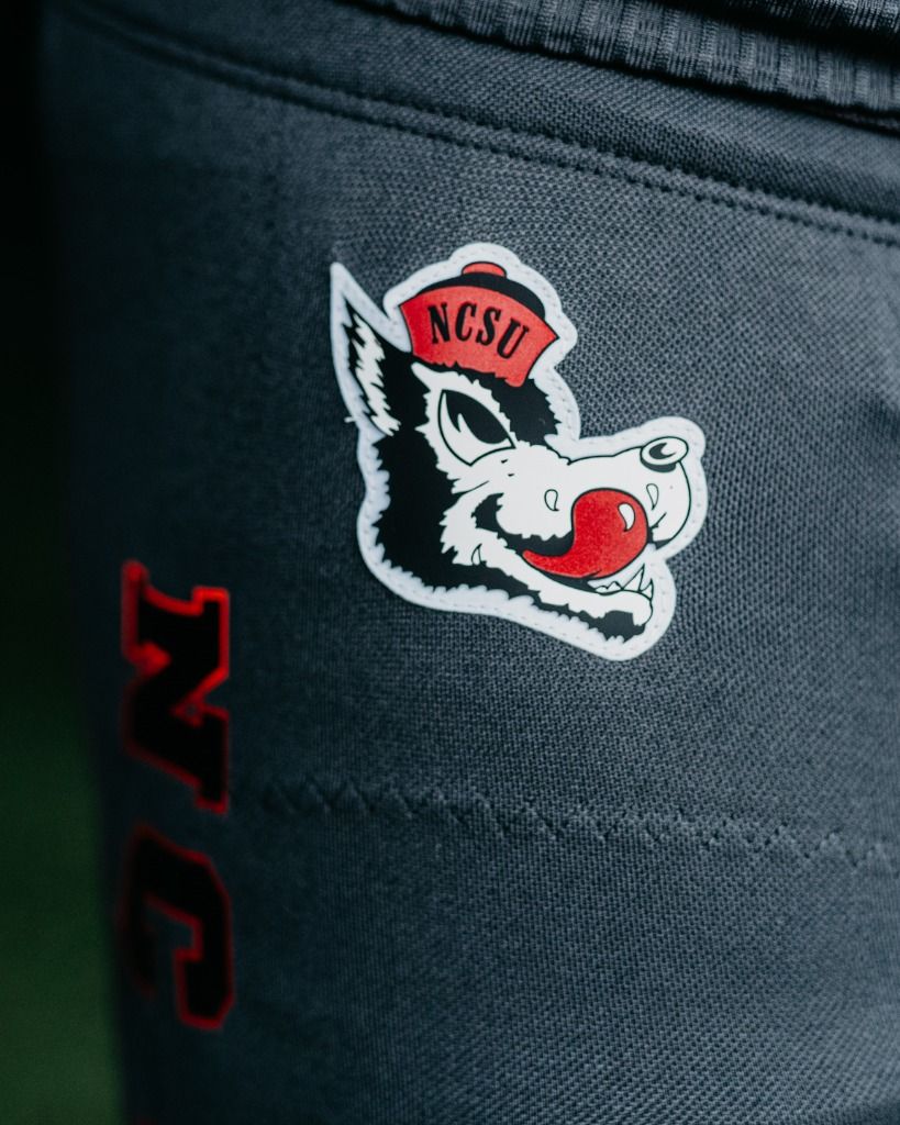
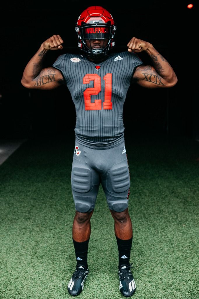
If an acid trip were a jersey, this would be it. Yep, the pinstripes are ugly, but I refuse to let that take away from how incredible the rest of this uniform is. All I ask when teams go left like this is one thing: Make it creative.
Wings on your jersey? Not creative. Making your helmet look like a bowling ball? Not creative. Whatever the fuck this was? Not creative. Brick-textured numbers? YES.
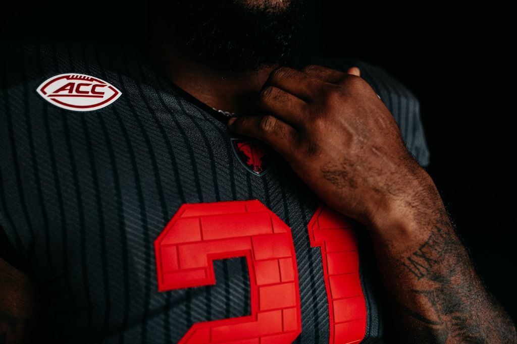
I've never seen anything like this. Pair it with the brick-style helmet and the slobbering wolf logo that looks like it for sure should come with a Disney Plus-style, "This character was a part of the times, we do not condone his actions in this series" notice? SIGN ME UP.
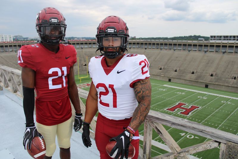
5. Harvard
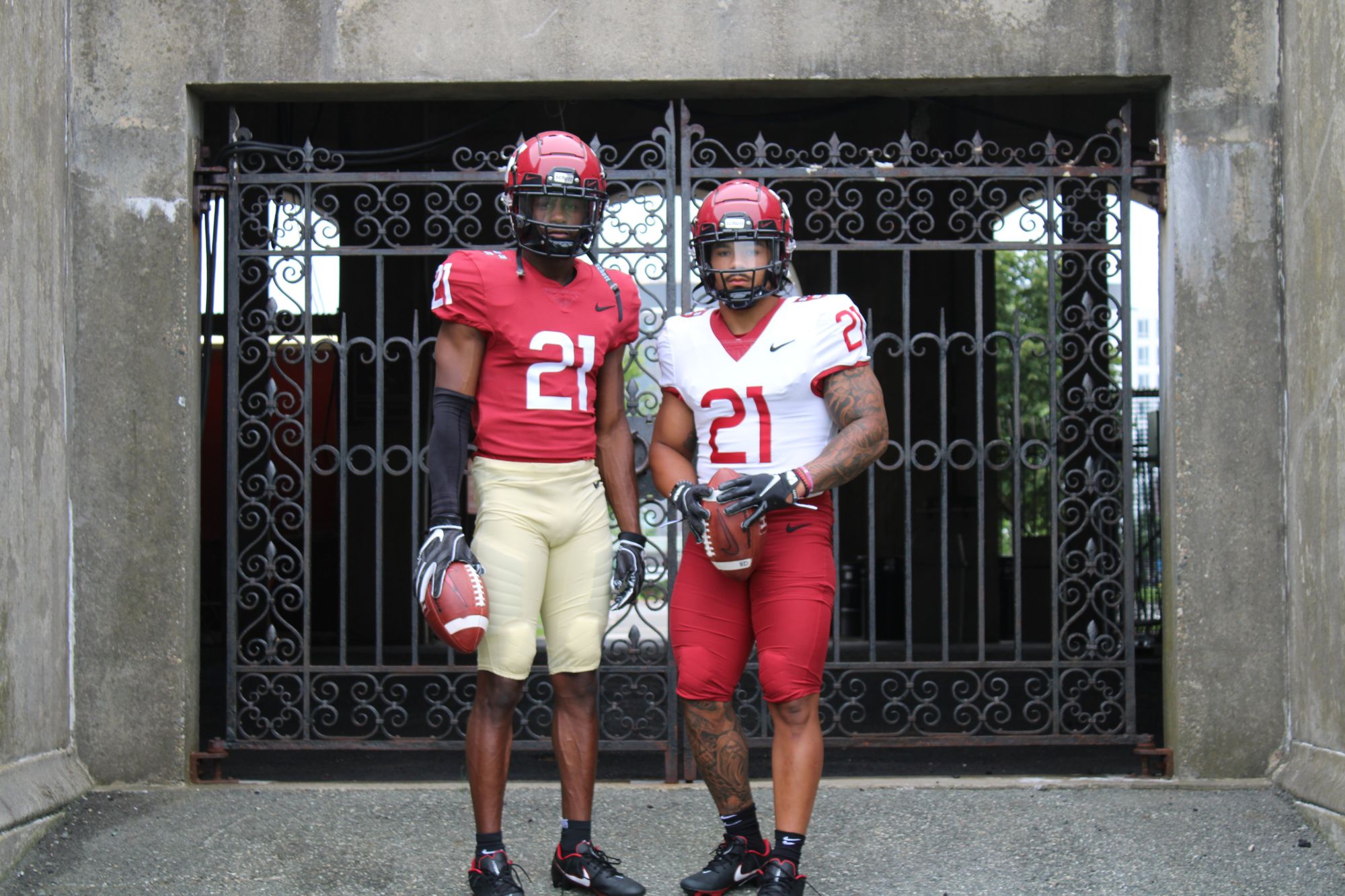
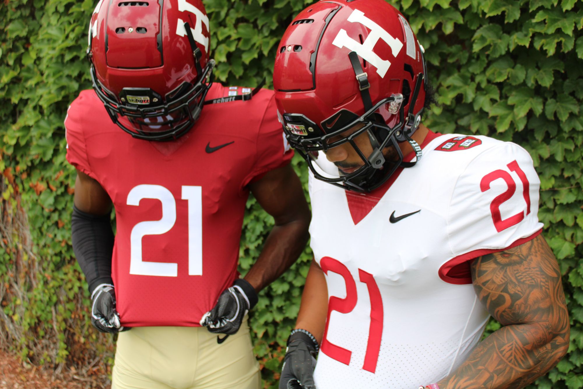
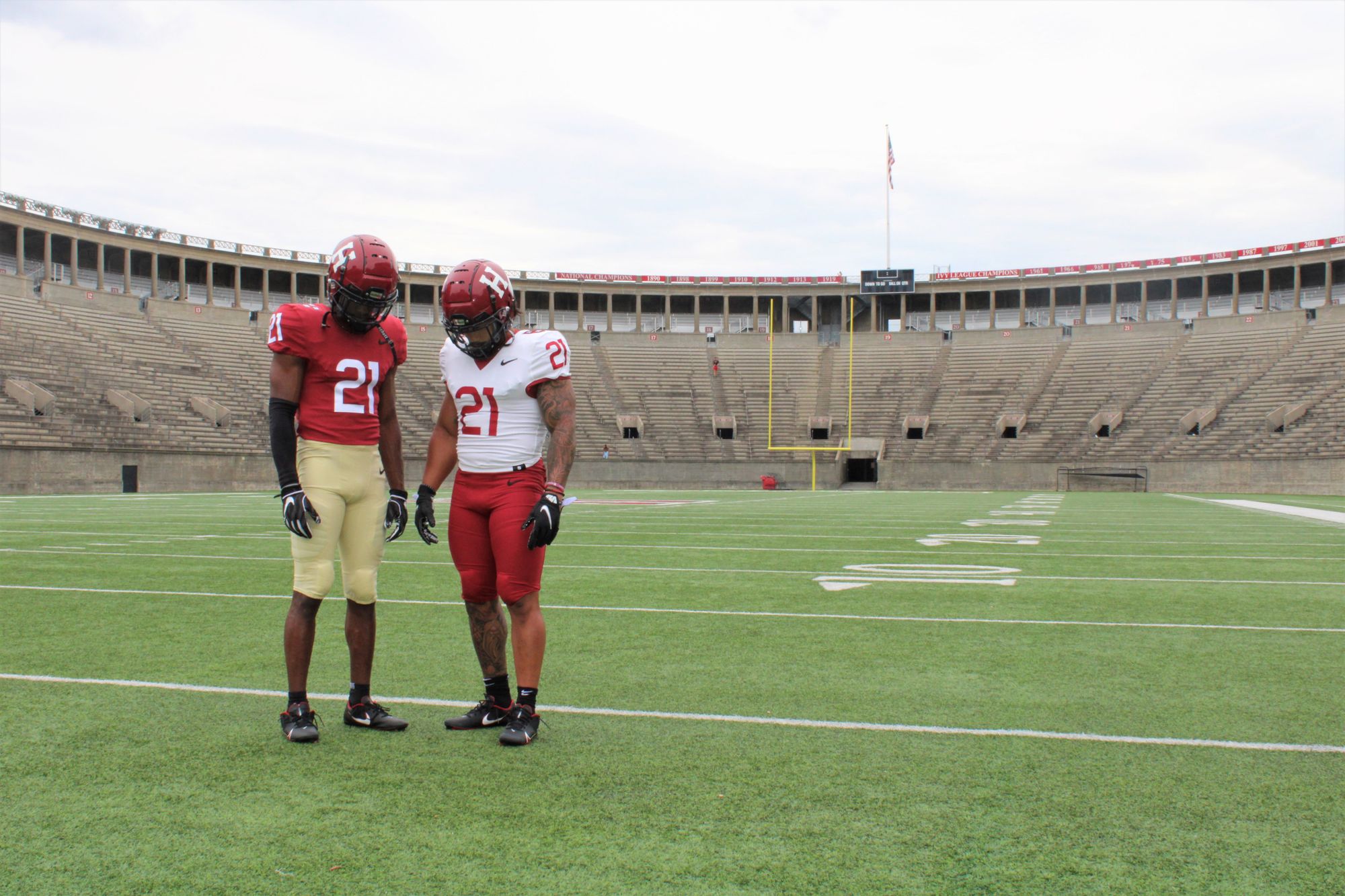

Juxtapose what you just saw from NC State to these. It'd be hard to find two jerseys less alike, but they both work - just in different ways. That's what makes uniforms great. This is the uniform version of oatmeal, and god damnit, oatmeal is my favorite thing to eat.
4. Missouri
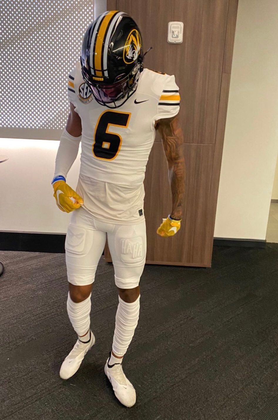
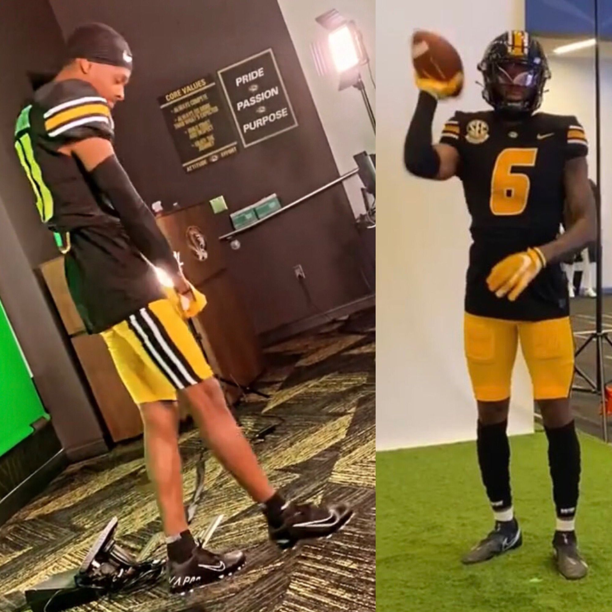
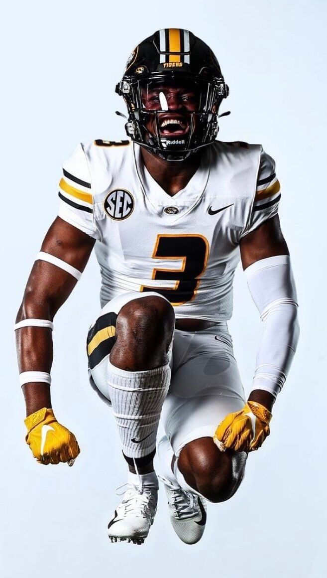
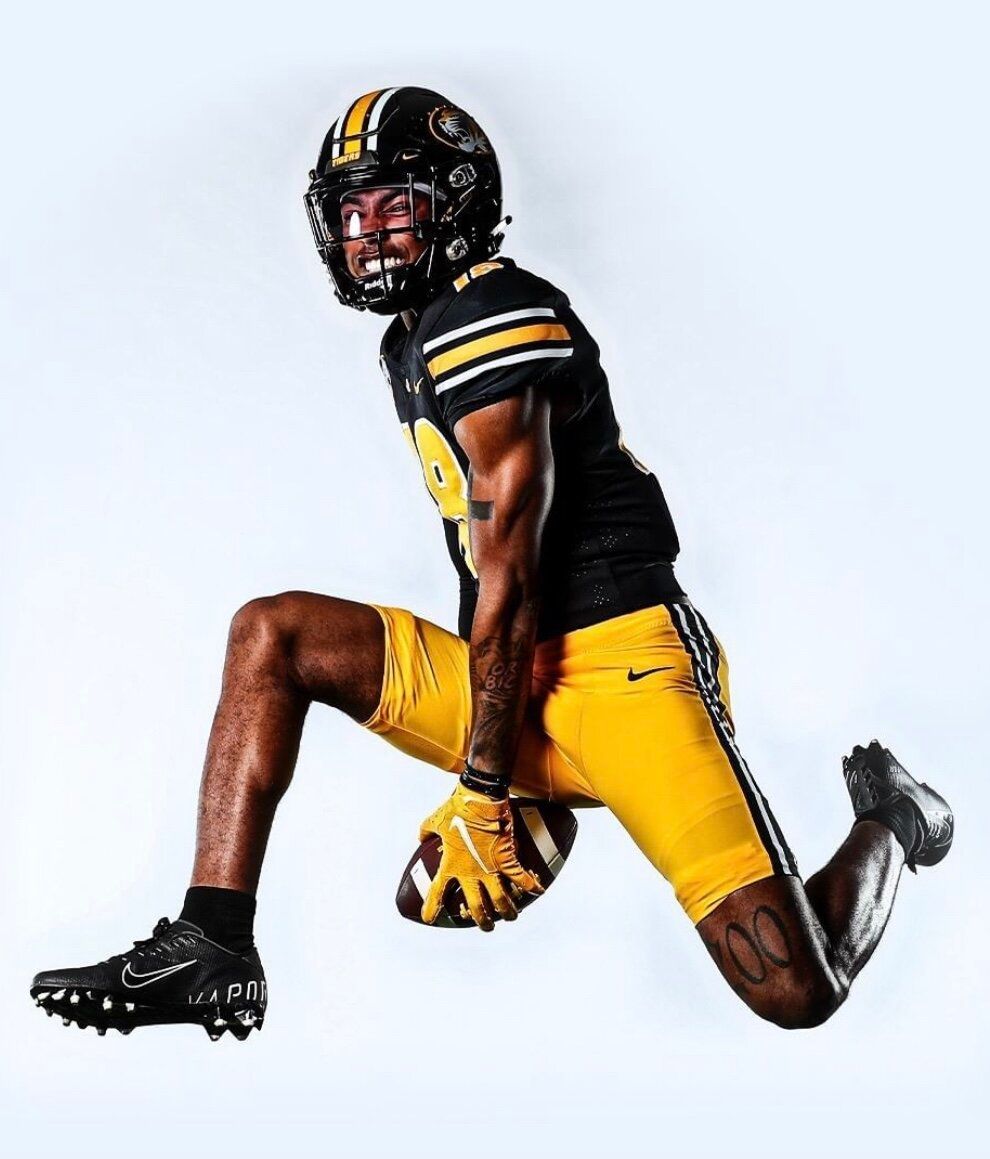
I don't know why I have Missouri in the top five, because this set breaks almost every code regarding uniform consistency. Why are there throwback shoulder stripes, but numbers that look like they're from Fast and Furious? Why don't the pant stripes match the shoulder and helmet stripes, and why does each pant color have a completely different stripe pattern than the other? Who signed off on the tiger head instead of the Block M?
I should really hate this jersey, but for some reason I'm with it. Probably because the shoulder stripes remind me of the golden age of the Buffs. The all-white is sick, and I hope they add black pants, a gold jersey, and a white helmet to the rotation at some point.
3. SMU - Dallas
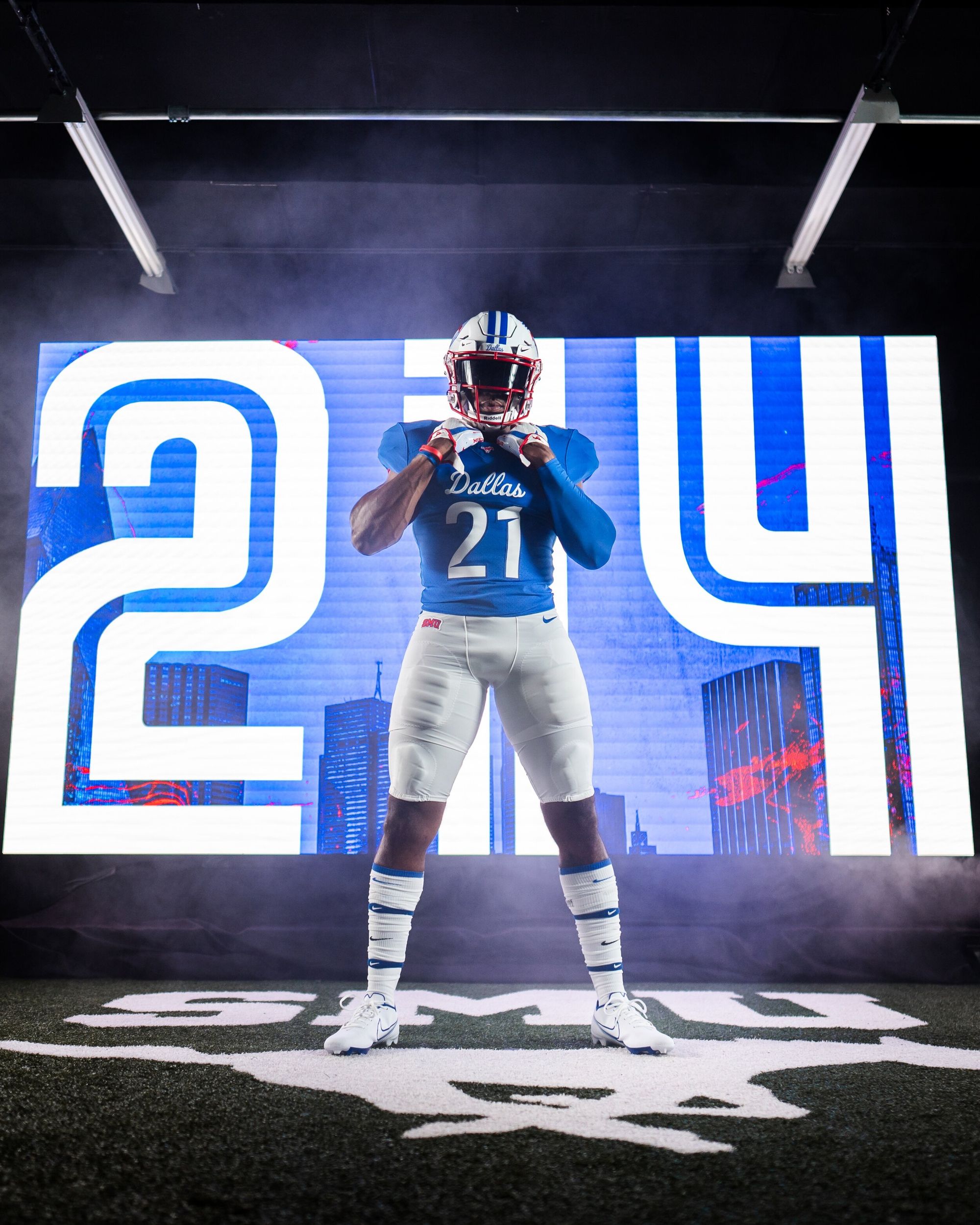
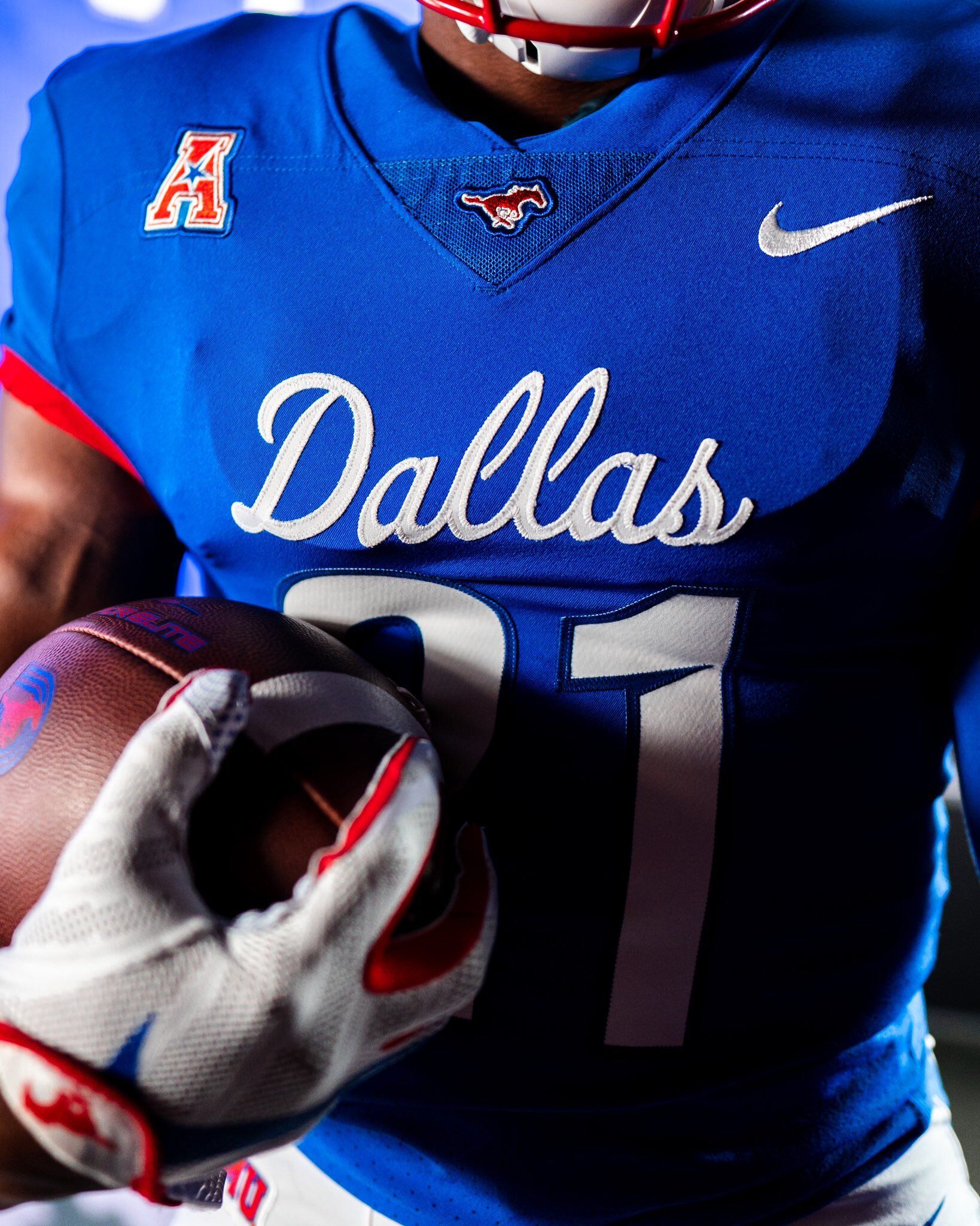
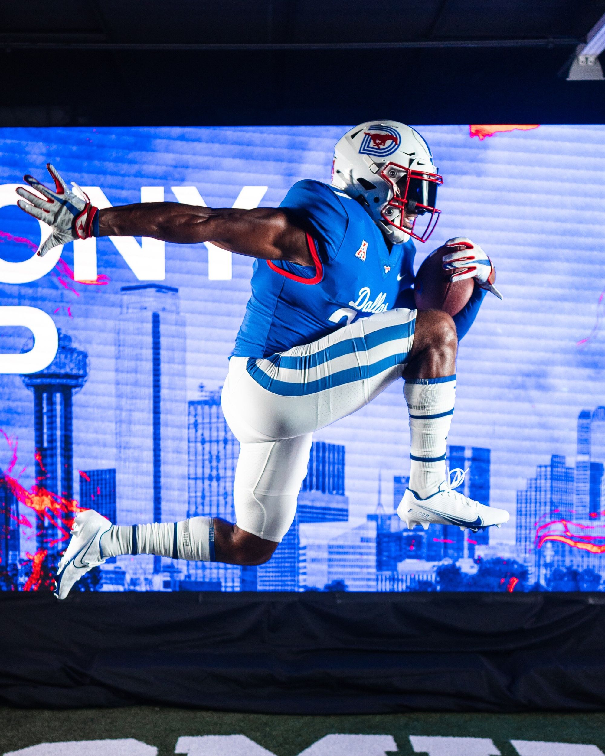
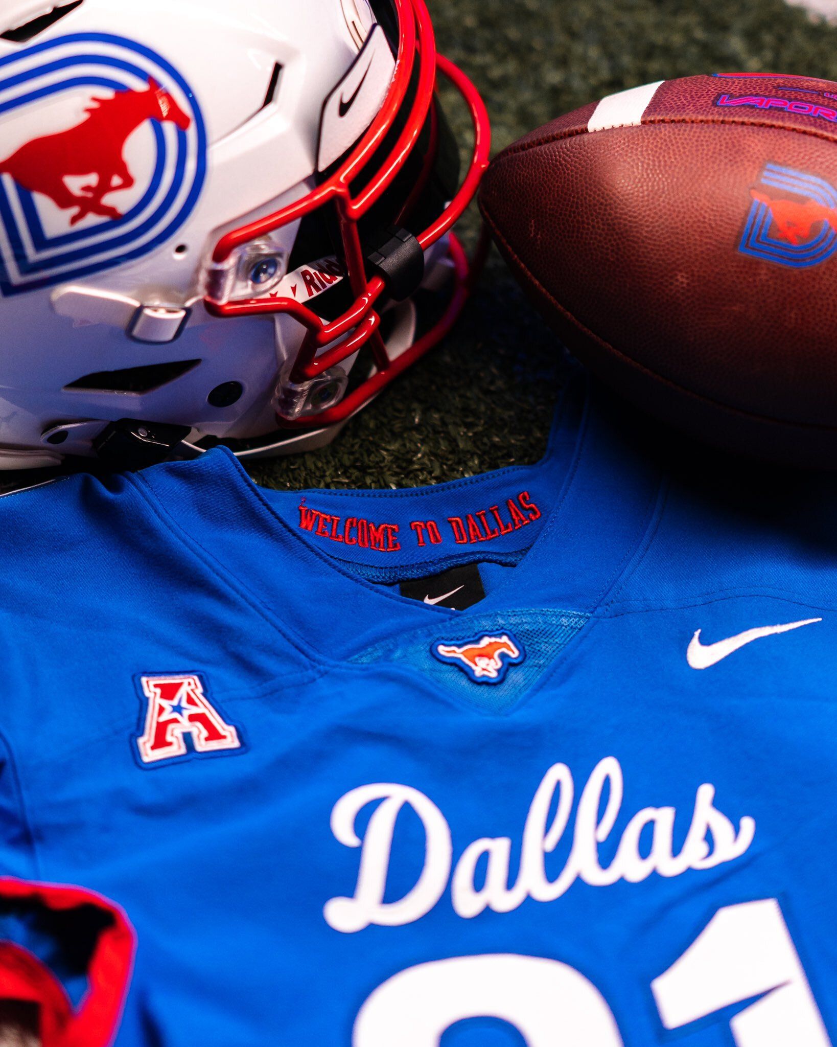
The only good variant is a a uniform variant, and the blue variant of SMU's 2020 "Dallas" jersey is just as clean as the original. I'm not worthy of trying to put into perspective how stunning these are. 10/10, probably should be 1st.
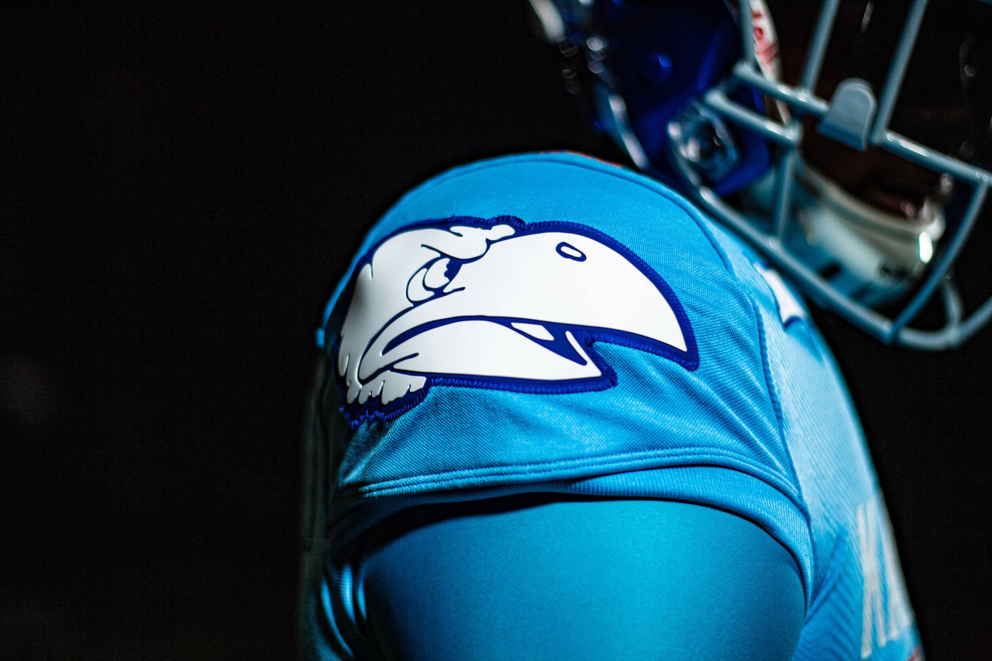
2. Kansas - Reverse Retro
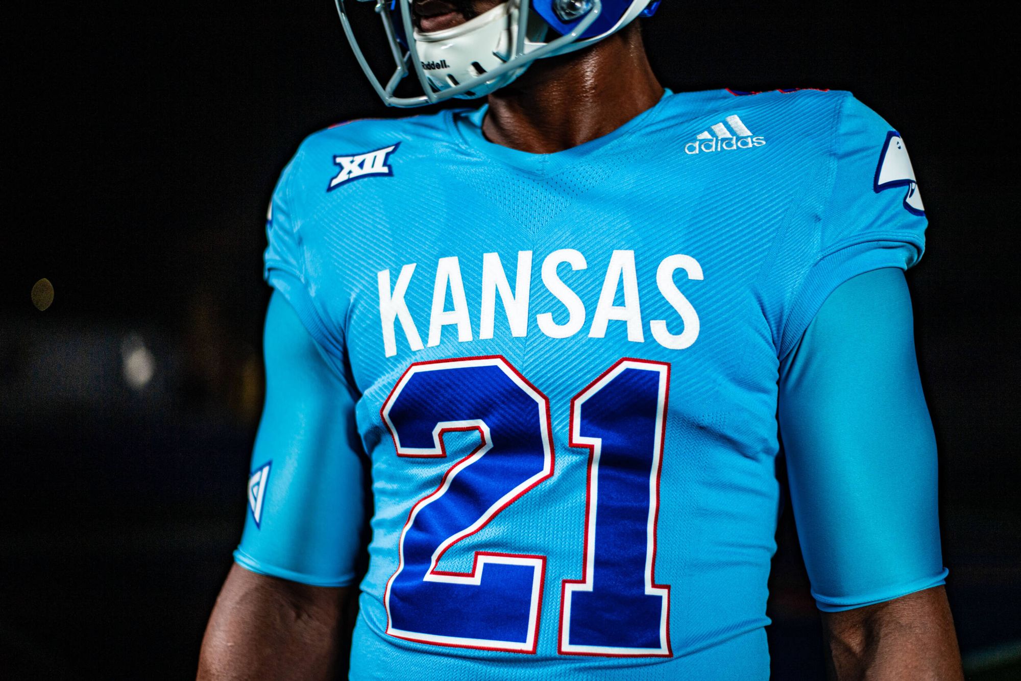
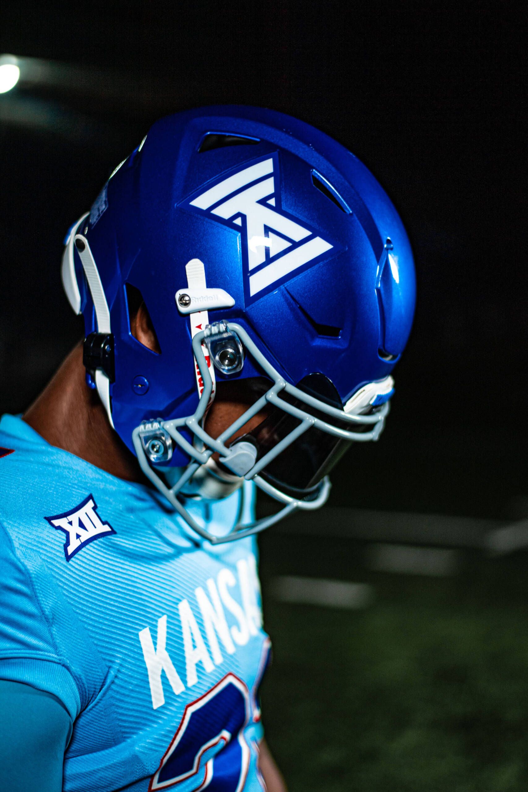
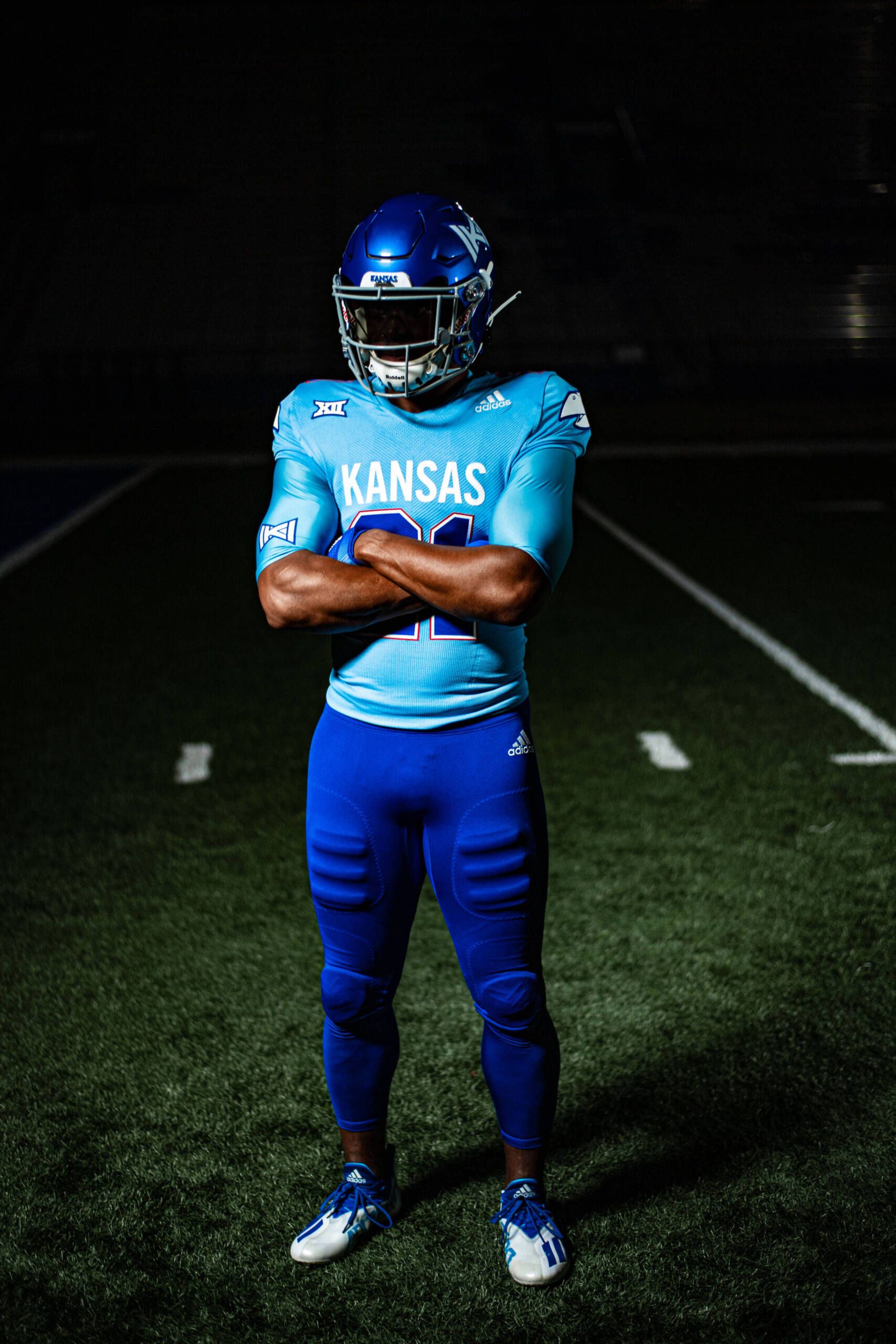
That's right. Kansas!
- The angry-ass Jayhawk on the shoulders
- TWO shades of blue, including powder
- The 1940s-style helmet logo and KANSAS on the chest
- The subtle red around the outside of the numbers
- Kansas fans deserve something positive, and these are probably gonna be the highlight of their season. In any other year, these would've been my no. 1.
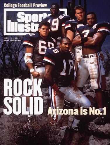
1. Arizona - "Desert Swarm"
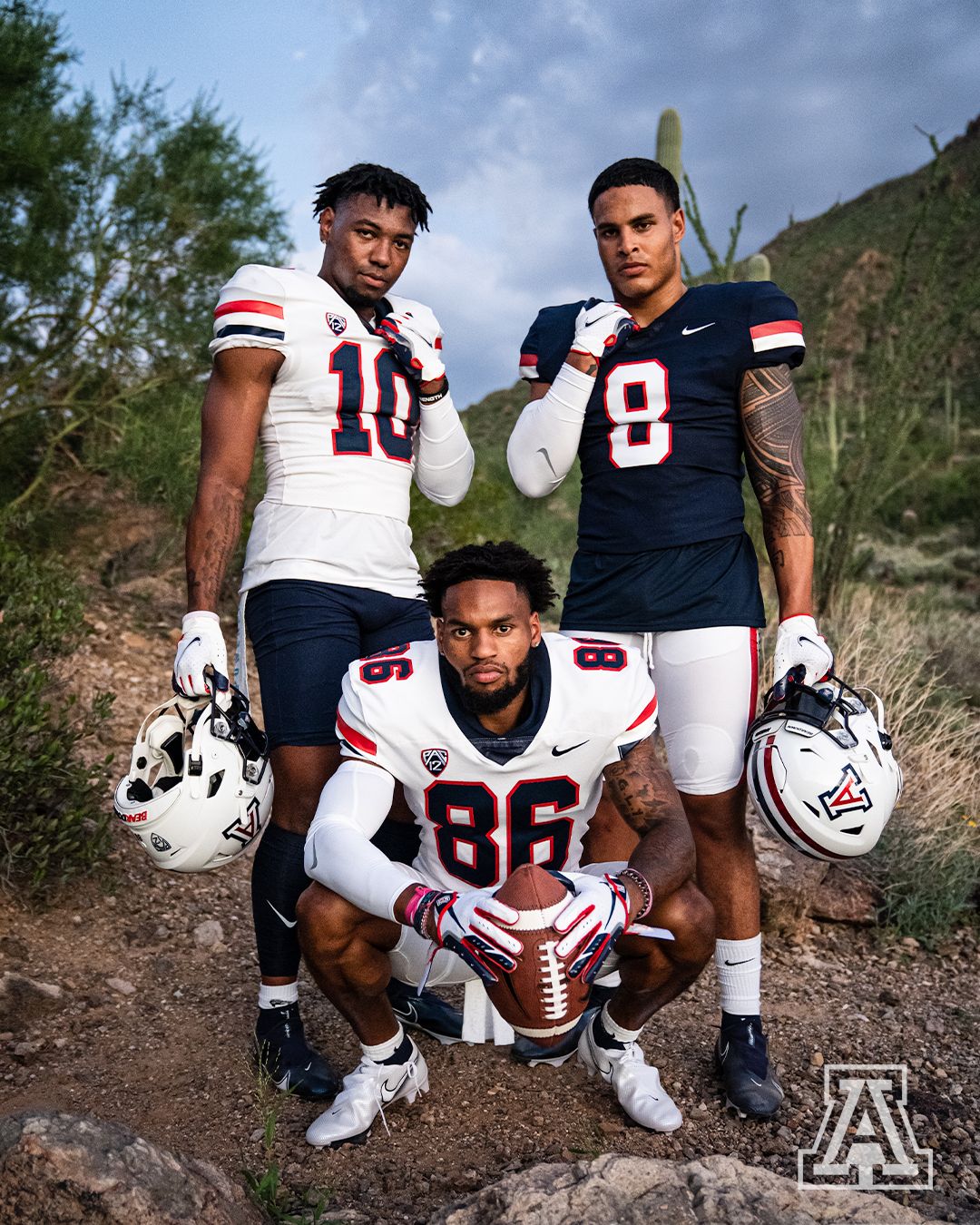
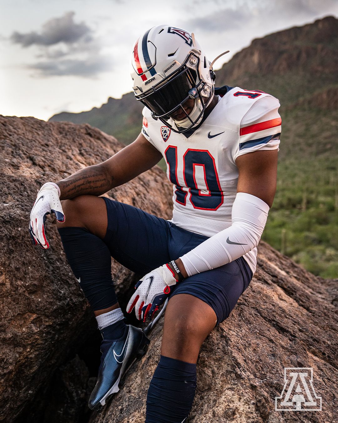
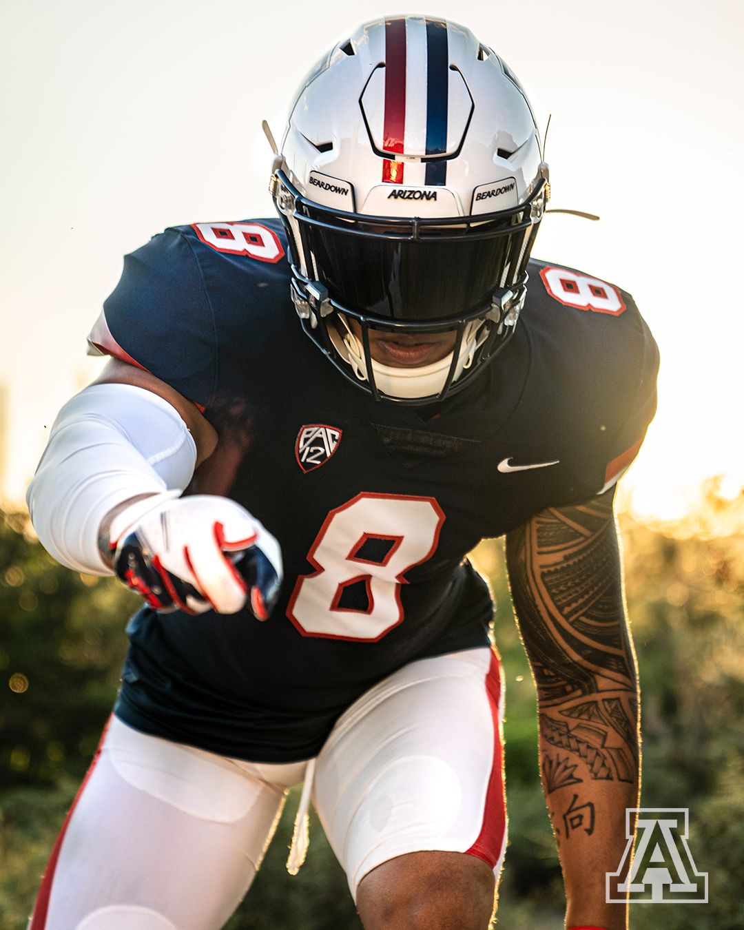
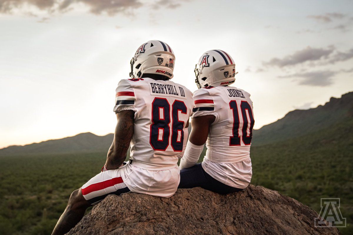
Flawless victory. Arizona fleeced themselves by trading one of the worst looks in college football history for one of the best. The desert swarm-era uniforms are back, and even their Twitter account doing the past/future shit I talked about hating earlier can't stop me from praising these:
Inspired by the Past, Built for the Future.#DesertRising #ItsPersonal #BearDown pic.twitter.com/p3HOUeIcc6
— Arizona Football (@ArizonaFBall) August 4, 2021
A true masterpiece. Uniform artistry. It doesn't get any better than this.
Others not receiving vote: UTSA's tragic all-grey, Southern Miss' GHASTLY yellow jerseys, Nebraska's decision to honor war on 9/11, Louisville's all-red atrocity.

/cdn.vox-cdn.com/uploads/chorus_image/image/19538995/180554384.0.jpg?ref=2stripescpd.com)
:format(jpeg)/cdn.vox-cdn.com/uploads/chorus_image/image/46878638/GettyImages-455440610.0.jpg?ref=2stripescpd.com)
/cdn.vox-cdn.com/uploads/chorus_asset/file/20023810/1175277164.jpg.jpg?ref=2stripescpd.com)
/cdn.vox-cdn.com/uploads/chorus_asset/file/21916103/1228754139.jpg.jpg?ref=2stripescpd.com)
/cdn.vox-cdn.com/uploads/chorus_image/image/55377171/625825380.0.jpg?ref=2stripescpd.com)
/cdn.vox-cdn.com/uploads/chorus_image/image/55177501/2025475.0.jpg?ref=2stripescpd.com)
/cdn.vox-cdn.com/uploads/chorus_image/image/60494865/282960.jpg.0.jpg?ref=2stripescpd.com)