
The 2023 Preseason Top-25 New Uniform poll (2.0)
We've got some new additions to the rankings with a week before the season starts.
For those reading on e-mail: click 'view in browser' to see the full contents of today's post
Welcome to week two of the 2023 preseason top-25 new uniform poll. If you want to see how I determine these rankings + what they looked like in week one, click here.
Teams kicked out of the top-25 this week: UCF, NC State, Illinois, Arkansas State, Kentucky
Honorable Mentions, AKA putting Maryland and Purdue here and explaining why they didn't make the top-25 so you don't yell at me: Purdue, Maryland
Vintage is in 🚂🆙 pic.twitter.com/0MfqJ4wpcR
— Purdue Football (@BoilerFootball) August 11, 2023
It's Iconic. It's Back.
— Maryland Football (@TerpsFootball) April 17, 2023
Script Terps is now our full time uniform!
I had a couple people ask last week why Maryland going back to the 'Script' look didn't qualify, and my answer is simple: They've worn them multiple times in the past few years, so they're technically not "new." Arbitrary, but that's how my brain works. Same story for Purdue. I like that they're going back to the 90s fit full-time, but they've already brought the home version out recently. I can promise that the road version will make the list as soon as they show/wear them. Same goes for the black and gold versions of the "Script" Maryland uniforms, which it looks like they'll be wearing on September 15 and November 4:
Before we get to the top-25: If you enjoy the content on today's post, consider subscribing to the site! I'll have a ton of great content –including lots of things not about uniforms– going up every day during the season!
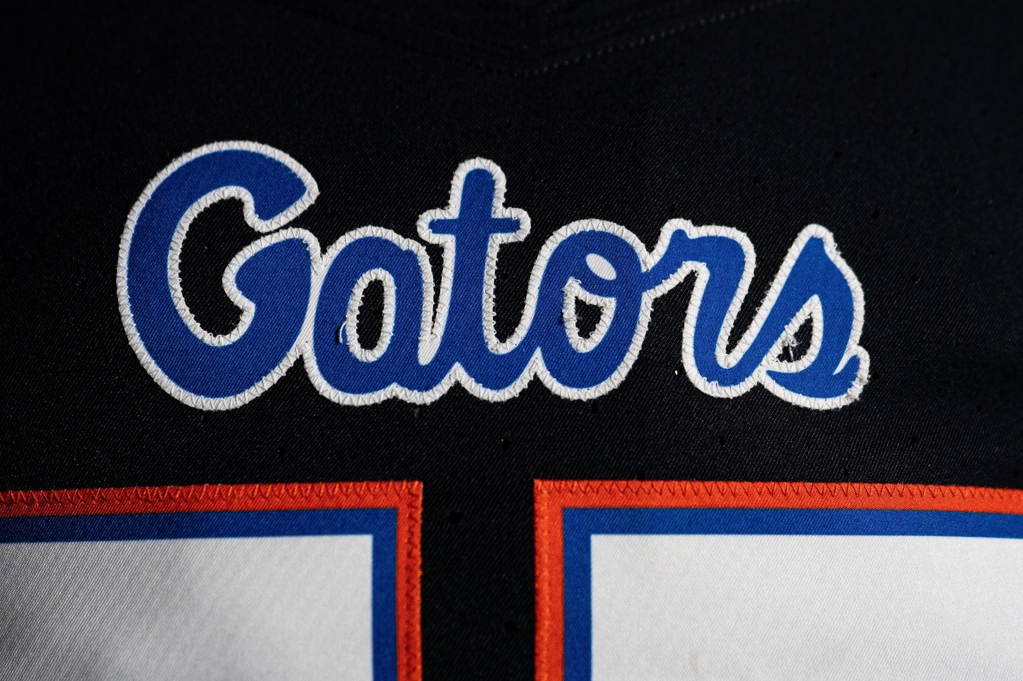
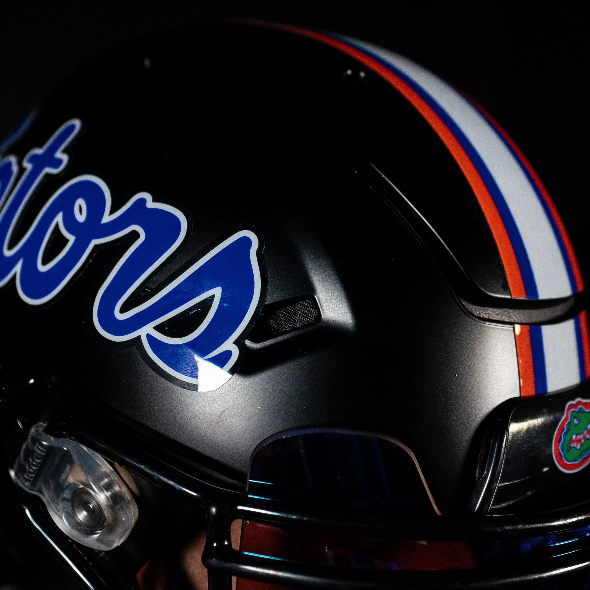
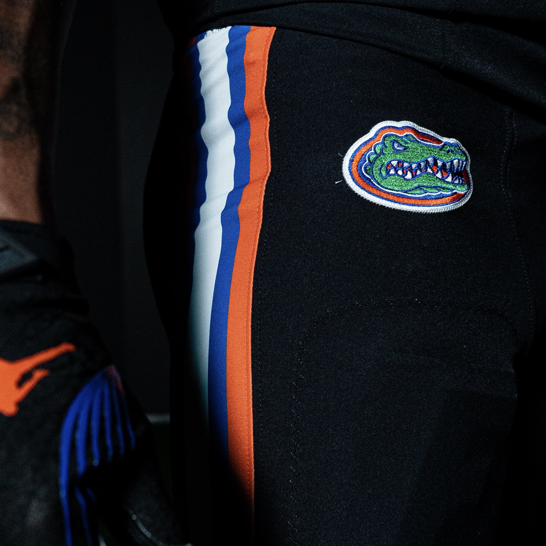
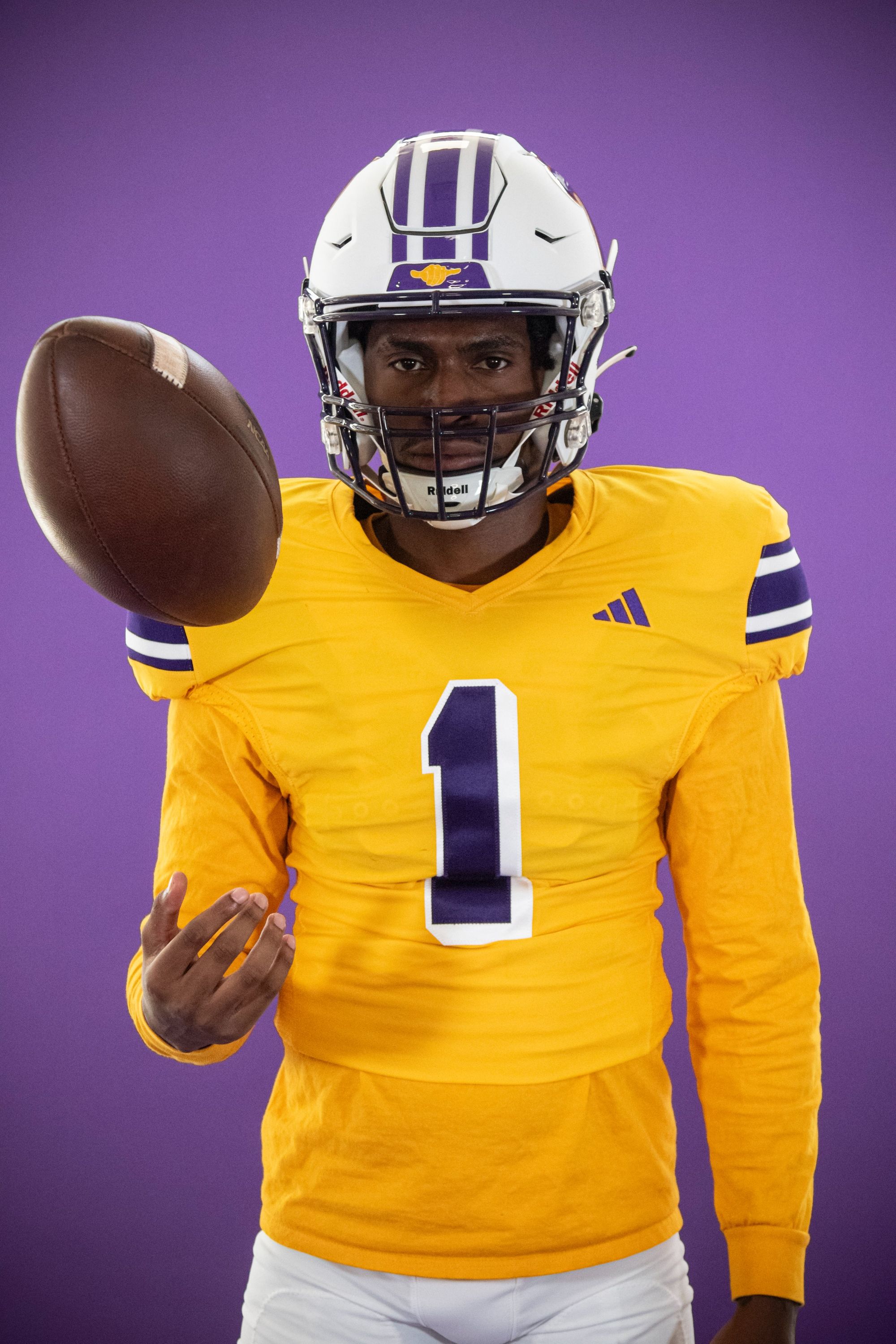
25. Florida - All-black alternate (Last week: 24)
Via Florida Football
As Uni Watch would say: This uniform is the definition of BFBS. I'm sure it'll look cool on the field –against Arkansas on November 4– and it definitely won't be the worst alternate the Gators have ever worn, but I'm numb to the all-black alternate craze at this point. I'm also still trying to figure out how these salute the military, but I guess that's why they're putting "Commitment," "Courage," "Excellence," "Honor," and "Integrity," on the nameplates instead of player names. That's certainly a choice that's been made in the past, and I'm just gonna stop typing now.
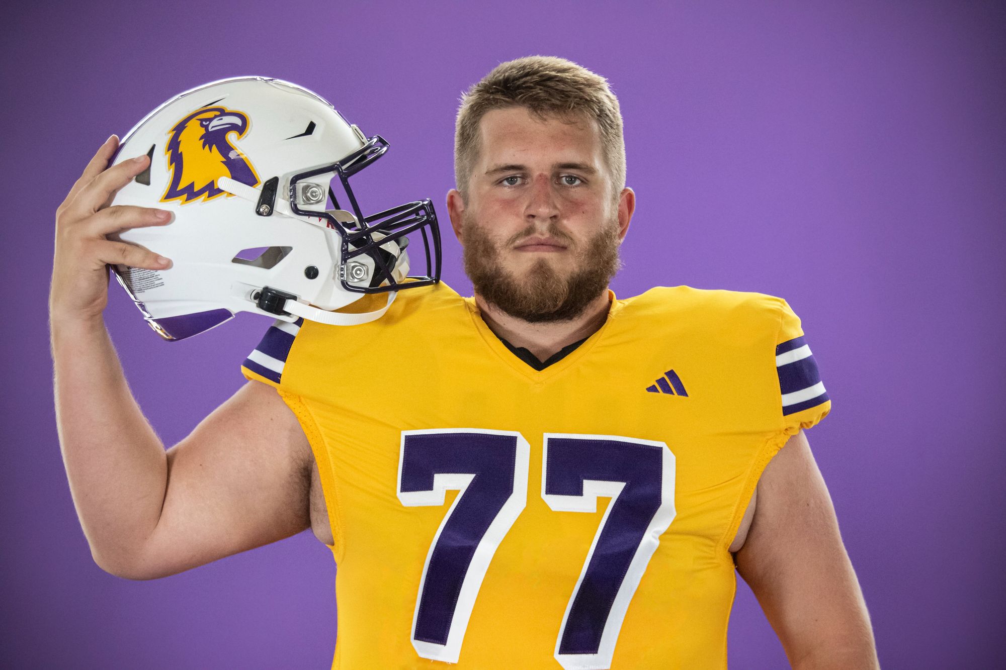
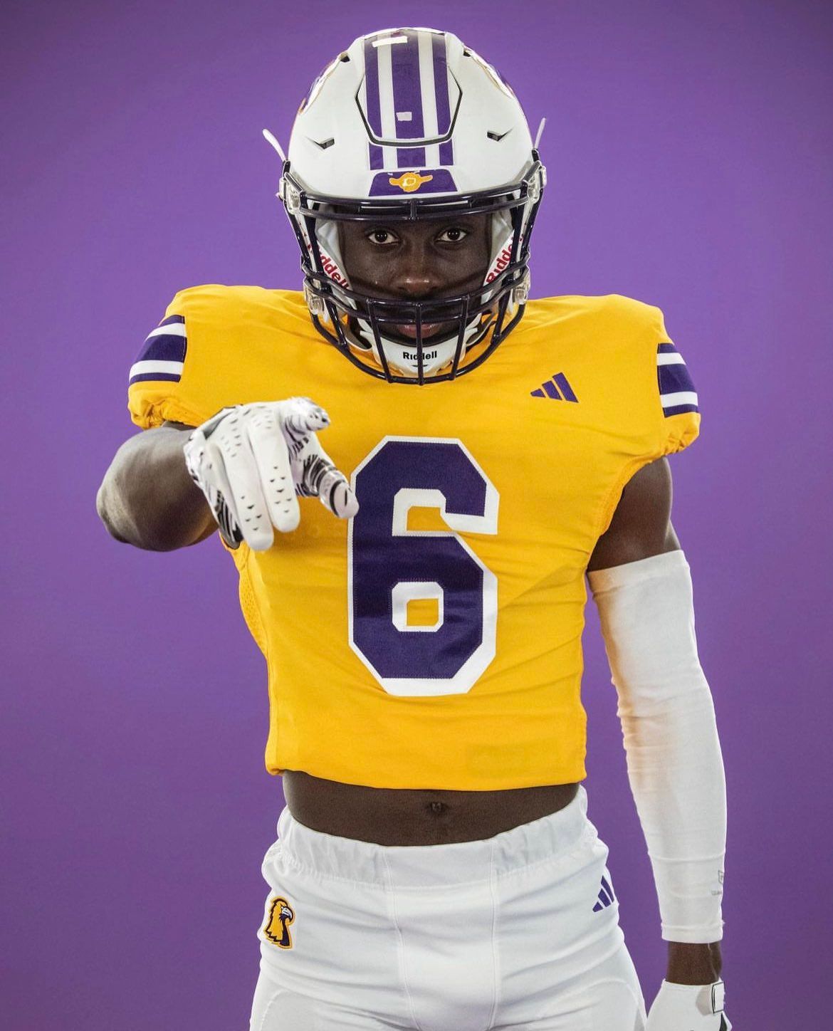
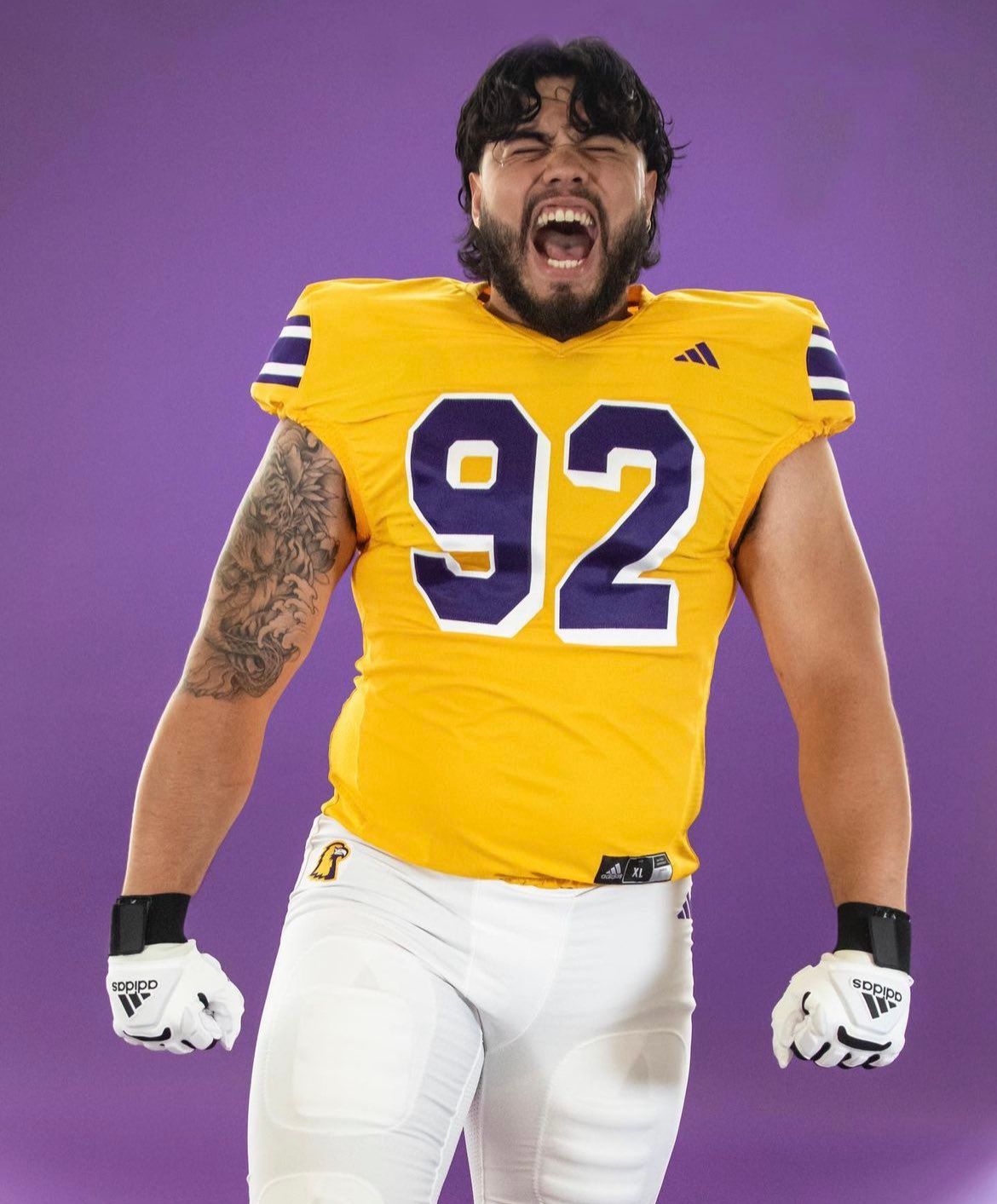
24. Tennessee Tech (Last week: 21)
Via Tennessee Tech Football
That's right, we're dipping into FCS territory. I don't love Tech's logo, but I'm a sucker for drop shadow numbers, and they give these an early-90s Lakers vibe.
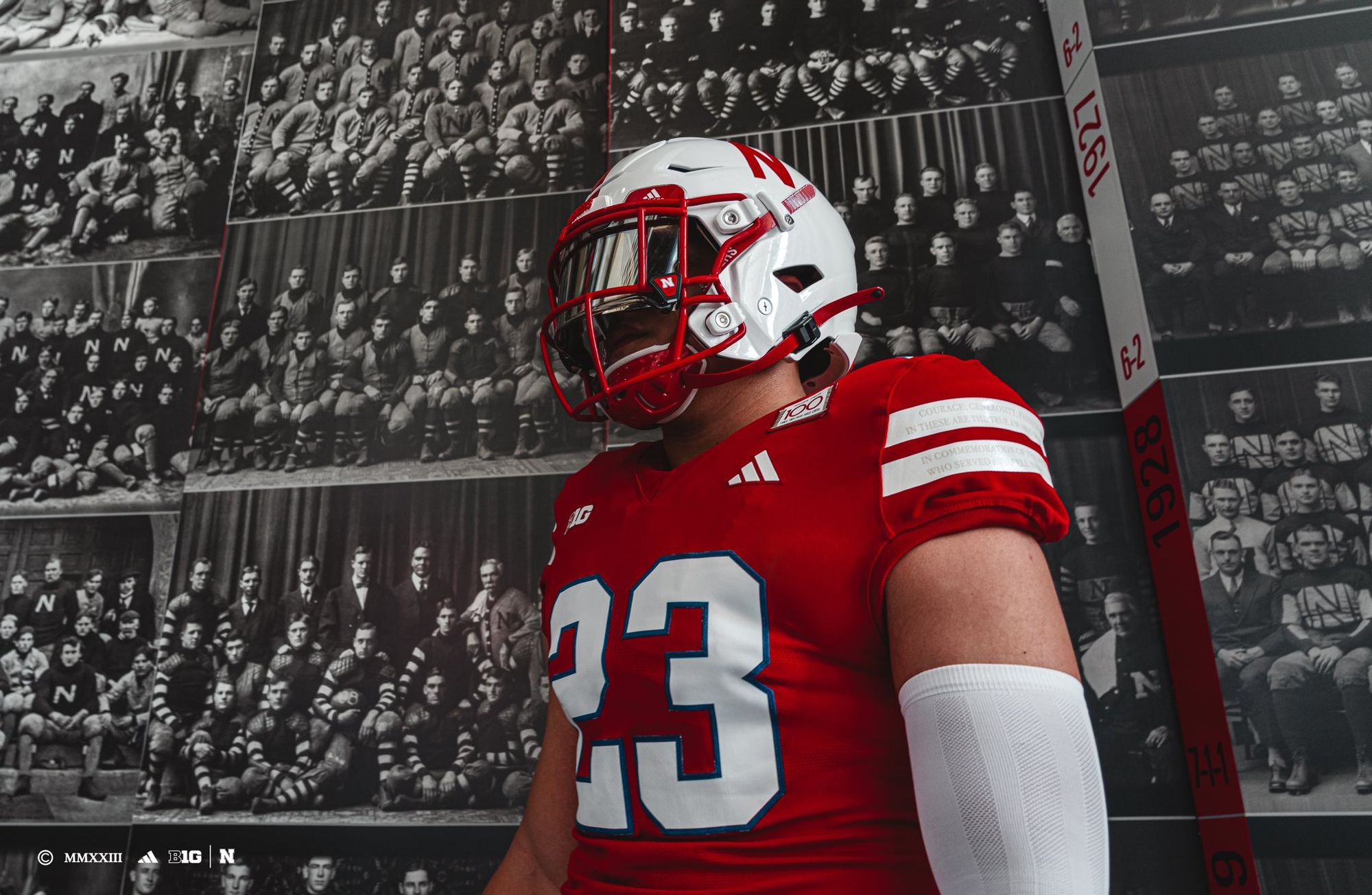
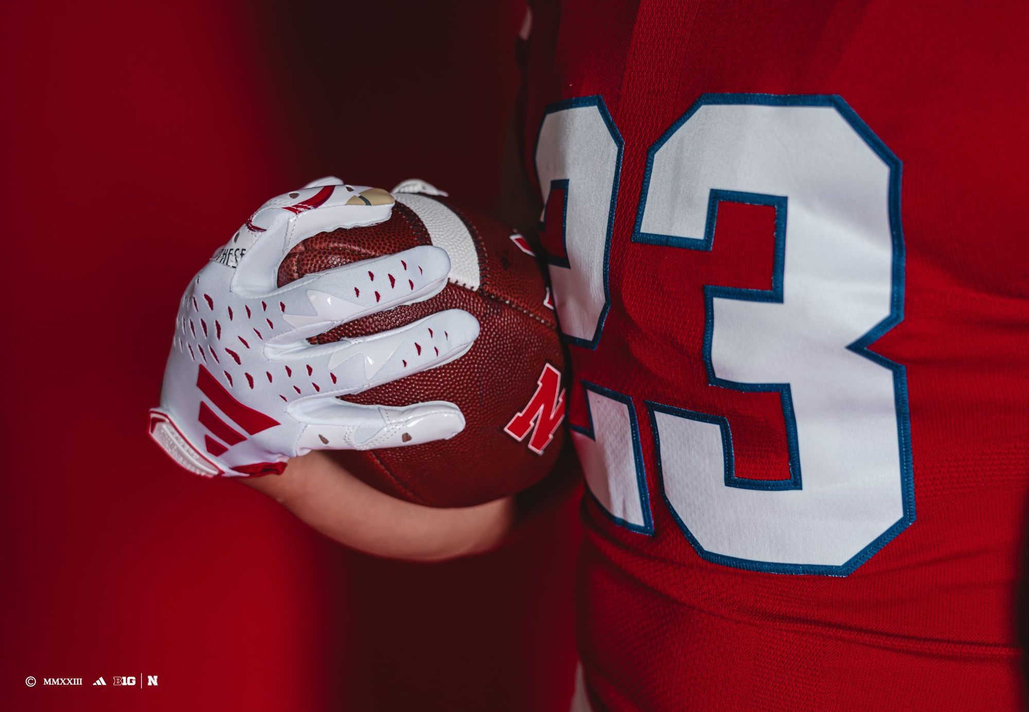
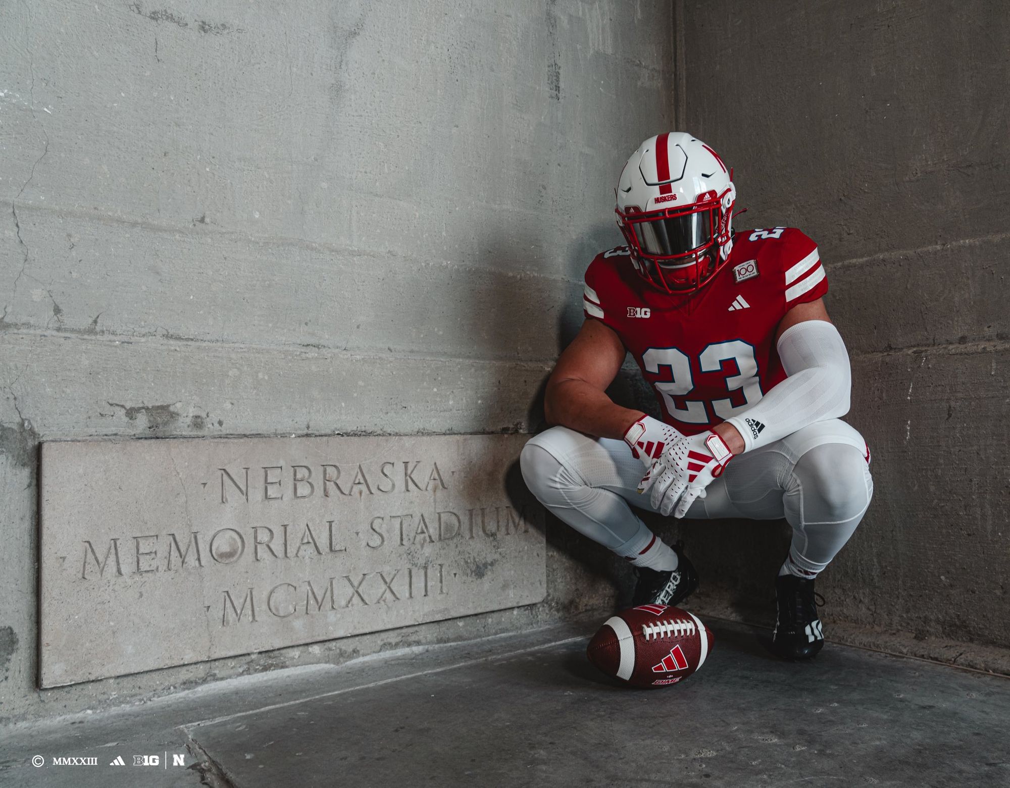
23. Nebraska - Memorial Stadium 100th Anniversary (Last week: NR)
Via Nebraska Football
Nebraska's celebrating their 100th season in Memorial Stadium with these alternates against Northwestern on October 21. The numbers outlined in blue are a tribute to the Huskers' 1923 game vs. Oklahoma where they wore blue uniforms to avoid confusion between the two teams because OU only packed their crimson home uniforms. If you look close enough at the first picture, you'll notice four different quotes on the shoulder stripes, which you can learn more about here.
22. Utah State (Last week: NR)
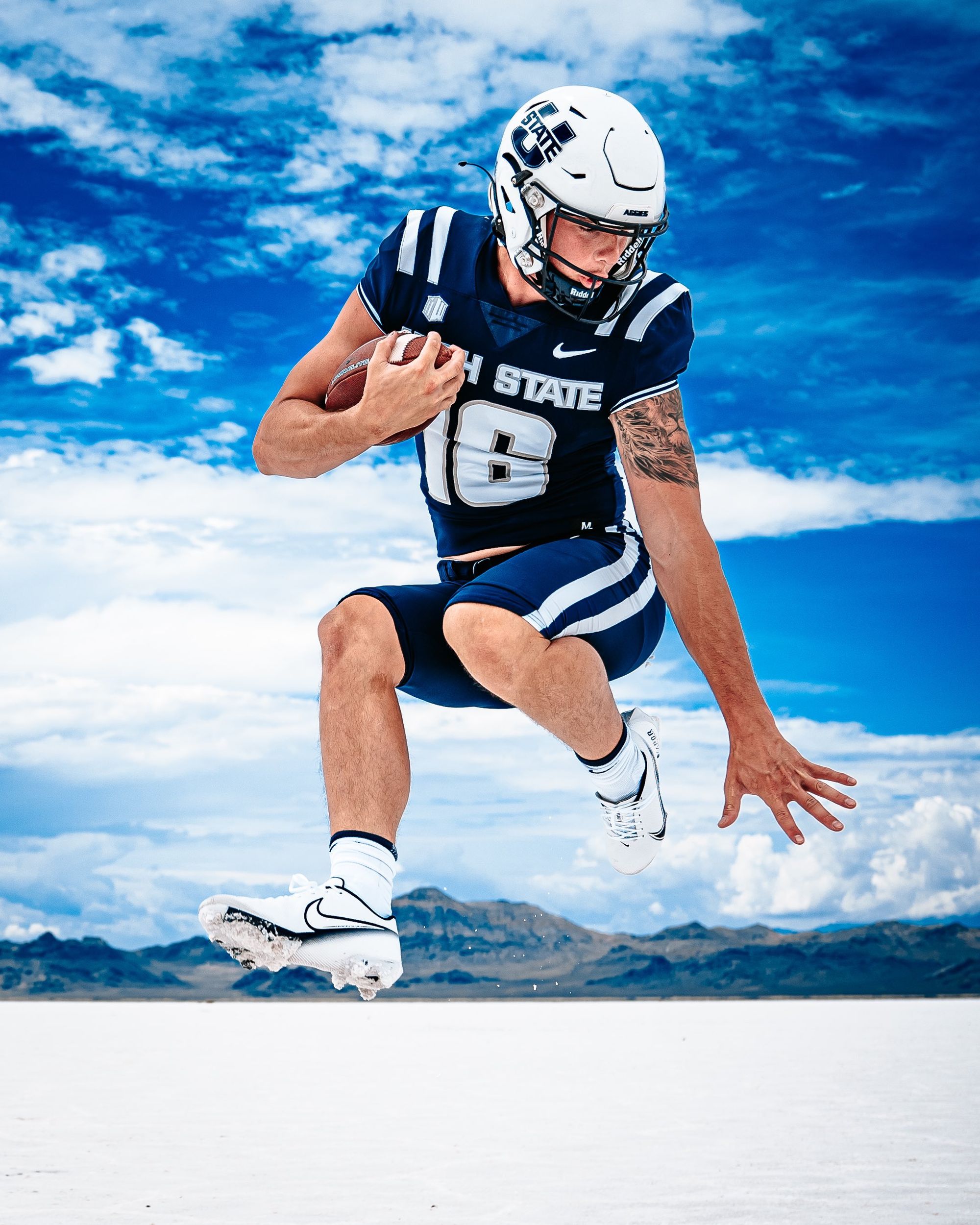
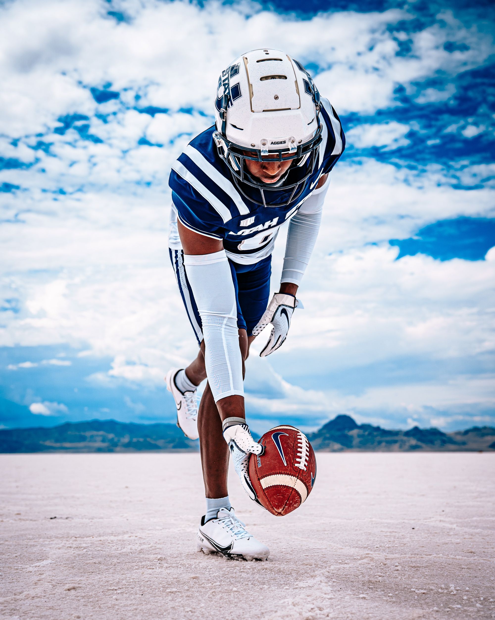
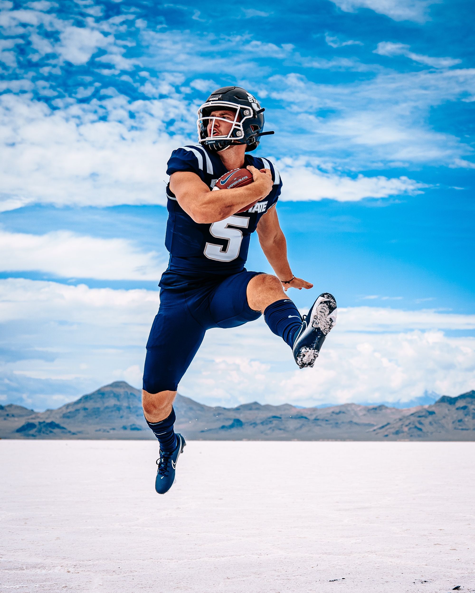
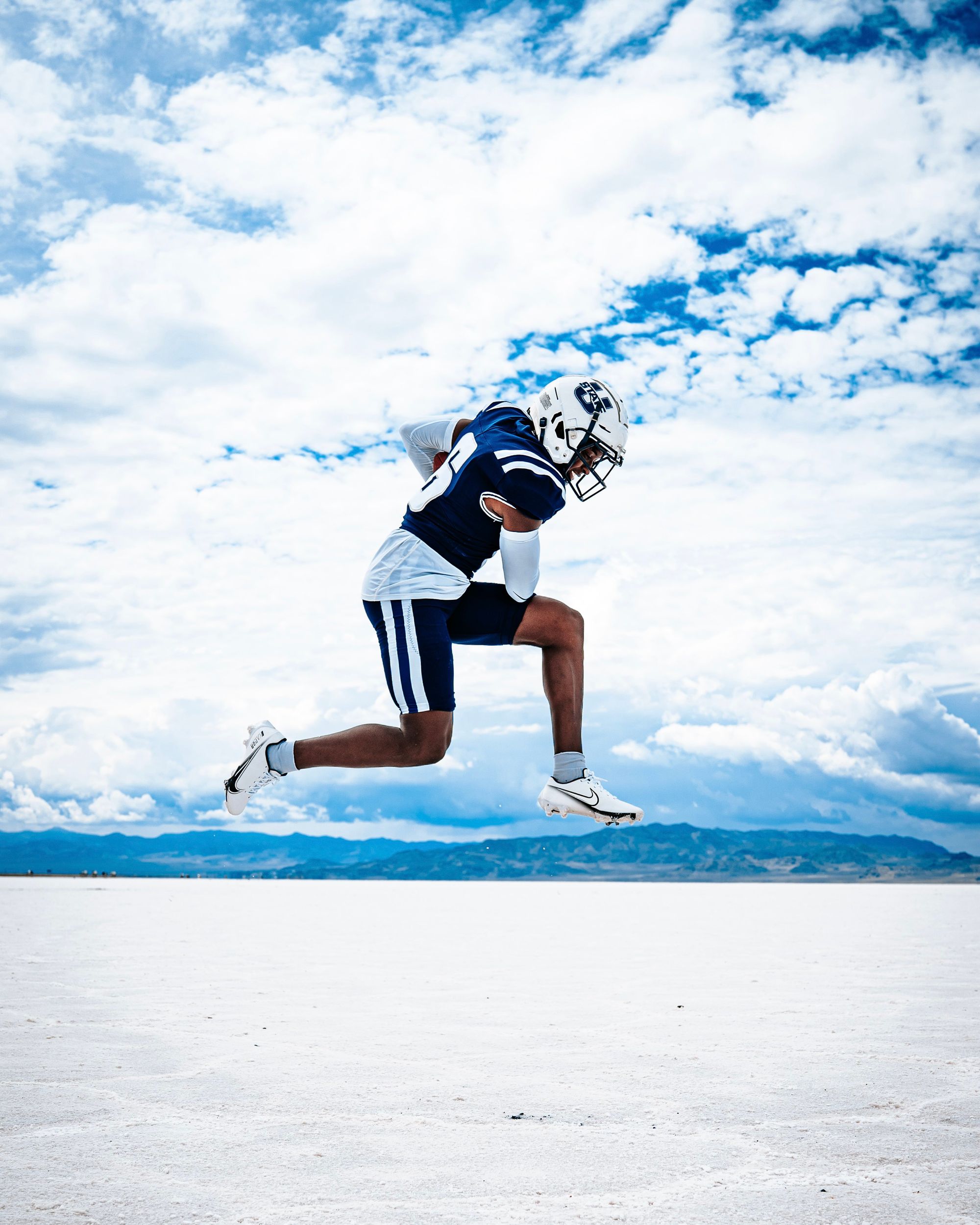
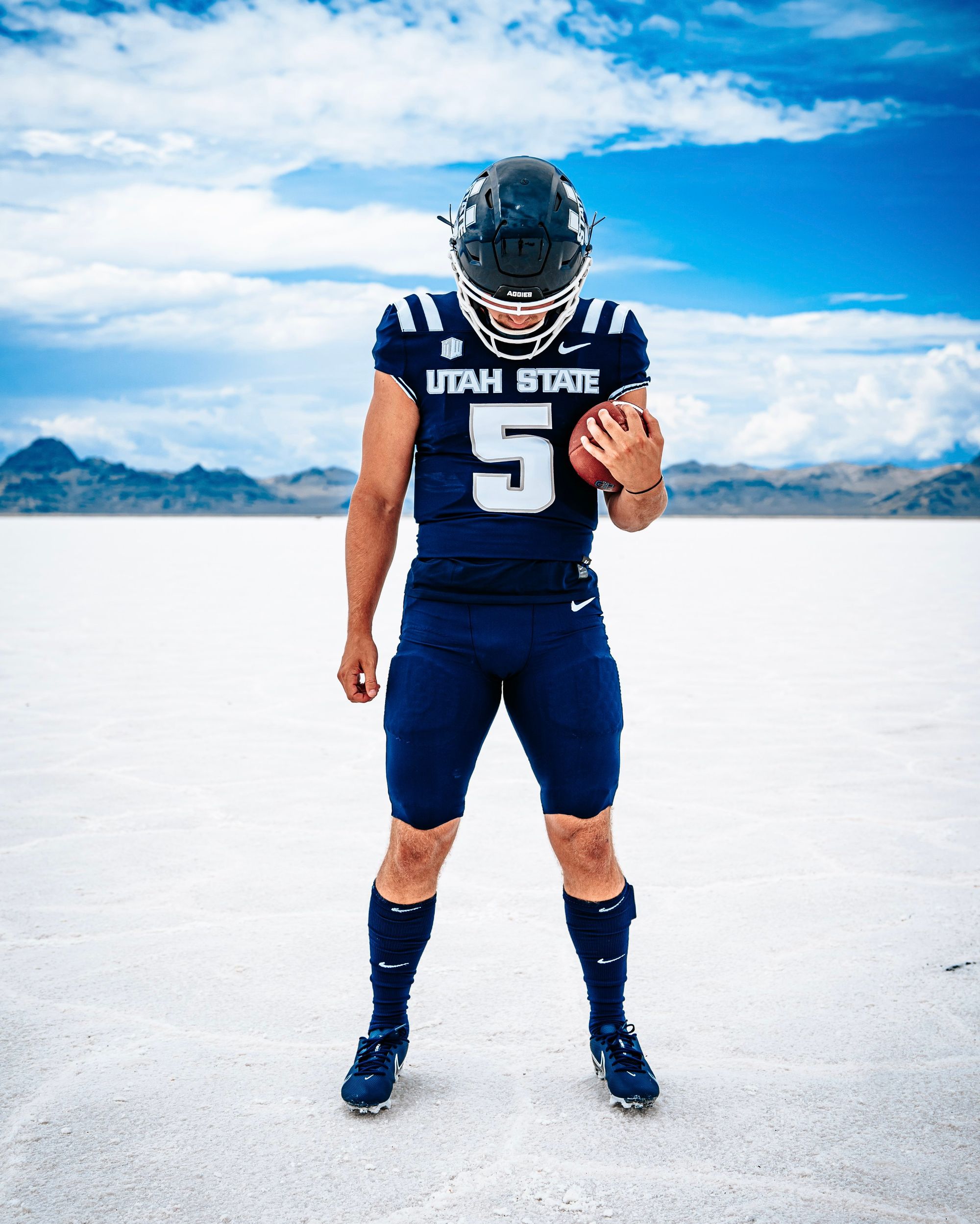
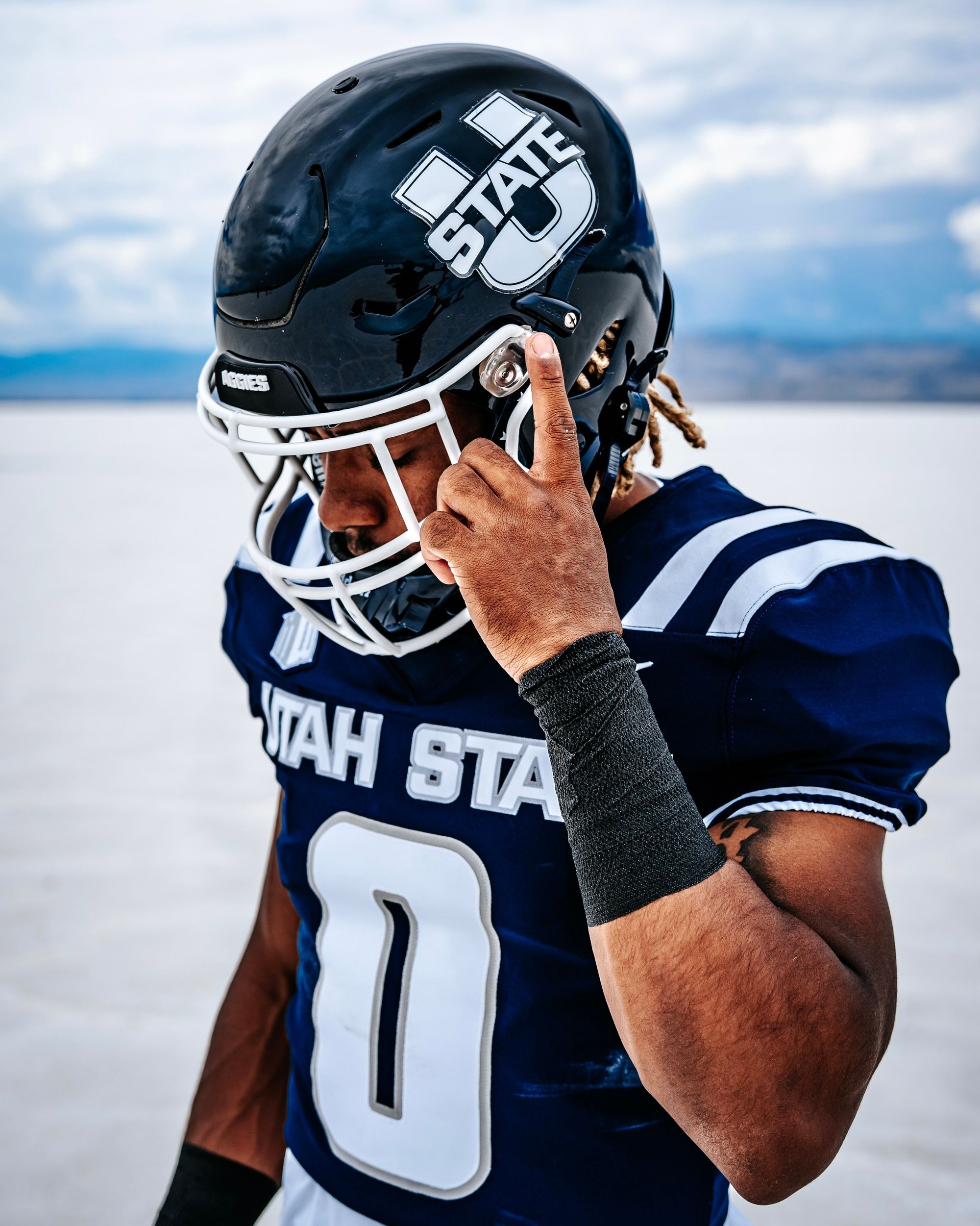
Via Utah State Football
Utah State's already been rocking the white version of this as their road uniform, so it makes sense that they'd introduce a home version.
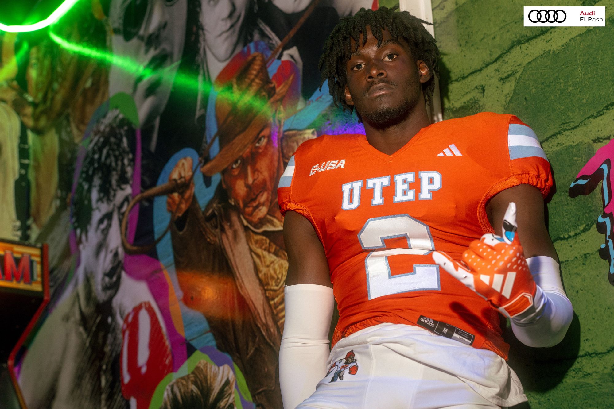
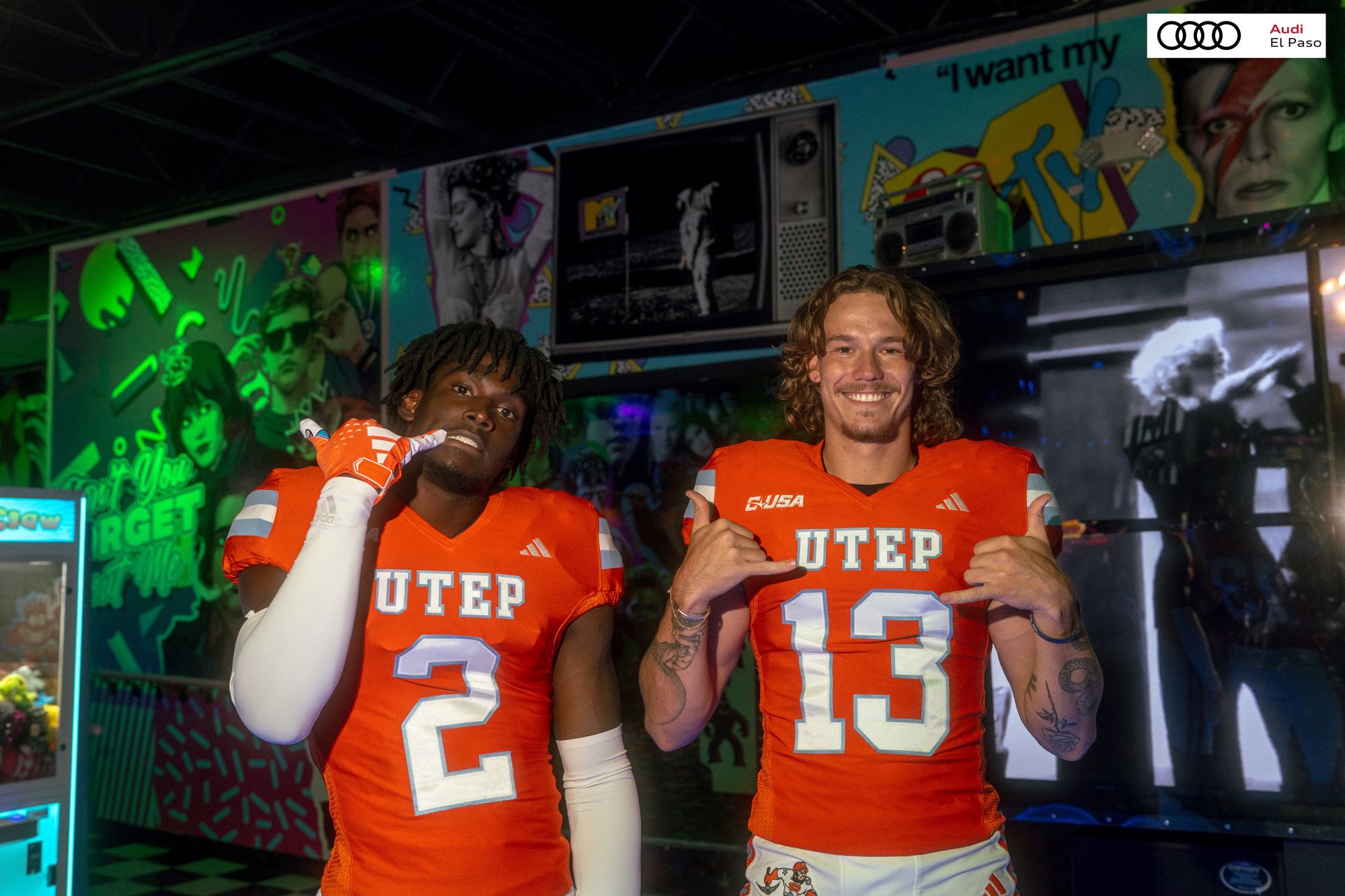
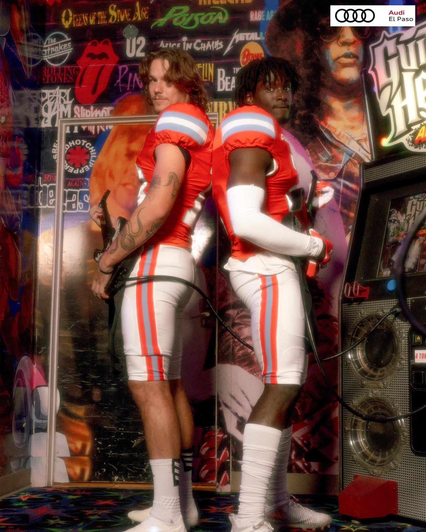
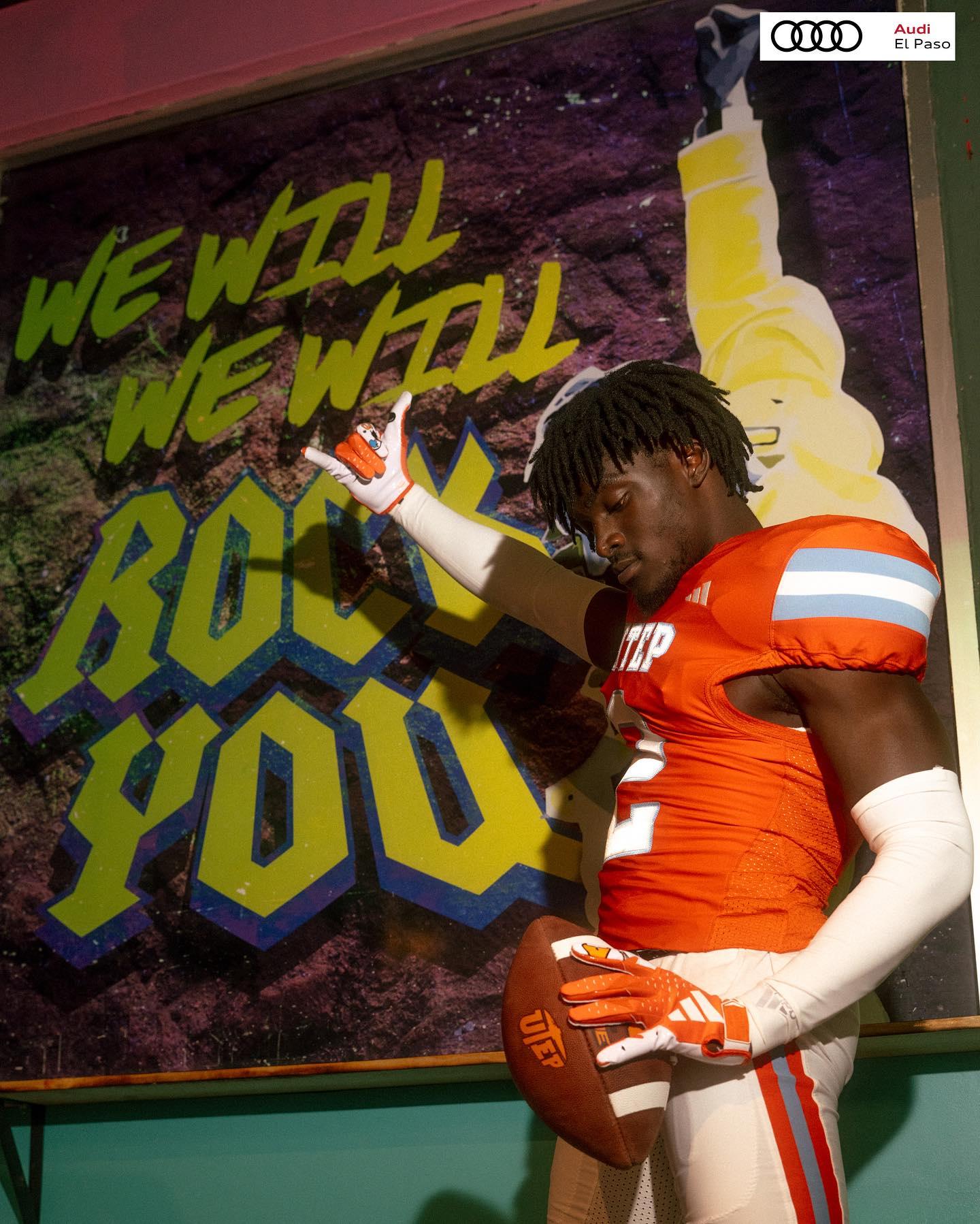
21. UTEP (Last week: 22)
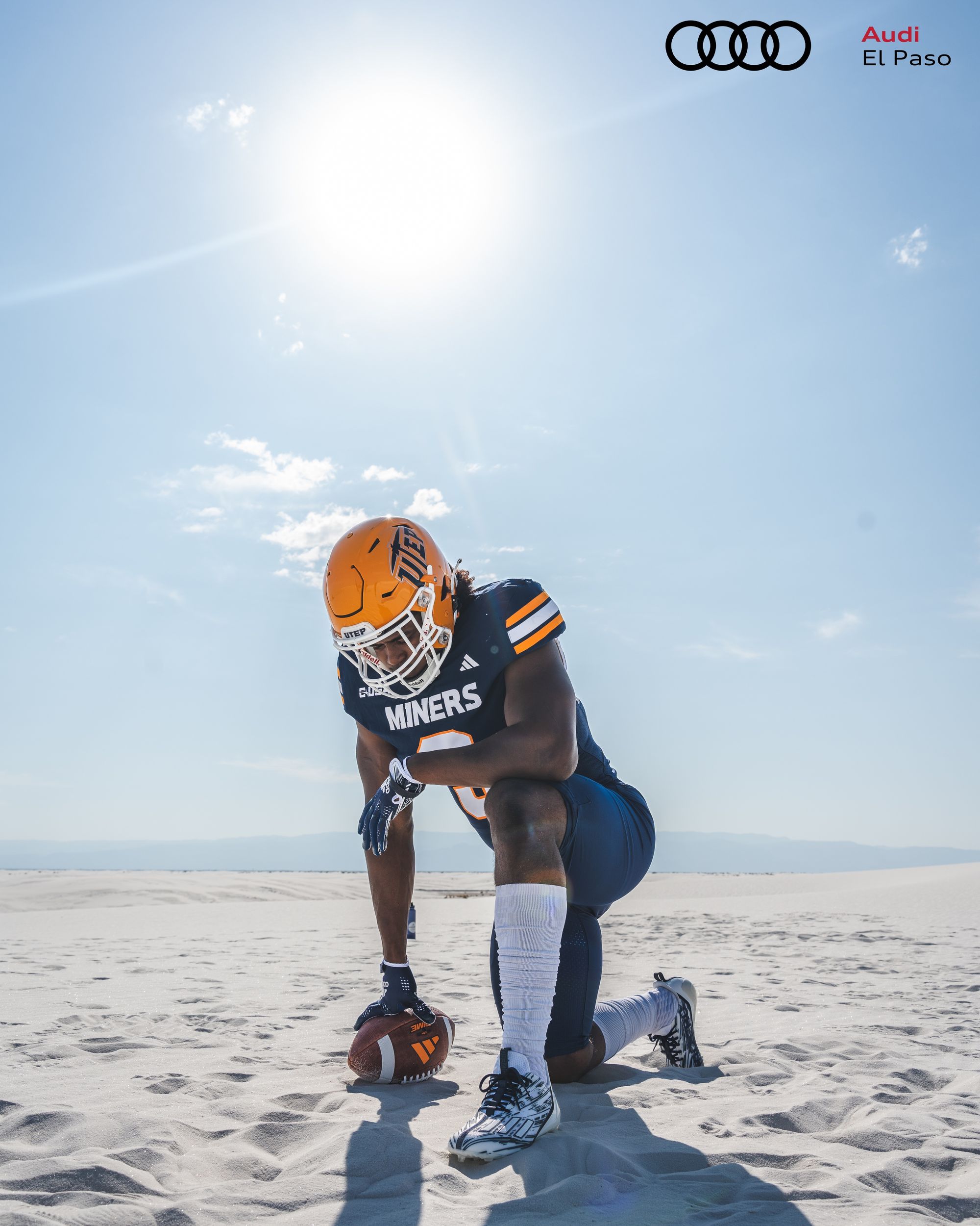
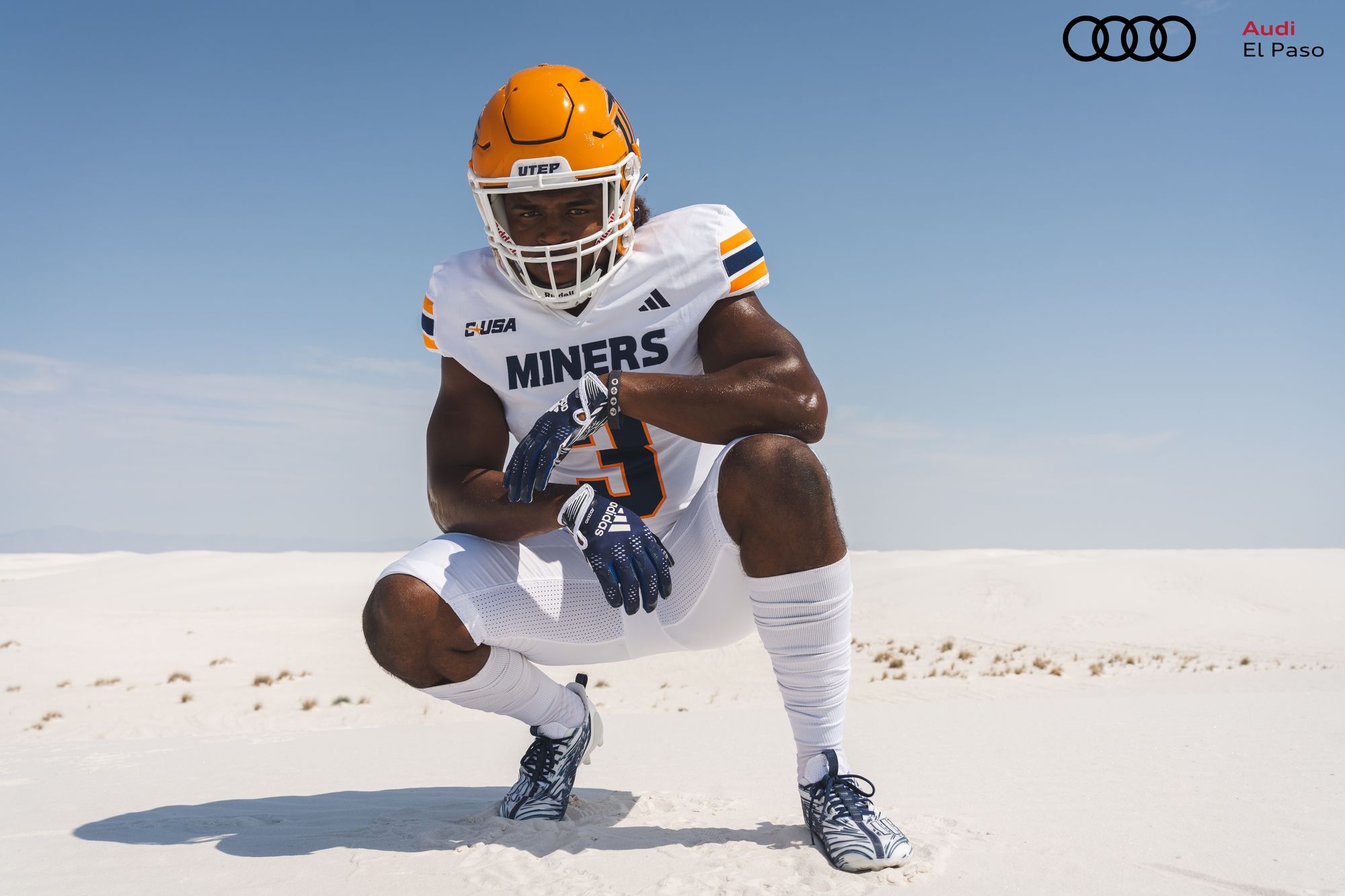
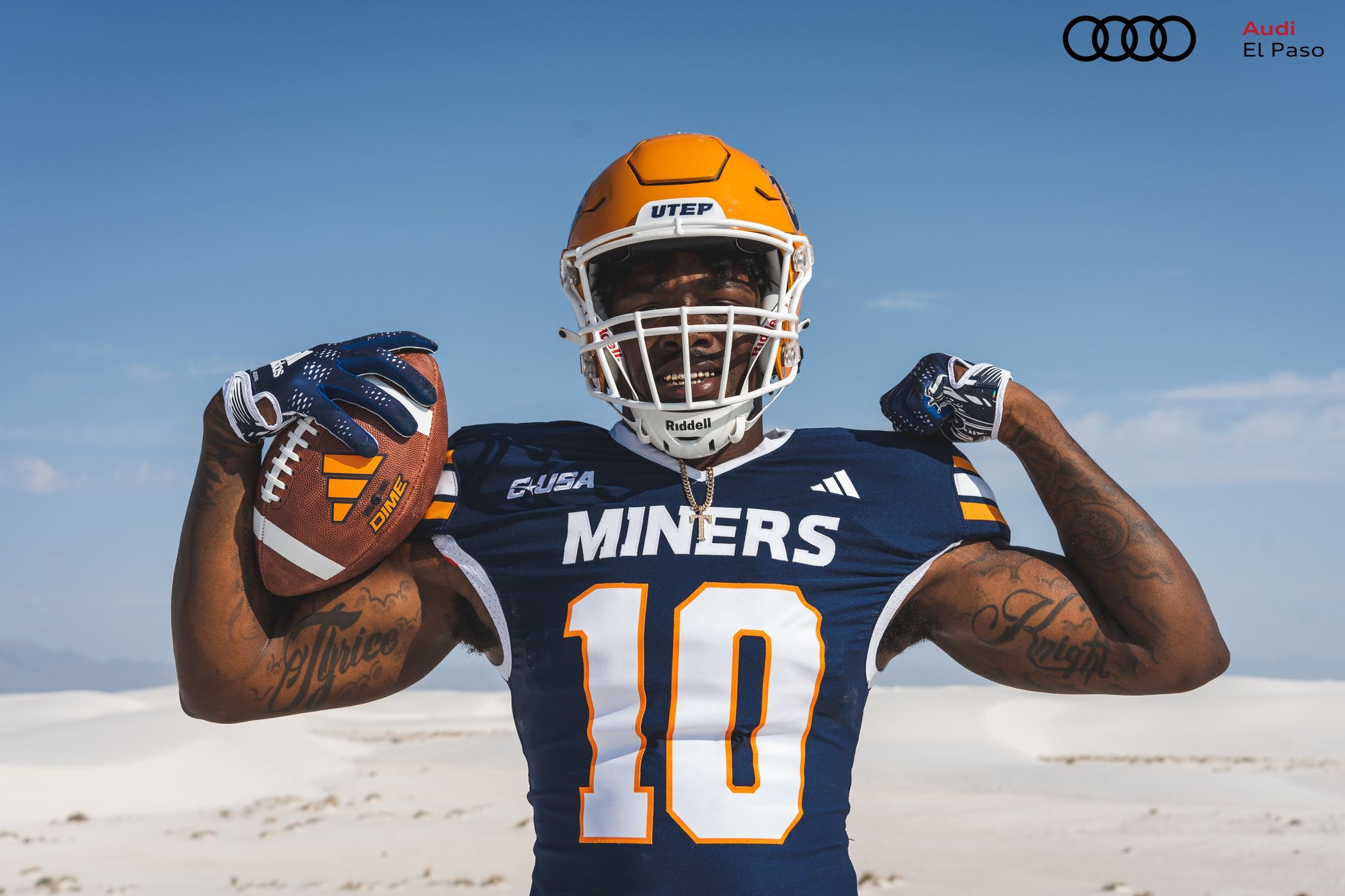
Via UTEP Football
The end result of UTEP's switch from Nike to Adidas isn't bad. These are a slight improvement, even if it feels like the orange isn't dark enough. It's a solid set that doesn't do anything offensive. Miners fans: Don't worry, this isn't the last time you're in these rankings 👀
20. Louisiana Tech (Last week: 17)
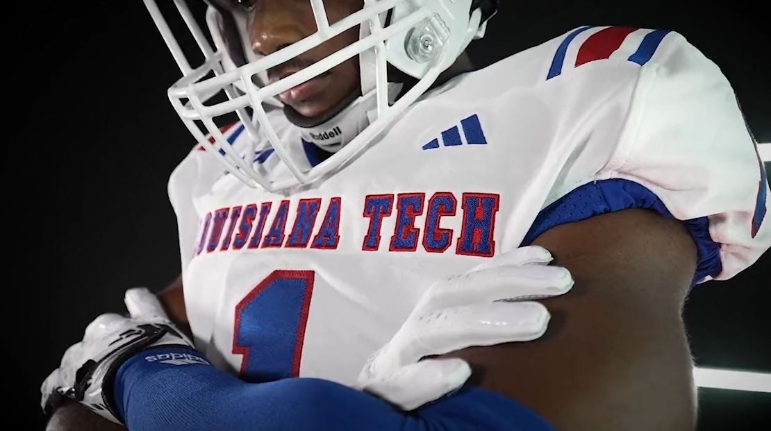
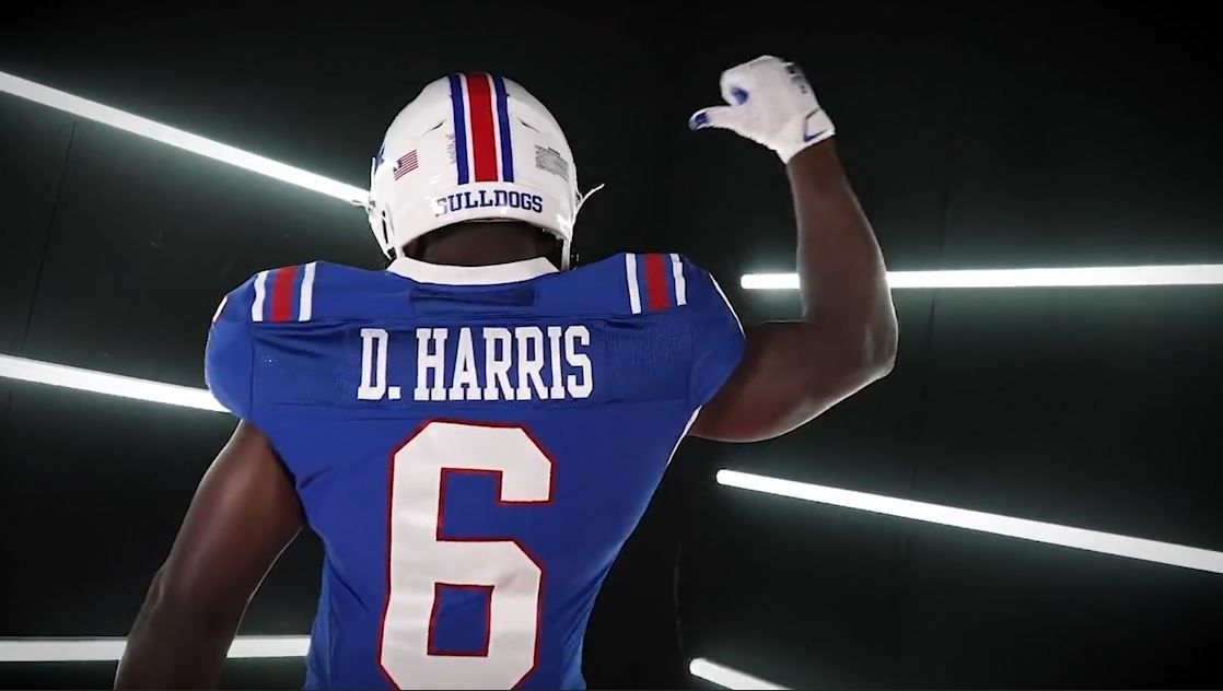
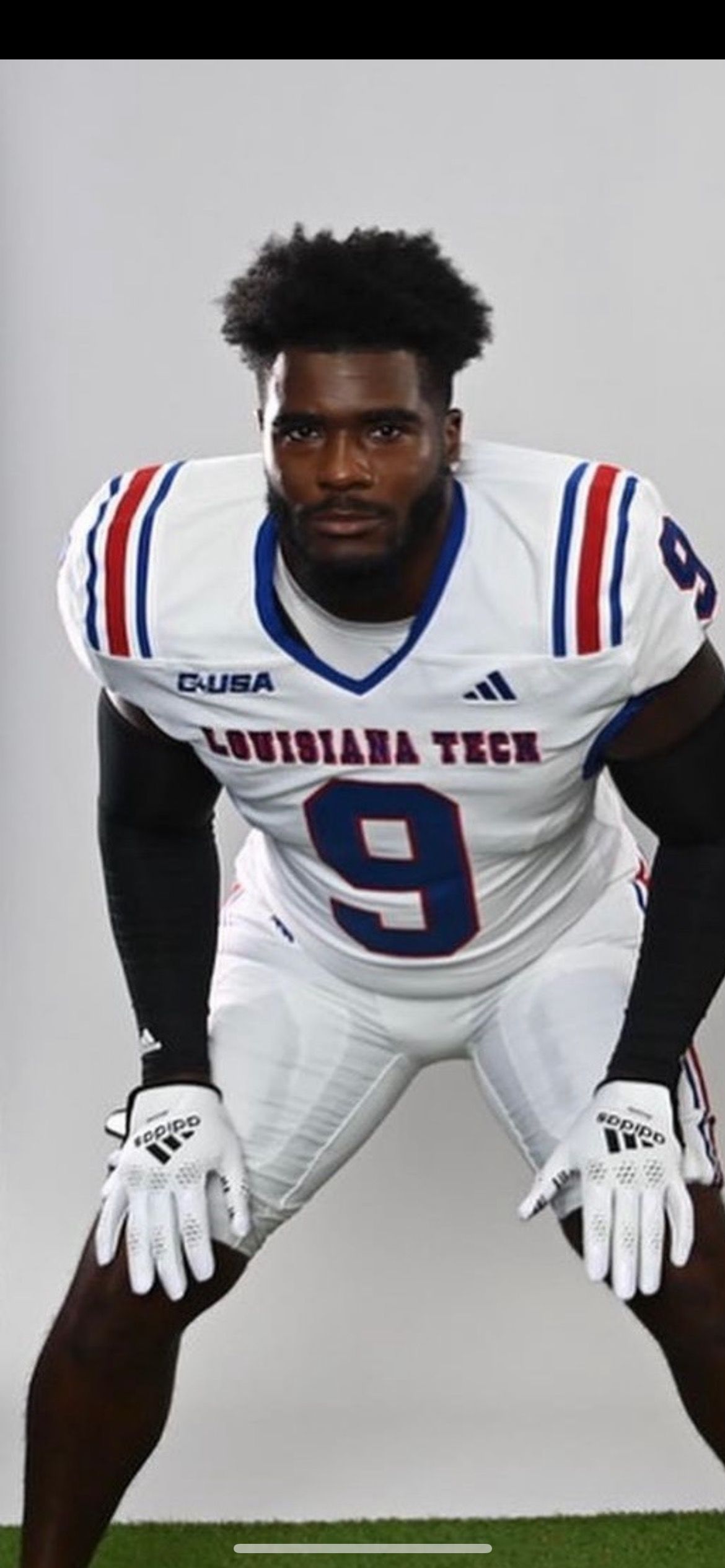
Via Louisiana Tech Football
Another Adidas school that shelved a bad uniform set for one that has a clean throwback feel. Everything here is tidy, and I love the full-length shoulder stripes. My good friend HUGH DAVIS (9) looks ready to make First-Team All-C-USA in these.
19. Notre Dame - Green alternates vs. Ohio State (Last week: 11)
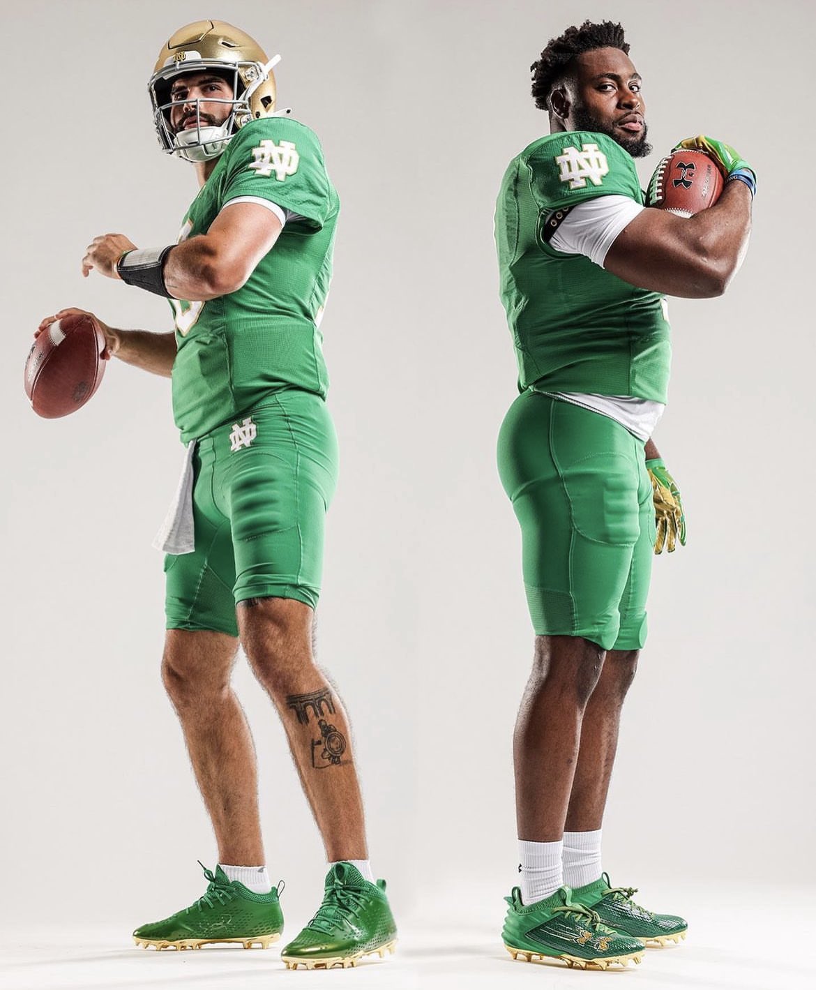
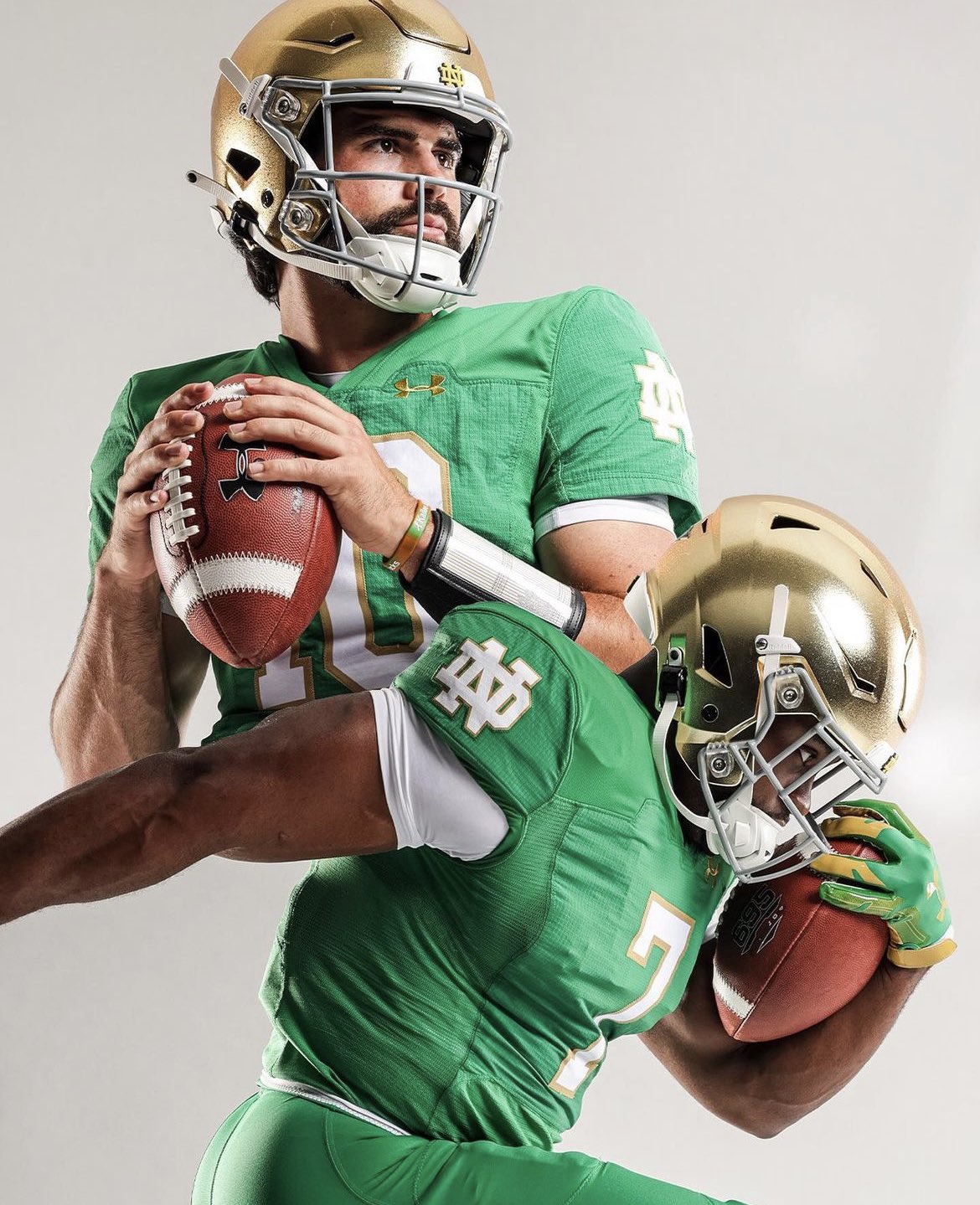
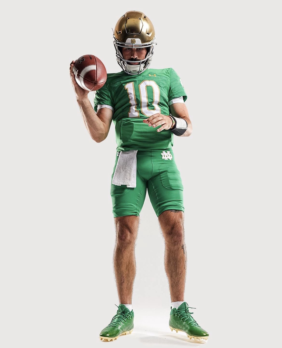
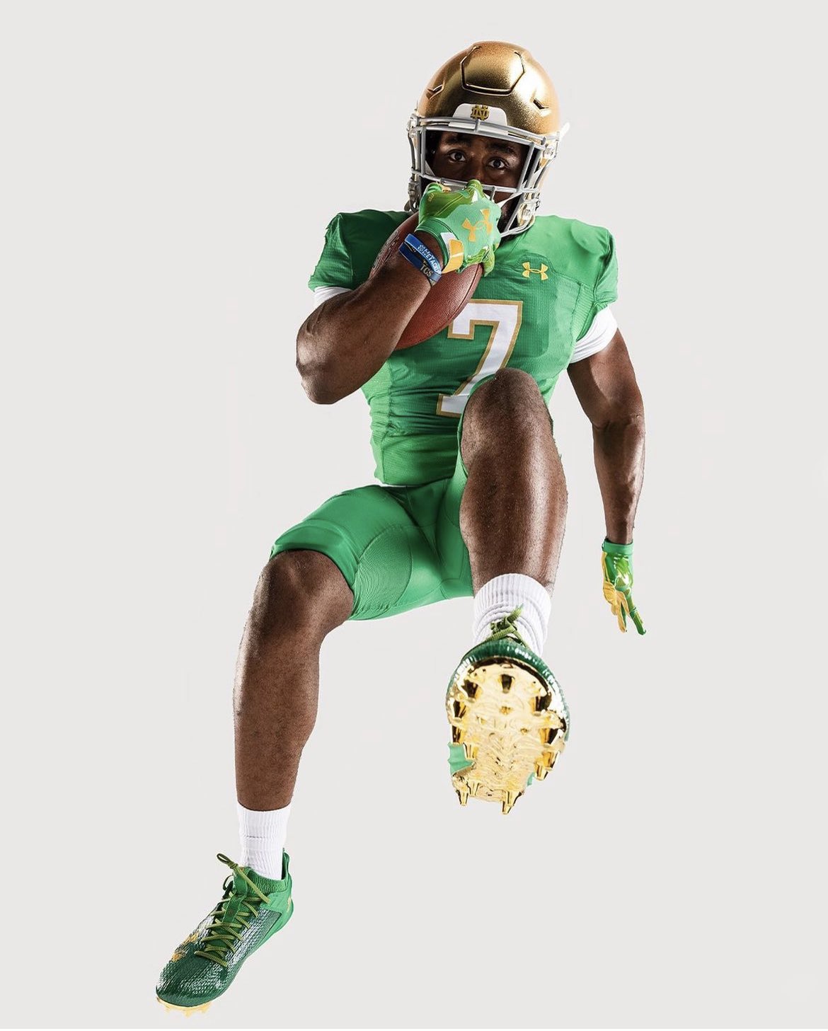
Via Notre Dame Football
I'm sure I'm in the minority here, but Under Armour has quietly hit their stride with Notre Dame. According to my shoddy research, this will only be the second time that they've ever worn green pants. The first was a disaster, but these are a million times better. They also buck the trend of blue numbers on green Notre Dame jerseys, which is an added bonus. If only we could get Ohio State to wear gray sleeves opposite of them....
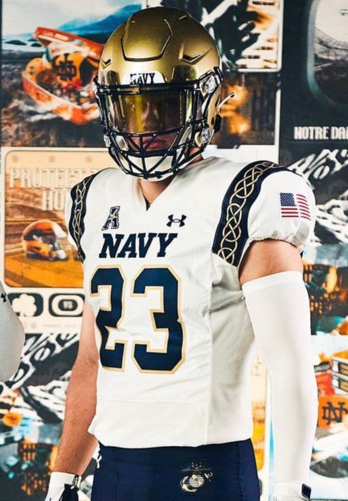
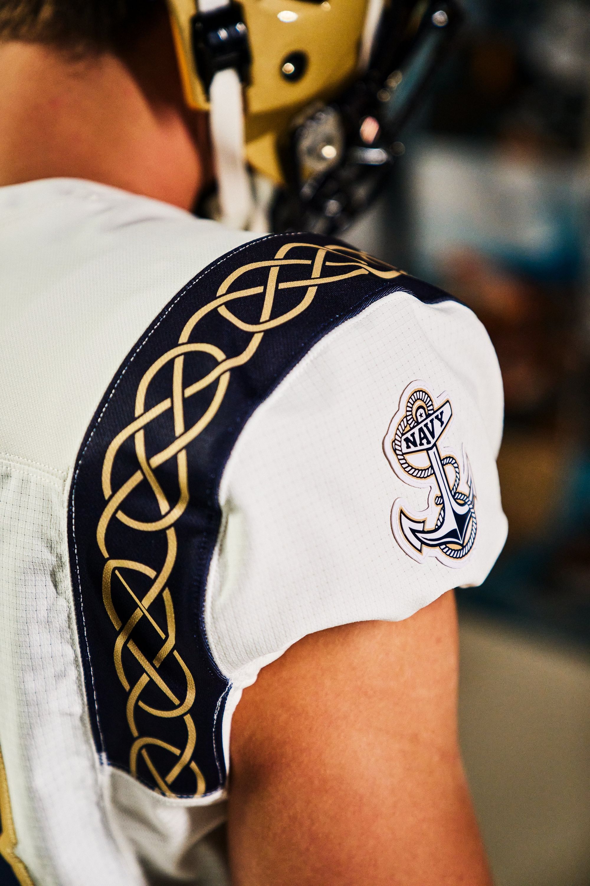
18. Notre Dame - Ireland alternates vs Navy (Last week: 10)
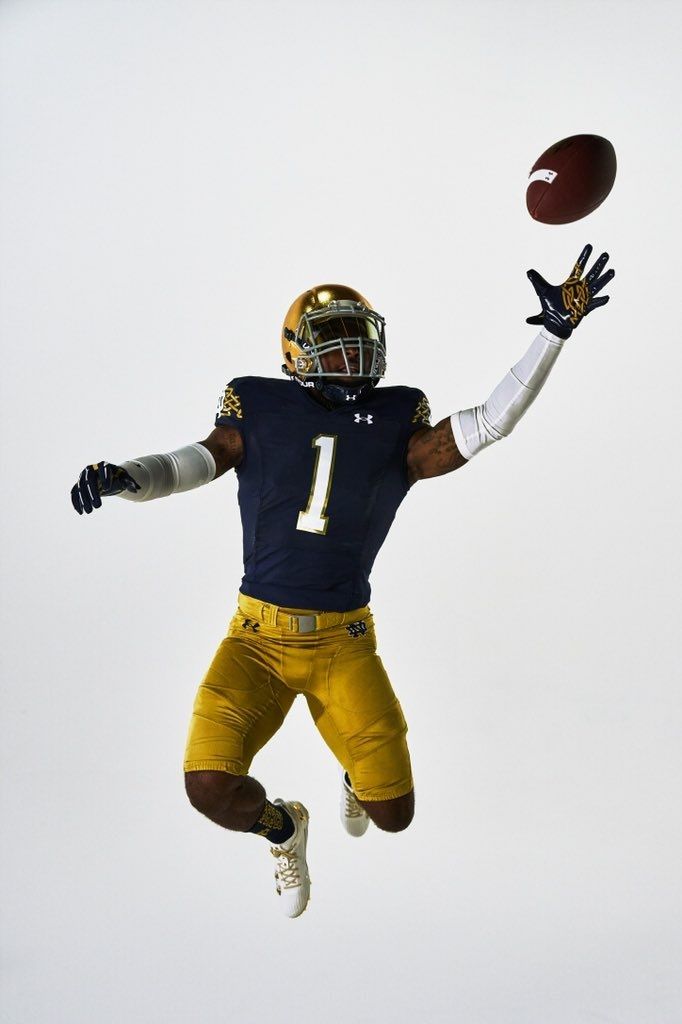
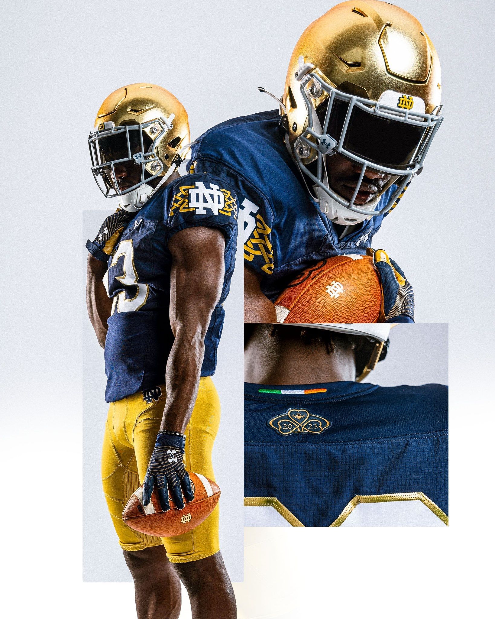
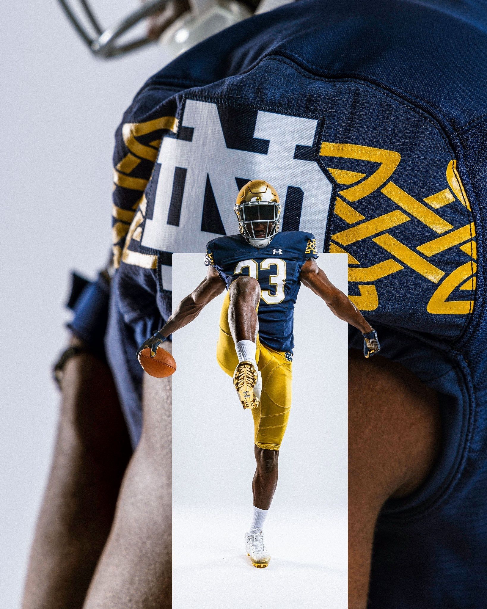
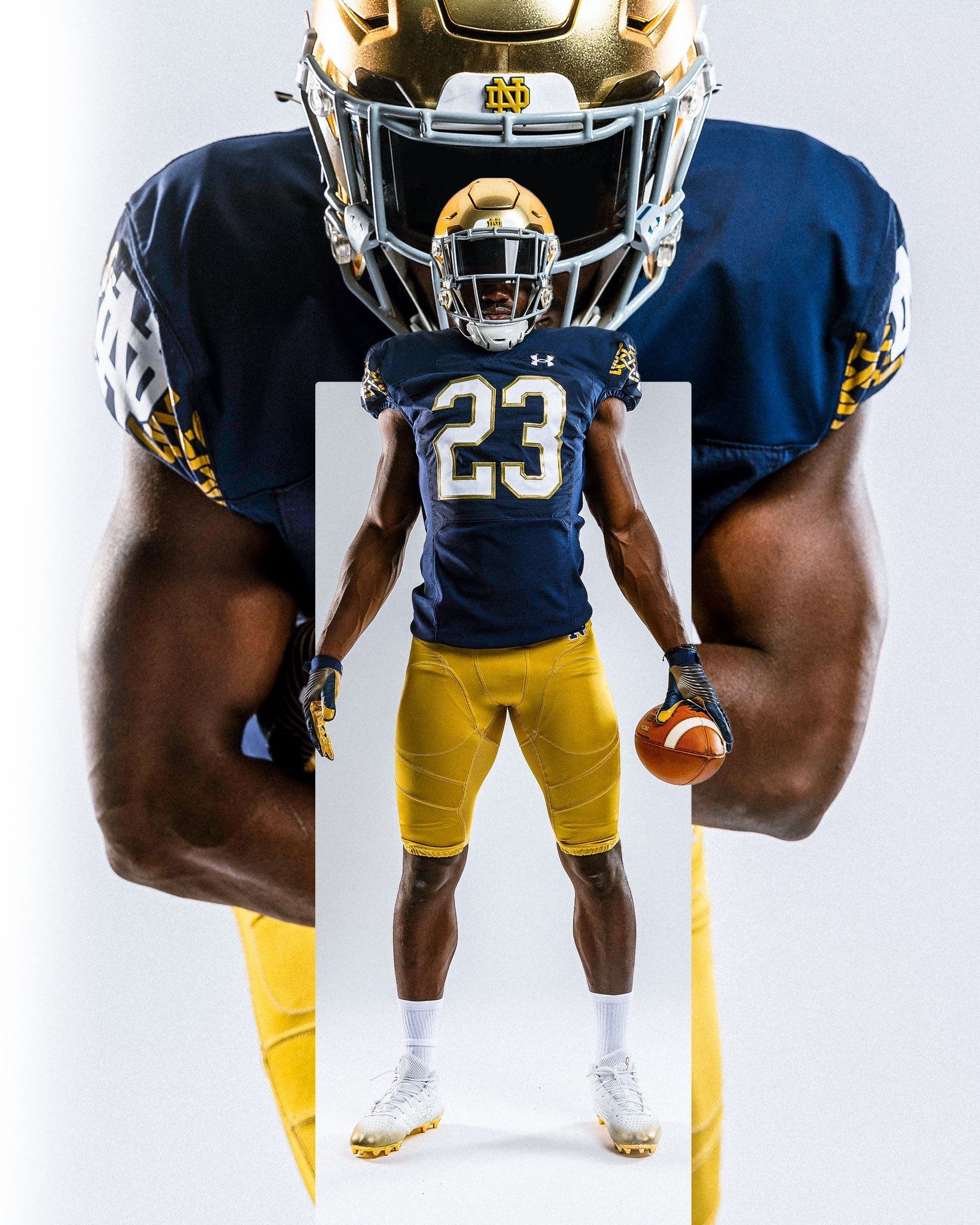
Via Notre Dame Football
Like I just said: Under Armour's doing a good job with Notre Dame! Nothing crazy here; just a Gaelic pattern on the shoulders, and a subtle Irish flag design on the back of the neck.
17. Western Kentucky (Last week 15)
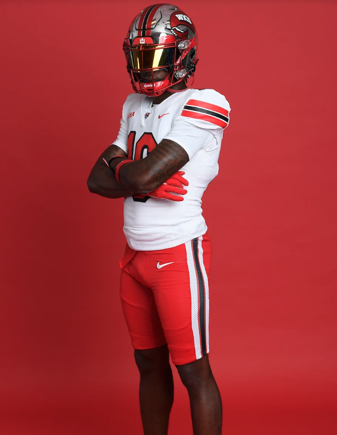
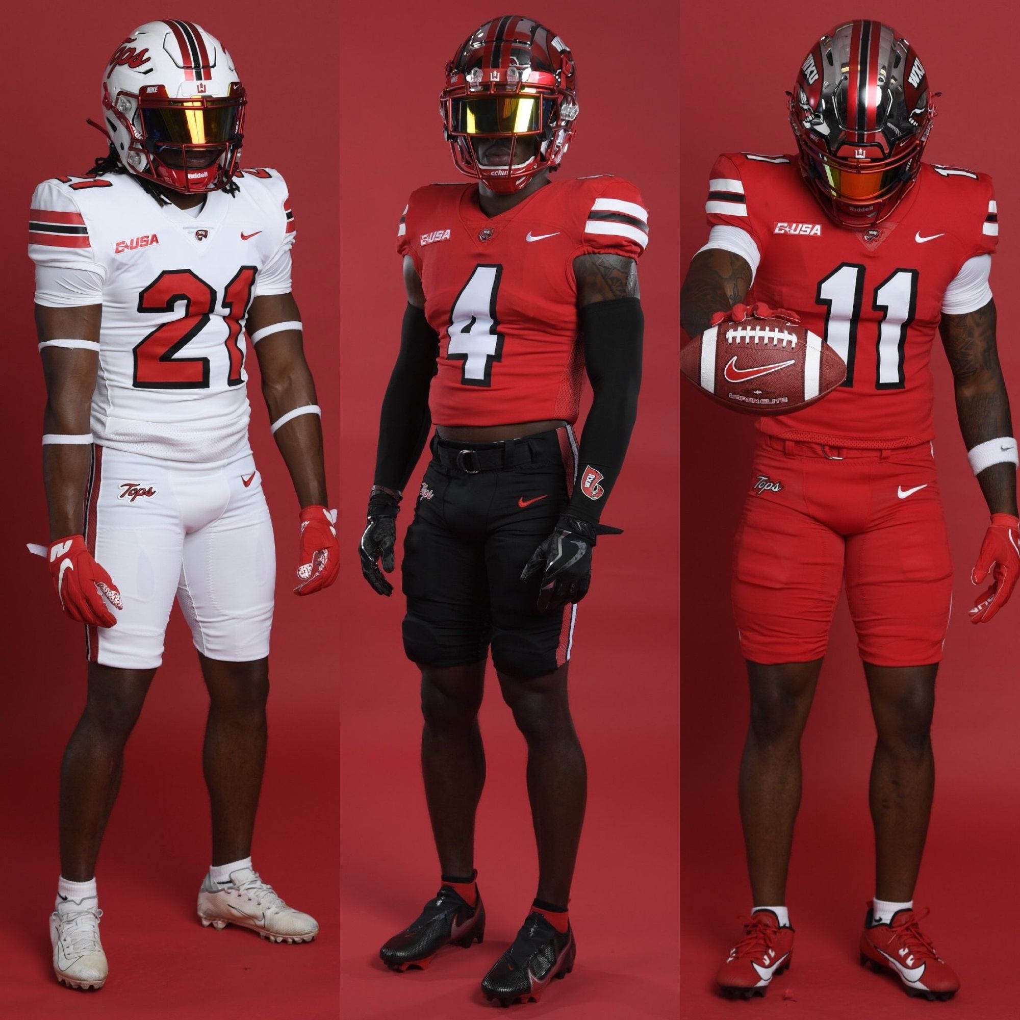
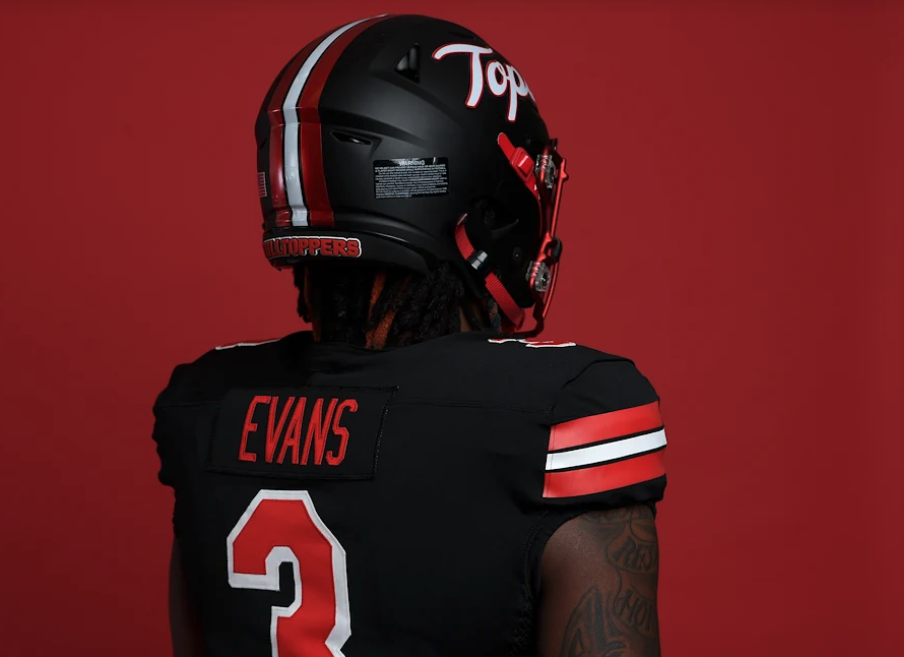
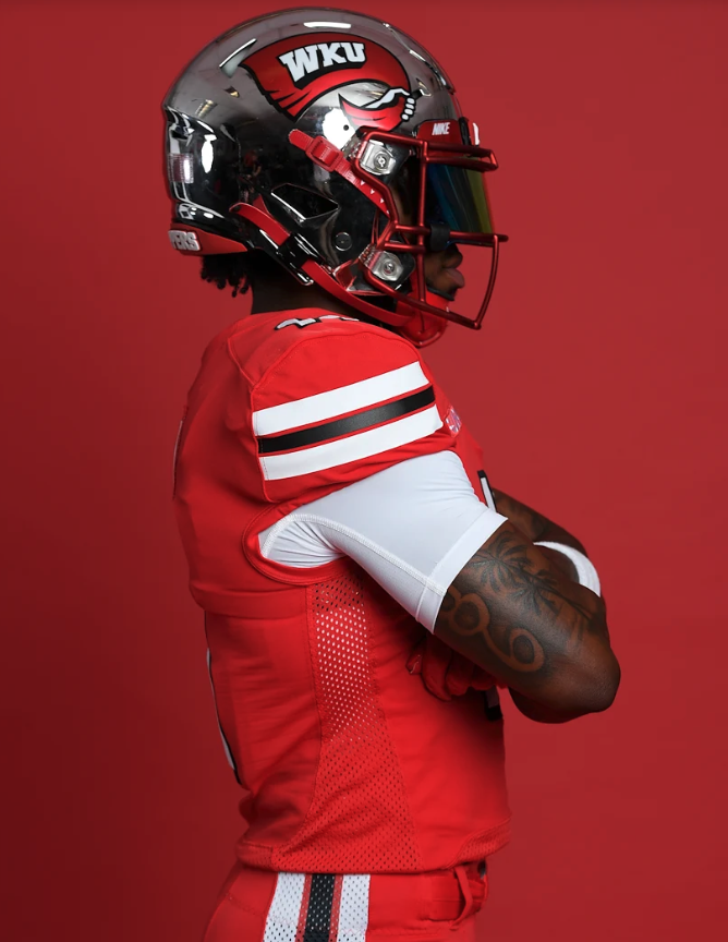
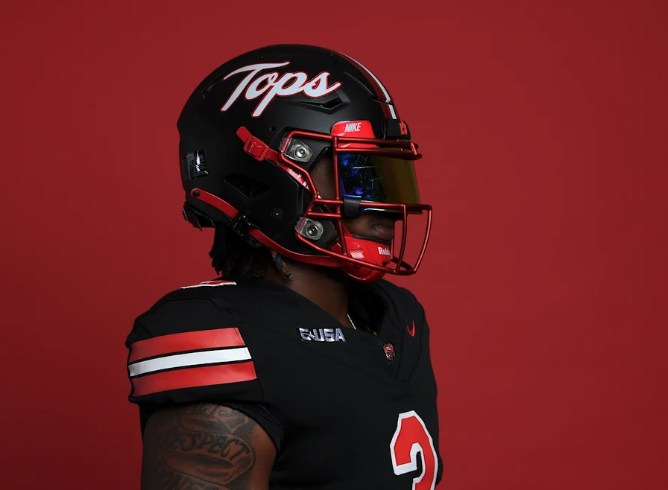
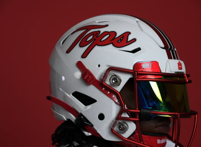
Via Western Kentucky Football
WKU was stuck in a stale, late-2000s uniform design and traded it in for something simple, yet super effective. The drop shadow numbers are sick, and I hope they wear the beautiful black and white 'Tops' helmets more often than the chrome one.
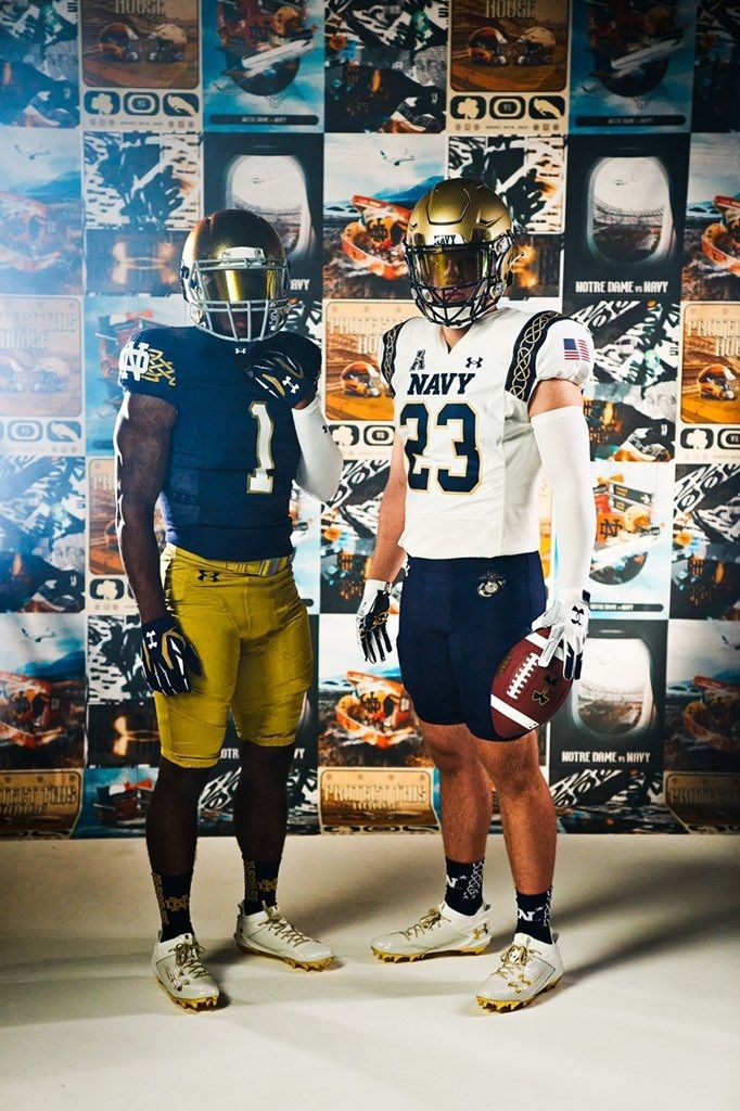
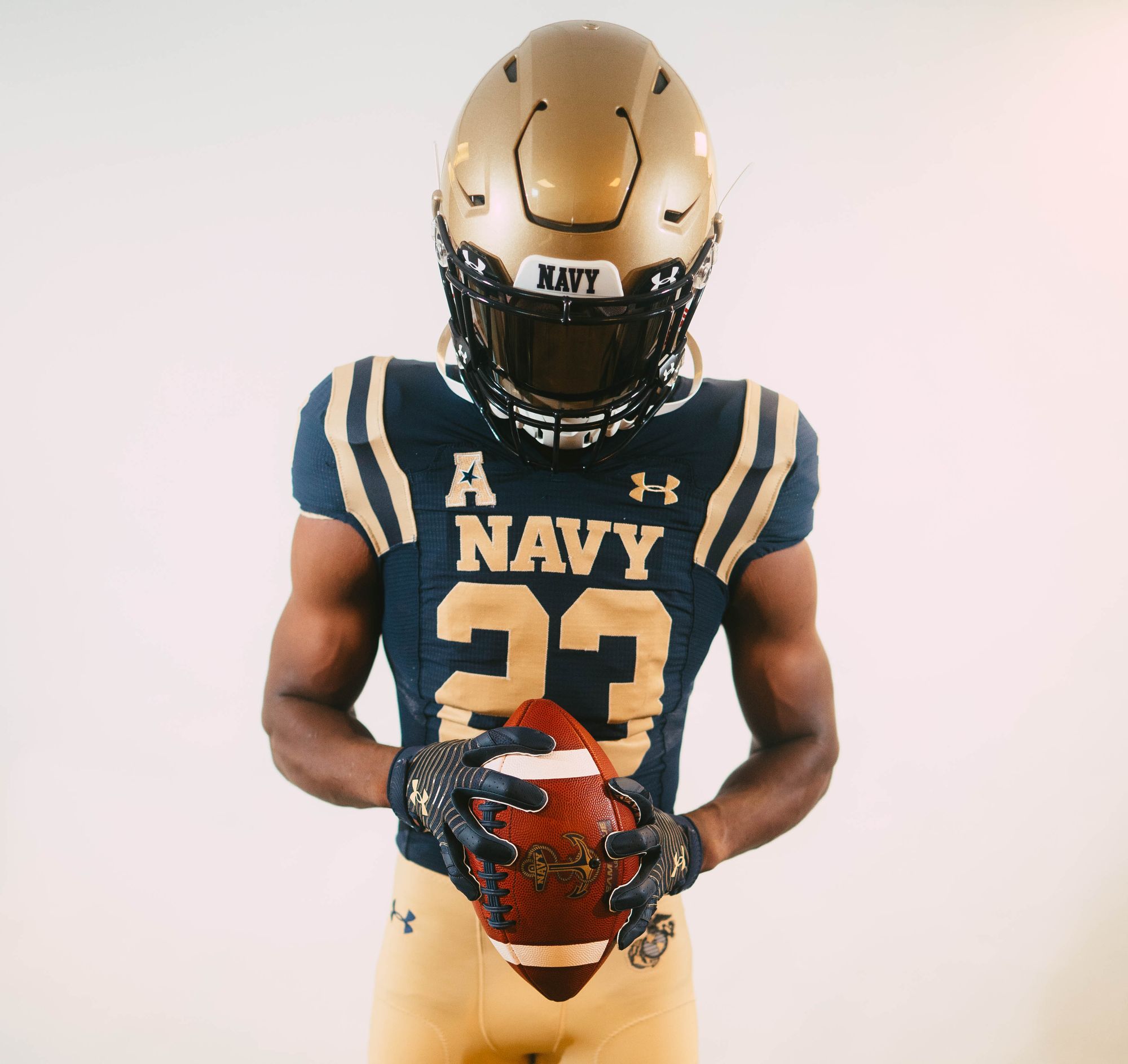
16. Navy - Ireland alternates vs Notre Dame (Last week: 9)
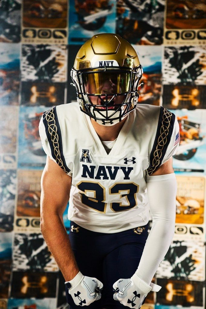
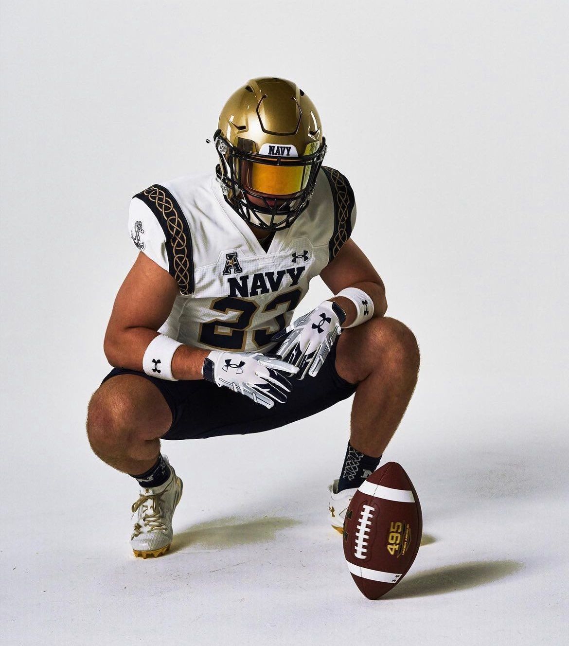
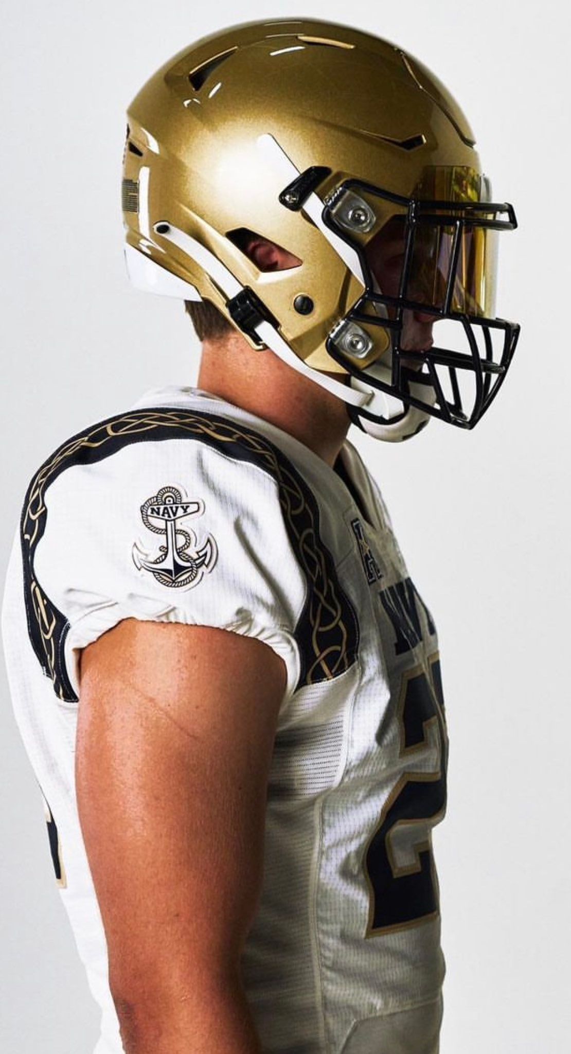
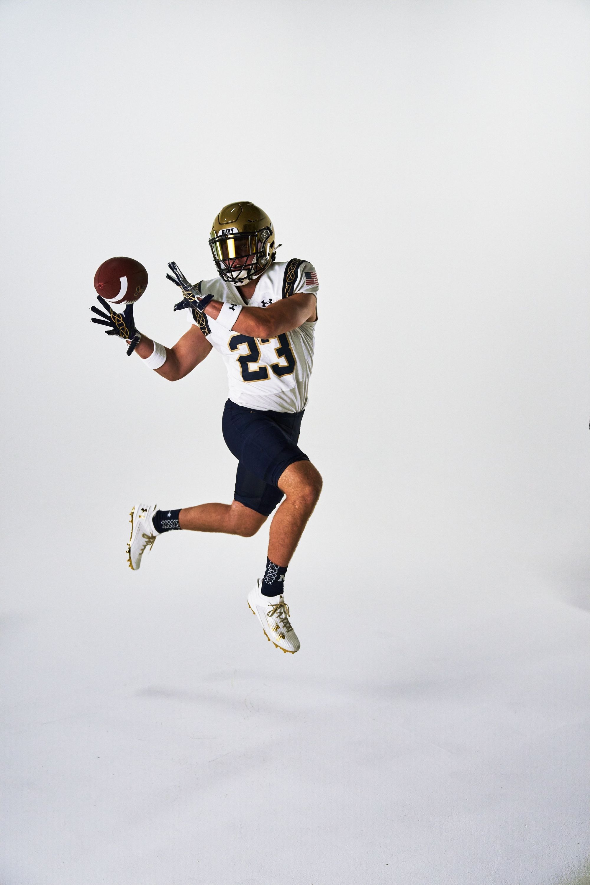
Via Navy Football
Notre Dame's counterparts for their August 26 season opener in Ireland took their shoulder design a step further, and that's why they're a couple spots higher.
15. Long Island (Last week: 16)
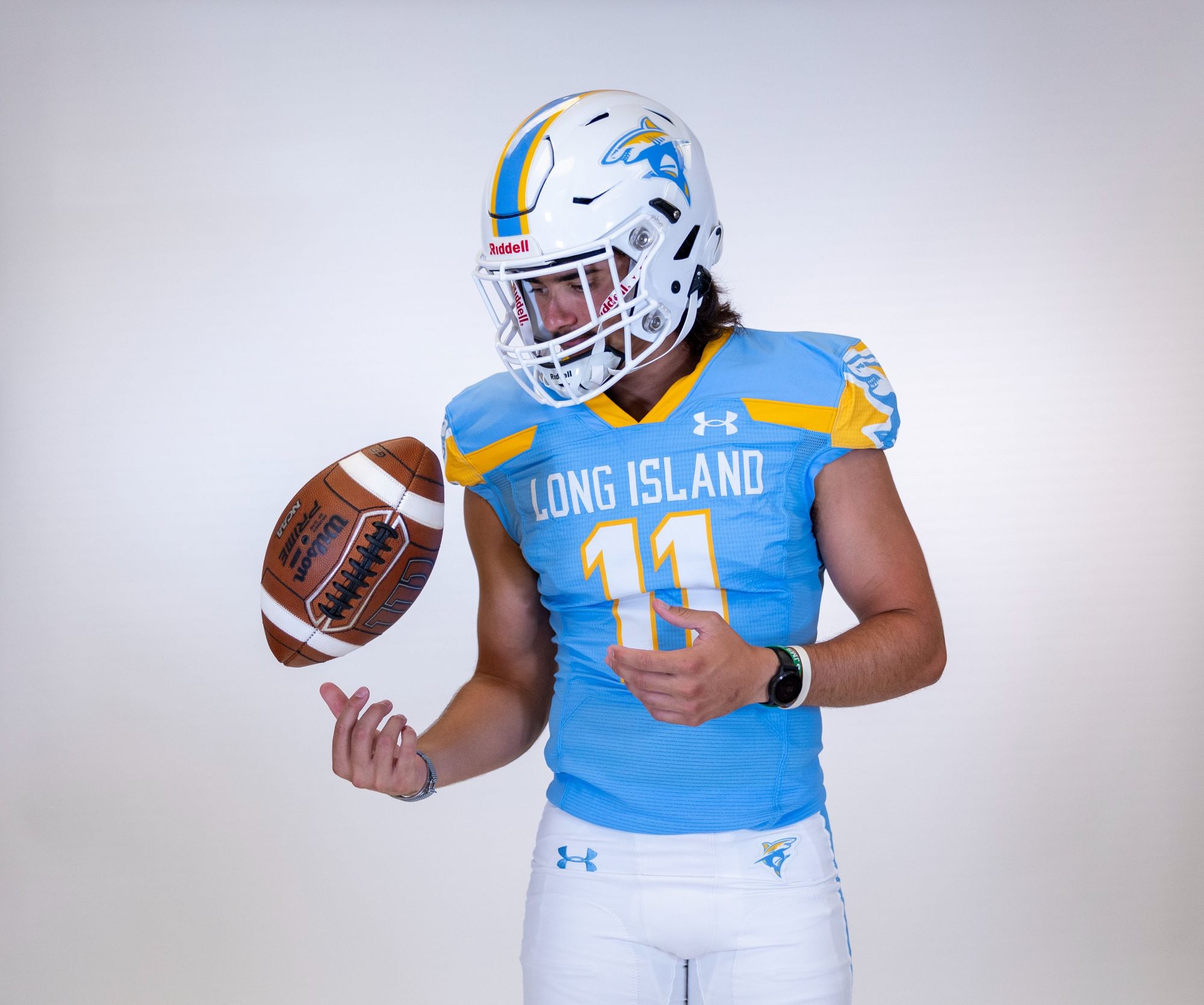
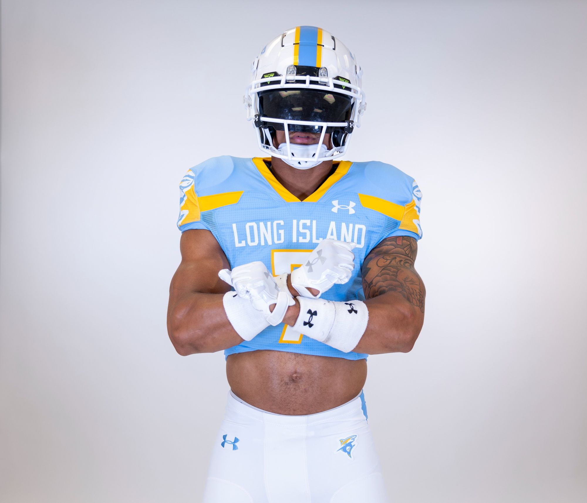
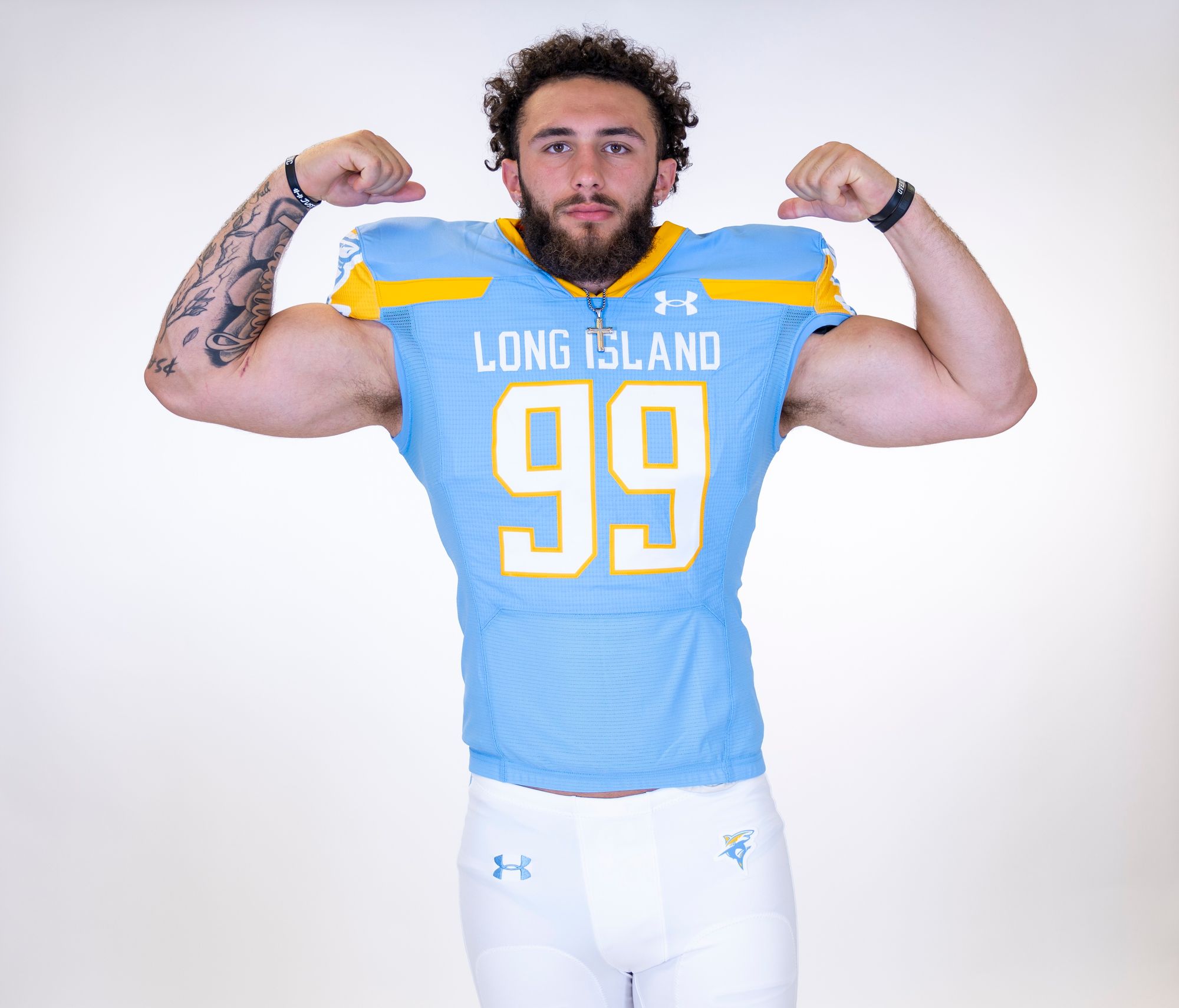
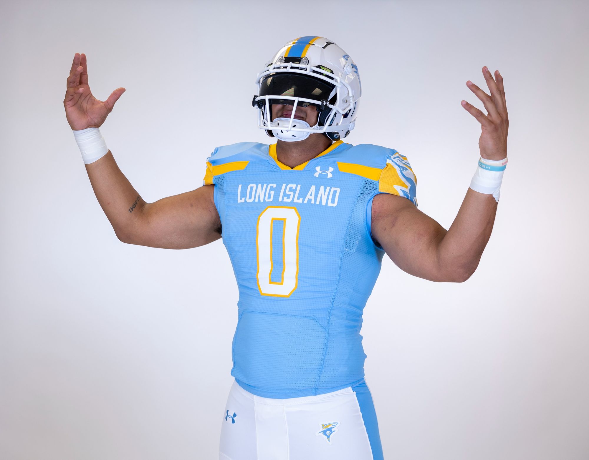
Via Long Island Football
There's one universal truth when it comes to uniforms: You can never go wrong with powder blue, especially if you pair it with light yellow. I wish more teams at both the college and pro levels understood this. Bonus points for the badass shark logo.
14. Navy (Last week: 14)
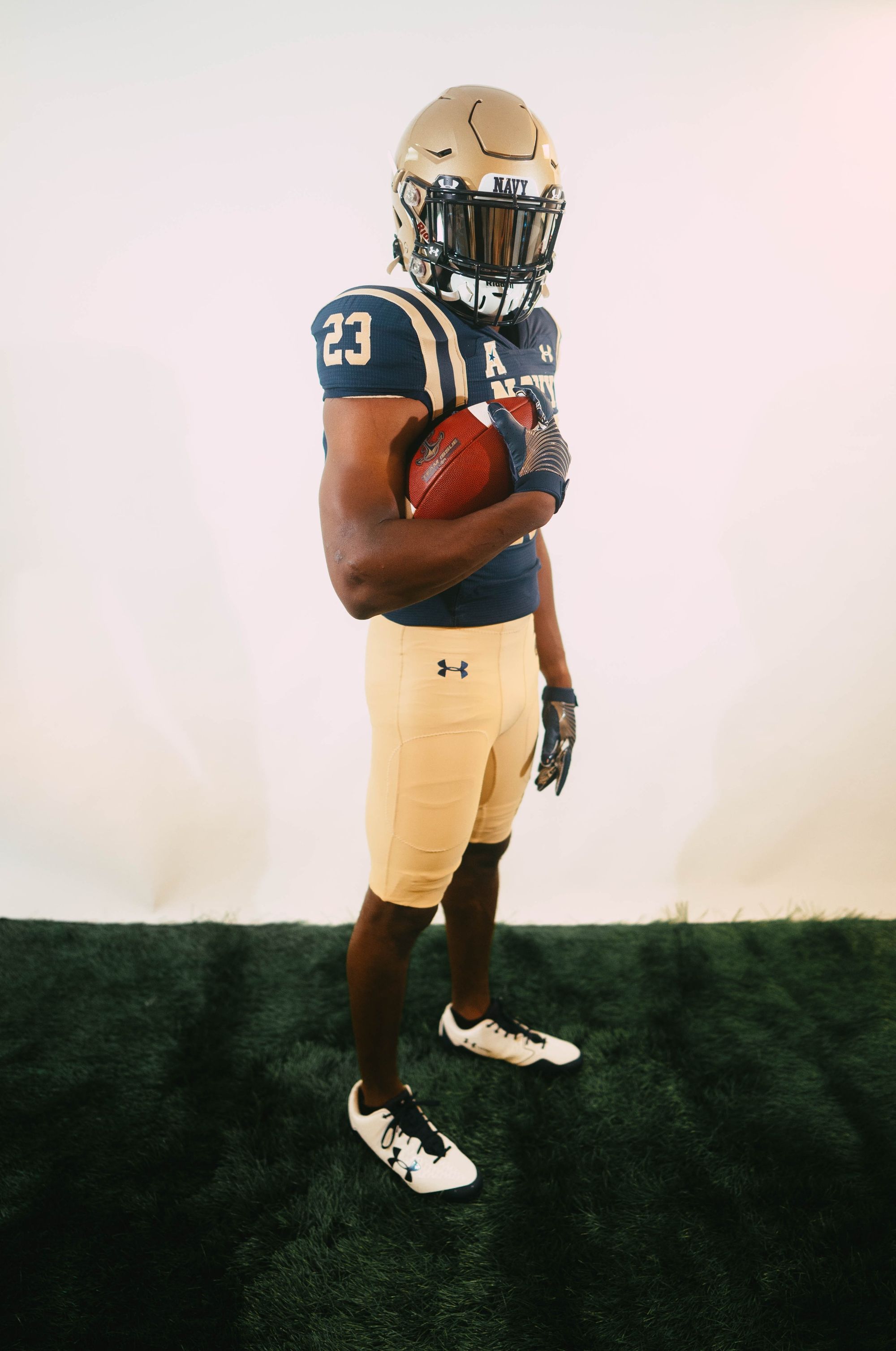
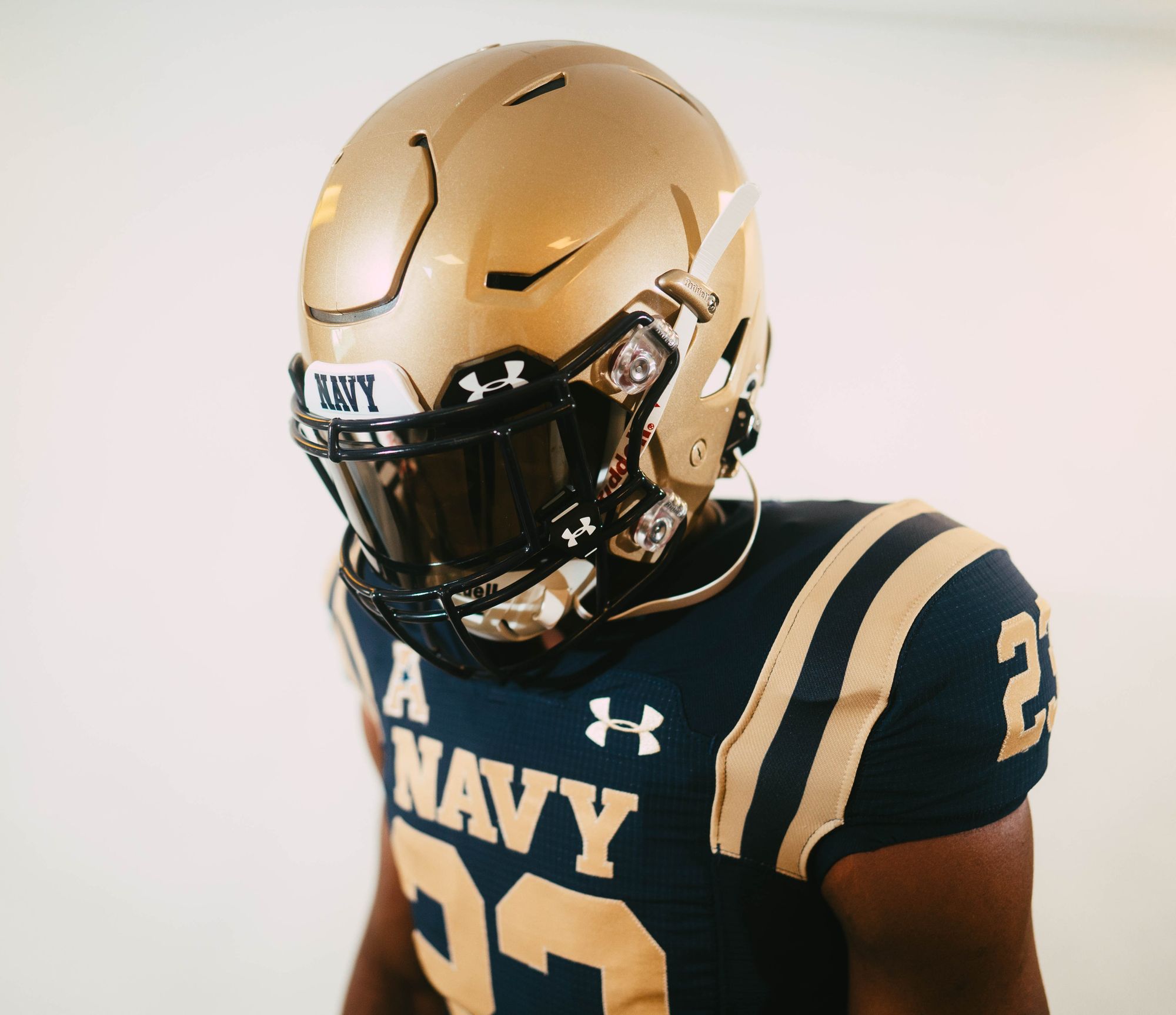
Via Navy Football
Navy's saying goodbye to their ghastly shoulder stripes from the past few years, and going back to the Roger Staubach-era. For everything people say about Under Armour –Please forgive me, I wrote this section before I saw the UAB uniforms– I appreciate that they can make a jersey template that doesn't neuter shoulder stripes. (Looking at you, Nike.) I can't wait to see the road white version. There's a strong chance these end up in the top ten once I see them in an actual game.
13. Florida International - Miami Vice alternates (Last week: 13)
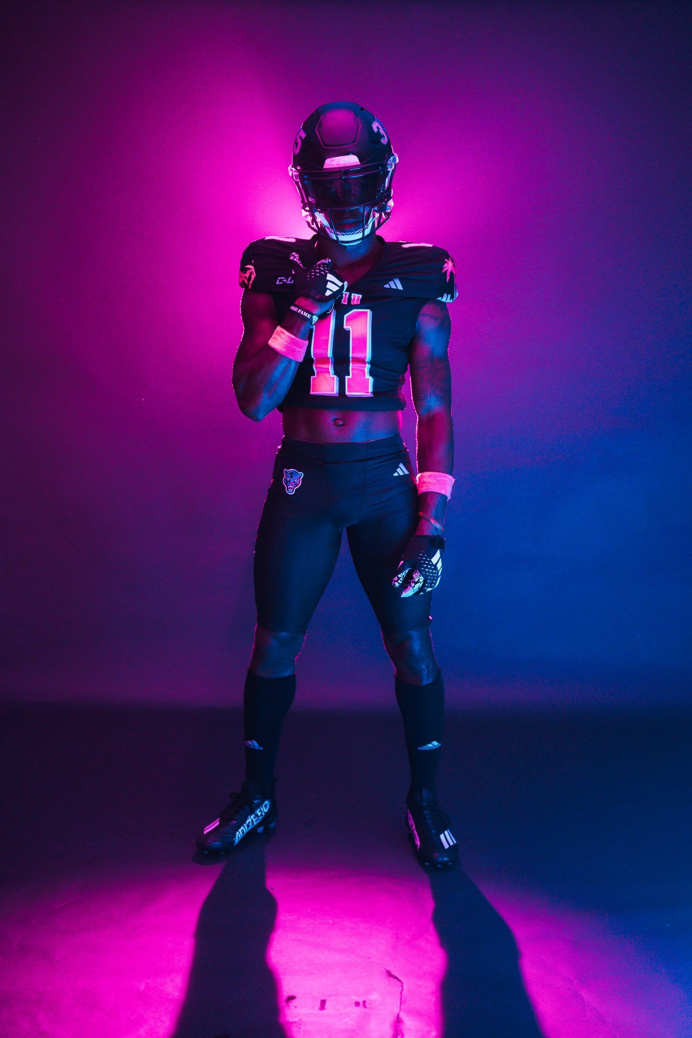
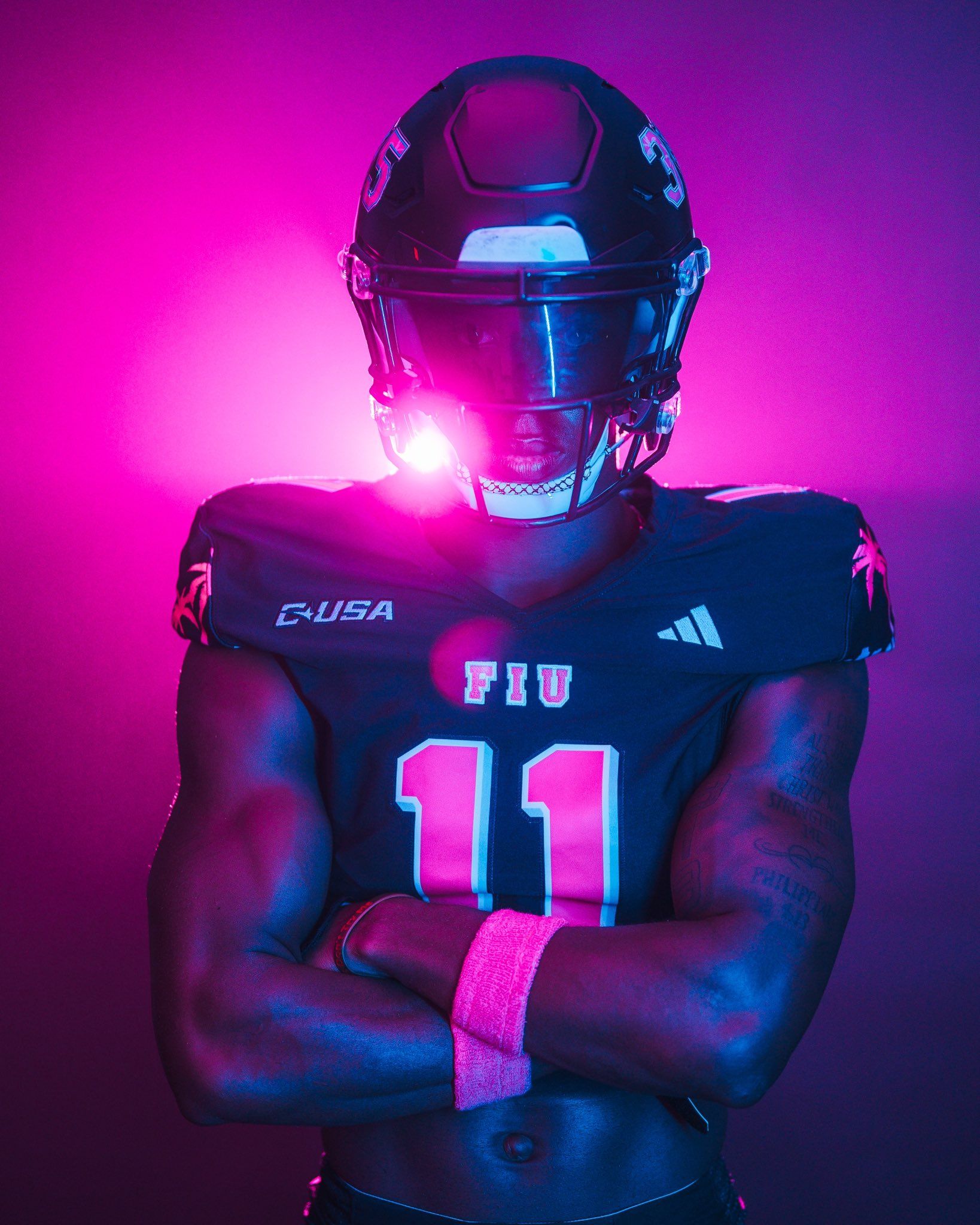
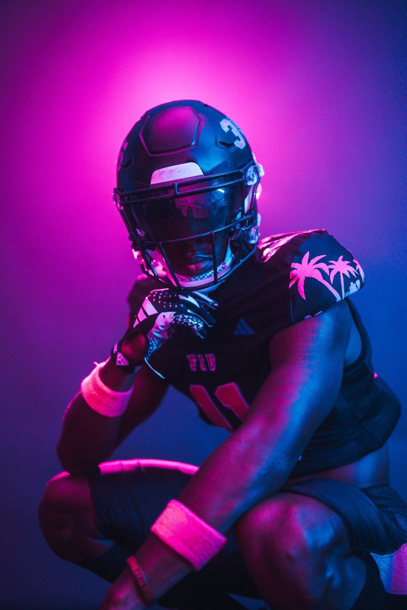
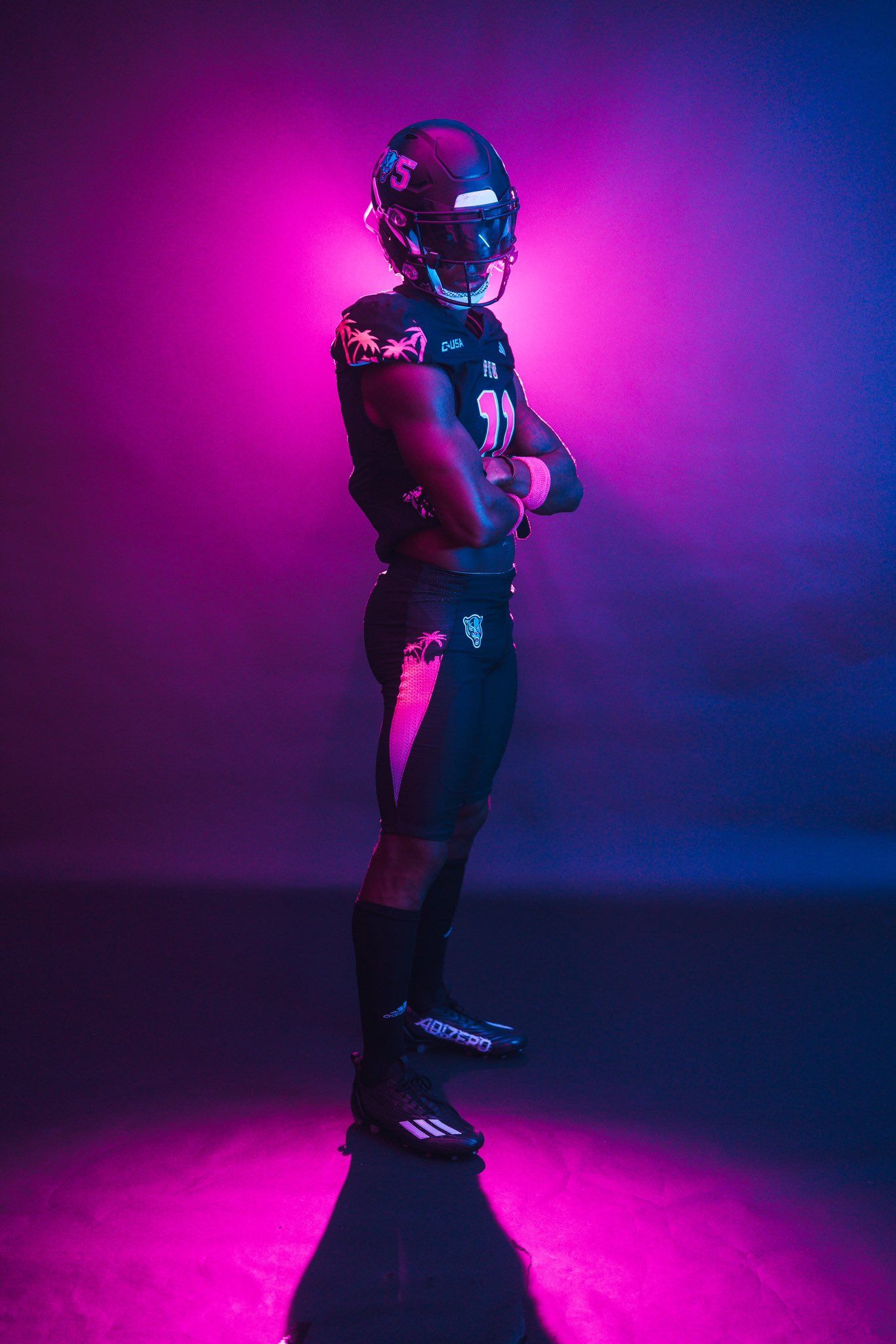
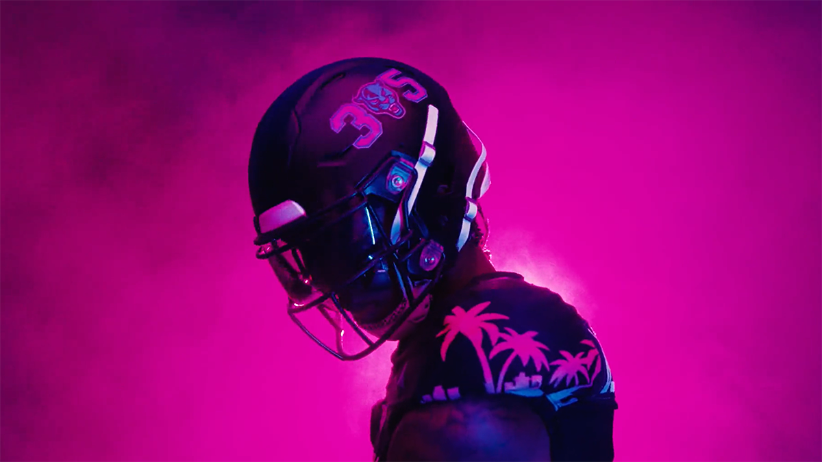
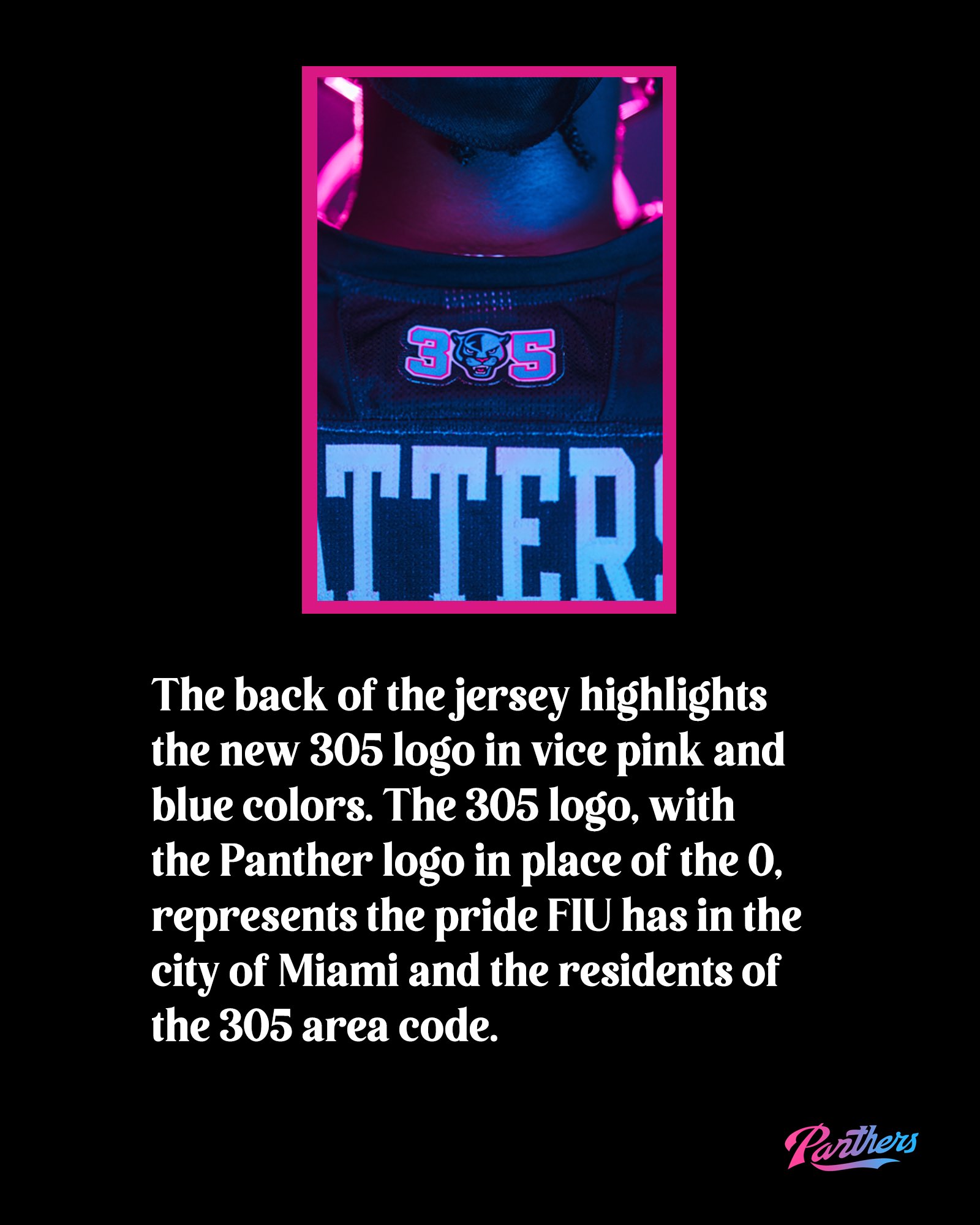
Via FIU Football
FIU already wore the '305' Miami Vice-style helmets last year, but now they're going full-Vice against UTEP on October 11. I get that these aren't for everyone, but here's the question I always ask myself when I see a uniform as wild as this one: Does it at least make sense? Yes, it makes sense that a school in Miami would wear Miami Vice uniforms. Simple as that. If you have a problem that I love these after I shit on what UAB did, I can't help you - they rock. I'll probably put them even higher when we see them in normal lighting.
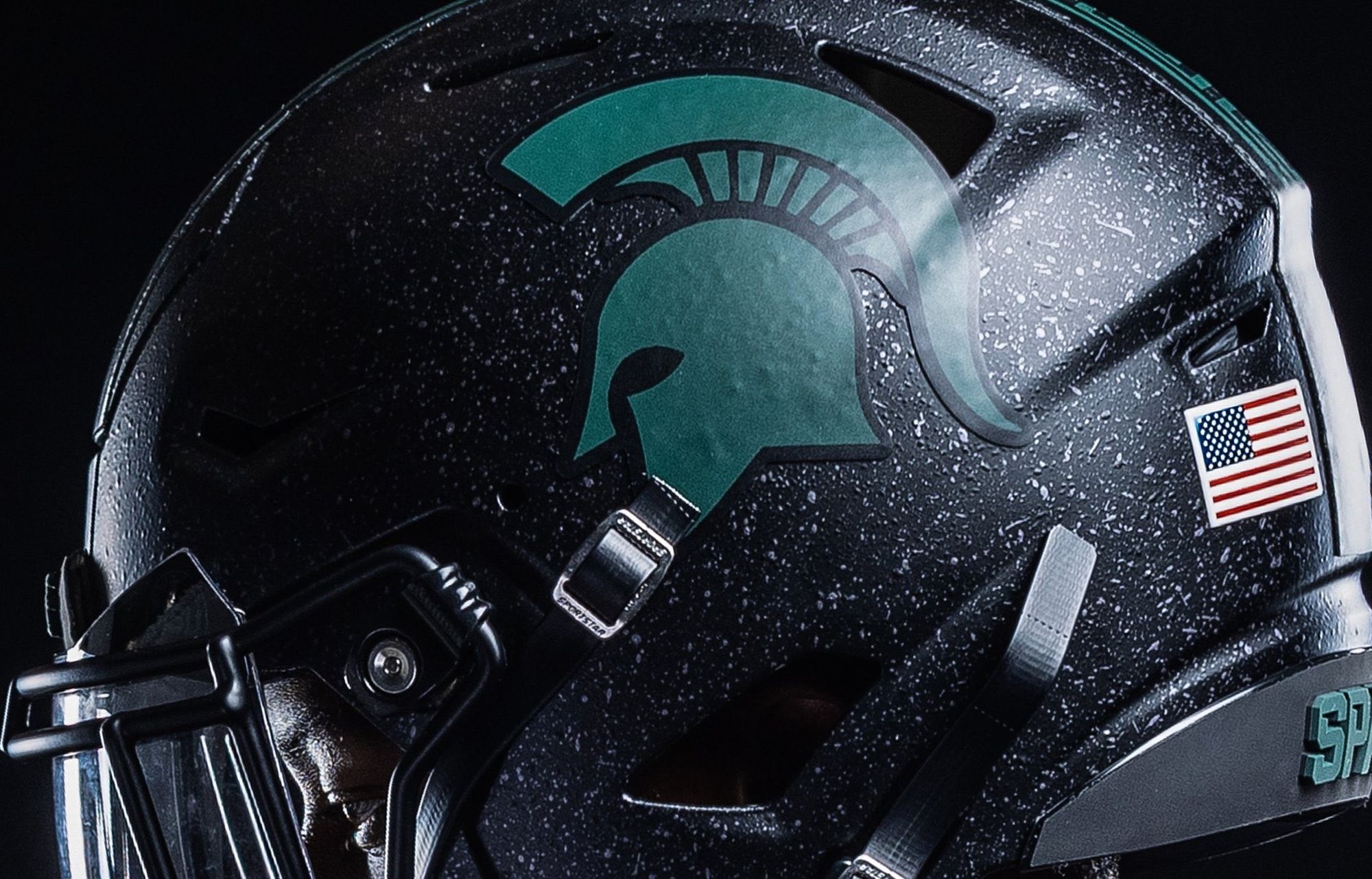
12. Michigan State (Last week: 12)
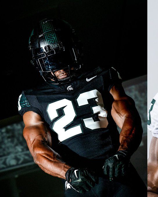
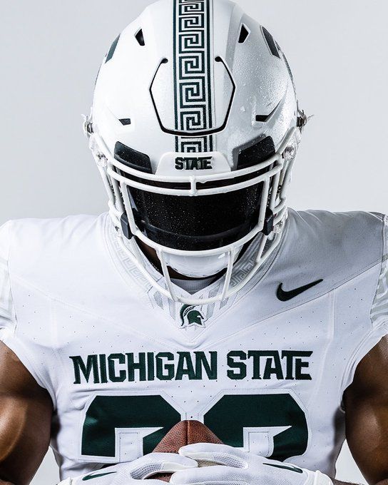
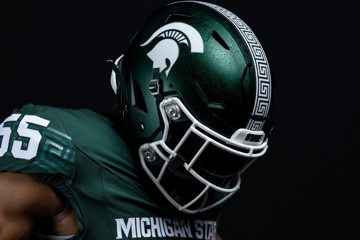
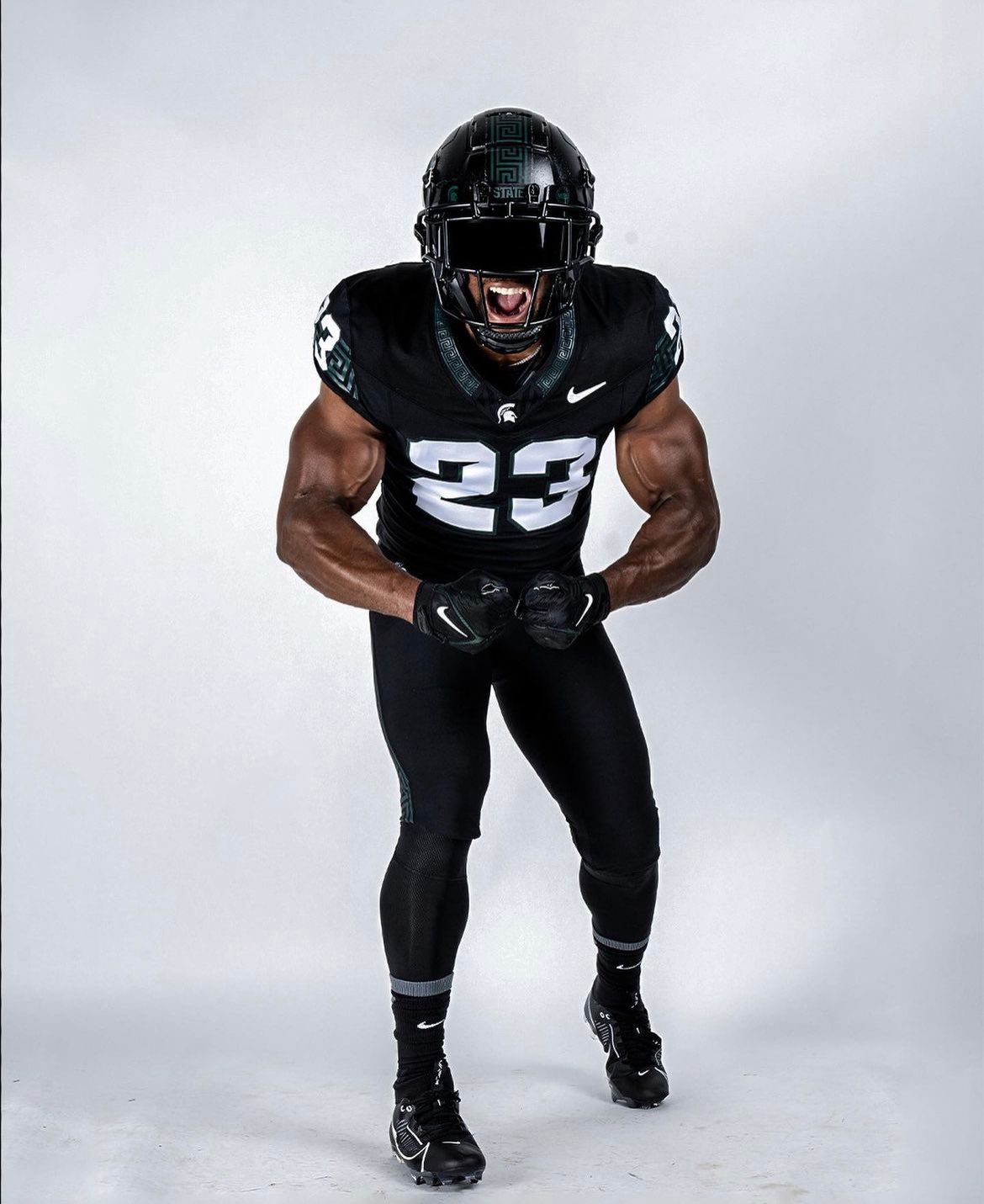
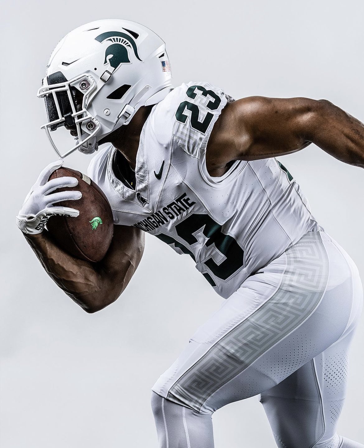
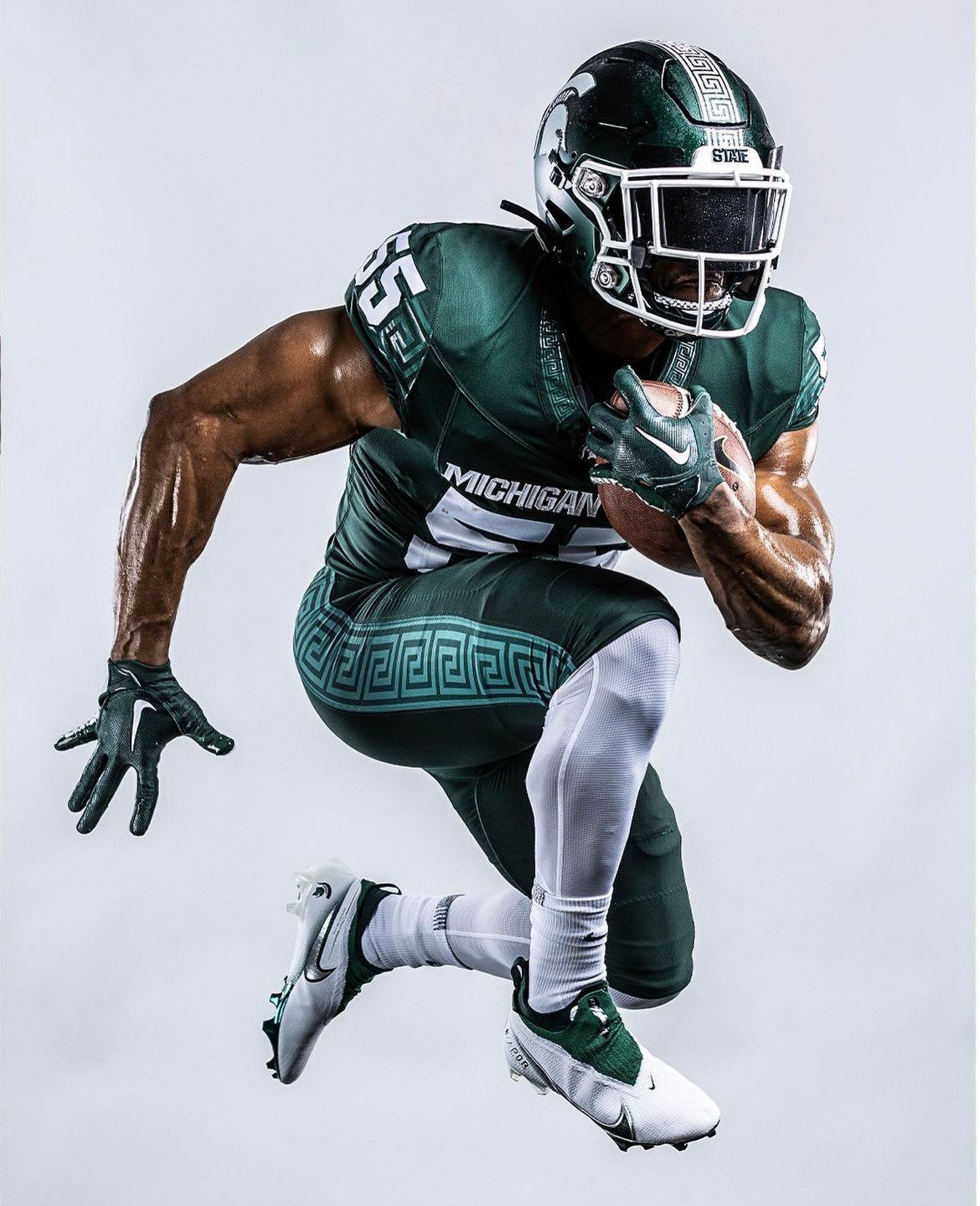
Via Michigan State Football
These might be the highlight of Michigan State's season. The Greek Key pattern on the pants, shoulders, collars, and helmets is straight out of the 90s, and it looks fantastic on a modern uniform. I usually don't like teams without black in their color scheme rocking an all-black set, but it's a home run in this instance. I need to see them in a snow game late in the season.
Bonus: All three Michigan State helmets this season feature what they're calling a "Battered" texture, which no other team in country will wear (for now):
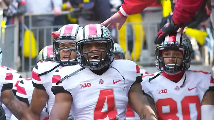
11. Ohio State (Last week: 8)
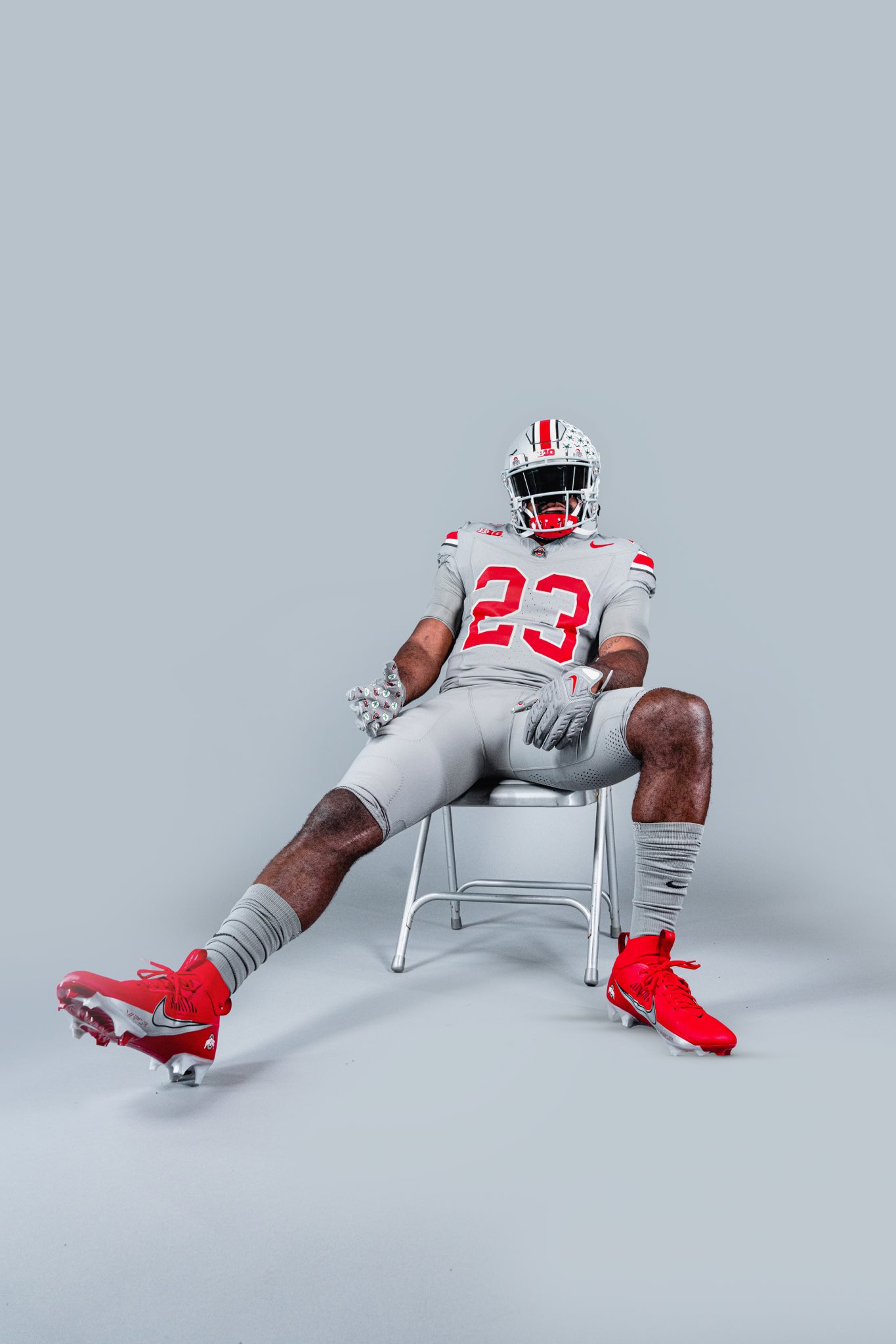
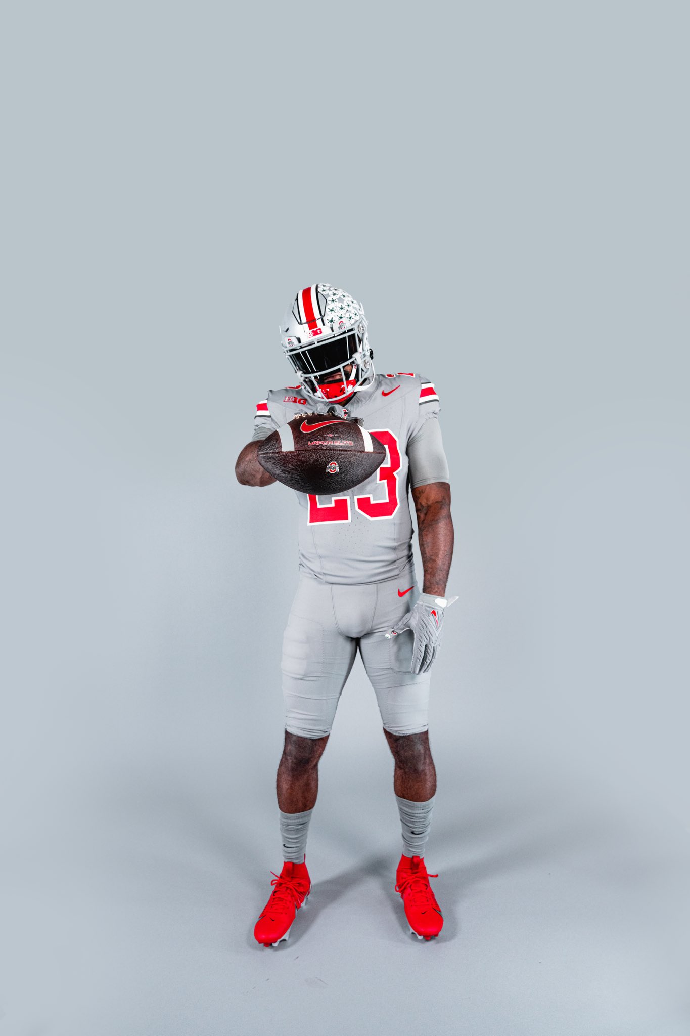
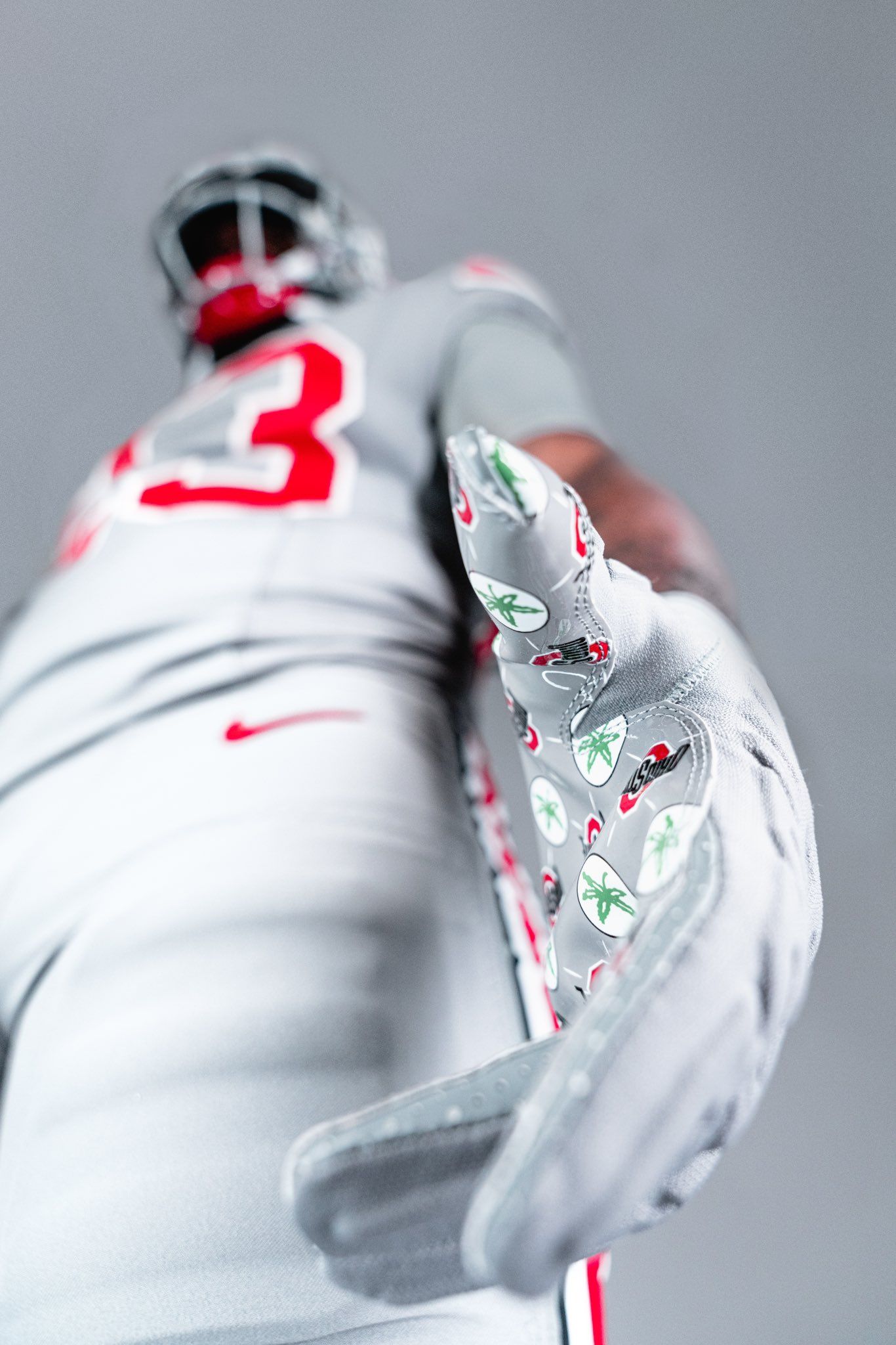
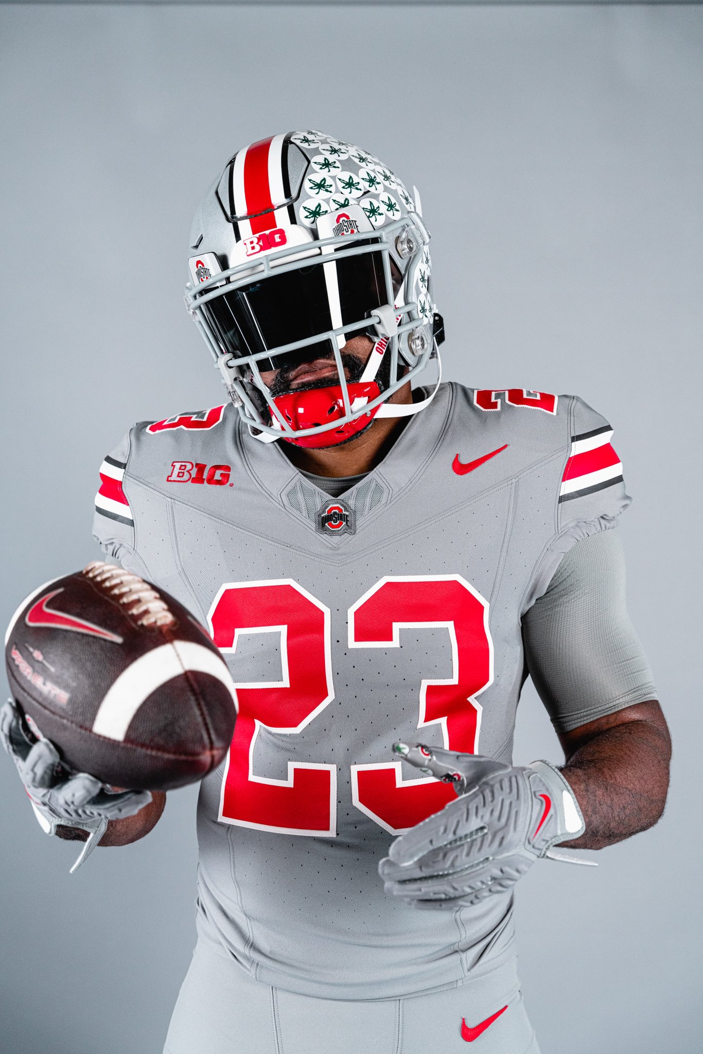
Via Ohio State Football
The Buckeyes are rocking all-gray for their primetime matchup with Michigan State on November 11. These are the natural evolution of the all-scarlet uniform from the 2021 Penn State game, but the difference is that these are actually cool and look good. In fact, I kinda want to buy one. I wouldn't mind these being part of the rotation in future seasons.
10. Nevada (Last week: 7)
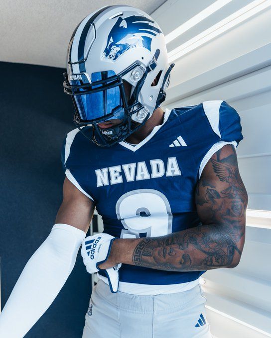
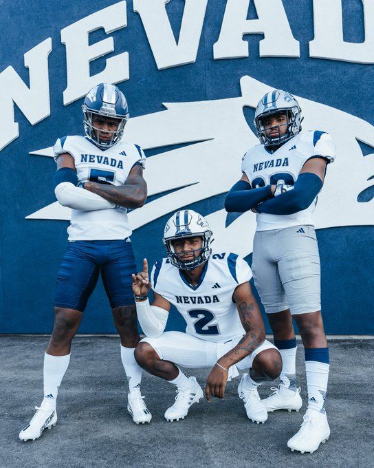
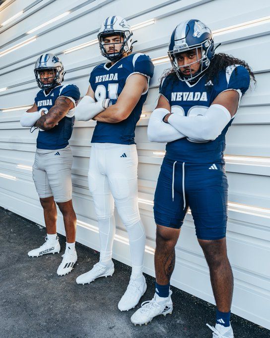
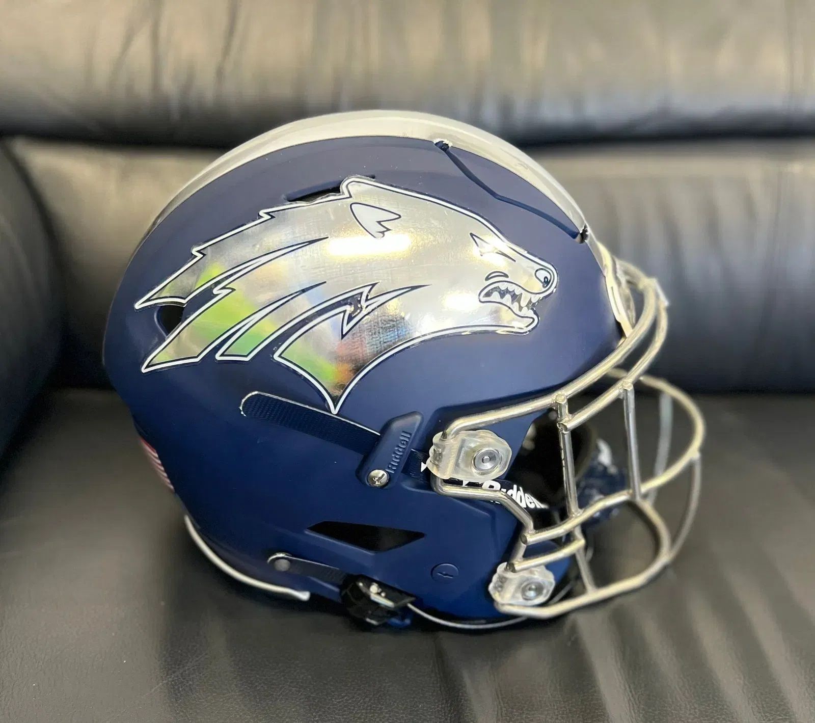
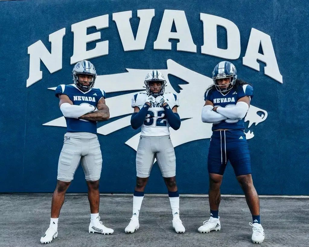
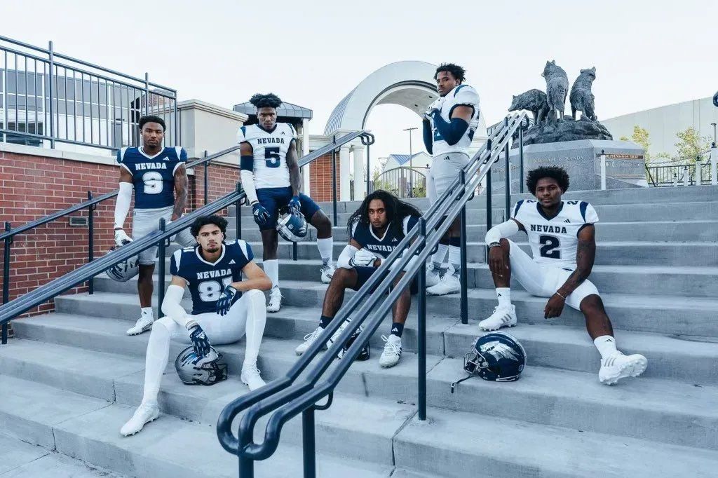
Via Nevada Football
We're getting to the point where uniforms from the 2000s can start being classified as 'throwbacks,' and Nevada might be the first program to truly embrace that. I'm glad they did, because these are a home run. They're a callback to the Wolfpack's mid-2000s set, and I'm counting them as another piece of evidence in my theory about uniforms from that era:
My theory that 95% of unis that looked plain in the 90s/early 2000s are flames with today’s fabric technology continues to ring true https://t.co/4AnddIGsCV
— Colton Denning (@Dubsco) July 9, 2019
9. Iowa State - Jack Trice Legacy Game (Last week: 6)
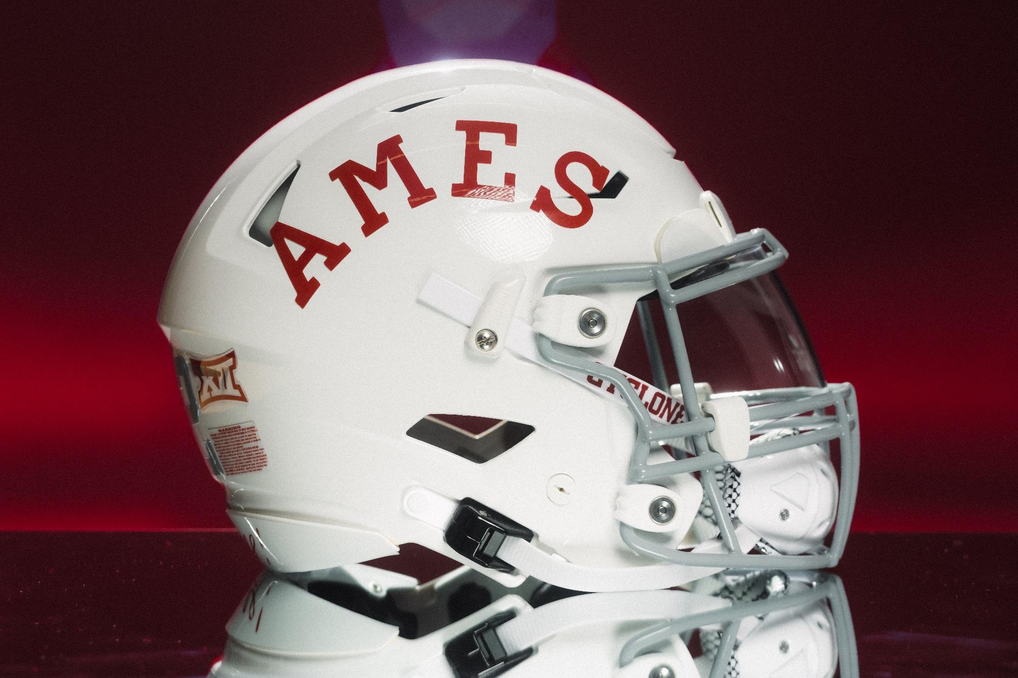
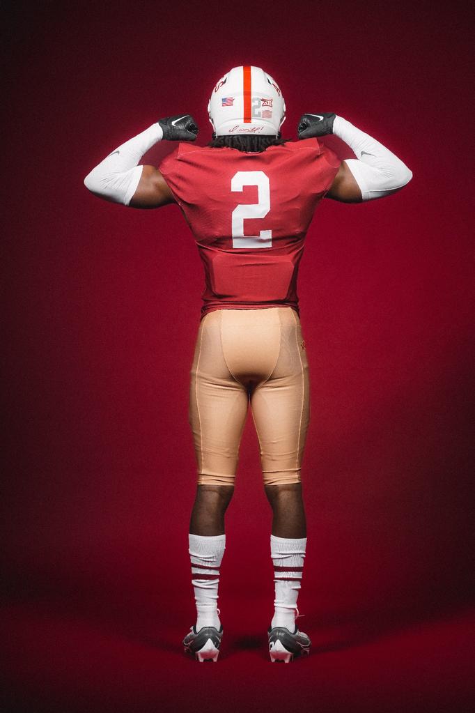
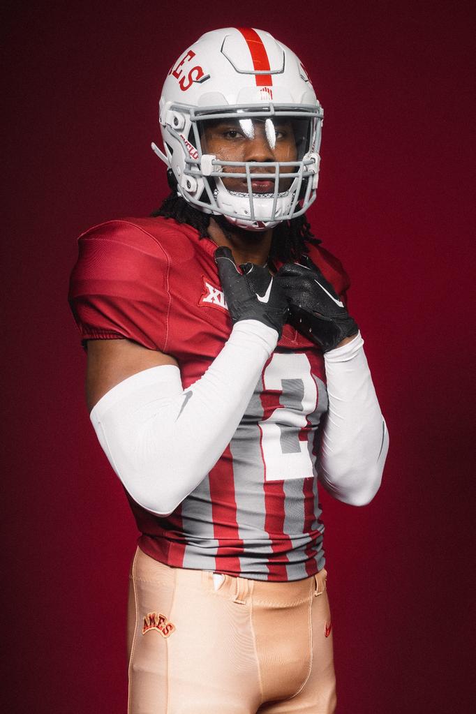
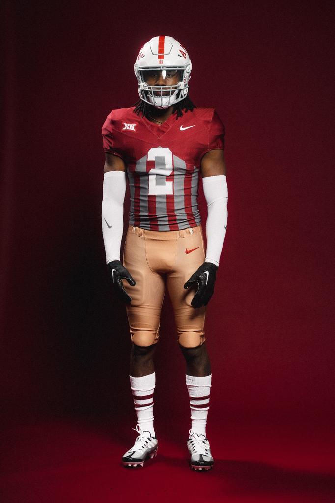
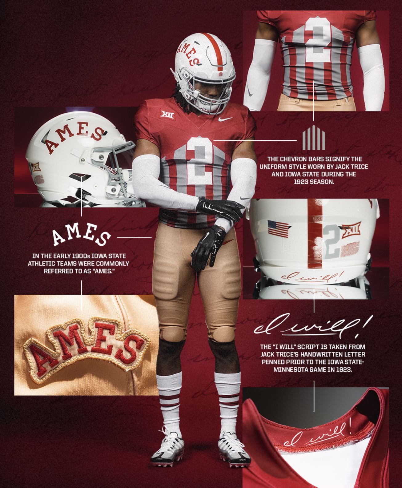
Via Iowa State Football
It's understandable that opinions on these are divided, but I'm a fan. Iowa State's breaking them out for their Jack Trice Legacy Game on October 7 vs TCU. The jerseys and pants pay homage to the uniform Trice wore at ISU in 1923, while the 'Ames' helmet script is a shoutout to what Cyclones sports teams were referred to as during the time. Again, I get why some people don't like them, but I love when teams do a one-off throwback/fauxback like this.
8. Mississippi State - 1998 throwbacks (Last week: NR)
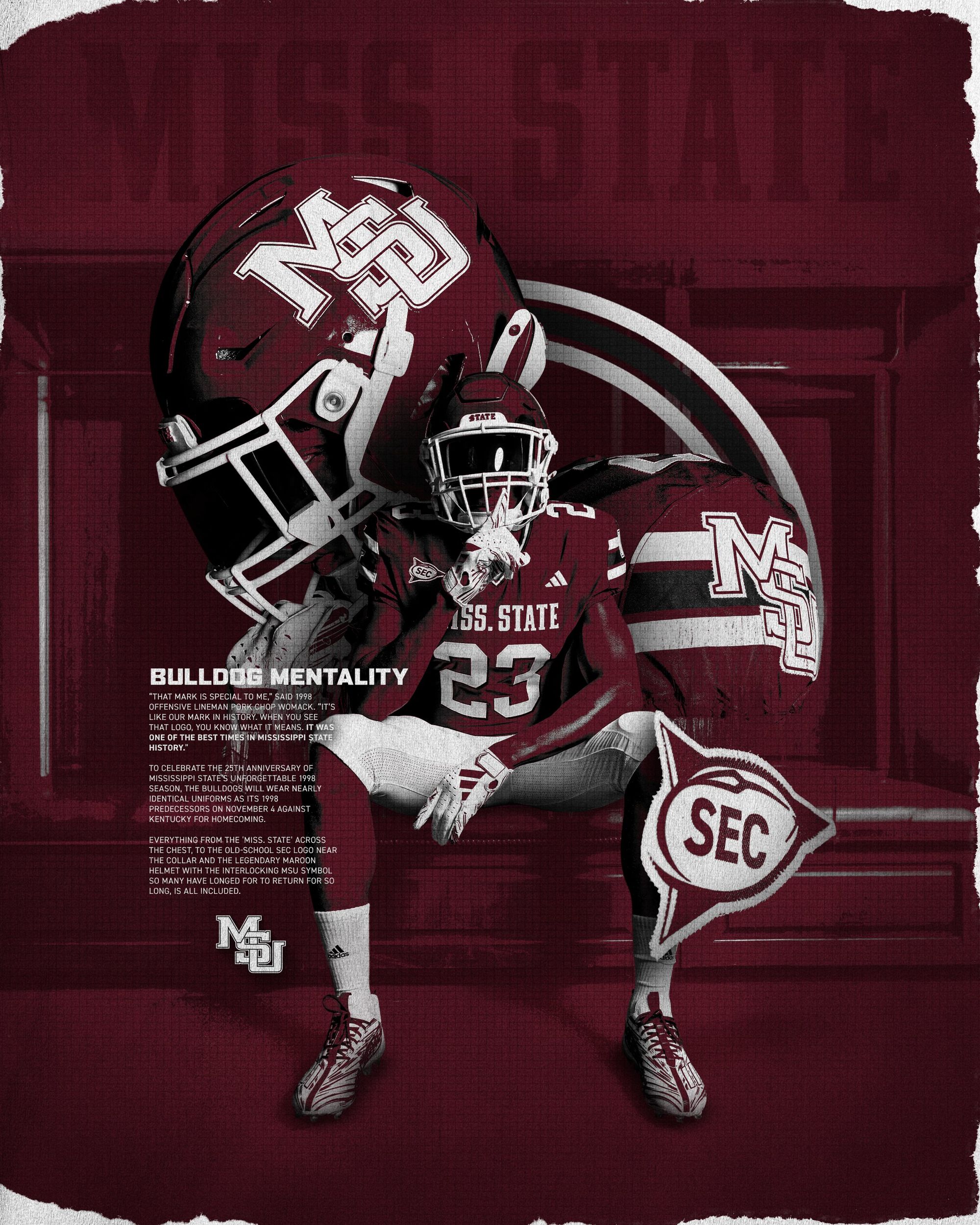
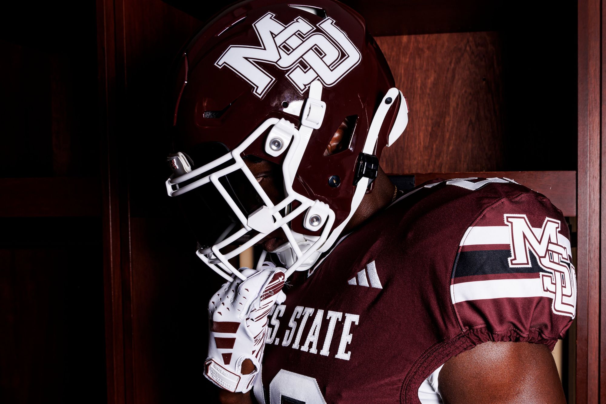
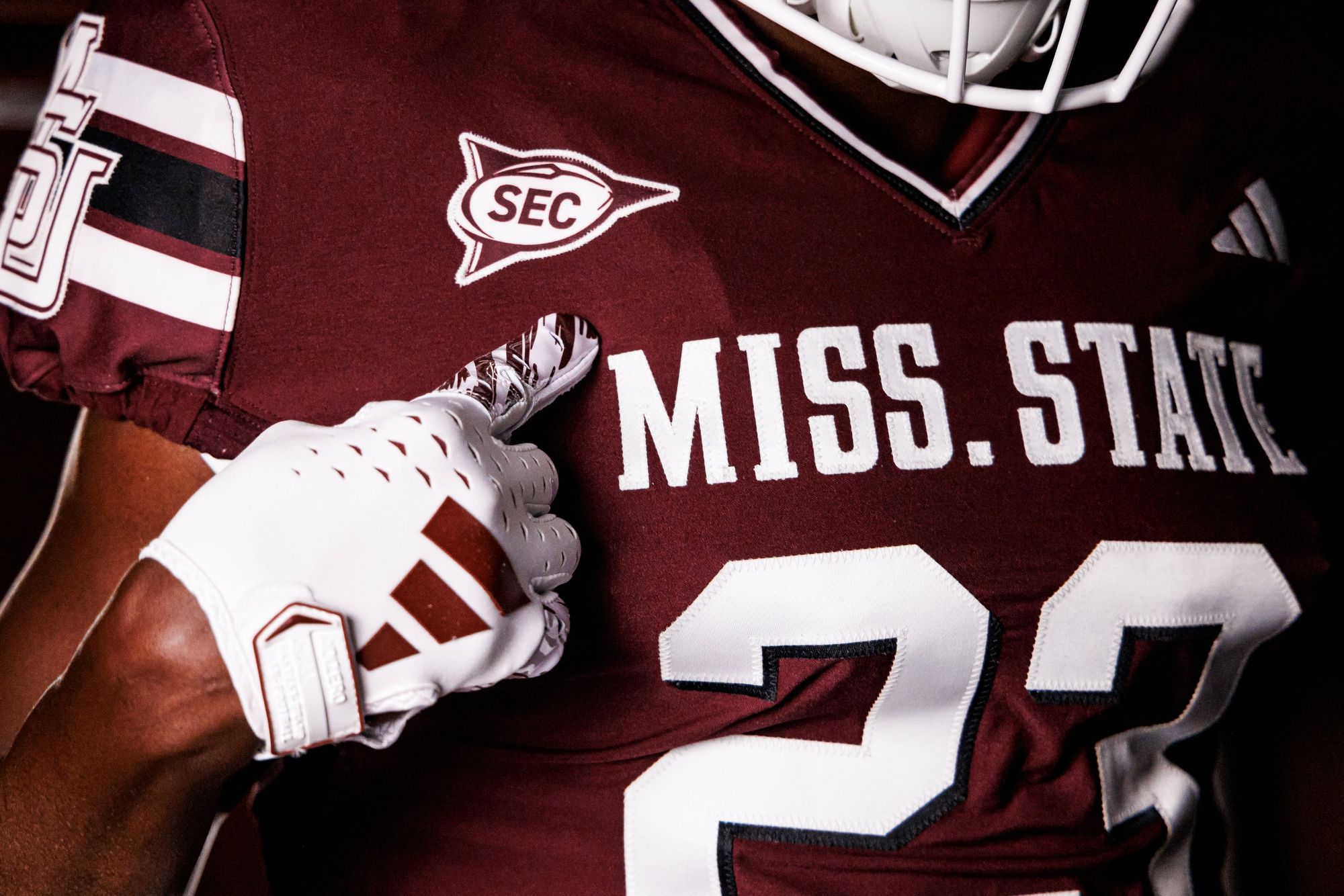
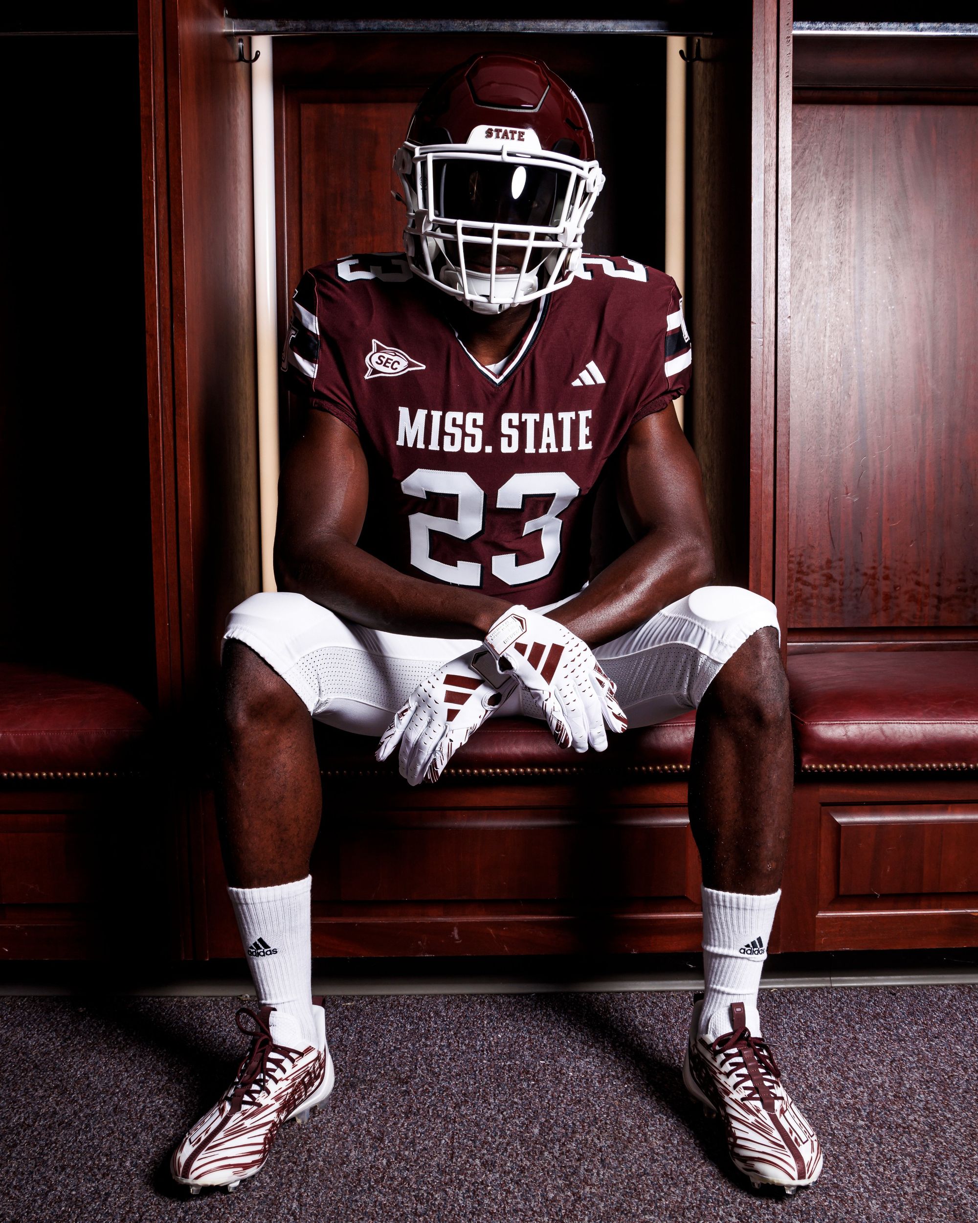
Via Mississippi State Football
I could spend 400 words telling you how much I like these, or I could just point out how fucking sick that throwback SEC chest patch is and let the rest of the uniform speak for itself. I choose the latter. (Read more about them here.)
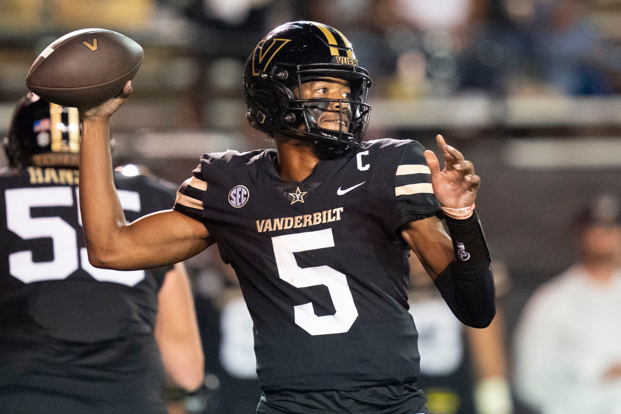
7. Vanderbilt (Last week: NR)
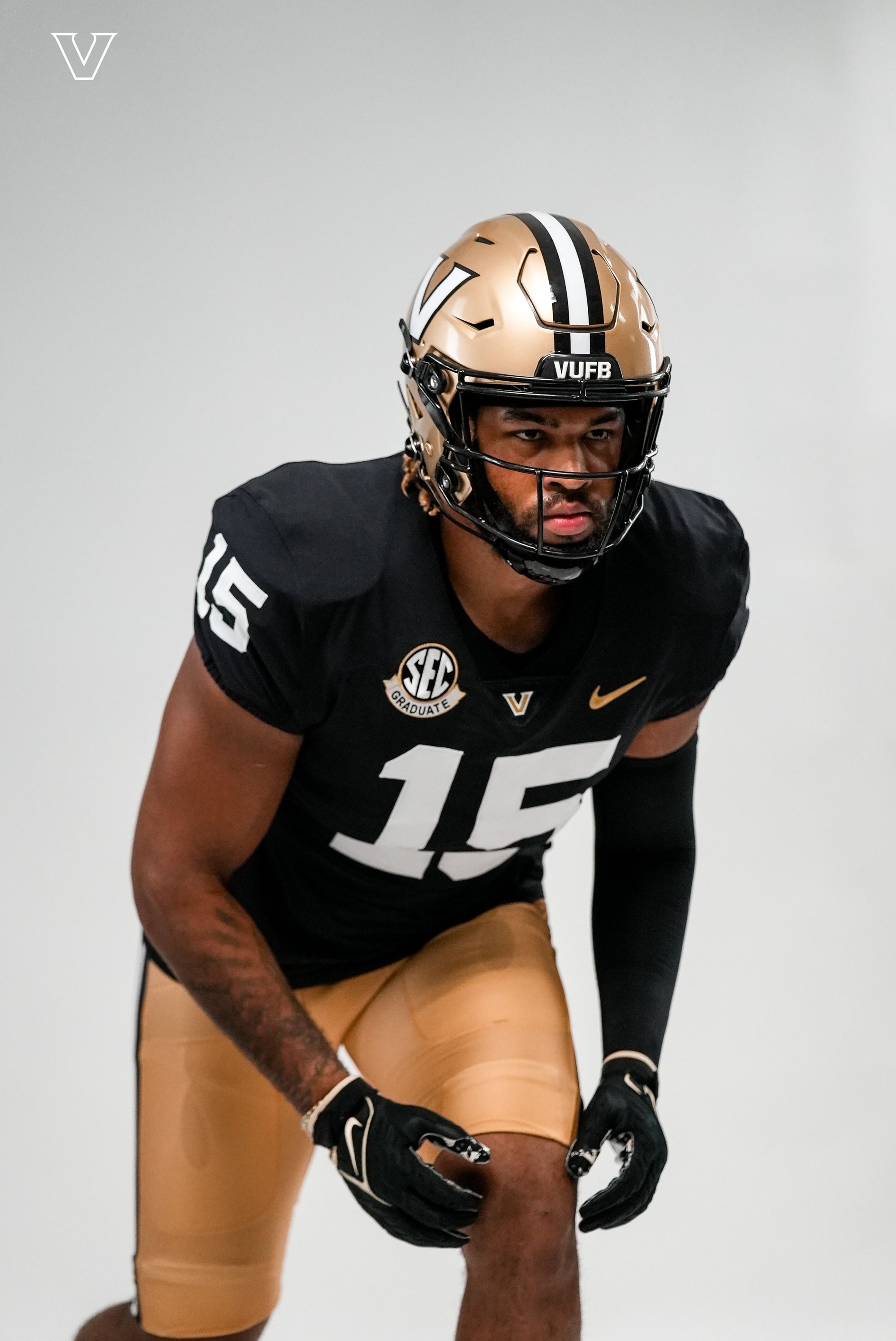
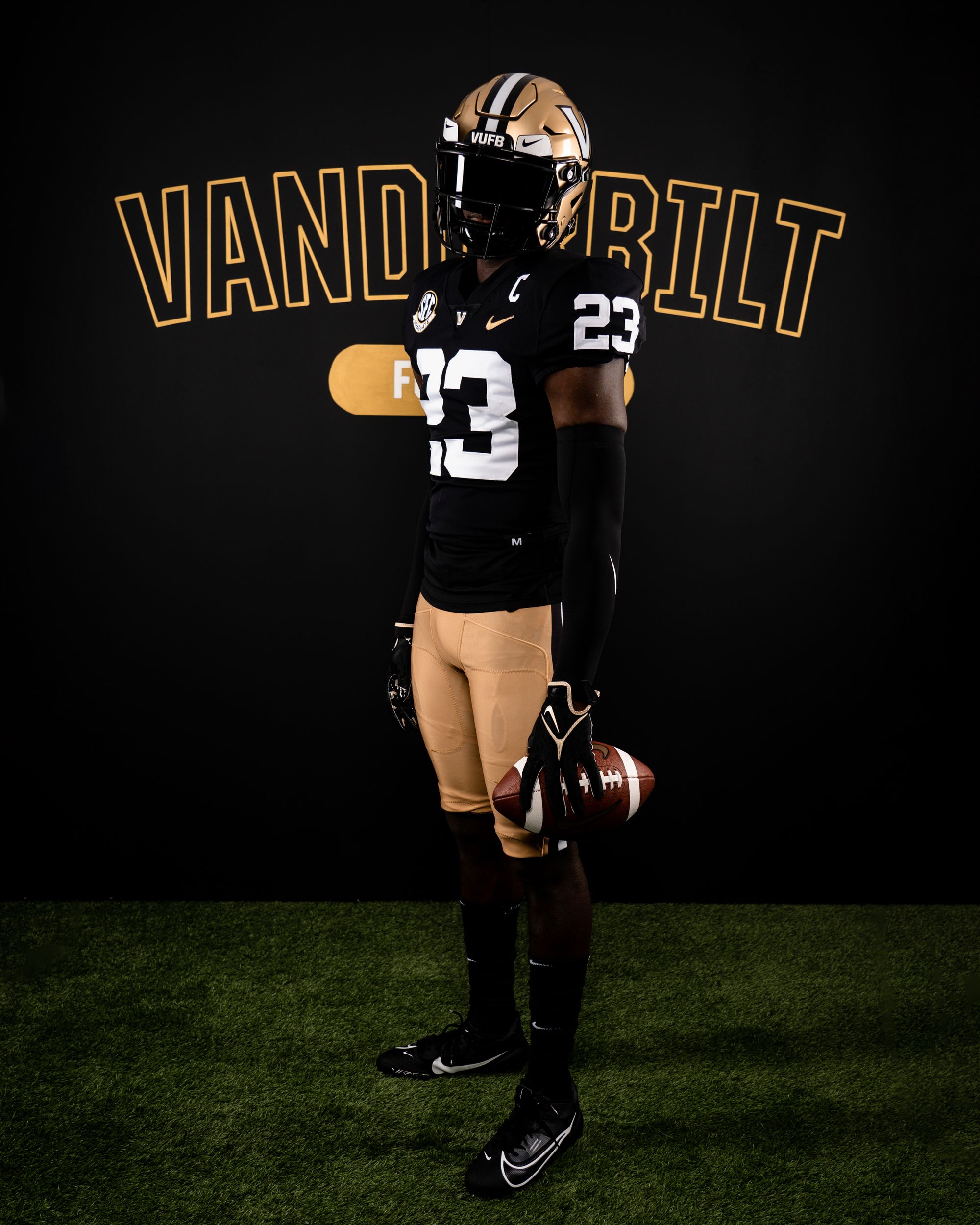
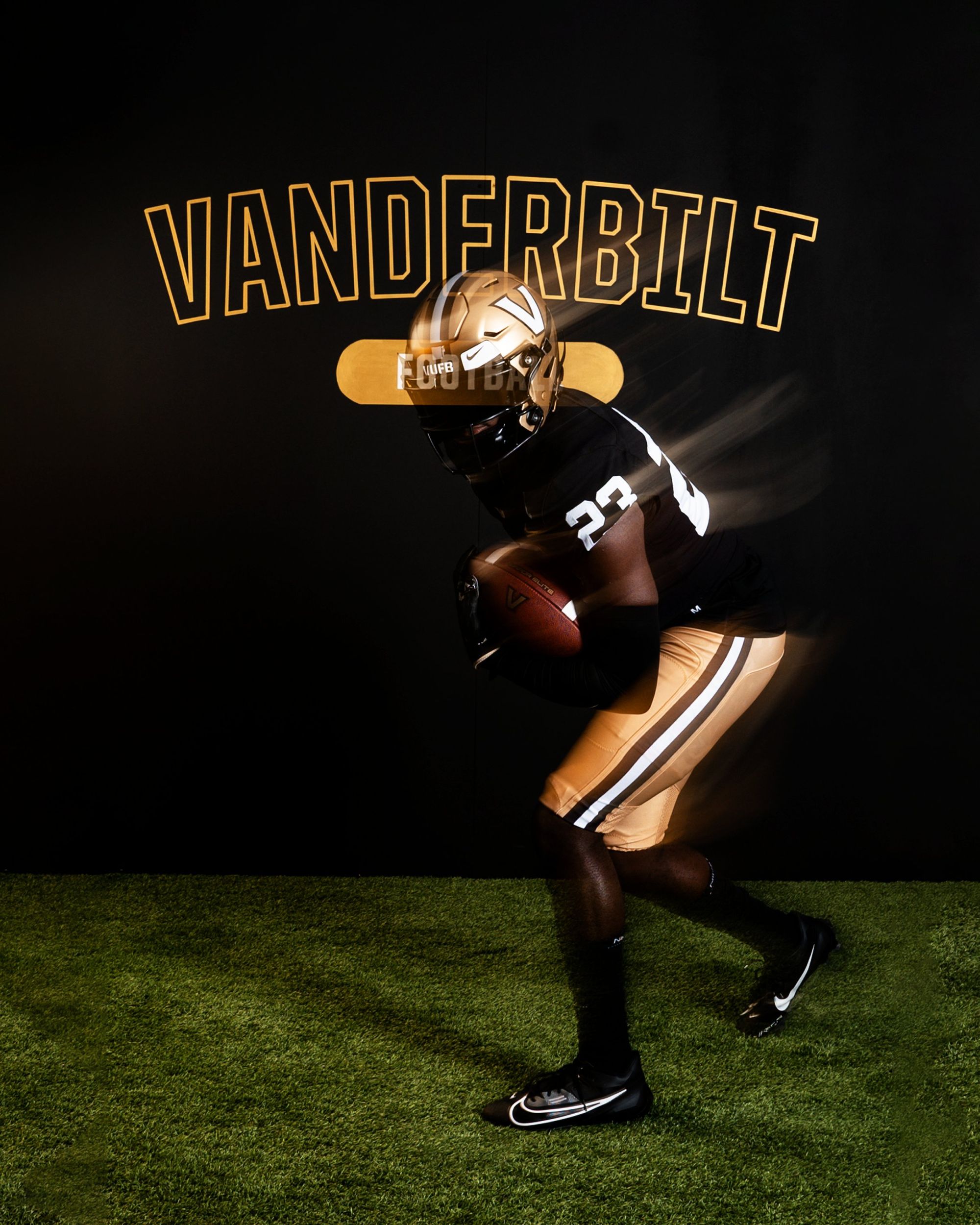
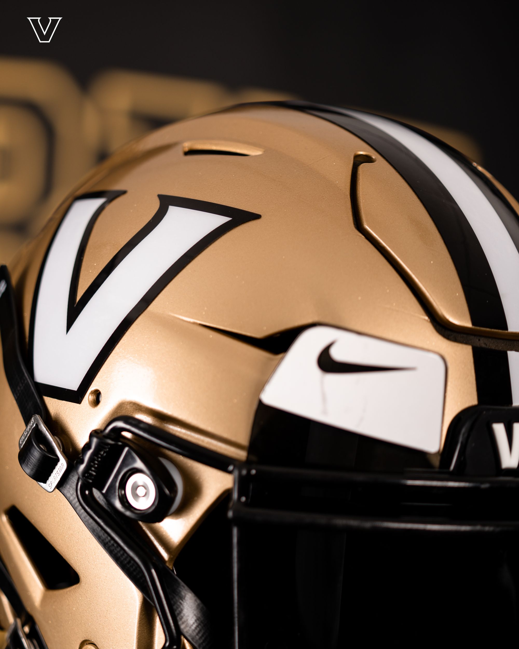
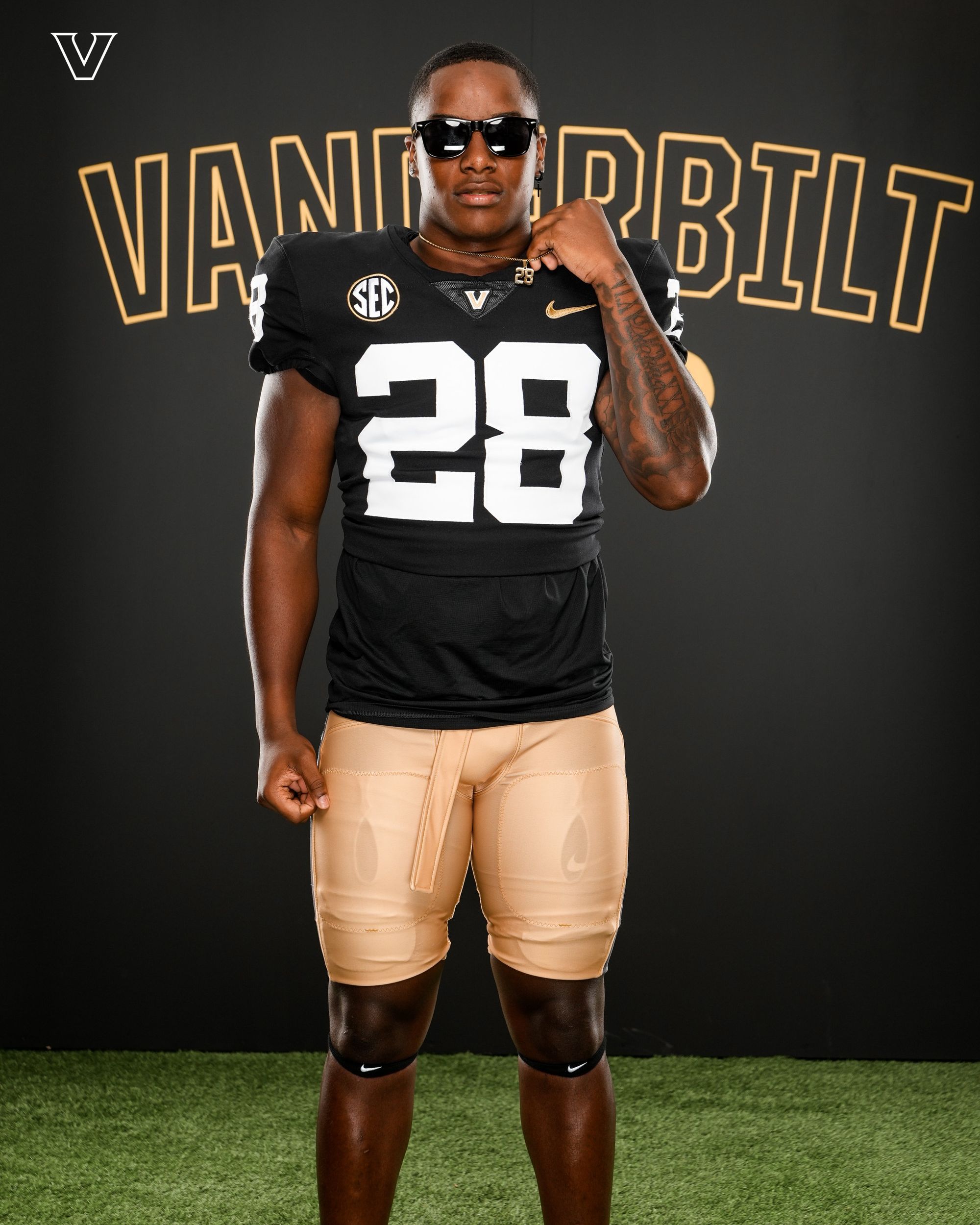
Via Vanderbilt Football
✅ Big block numbers
✅ Shade of gold on the helmet matches the shade of gold on the pants
✅ Inverted helmet logo that stands out much more than last year's.
I don't care if you think they're plain - this is the perfect look for Vanderbilt. Also worth monitoring if it's just the lighting or if they really found a way to bring back the shiny pants era.
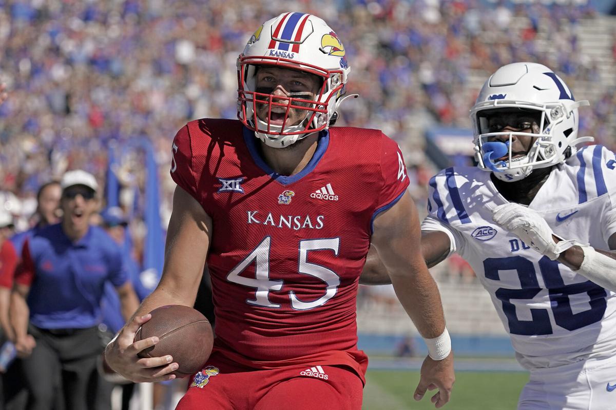
6. Kansas (Last week: 5)
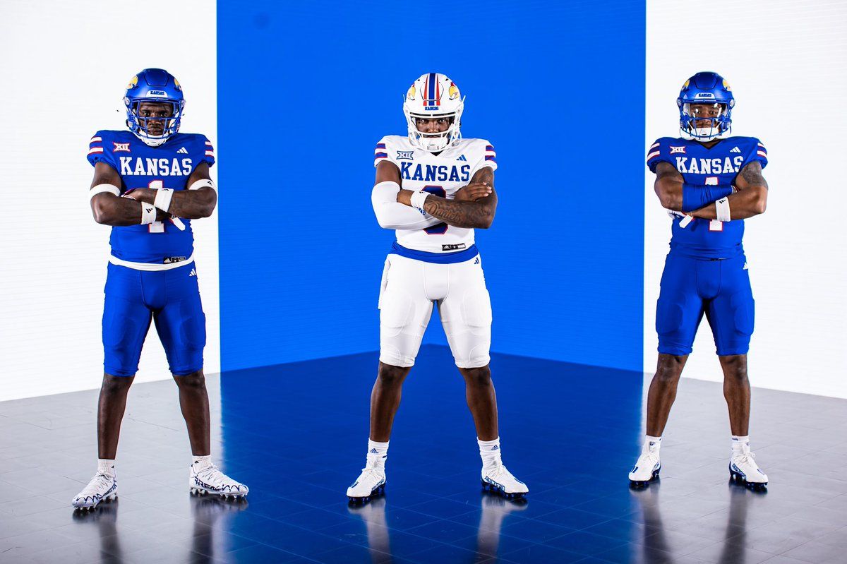
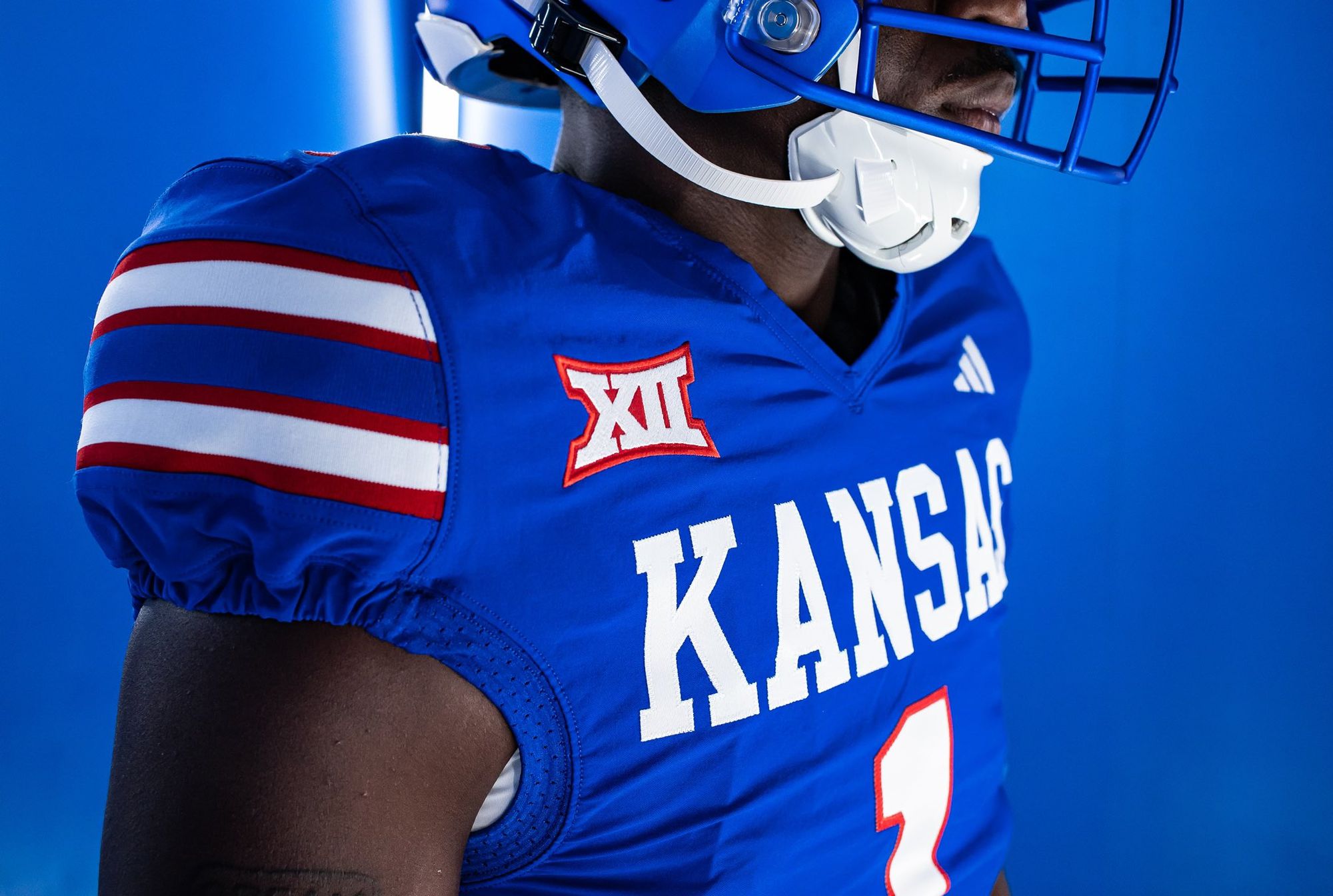
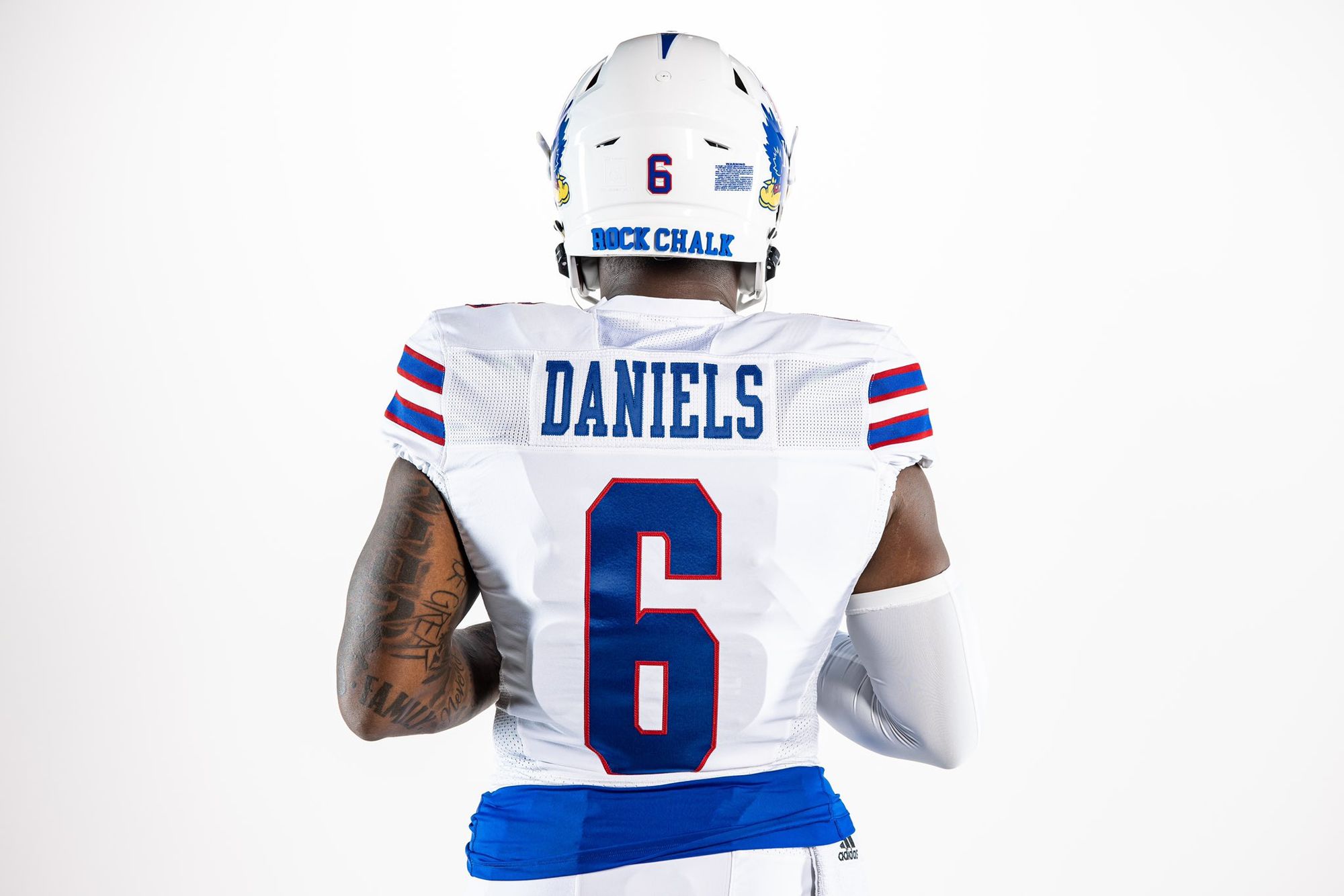
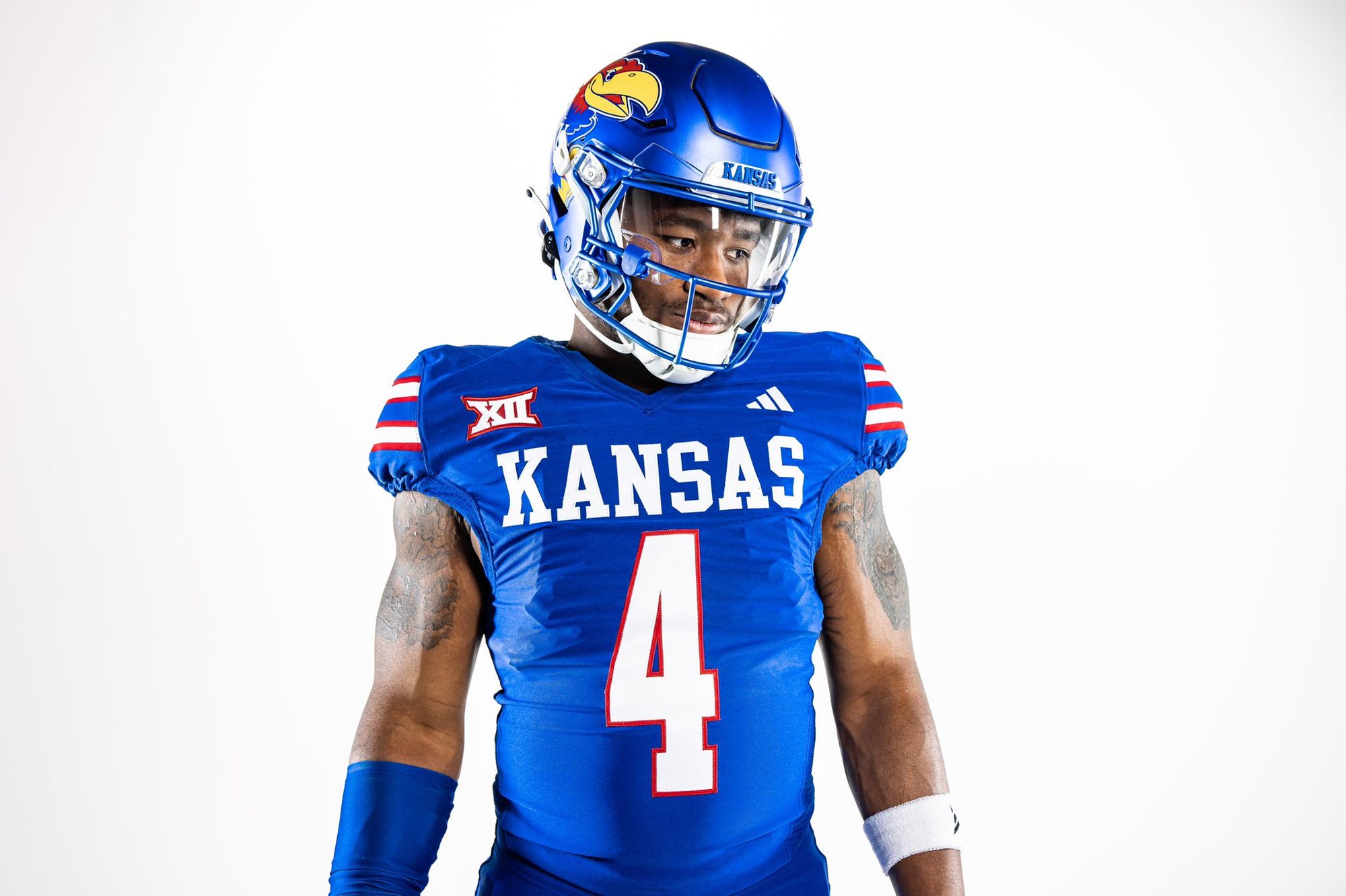
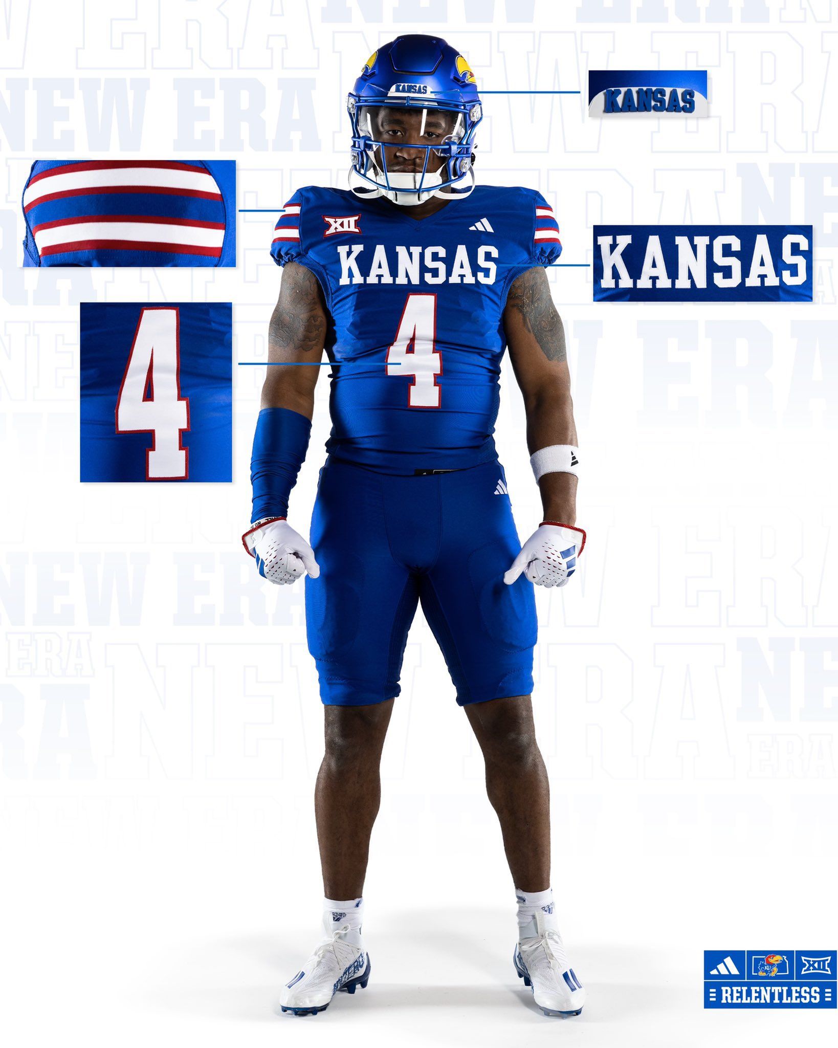
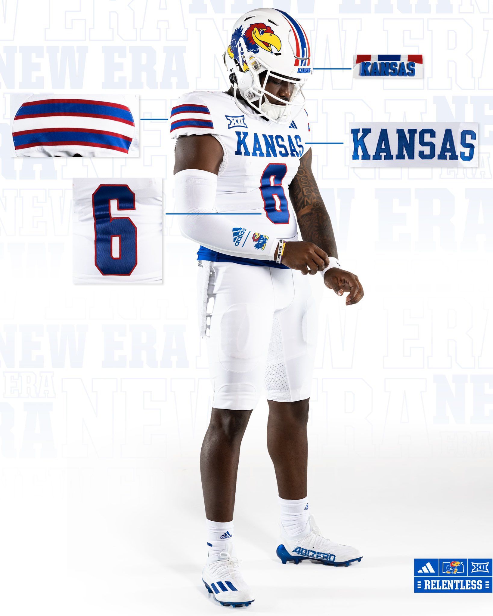
Via Kansas Football
There were elements of Kansas' uniforms the past few seasons that I liked. The throwback Jayhawk set and the powder blue fauxback are the first things that come to mind. Unfortunately, the bad elements were too aggressive to look past. Adidas' stupid stretch fabric made everything look scrunched, the 'Kansas' script was too small, and the amount of red as a primary color was jarring. All of those problems are fixed with this new set.
The script on the front of the jersey is LARGE and legible. I'll miss the italicized numbers, but I don't mind the new font. The new shoulder stripes pop, and red is used as a perfect accent to the blue. Most importantly, the stretch fabric is gone. I wouldn't put it past them to break out a red alternate at some point, and you know what? They did such a good job with these that I'll be okay with it.
5. Colorado State (Last week: 4)
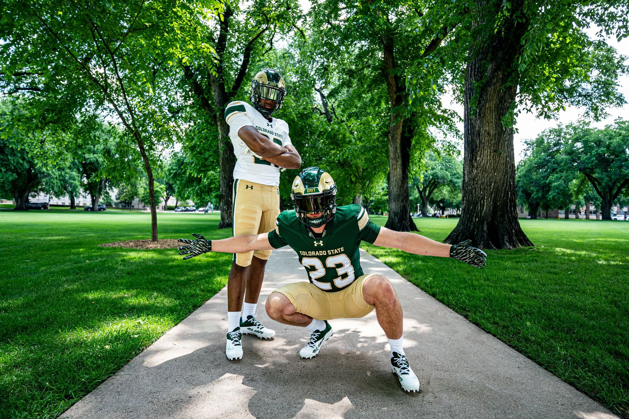
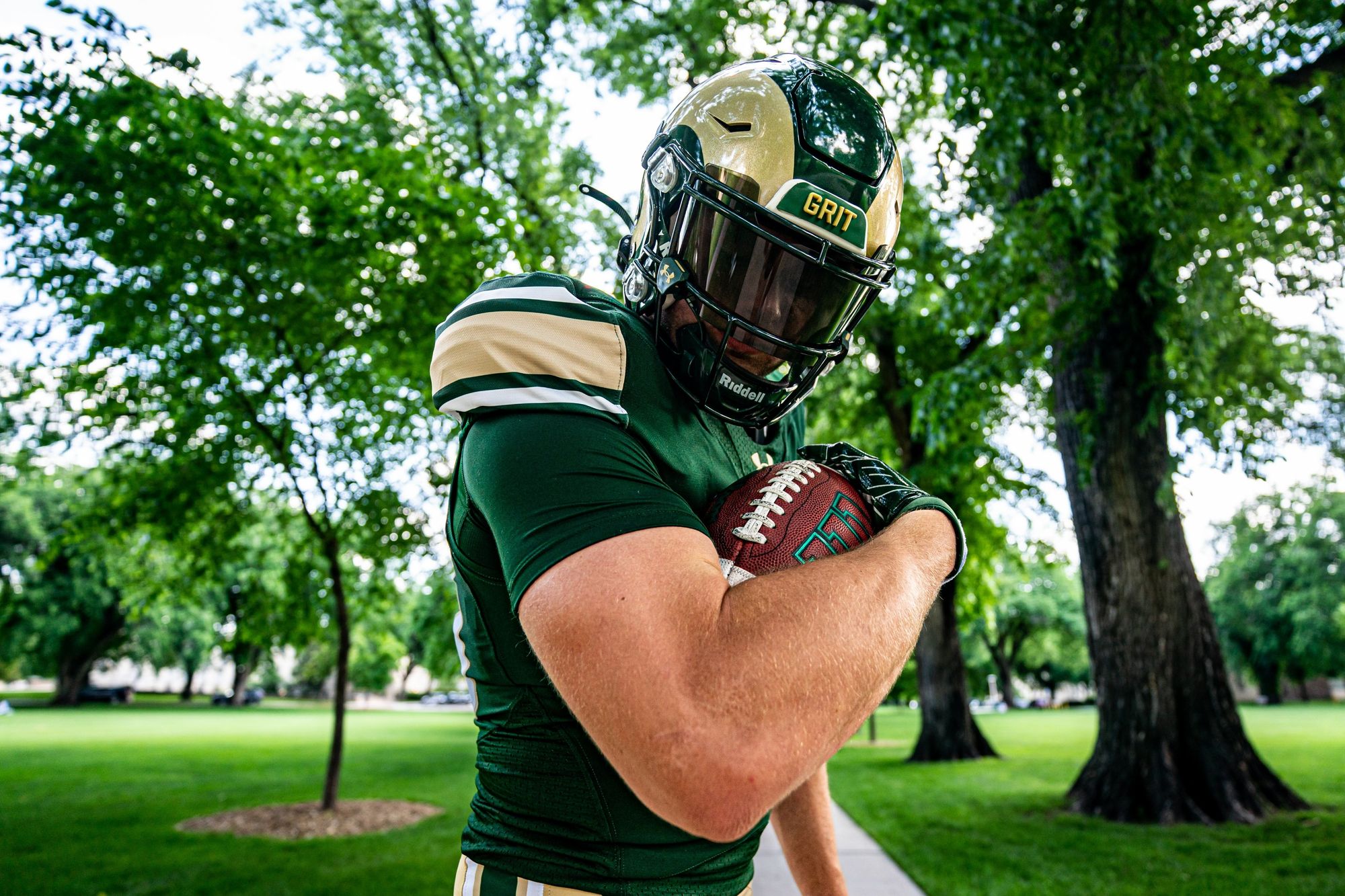
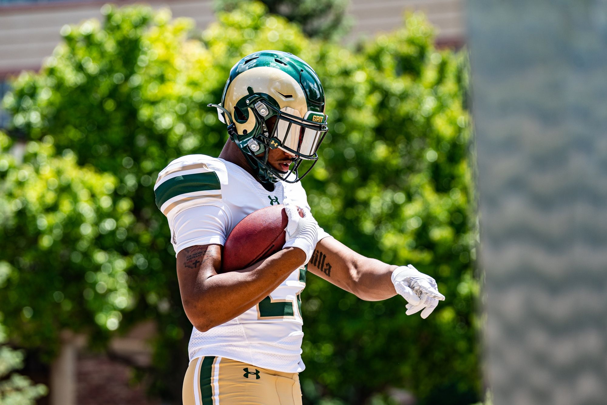
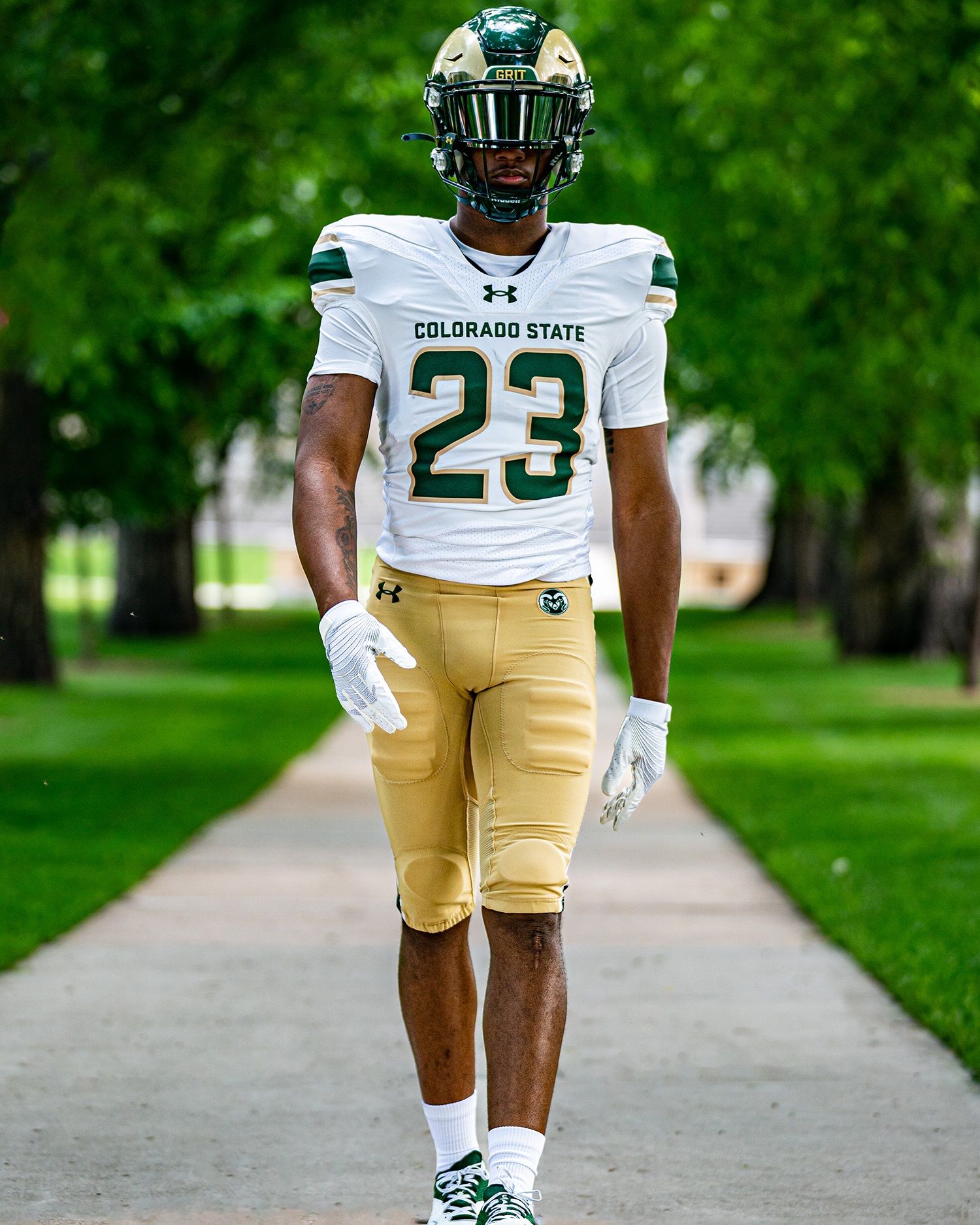
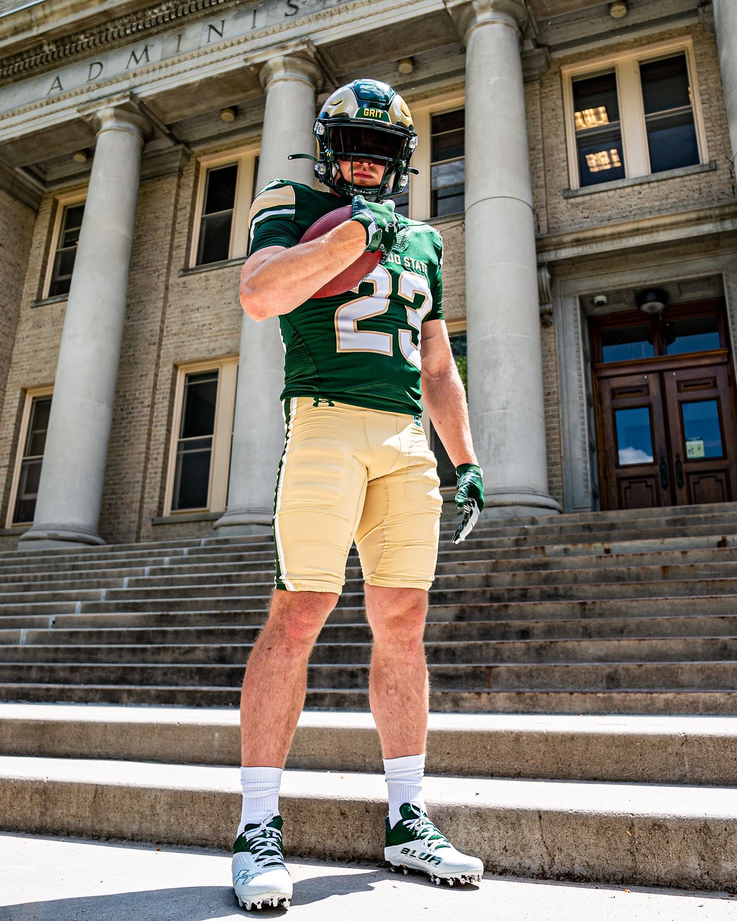
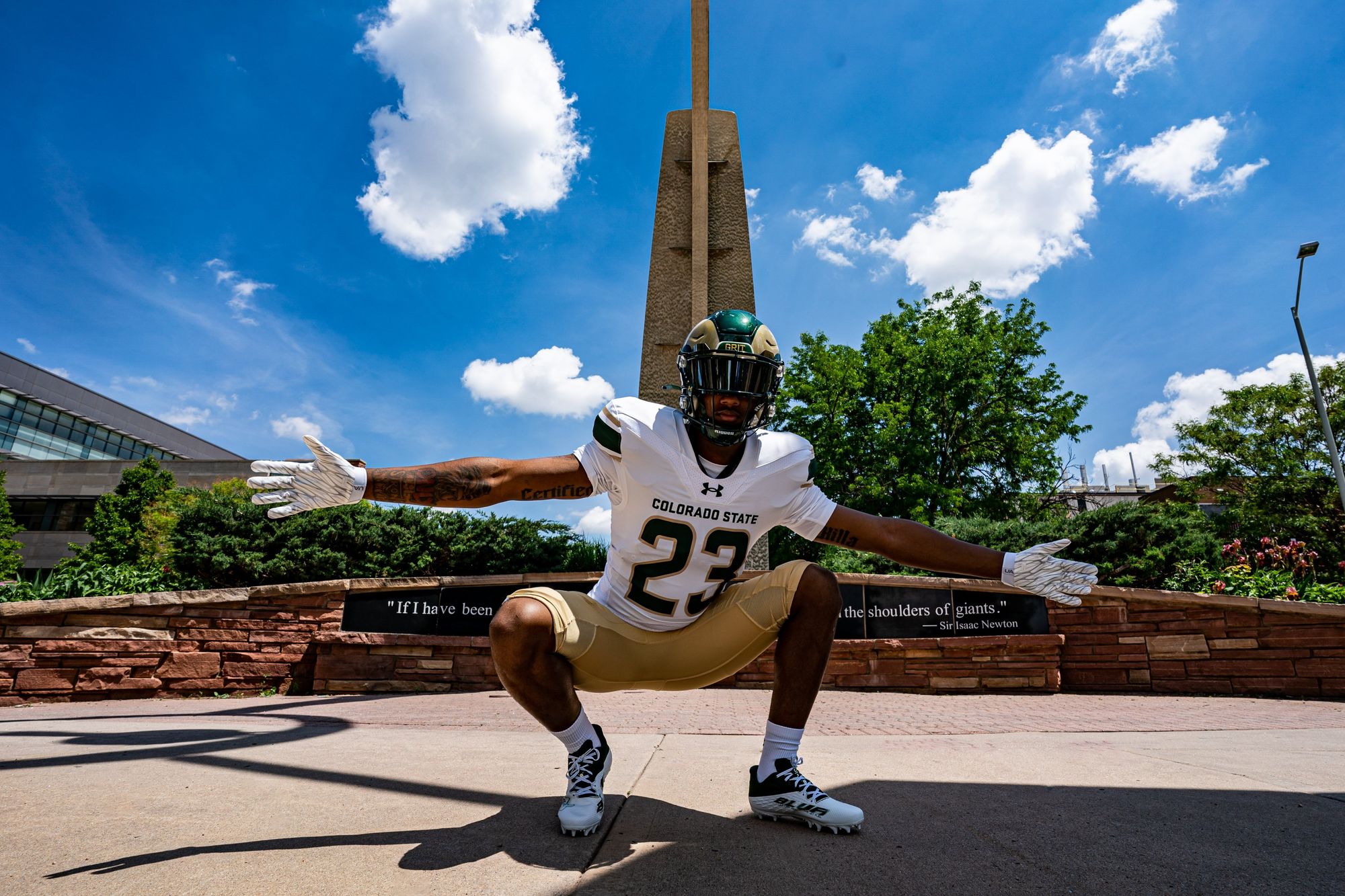
Via Colorado State Football
CSU's uniform identity has been in a weird place over the last decade-plus. The Colorado State Flag alternates and the orange and green Aggies throwback both kick ass, but the regular home and away uniforms have been lacking any sort of personality or distinguishing trait. Until now!
I can't get enough of those shoulder stripes, which I dare say look inspired by the Rams' biggest rival. Regardless, the thick stripe is beautiful in green and gold, and the pants stripes are great, too. Small changes can make a world of difference, and these are simply beautiful uniforms. How can Under Armour be responsible for both these and the UAB uniforms?!
4. Oklahoma State (Last week: 3)
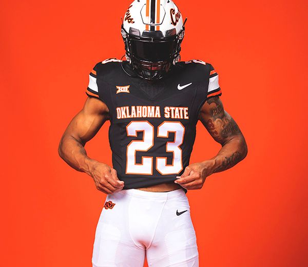
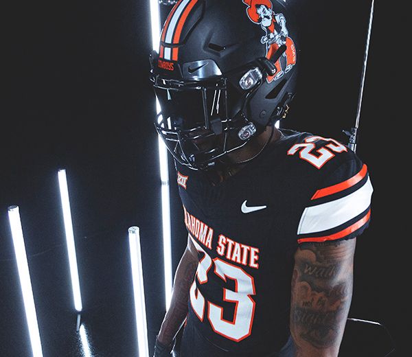
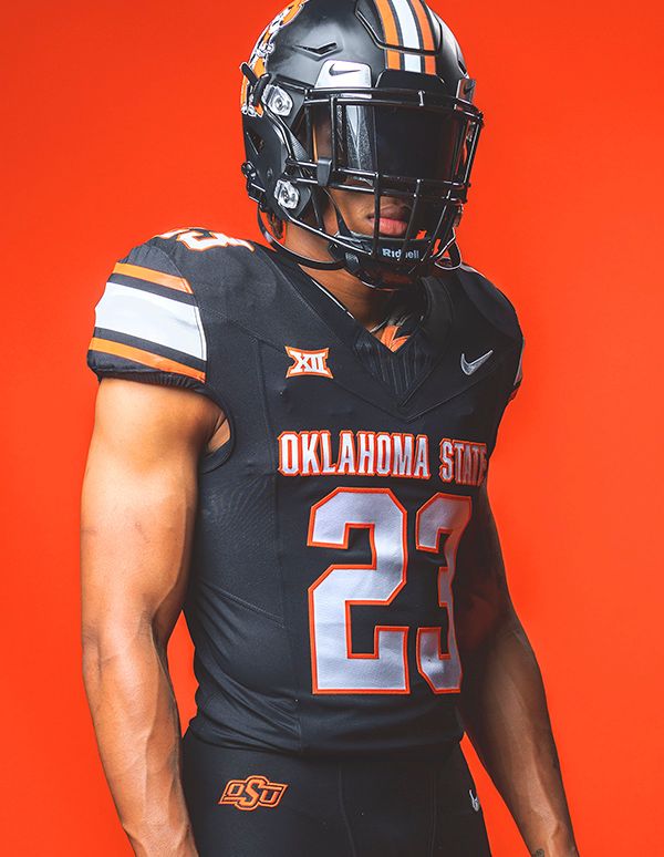
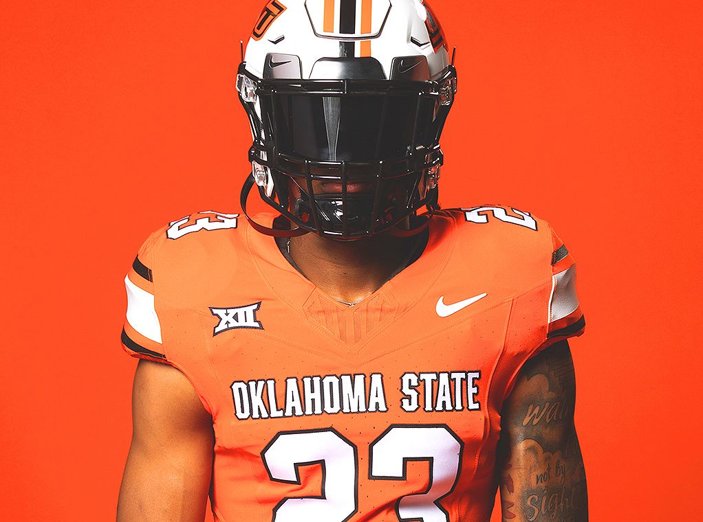
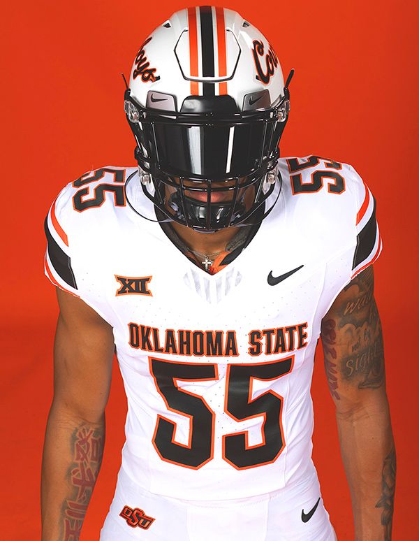
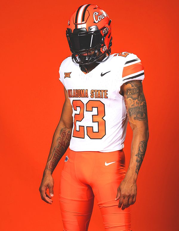
Via Oklahoma State Football
You can probably tell that I like these shoulder stripes, right? Oklahoma State's been the poster child for doing too much uni-wise over the last 15 years, and it's kind of shocking that they completely scrapped what they were doing and decided pay homage to their 1980s teams with a whole new primary set. I like every combination here, but the black jersey with white pants is a killer. I count four different helmets in the above photos, and you can bet they have a few more stashed away for the season.
3. Florida State (Last week: 2)

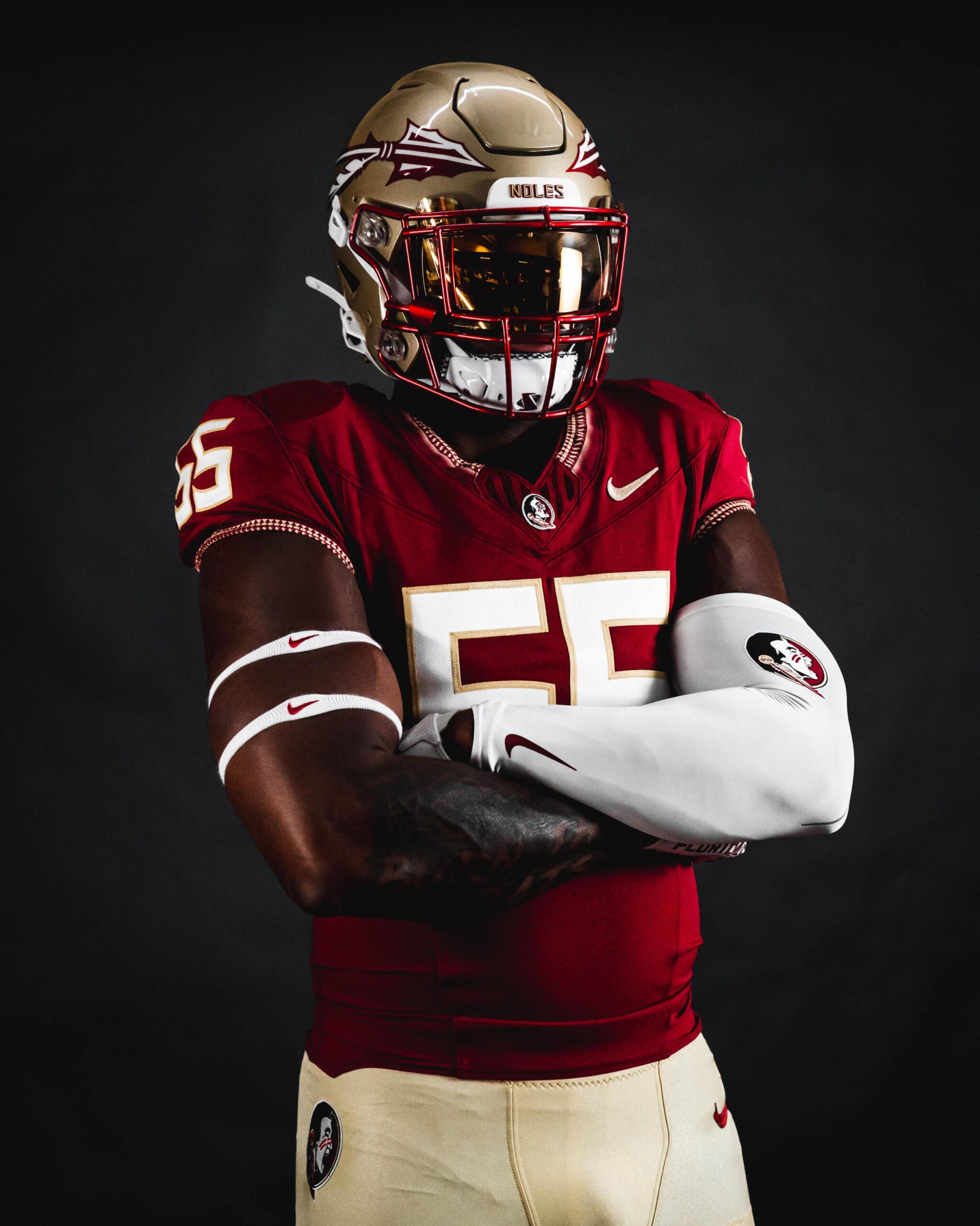
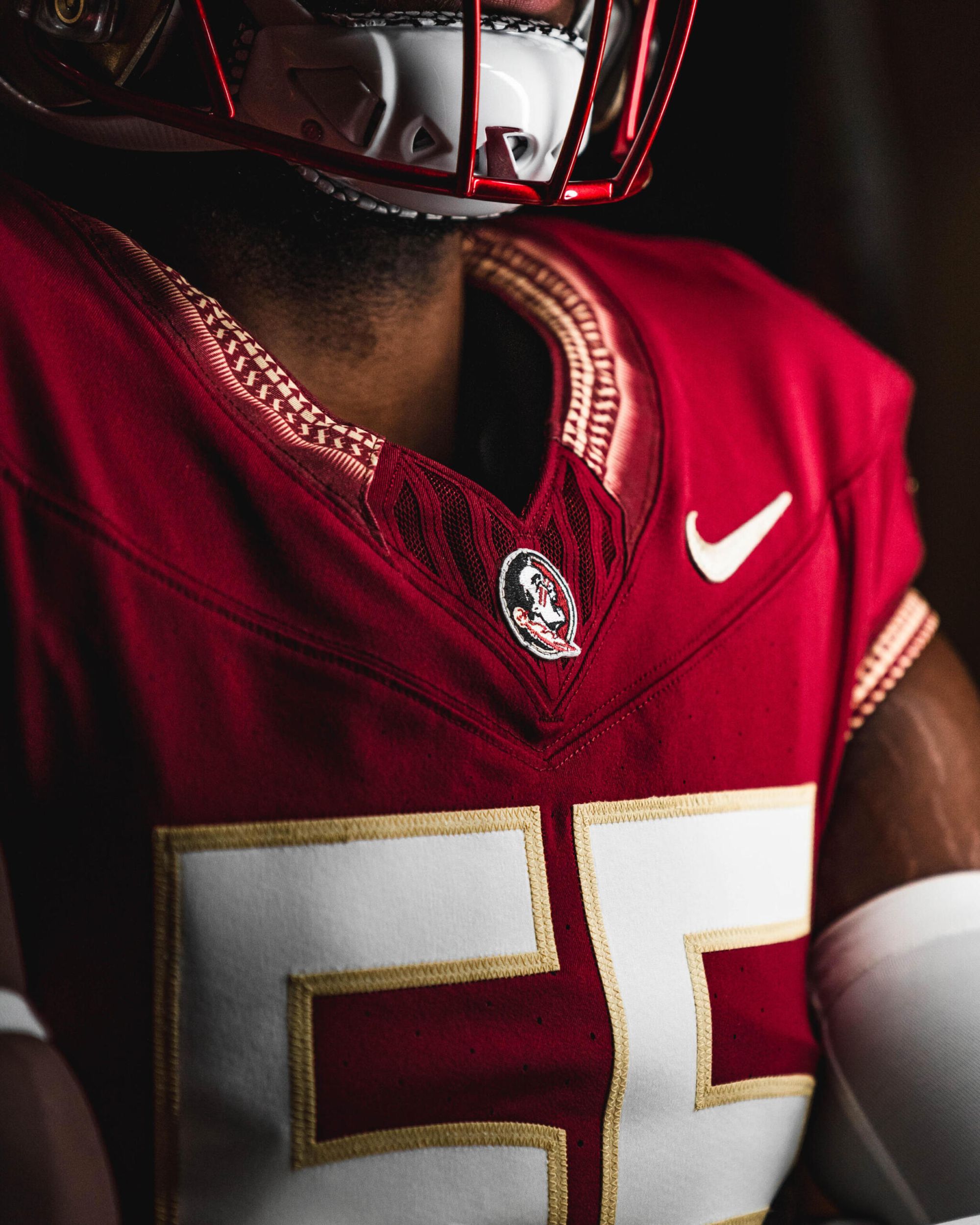
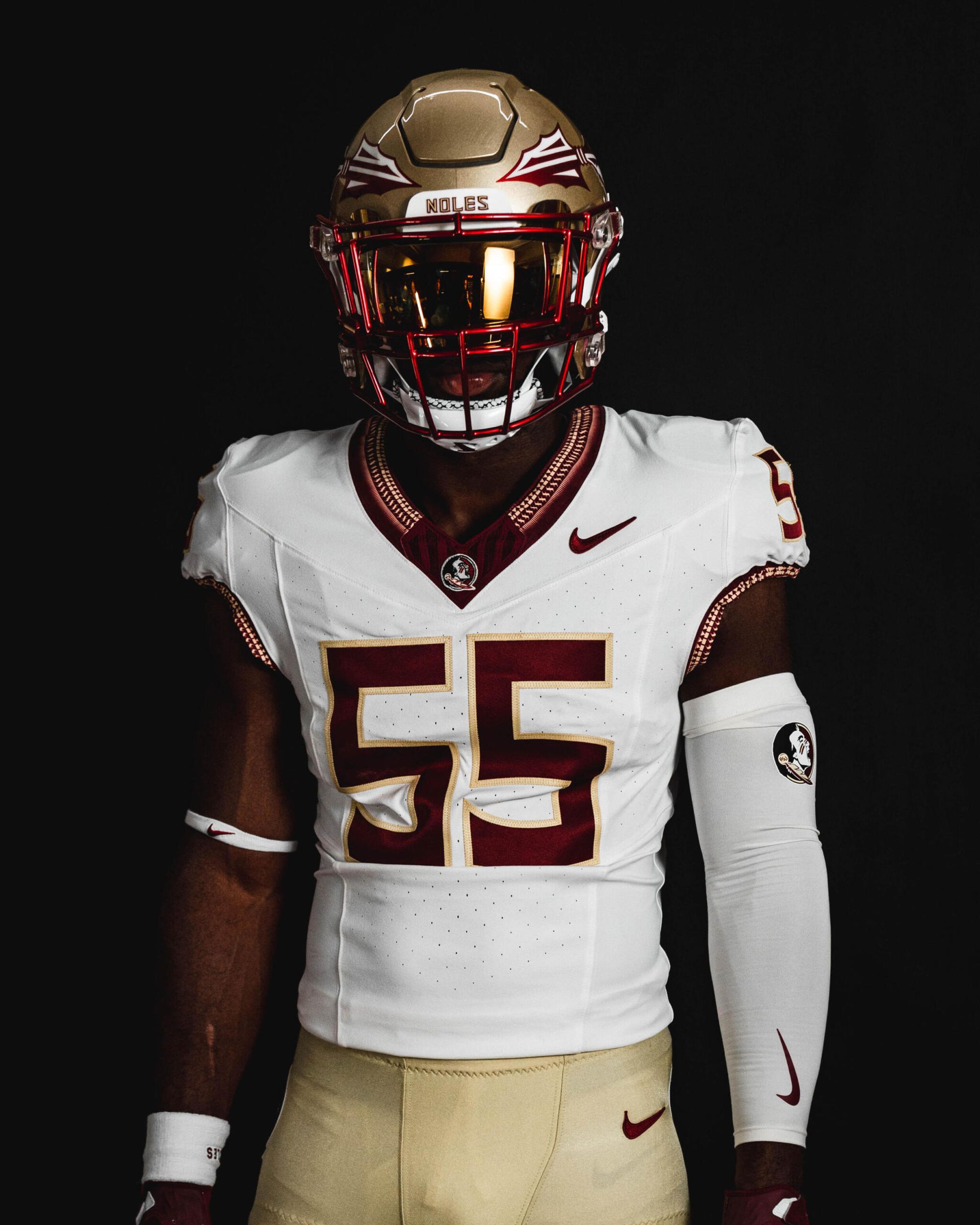
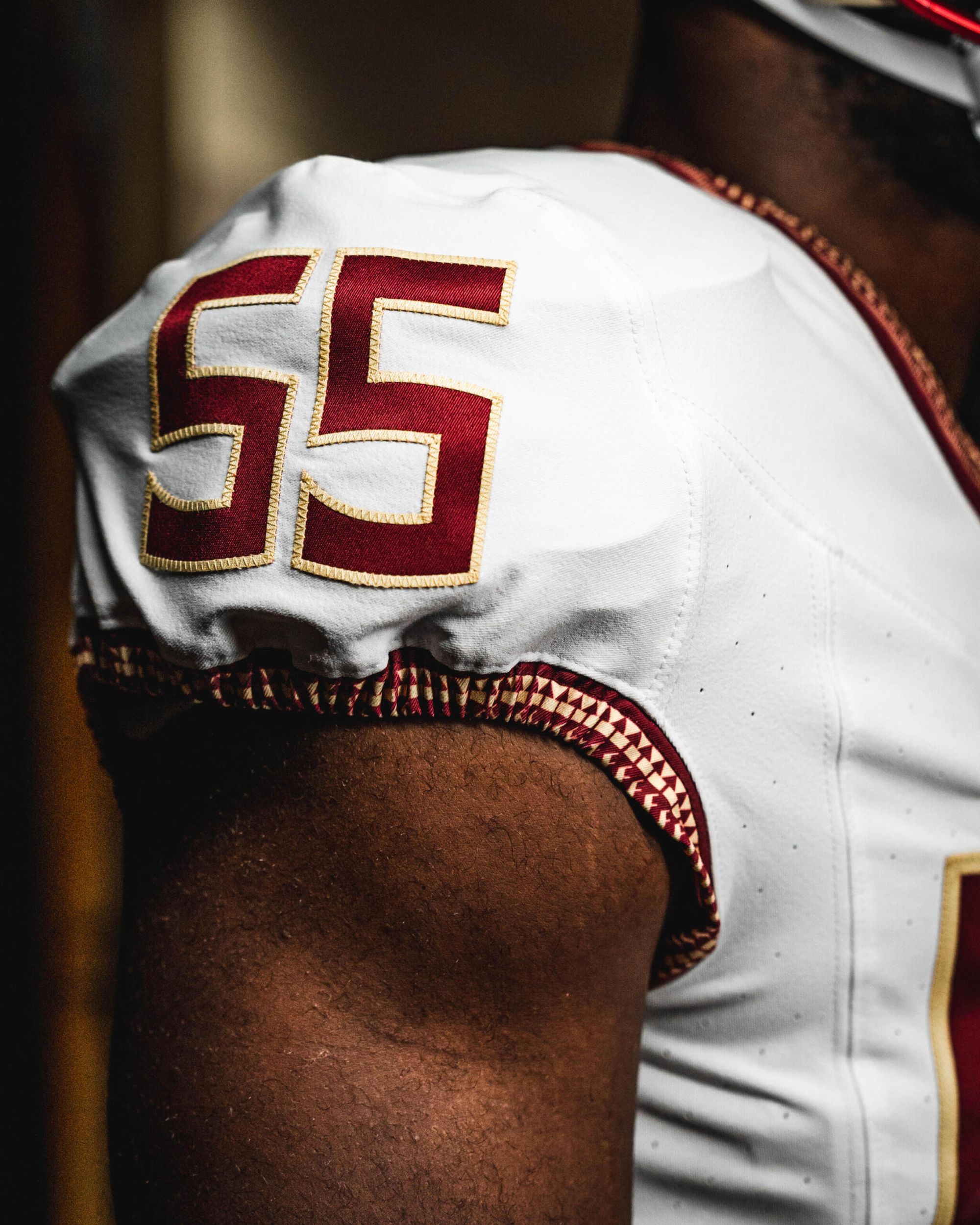
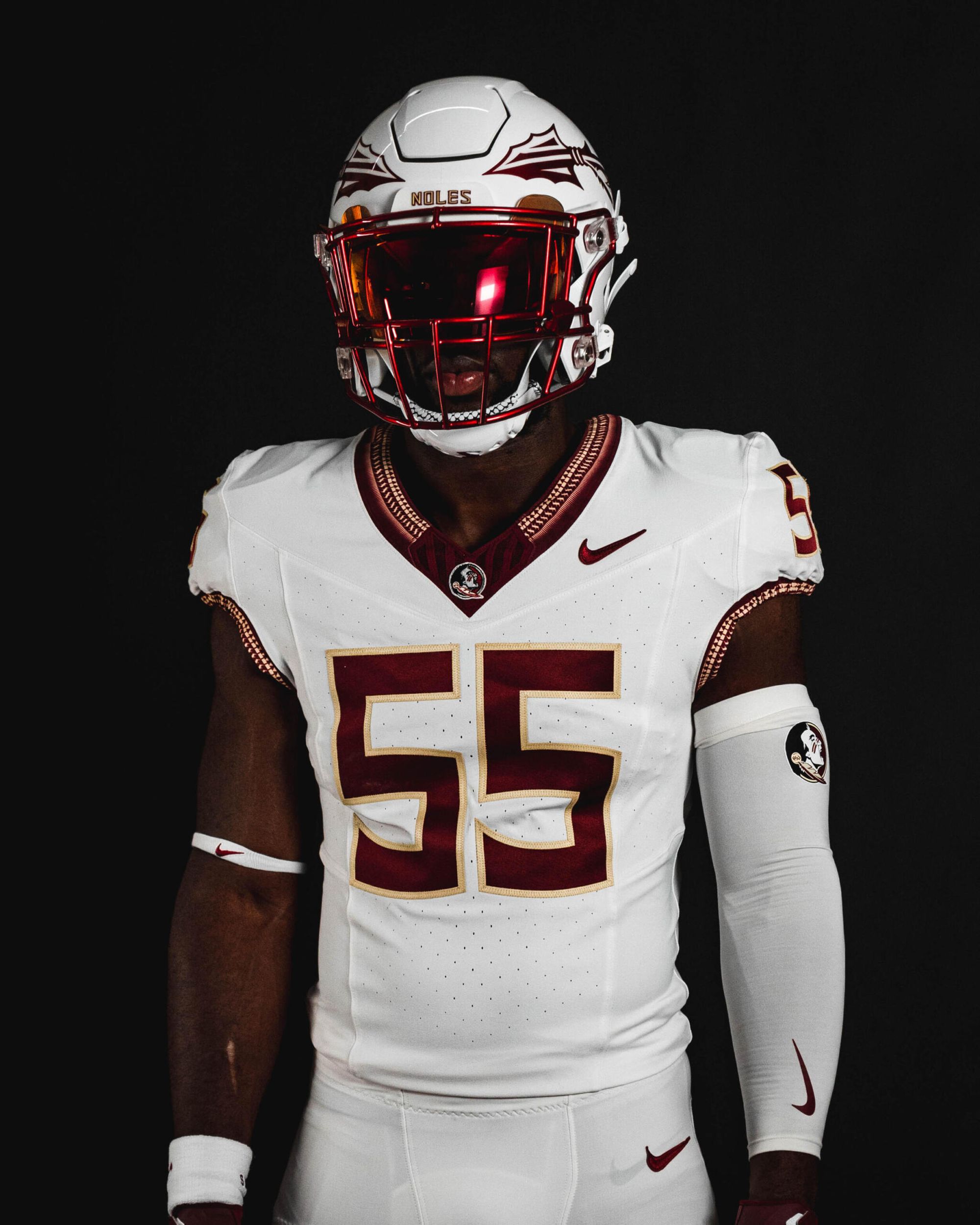
Via Florida State Football
There's nothing else to say here other than this feels right. No more ridiculous pattern on the shoulders, and the size of the collar pattern has been reduced. The numbers on the front of the jersey look smaller, and I dig that they're also on the shoulder panels. They probably have some kind of alternate ready for mid-season as well, but this is exactly what Florida State should look like.
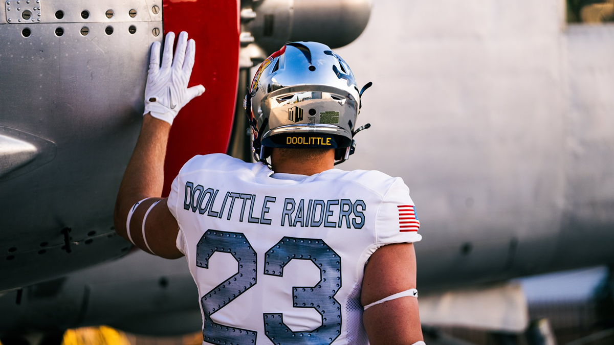
2. Air Force (Last week: NR)
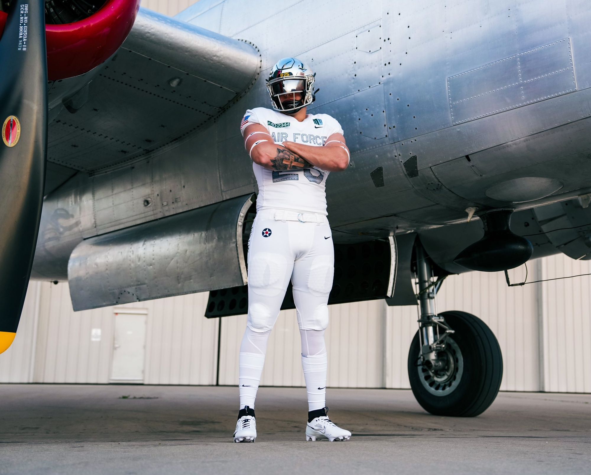
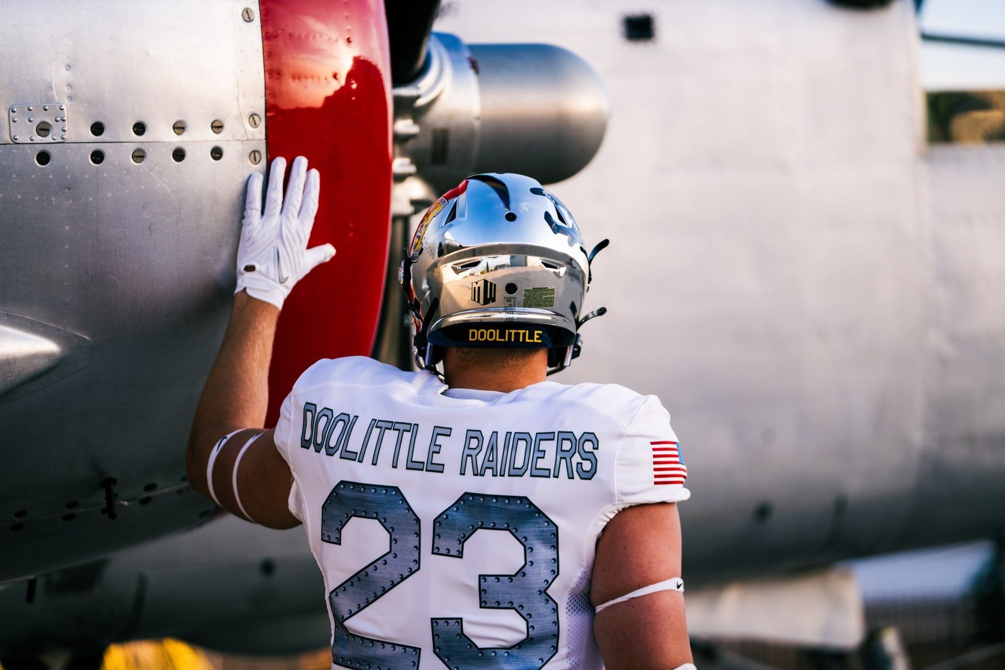
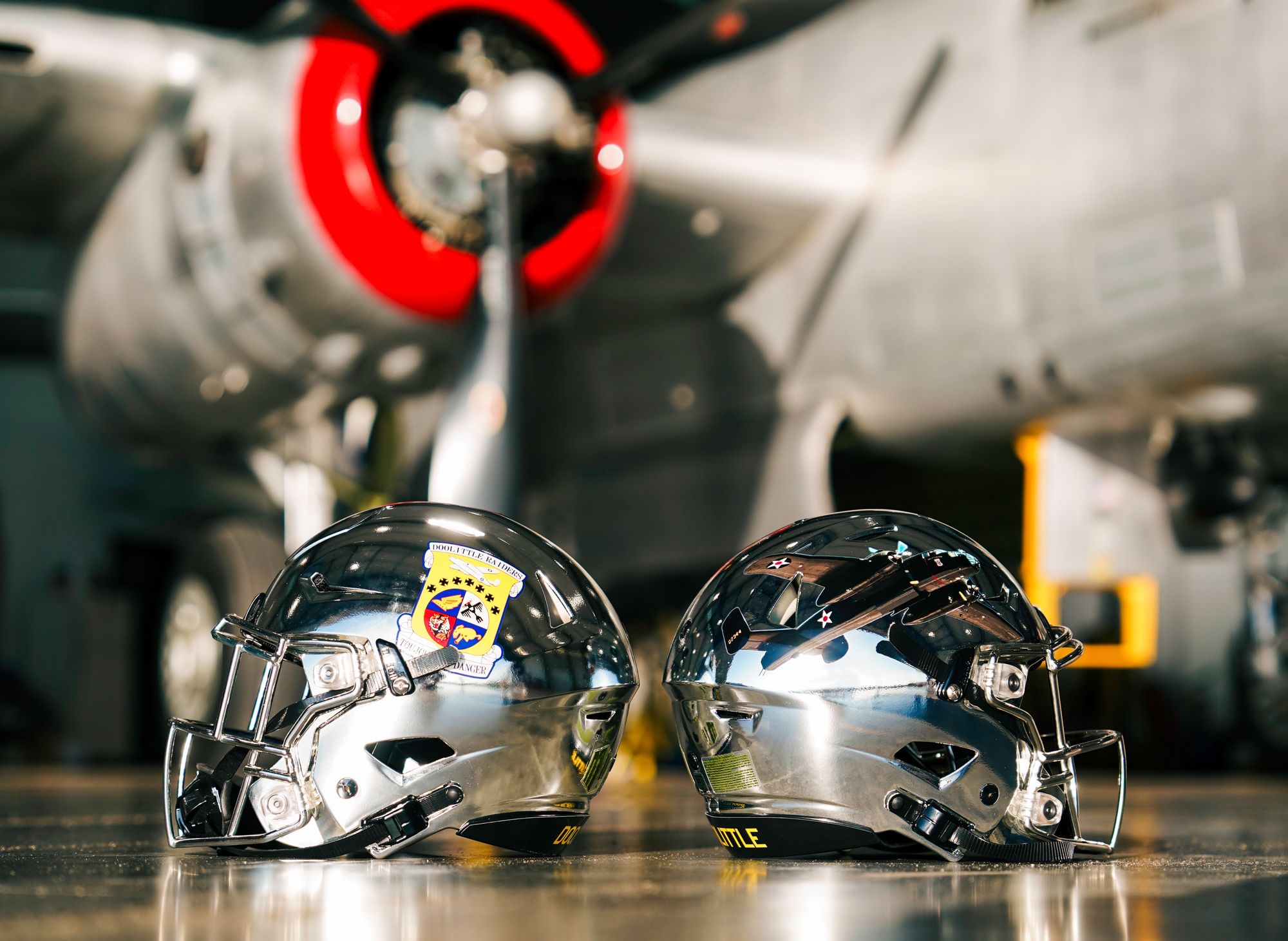
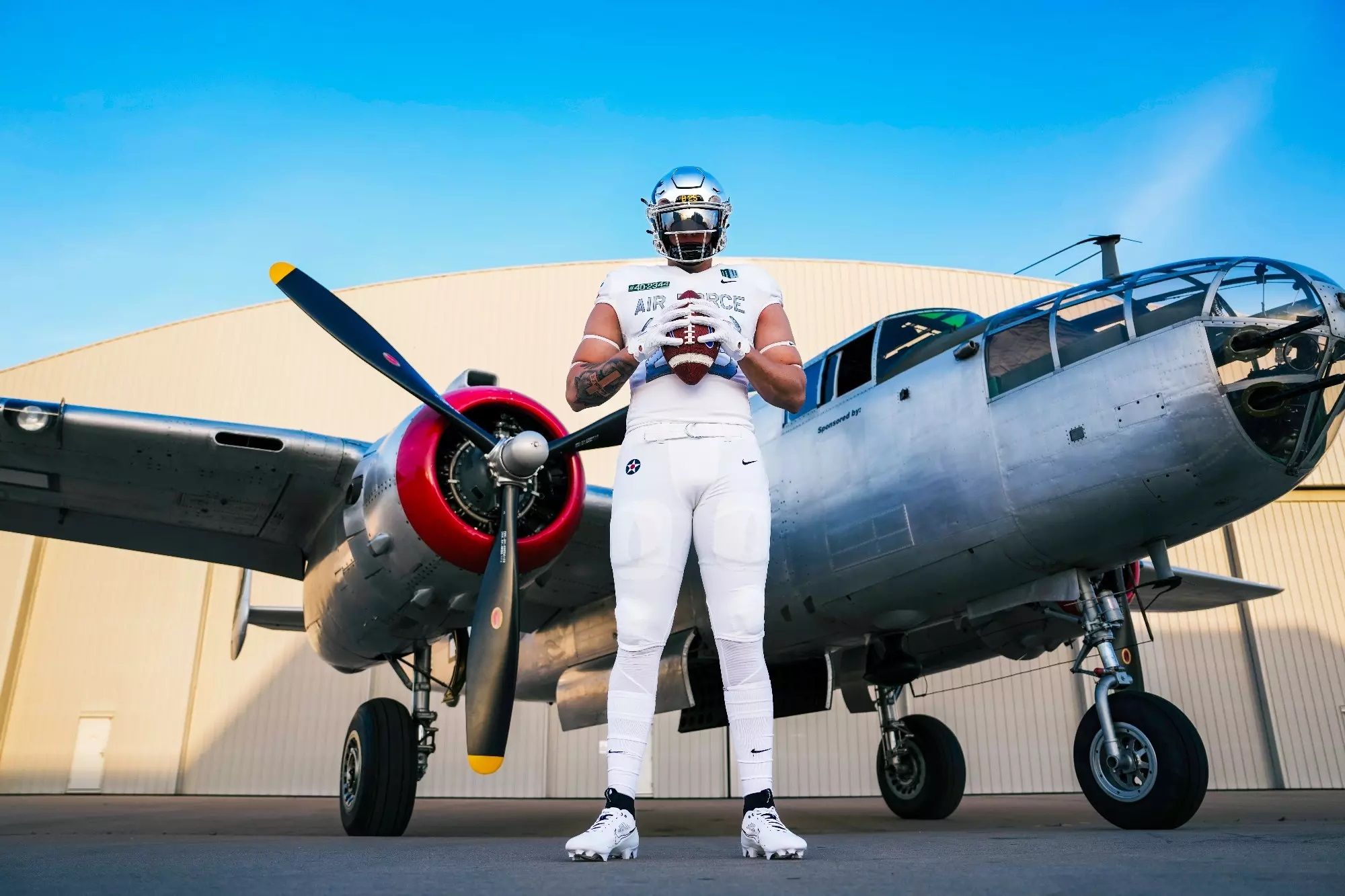
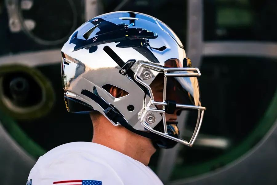
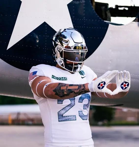
Via Air Force Football
I'm not someone who gets swept up in military/service pride uniforms, but these are just straight-up cool. This is the eighth uniform in the Air Force "Air Power Legacy" series and these are the best ones yet. The reflective helmets, the steel numbers - it's all excellent. They're wearing them at Navy on October 21 as tribute to the Doolittle Raiders, and you can read more about them here.
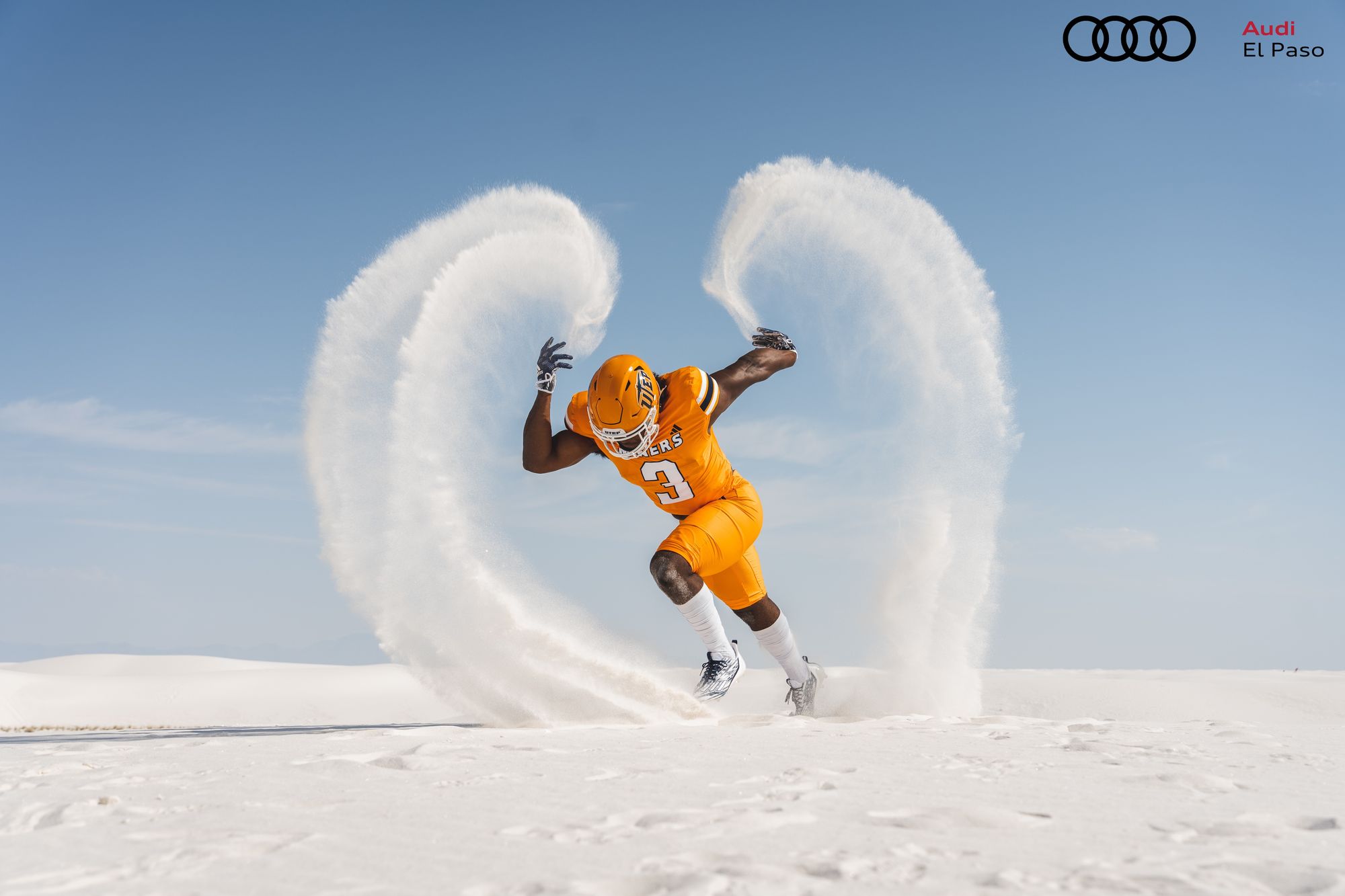
1. UTEP - 1988 Throwbacks (Last week: 1)

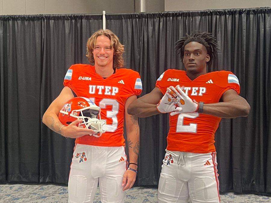
Via UTEP Football
No change at the top. These are still the best new uniforms of the offseason, and I can't wait to see them on September 23.
/cdn.vox-cdn.com/uploads/chorus_asset/file/23899197/1236591681.jpg?ref=2stripescpd.com)
/cdn.vox-cdn.com/uploads/chorus_asset/file/23896555/1236448362.jpg?ref=2stripescpd.com)