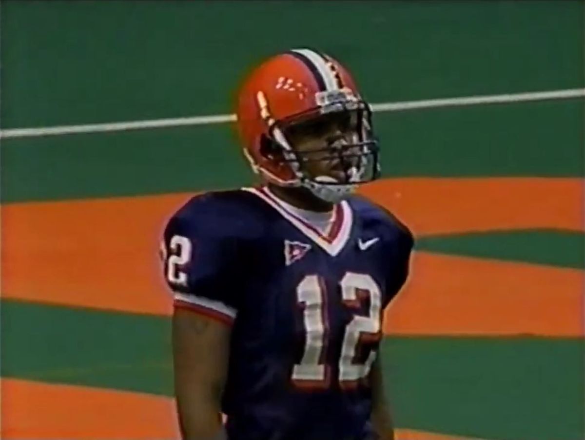
Uniform of the Day Uniform of the Day: It's time to come home, Syracuse The Orange have strayed from God's light for too long.
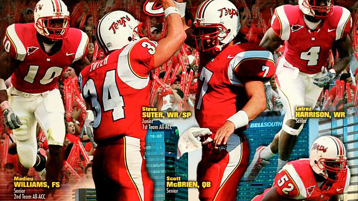
Uniform of the Day: Remember when Maryland was with Nike? That's right, the Terps rocked with the Swoosh once upon a time.
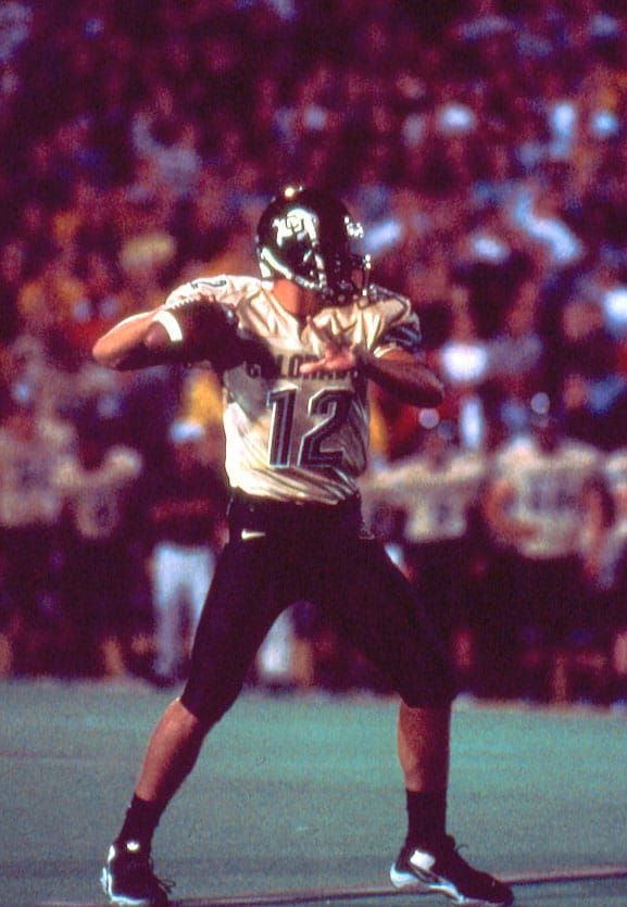
Uniform of the Day: Colorado goes Vegas gold for one night only The last time the Buffs rocked a true gold jersey.