College Football Uniforms I need to see again
Some of the best (and worst) threads I want to see on a CFB field again.
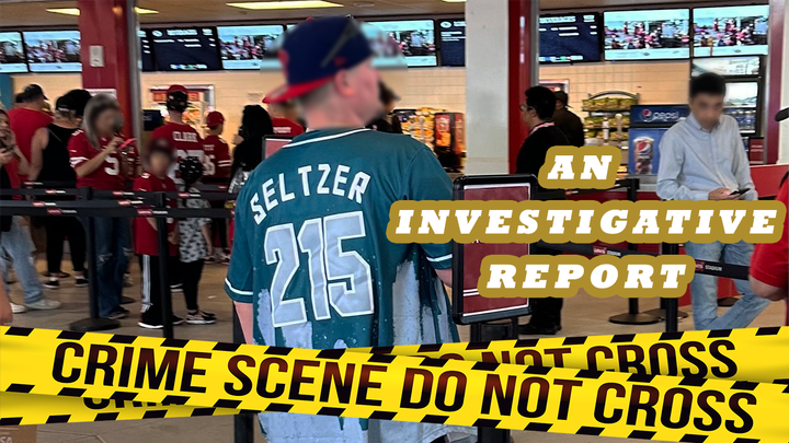
(Note: People viewing on email should click 'view online' above the photo, because today's article is chunky)
I spend a lot of time thinking about uniforms, and since there isn't a ton of actual football to talk about (yet), I thought now would be the perfect time to comb through the far reaches of the internet for a nice uniform article. Over the last couple weeks, I've been digging through team media guides, old uniform previews, helmet history and the memories in my own sick brain to compile this list of uniforms throughout college football history that I'd like to see on the field again.
Just so we're clear, I'm not necessarily saying I want to see these uniforms back because they look good. In fact, most of them are horrendous; I just want to see what they'd look like in 2022. My only real guideline/rule was it couldn't be a uniform that a team wears regularly as an alternate, or have recently worn as a one-off. Let's get to it.
Indiana - Late 90s/Early 2000s


I might be the only person in the world who likes these. Indiana fans hate them from what I've read, but they'd look great today compared to then. Their main uniforms now are fine, but these would be a huge improvement over the fake mesh jersey with the Illinois helmet they wore as an alternate against Cincinnati last season.
I also love the circle 'IU' logo, mostly because it looks like it belongs to a Midwest gas station company:

Bonus: The black alternates (1997)

Heavy 90s Atlanta Falcons/Houston Gamblers vibes. They only wore these once –against Kentucky in 1997– and I'm begging for them to return to the rotation.
Colorado - 1930s throwbacks (2009)


Hear me out: This uniform sucks, but I like the idea. These also had the unfortunate distinction of being part of CU's awful uniform set during the Dan Hawkins era, which makes them even worse by association. The ugly piping on the chest and pants. The shade of gold that looks like it was made from a green/gold/piss-yellow mixture. The completely unnecessary texurted material on the shoulders. It was all bad.
As for these: Axe the fat pants stripe, fine-tune the gold, get rid of the shoulder material, and we're really on to something. I like the silver/gold/silver theme from top to bottom, and the black buffalo horns on the helmets are beautiful.
Ohio State - The 2017 Michigan uniforms


I had this in the drafts before Dwayne Haskins tragically passed away earlier this week, but these uniforms now have an even more special significance for Ohio State fans beyond beating Michigan in them that day. This was Haskins' first big moment, and I think bringing them back for this year's road trip to Maryland –where Haskins grew up– would be a nice tribute to him and his family if it's possible to make happen.
Memphis - The flying tiger (1988-89)
It feels like Memphis has worn as many different helmets and jerseys as anyone recently, so why not bring back the flying tiger head? While we're here, the Seahawks need to bring theirs back, too.
BYU - The bib jerseys (1999)


Arguably the most hated uniform of all-time makes the list. Not because I'm going to try to convince you they're actually good –they are– but because they helped set the tone for everything in the world of college football uniforms to come. These uniforms –along with Oregon's 1999 set– were the tipping point for Nike, Adidas, and other suppliers to push past the boundaries of football uniform decency, for better or worse.
Beyond setting a lasting legacy for uniforms and looking like a bib, these elicited such a strong reaction that the NCAA made up a whole damn rule specifically banning them. Imagine if the first Air Jordan's were so ugly that David Stern actually banned them. That's what we're dealing with here. Also, the helmets kicked ass, but we'll get to those later.
Whether you like them or not, The Bibs are a legendary thread in uniform history, and they deserve their flowers. The day I become NCAA President, I'm un-banning them and forcing BYU to wear them again. Until then, long live The Bibs.
Purdue - 1965 throwbacks (2006)


From the helmets to the socks, these are perfect throwbacks. Purdue wore these for their 2006 season opener against Indiana State as a tribute to their 1966 Rose Bowl Championship team, and they'd probably look even better in 2022 paired with their 2000 throwbacks.
Iowa State - The 'Beat Iowa' jerseys (1977)


Imagine the discourse online if a team did this today.
For instance:


Iowa - 1921-22 throwbacks (2012)


A uniform that somehow looks worse from the back and the sides than it does from the front. I just want to see if it's even possible for Nike to replicate this monstrosity, and since it's the 100-year anniversary of that 1921-22 team, I'm going to irrationally get my hopes up that we see them again.
Colorado - Sky blue (1981-1984)


These uniforms –and this era of CU football– were so universally despised by the fanbase that almost 30 years later, students planned a powder-blue protest because of how bad the 2009 team was. (Ironically, the 2009 Colorado team was wearing the hideous uniform set I mentioned earlier.)
So why do I need to see these again? Because Karl Dorrell has the program in just as bad a place right now as it was in 1981-84, –maybe worse– so it fits, and it'd also be kinda funny to see them blatantly swagger-jack UCLA now that they're in the same conference.
Bowling Green (2001-2004)


Time to get serious for a second. I'm pleading Bowling Green to get back to basics, and these are the uniforms to accomplish that. There isn't an FBS program who's had consistently uglier uniforms over the last 15 years than what Adidas and Nike have cooked up for BG, and that goes for the helmets, too. The 2001-04 set is clean, has the GOAT falcon logo on the helmet, and the cool drop shadow on the number font. Hell, you could even add a brown alternate uniform and helmet to it for all I care - just bring these back.
Oregon - 2006 Las Vegas Bowl


A heinous uniform, on every single level. The helmets had the same gold/green/piss-yellow color mix I was talking about earlier with Colorado, except these also had flames airbrushed on them. The color doesn't even match the rest of the yellow on the jersey! What's incredible is that the helmets might not even be the worst thing here.
Nike went through this weird phase where they gave Oregon's knee and shoulder pads the texture of steel stairs, and as much as I applaud the effort to go wild, even I have my design limits. Throw in the cartoon numbers, and we've got one of the worst combos ever. A uniform so bad that I need to see it again, to just confirm that it was a real thing that happened.
Temple - (1998-99)


I'm not asking for a full-time return to maybe the most aggressively-1990s uniform on this list, but I do want to see the flying owl helmet again, plus the hilariously cartoonish font and numbers are great. Maybe just bring the black alternates back as a one-off? Temple's current uniforms need a refresh, anyway.
Tulsa - The hurricane helmets (2009)


I'm only asking for the helmet here. I don't need or want to see the jerseys and pants ever again. Too much yellow, too much late-2000s Nike piping overkill. But the helmets? Those are perfect, and according to my brief research –shoutout to helmet history– the only time Tulsa ever wore them was for this game against Memphis in 2009.
Both uniforms from the 2012 Nebraska-Wisconsin game


Every year Nebraska or Wisconsin don't win the Big Ten West, they should have to wear these against each other the next season as punishment. They've let Northwestern and Iowa win the last two years, and they both need to pay the consequences.
Clemson - 1939-40 throwbacks (1995-1996)


Placing these in the category of uniforms I think would completely kick ass with today's materials. I also like the idea of big-time programs using cupcake games as an excuse to either go wild with uniform designs, or wear throwbacks like these. That way you avoid risking them becoming a sour memory you'll never want to wear again. Clemson always has a yearly beatdown scheduled for someone like The Citadel or Furman, and that'd be the perfect time to roll these out again.
Virginia Tech - Digital uniforms vs. Boise State (2010)


One of the most influential uniforms of all-time, worn in one of the most influential games of the modern era. Oregon pioneered the uniform craze, but this game felt like the moment alternate uniforms truly exploded into what they are today:
Big shout out to Nike Football for dressing this game. Best dressed game ever!!
— LeBron James (@KingJames) September 7, 2010
Realistically, I know these are never coming back, but damn would I love to see them. Maybe it's just nostalgia, but I'll always associate these uniforms with a time when VT was a major player in CFB. I miss those days. And honestly, they've worn some wild shit in the years since, so it's not like bringing them back for one game only is doing too much.
(I love this game so much that last month I made a 20-minute video about it)
Rice - (2006)


Let's dork-out on this one: It took me a second to figure out what these reminded me of, and then it hit me: They're the same template as the Patriots' dynasty-era uniforms, which makes sense because Adidas initially designed those, too. They also have a very 2000s-Chargers feel because of the colors, which rules. Rice's current set is pretty standard, so at the very least I'd like to see the sprawling eagle helmet from that season back in the fold.
Akron - Late 1990s/early 2000s


Just like Bowling Green, Akron needs to go back to the 2000s. They switched to Nike last year –I'd love to hear the story someday on why it took so long for that to happen given *points at LeBron*– after years with Adidas, and they kept their year one looks under the swoosh pretty simple. I, for one, won't stand for 2001 Charlie Frye erasure, and I'm demanding that this yellow/navy blue combo be revived, as well as the superior 3D 'A' helmet. This is what G5 greatness looks like.
Eastern Michigan- 1970s/80s


EMU EMU.
Georgia - 2011 Pro Combat vs Boise State


Just to laugh at how ugly they are one more time.
Hawaii - 1999


This one-season uniform made the list for two reasons:
- The completely absurd and wonderful helmet logo
- The incredible rainbow pants stripe on the dark green home jersey.
This whole getup is so late-90s/early 2000s that I can actually hear the old Fox Sports Net CFB broadcast intro music just by looking at these photos.
Air Force - Stealth Bombers (2012)


Putting these in the 2011 Georgia pile. You can't convince me they aren't worse than The Bibs. I appreciate that if you look close enough, the helmet, shoulder, and pants stripe designs are all little stealth bombers, but it's funnier to pretend that Air Force decided to wear houndstooth once for no reason. This is the textbook Nike overkill from this era I was talking about with the Tulsa uniforms.
Iowa State - The Seneca Wallace set (1995-2002)


Iowa State's spent the last three years obsessively adding black to their color scheme as alternates, and I'm done with it. We're 20 years removed from the era where ISU wore these, which means it's time for them to get the retro treatment; especially the tornado bird helmet. Red, yellow, white, and navy blue isn't a color scheme that should work, but it did then, and it'd look even better now.
SDSU - The two-tone helmets (2001-05)


Before the era of matte, metallic, bowling ball, and state flag, San Diego State's early-2000s helmets set the tone (literally) for helmet design innovation. They were the first team I can remember who rocked the two-tone airbrushed style, and it looked so badass in every setting they played in. They were always a team I wanted to play with in NCAA 01-05 because of the helmets, but unfortunately they haven't worn them since that '05 season. The rest of their uniforms from this era were hit-or-miss, although I do love the old Colorado Avalanche number font, and wish more teams across all sports would bring it back.
San Jose State - '4-Players Only' (2001)


A few things about this one-of-a-kind uniform:
- The scrunched font on the chest, with the massive 'S' and 'E' letters bookending 'AN JOS TAT" to spell the school name.
- The multi-colored side-panels that jut out to the collarbone area, then wrap around the shoulders.
- The black alternate: a top-3 so-bad-it's-awesome uniform. I'm pretty sure I saw one in person when I went to SJSU's spring game the other week, and I'm retroactively pissed at myself for not buying it.
These have a unique story. Fitz Hill –SJSU's Head Coach in 2001, and one of only five black head coaches in Division 1-A that season– and the school partnered with a Texas-based, black-owned apparel company named '4-Players Only,' to make their uniforms and gear, and it led to one of the most out-of-the-box sets ever. From what I can tell, the partnership (and uniforms) only lasted one season, but it was a move that was as ahead of its time as the actual designs were.
BYU - 1940s

These are pretty out of control for any era, much less the 40s. But maybe they aren't as wild in colo-

Eastern Michigan - The alarm clock uniforms (2015)


I had no idea these existed until I started doing research for this column. A uniform so appalling that when I saw it for the first time I thought I was looking at photos from someone's NCAA 14 create-a-team dynasty. There are zero redeeming qualities here, so let's run down everything that contributes to maybe the worst uniform ever:
- So many god damn numbers. They're on the front and back of the jersey, both shoulders, and one side of the helmet. They're even on the pants, but for some reason are in a different font there than the rest of the numbers on the uniform.
- The font itself is HUGE, and reminds me of an alarm clock, or a bomb countdown timer from a 90s movie. Maybe they were just paying tribute to '24'?
- In addition to the gigantic numbers on the front, we've got the extra large, 'EASTERN MICHIGAN' script that –in true Adidas fashion– is so contorted by its fabric that the whole thing looks like it's photoshopped by a 13-year old making sick editz for their favorite CFB team. Plus, we've got patches from Adidas and the MAC on each side of the chest to clutter the front even more.
- A matte, forest green helmet with a different design on each side, including an alternate 'E' logo with attached wings. Quietly, this is the most sickening thing here.
- White piping on the front and back of the shoulders that spills into the collar on each side, plus separate white piping below that extends across the back of the jersey just above the numbers.
- The highlighter yellow blob side panels, that also somehow jut into the front and back of the jersey.
- Everything else is so bad that the pants don't even bother me.
Bar none, this is the worst uniform to ever grace an FBS football field. I need it revived so I can travel to Ypsilanti, Michigan, and see it with my own eyes like I'm Darth Vader looking at Luke without his helmet on for the first time.
UConn - The Aeropostale uniforms (2002-03)


I couldn't write about uniforms and not mention these, right? Imagine a world where clothing brands outside of Nike, Adidas, and Under Armour make FBS uniforms in 2022. I want Uniqlo designing for Charlotte. Homage for Ohio. Pacsun for Fresno State. Patagonia for Coastal Carolina. The possibilities are endless.
LSU's gold alternates- (1996, 1997, 1998)


LSU doesn't get enough credit for quietly having a stable of banger alternates over the last decade-plus. The last time they wore gold jerseys was against Mississippi State in 2016, but I like these three from the 90s better. No one does simple, yet effective better than the Tigers.
BYU - (2004)


We saved the best for last. BYU fans: Forgive me. I'm bringing up all the uniforms you hate, but this time it's actually not a gag. I understand and accept that I'm a bad person for thinking these uniforms are great, but I can't help myself.
These dropped four years after The Bibs, and only lasted one season before BYU permanently went back to more of the traditional look we still see today. There's a lot going on here, but this is one of my favorite sets ever. I dig the gold accents, from the triple stripes on the pants and shoulders, to the outline on the numbers. It compliments the navy blue perfectly. Add in one of my favorite helmets of all-time, and you've got a uniform that I unashamedly love. If I had to pick one uniform out of all we've gone through to come back –even just for one game– it's this one.