15 NHL uniforms that need to come back
The uniform connoisseur has re-entered the chat.
It's been too long since I talked uniforms. With leaks indicating that the Buffalo Sabres 'goathead' uniforms are making a comeback next season –along with the league-wide return of the Reverse Retro sets– it's time to get back in my duffle. This column is all about the other NHL uniforms I'd like to see make a return next season, but with a couple parameters:
- No reverse retros, since they're coming back anyway.
- No mixing and matching eras. I can't say I want the Leafs to bring back their 1930s set and their 2002 Heritage set in the same bullet point.
- Some uniforms on this list are ranked higher than they normally would be because their team has such a bad current set that it needs to be changed immediately.
- I'm not calling for all these to be primary uniforms. I just want to see some of them brought back as alternates.
- No defunct teams. As cool as it would be to see the Jets take the ice as the Atlanta Thrashers, I'm trying to stay grounded to some sort of reality here.
- Getting rid of the Avalanche's blue pants/blue glove/blue helmet trio doesn't apply here. I still can't find the right words to describe how much I hate that shit.
Honorable mentions:
- Colorado Avalanche - Burgundy alternates (2001-07)
I distinctly remember people around Denver not liking these –probably because the Avs golden era crumbled in them– but I always thought they looked regal.
- Anything that isn't what the Lightning are currently wearing
"Look good, play good" apparently doesn't apply to Tampa Bay. I'd like a complete refresh for the Lightning, which is why they don't make the list. (Teams actively winning titles rarely ever do that anyway.) Maybe it'd be cool to see the 1993-94 set with NASCAR numbers? Or the 1996-99 set with lightning numbers and a literal thunderstorm jersey? I don't know, but the best team in the league deserves better than the most boring home/road uniforms in the league, and the sorry ass excuse of a logo they currently rock.
- Detroit Red Wings - 2009 Winter Classic
Detroit's current uniforms are perfect, but these would be nice weekend home alternates.
- Carolina Hurricanes - The hurricane white jersey
Banish the diagonal 'Canes' jersey into uniform hell forever.
- Montreal Canadiens - 100th anniversary
More stripes. Always more stripes. Until the whole uniform is nothing but stripes.
The greatest All-Star uniforms of all time. A set so legendary that the Dallas Stars took the design for themselves. (More on that later.)
15. Colorado Avalanche - 2016 Stadium Series
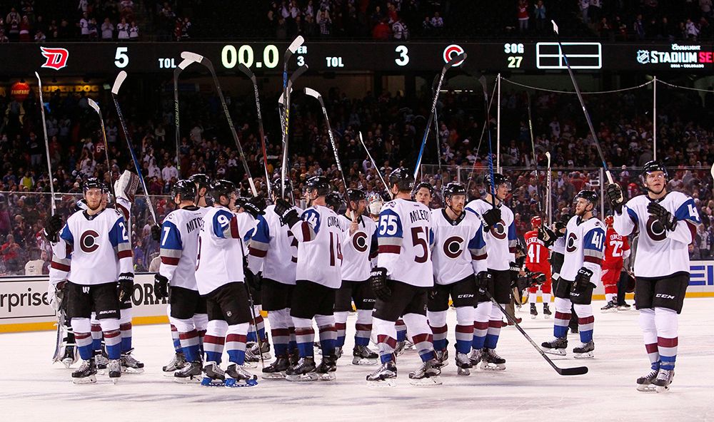
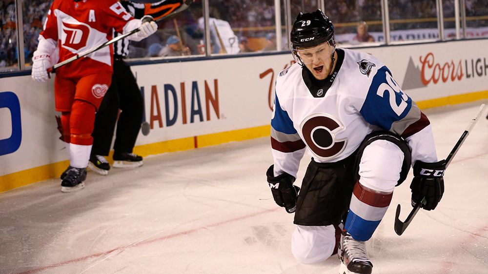
I'm a big fan of the current alternate uniform, but I'd love to see these get back into the rotation somehow. The three-color stripes on the arms, paired with the big ass TV numbers somehow works for me.
14. Philadelphia Flyers - 1997-2007 alternates
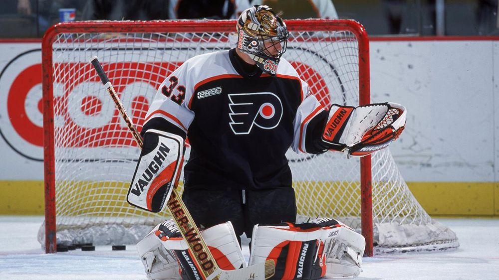
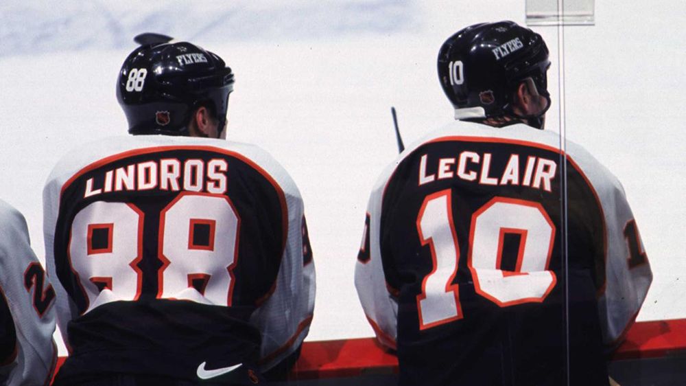
Eric Lindros, John LeClair, Keith Primeau. Tough ass hockey. That's what I think of whenever I see these. The Flyers current set is one of the best in the league, but these would be a solid addition to the rotation once Philly finds an identity that isn't double-digit losing streaks.
13. Anaheim Ducks - 1998-99 home/away
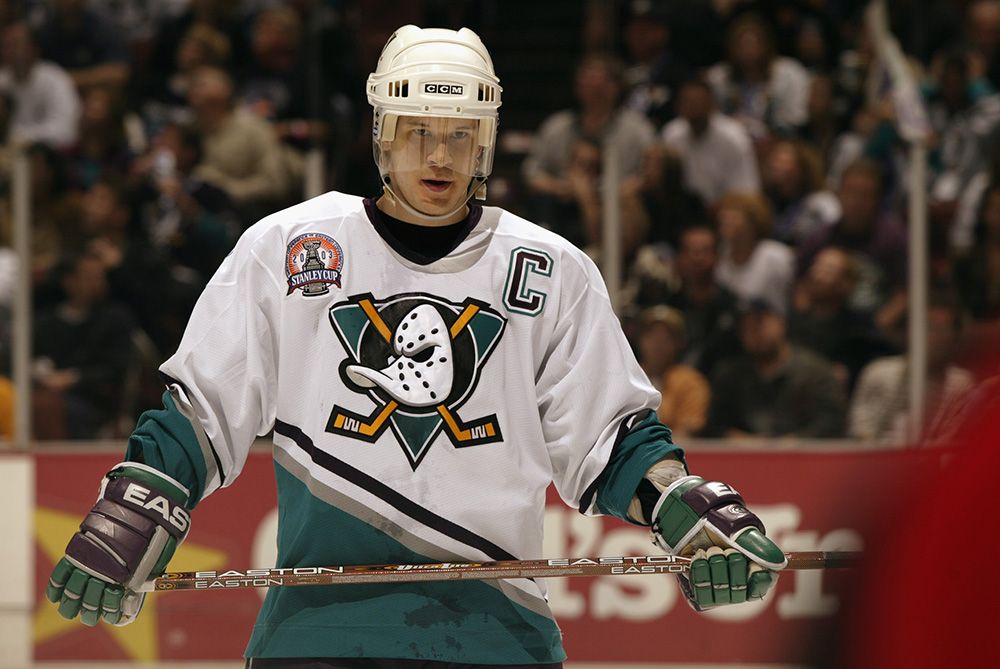
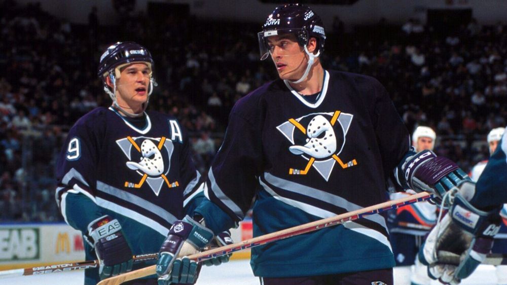
Black and Orange works in Philly. It doesn't in Southern California. It's time for the Ducks to either start from scratch, or go back to the basics of the Paul Kariya/Teemu Selanne era. The purple/teal combo is unique, and we've already seen that it works with modern fabric.
12. Edmonton Oilers - The Oil Drop
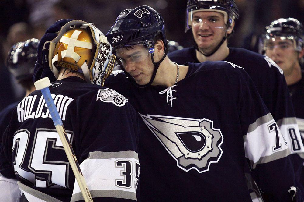
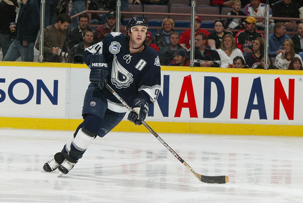
I'm the only person in the world who likes these, and I refuse to take them off the list. They're an affront to the history of the Oilers, and that's precisely why they rule. BRING BACK THE OIL DROPS!
11. NY Rangers - Statue of Liberty (white)
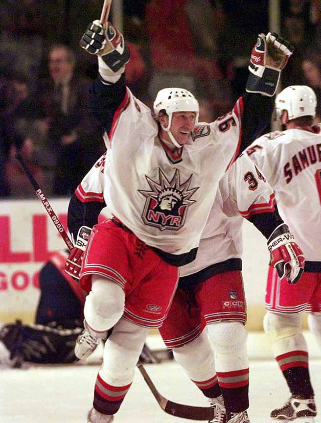
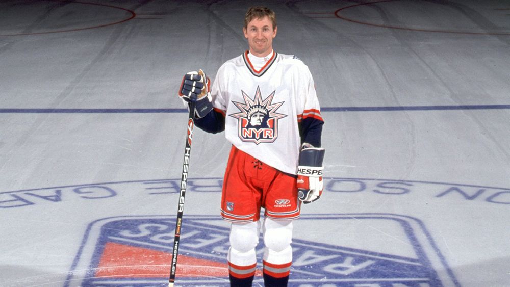
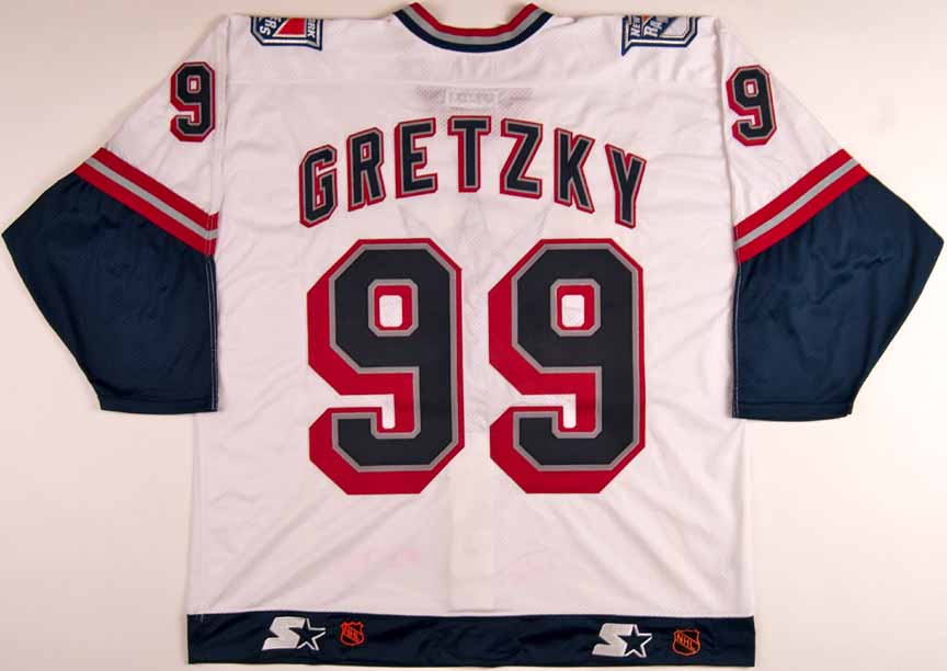
I said no reverse retros, but this is the white version that the Rangers wore for one season in 1998-99. They already have a legendary set, but I need these back as alternates.
10. Washington Capitals - 1990s/Early 2000s set
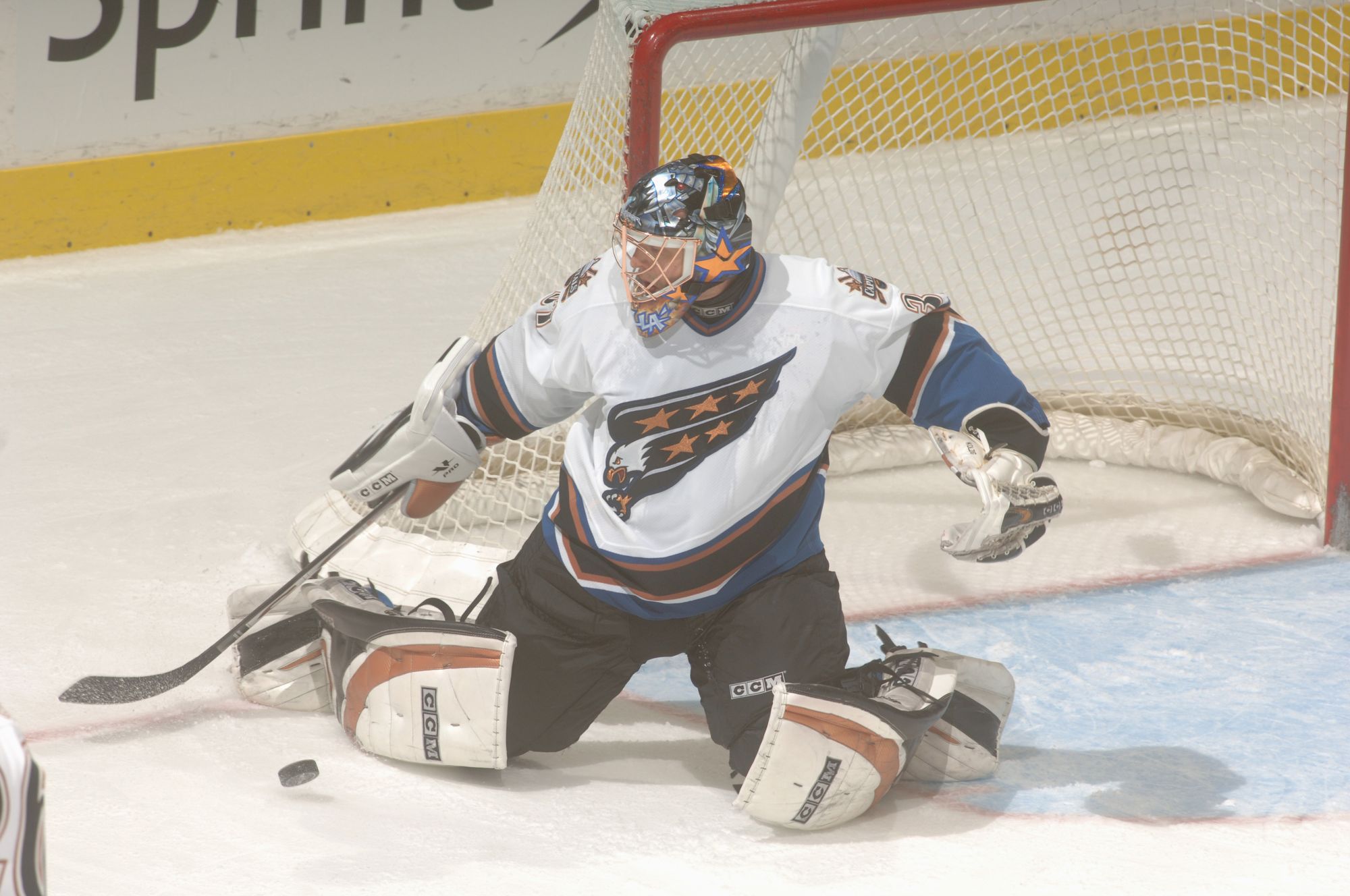
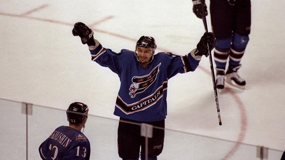
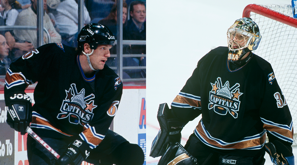
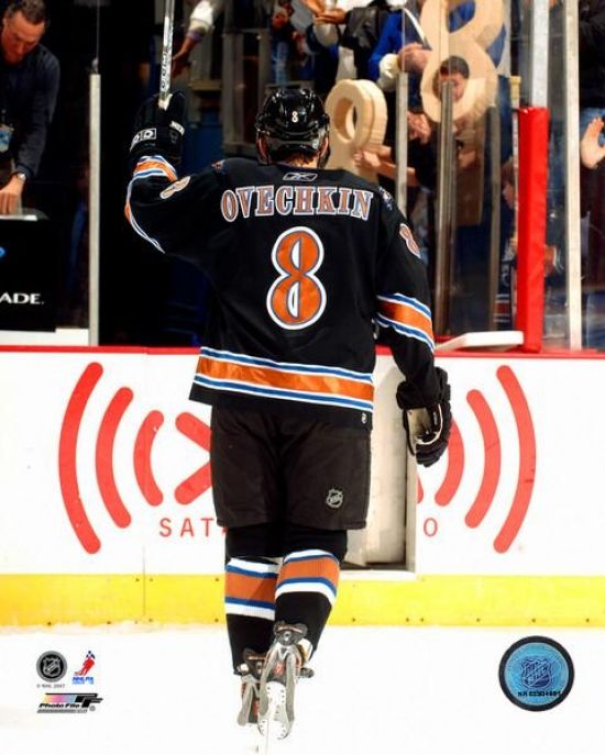
The flying eagle. The double-stick capital building logo. The ridiculous name/number font. The metallic copper. This this is one of my favorite uniform sets of all-time. Washington brought back the flying eagle for their reverse retros –which I loved– but I still prefer the original color scheme more. That's never going to happen, because the Caps are never going back to something that isn't red, white, and blue. In that case....
9. Washington Capitals - 1980s home/away
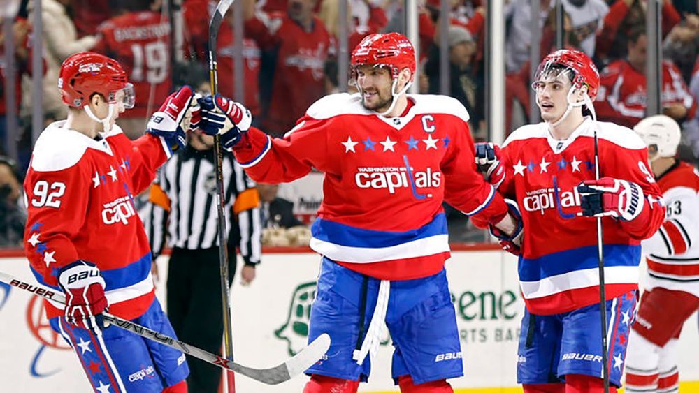
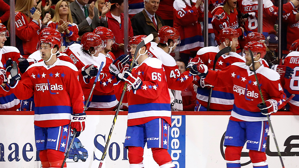
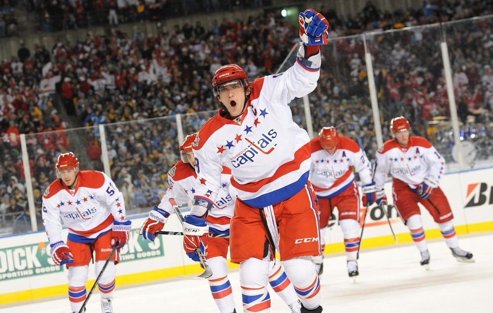
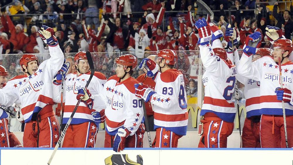
What are we doing here? How are these not Washington's full-time uniforms? Why have we been subjected to these for the last 15 seasons? I legitimately get mad when I think about how it's 2022, and the Capitals are still trotting out the remnants of the Reebok era nightly, instead of arguably the best uniforms in hockey history. It should be a no-brainer that Alexander Ovechkin's wears these as he chases the all-time goal scoring record.
8. NY Islanders - Fish sticks
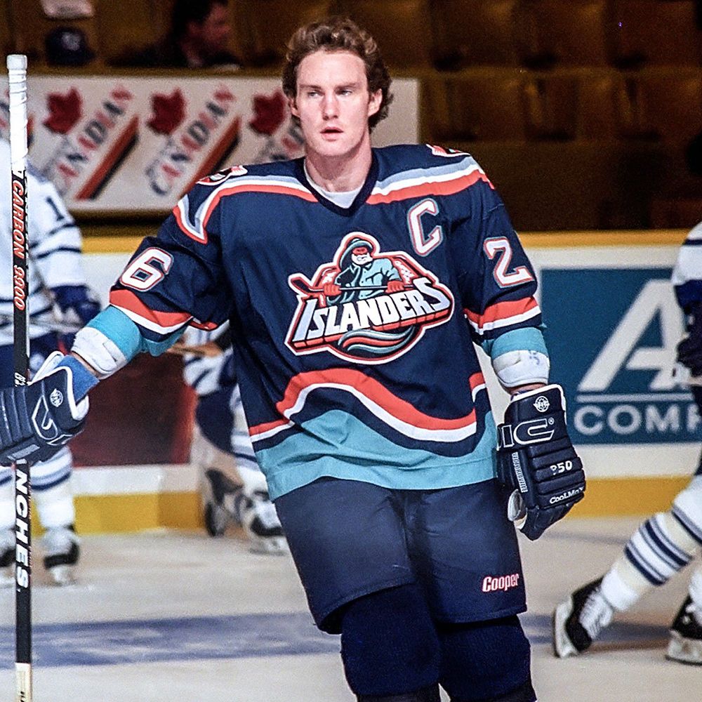
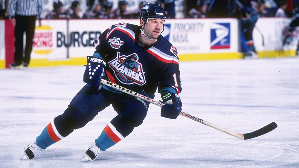
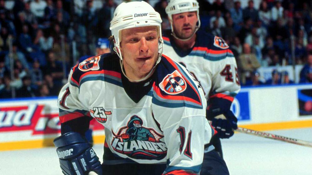
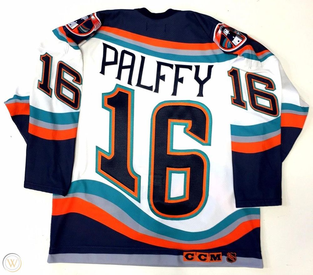
I have no grounds to defend these. Quite possibly the best bad jersey of all time. The Islanders current home/away look is perfect, but they should ditch the 'NY' alternates. 5-10 games a season of the fish stick waves jersey. BOOK IT.
7. Los Angeles Kings - Black 1990s uniform
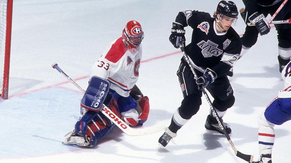
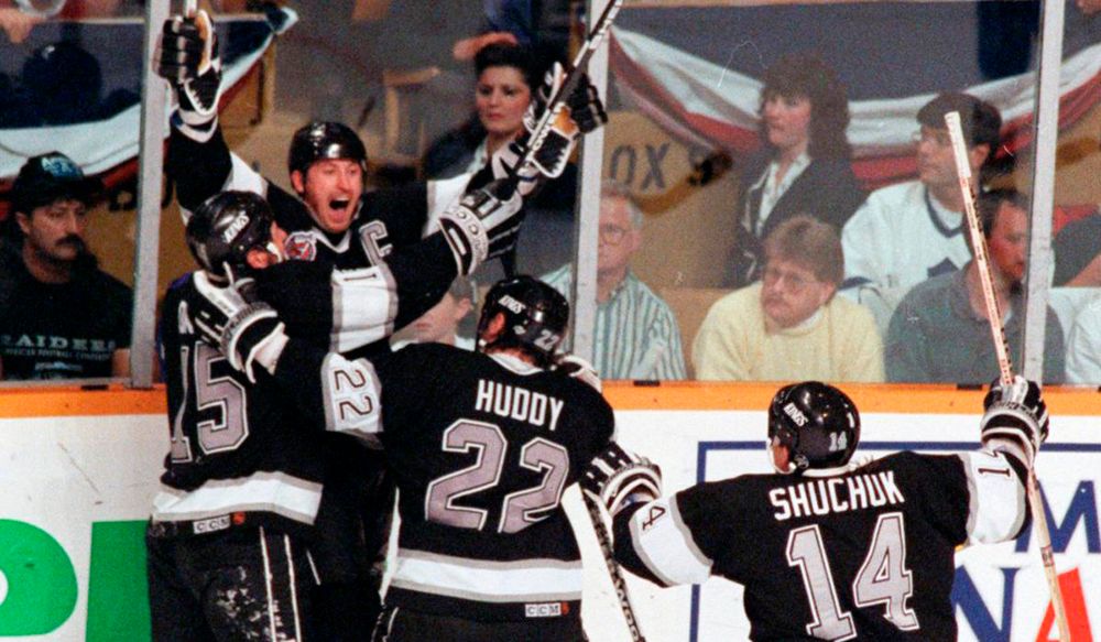
LA brought back/put a new twist on the white version of their 90s uniforms this season –I dig the chrome helmets– and it's time for the all-black version to come back, too. I'm not asking for them to just be alternate uniforms, either. Just like the Capitals, it's time for the Kings to put the Reebok era to bed, and go back to this classic look permanently.
6. Boston Bruins - The Pooh Bear (1995-2006)
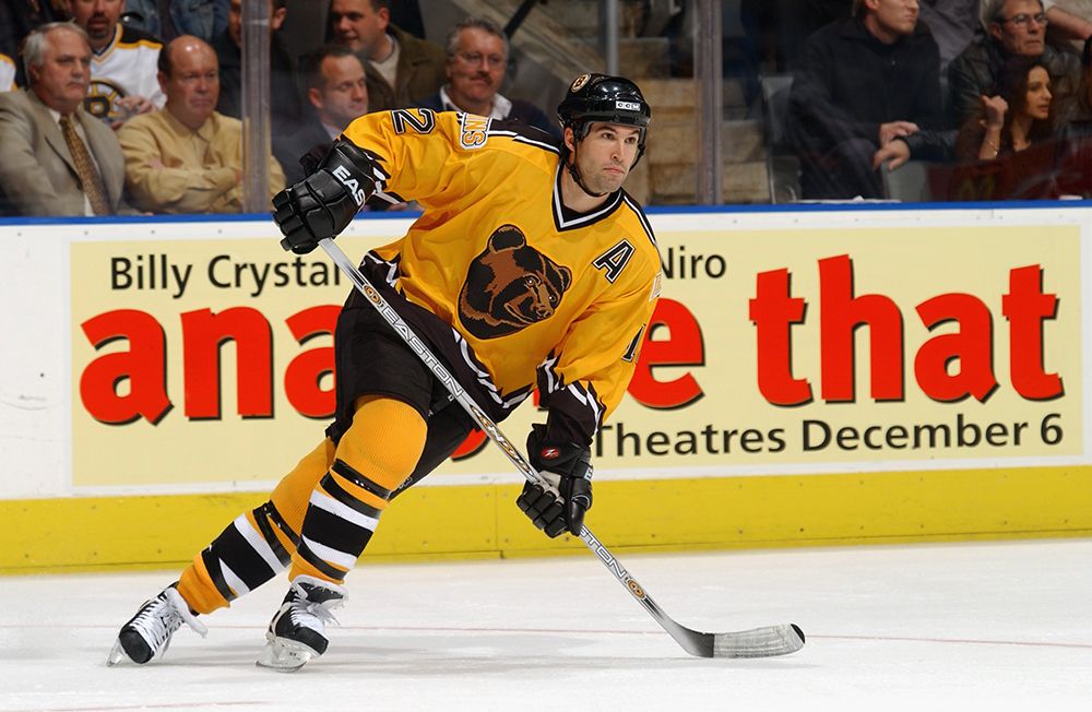
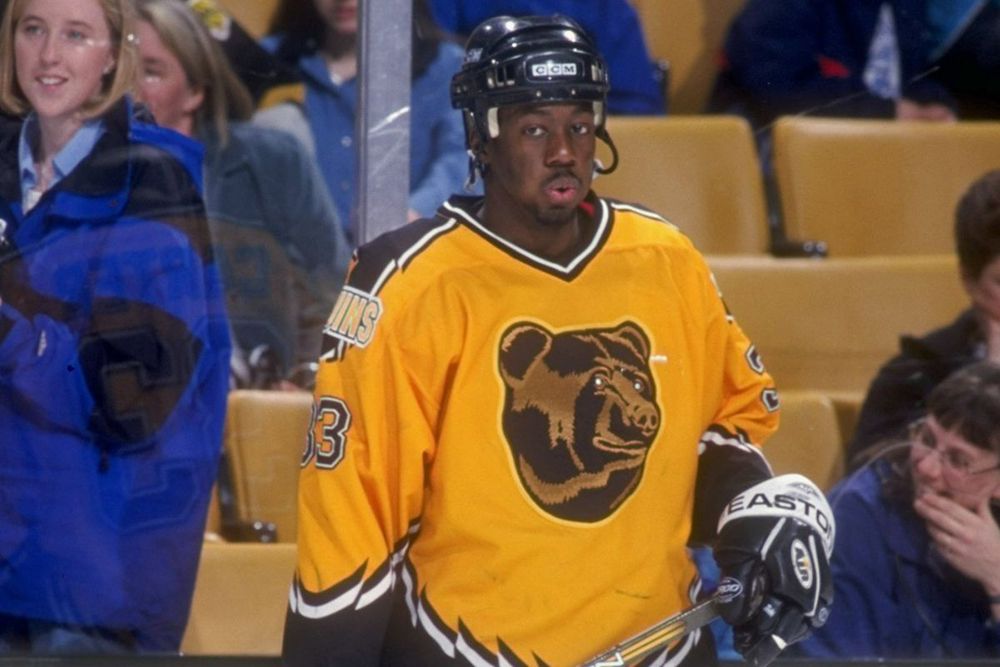
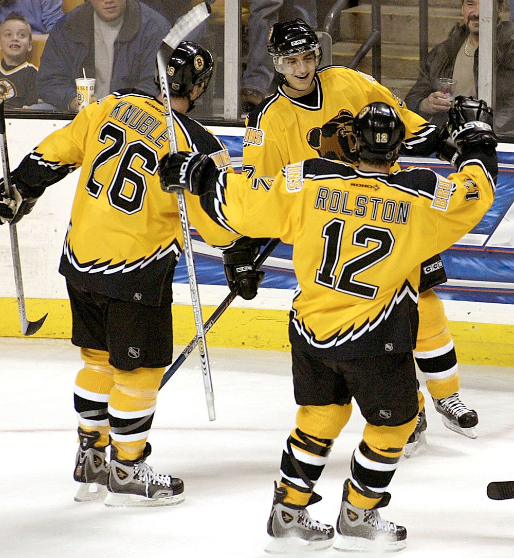
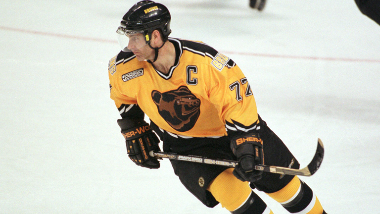
The vacant expression on the face of the bear, thanks to two miniscule dots that are supposed to be eyes. The bear claw (?) marks along the arms and waist/back of the jersey. The unnecessarily large shoulder stripe with equally unnecessary white and black trim. The massive 'BRUINS' wordmark covering up the bottom of said shoulder stripe, which is shockingly the most foul part of the whole thing. THE WHOLE DAMN COLOR OF THE JERSEY. This uniform is the peak of excess and gluttony, and god damnit do I adore it. I'm shameless, and I've never needed to see a jersey on the ice again more than I need to see this one.
5. San Jose Sharks - Original set
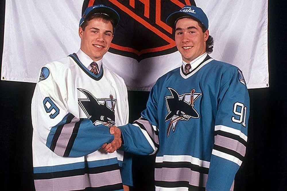
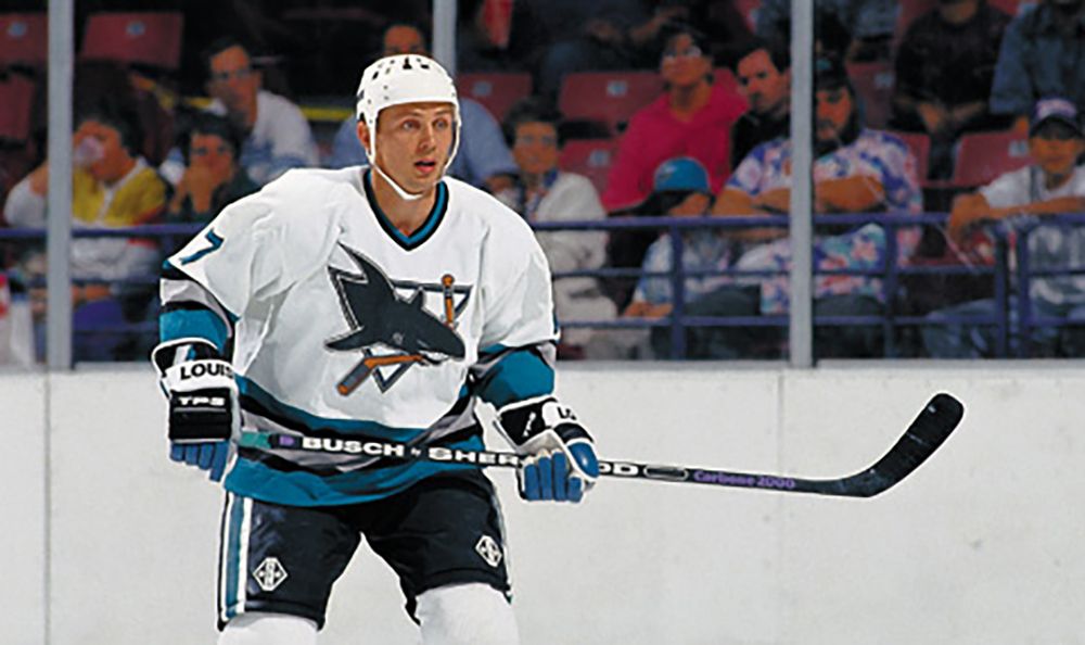
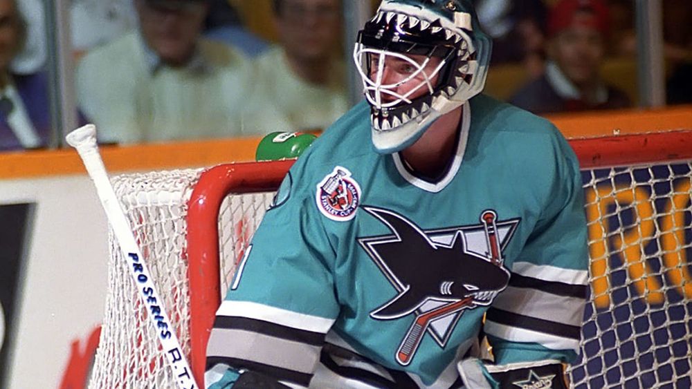
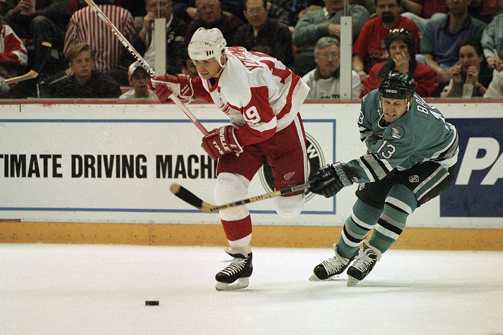
I've hated almost every single Sharks uniform since 2007. That shouldn't be the case when your colors are black and teal, and you also have maybe the most badass logo of all-time. This one isn't complicated: bring back the originals from 1991-97. The teal version popped up last year for their 30th anniversary, and looked great; now it's time to complete the set with the throwback white jerseys full-time.
4. Dallas Stars - Take your pick from the 90s
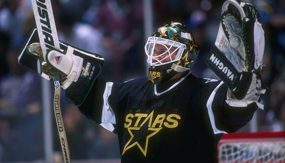
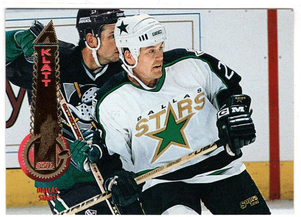
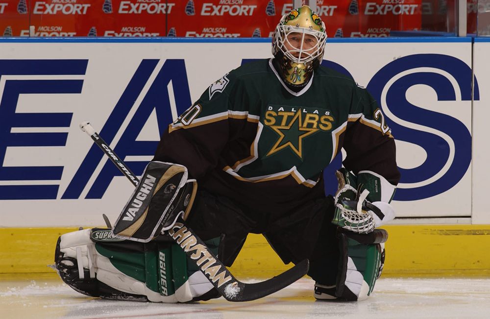
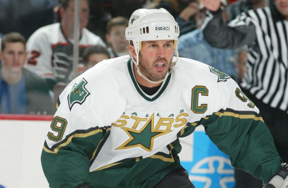
The current Stars uniforms are collectively the worst in the league. The green looks like the playing surface of a mini-golf course, and the logo is boringly simple. I'm actually OK with the Monster Energy neon alternates, and the stormtrooper reverse retros; at least they're something outside the box. Dallas needs to take their whole brand identity and blow it up, or just bring back either of the 90s looks that would both be clean in 2022.
3. Winnipeg Jets - 1990-96 home/away
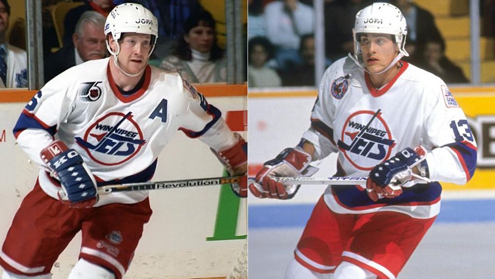
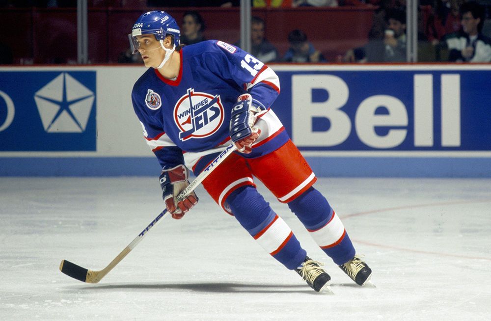
Do I have to explain this one?
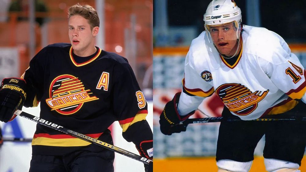
2. Vancouver Canucks - Late 1980s/90s set
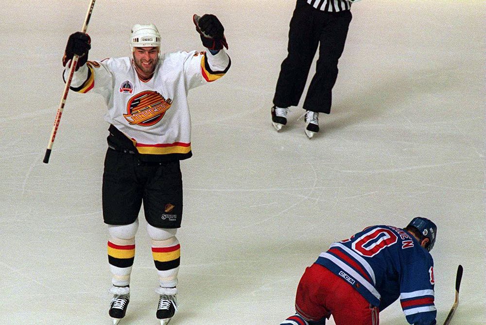
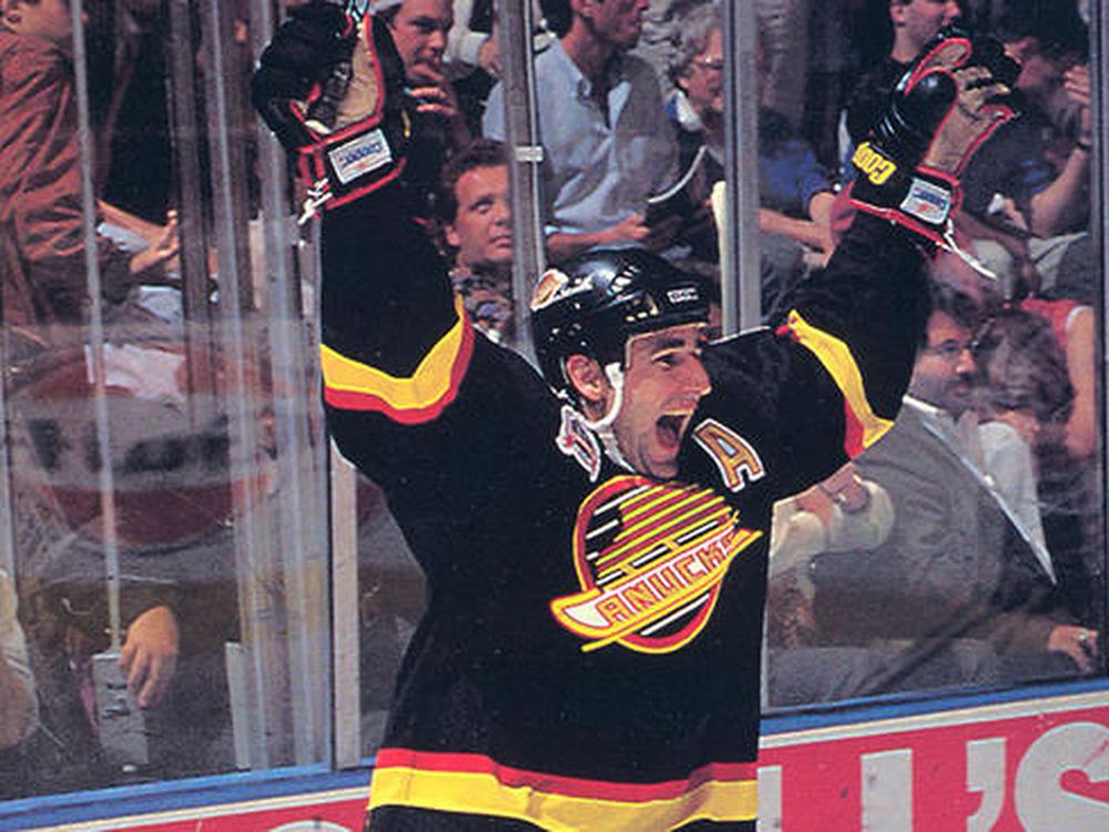
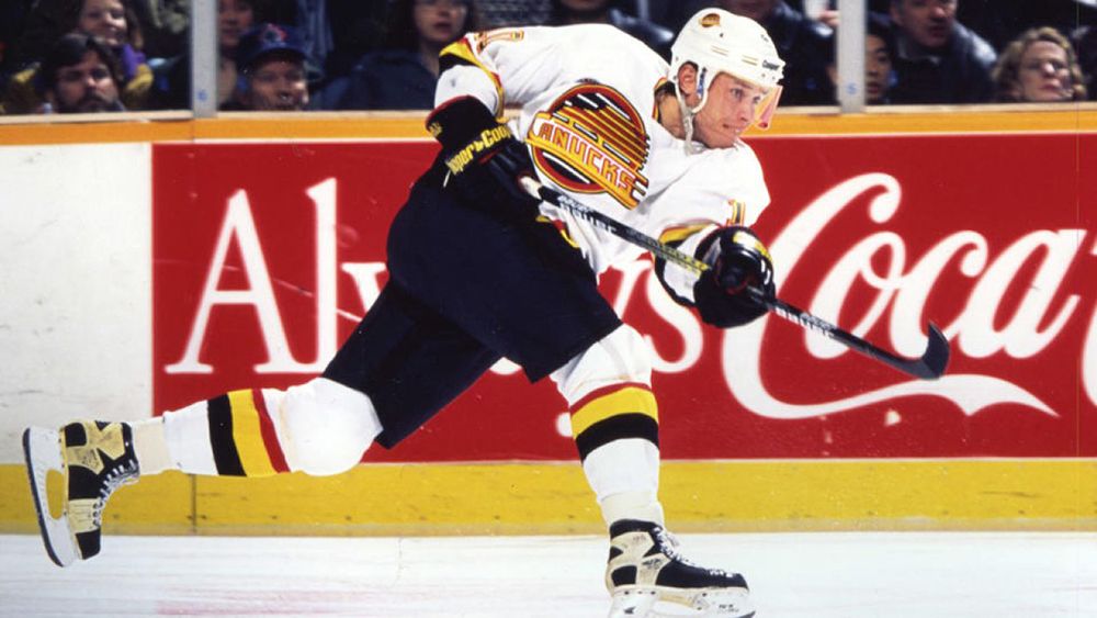
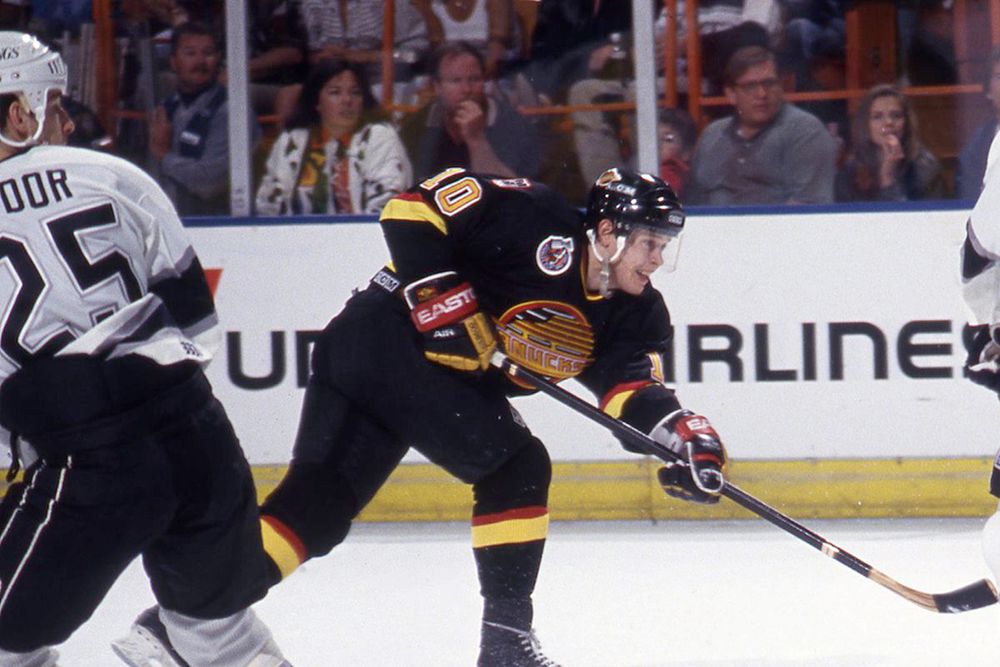
The current Canucks uniforms aren't my style, but I'm not gonna scream about them, either. They're fine. But they're not these.
Vancouver brought back the black version for their 50th anniversary in 2019-20, but I want the full set back in rotation, even if they're only as alternates. Black, white, red, and yellow is a criminally underused color way in sports, and that skate logo is too classic to leave on the shelf.
1. Pittsburgh Penguins - The Robo Penguin
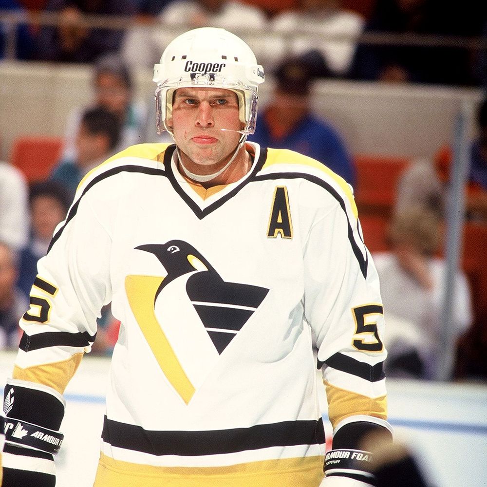
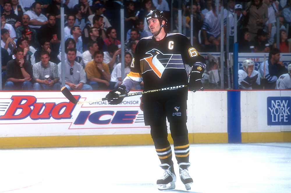
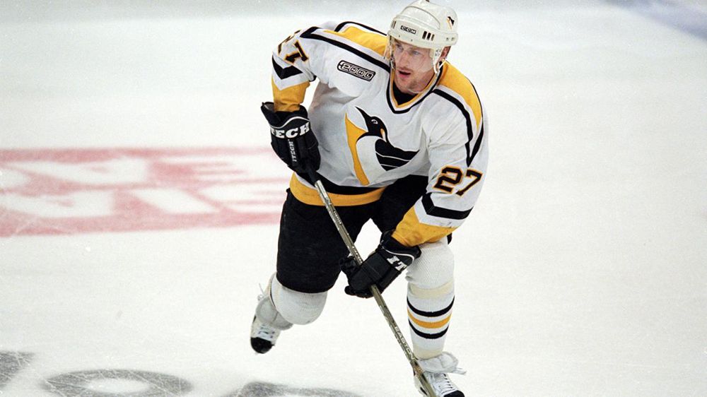
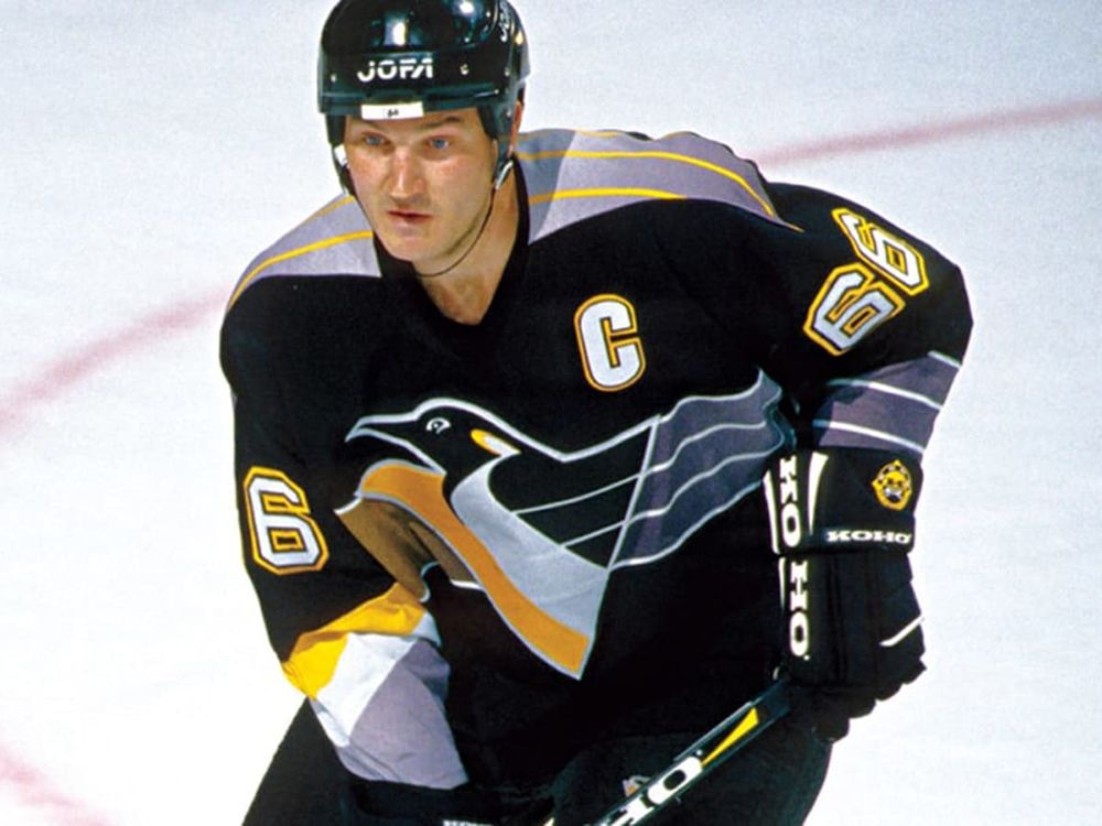
The Pittsburgh Penguins have never missed. The colors are perfect, the logos have always been on point, and even their diagonal wordmark jerseys are classics. Their current uniforms are beautiful and shouldn't go anywhere. But in my mind, Sidney Crosby's career isn't complete until he throws on the Robo Penguin at least once.
Let me be clear: I don't need to see Robo Penguin every game. I don't even need to see Robo Penguin once a week. I just need to know that Robo Penguin is an option. Let me tell you everything I love here:
- The gradient switch on the chest, complete with no stripes to stripes on the other side.
- Stripes on each arm sleeve that are completely different from each other.
- The gray triangle shoulder box with neon yellow stripes.
- The fact that the stripes on the socks match nothing else on the uniform.
- It's a robot penguin who looks like he might be one of the enemies from the original Sonic the Hedgehog on Sega Genasis.
And that's just the black jersey!
This set holds a special place in my heart, and I'd be over the moon to see Pittsburgh bring them back for special occasions. Crosby in these vs. Ovechkin in the flying eagle needs to happen before they retire. Are there better jerseys deserving of the top spot? Yes, but none of them have a robot penguin on them, and that's all that matters to me.

