
Grading the 2022 NHL Reverse Retro Jerseys
Penguins, Capitals, Lightning, Bruins, and Panthers fans: Hello.
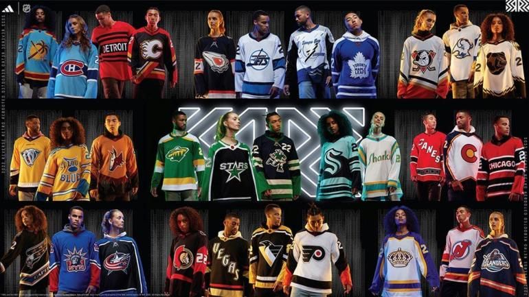
It's time.
Anaheim Ducks: C-
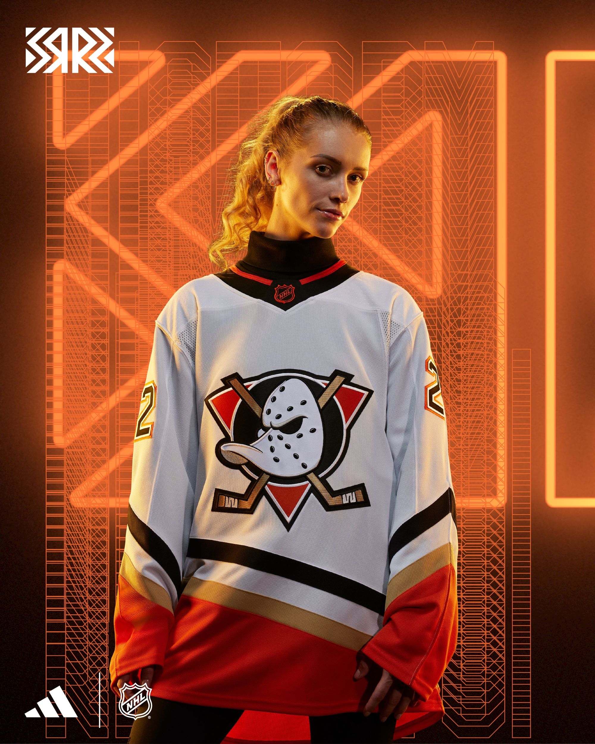
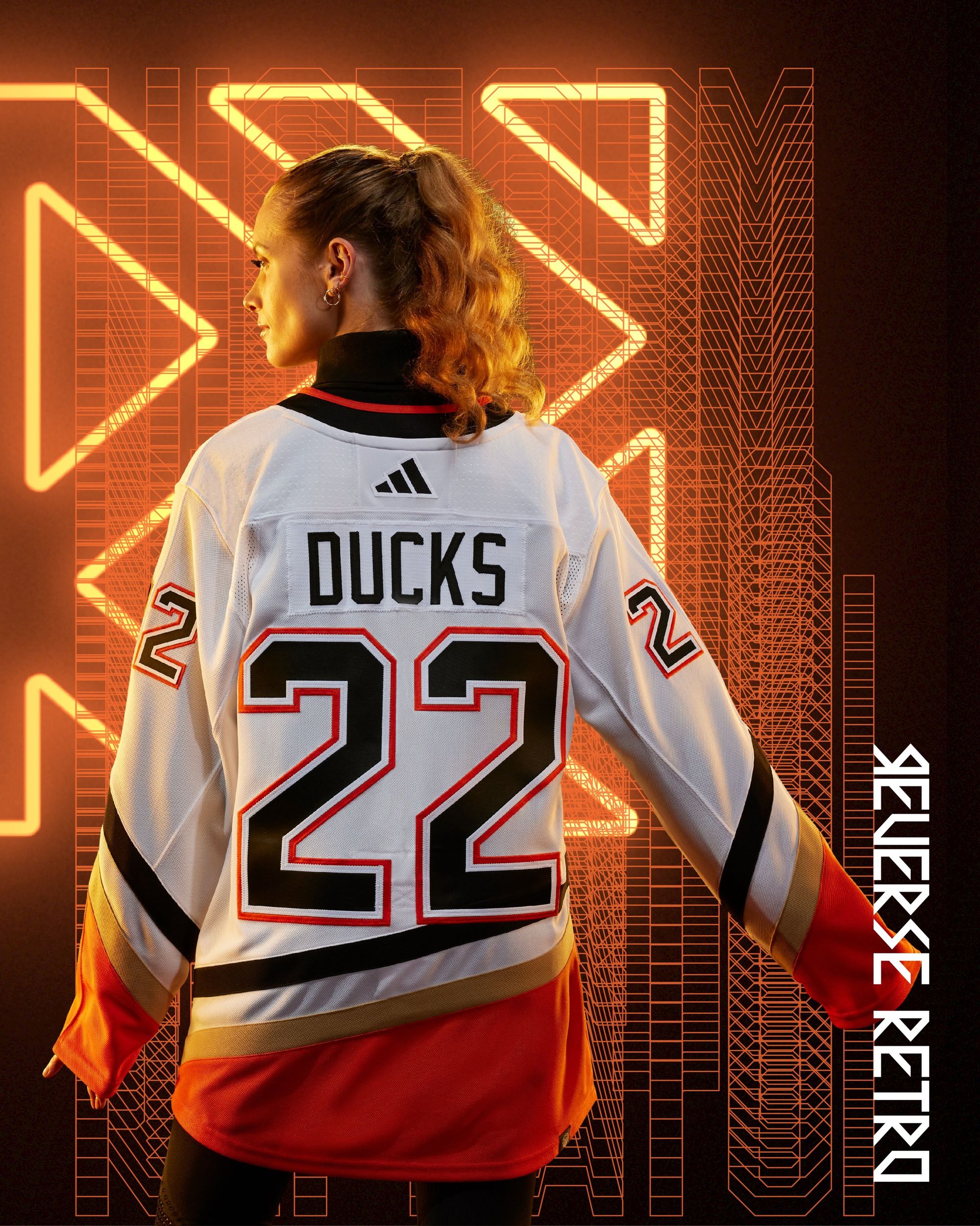
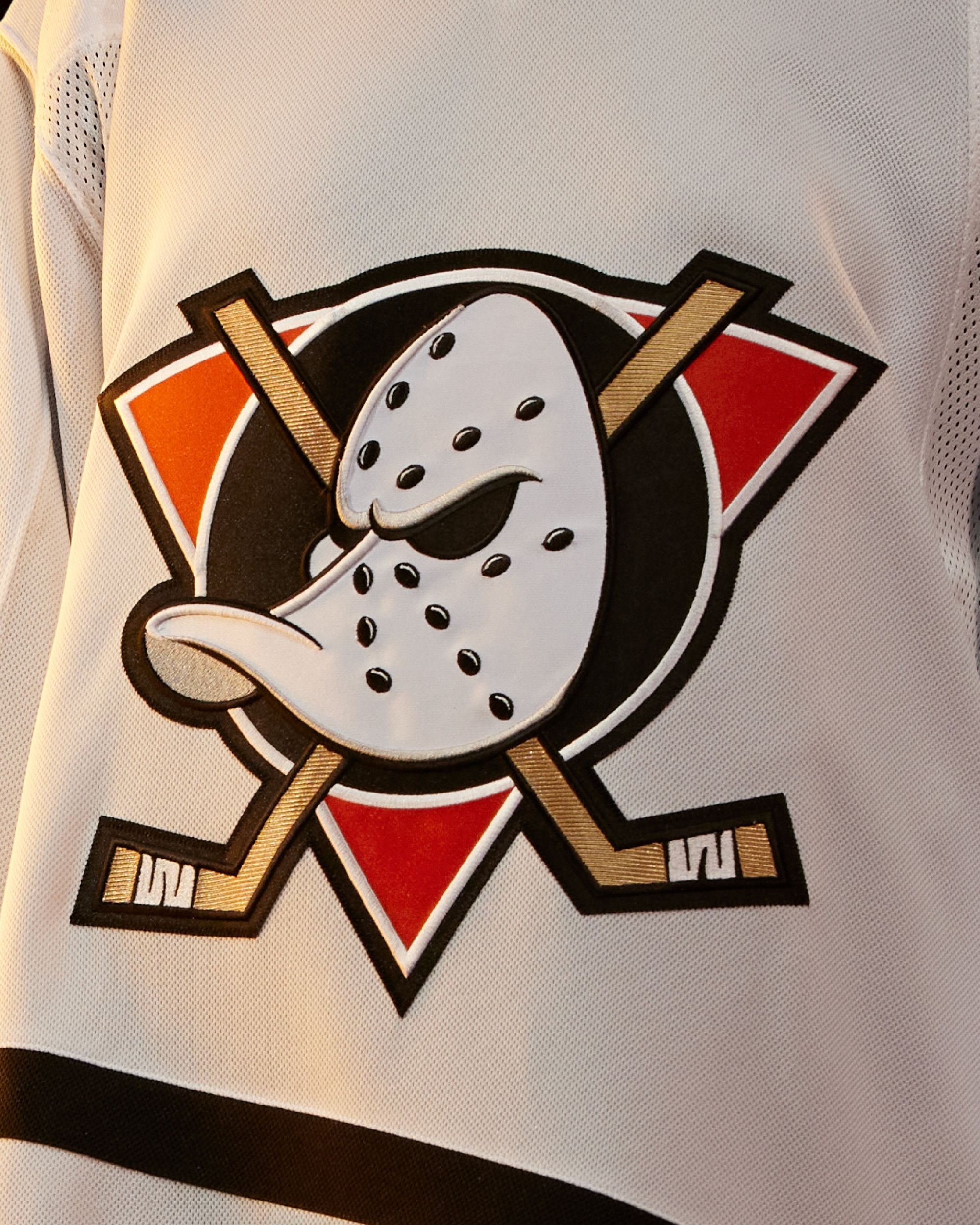
Pros: Better than their current uniforms + I love the old logo.
Cons: The Ducks have to ditch the orange/black/gold colorway. Either go back to the green/purple era, or do something completely off the board. Trevor Zegras shouldn't have to wear this shit.
Is it better than their first Reverse Retro?
Worse, by a mile.
Arizona Coyotes: B+
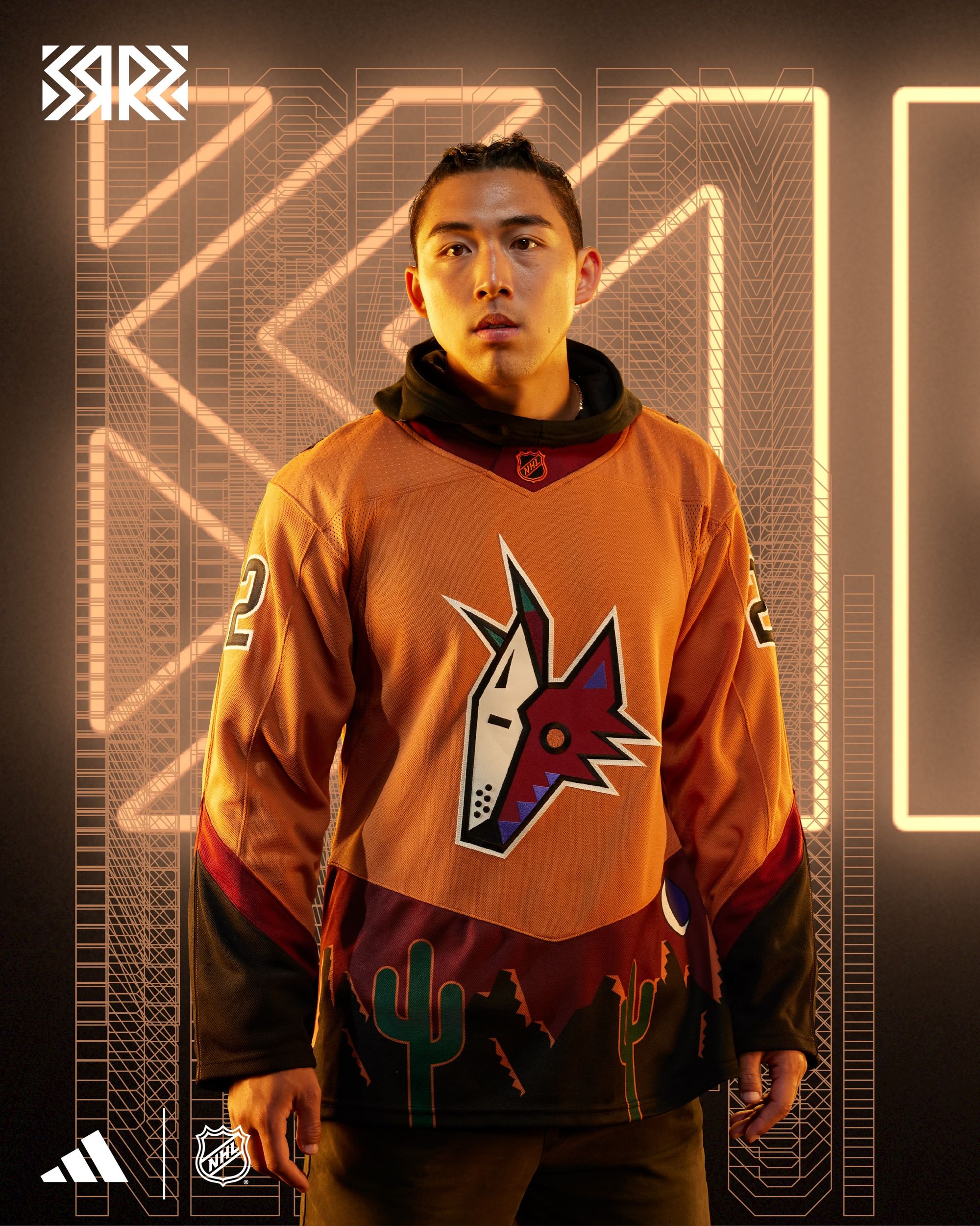
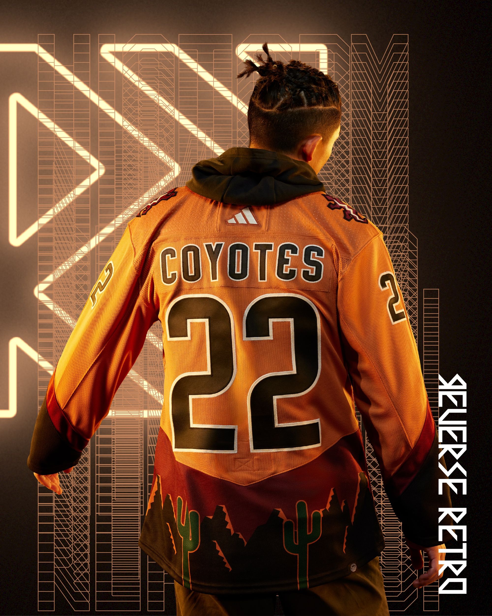
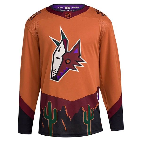
The acid 'Yote is one of my favorite logos ever, so this is a hit for me. The only reason it gets a B+ is because I'm not 100% sold on the "desert sienna" orange yet. It's a look that feels uniquely Arizona, though, and I can dig that.
Is it better than their first Reverse Retro?
No, but not many jerseys in NHL history are better than that one.
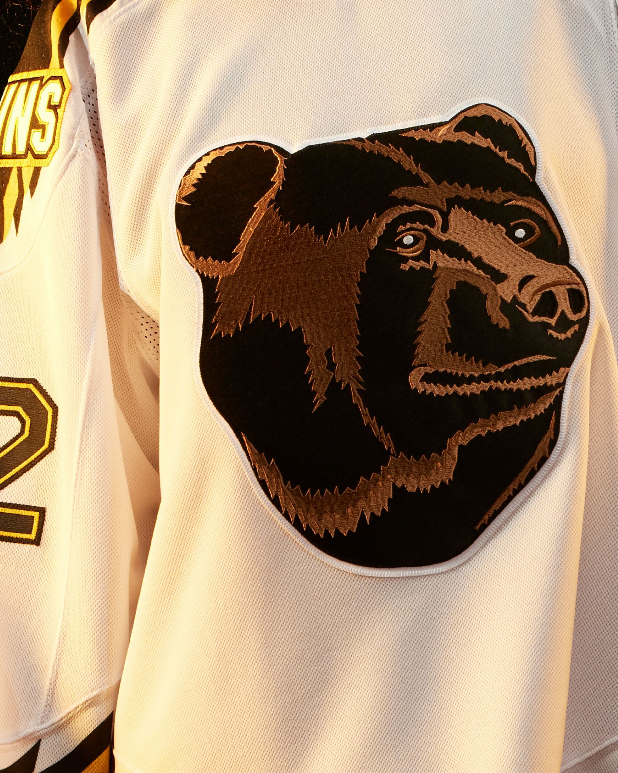
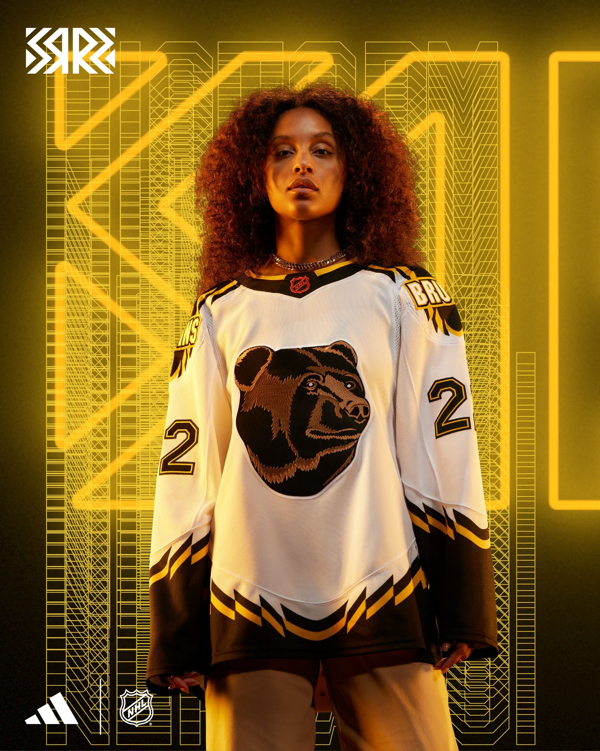
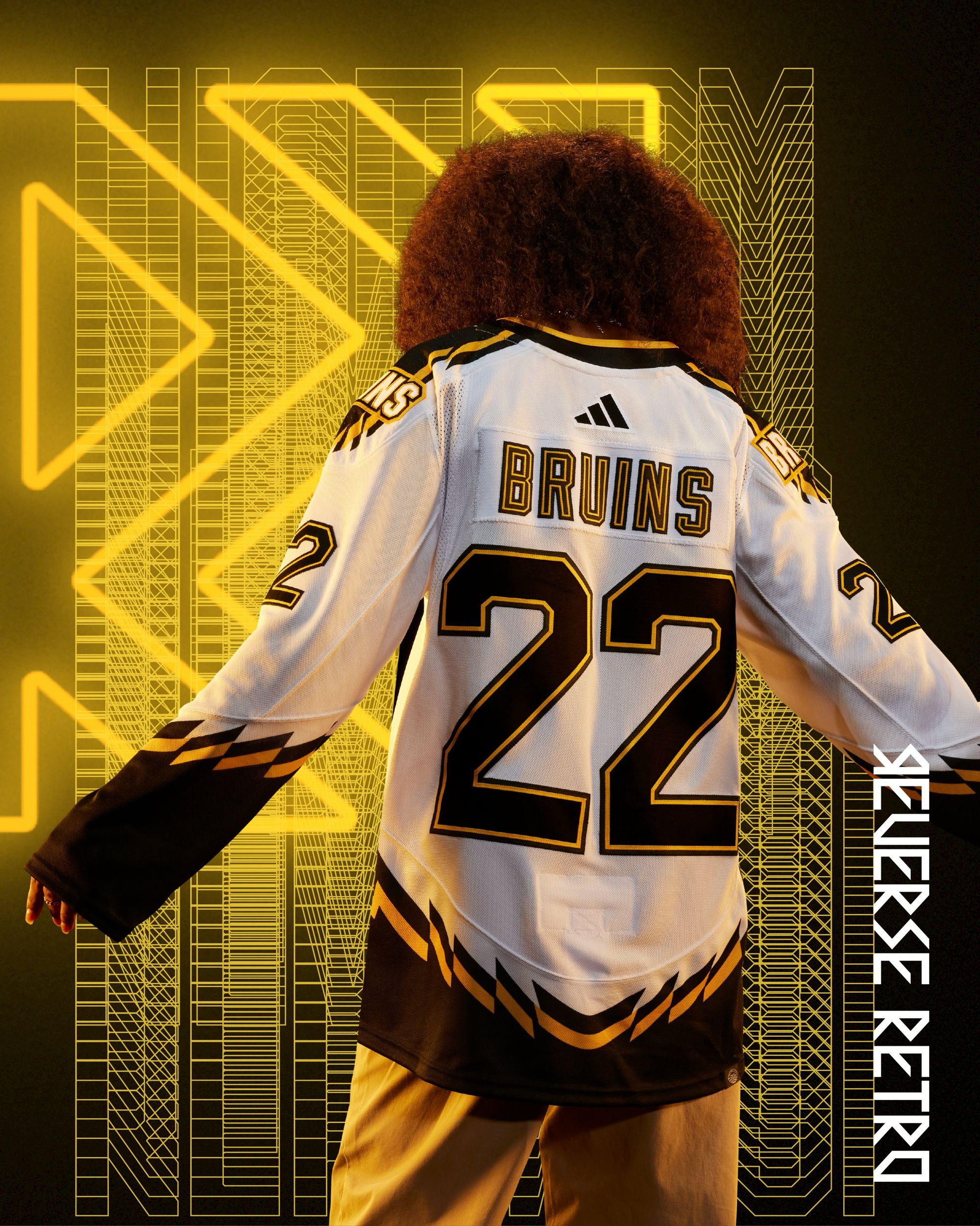
Boston Bruins: A+
Sometimes in life you ask for something and what you get in return exceeds even your wildest dreams. This is one of those moments for me. I apologize to the Bruins for what I said about the Avs retiring Ray Bourque's number out of spite because I was mad about their first Reverse Retro's. My bank account's about to be $220 lighter. PURCHASED!
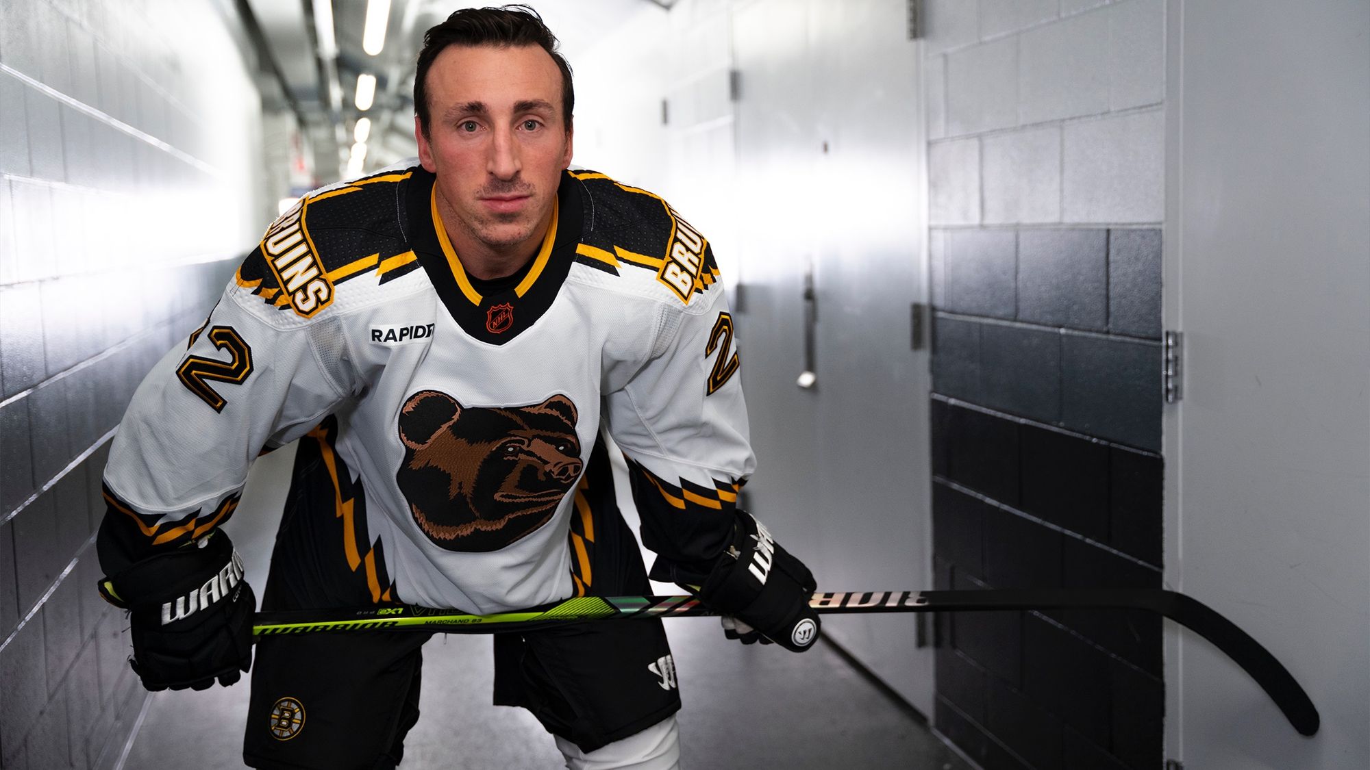
Is it better than their first Reverse Retro?
The Bruins are the only Boston team I respect because they play a wonderful style of hockey and they also wore the greatest alternate uniform of all-time pic.twitter.com/dyFQnbpqvh
— Colton Denning (@Dubsco) August 24, 2020
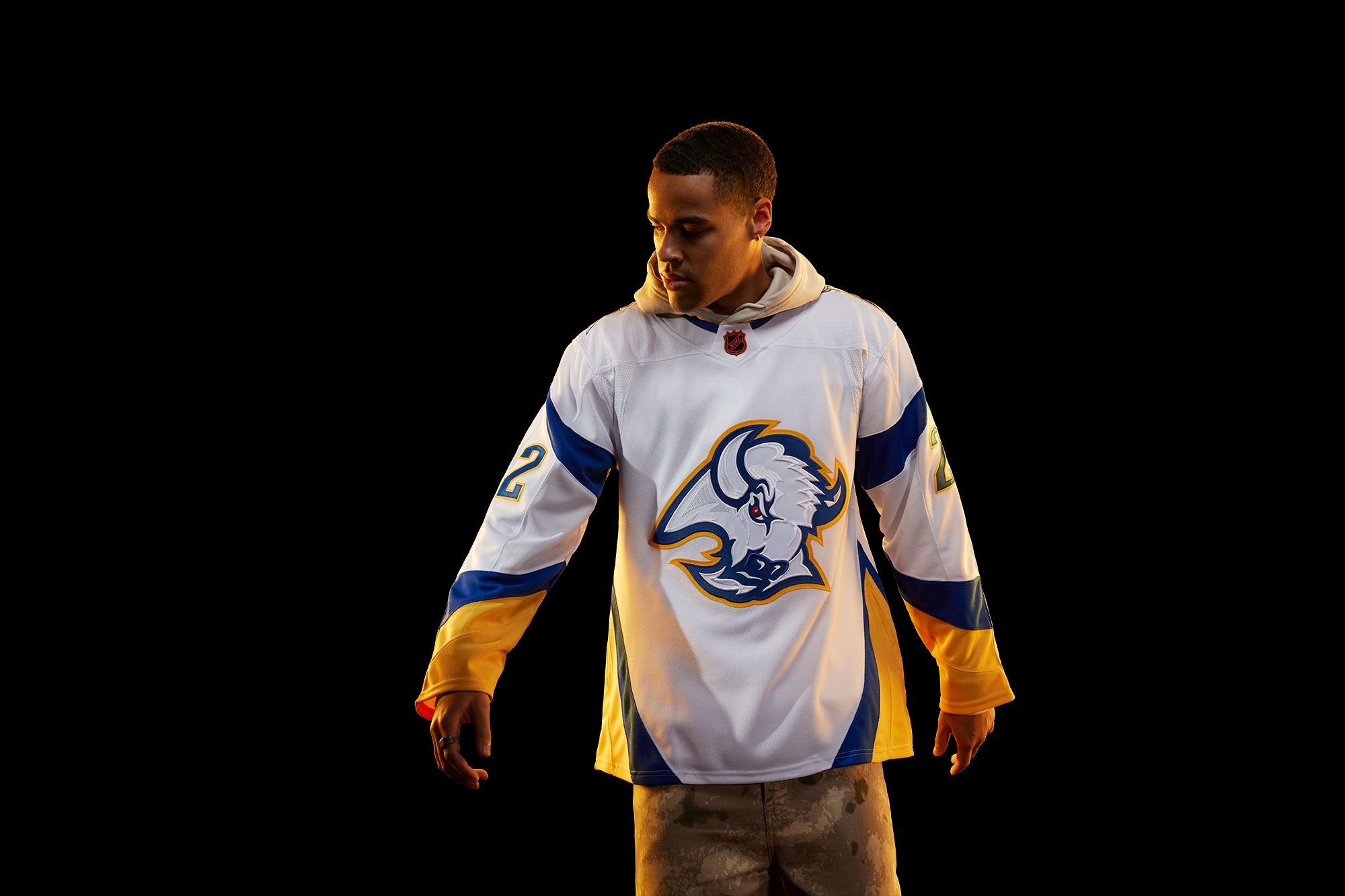
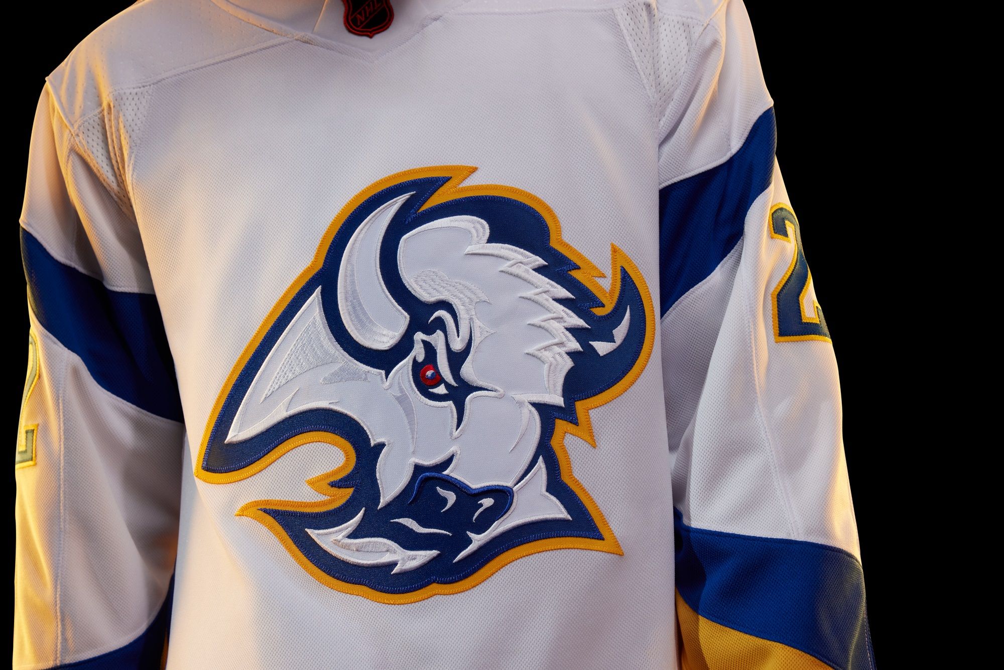
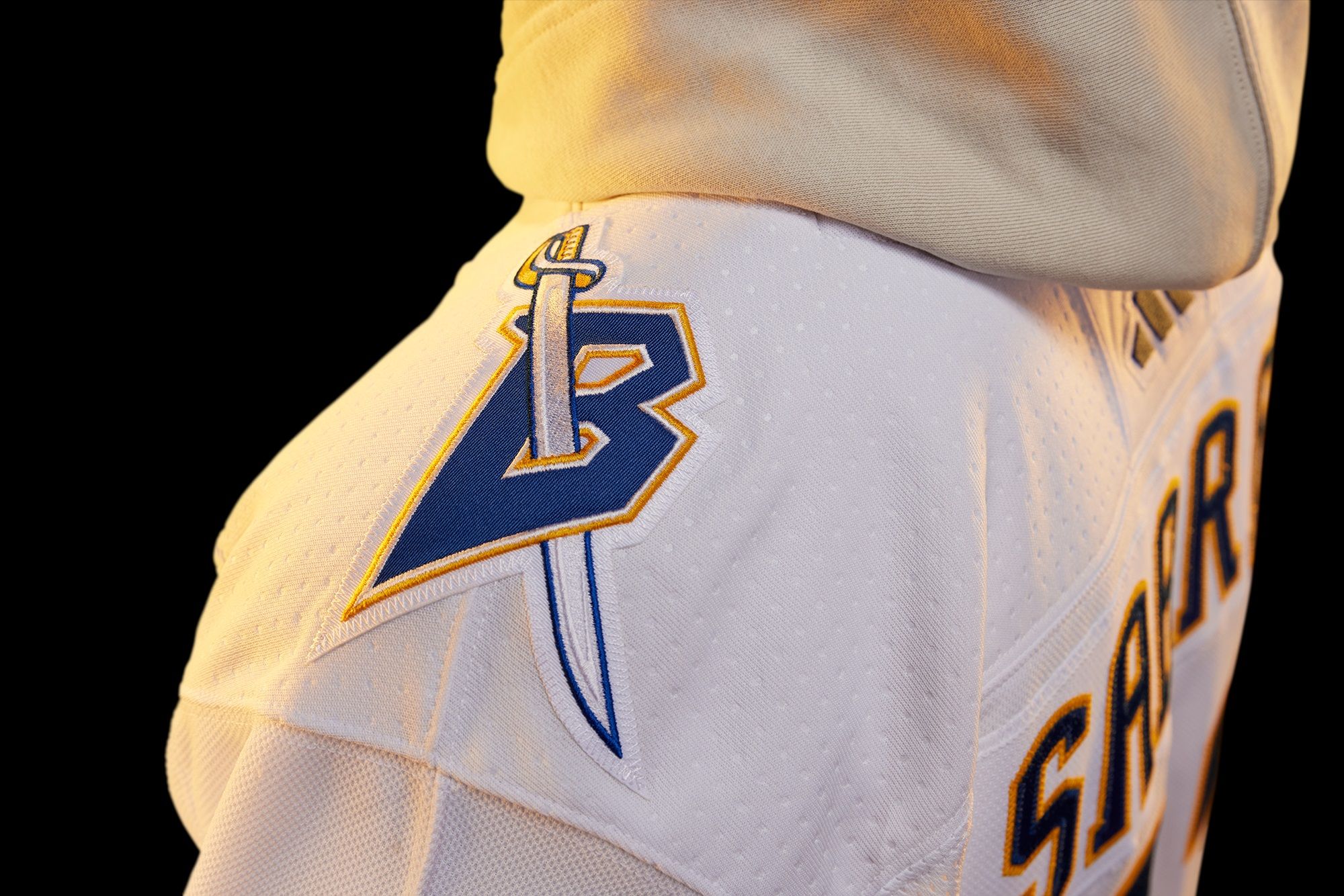
Buffalo Sabres: B+
The original black and red Goathead uniforms are one of my favorites ever, and they're not only back this season as alternate, but on display here in current Sabres colors. The B+ is only because it's so jarring to see it in yellow and blue.
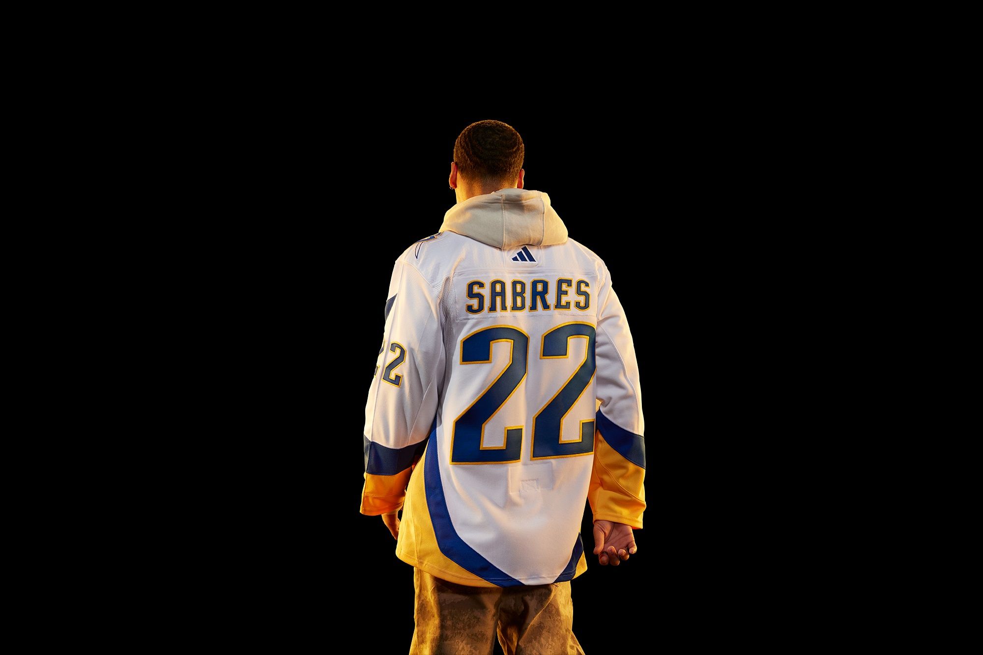
Is it better than their first Reverse Retro?
Goathead always gets the edge.
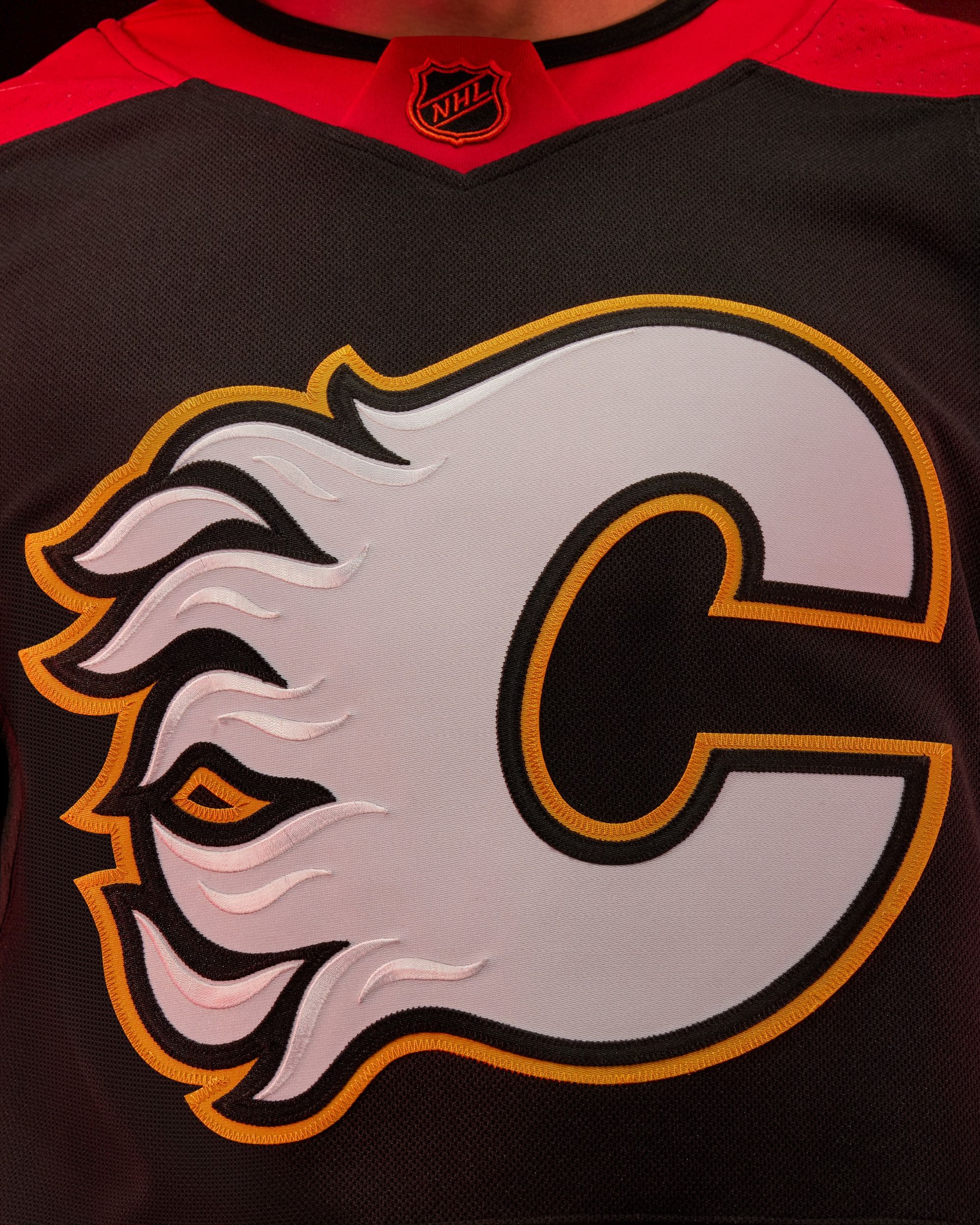
Calgary Flames: B
Blasty's already coming back this year as an alternate, so the Flames had to do something different. I like throwing it back to the classic 1998-2000 striped set, and making the jersey black instead of red was the right decision. The Flames have at least four different uniforms this season, and I hope someone on the Calgary beat asks Daryl Sutter what he thinks about that just to see the look on his face.
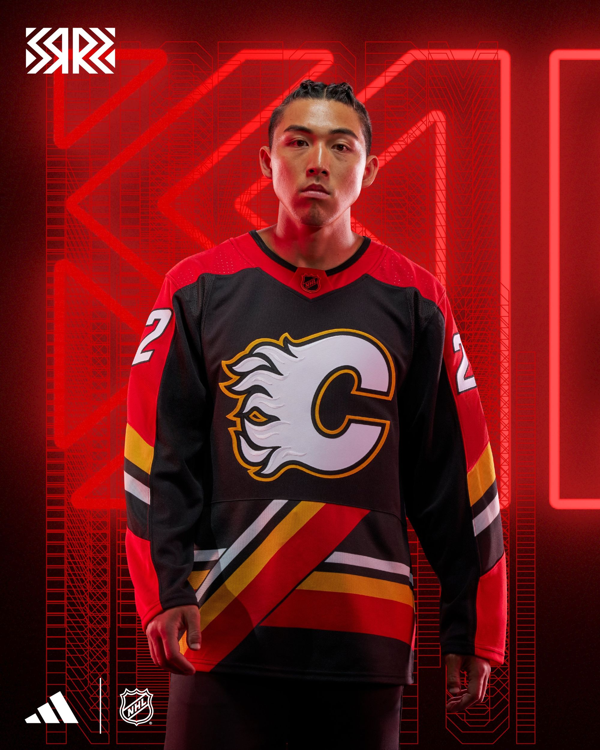
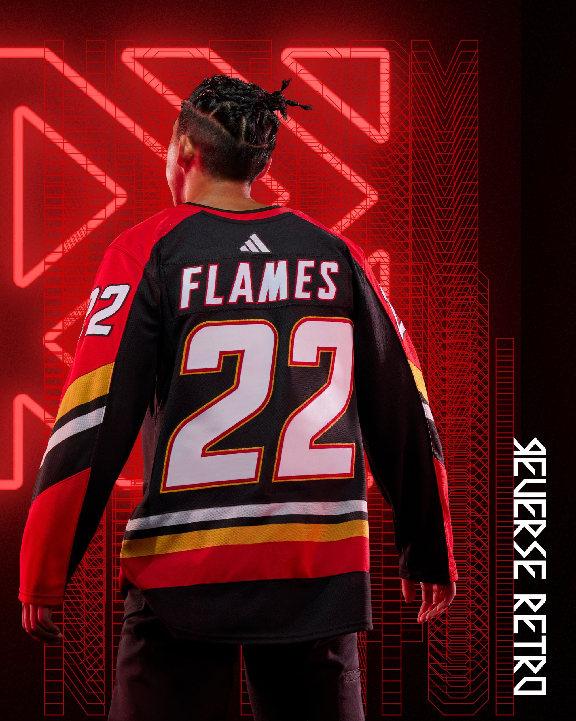
Is it better than their first Reverse Retro?
I'll give the edge to Blasty, but these are solid, too.
Carolina Hurricanes: F
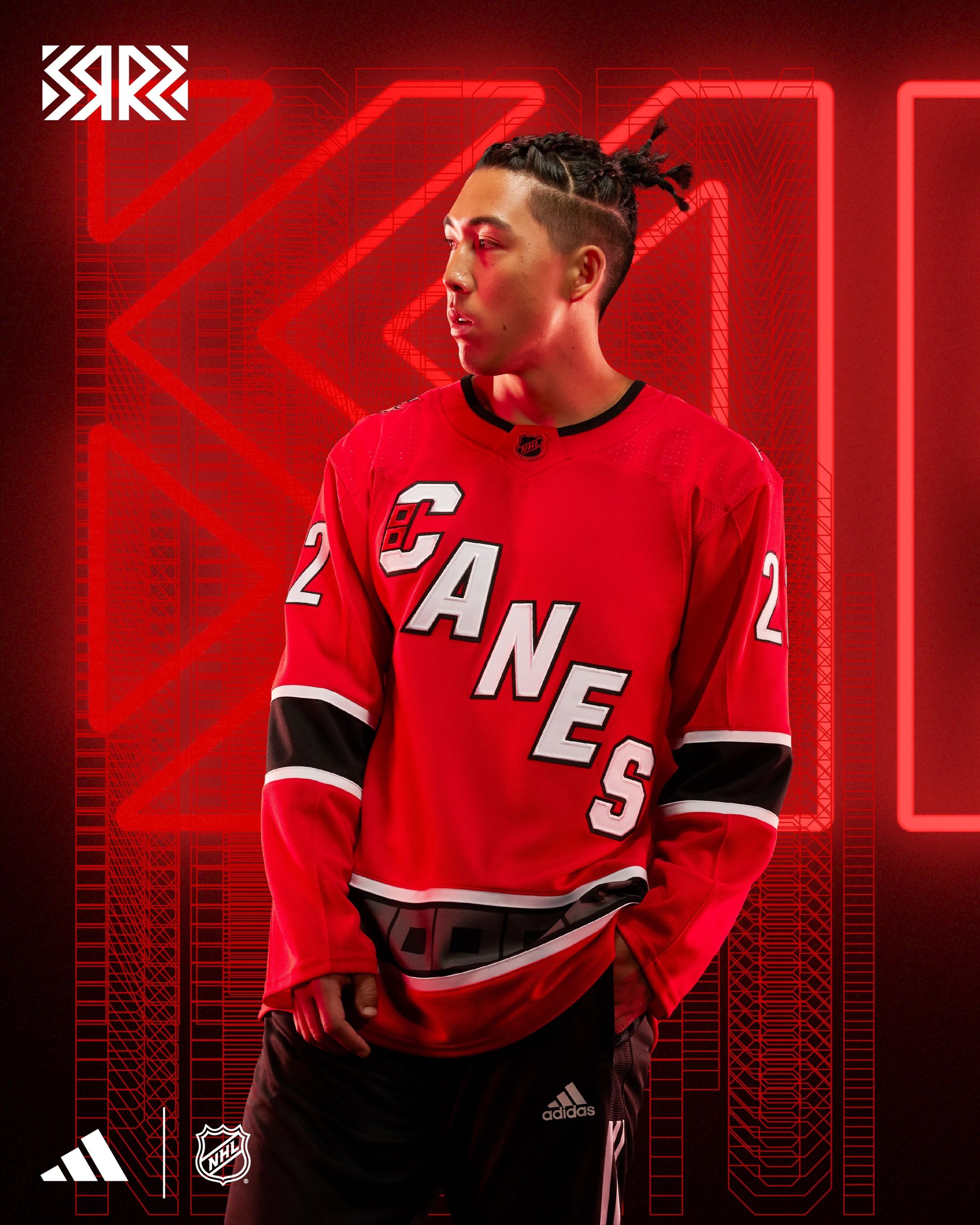
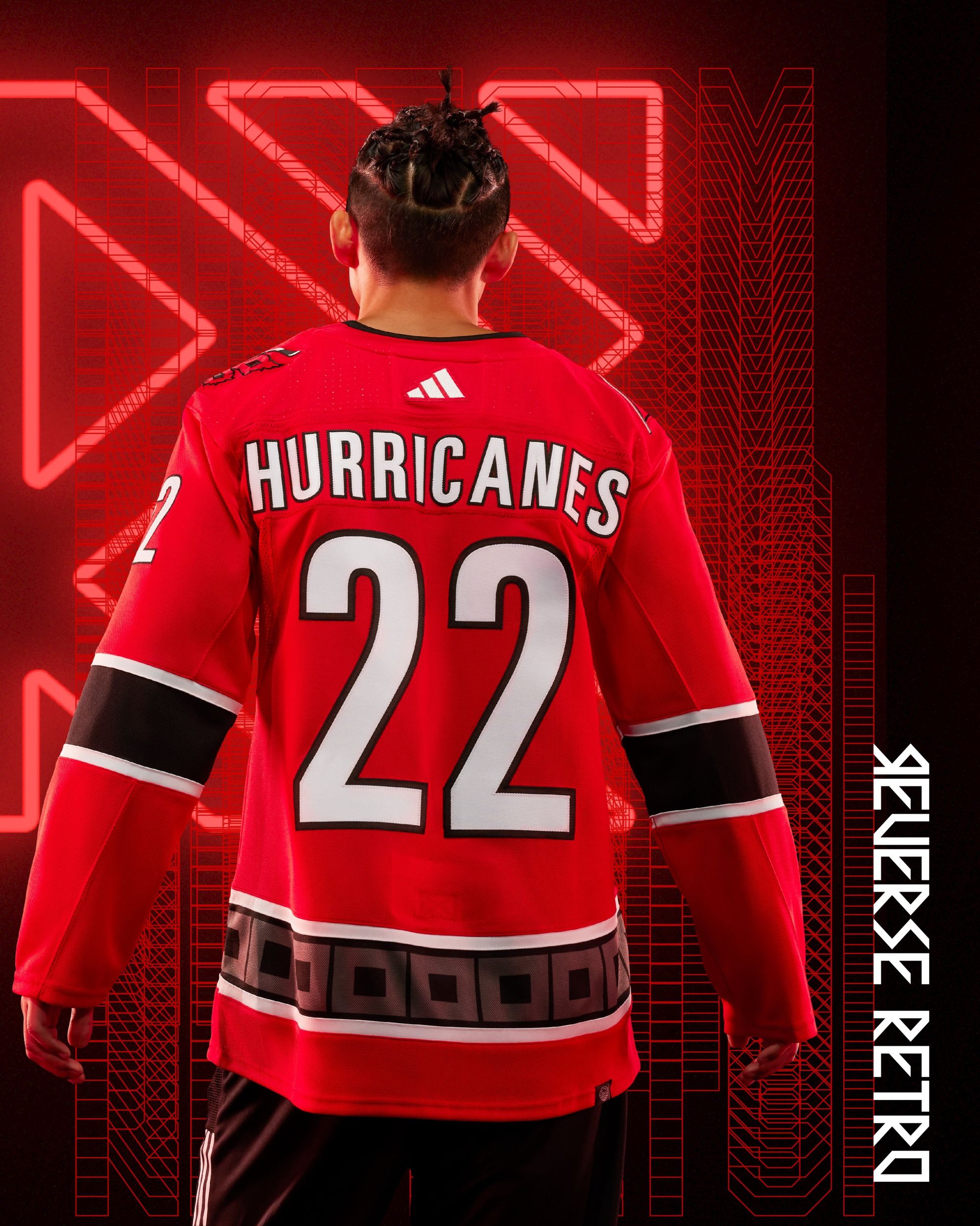
Carolina didn't bother trying, because this is basically a red version of their current white jersey. It's not retro, and it's reverse in the sense that it's setting uniform and design culture back to the Reebok era. If "second round exit after first place regular season finish" was a jersey, it'd look like this.
Is it better than their first Reverse Retro?
Stupid ass question.
Chicago Blackhawks: F
J. Crew rugby longsleeve ass jersey.
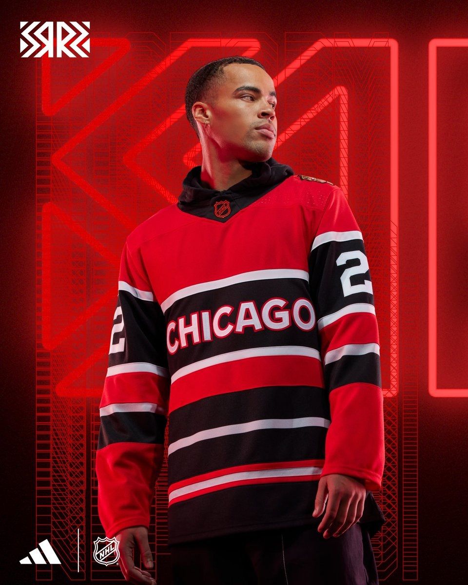
Is it better than their first Reverse Retro?
Less racist, which is an improvement.
Colorado Avalanche: C-
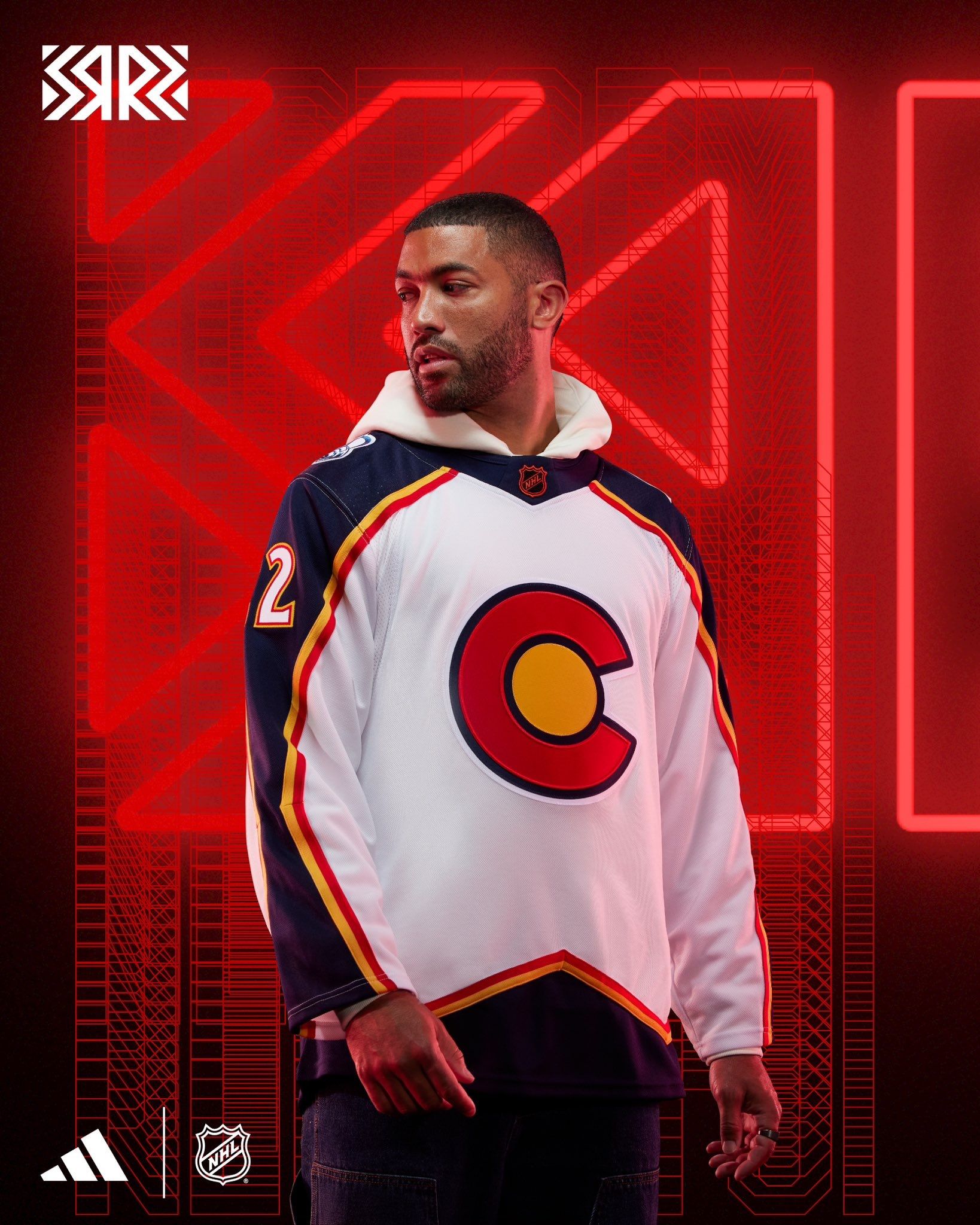
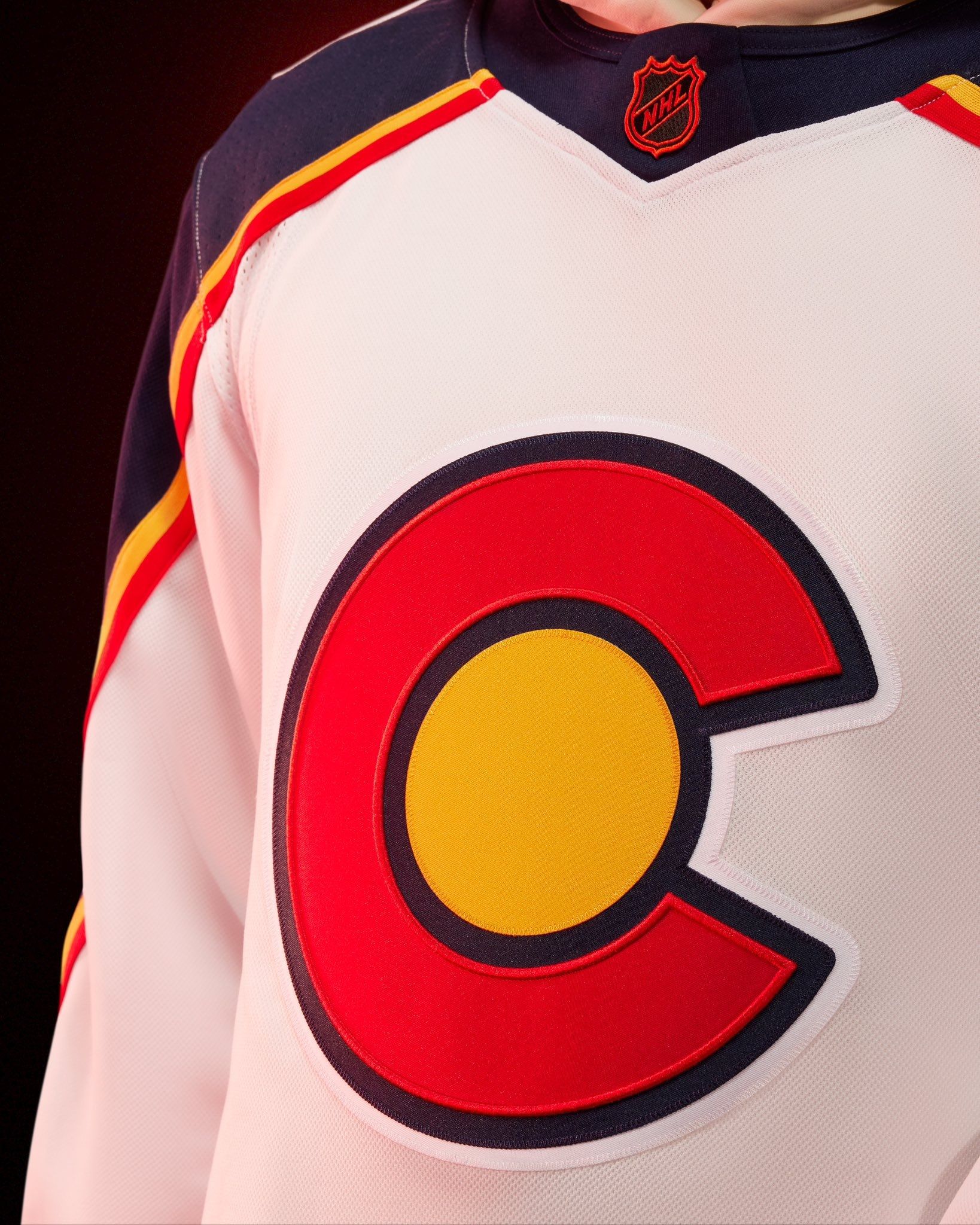
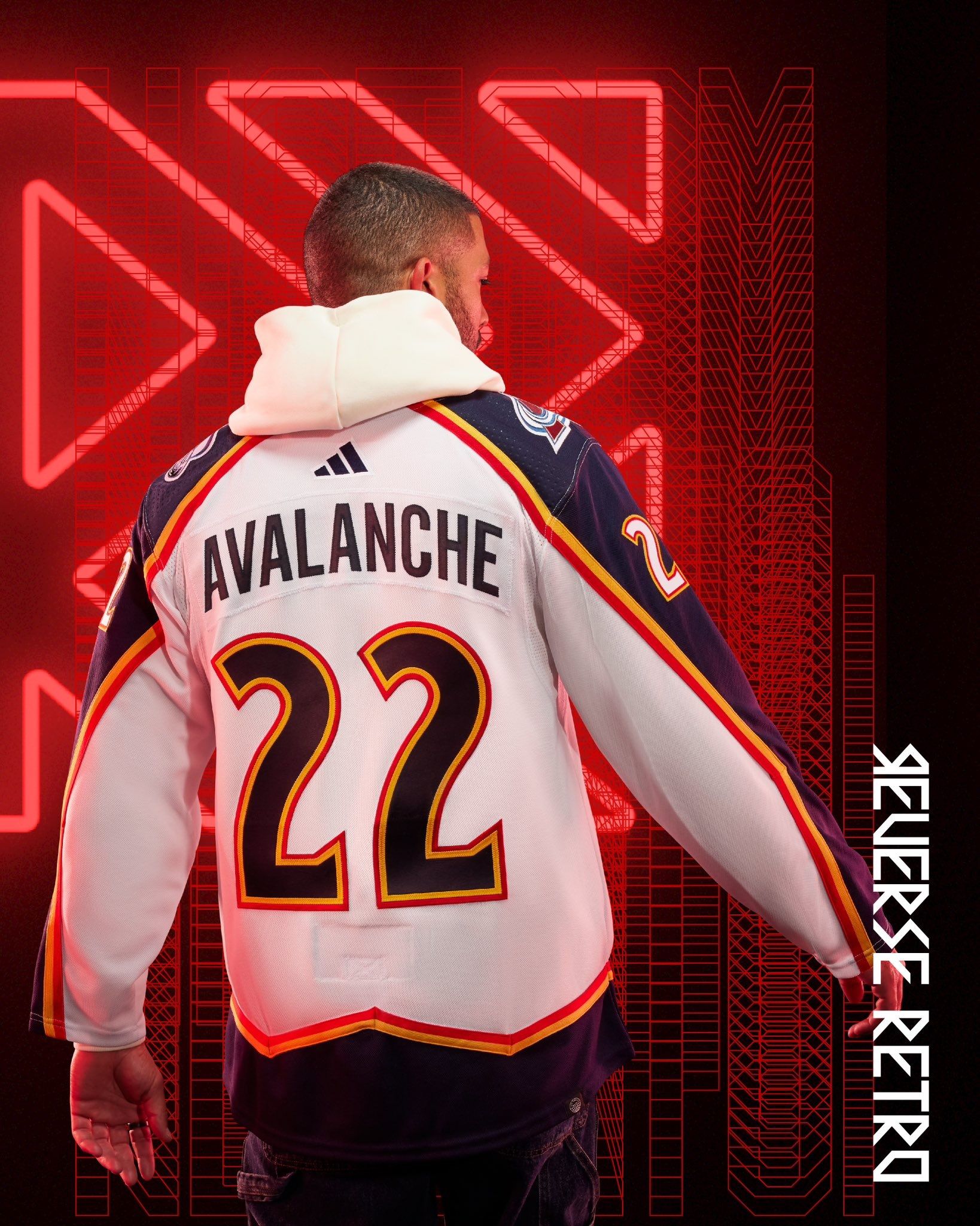
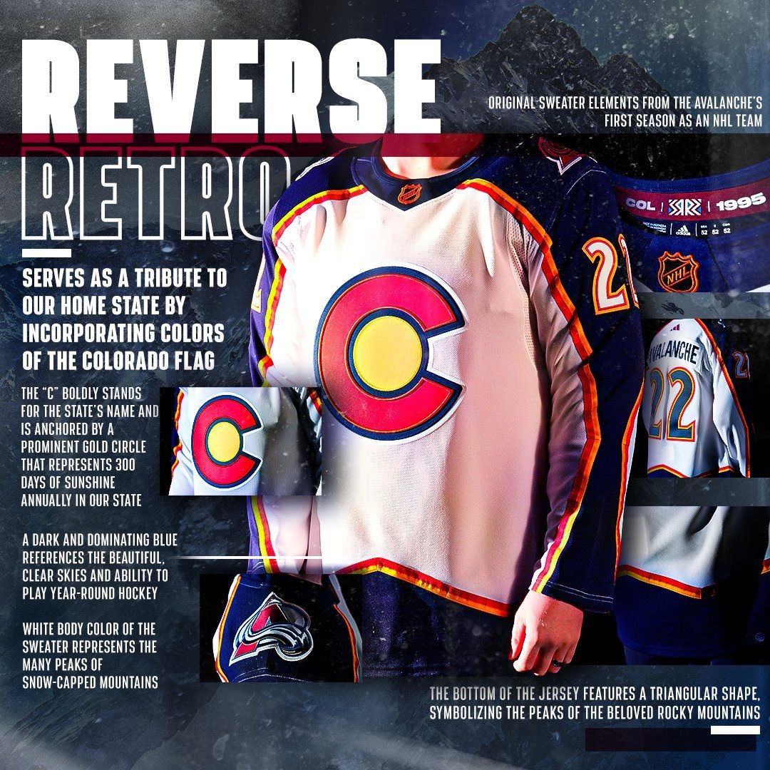
I was born and raised in Colorado and I love my home state, but enough of this shit. I'm tired of the Avs hammering the 'C' and the state flag into everything they do. The C is already on the shoulders of their home and road jerseys! It's literally the main chest logo of their alternate, which also includes the state flag! They used it for the Stadium Series uniform in 2016! I might actually like the full uniform when it debuts, but I wish they would've tried something new. Maybe that means bringing back the bigfoot logo or finally using the infamous light blue prototype from the 90s. It's not an ugly jersey, but it's still one of the biggest flops of this year's batch.
Is it better than their first Reverse Retro?
Lmao
Columbus Blue Jackets: D
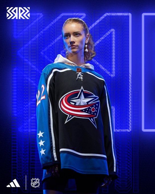
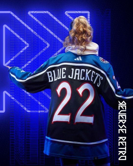
This jersey looks like it could've been a prototype that got scrapped from when the Blue Jackets first started using this logo as an alternate back in 2003. Jackets fans, I'm sorry: This is an AHL jersey.
Is it better than their first Reverse Retro?
Almost nothing could be worse than that one.
Dallas Stars: B-
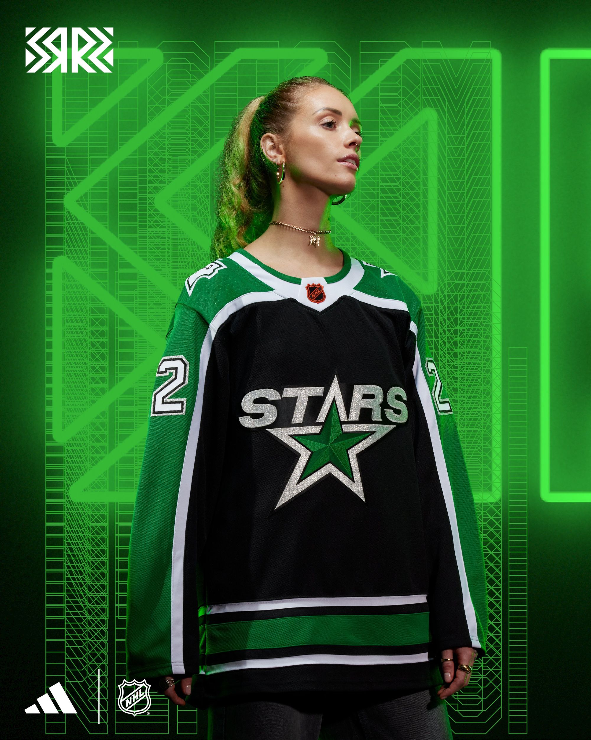
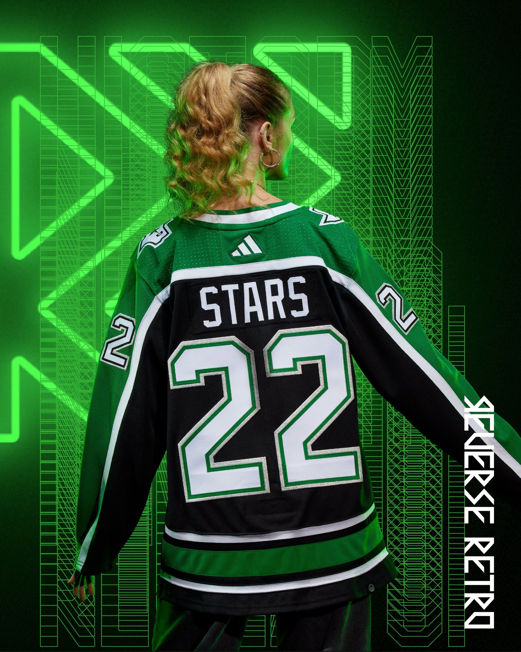
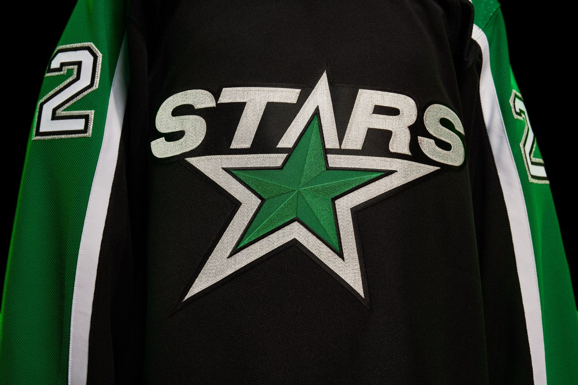
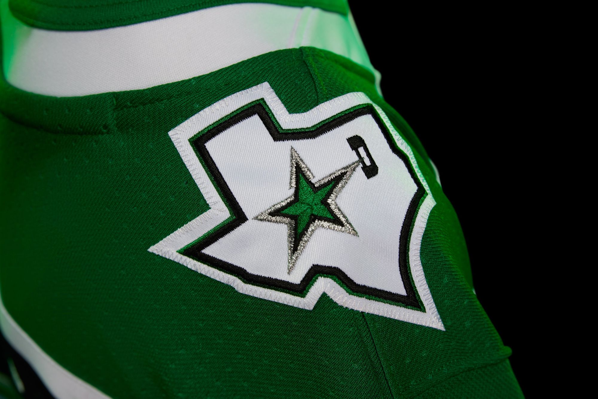
The Stars currently have the worst uniform set in the league, so these get bumped up a letter solely by comparison. I love the 3D star on the chest, and the throwback "Stars" lettering/numbers from their 90s look with silver accents look great. They could've done much worse than this.
Is it better than their first Reverse Retro?
This is what I meant by "much worse."
Detroit Red Wings: C+
I hated this jersey the first time I saw it and was ready to dump it in the same bucket as Chicago's like everyone else did. Then I saw that the Red Wings were one of like three teams who did the bare minimum and showed us what it's going to look like on-ice.
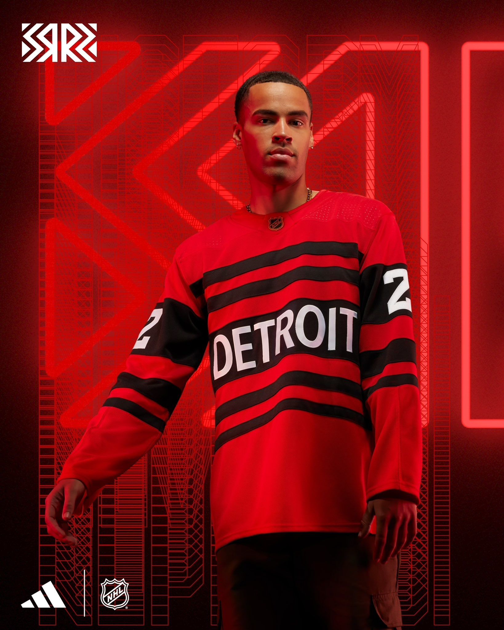
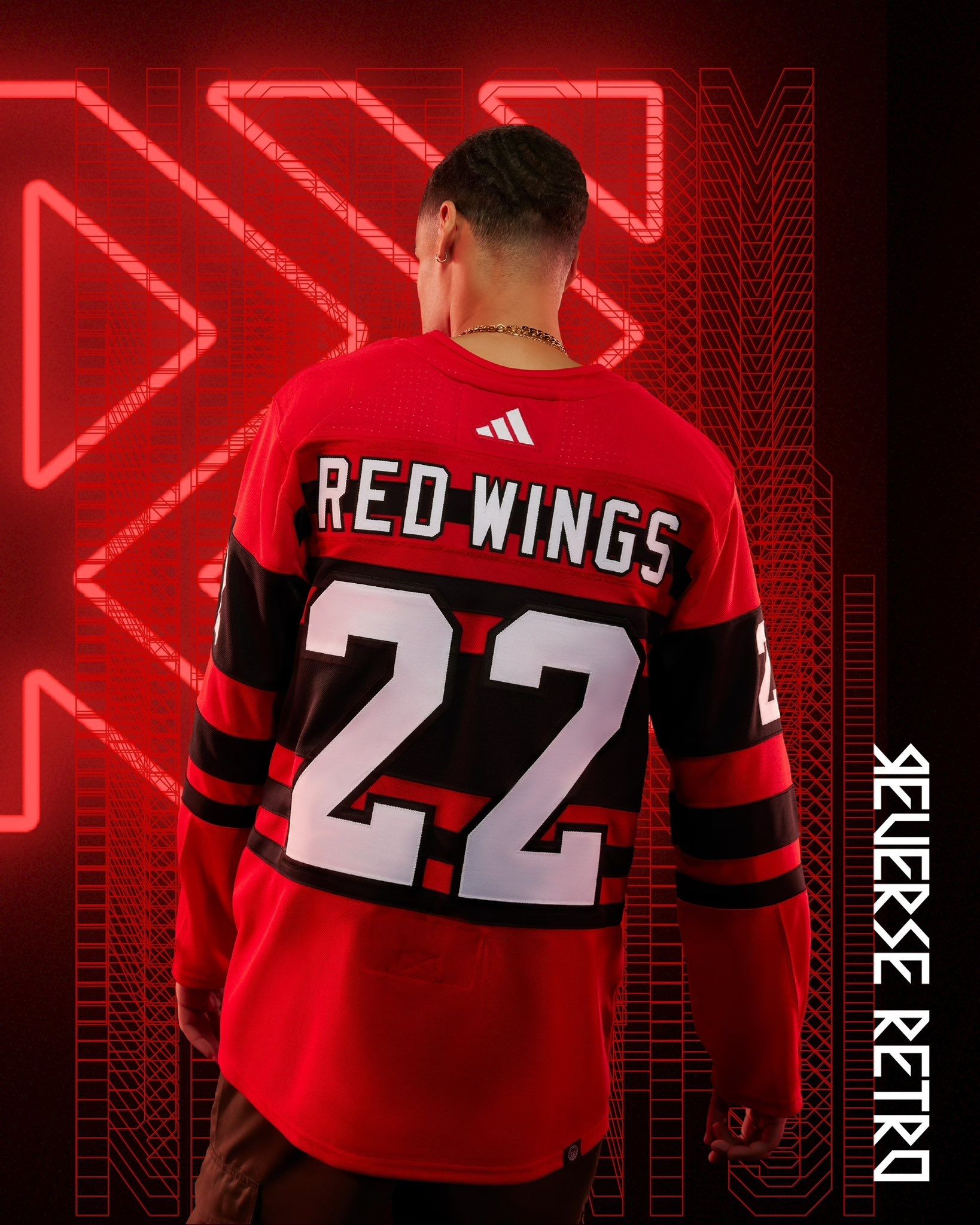
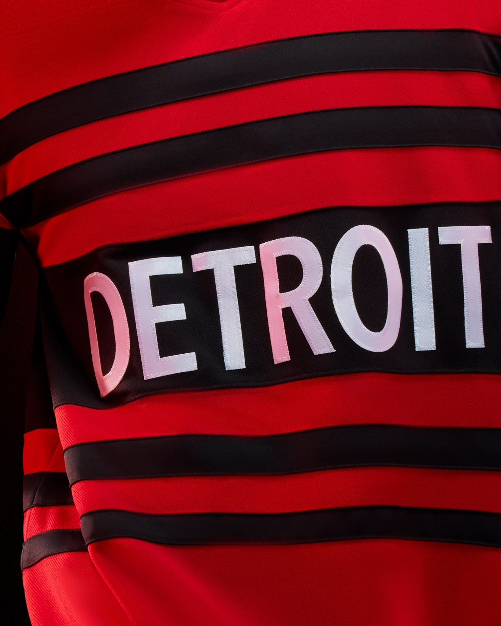
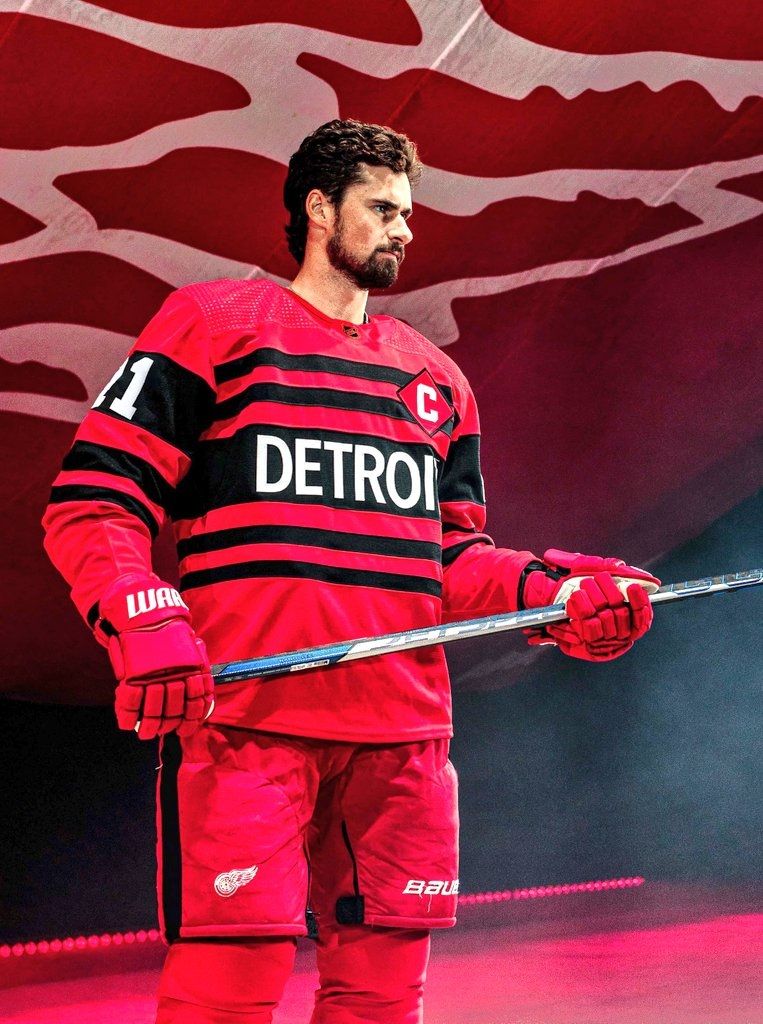
That captain's patch kicks ass and I hope they wear black helmets with it. The jersey itself is lacking a bit, but I'm giving extra marks for the full uniform.
Is it better than their first Reverse Retro?
I'm confident that you and I could design something better than their first Reverse Retro.
Edmonton Oilers: B
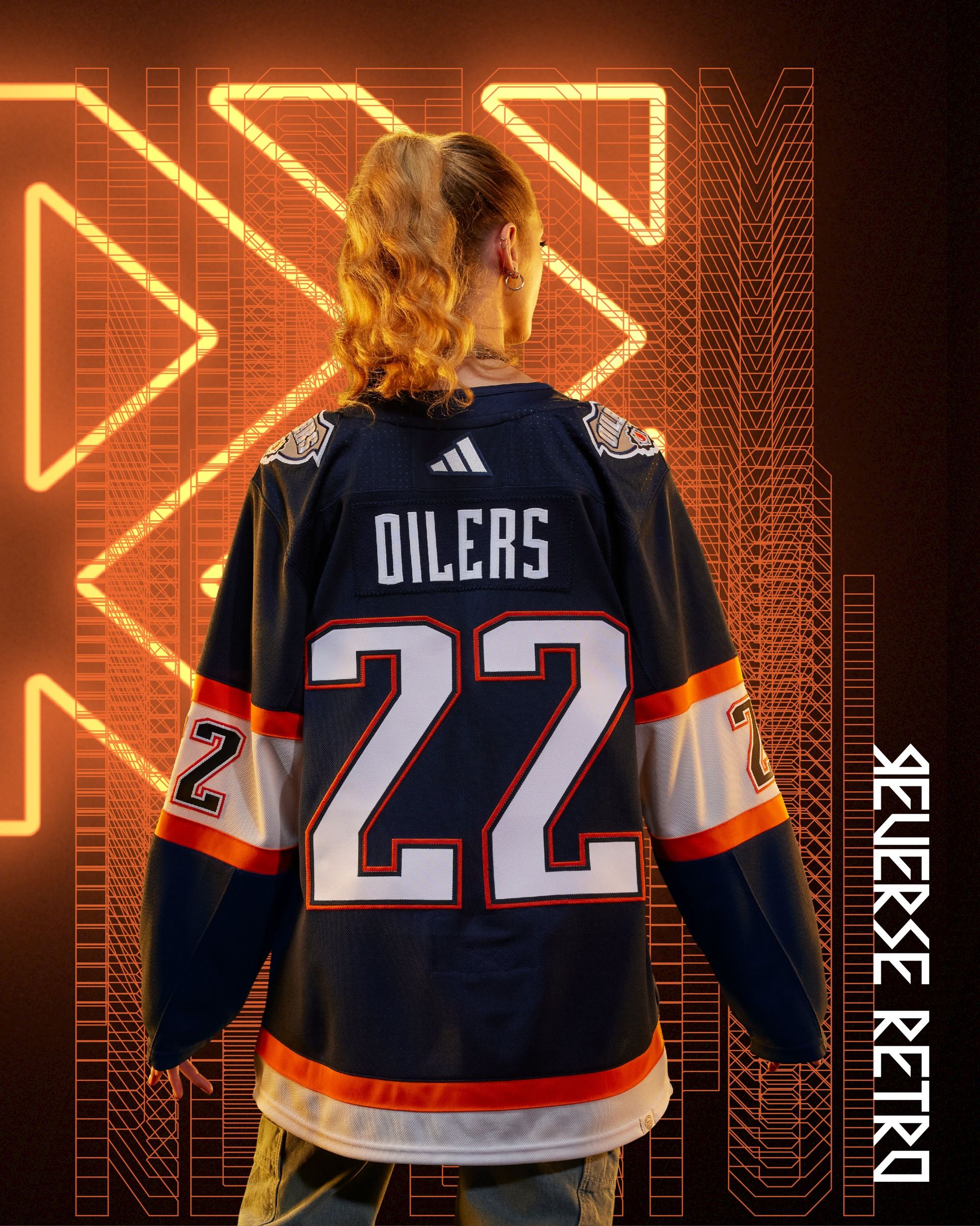
My parents always like to tell a story about my older brother asking for $100 one weekend when he was either in high school or college. My parents said the most they could do was 50. An argument ensued, and neither side was willing to budge. Eventually my parents said something to the effect of, "50 dollars, take it or leave it." He left it.
I've been begging for the oil-drop uniforms to come back, but exactly as they were then, not with any orange accents. I'm a little disappointed with these, but I'm also gonna take the $50 and shut the fuck up.
Is it better than their first Reverse Retro?
Yes, in theory. No, in reality.
Florida Panthers: A+
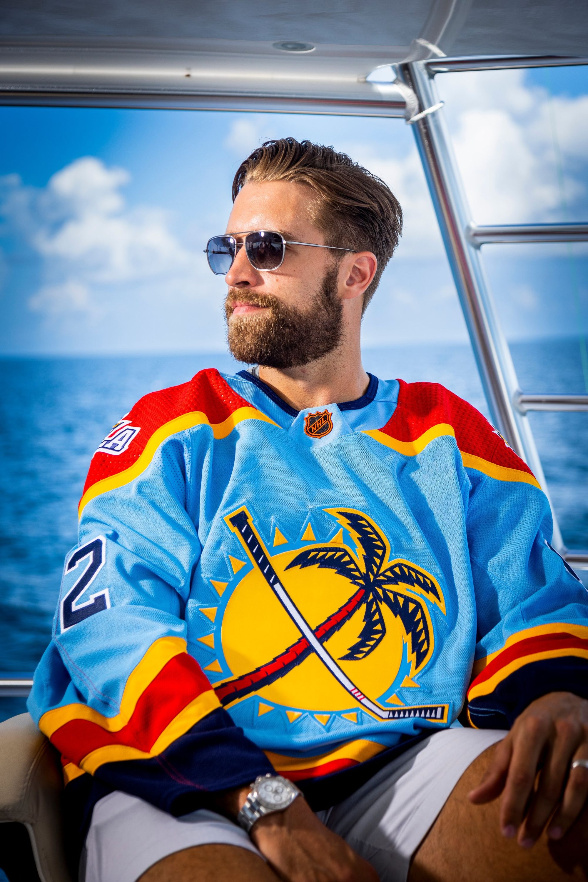
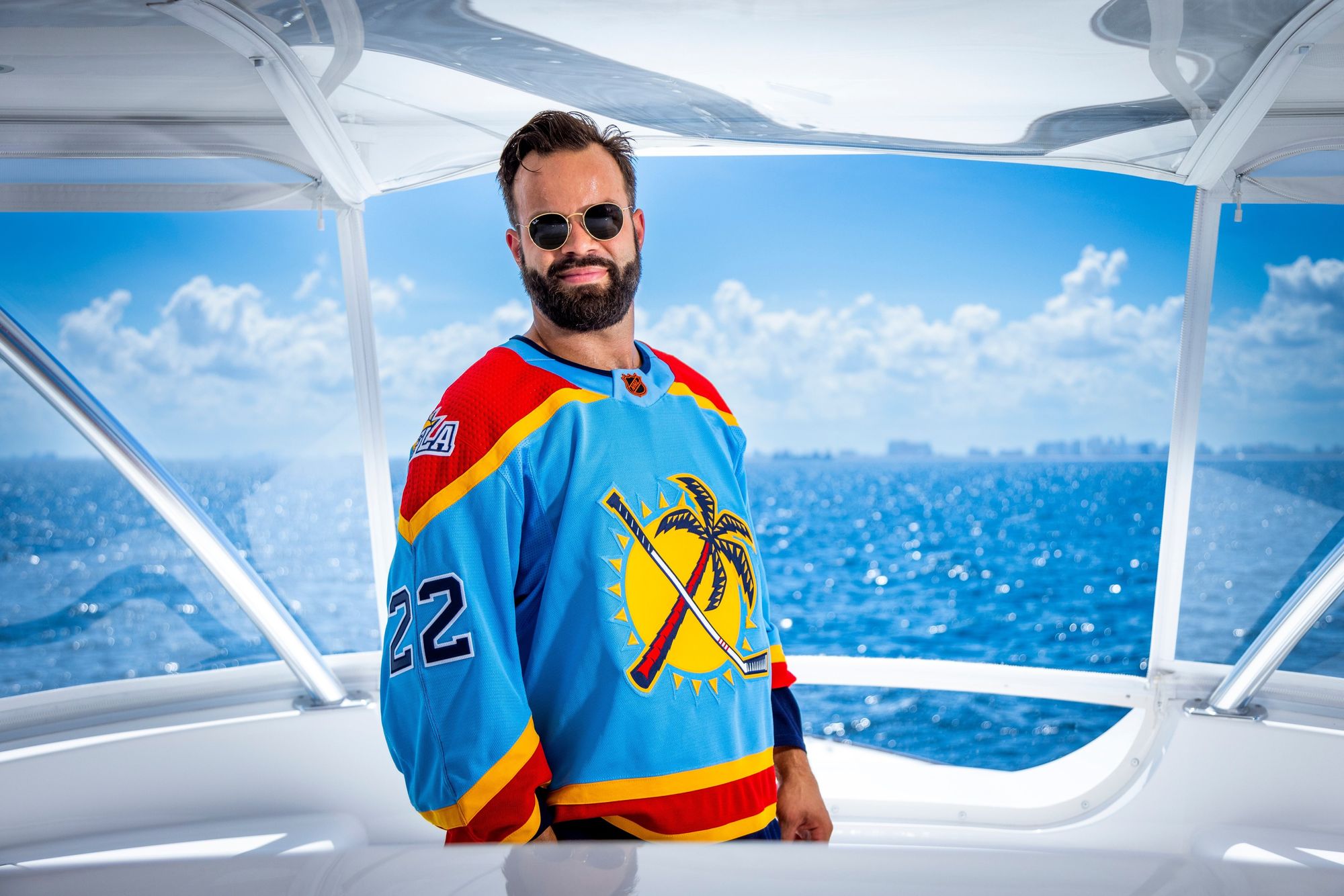
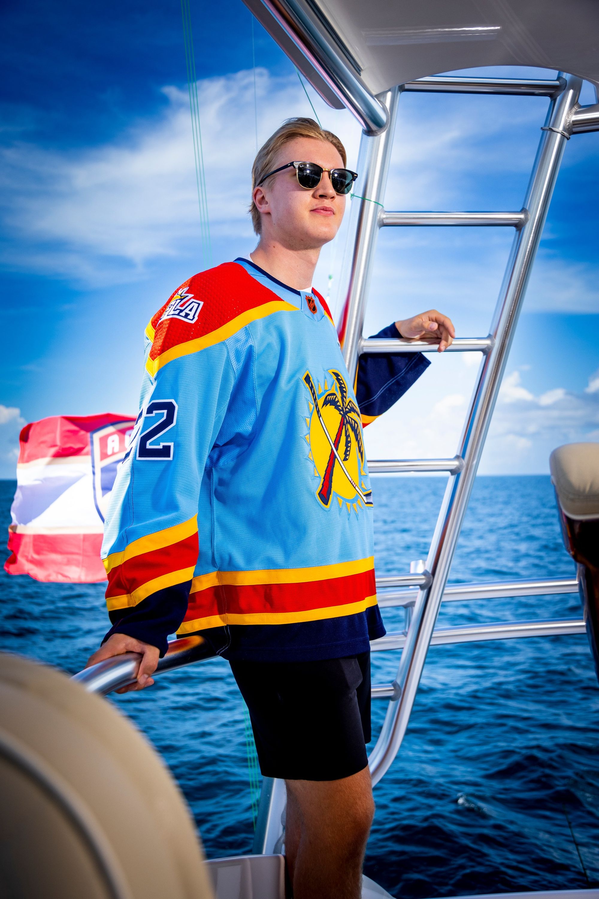
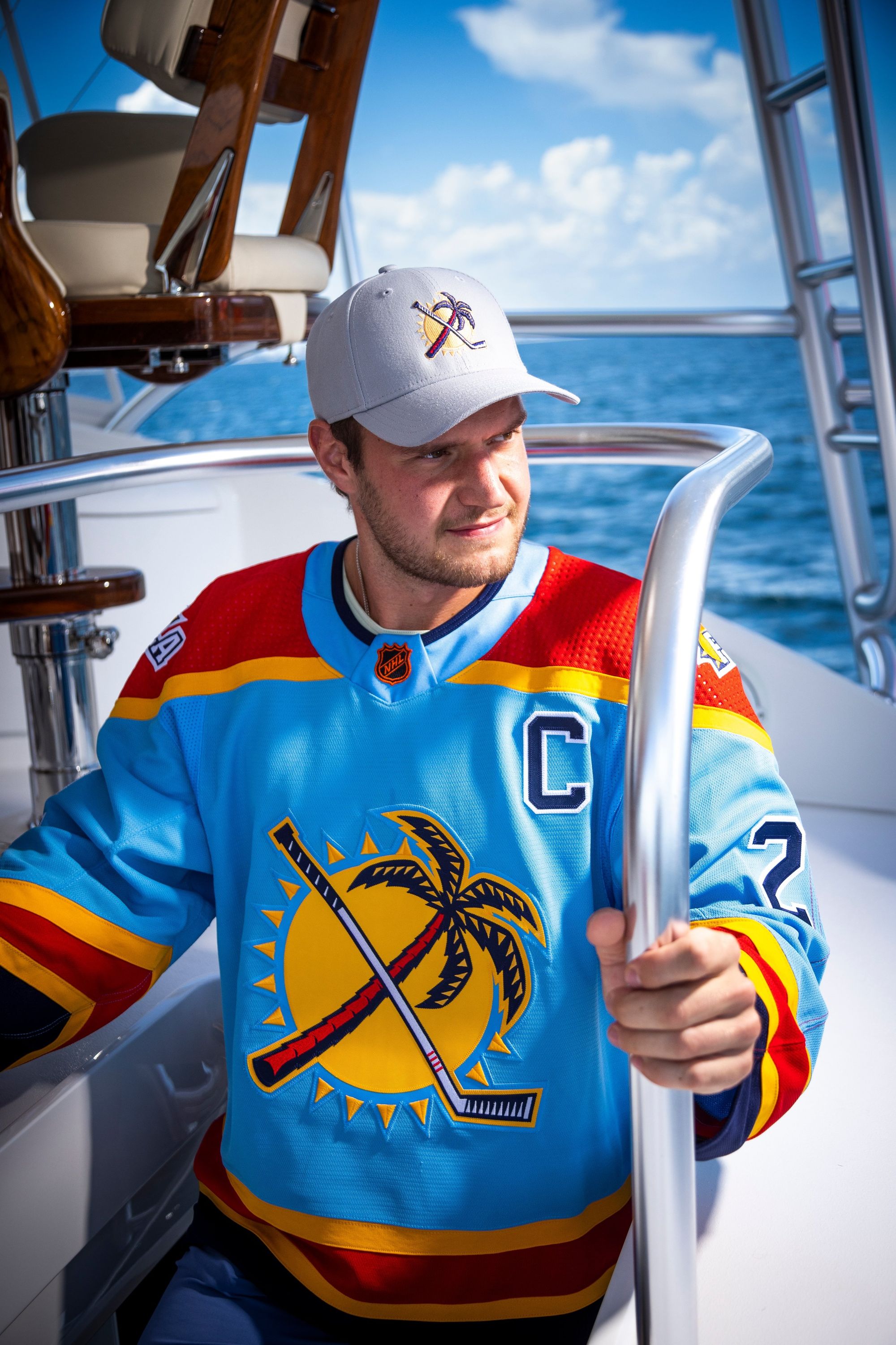
The Panthers simply don't miss on Reverse Retros. They also get bonus points for being one of the few teams who actually got shots of their players in the jersey. The hockey stick/palm tree alternate logo on a powder blue background embodies everything that the Reverse Retro program should be. My biggest question: How does the rest of the uniform look? I'm guessing it'll be dark blue bottoms/gloves/helmet, but imagine if they went full-on 2000s Denver Nuggets?
Is it better than their first Reverse Retro?
Tie. Both perfect jerseys.
Los Angeles Kings: A
I don't have much to say here. It's a beautiful jersey. I asked for the crown logo last time, and the Kings delivered here. This is one of those jerseys that's great on its own, but will look even better with the full fit on ice.
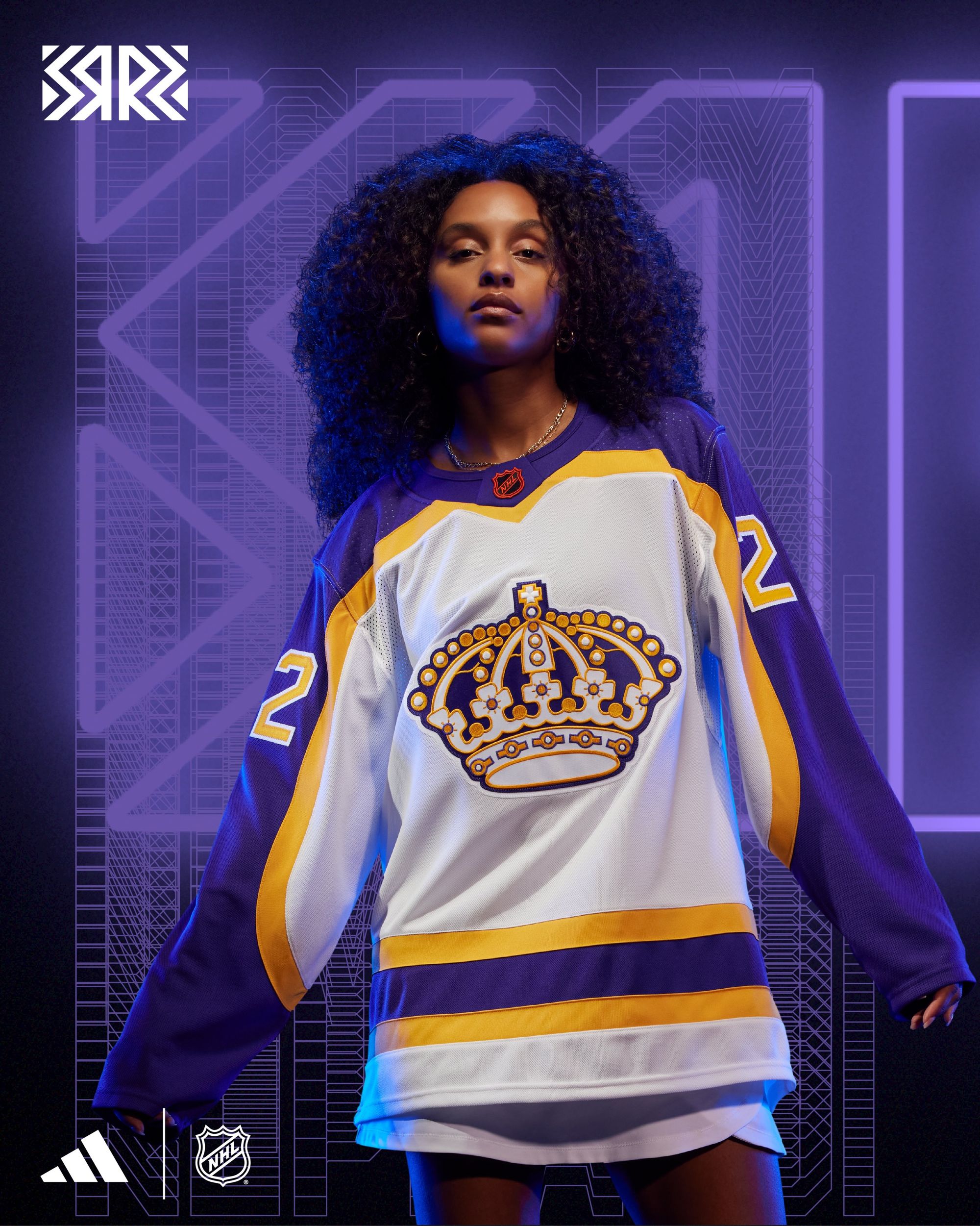
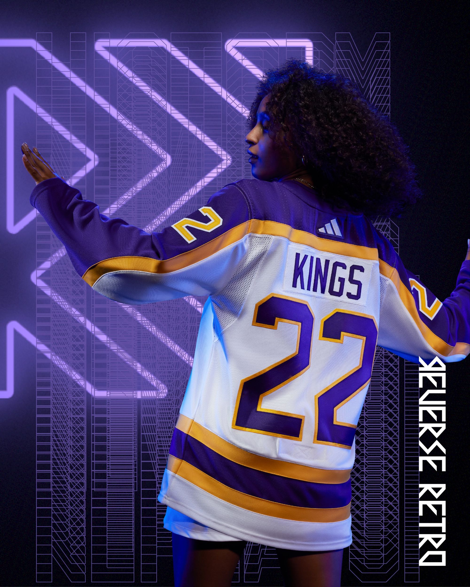
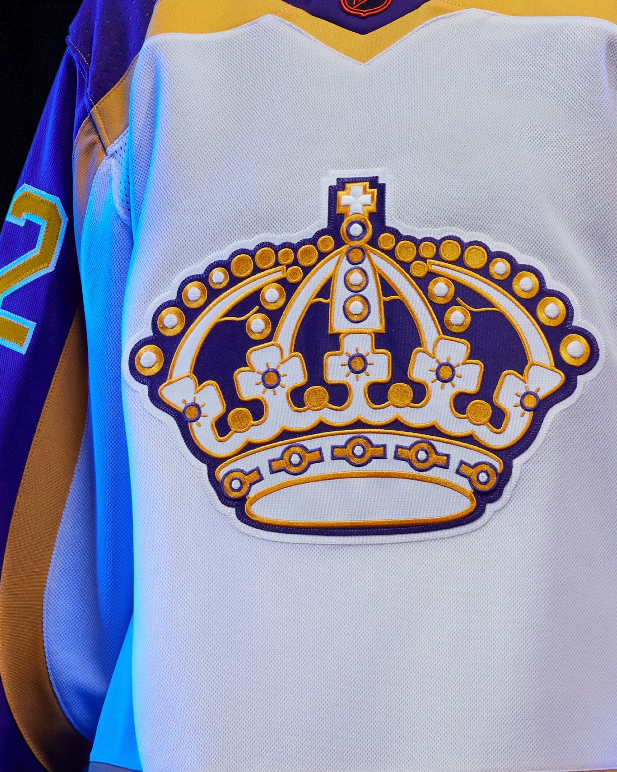
Is it better than their first Reverse Retro?
Another tie. It's hard to fuck up purple and gold. (Even though the Lakers keep trying their best.)
Minnesota Wild: C+
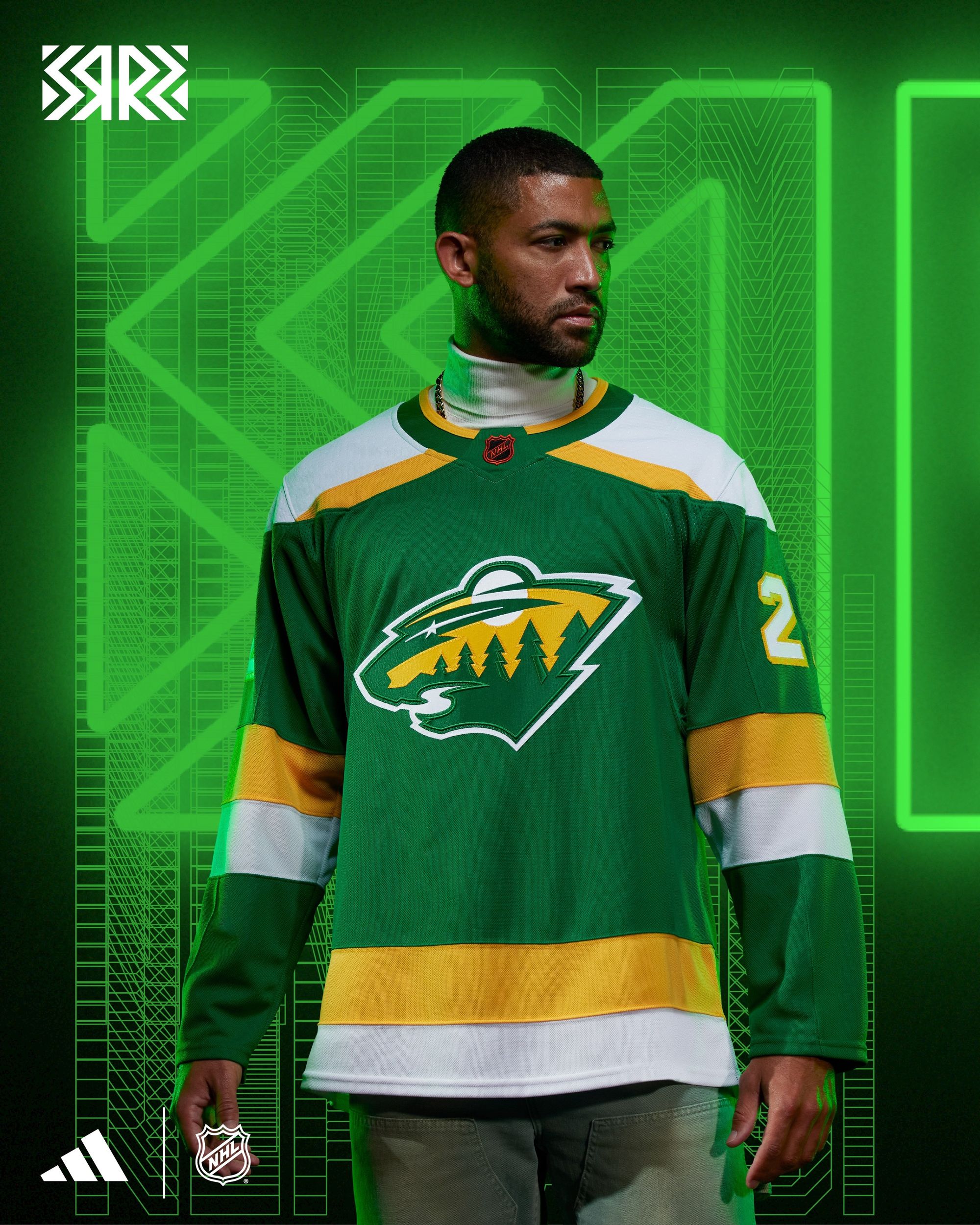
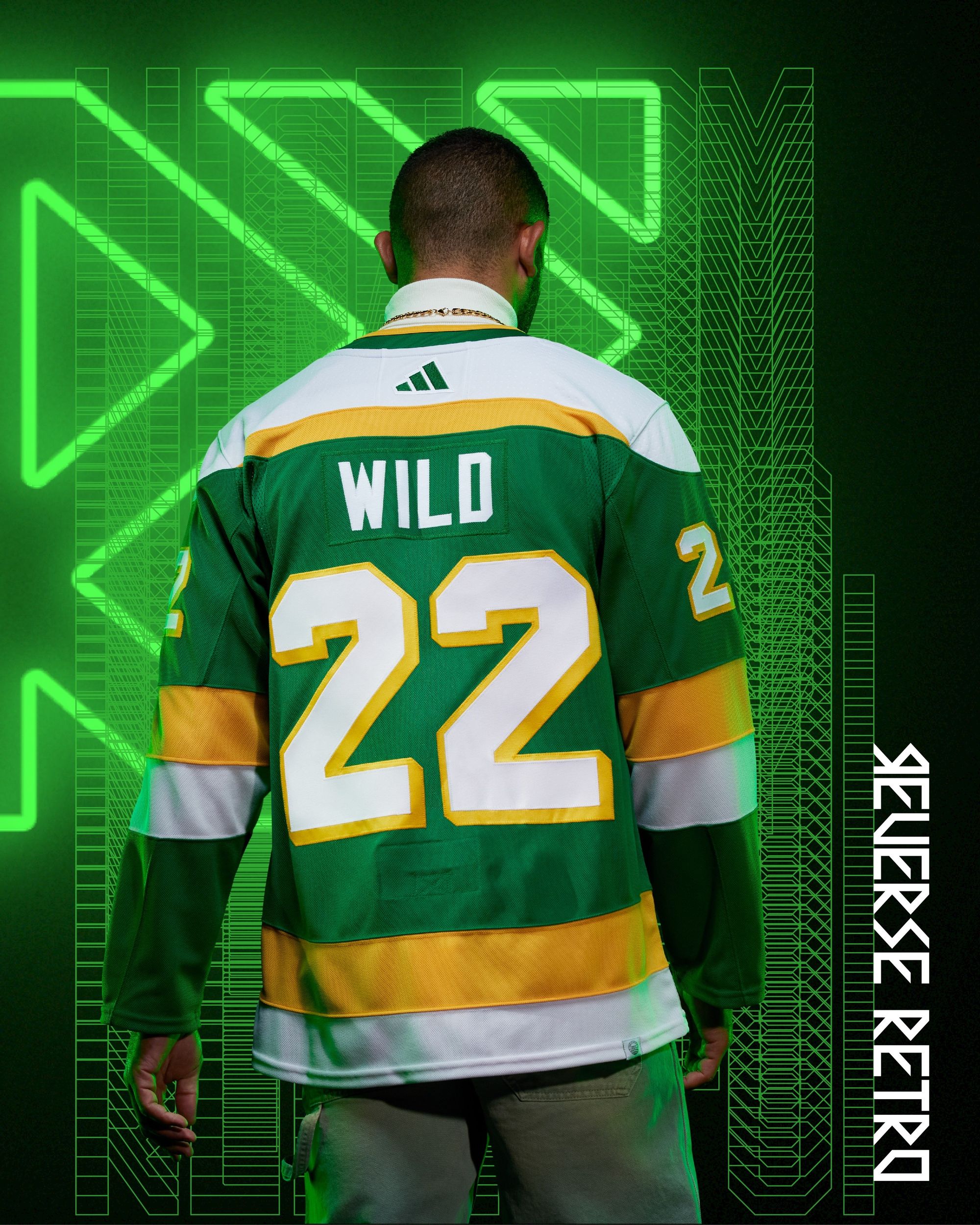
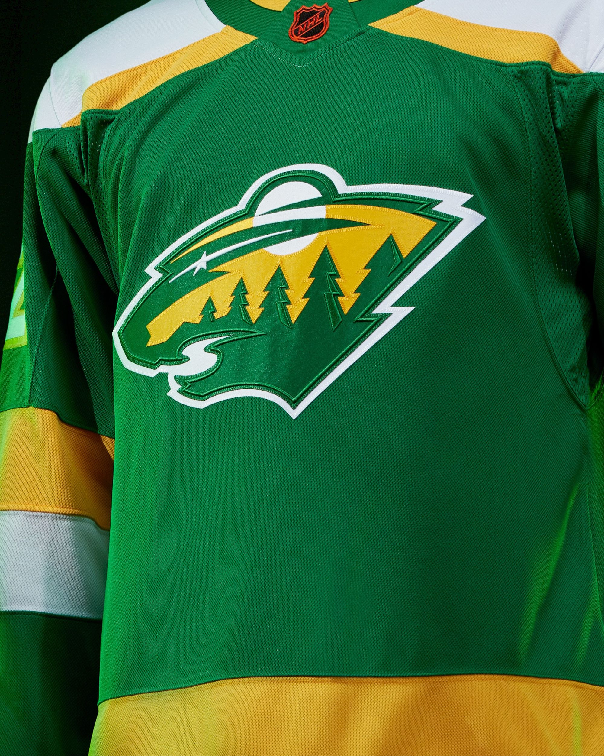
This jersey hits on most of the notes I thought Minnesota's first RR missed. The stripes and block lettering are classic Minnesota North Stars, and it's gonna look killer with green pants, gloves, and helmets. My only beef is the logo. I wish the Wild would've showed the slightest bit of creativity here and not used the exact same chest logo they did on their first RR, but I'm not surprised they didn't. As they say:
Hearing extreme reports of Minnesota Mild
— Colton Denning (@Dubsco) October 18, 2022
Is it better than their first Reverse Retro?
Staying true to the North Star's look means yes.
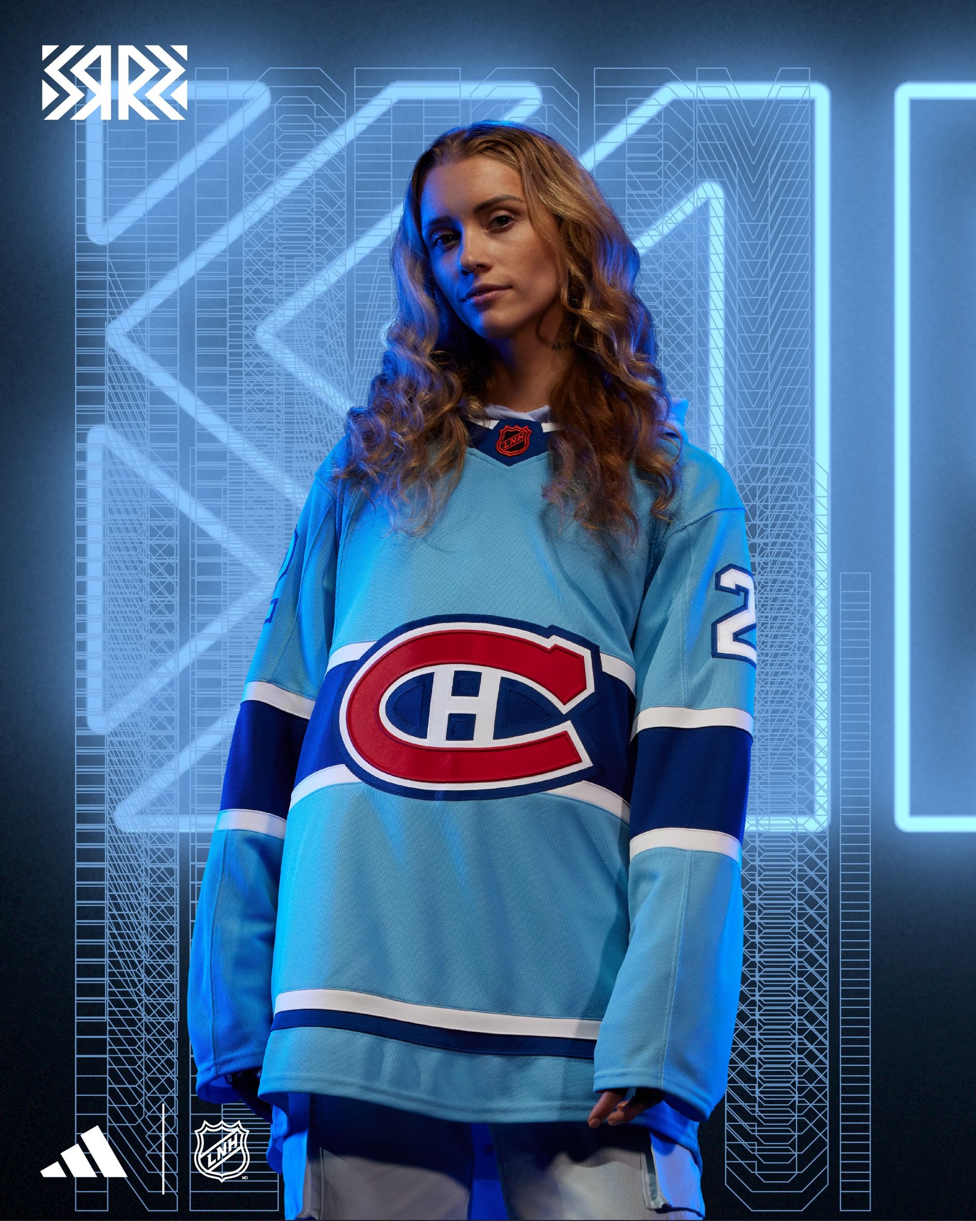
Montreal Canadiens: B
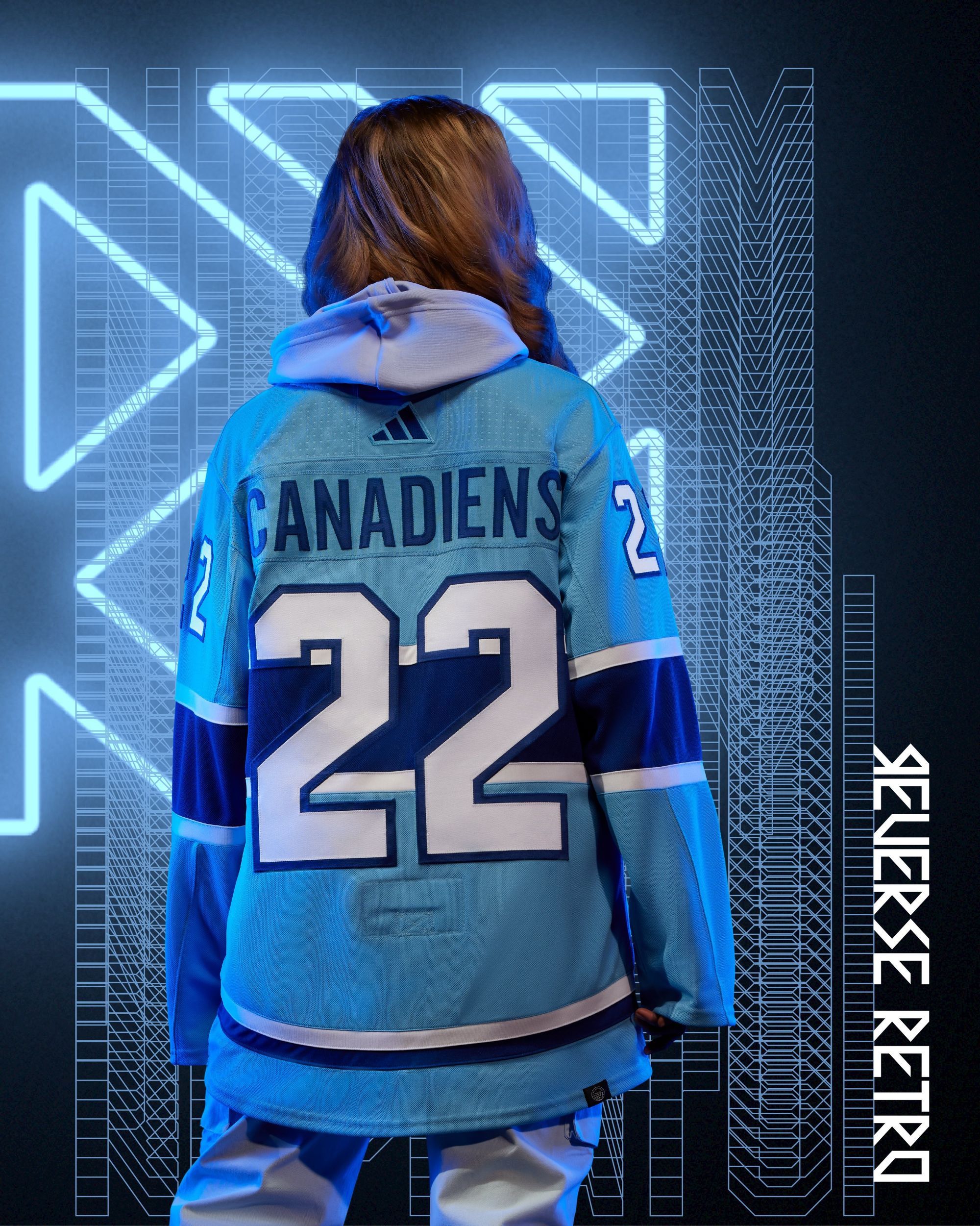
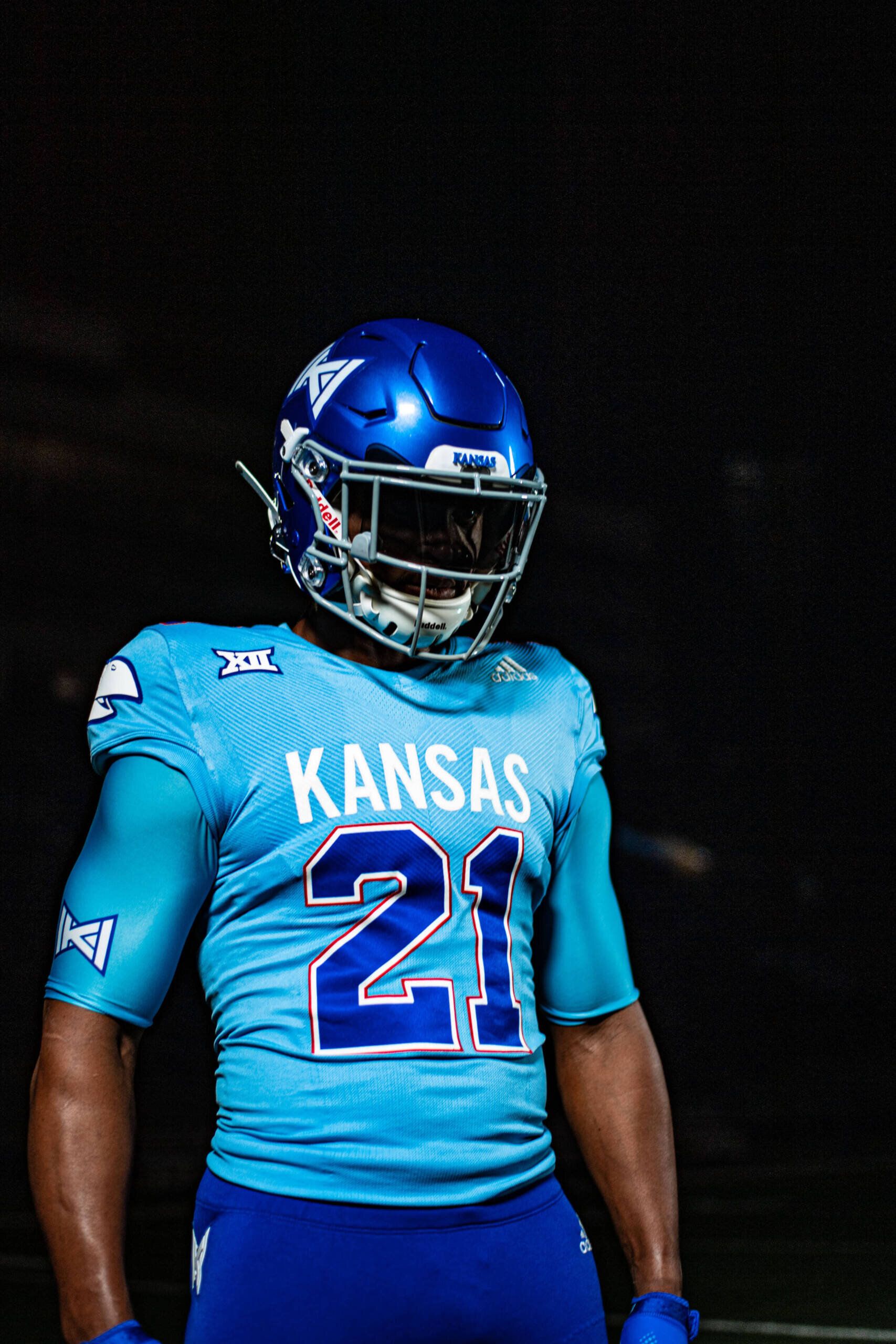
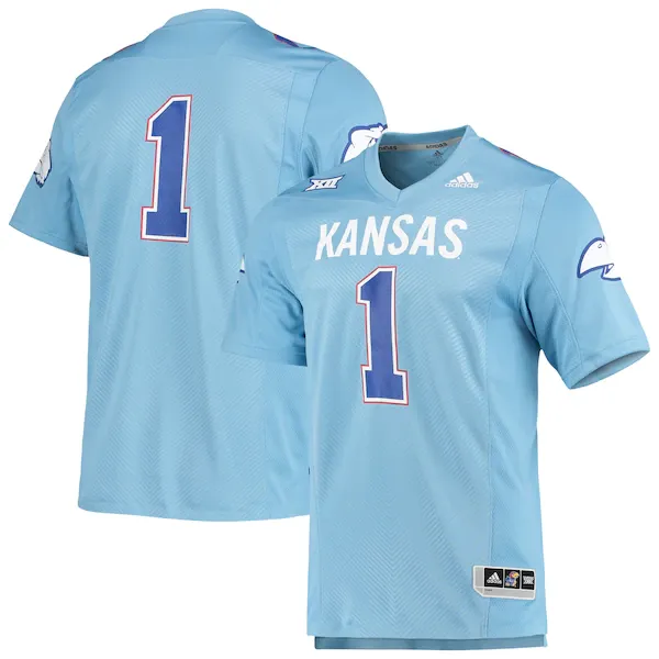
A simple jersey that serves as a cool Expos tribute. I like it. Also, I can't stop laughing at Adidas making similar alternates for the Montreal Canadiens and KANSAS FOOTBALL:
Is it better than their first Reverse Retro?
No, but not by much.
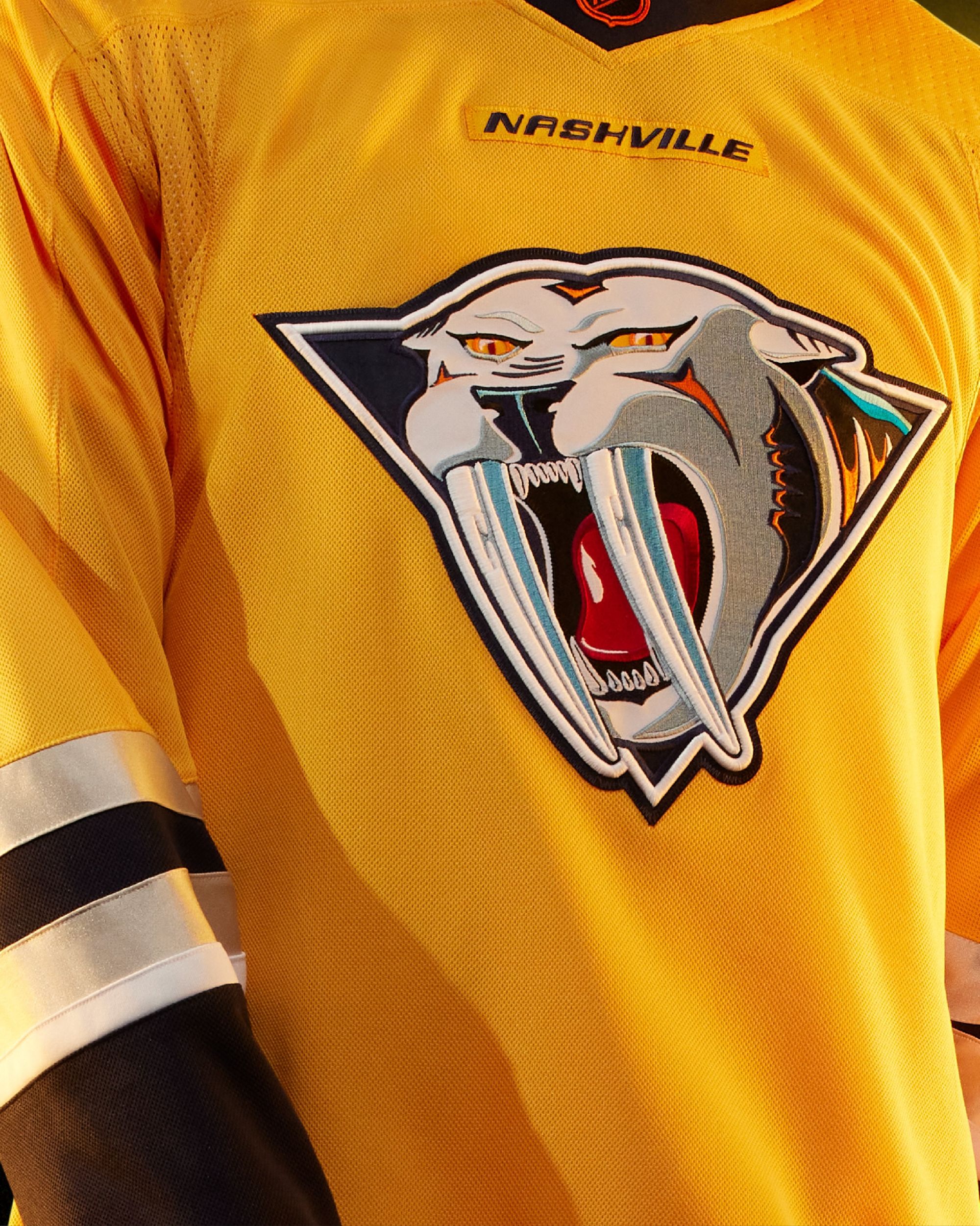
Nashville Predators: C+
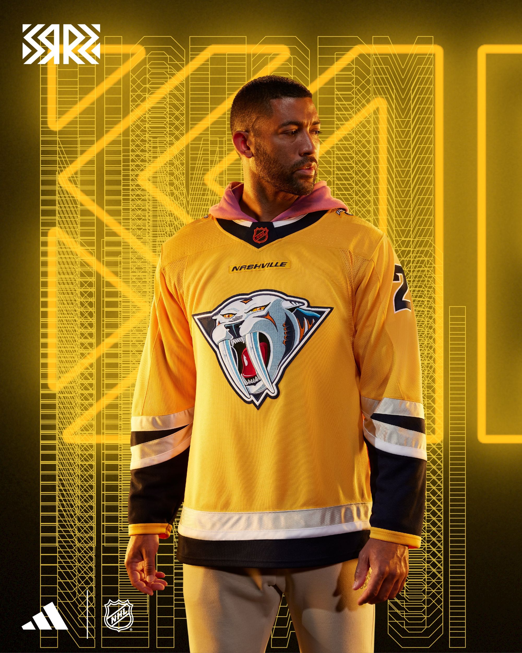
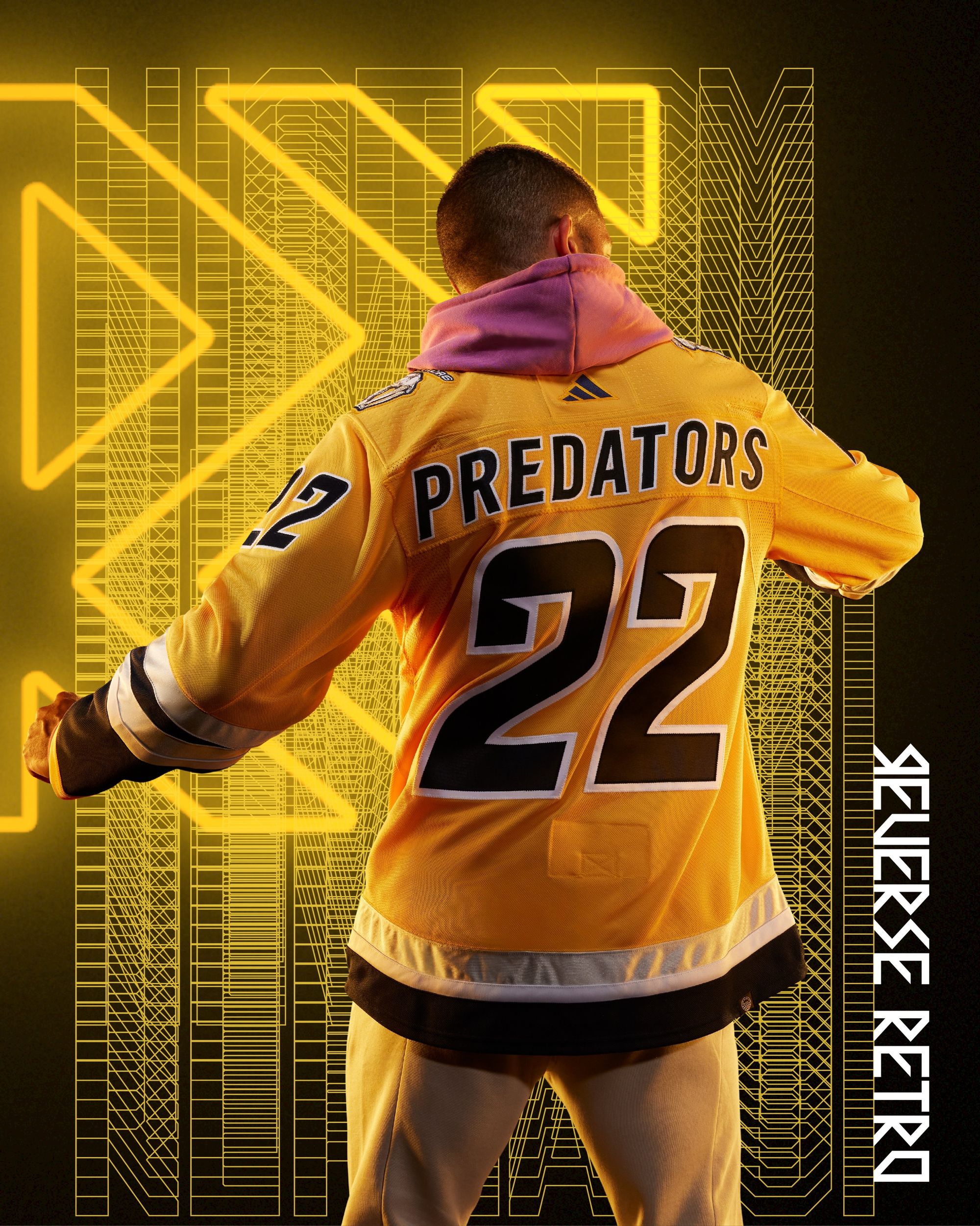
Two things:
1) All I can think of when I see that logo is that it looks like it's either the poster design for an 80s hair band tour, or they ripped it straight from one of the animal designs in the He-Man cartoon.
2) Metallic silver will always get good grades from me.
It gets a C+ and not a B- only because I know they're going to wear yellow helmets with it, and –I mean this from the bottom of my hear– I fucking hate the yellow helmets.
Is it better than their first Reverse Retro?
No. Way more metallic silver on the first one.
New Jersey Devils: B-
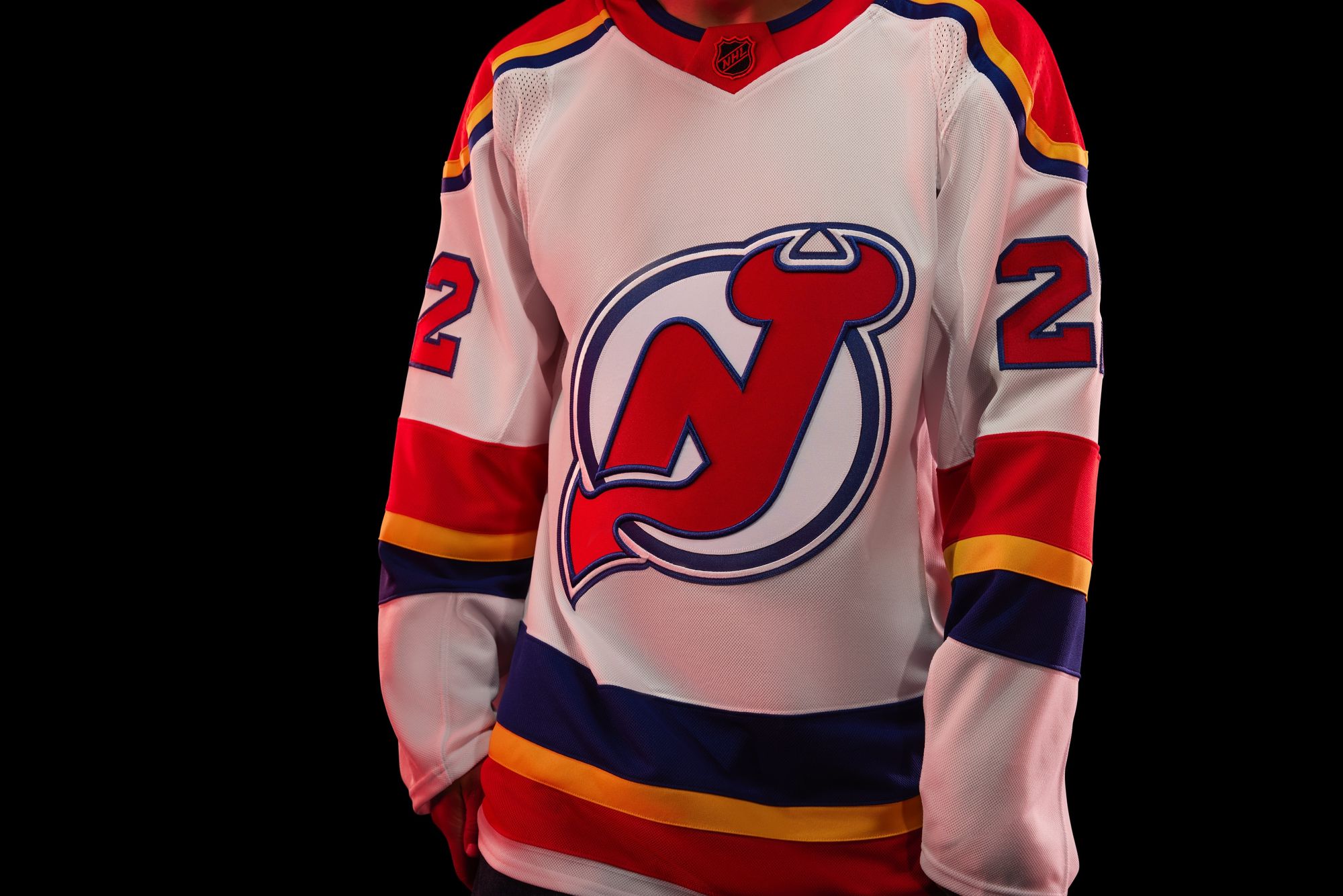
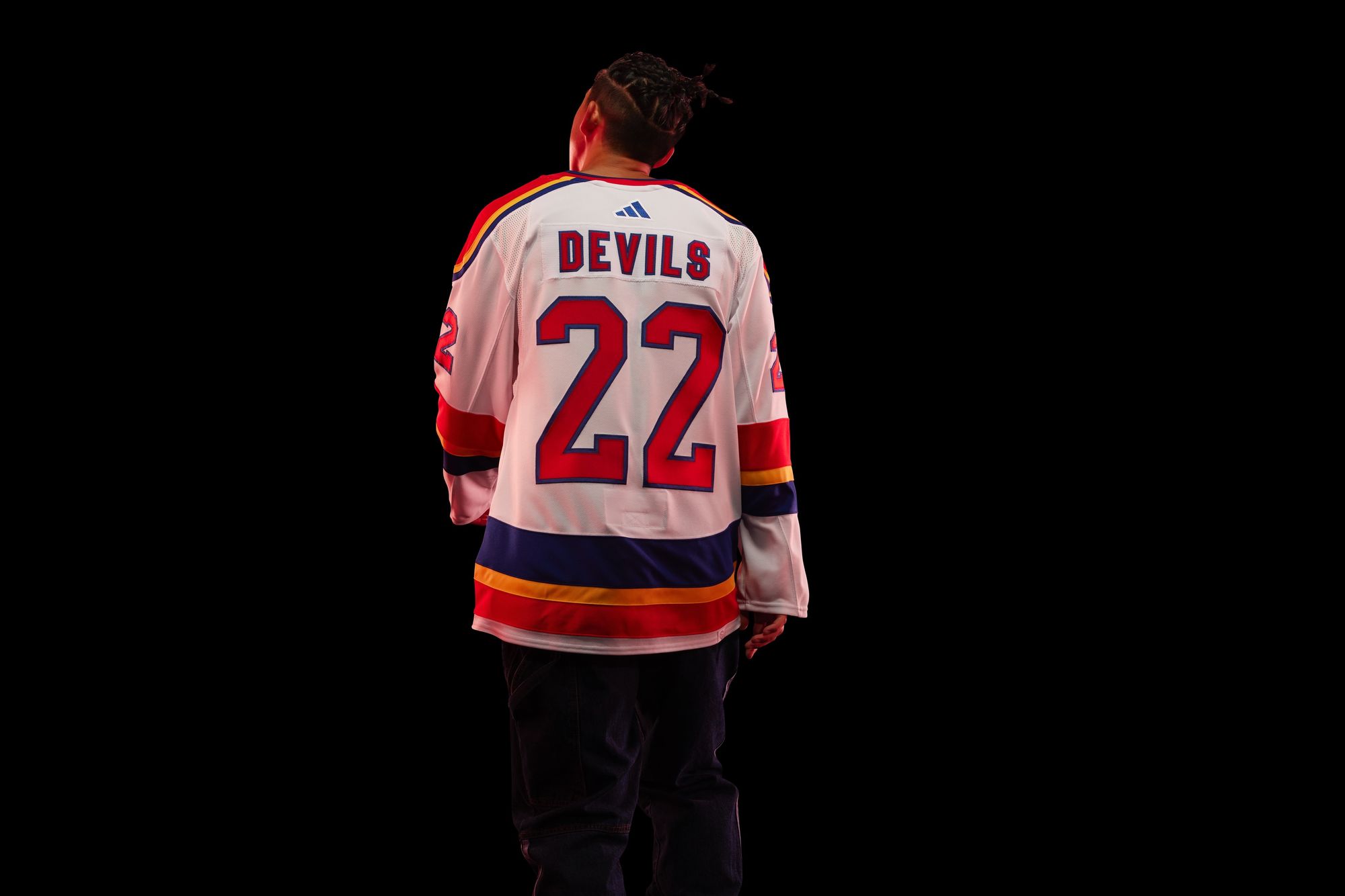
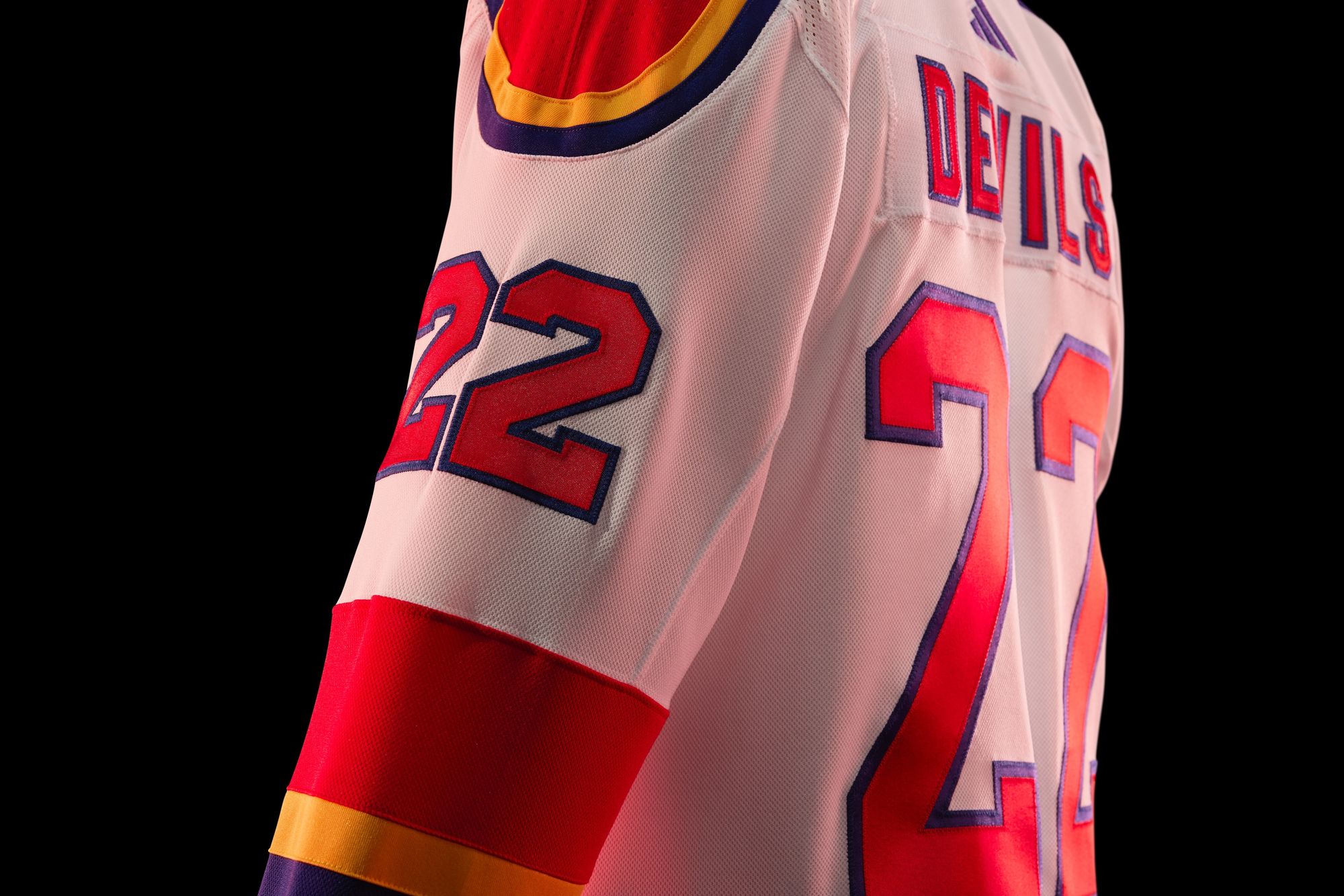
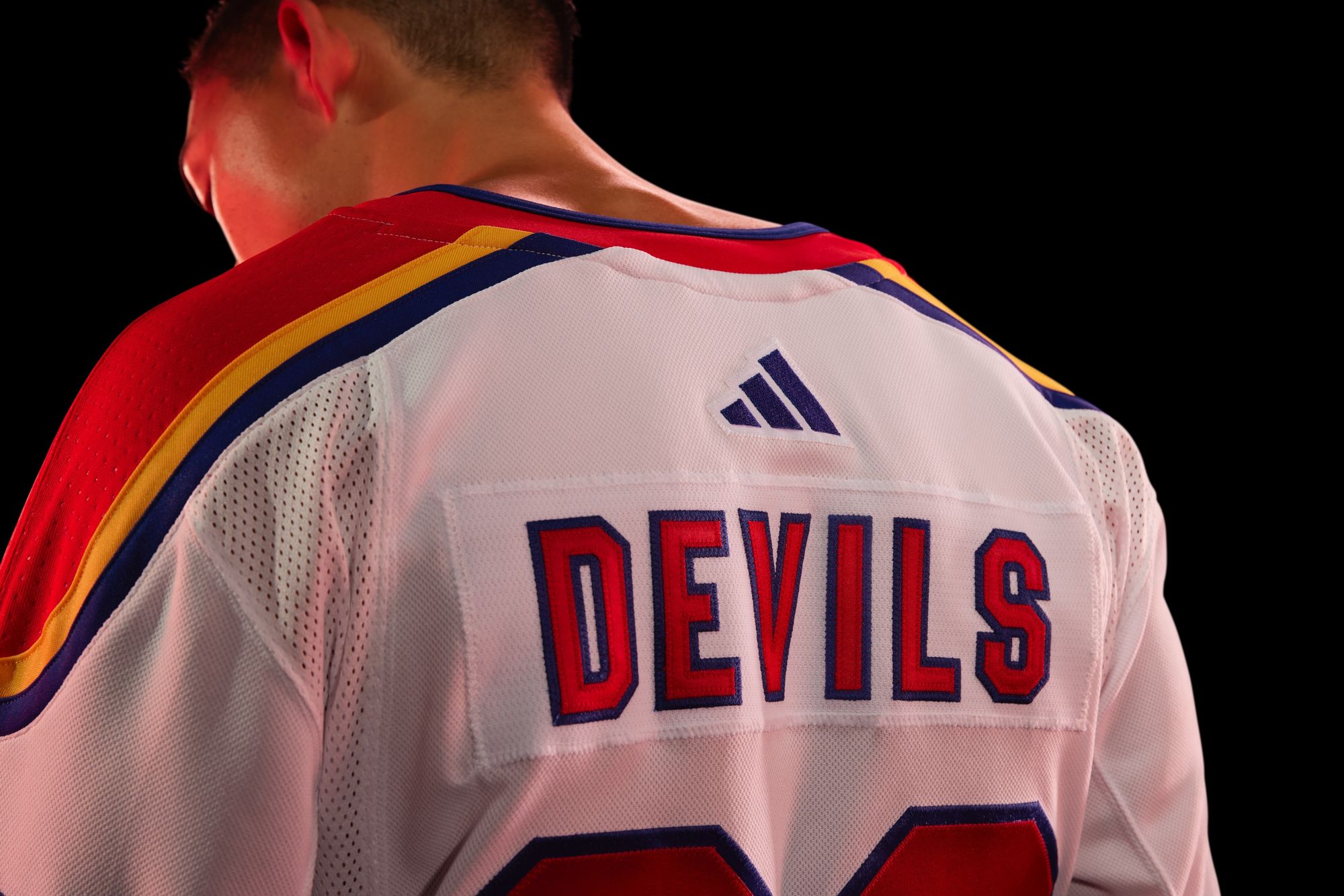
I'm picturing the Avs and Devils walking up to the teacher's desk after class to explain why their homework looks the same, only for idiot Professor Bettman to not realize they were cheating with each other and telling them to stop copying off the Florida Panthers.
New Jersey gets a higher grade than Colorado because they've never actually worn Colorado Rockies colors before, and I'm also not sure any colorway could look bad with that 'NJ' logo.
Is it better than their first Reverse Retro?
How dare you even ask.
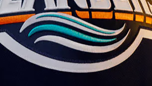
New York Islanders: F
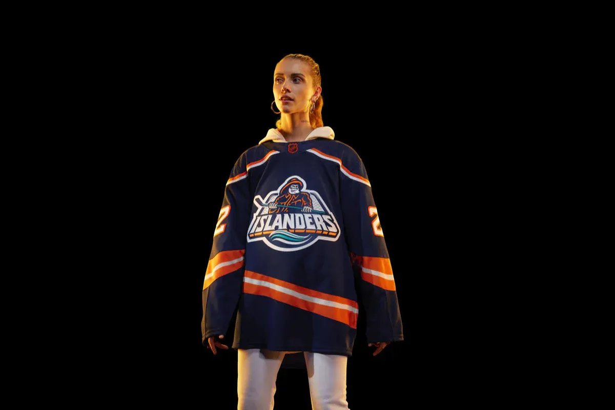
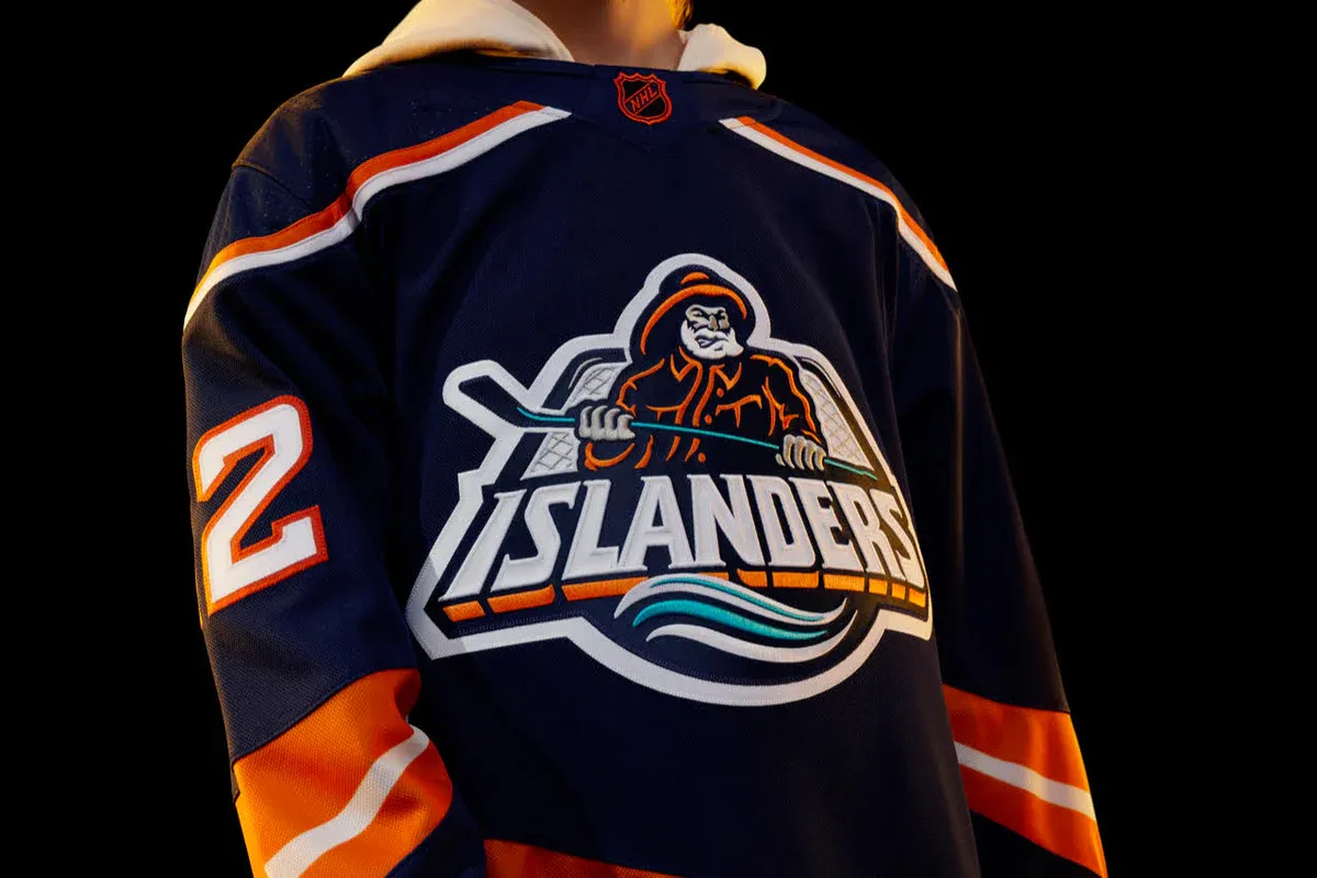
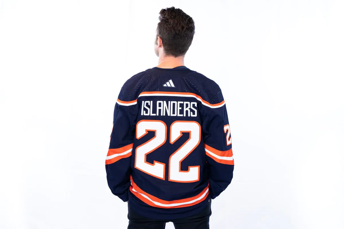
The biggest disappointment of this year's batch. If you're gonna bring back the Fishsticks, then do it all the way. The Reverse Retro program should be about taking risks and having fun, and this feels like the Islanders finally relenting to people wanting that jersey back, but doing it in the safest, least fun way possible. Where's the teal/seafoam green? Where the hell is the wave on the bottom front of the jersey?? The Fishstick jerseys sucked out loud, and that's what made them awesome. These try to re-create that, but without any of the stupidity from the original that people love. That makes for a boring, dog shit excuse of a Reverse Retro. Congratulations on the one bit of teal you used looking like a fucking toothpaste logo:
Is it better than their first Reverse Retro?
Both boring as hell, but this one is worse because they acted like they were doing something.
New York Rangers: B-
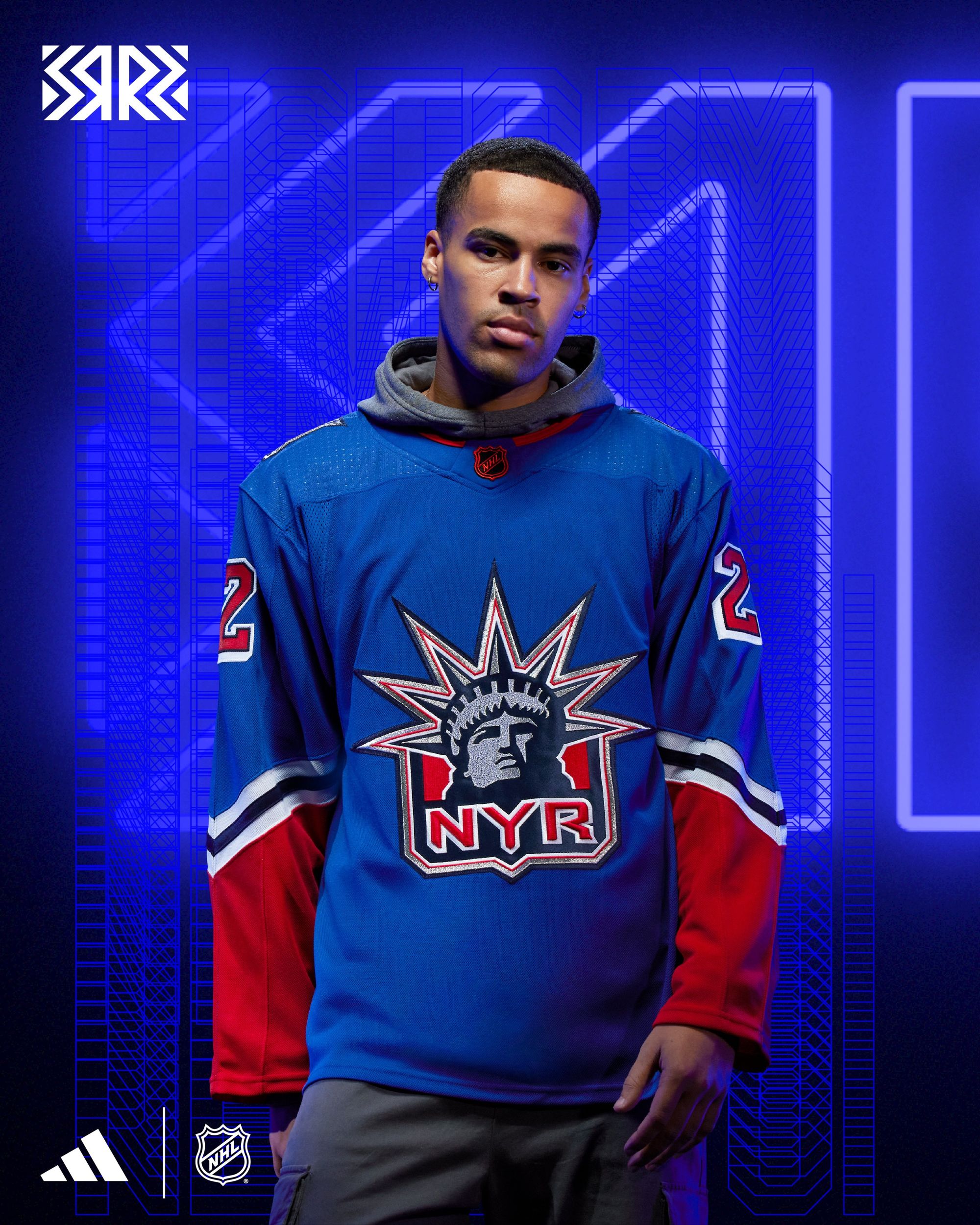
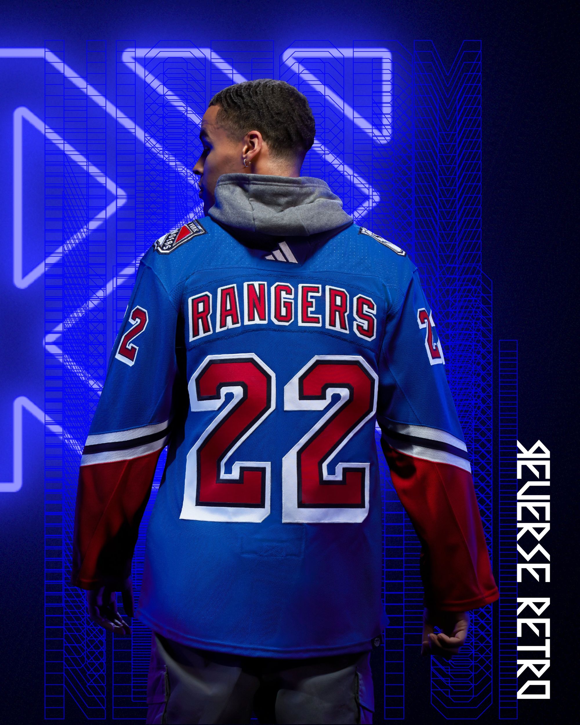
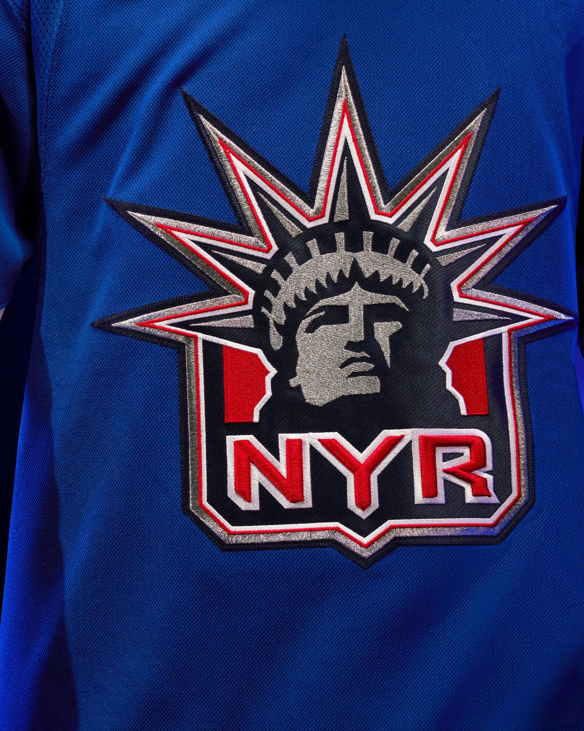
The Lady Liberty logo should never be on any jersey that isn't dark blue. That's my only problem.
Is it better than their first Reverse Retro?
Read above.
Ottawa Senators: C+
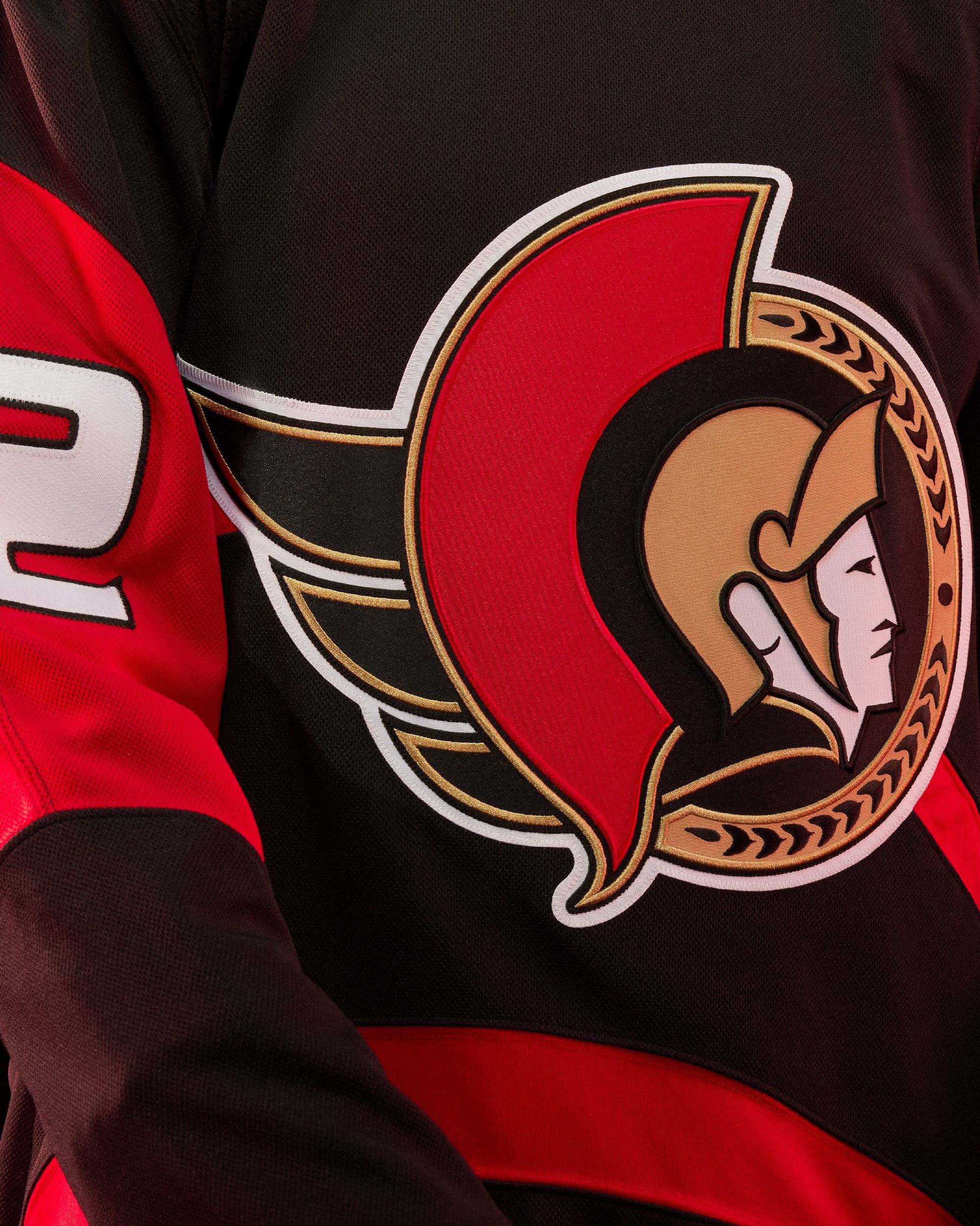
I said that the Sens needed a full rebrand when their first Reverse Retro's dropped, and you know what? I was wrong. Their current set is clean, and these are an OK addition to the mix. The number font looks like something every middle-schooler in the 1990s doodled in a notebook, and it doesn't even bother me how comically large they are. I still think Ottawa desperately needs a strong alternate, but these will do fine for one season of use.
Is it better than their first Reverse Retro?
I take back the "rebrand" stuff, but not what I said about those first RR's. Yuck.
Philadelphia Flyers: A
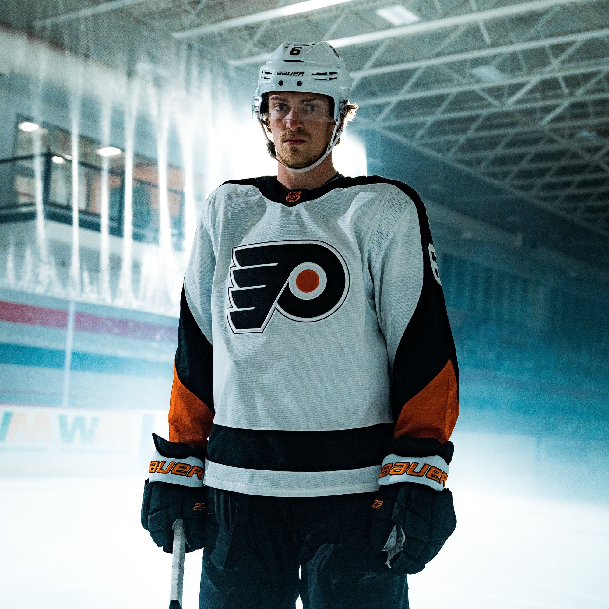
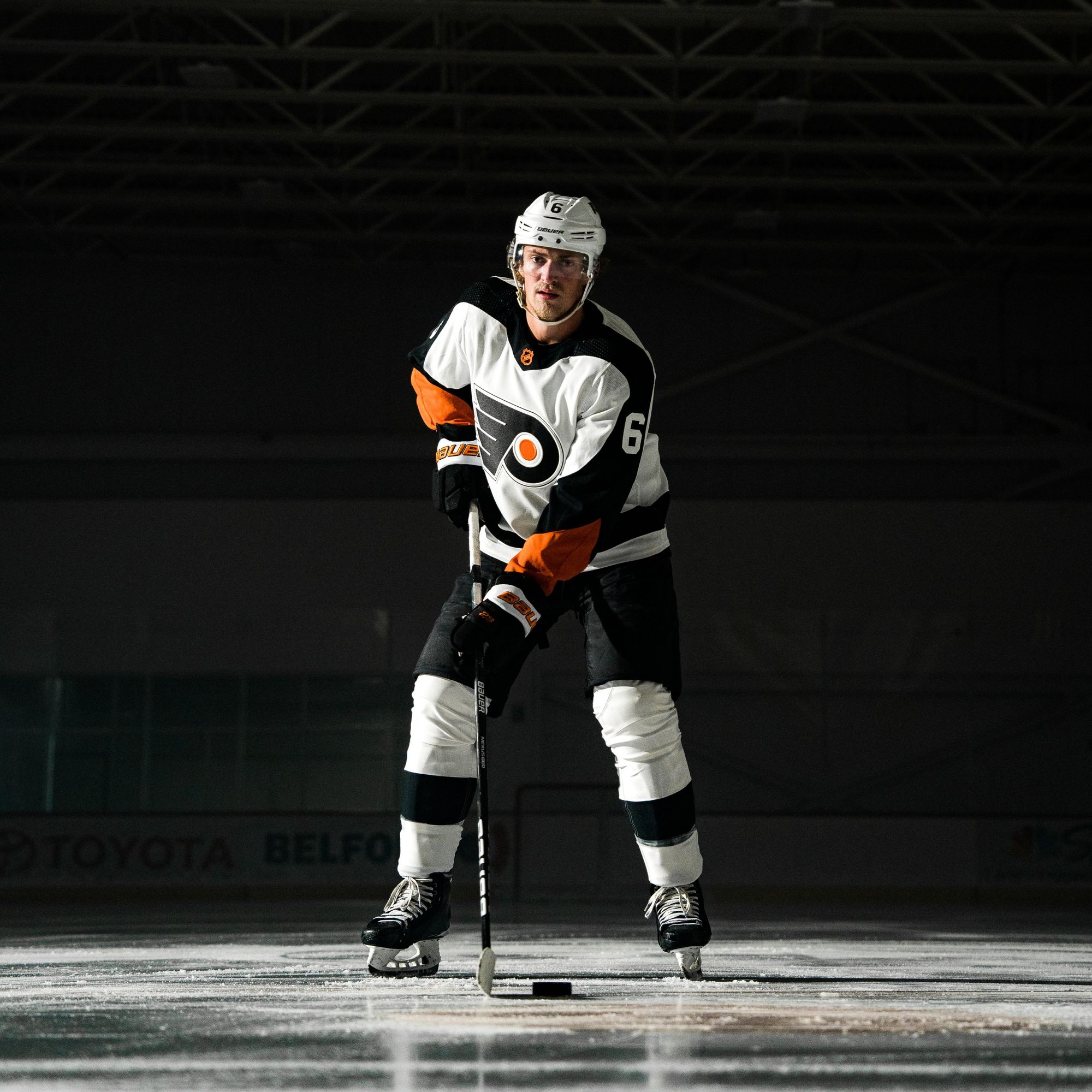
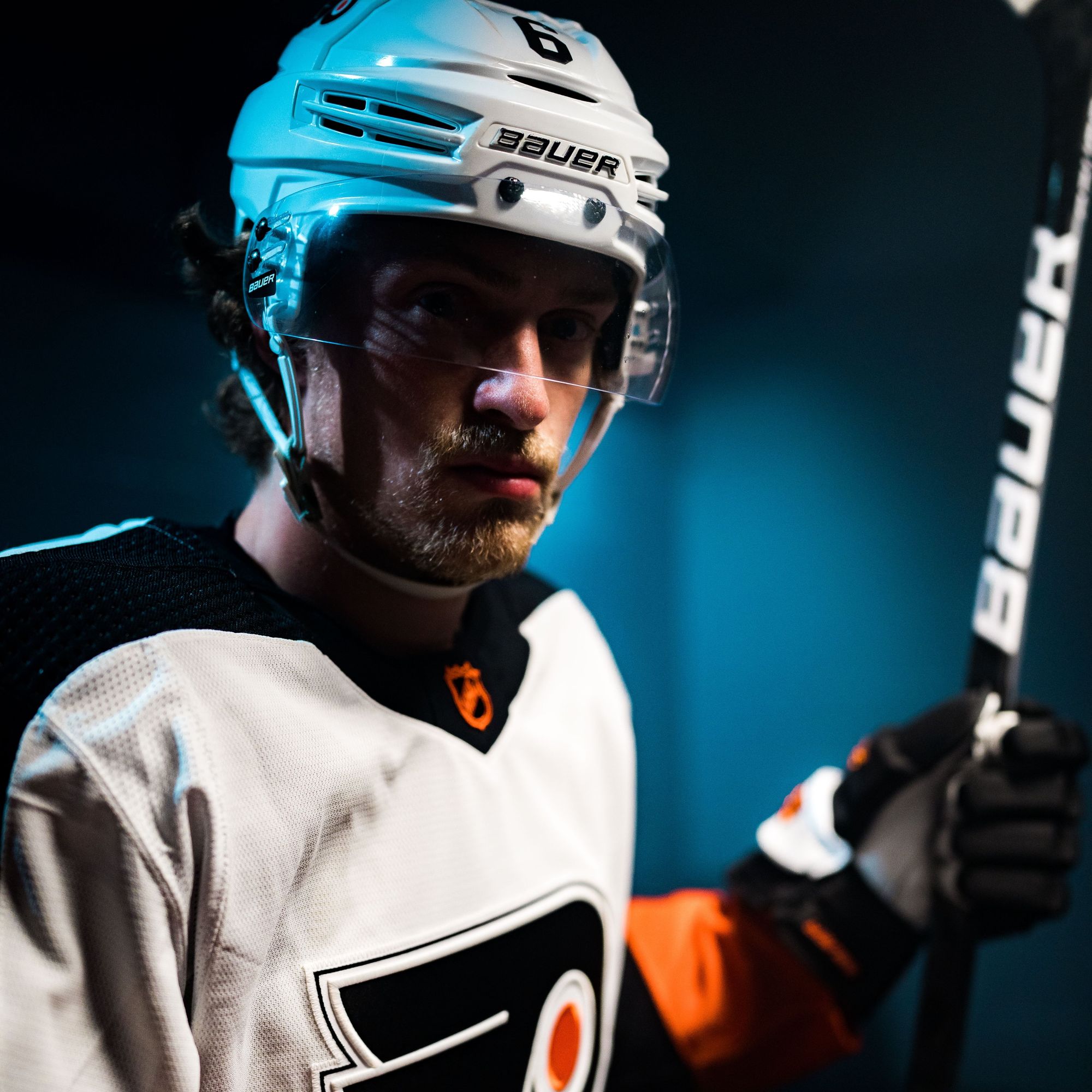
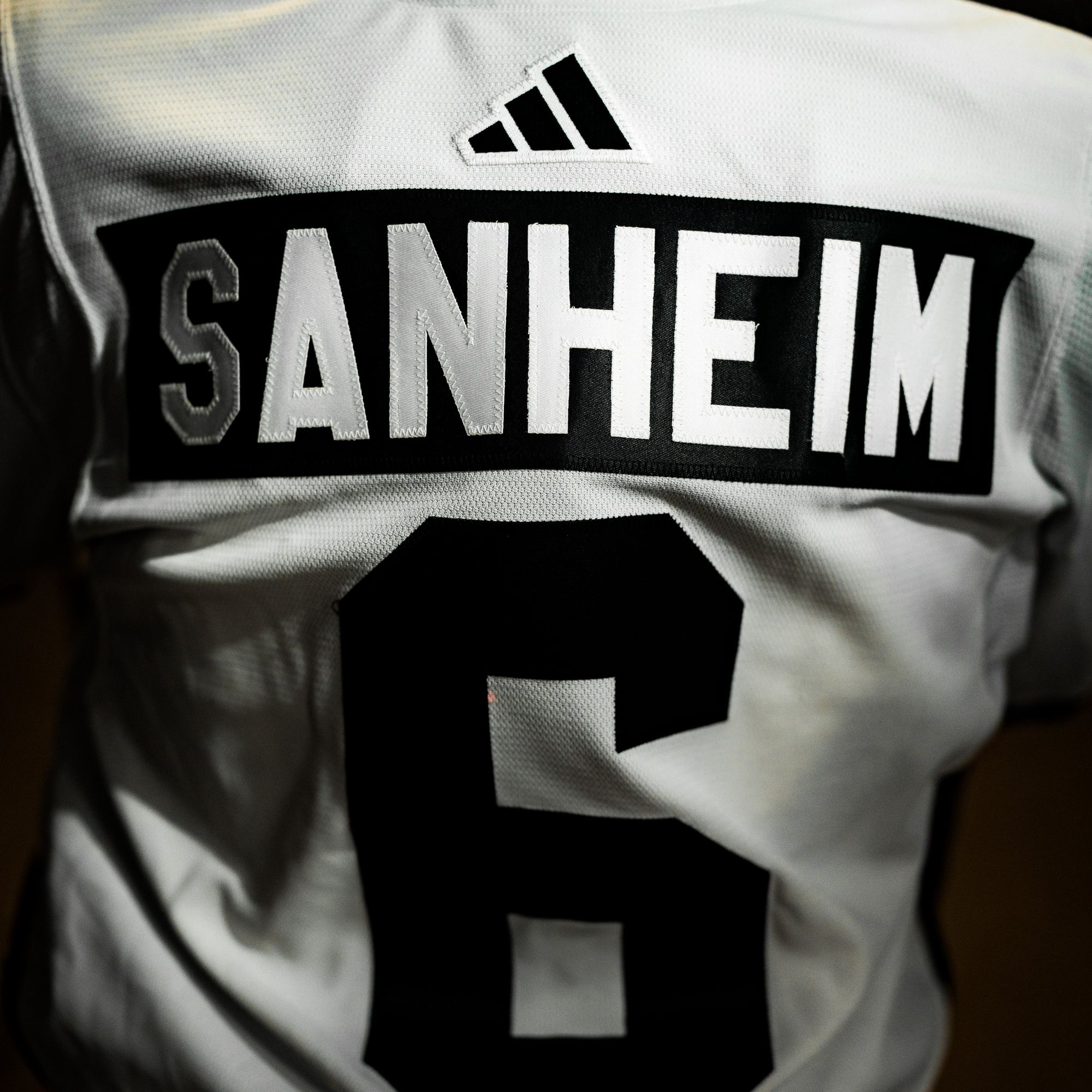
Only the Flyers could wear a white jersey that makes you feel intimidated. They're also brining back the infamous Cooperalls pants for pre-game warmups in them:
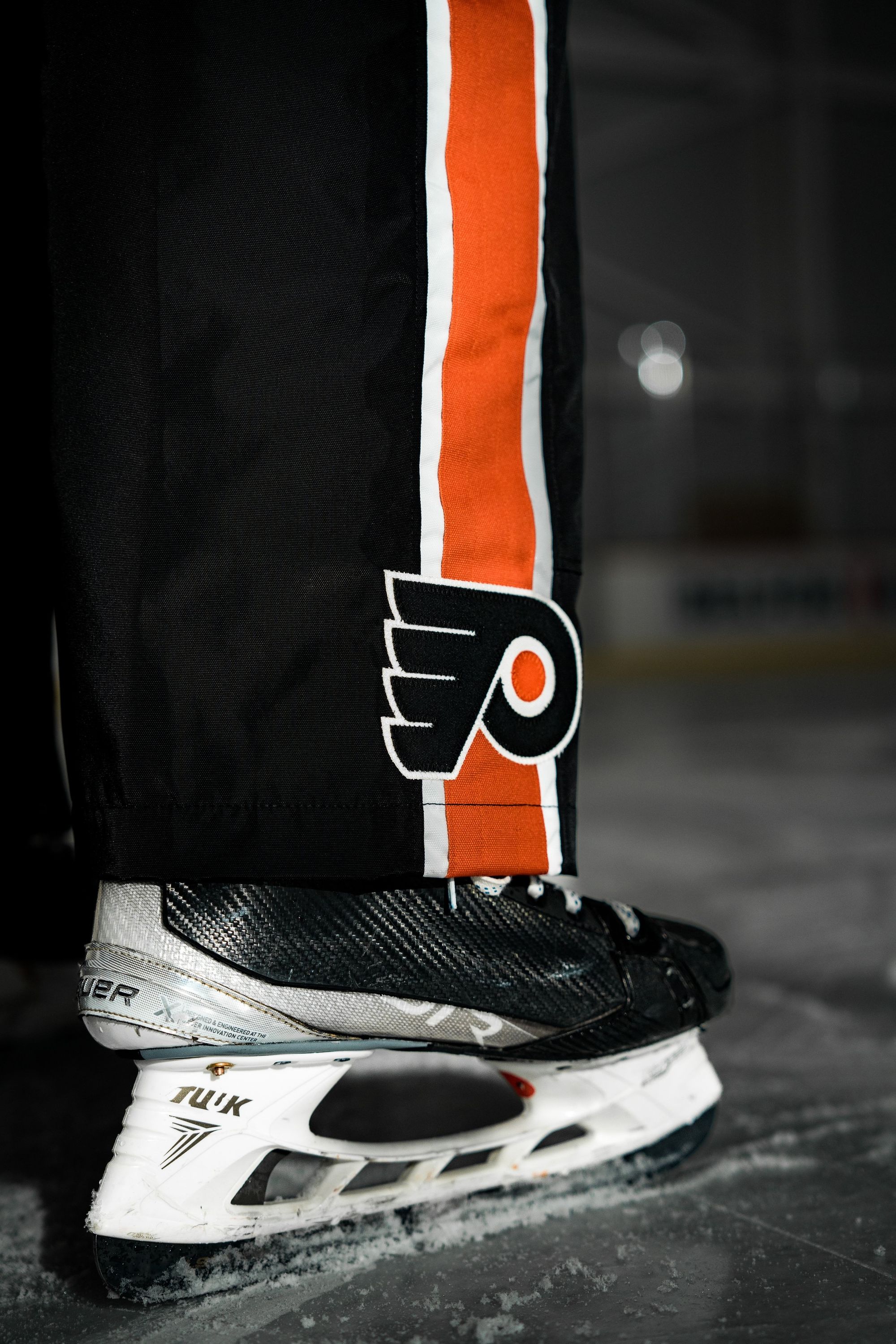
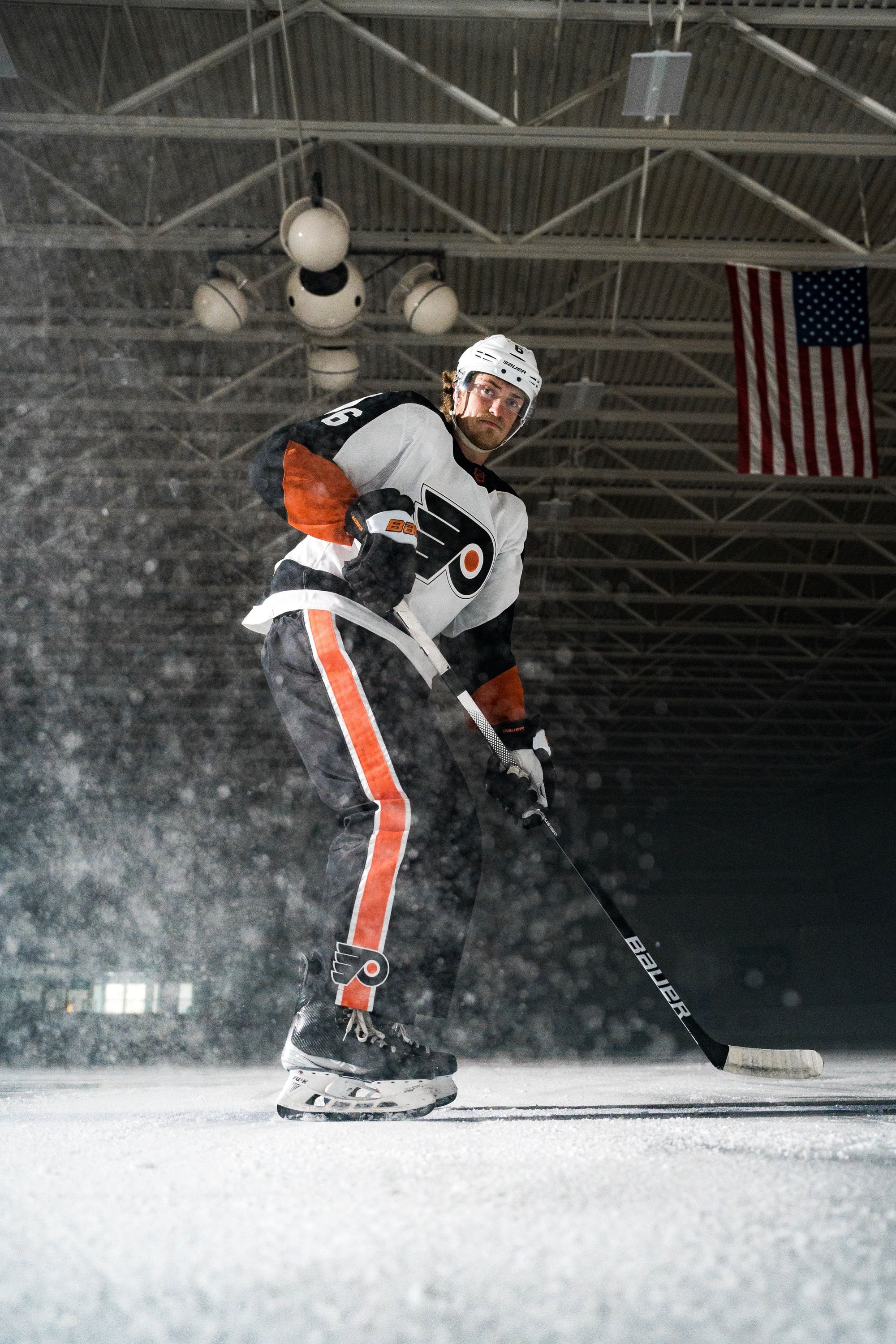
Every team who put in a little bit of effort seems to be getting a good grade. Weird how that works.
Is it better than their first Reverse Retro?
At the risk of a Flyers fan punching me in the face, yes.
Pittsburgh Penguins: A+
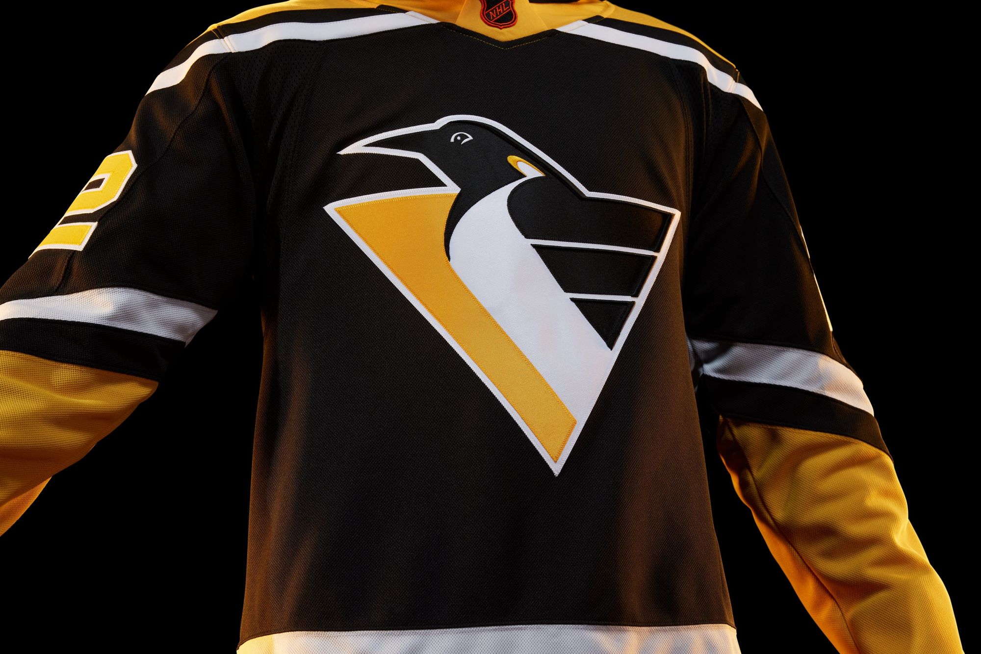
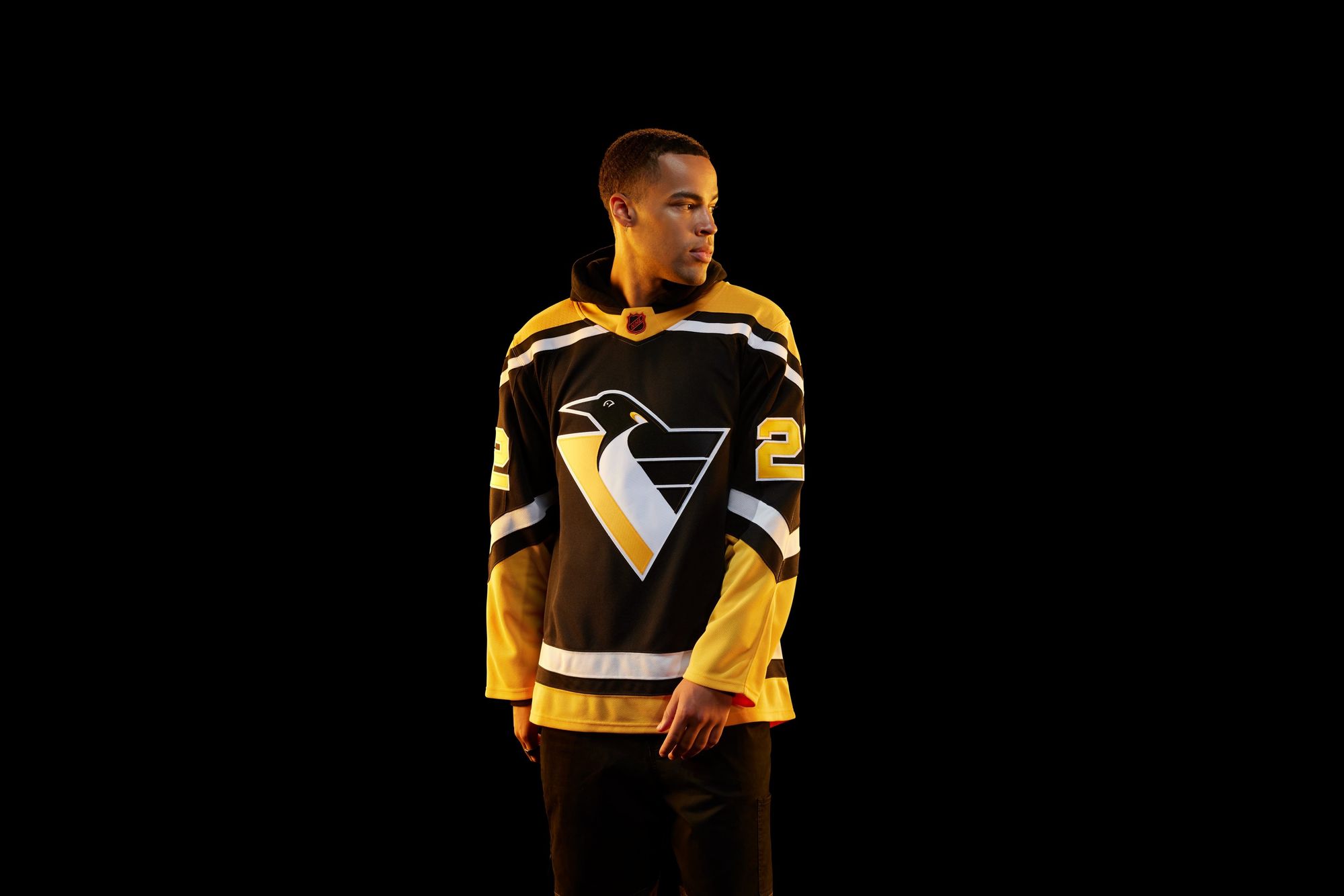
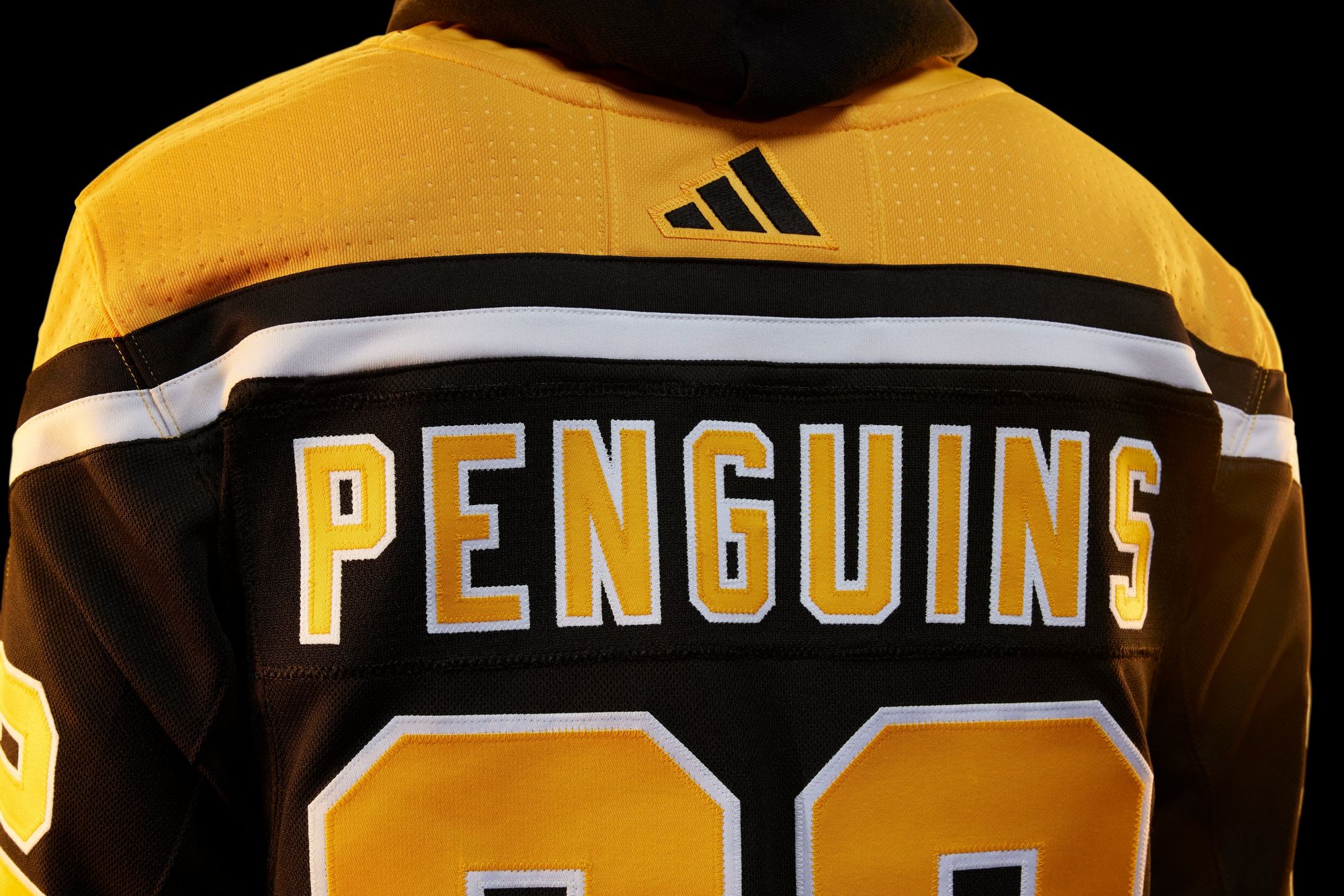
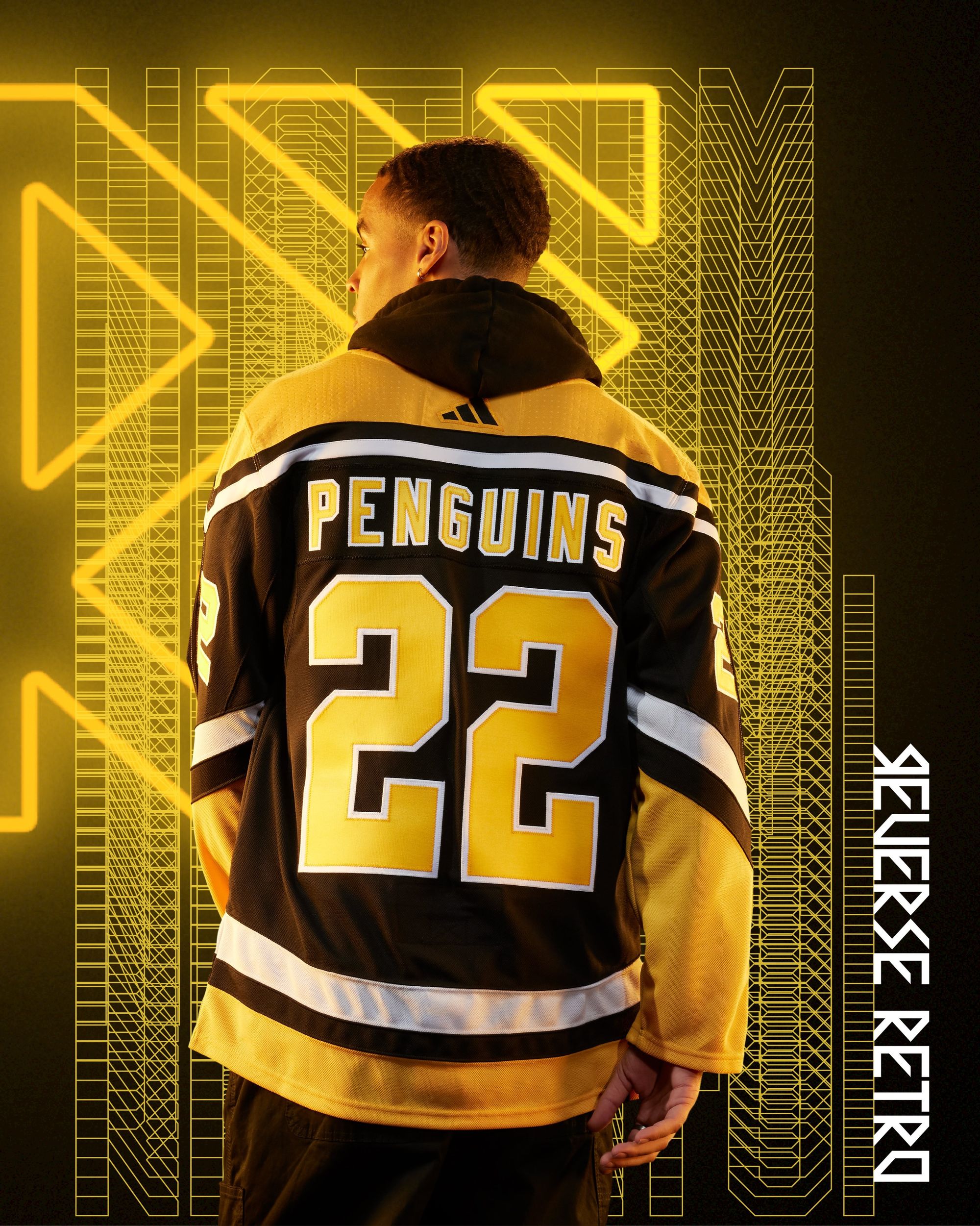
Nine months ago, I wrote that the Robo Penguin was my No. 1 NHL uniform that needed to come back. Yesterday, my prayers were answered. Sidney Crosby in the Robo Penguin vs. Alex Ovechkin in the Flying Eagle, just as god intended.
Is it better than their first Reverse Retro?
Both home runs, but c'mon. Robo Penguin.
San Jose Sharks: C
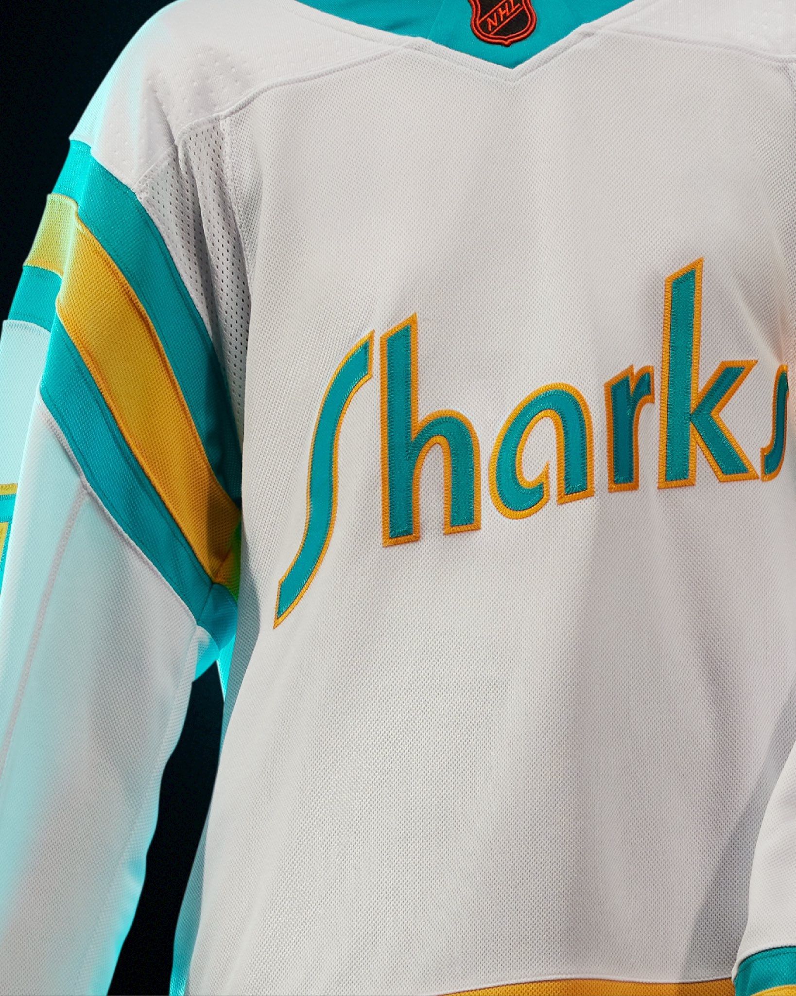
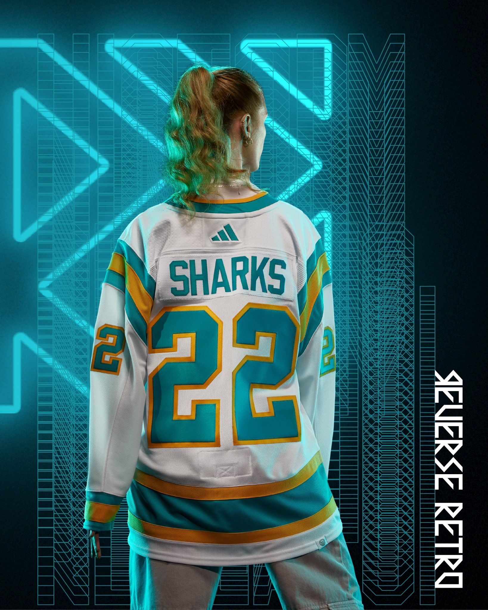
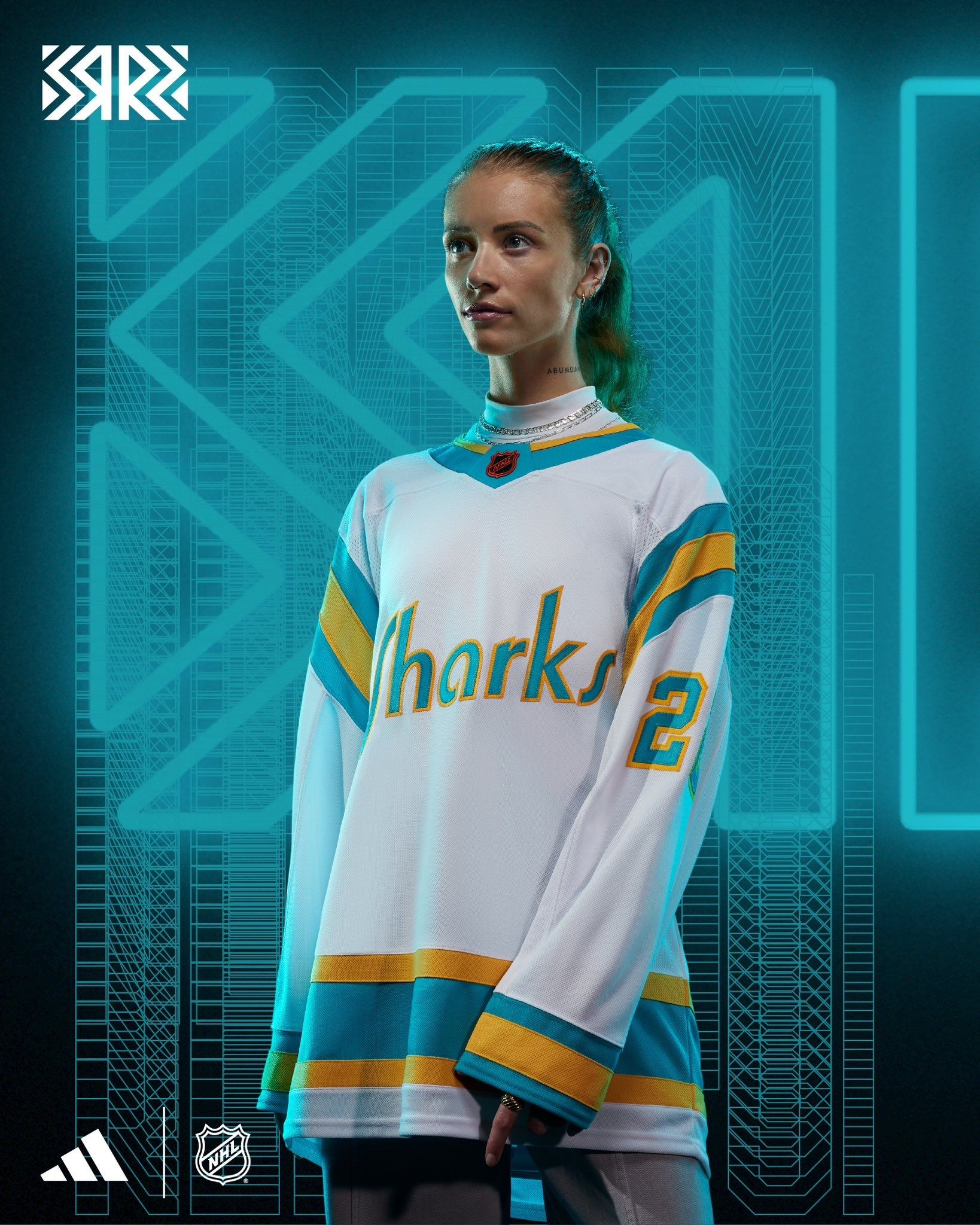
I guarantee that I'm going like the full uniform infinitely more than I do the jersey itself, especially if they go with teal pants/helmets/gloves. The jersey on its own looks like a 1965 UCLA jersey that got left out in the sun for too long.
Is it better than their first Reverse Retro?
No. Metallic silver always wins.
Seattle Kraken: F
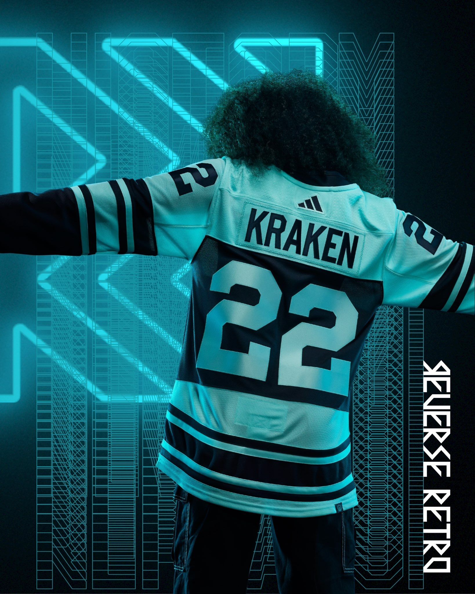
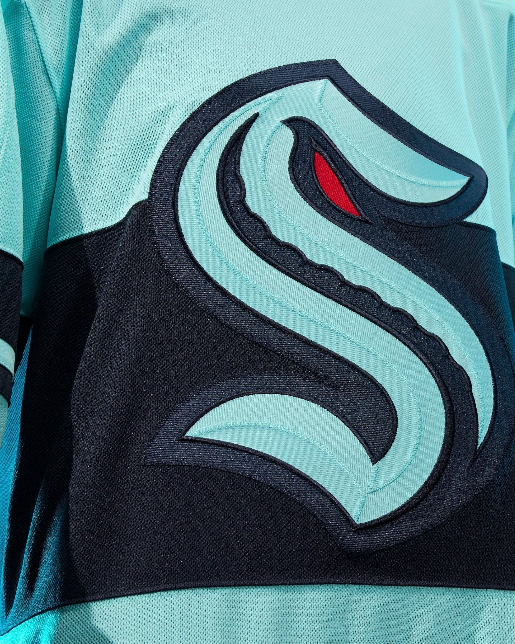
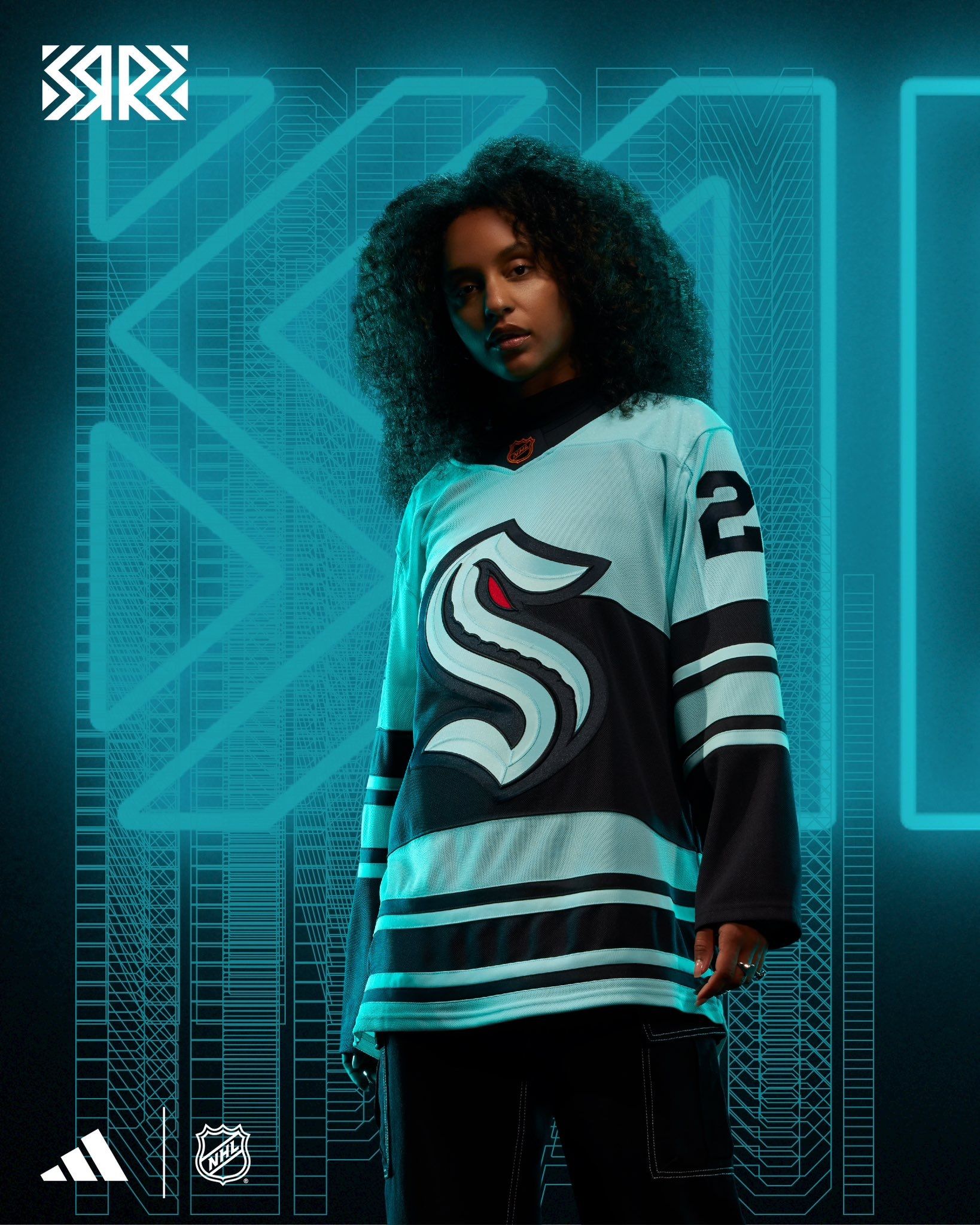
The main thing I don't like is that Seattle missed the chance to come up with a cool alternate logo. They lack history to pull from, but that just means they have a blank slate to choosing any direction they want to go with it. Instead, they used the 'S' that's already on both their uniforms, so this is just ends up as a mashup of their current look, but with different jersey stripes. If that's what you're gonna come up with, why not do a Sonics homage?
Is it better than their first Reverse Retro?
They weren't around yet, but hopefully the next one is better than this.
St. Louis Blues: A-
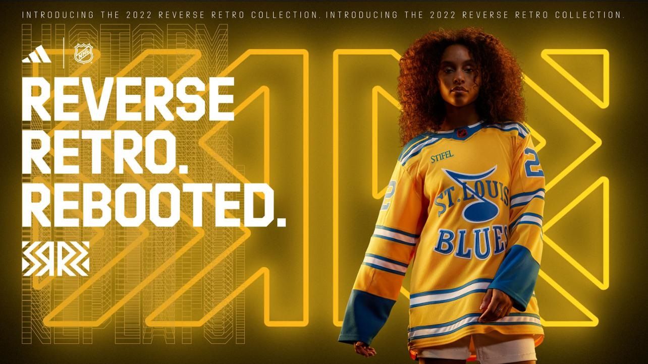
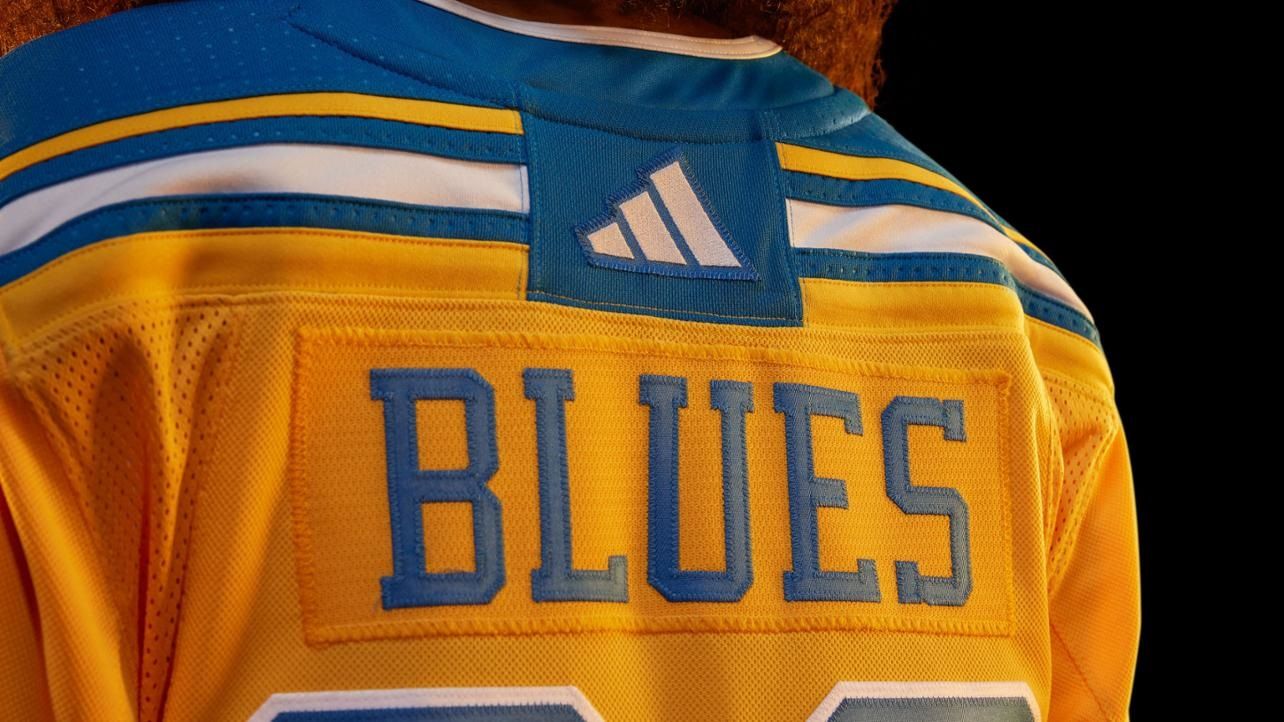
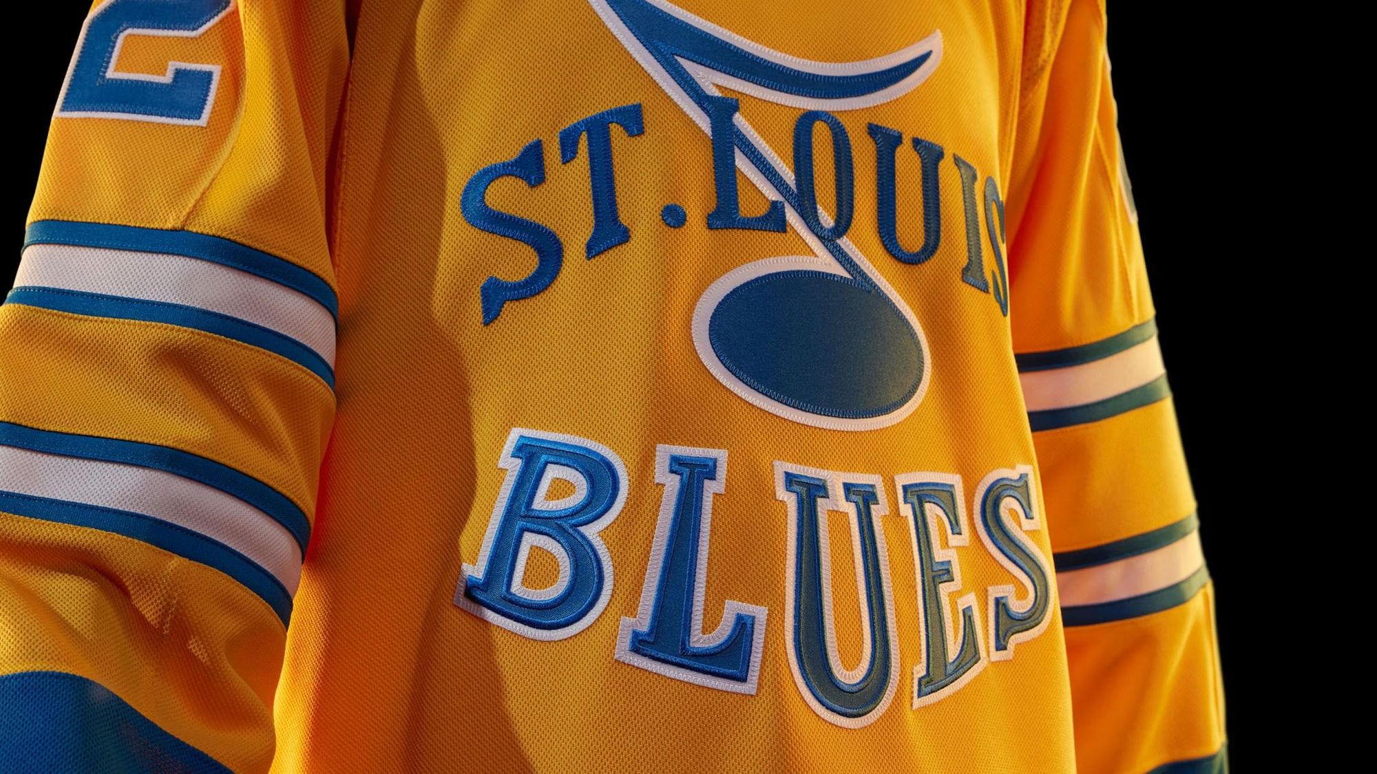
This looks like the type of jersey that's gonna be so popular among Blues fans that it becomes an alternate. It has similar elements to their Winter Classic looks, but with a much different logo. It also looks like these are the first yellow jerseys in team history, which is neat. There's quietly a lot happening here, but I think it all works.
Is it better than their first Reverse Retro?
Yes, because they missed the mark with red instead of blue last time.
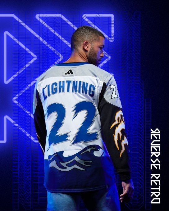
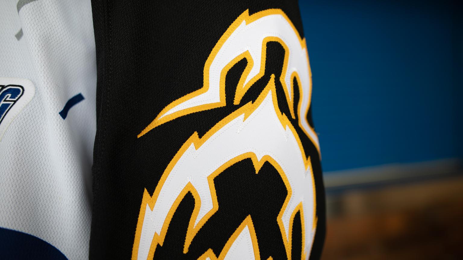
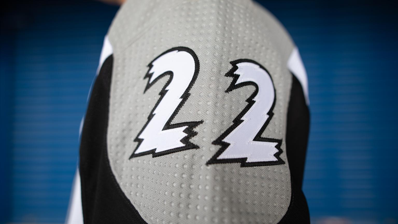
Tampa Bay Lightning: A+
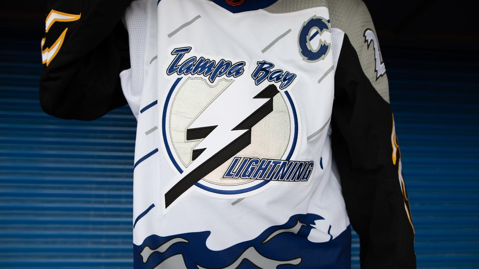
Look at the Lightning's announcement tweet. They get it:
So bad, it's good. 😈
— Tampa Bay Lightning (@TBLightning) October 20, 2022
This is what Reverse Retro is all about. They're leaning into one of the most infamous jersey's in NHL history without a second thought. I love it, and I have to buy one.
Is it better than their first Reverse Retro?
It might be better than any jersey in NHL history, if we're being honest.
Toronto Maple Leafs: B
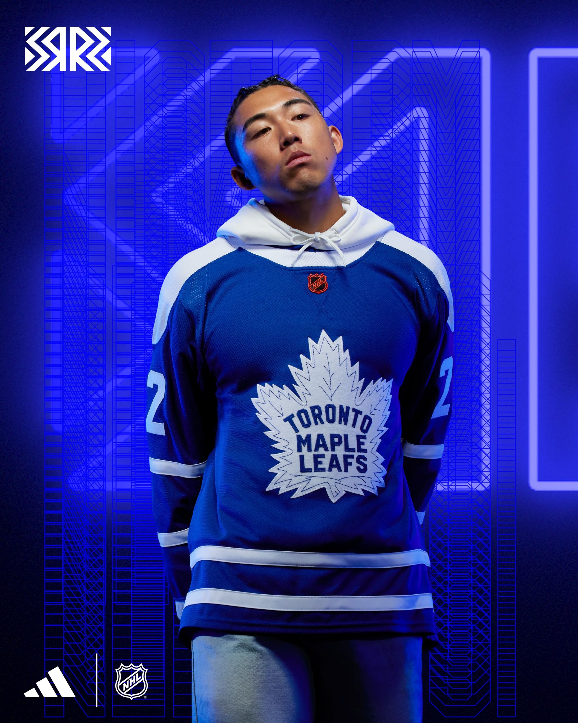
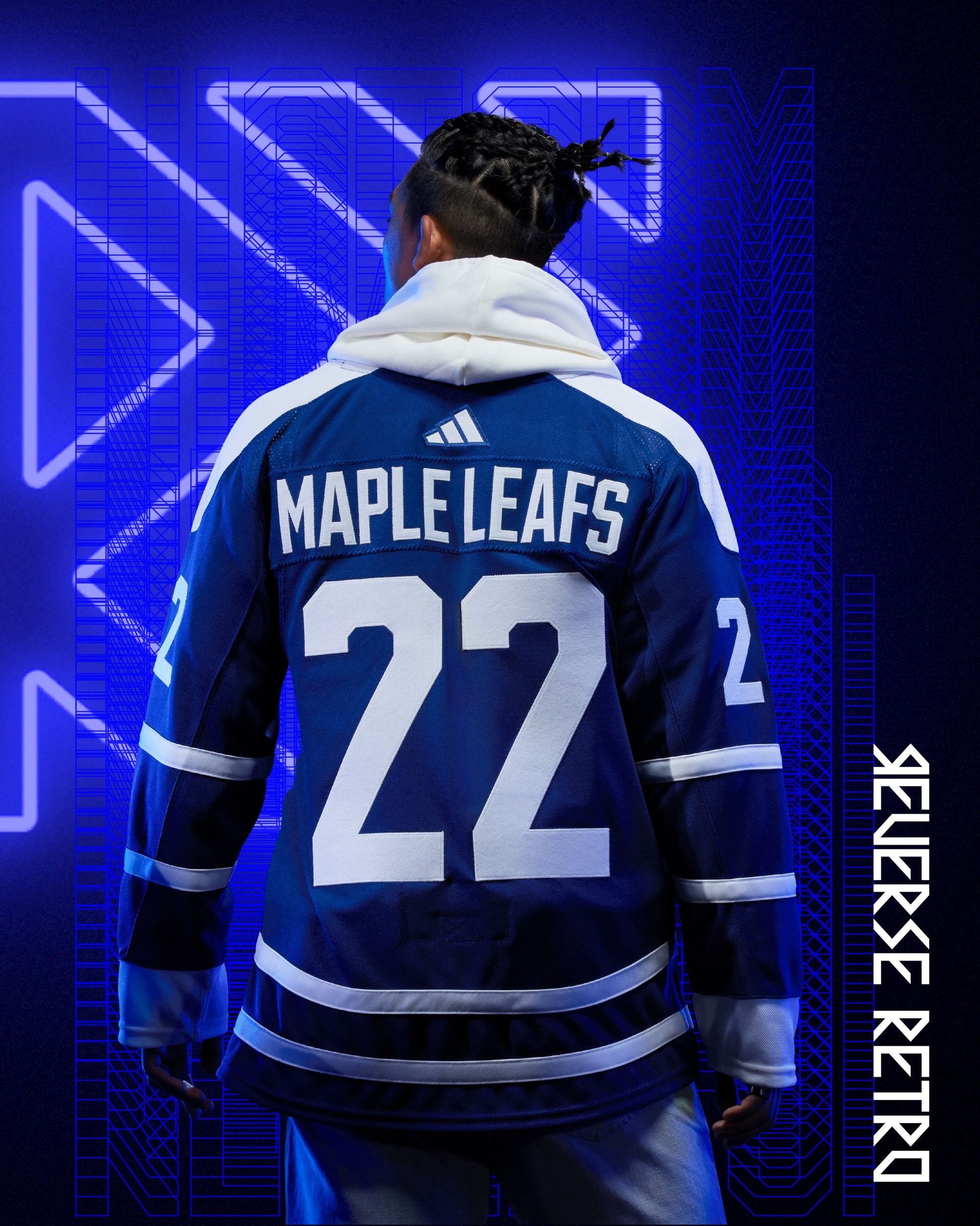
No strong opinion other than "Solid." The Maple leaf logo looks like it's straight from the 1950s, the stripes aren't too much, and the white shoulder plate is a nice mix of 80s and the 2000s alternates, just in white this time. If this jersey was put into a 32-team Reverse Retro playoff with the rest of the league, it would definitely make it out of the first round.
Is it better than their first Reverse Retro?
Don't know what they were trying to do there. This one gets the nod without a second thought.
Vancouver Canucks: D+
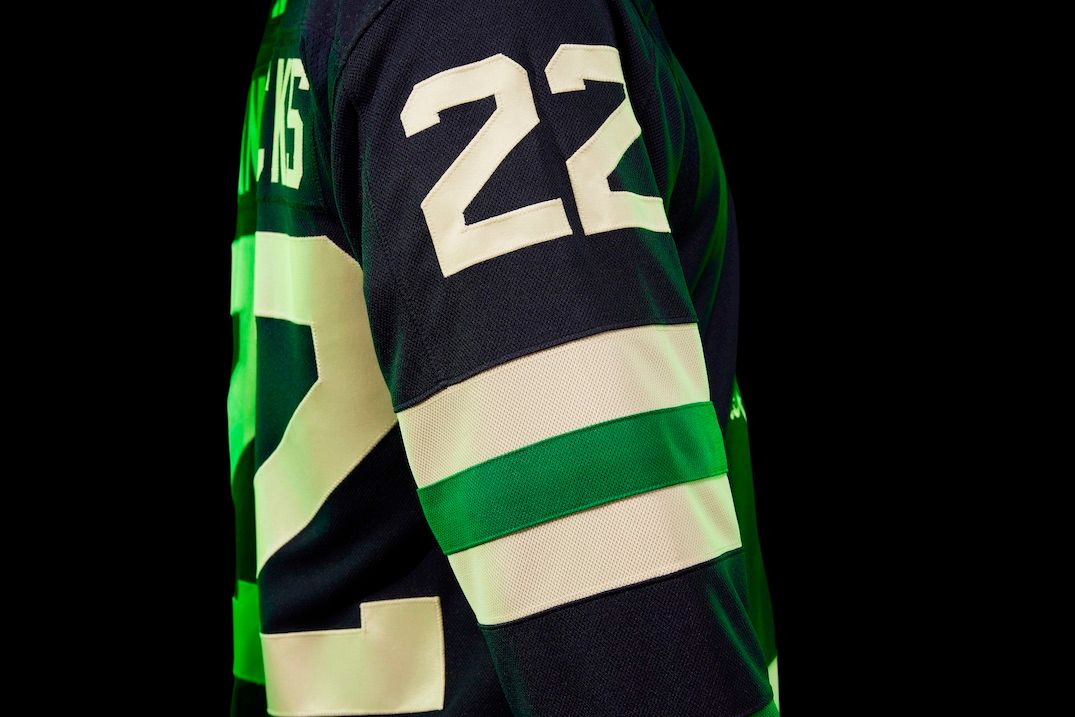
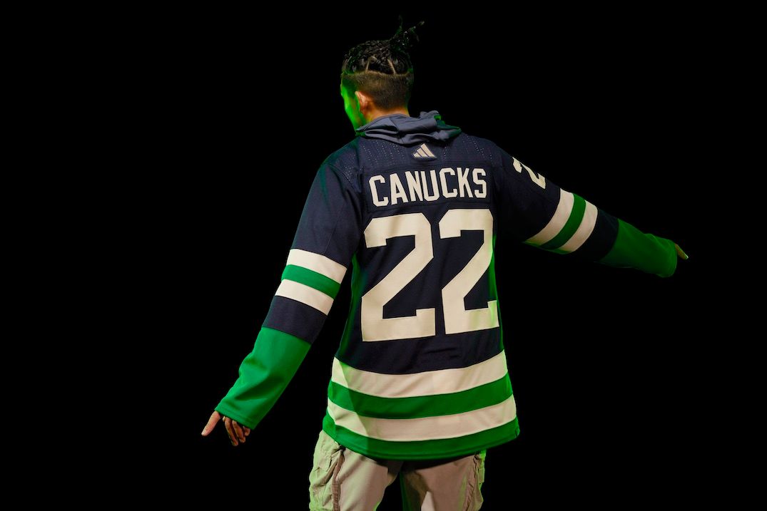
I'll give Vancouver a little bit of credit: Having numbers above the chest is unique! It might get a little crowded with a "C" or an "A" patch on the other side, but I like that it's different. My big disappointments here are the logo and color choices. No disrespect to 'Johnny Canuck' or blue and green, but the Canucks have a hell of a logo, jersey and colorway history to pick from, and choosing a generic old-school logo with their current colors doesn't do it for me. Another uniform that doesn't look bad, but also doesn't fit what I think Reverse Retro's should be.
Is it better than their first Reverse Retro?
I'm probably the only one who thinks this, but no. That one was hideous in a beautiful way.
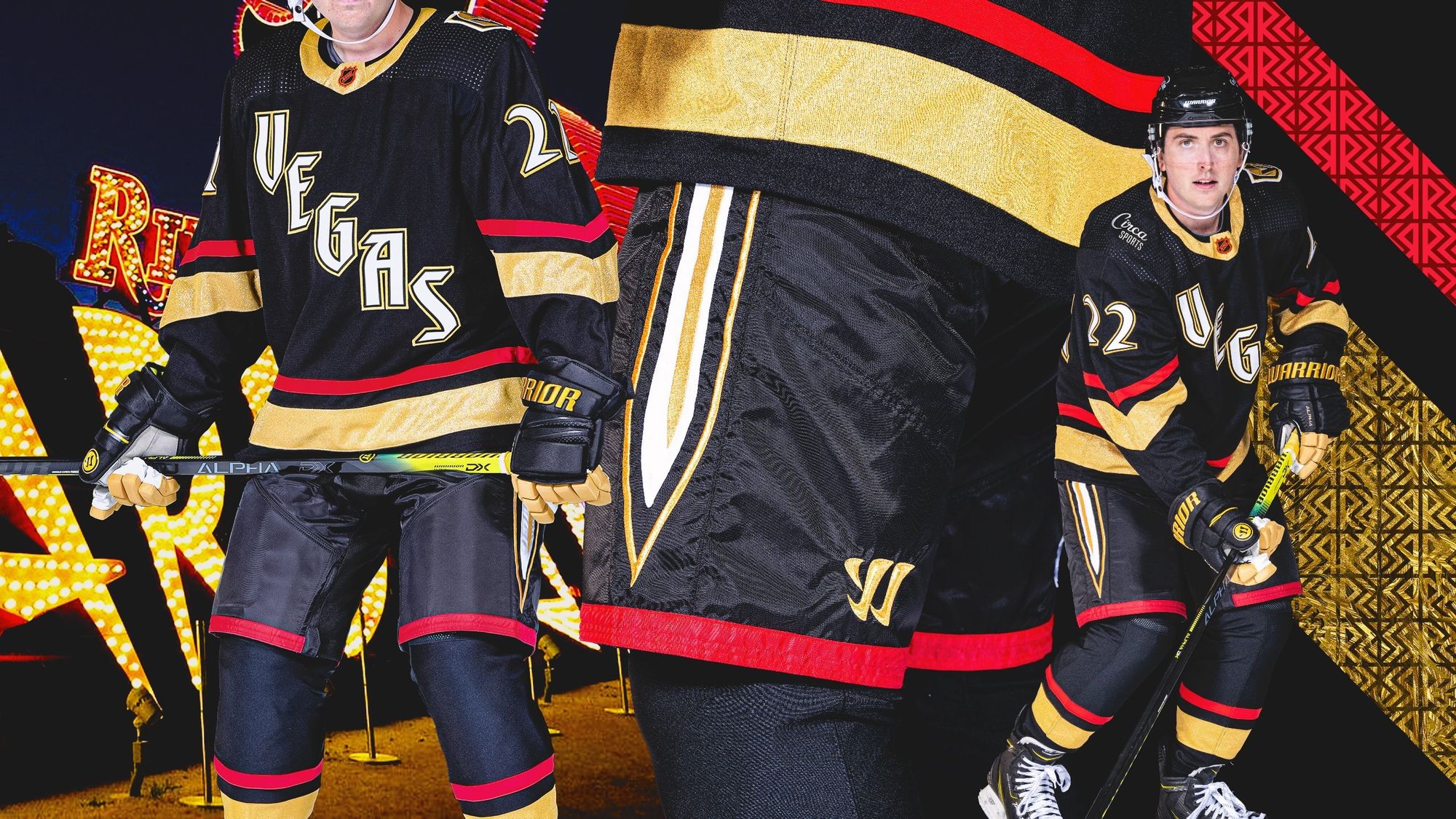
Vegas Golden Knights: B+
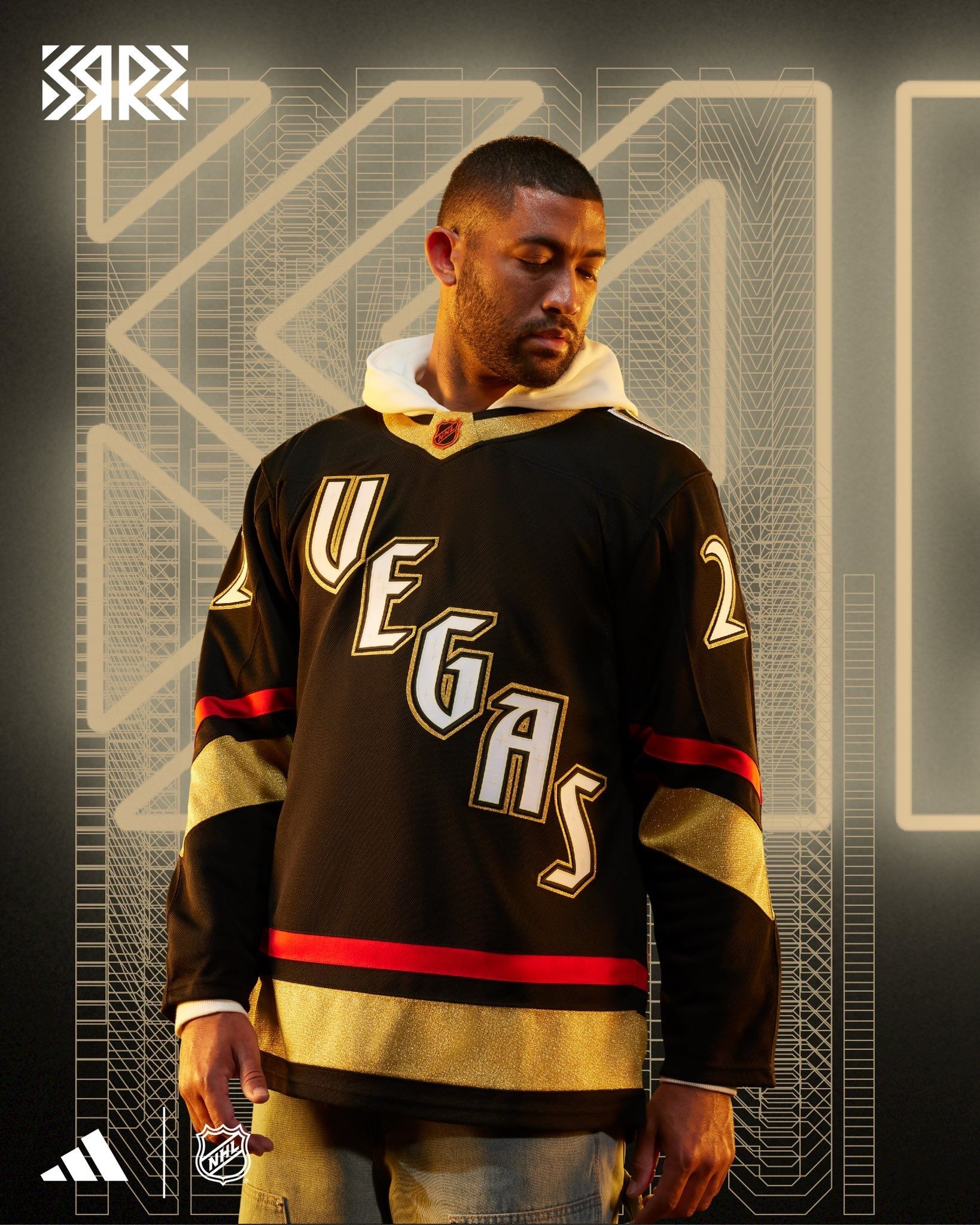
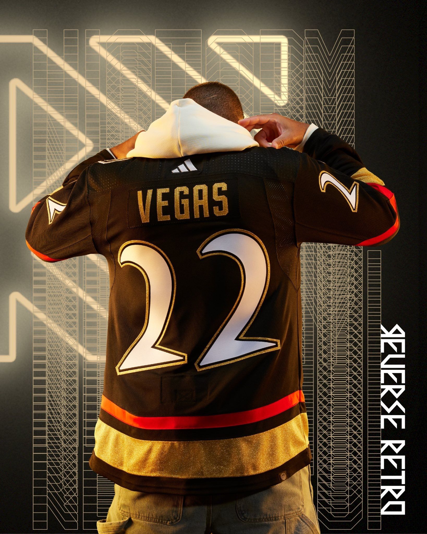
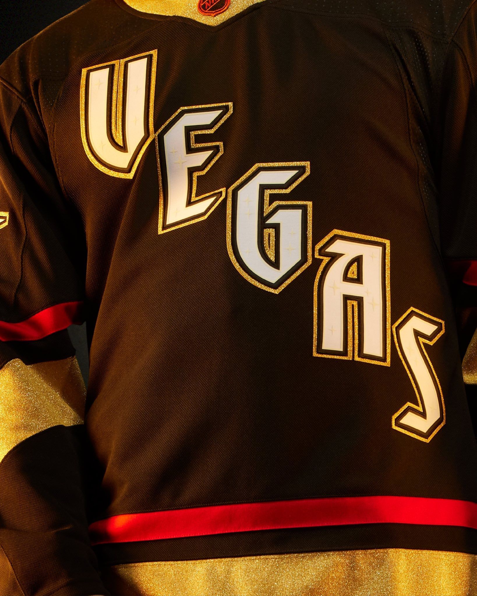
I really wanted to trash these the first time I saw them. And then I saw the full uniform:
Then I saw that they glow in the dark:
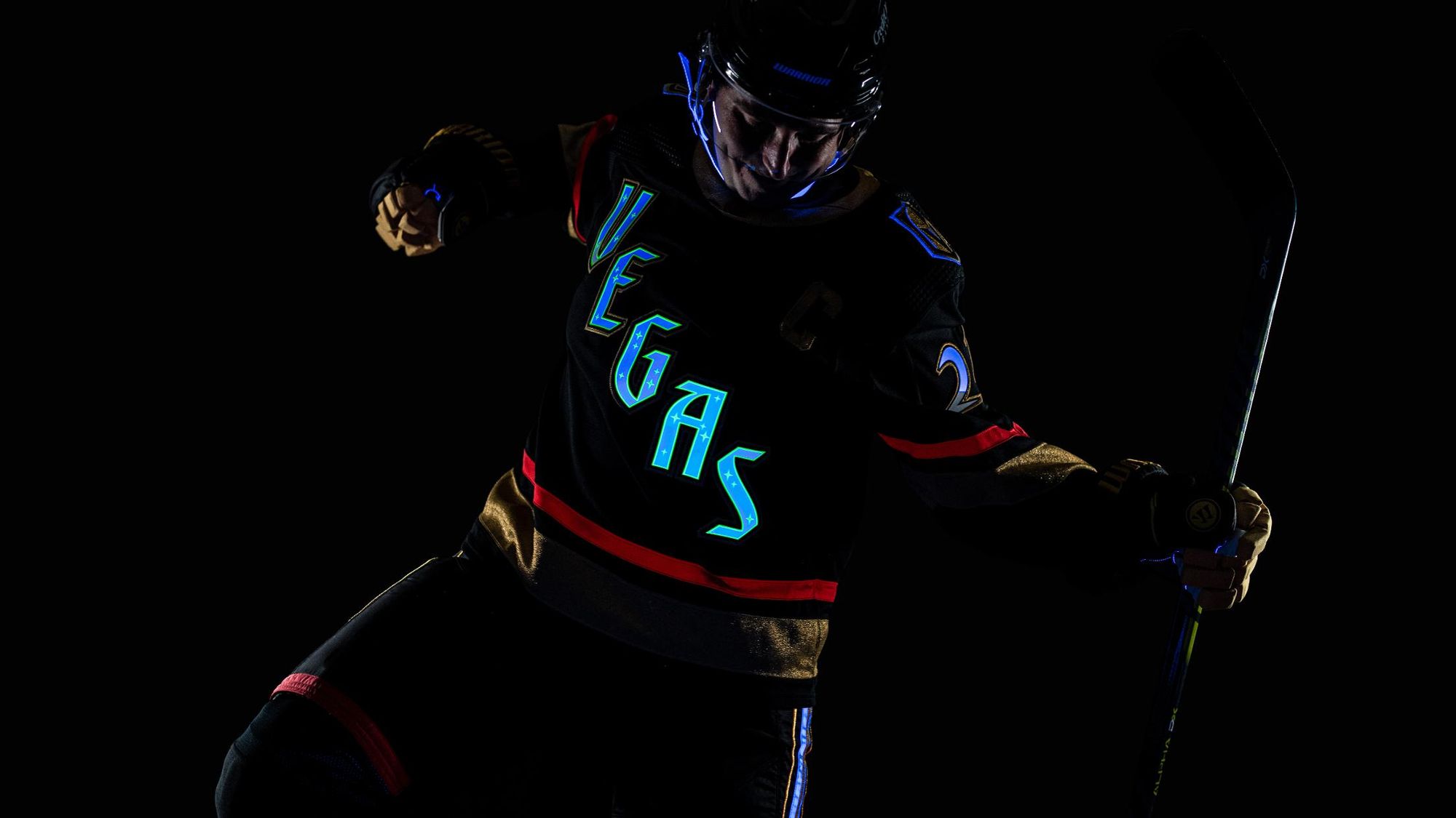
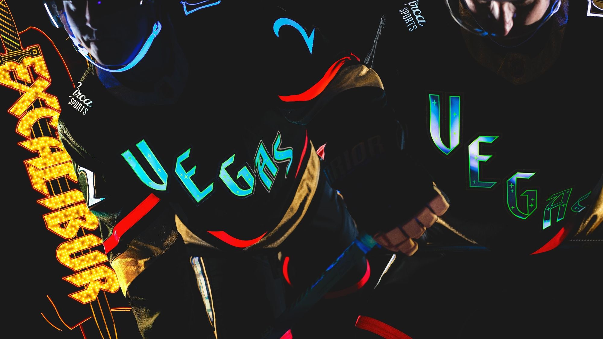
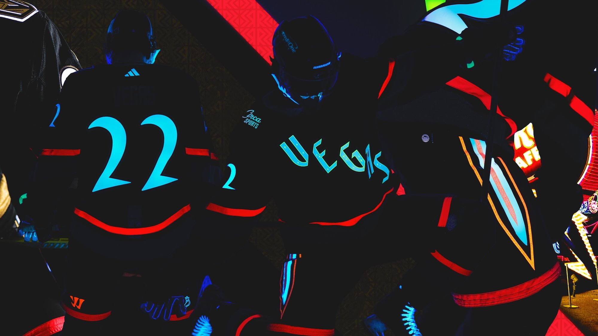
Does that last part really matter in the grand scheme of things? No, but again: The point of the Reverse Retro program should be that you're either bringing back a classic uniform everyone loves, or you go completely wild with a design people either love or hate. There shouldn't be any middle ground. For whatever you want to say about how the Golden Knights operate, they seem to understand that as well as anyone in the league, and they nailed it here.
Is it better than their first Reverse Retro?
Doesn't look like an aquatic Pokémon, so yes.
Washington Capitals: A+
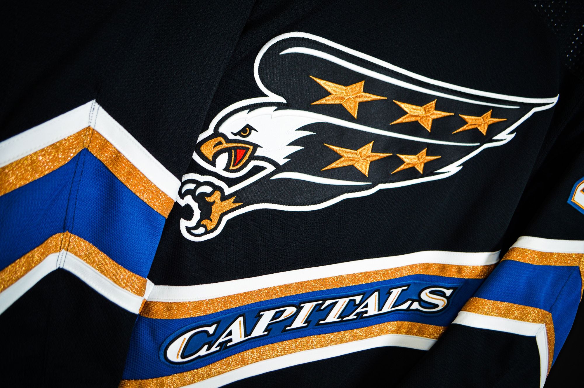
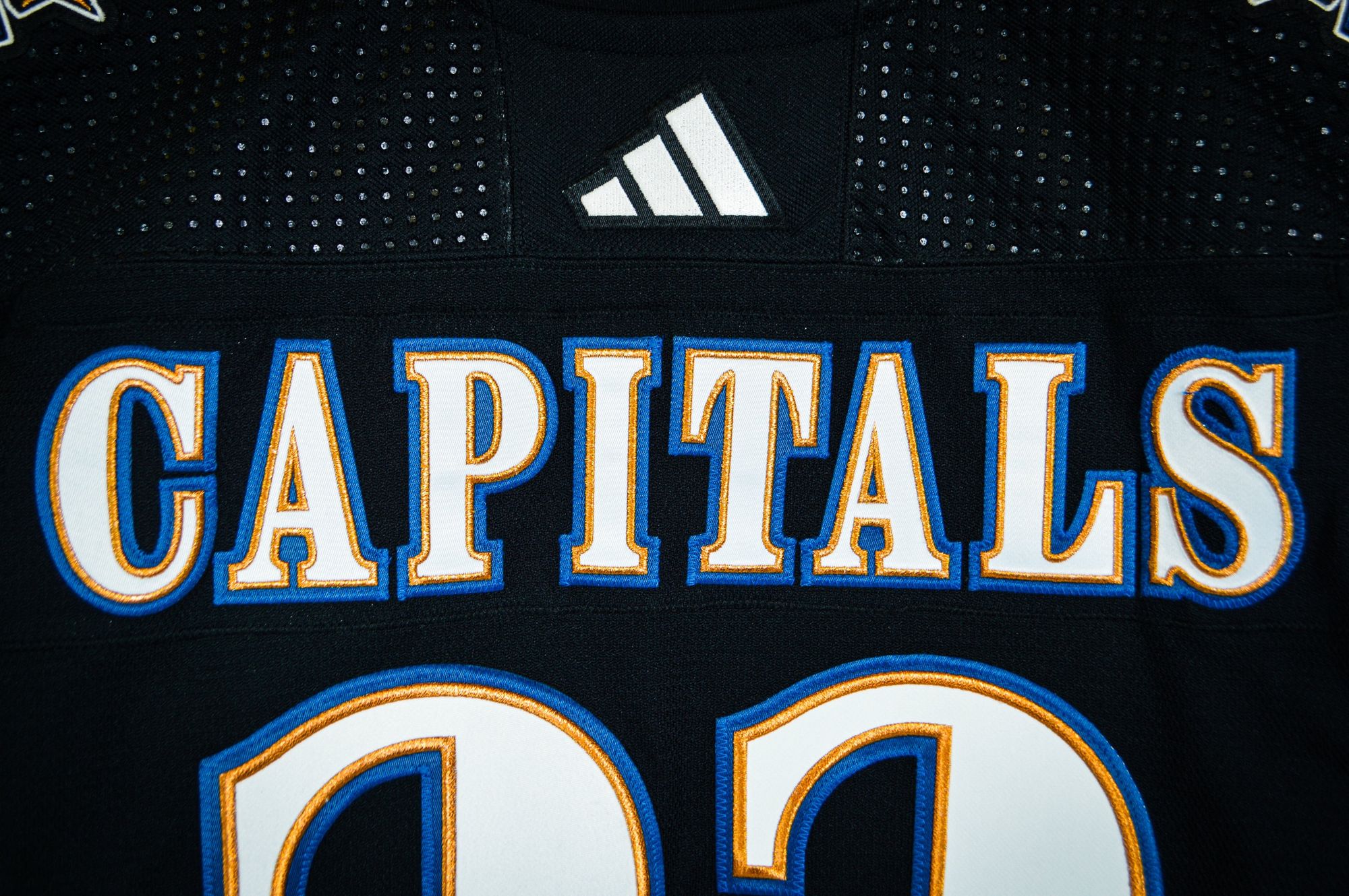
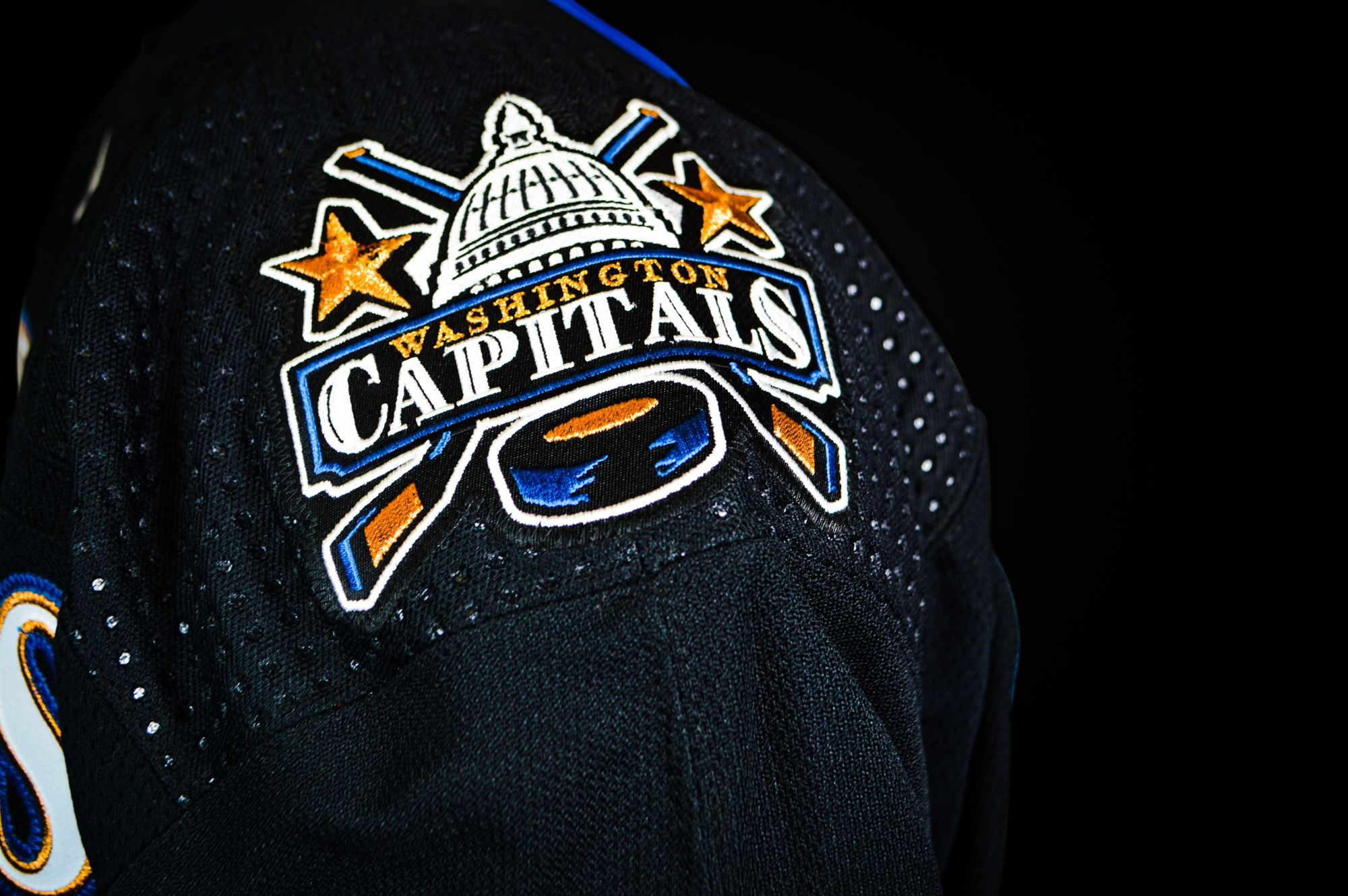
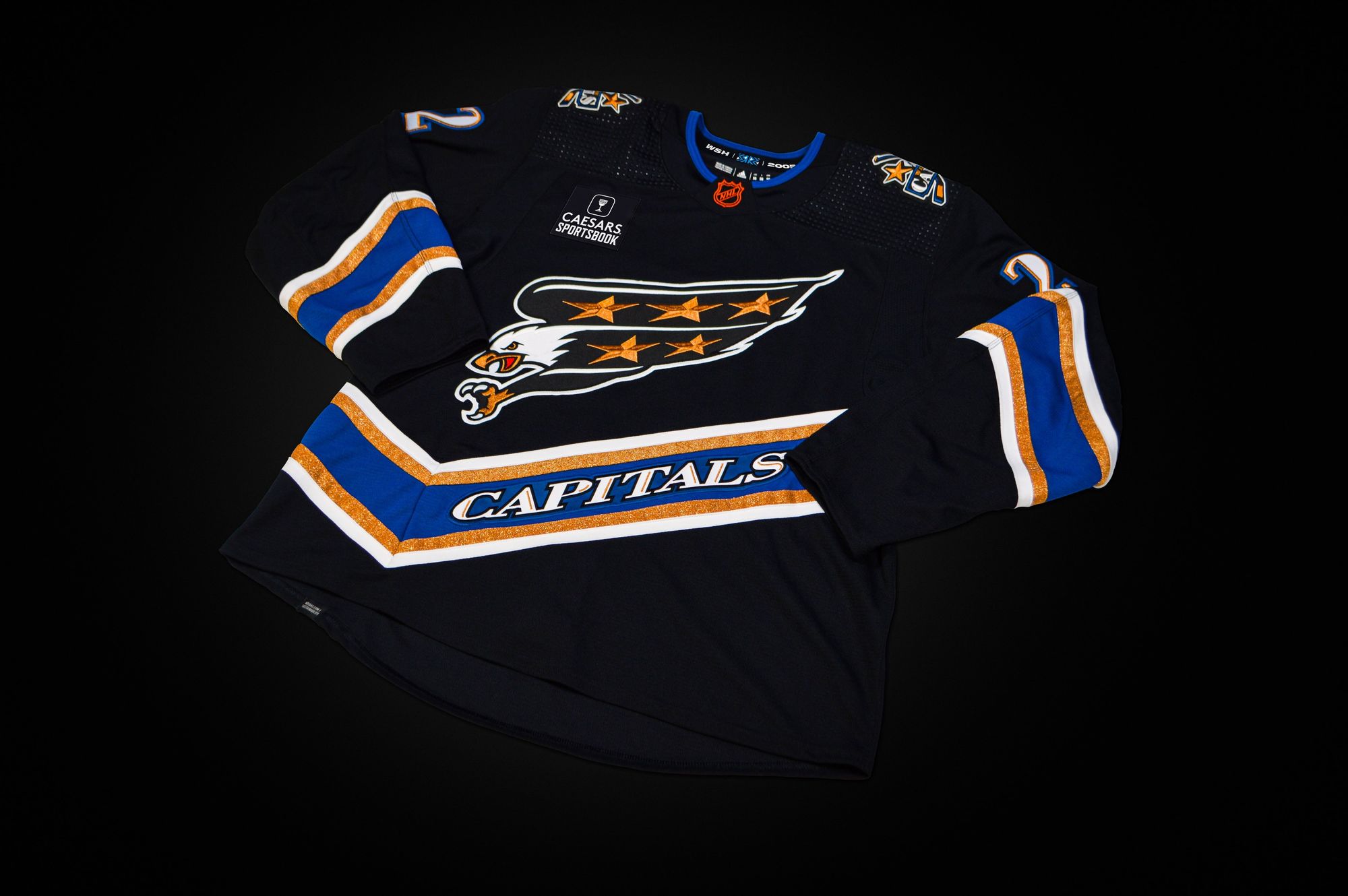
They actually did it.
It's flawless, and even better than I imagined. Look at the screaming eagle.
Ovie wore the white version as a rookie, but finally gets to wear the black version almost two decades later. It's as close to a perfect jersey as you'll ever see in any sport.
Is it better than their first Reverse Retro?
Yes, because it's the proper color scheme.
Winnipeg Jets: B-
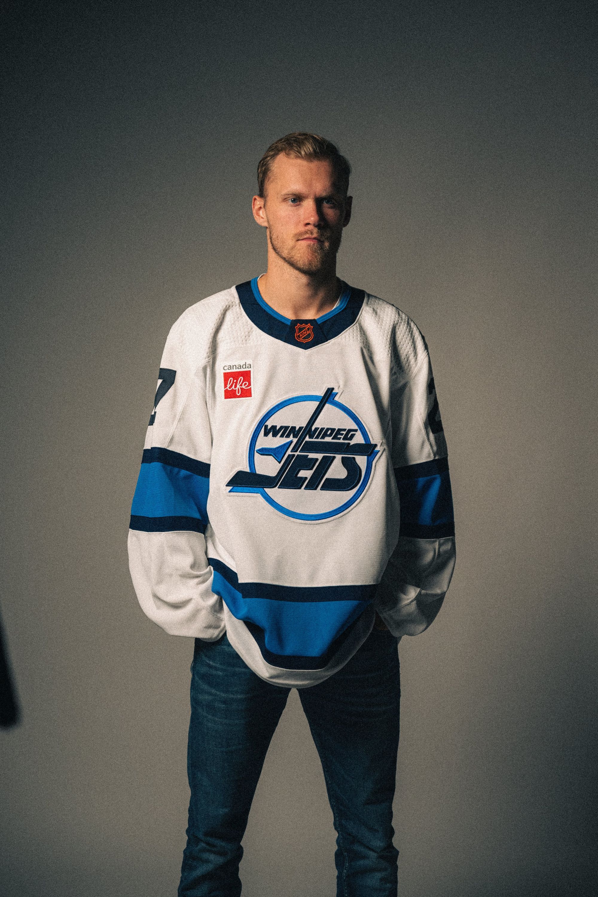
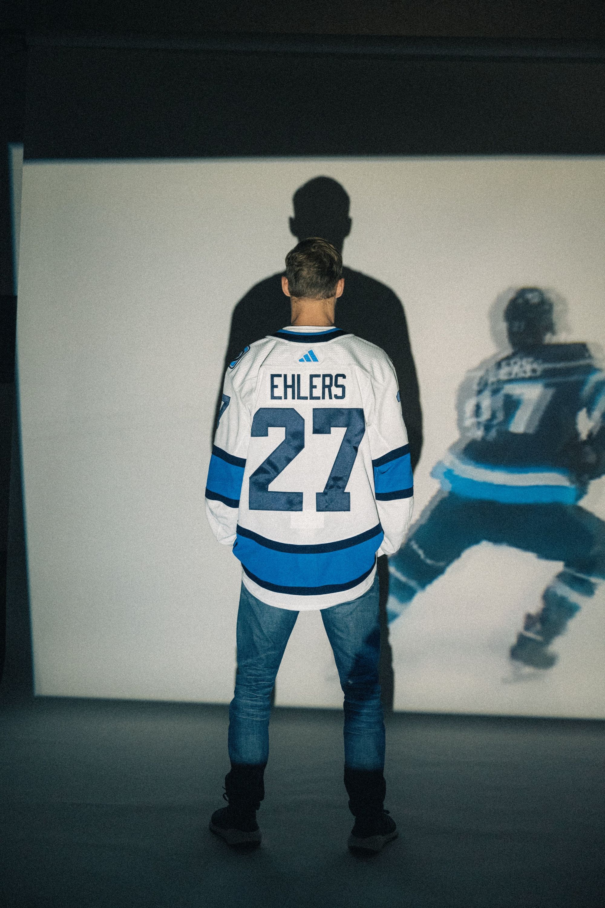
The Jets are doing the same thing the Capitals did with their first reverse retro: Bringing back a classic jersey - just with their current colors instead of the OG. That's exactly what bothers me about it.
The Capitals one was cool, but Winnipeg's seems like another instance of their management actively avoiding wearing the uniform everyone knows is better than what they currently wear. This is a way to placate the people screaming for the throwbacks, without actually having to fully give in to them. That's why it only gets a B-. Bonus negative marks for whoever thought it was a good idea to do the angsty Nikolaj Ehlers photoshoot.
Is it better than their first Reverse Retro?
It doesn't look like a slab of concrete, so yes.
